The rating control is an advanced control that lets you configure settings like content and the number of levels on a data entry page.
Use cases
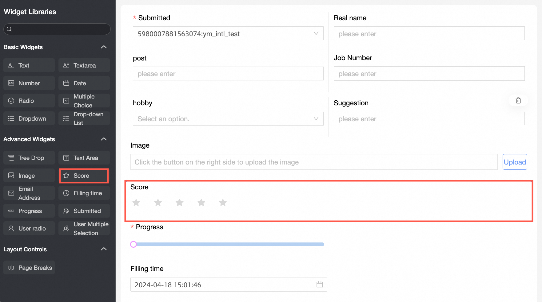
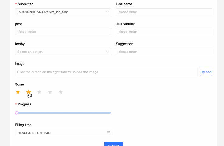
The rating control is ideal for questionnaires, product reviews, and service ratings.
Example
Control settings
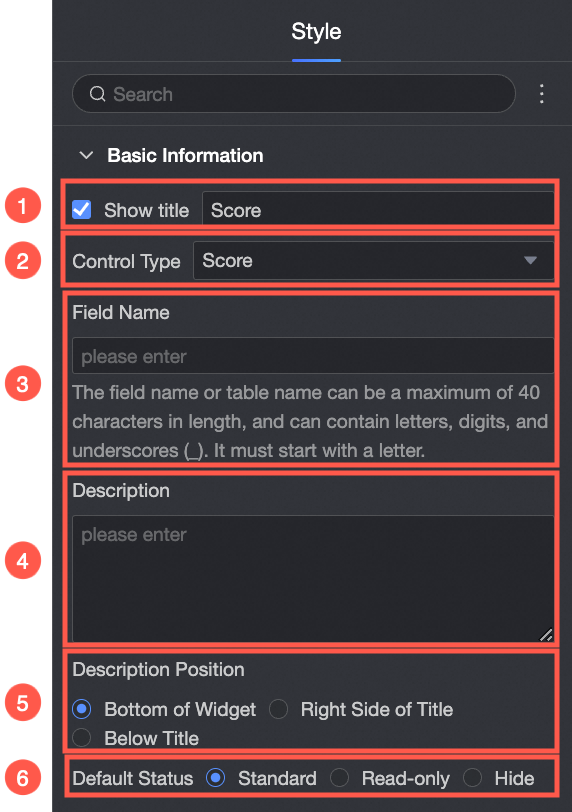
Basic settings
Parameter | Description |
| ① Display Title: Shows or hides the control's title. This title also serves as the column name for submitted data. |
② Control Type: Allows you to switch to a different control type. You can choose from other basic and advanced control types in the dropdown list. | |
③ Field Name: The corresponding field name in the data table for this form. Note A field name or table name must start with a letter and can contain only letters, numbers, and underscores (_). The maximum length is 40 characters. | |
④ Description: A custom description for the control. | |
⑤ Description Position: Sets the position of the description. The available options are Below the control, Right of the title, and Below the title. | |
⑥ Default State: Sets the initial state of the control. The available options are normal, read-only, and hidden. |
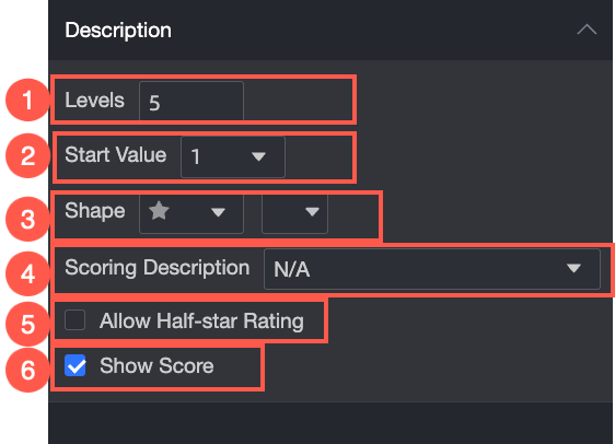
Content
Description | Example |
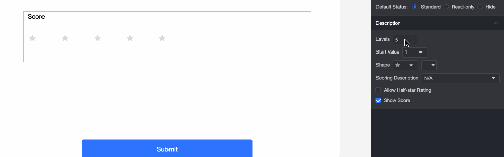
① Number of Levels: Manually sets the number of levels for the rating. The maximum is 10. |
|
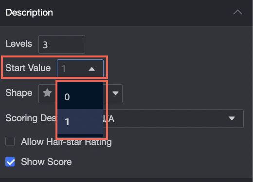
② Start Value: Sets the start value for the rating scale. You can choose either 0 or 1. |
|
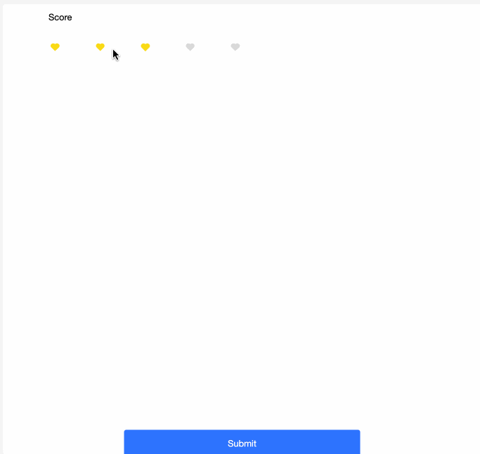
③ Shape: Sets the shape and color of the rating icons. |
|
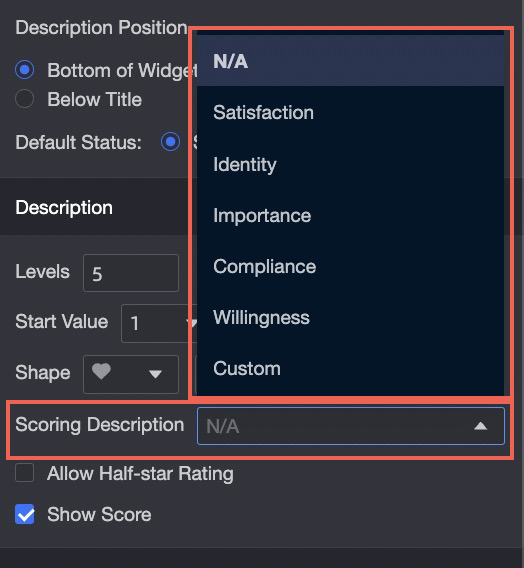
④ Rating Description: Sets the description that appears above the rating icons. Seven types are supported. |
|
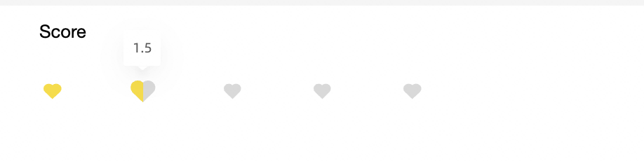
⑤ Allow Half-Star Rating: Determines whether users can give half-star ratings. |
|
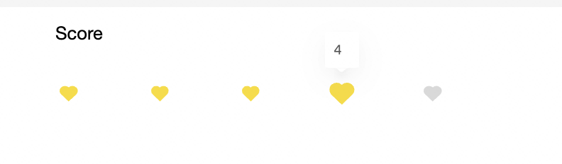
⑥ Display Score: Toggles the display of the numeric score. |
|
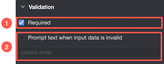
Validation
Parameter | Description |
| ① Required: Makes this control a required field. |
② Validation Message: The custom message to display if an input fails validation (e.g., a required field is left empty). |