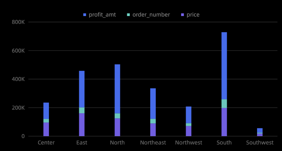
A stacked column chart shows trends over time and compares values across categories.
Prerequisites
You have created a dashboard. For more information, see Create a dashboard.
Example
Add Data
-
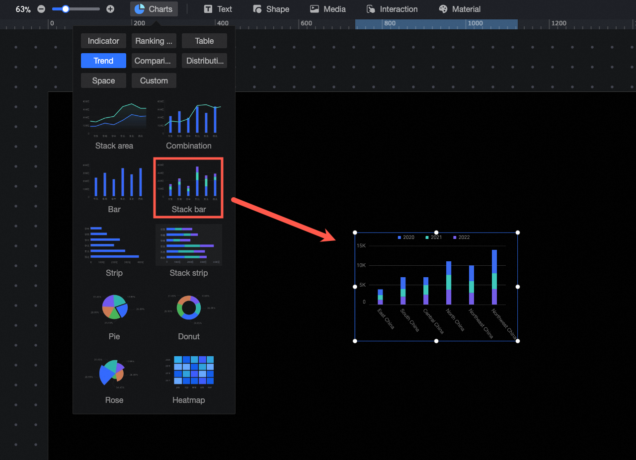
In the component library pane, under charts, find and drag stacked column chart to the canvas.
-
Click Select a dataset and add data to the chart as shown in the following figure. The updated chart is displayed.
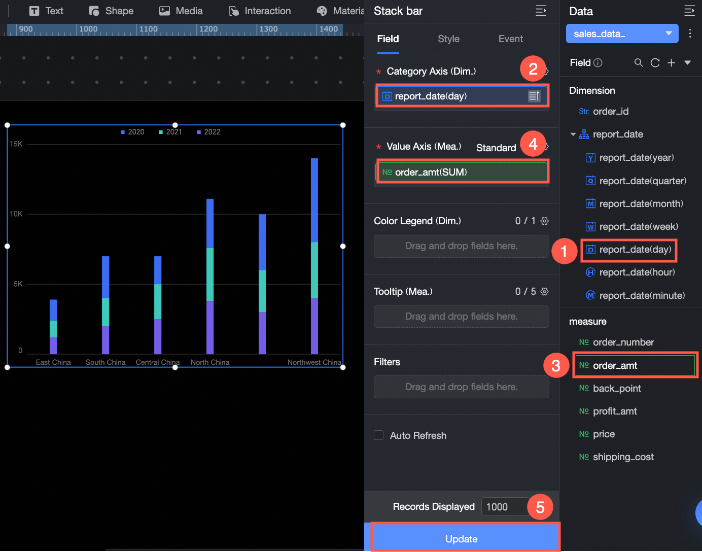
You can also do the following with the data: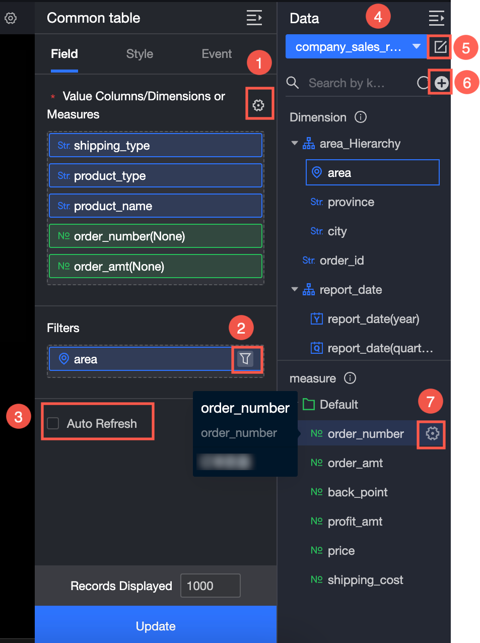
Set field formats in bulk (①). For details, see Configure field styles in batches.
Set a field filter (②). For details, see Filter data.
Set automatic data refresh (③). For details, see Refresh data on a schedule.
Switch datasets (④). For details, see Switch datasets.
Edit the dataset (⑤). For details, see Edit a dataset.
Transform data (⑥). For details, see Create a calculated field and Create a grouped dimension.
Duplicate a field (⑦). For details, see Duplicate a field as a dimension.
Chart Styles
Position and Size
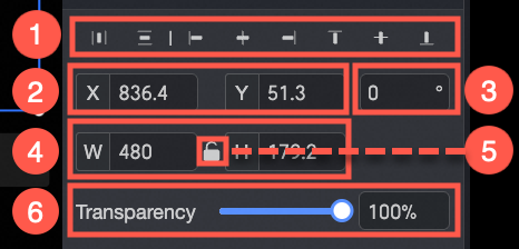
The Position and size section provides the following settings:
-
Adjust component alignment (①): Aligns the component to the left, center, or right.
-
Position (②): Sets the X and Y coordinates of the component, with the top-left corner as the origin.
-
Rotation (③): Sets the rotation angle of the component.
-
Size (④): Sets the W (width) and H (height) values to adjust the component's size.
-
Lock Component (⑤): Locks the component to prevent modifications to its size and position.
Plot Area
The plot area section provides the following settings:
-
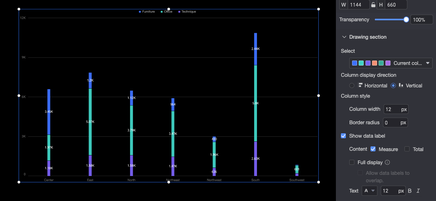
Color scheme: Select the color of the bars.
-
Bar Orientation: Sets the bar orientation to horizontal or vertical.
-
Bar Style: Set the bar width and corner radius.
-
Display data labels: Controls whether to show data labels, the content to display, whether to show all labels, and the text style.
When Show All is enabled, the system intelligently arranges data labels to prevent overlap. However, if the chart has a large number of labels, some that extend beyond the plot area might be hidden. To display all labels regardless of overlap, select Allow Data Labels to Overlap.
Legend
The legend section provides the following settings:
-
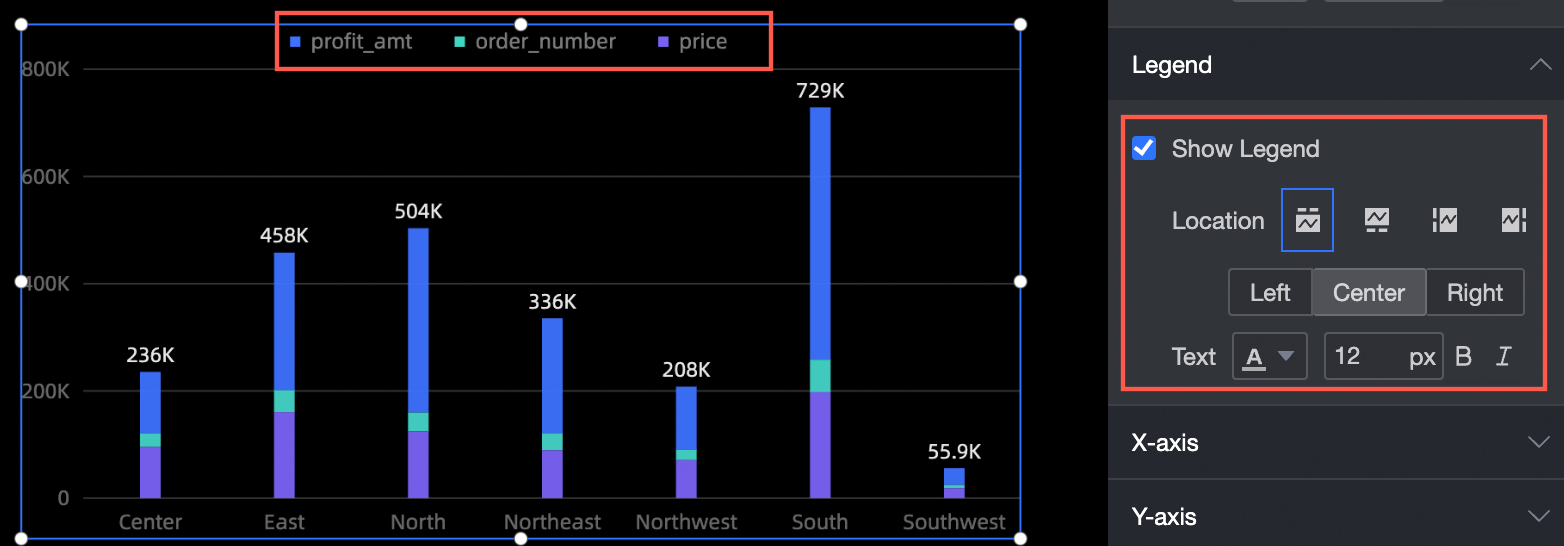
Show legend: Toggles the legend visibility.
-
Position: Sets the legend position.
-
Text: Configures legend text properties such as size and color.
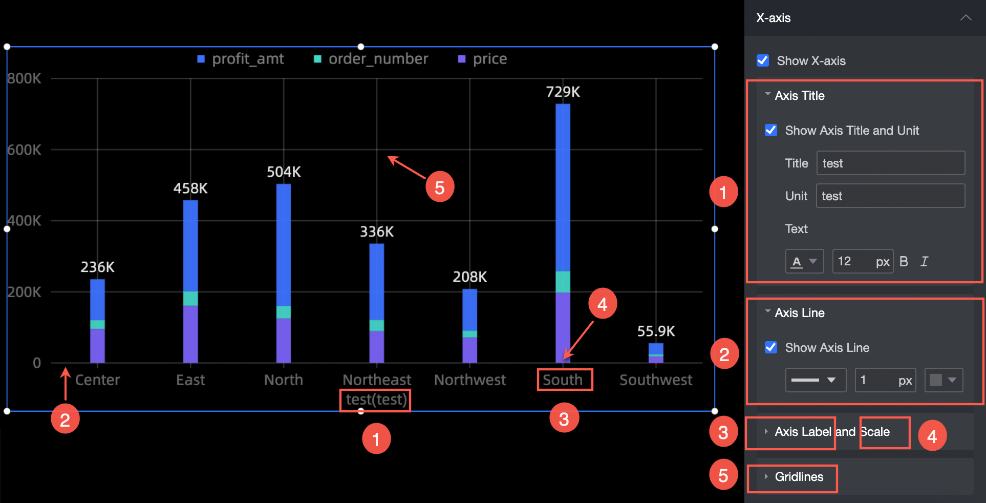
X-axis
The x-axis section provides the following settings:
-
Display X-axis: Toggles x-axis visibility.
-
Axis title: Configures the axis title and unit, including text size and color.
-
Axis line: Configures the axis line visibility and color.
-
Axis labels and ticks: Configures axis label visibility, text color, and tick style.
-
Gridline: Configures gridline visibility, width, and color.
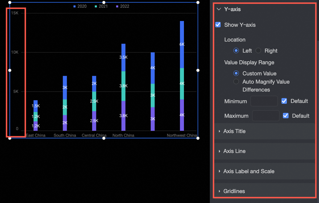
Y-axis
The y-axis section provides the following settings:
-
Show Y-axis: Sets the visibility and properties of the y-axis, such as its position, value range, maximum value, and minimum value.
-
Axis title: Configures the axis title and unit, including text size and color.
-
Axis line: Configures the axis line visibility and color.
-
Axis labels and ticks: Configures axis label visibility, text color, and tick style.
-
Gridline: Configures gridline visibility, width, and color.
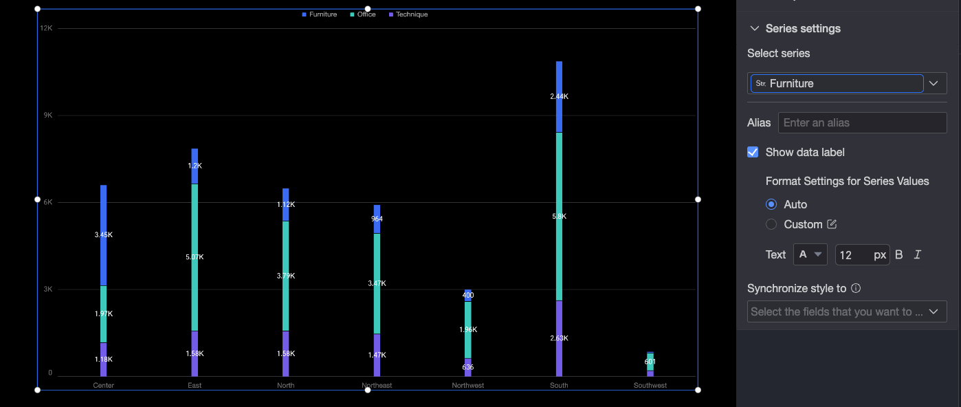
Series Settings
The series settings section provides the following settings:
To configure alias and series value display format in the series settings pane, you must first add a field to the Color Legend/Dimension field in the Fields configuration pane.
-
Select a series: Select a dimension or measure for your business scenario.
-
Alias: Sets a custom field name for your business scenario.
-
Display data labels: Set the number display format and text style. The number display format supports Automatic and Custom modes.
-
Auto: In this default mode, series values inherit the data display format settings from the corresponding measure field.
-
Custom: Click the
 icon to open the data display format settings dialog box. For details, see Data display format > Custom.
-
-
Sync style to: Syncs the current conditional formatting to other measures.
 icon to open the data display format settings dialog box. For details, see