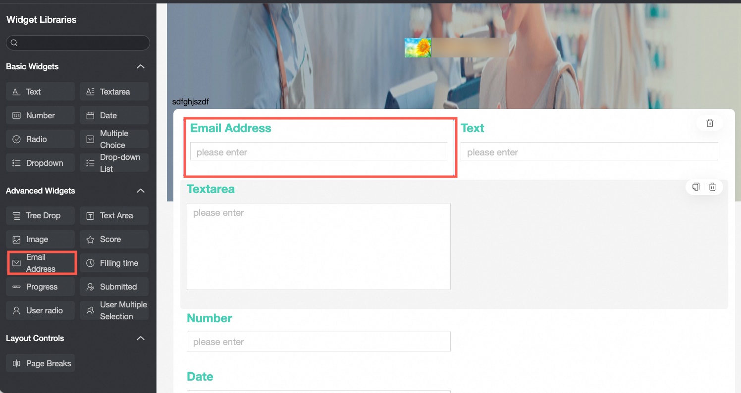
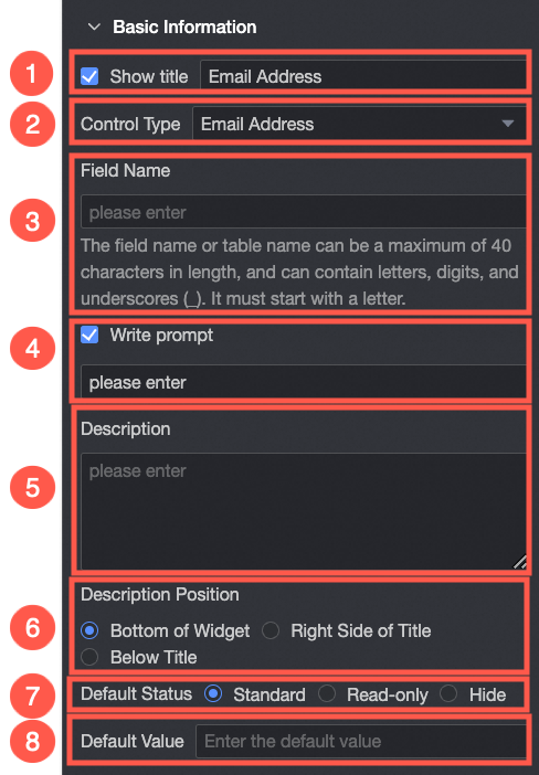
An advanced control for collecting email addresses, with built-in format validation.
Scenarios
Use the Email control in data forms to collect and validate email addresses. Example scenarios:
-
Collecting respondent email addresses in satisfaction surveys.
-
Recording employee email addresses during onboarding.
TensorBoard
Control configuration
Basic parameters
|
Parameter |
Description |
|
|
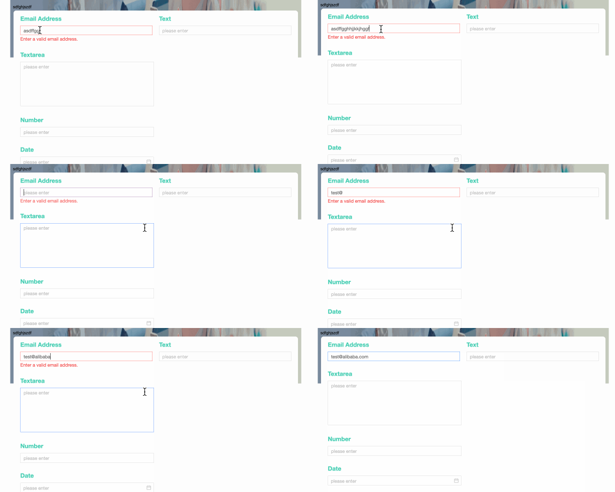
① Display Title: Specifies whether to display the control title. You can customize the display name, which serves as the column name in the data form. |
|
② Control type: Allows you to change the current control type. The drop-down list provides other basic and advanced control types. |
|
|
③ Table Field Name: The name of the corresponding field in the database table generated from the data form. Note
The field or table name must start with a letter and can contain letters, digits, and underscores (_). The name can be up to 40 characters in length. |
|
|
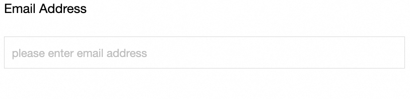
④ Prompt: The placeholder text displayed in the input field. For example, enter an email number.
|
|
|
⑤ Description: A custom description for the control. |
|
|
⑥ Description Information Location: The position where the description text appears. Valid values: Bottom, Right, and Below. |
|
|
Default State: The initial visibility of the control. Valid values: Normal and Hidden. |
|
|
⑧ Default Value: The pre-filled value displayed in the control. |
Yes
|
Parameter |
Description |
|
|
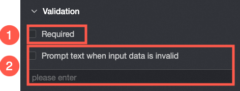
① Required: Specifies whether the field is mandatory. If selected, users must fill in this control before submitting. |
|
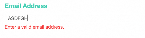
If the input data is invalid, you can edit the prompt text. For example, you can edit the email address that you entered.
|
styles
|
Parameter |
Description |
|
|
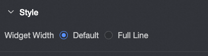
Widget Width: Sets the control width. Valid values: Default or Whole Line. Note
You can also drag the control border manually to adjust the width. |