LBS flying line map
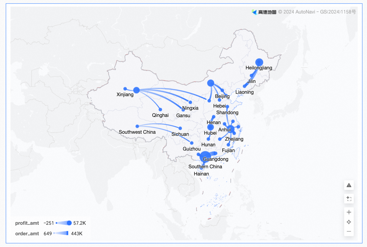
An LBS flying line map visualizes relationships between geographic locations using animated lines on a map. This topic describes how to add data to and configure styles for an LBS flying line map.
Prerequisites
You have created a dashboard. For more information, see Create a dashboard.
You have converted the relevant fields to a geographic data type. For more information, see Configure fields.
NoteAssume that area is the geographic area field to be added to a chart. This field is converted to geographic information only when the
 icon is displayed. For a detailed mapping table of regions, see public-area-info.xlsx. This table is for geographic area matching reference only and does not represent the political views of Quick BI.
Overview
Use cases
LBS flying line maps are ideal for visualizing geographically distributed data, such as displaying summarized, continuous data for specific regions.
Advantages
Visual effects: The map supports an animated flying line style.
Interactivity: You can zoom in on the map by selecting an area, switch between measures, and apply filters within the component.
Example
Configure chart fields
On the Fields tab, select the required dimension and measure fields.
Geographic information can be created by using an area name or longitude and latitude.
 Note
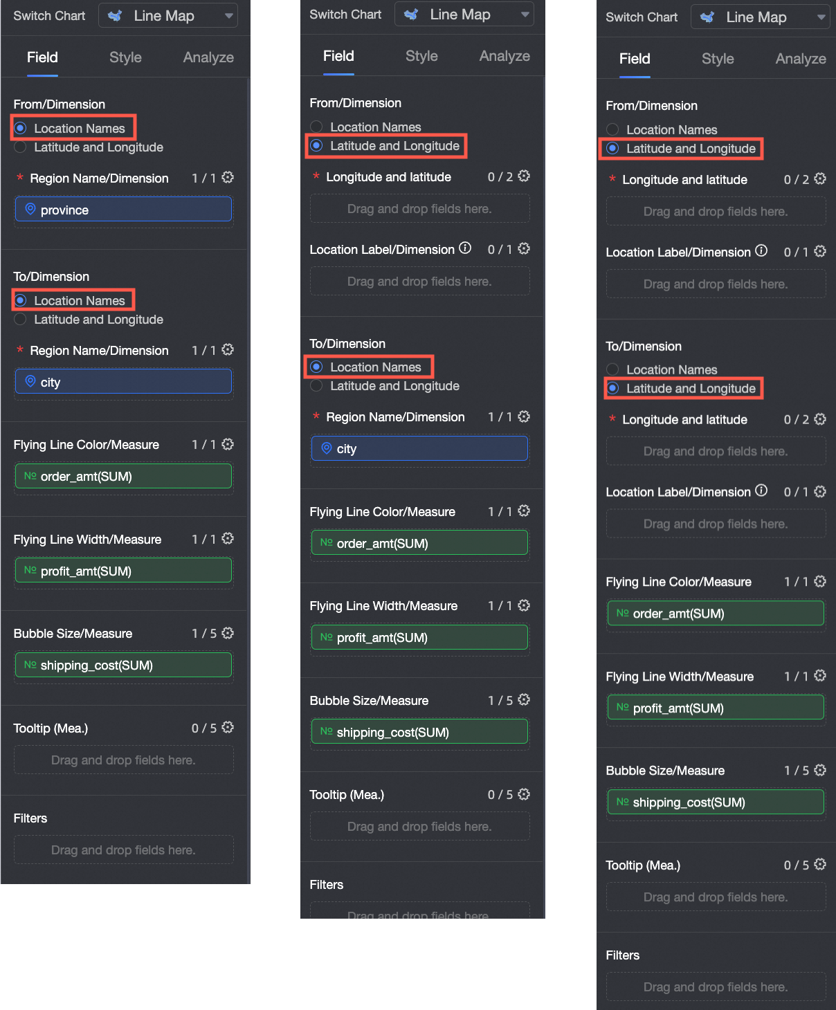
NoteThe From/Latitude and To/Latitude fields support two selection methods: area name and longitude and latitude. Cross-selection is also supported.
If you create an LBS flying line map by selecting the Area Name mode for From/Dimension and To/Dimension, the map is composed of Area Name/Dimension and Flying Line Measure:
The Area Name is determined by the data dimension. You can select up to one dimension, and it must be a geographical field, such as province.
Flying Line Color: Add a measure, such as
order_amount, to determine the color of the flying lines.Flying Line Width: Add a measure, such as
order_amount, to determine the thickness of the flying lines.The Bubble size is determined by data measures. You must select at least one and up to five measures, such as shipping cost and order quantity.
If you create an LBS flying line map by selecting the longitude and latitude mode for From/dimension and To/dimension, the map consists of longitude and latitude/dimension, location label/dimension, and flying line measure:
The Longitude and latitude are determined by the data dimensions, and you can select a maximum of one longitude field and one latitude field.
The Location Tag is determined by the dimensions of the data and supports string and geographic dimension types. This is an optional field.
Flying Line Color: Add a measure, such as
order_amount, to determine the color of the flying lines.Flying Line Width: Add a measure, such as
order_amount, to determine the thickness of the flying lines.The Bubble Size is determined by measures. You must select at least 1 and at most 5 measures, such as shipping cost and order quantity.
If you select Area Name, find Province/City in the Dimension list, and double-click or drag it to the Area Name/Dimension field in the From/To areas.
If you select Longitude and Latitude, in the Dimension list, find the Longitude and Latitude fields, and double-click or drag them to the Longitude and Latitude/Dimension field in the From/To area. The Location Label/Dimension field is optional.
In the Measures list, find Order Amount, and double-click or drag it to the Flying Line Color/Measure area. This setting is optional.
In the Measures list, find Profit Amount and double-click or drag it to the Flying Line Thickness/Measure area. This configuration item is optional.
In the Measure list, find Transportation Cost, and double-click or drag it to the Flying Line Size/Measure area. This setting is optional.
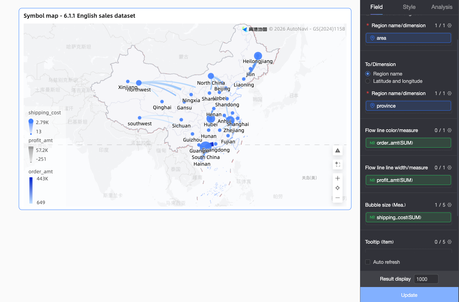
Click Update. The chart updates automatically.
 Note
NoteWhen area values in your data do not match the standard geographic names supported by the system, an alert icon appears in the bottom-right corner of the chart. Click the icon to view details about the unplotted data and troubleshoot the issues.
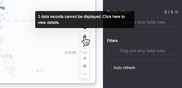
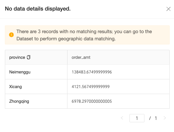
In the Unplotted Data Details pane, you can view the details of the unmatched data and copy them with a single click. You can then navigate to the Geographic Data Matching settings for the dataset to process the copied data in batches, which streamlines data correction.

After you configure the matching, the map displays the data correctly.
Configure styles
The following sections describe the style settings for the chart. For general style settings, see Configure the chart title.
Geographic area
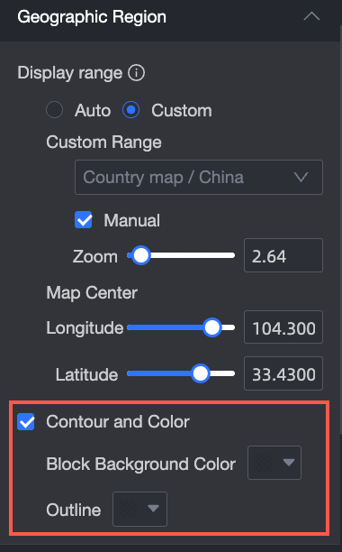
In the Geographic area section, configure Display Range and Outline and Fill.
Display Range: Set to Auto or Custom. In this example, China is selected.
NoteInteractive analysis always uses Auto mode. Custom mode allows you to set the range manually.
Custom display ranges are available for global continents and countries, as well as regions, provinces, and cities within China.
Enable Manual Adjustment to automatically generate the current Center Point and Zoom Value, which you can then modify.
In the Outline and Fill section, you can configure the color for the Area Base Color and the Outline.
NoteOutlines are not supported for some regions.


Basemap
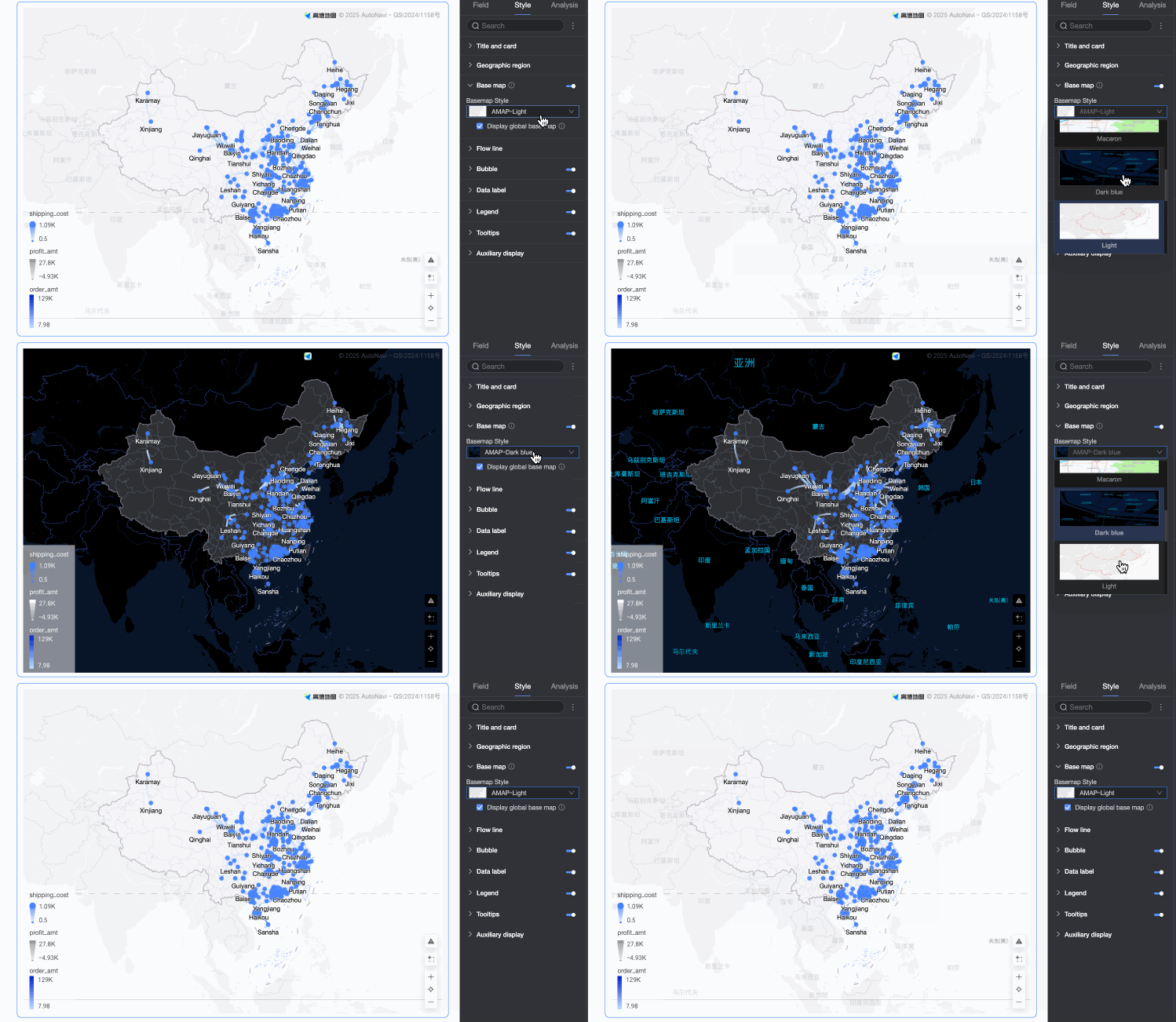
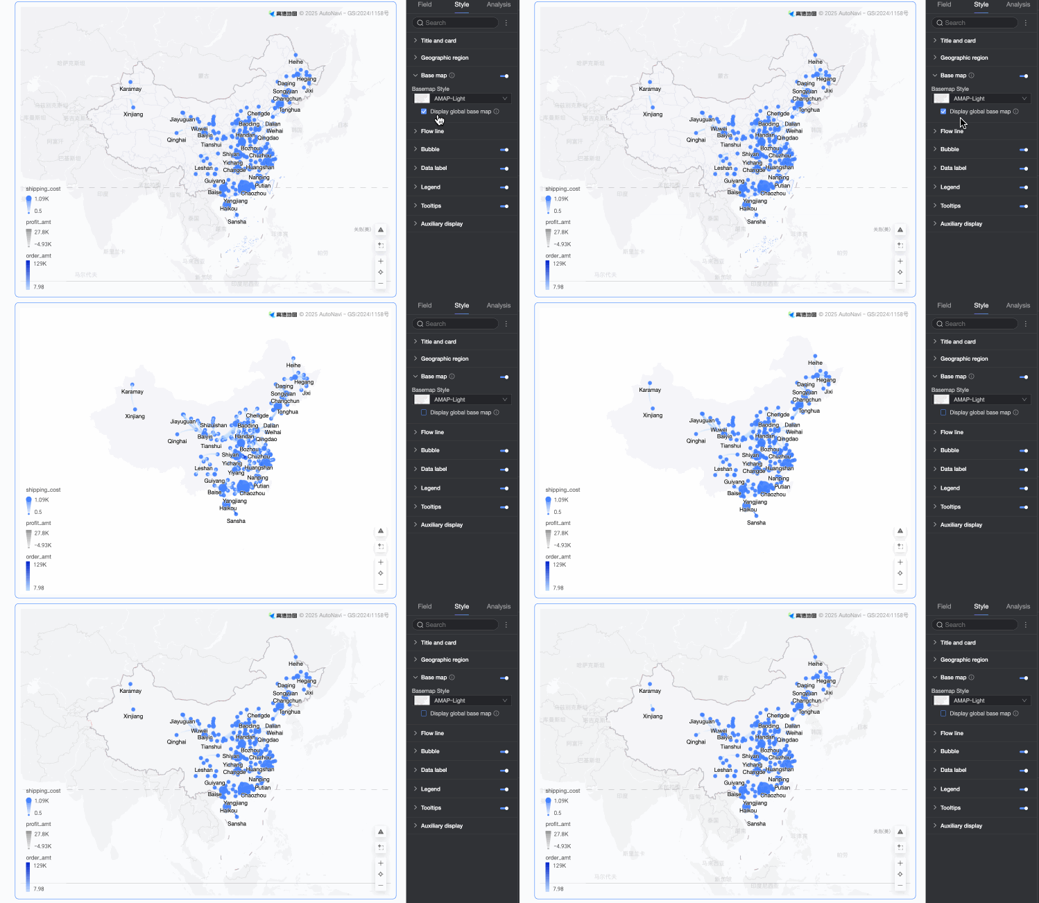
In the Basemap section, configure the Show Basemap, Basemap Style, and Show Global Basemap options.
Show Basemap: Turn this switch
on or off to show or hide the basemap.Basemap Style: Select from various Gaode map styles.
Show Global Basemap: Select this option to display global city information on the basemap.
NoteGlobal basemap usage limit: Each Quick BI organization is limited to 1,000 monthly initializations of overseas basemaps. Once this limit is exceeded, maps will only display basemap information for the Chinese mainland.
 on or off to show or hide the basemap.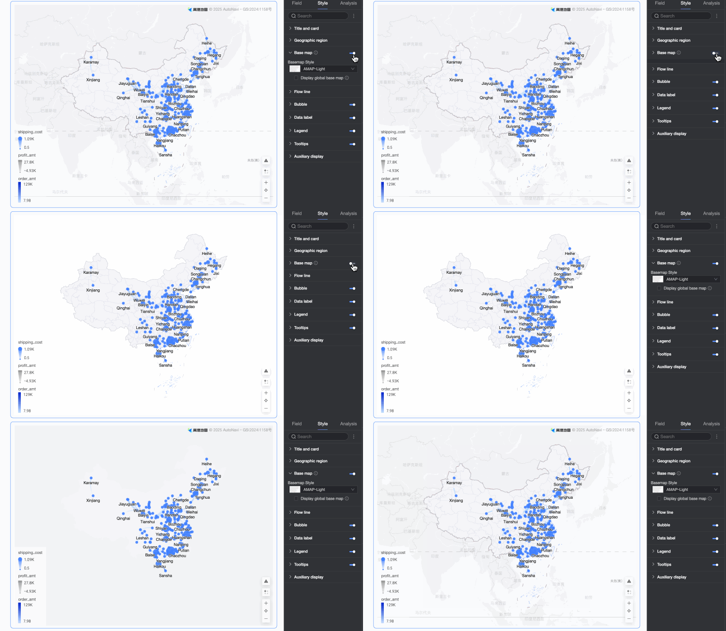
Flying line
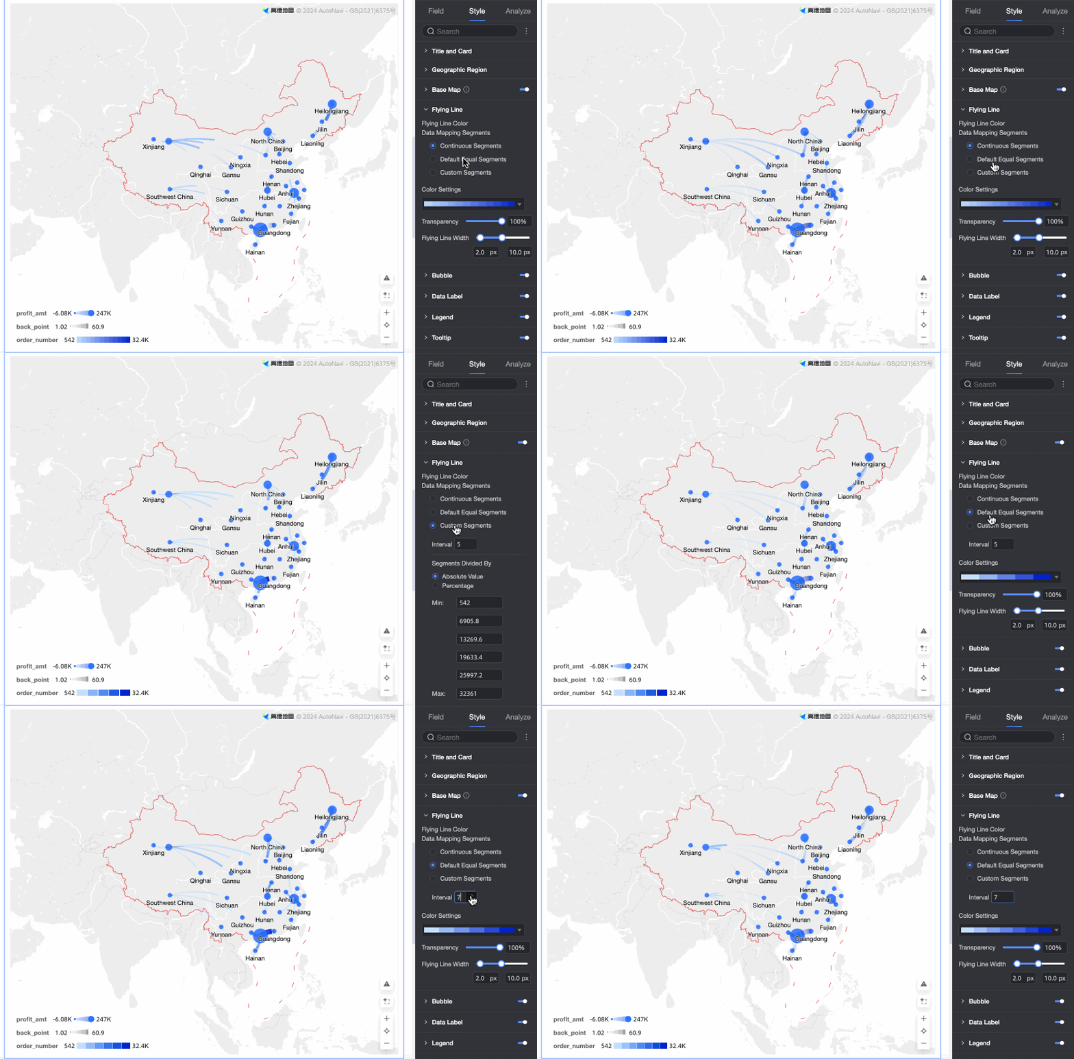
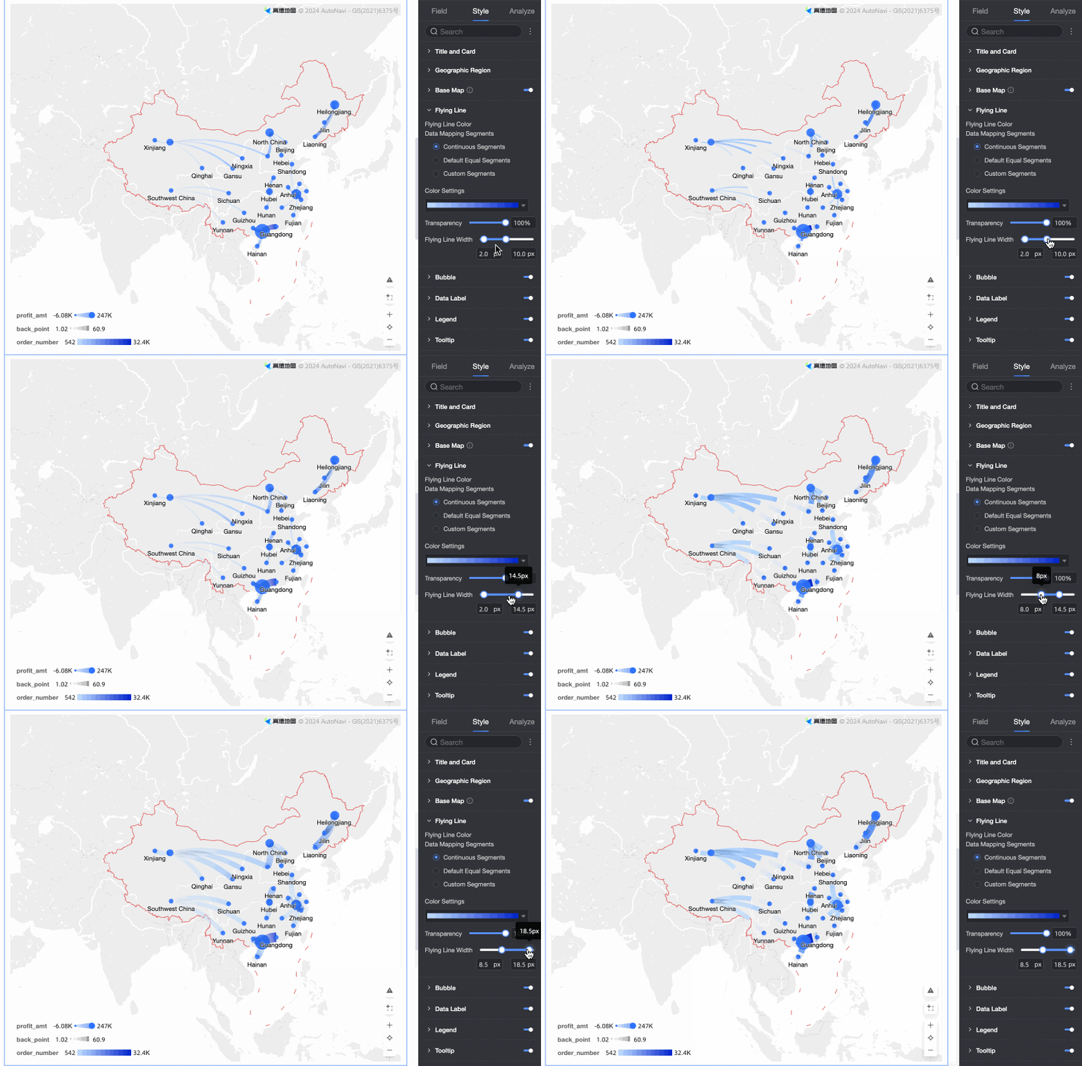
In the Flying line section, configure the Data Mapping Range, Flying Line Color, Transparency, and Flying Line Width.
Data Mapping Range: Select from Continuous, Equal-interval, and Custom range types.
NoteThis setting is available only when a measure is added to the Flying Line Color field well.
Flying Line Color: Select from sequential, diverging, and custom color schemes.
Transparency: Sets the transparency of the flying lines.
Flying Line Width: When a measure is configured for line width, you can set the minimum and maximum thickness of the flying lines.
Bubble
In the Bubble section, configure whether to Show Bubble, and set the Bubble Color, Bubble Shape, Bubble Size, and 0 Value Handling.
Bubble Color: When Show Bubble is enabled, you can set the color and transparency of the bubbles.
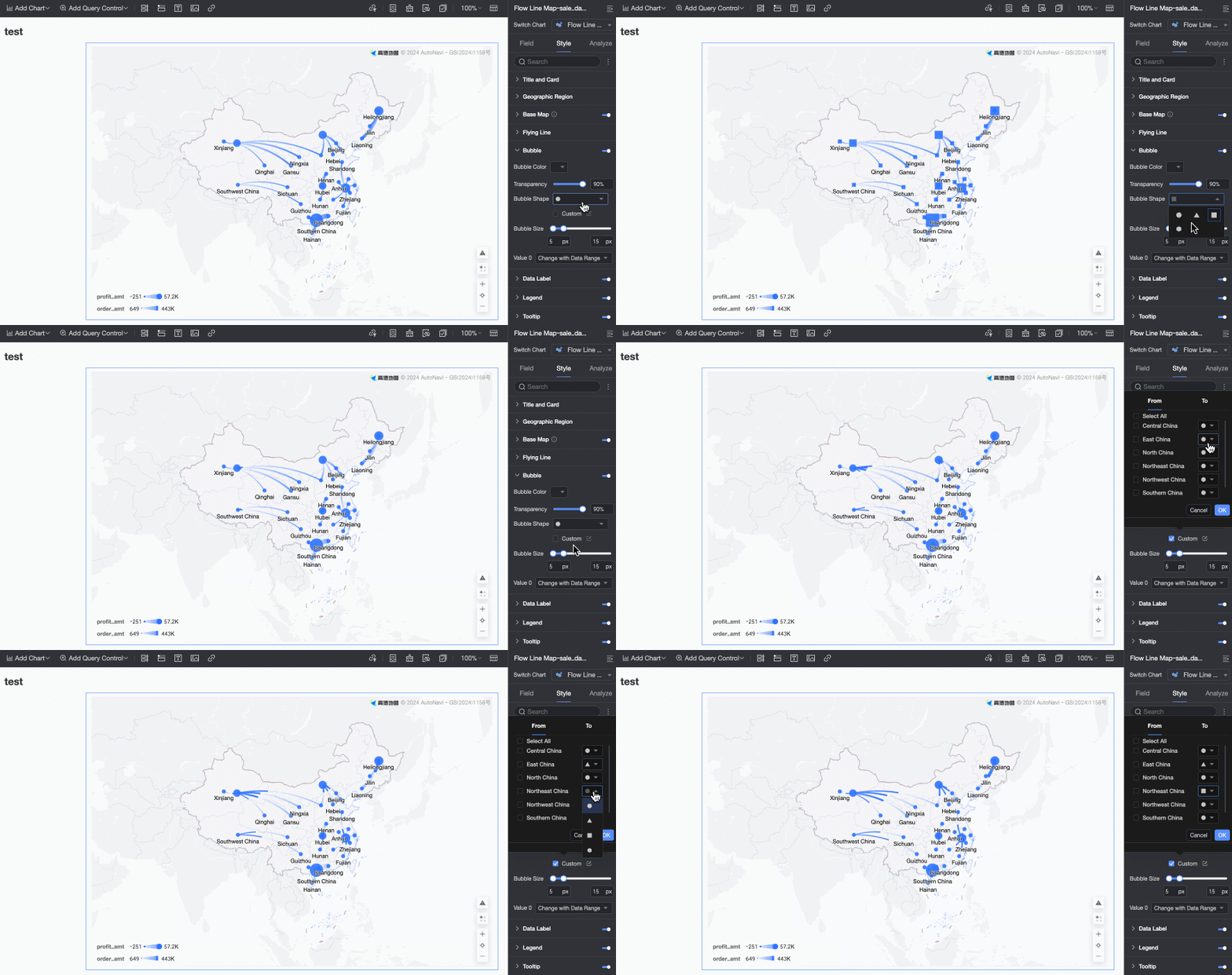
Bubble Shape: Select Circle, Triangle, Rectangle, Diamond, or Advanced. The Advanced setting lets you customize the shape for both the origin and destination points.
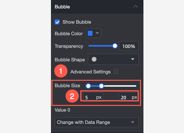
Bubble Size: You can drag the slider to change the Bubble Size. If no measure is added to the Bubble Size field, you can only set a fixed size, as shown in Figure ①. If a measure is added, you can set a minimum and maximum size, as shown in Figure ②.
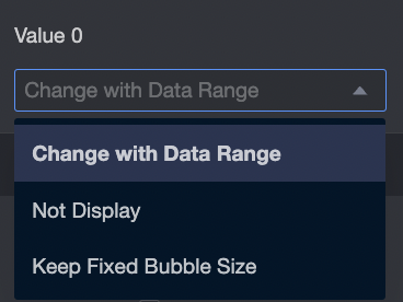
0 Value Handling: Choose how to handle zero values: hide their bubbles, size them relative to the data range, or set a fixed size for them.
Data label
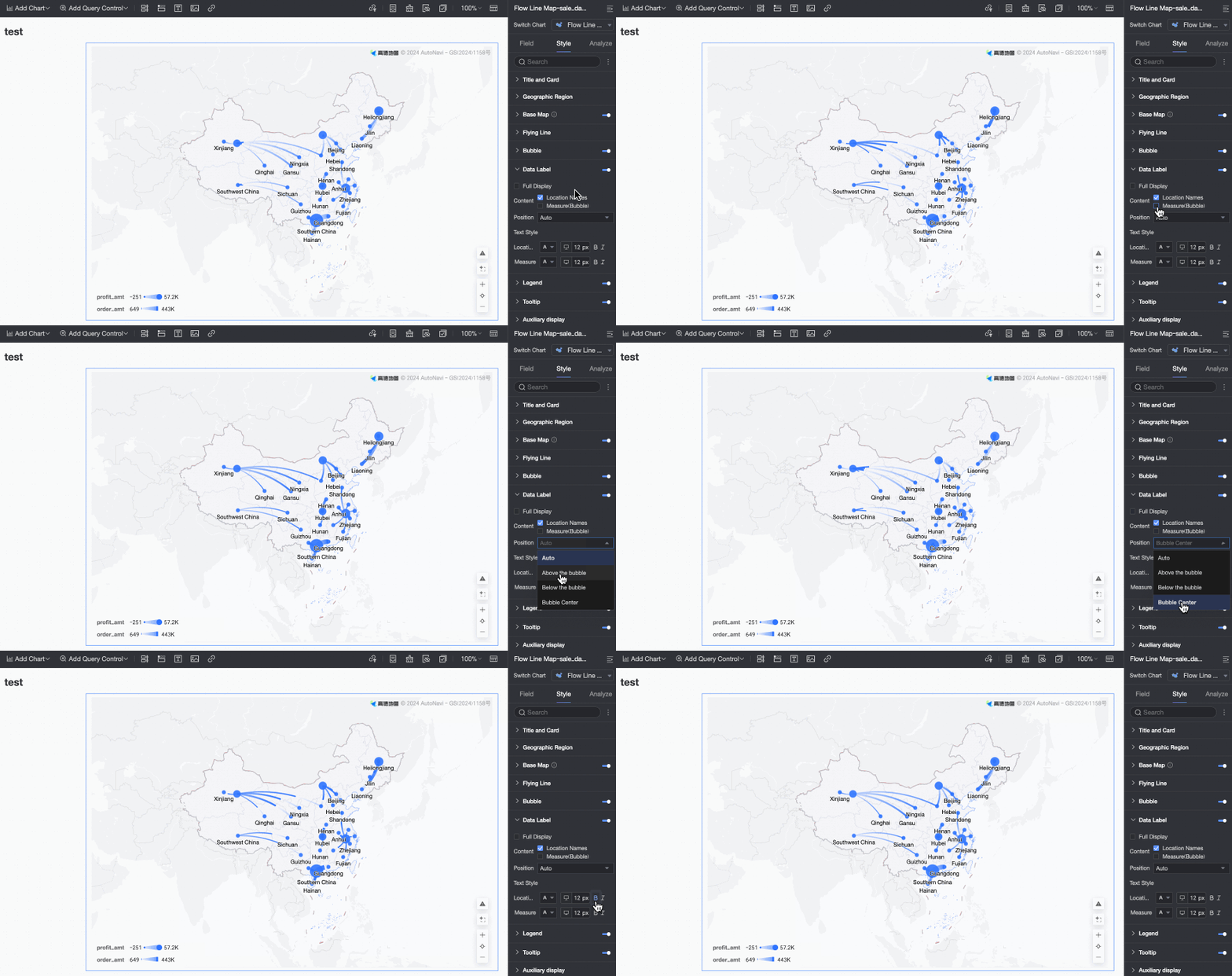
In the Data label section, configure Show Data Label, Label Display Format, Content, Position, and Text Style.
The data label can only display the values of the area name and the measures in the Bubble Size field. This section is configurable only when a measure is added to the Bubble Size field.
Legend
In the Legend section, click the  icon to enable and configure the chart legend.
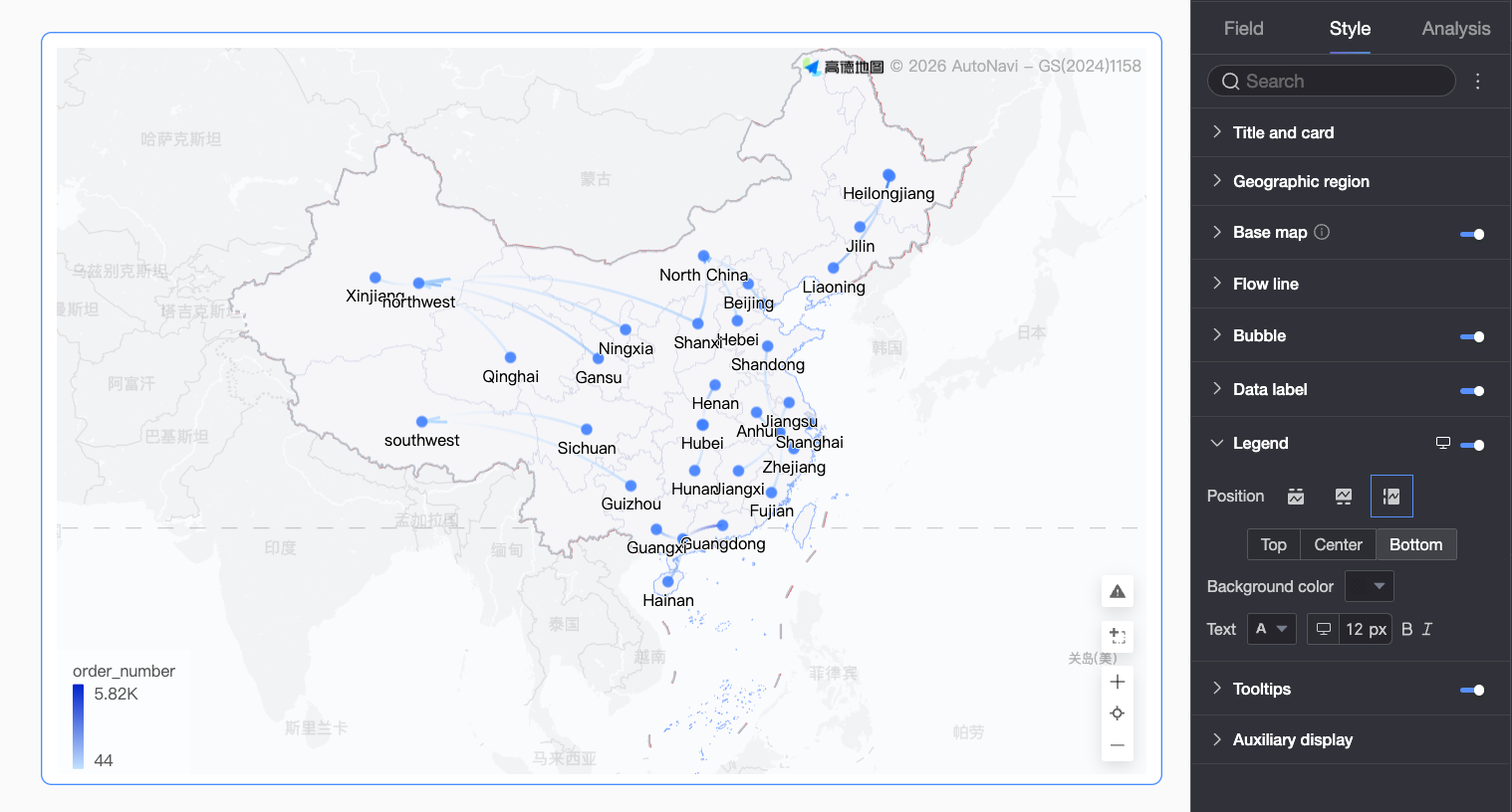
Parameter | Description |
Position | Sets the display position and alignment of the legend.
|
Background Color | Sets the legend's background color. |
Text | Sets the text style for the legend, including font color, size, weight, and italics. |
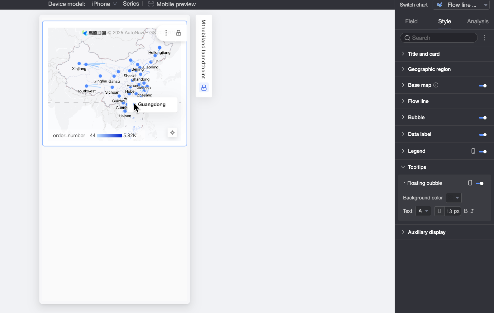
Mobile legend configuration | PC and mobile legend settings are independent. Use the |
 button at the top of the dashboard edit page to switch between PC and mobile editing views. This allows you to configure a separate, optimized legend for mobile devices by customizing its position, background color, and text style.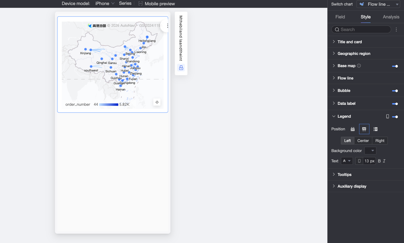
Tooltip
In the Tooltip section, click the icon to enable and configure the tooltip.
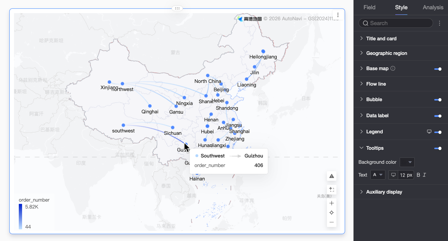
Parameter | Description |
Background Color | Sets the tooltip's background color. |
Text | Sets the text style within the tooltip, including font color, size, weight, and italics. |
Mobile tooltip | The tooltip can be enabled or disabled independently for PC and mobile views. Use the |
Auxiliary display
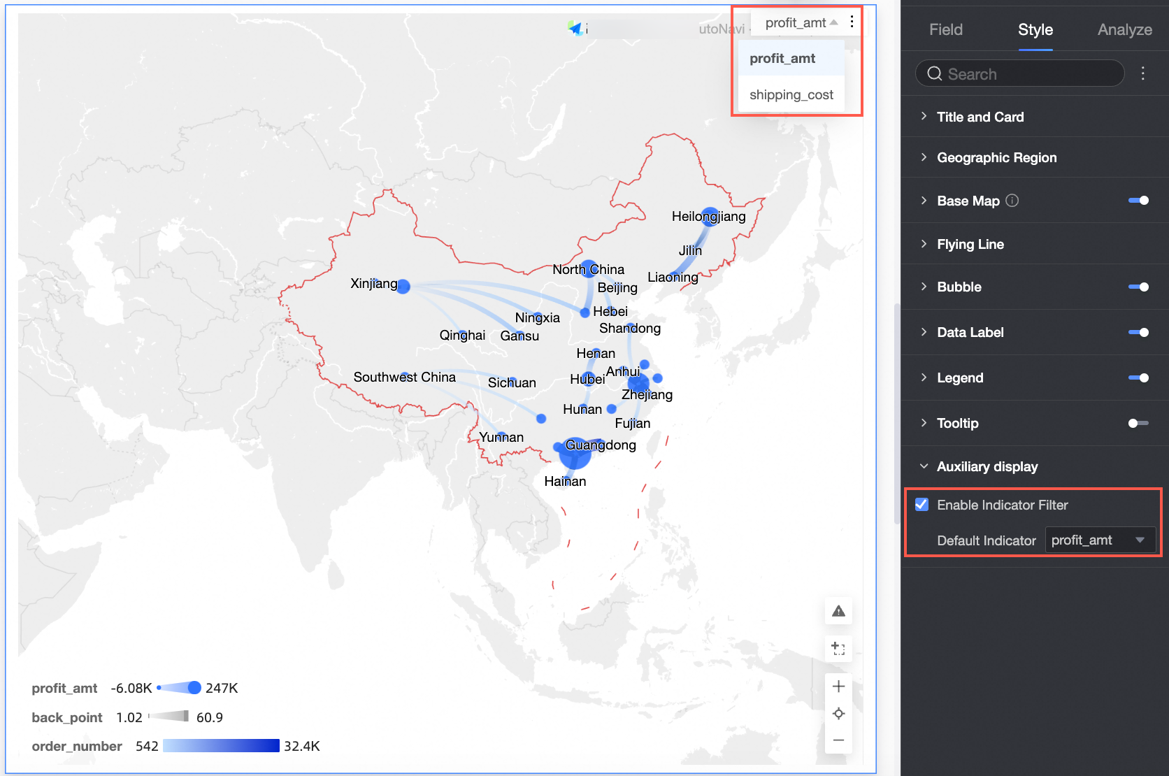
In the Auxiliary display section, select the Show Indicator Filter checkbox to choose which measures are displayed.