Symbol Map
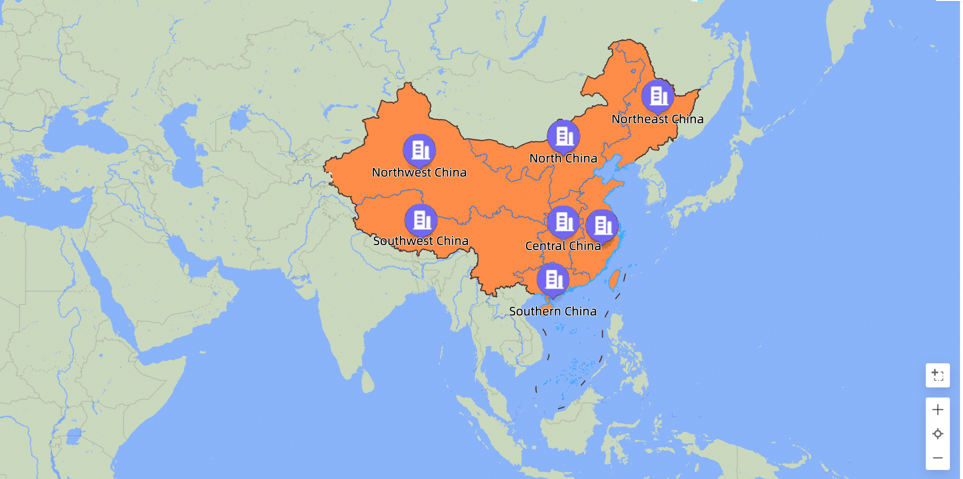
A Symbol Map uses a map outline as its background and places icons or images on the map to represent data points. This topic covers the use cases, configuration, and deletion of Symbol Maps.
Prerequisites
You have created a dashboard. For more information, see Create a dashboard.
Ensure you have converted the desired geographic area field to geographic information. For more information, see Configure fields.
NoteFor example, if you add a geographic field named area to the chart, the
 icon appears only after the field is successfully converted to geographic information. For a detailed reference table of geographic areas, see public-area-info.xlsx. This table is for geographic area matching reference only and does not represent the political views of Quick BI.
Limitations
In Area Name mode, a Symbol Map is configured with the following fields: Area Name/Dimension and Tooltip/Measure:
Area Name: Requires one geographic dimension, such as a province.
Tooltip/Measure: Requires one to five measures, such as order amount and profit amount.
In Longitude and Latitude mode, a Symbol Map is configured with the following fields: Longitude and Latitude/Dimension, Location Label/Dimension, and Tooltip/Measure:
Longitude and Latitude: Requires a longitude dimension field and a latitude dimension field.
The location label is an optional field that supports string and geographic dimension types.
Tooltip/Measure: Requires one to five measures, such as order amount and profit amount.
Chart overview
Use cases
Symbol Maps are ideal for visualizing datasets with geographic data. They are typically used to display data aggregates for specific regions.
Benefits
Visual effects: Add icons or images as markers.
Interactive features: Zoom by area selection, switch metrics, and filter data directly on the chart.
Example
Field configuration
On the Fields tab, select dimension and measure fields:
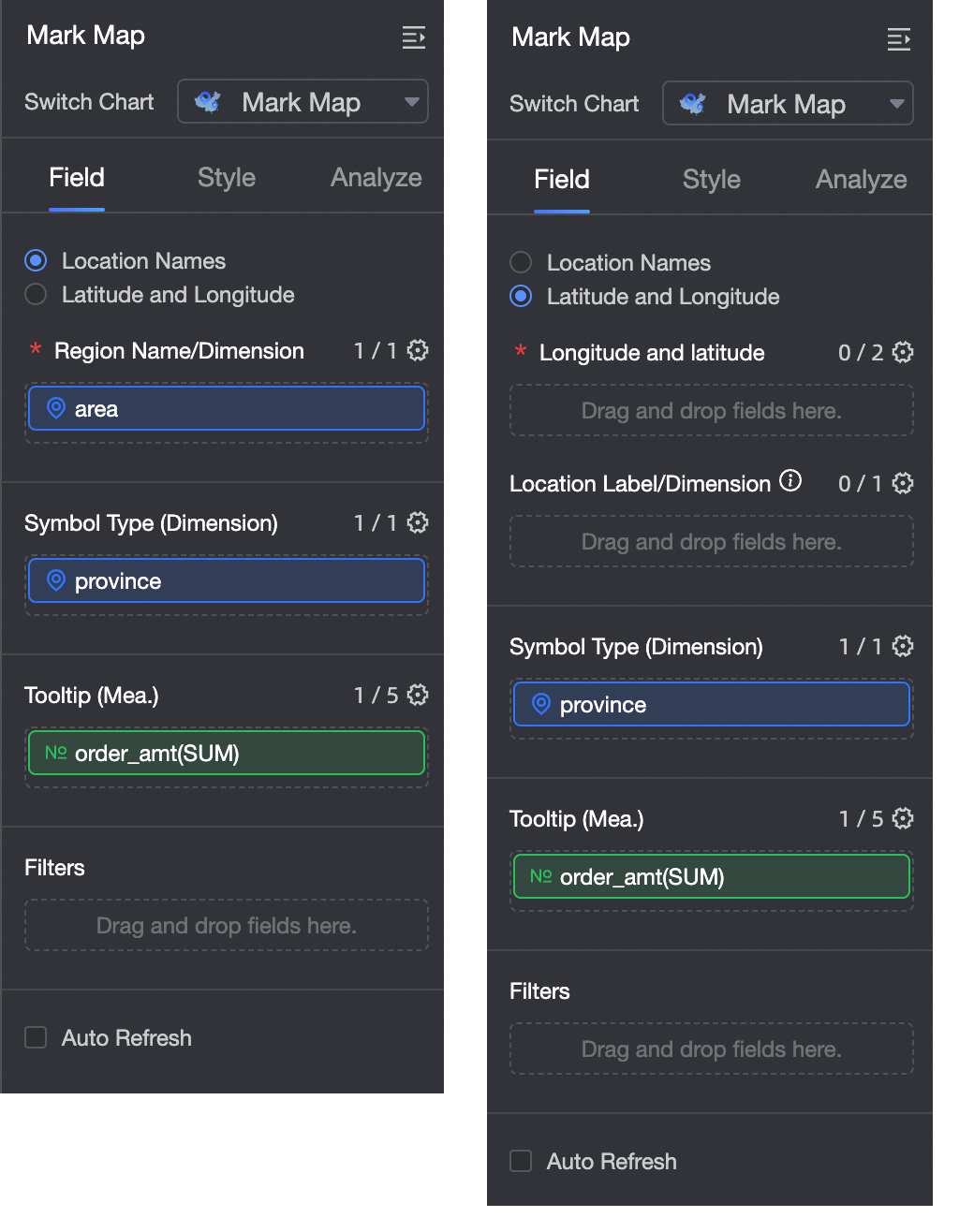
Geographic information can be created by using an area name or longitude and latitude.
If you select Area Name, double-click or drag the Area field to the Area Name/Dimension well.
If you select Longitude and Latitude, double-click or drag the longitude and latitude fields to the Longitude and Latitude/Dimension well. The Location Label/Dimension well is optional.
To use different symbol styles for different dimension values, from the Dimensions list, double-click or drag a dimension such as the Store Type field to the Symbol Type/Dimension well.
From the Measures list, find order_amount and double-click or drag it to the Tooltip/Measure well.
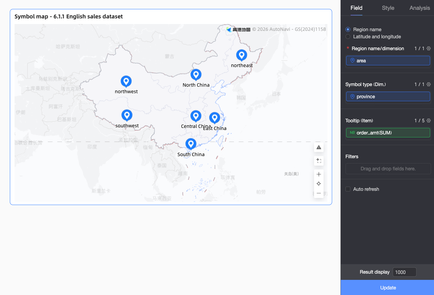
Click Update to refresh the chart.
 Note
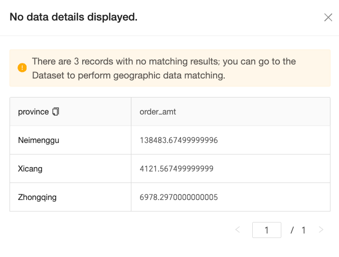
NoteIf an area value in your data does not match a standard geographic name supported by the system, an alert icon appears in the lower-right corner of the chart. You can click the icon to view details of the unmapped data and resolve the mismatches.
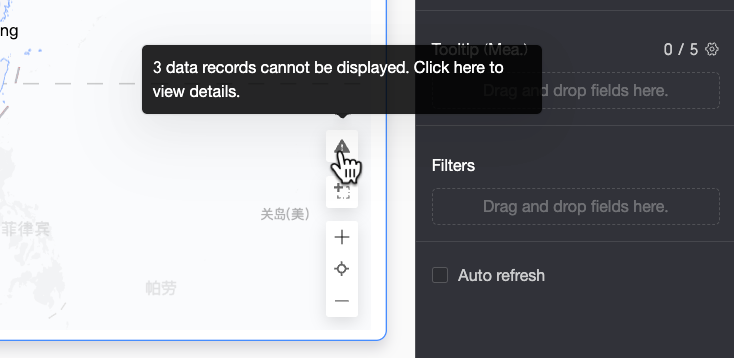
In the Details of Data Not Displayed dialog box, you can view the details of the unmatched data and copy it with one click. You can then navigate to the Match Geographic Data settings of the dataset to perform batch corrections.

After the configuration is complete, the map data is displayed correctly.
Style configuration
This section describes how to configure the chart style. For information about general chart style settings, see Configure the title section.
Geographic area
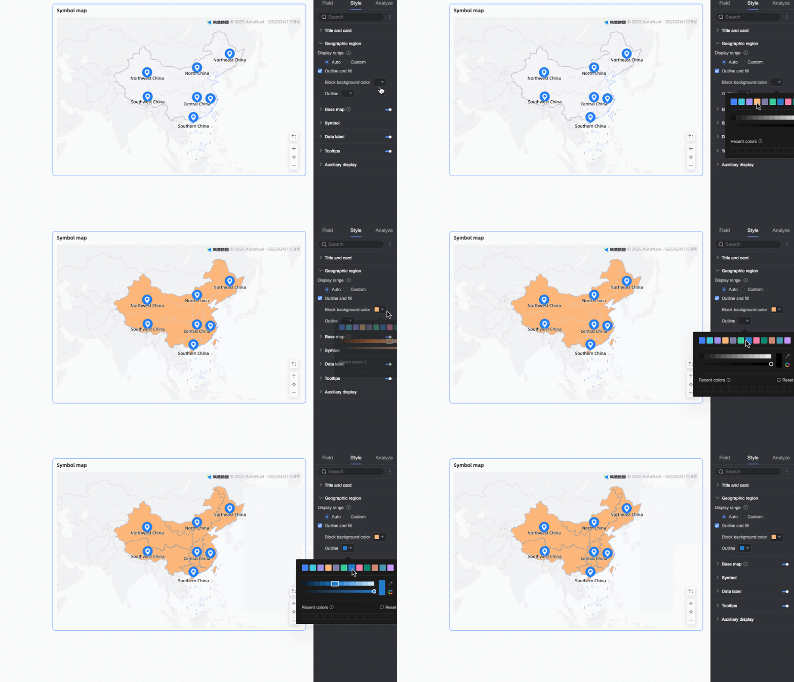
In the Map Area section, configure Display Range and Outline and Fill.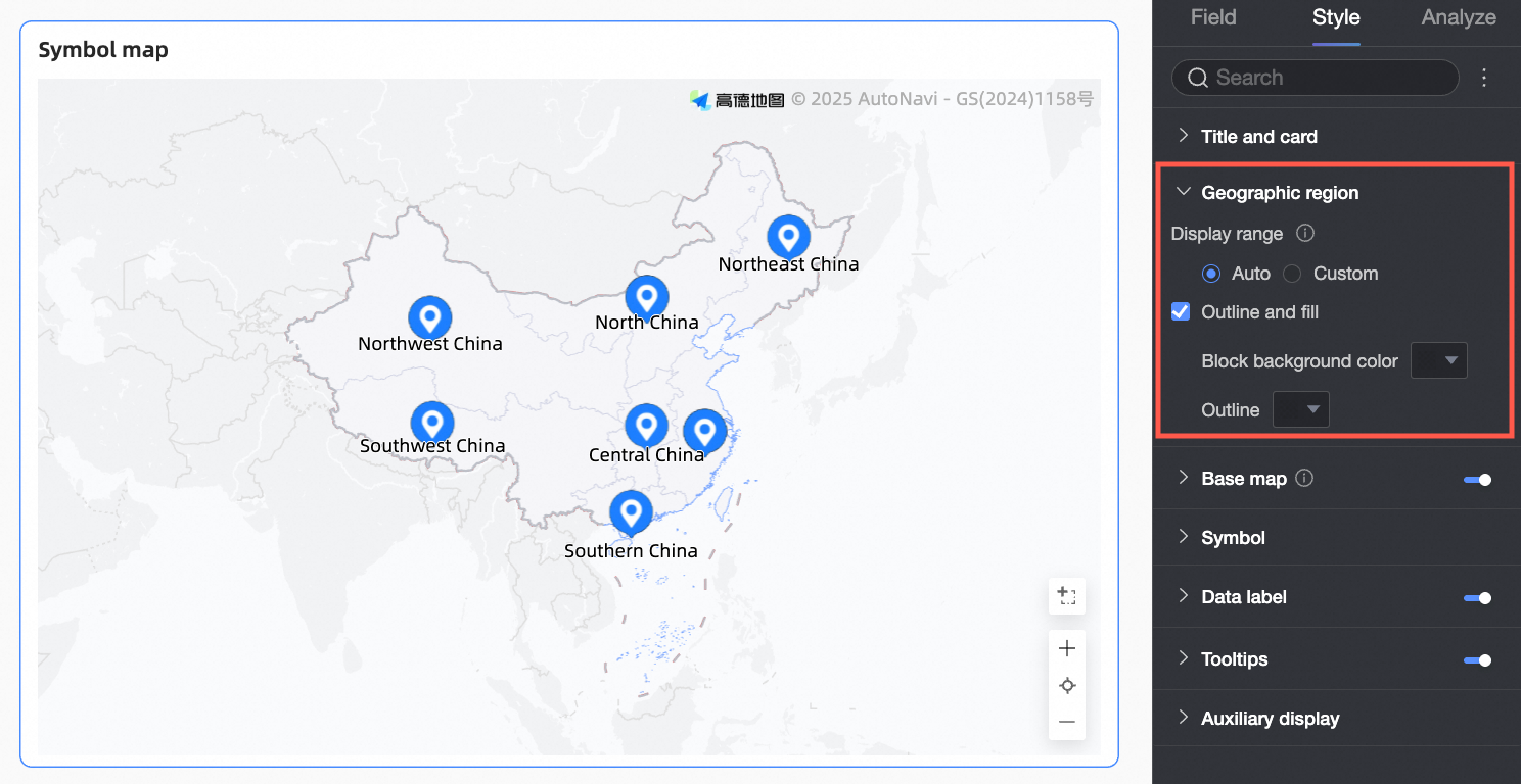
Parameter | Description |
Display range | Supports Auto and Custom modes. In this example, select China. Note
If you enable Manual Adjustment, the current Center Point and Zoom Value are automatically populated. You can also modify these values manually. |
Outline and fill | Configure the colors for the fill color and outline. Note Some regions do not support outlines.
|


Basemap
In the Basemap section, configure whether to Show Basemap, the Basemap Style, and whether to Show Global Basemap.
The Amap basemap is not supported in Internet Explorer.
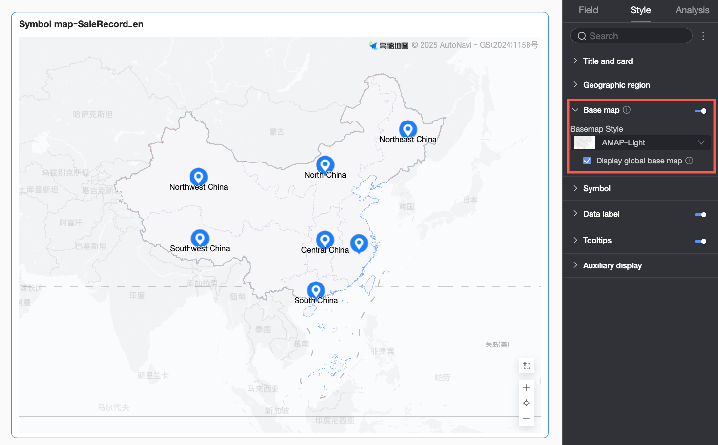
Parameter | Description |
Show basemap | Click the |
Basemap style | Supports various styles for the Amap basemap. |
Show global basemap | Select this option to display global city information on the basemap. Note Global basemap usage limits: Each Quick BI organization has a monthly quota of 1,000 overseas basemap views. A view is counted each time a basemap is initialized. Once the quota is reached, only basemaps for the Chinese mainland will be displayed. |
 toggle to show or hide the basemap information.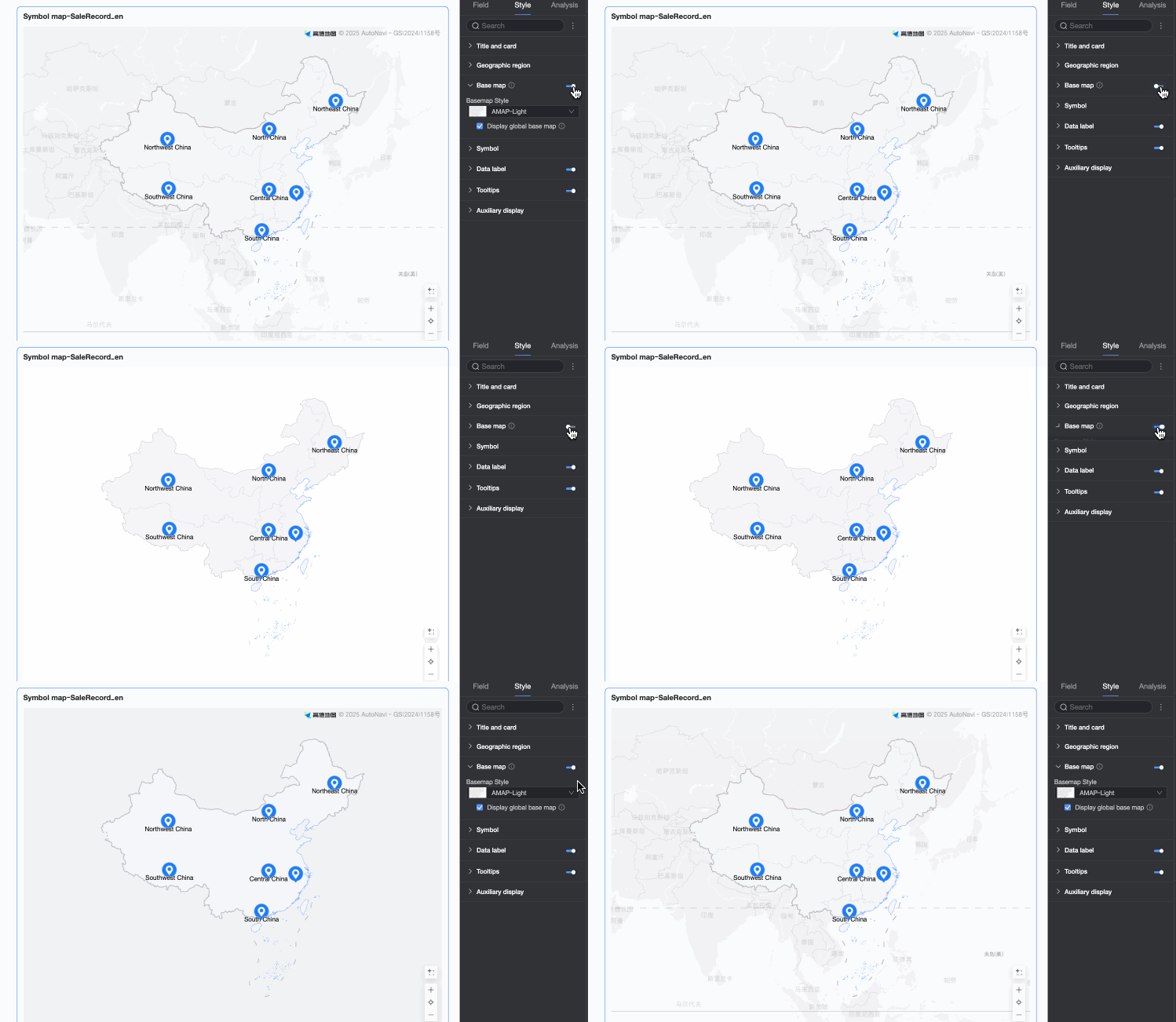
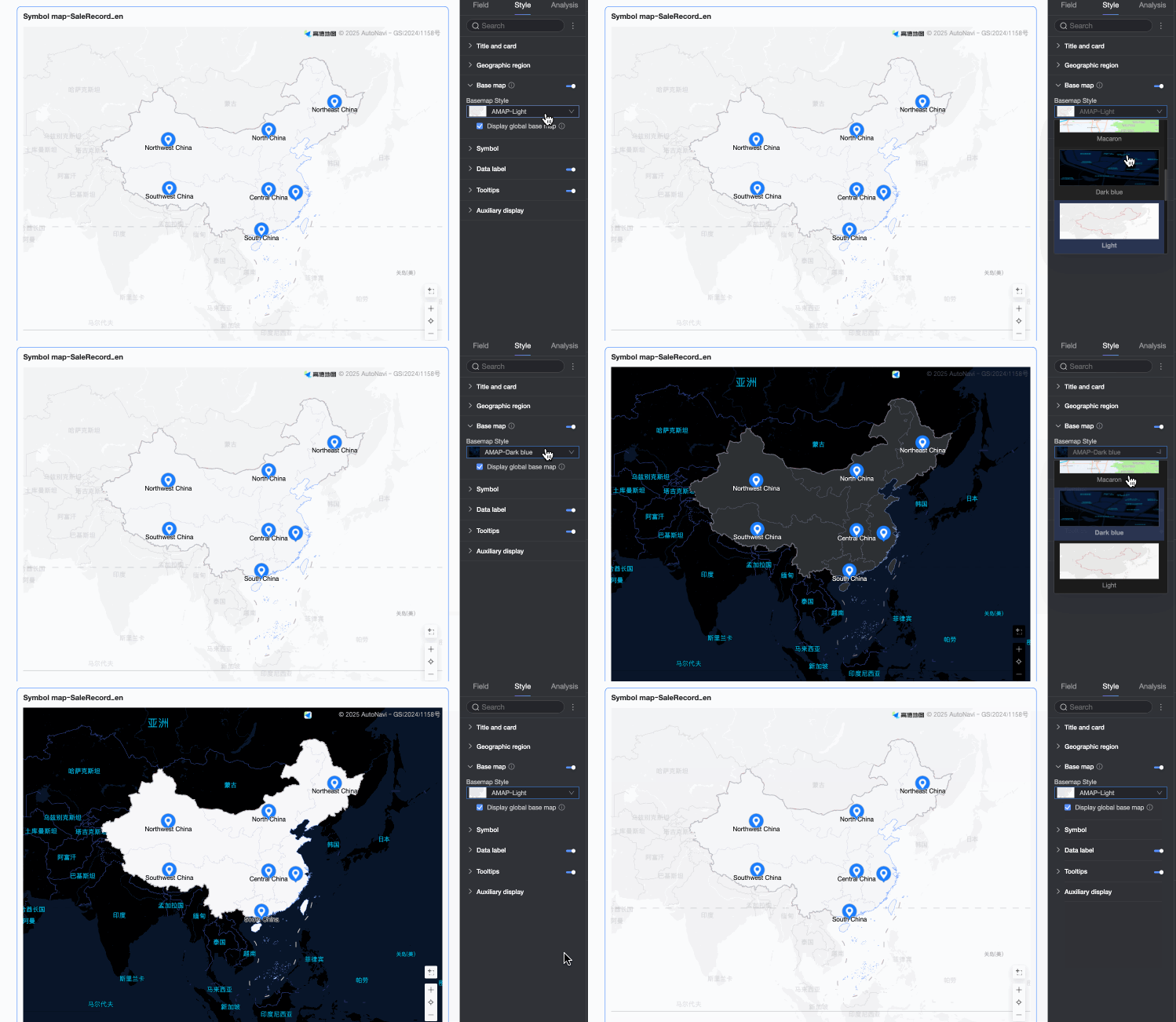
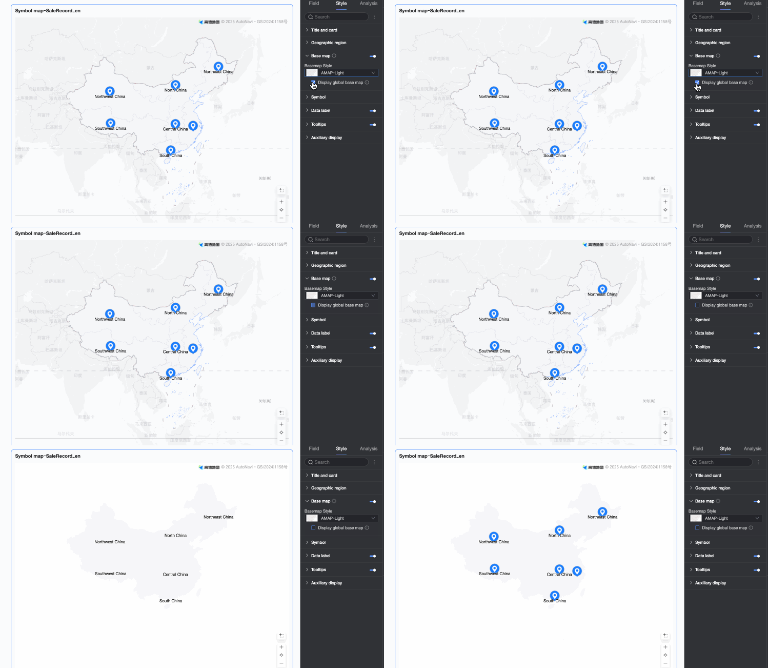
Symbol
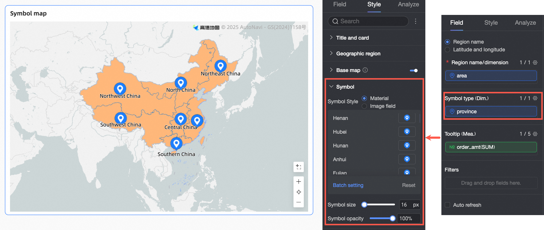
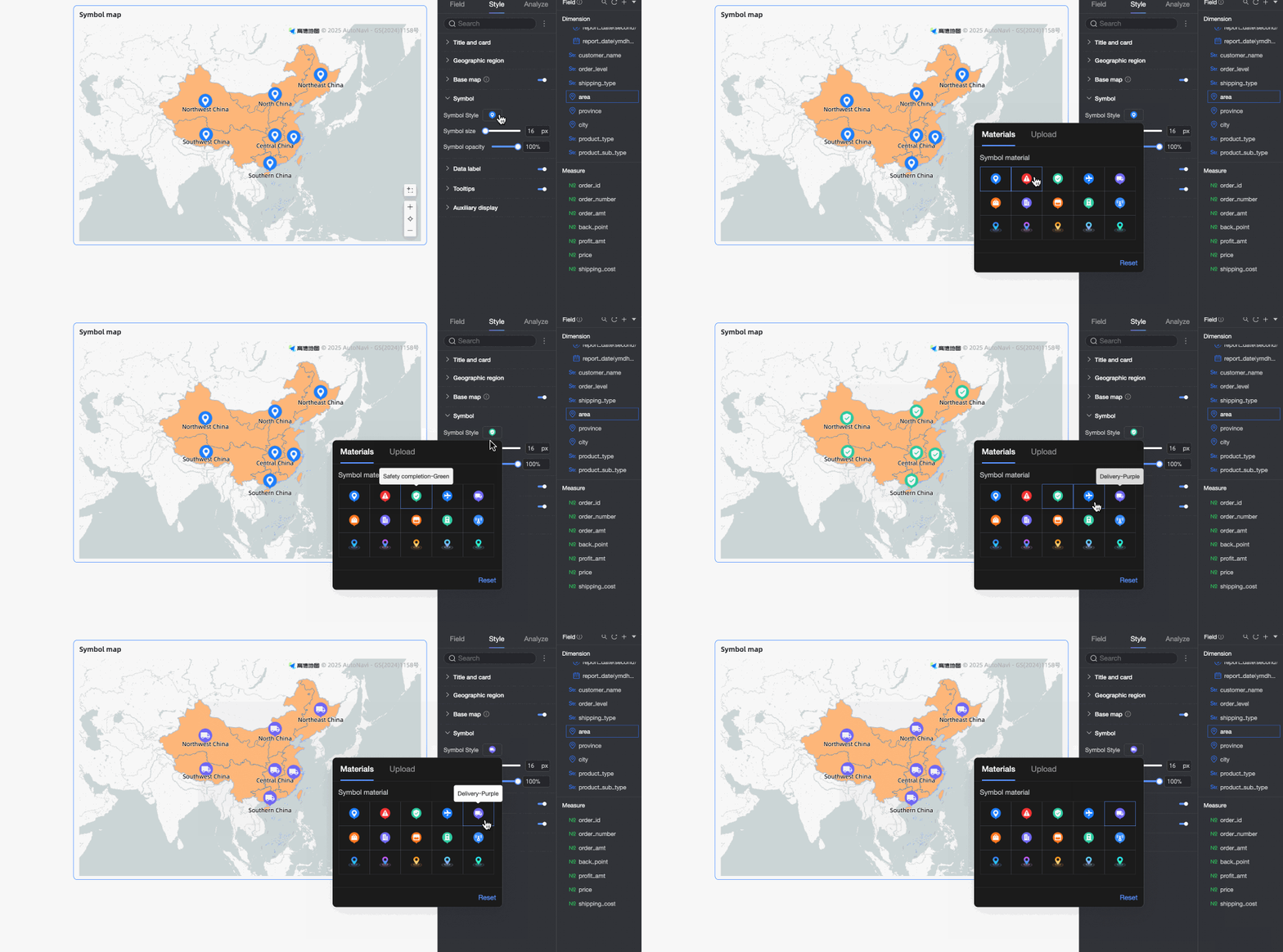
In the Symbol section, configure the Symbol Style, Symbol Size, and Symbol Opacity. The available configuration items vary depending on the fields configured in the field wells.
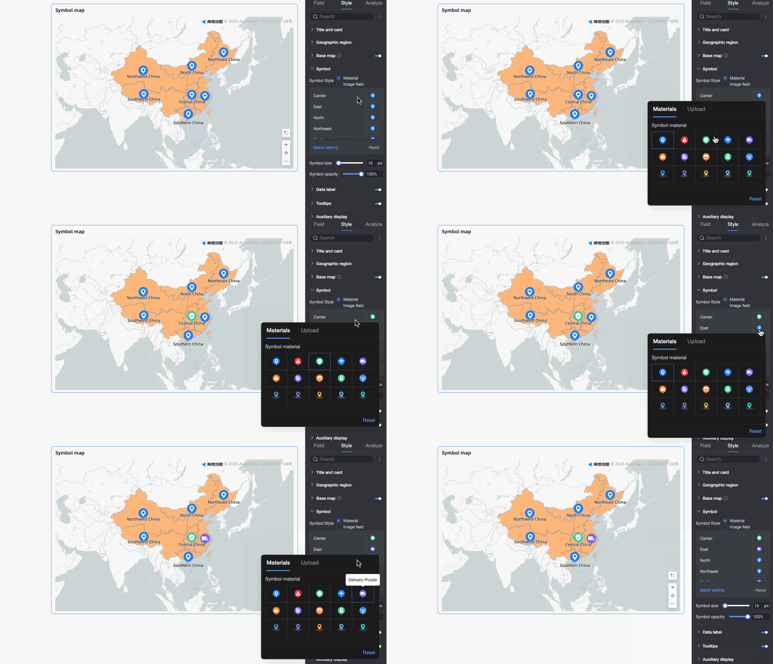
When you add a field to the Symbol Type/Dimension well, the following options are available.
Parameter
Description
Symbol style
You can select either Material or Image Field.
Material: Set a different shape for each dimension value. You can use built-in materials or upload custom images.
Image field: Select an image from the image field in the dataset. The Image field option is available only if the dataset contains an image field and the field type is image (
). For more information, see Use image dimensions in dashboards.
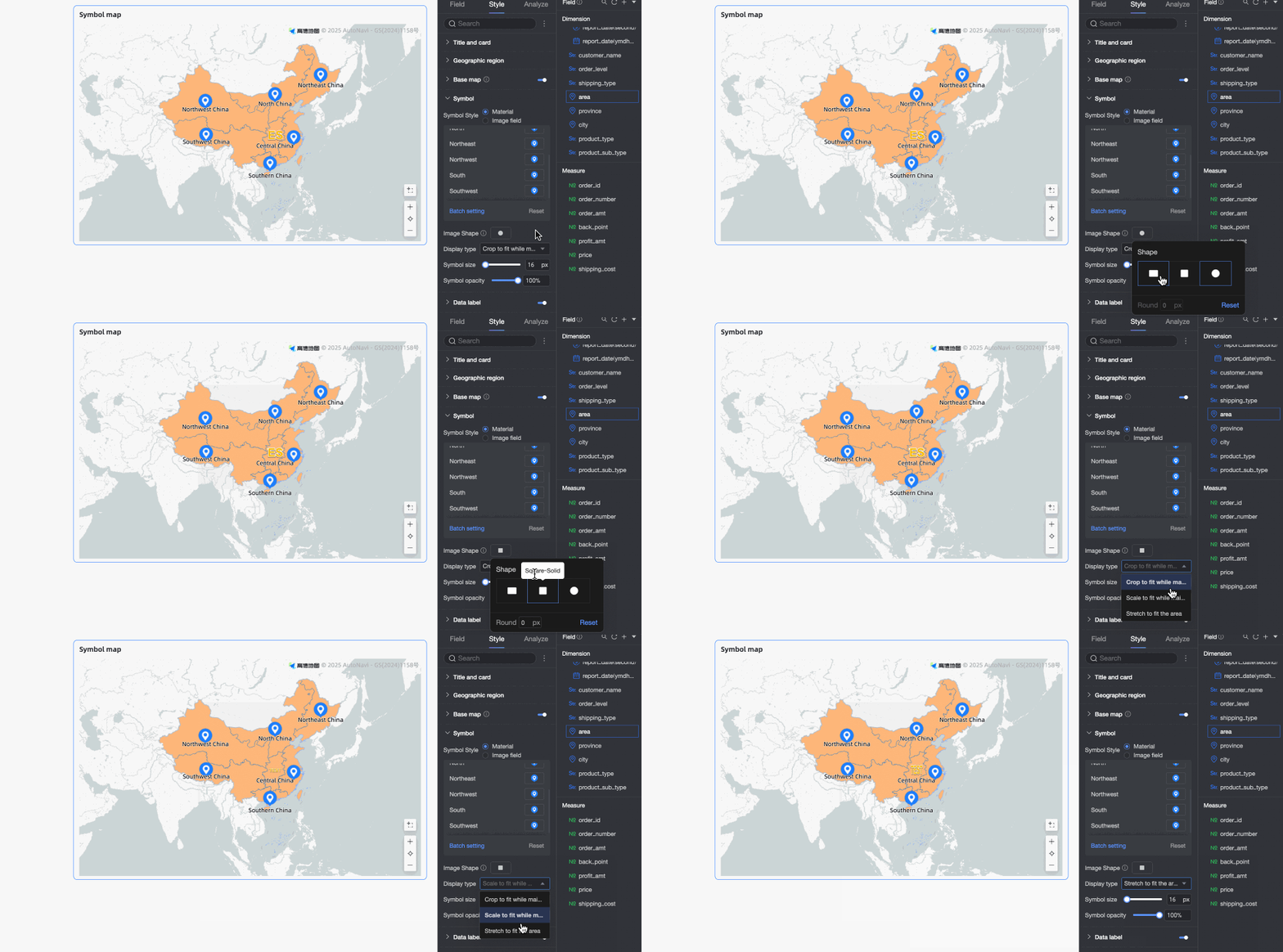
When you upload custom images or use an image field, you can also set the shape and display mode of the images.
Symbol size
Sets the size of the symbols in the chart.
Symbol opacity
Sets the opacity of the symbols in the chart.
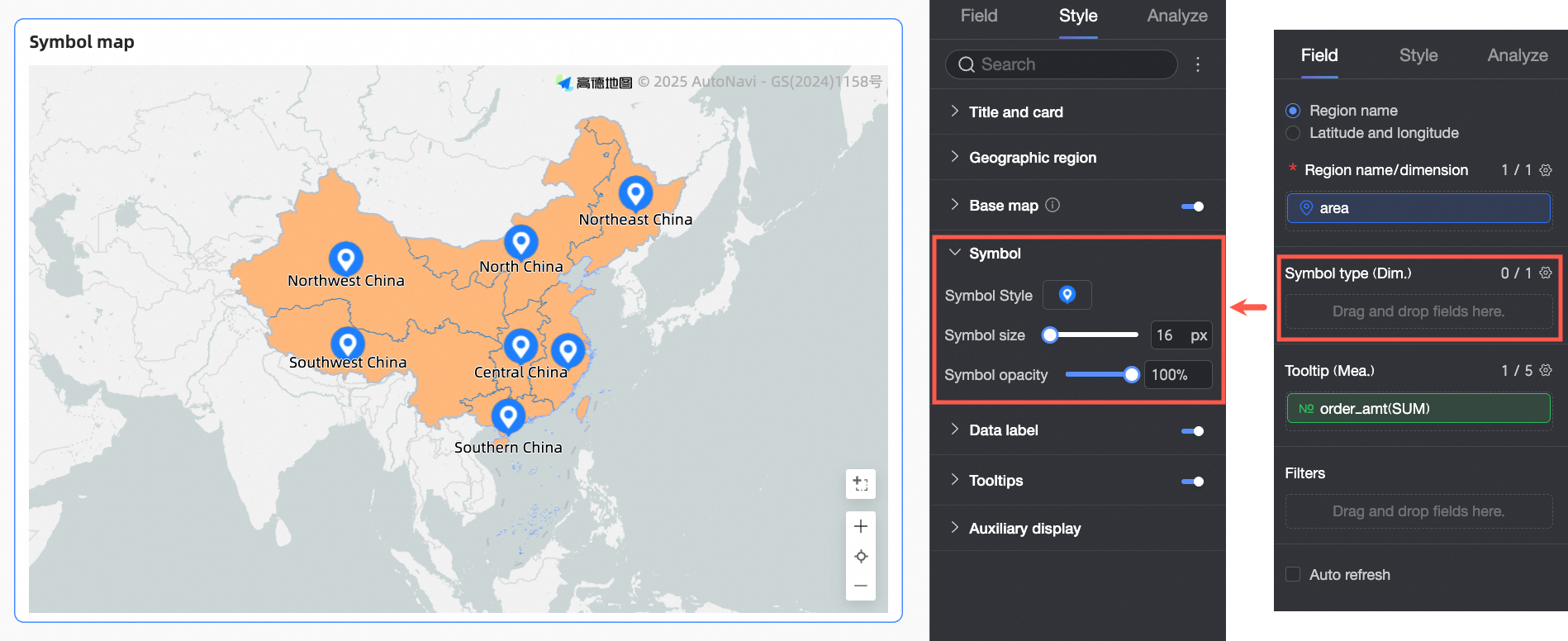
When no field is added to the Symbol Type/Dimension well, the following options are available.
Parameter
Description
Symbol style
Set the style for all symbols in the chart. You can choose a built-in symbol or upload a custom image. You cannot configure styles for individual dimension values.
Symbol size
Sets the size of the symbols in the chart.
Symbol opacity
Sets the opacity of the symbols in the chart.
 ). For more information, see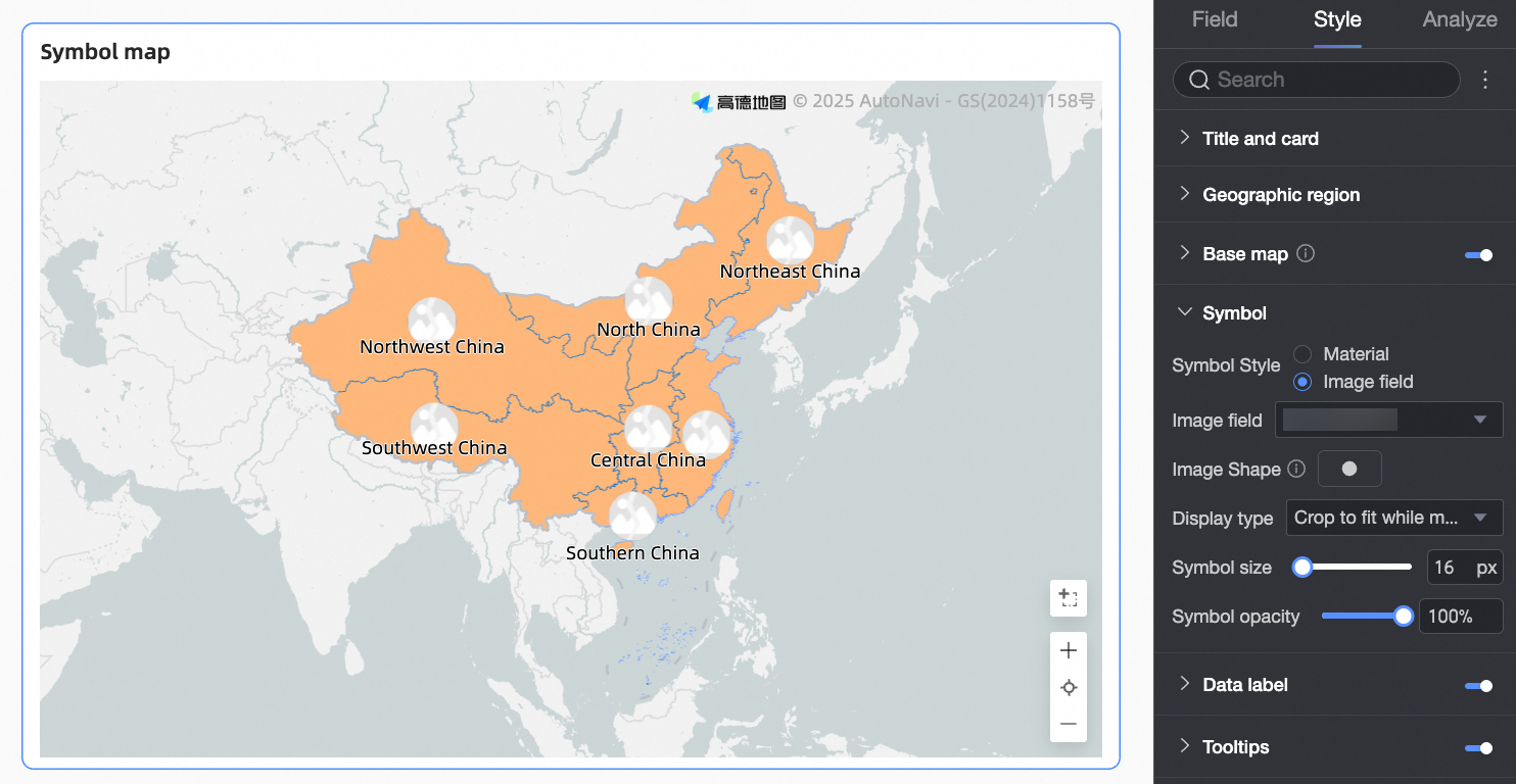
Data label
In the Data label section, configure Show data labels, Content, and Text style.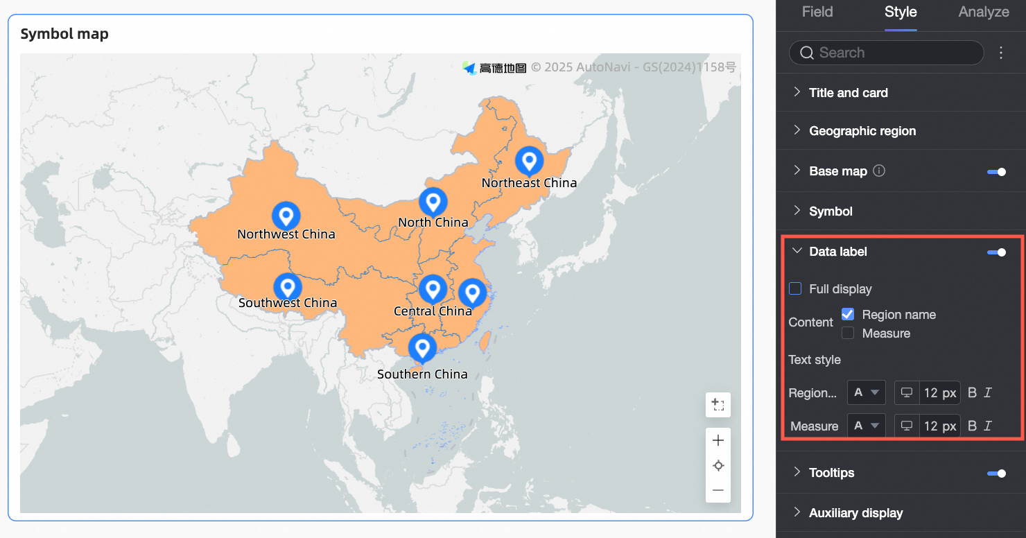
Parameter | Description |
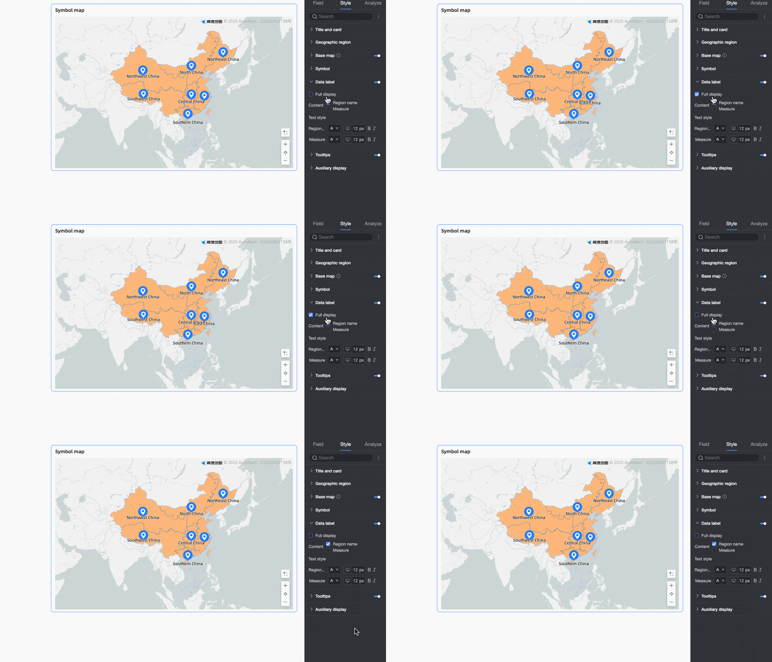
Show all | Select whether to show all dimension values. This option is suitable for scenarios where there are few dimension values and sufficient space in the chart. |
Content | Sets the content to be displayed in the chart.
|
Text style | Sets the text style for the data labels displayed in the chart, such as font size and color. |
Tooltip
In the Tooltip section, click the  icon to enable tooltips and configure their style.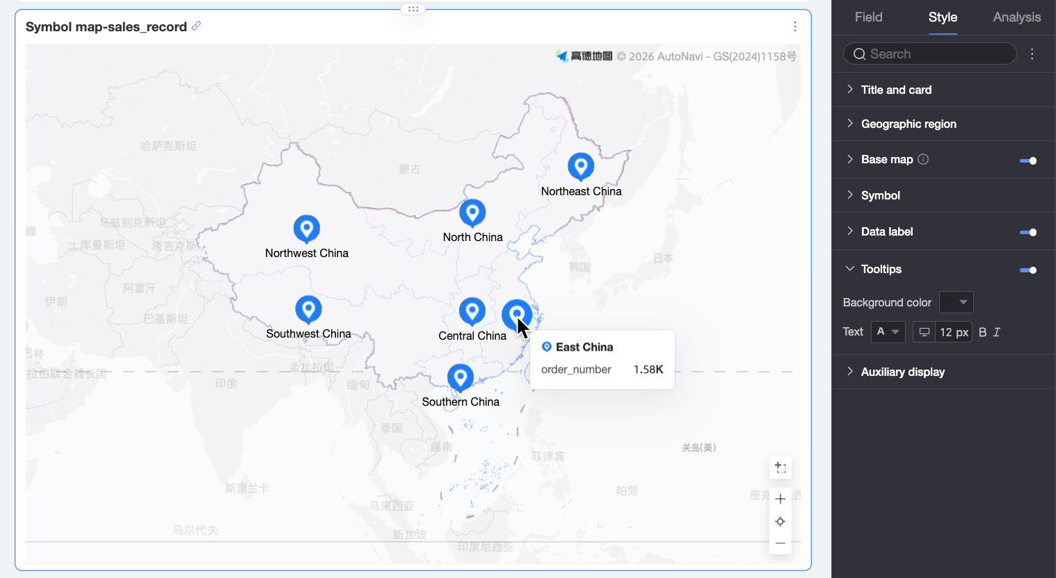
Parameter | Description |
Background color | Sets the background fill color of the tooltip. |
Text | Sets the style of the text in the tooltip, including font color, size, weight, and style. |
Tooltip on mobile | Tooltips can be configured independently for PC and mobile views. To configure the mobile tooltip, switch to the mobile editor using the |
 button. Font size can be set separately for PC and mobile, while other style settings are shared.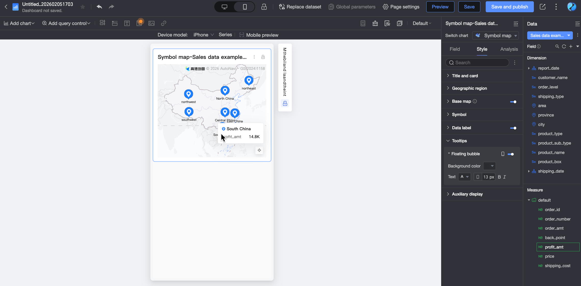
Metric switcher
In the Metric Switcher section, you can enable the switcher and select a default metric to display.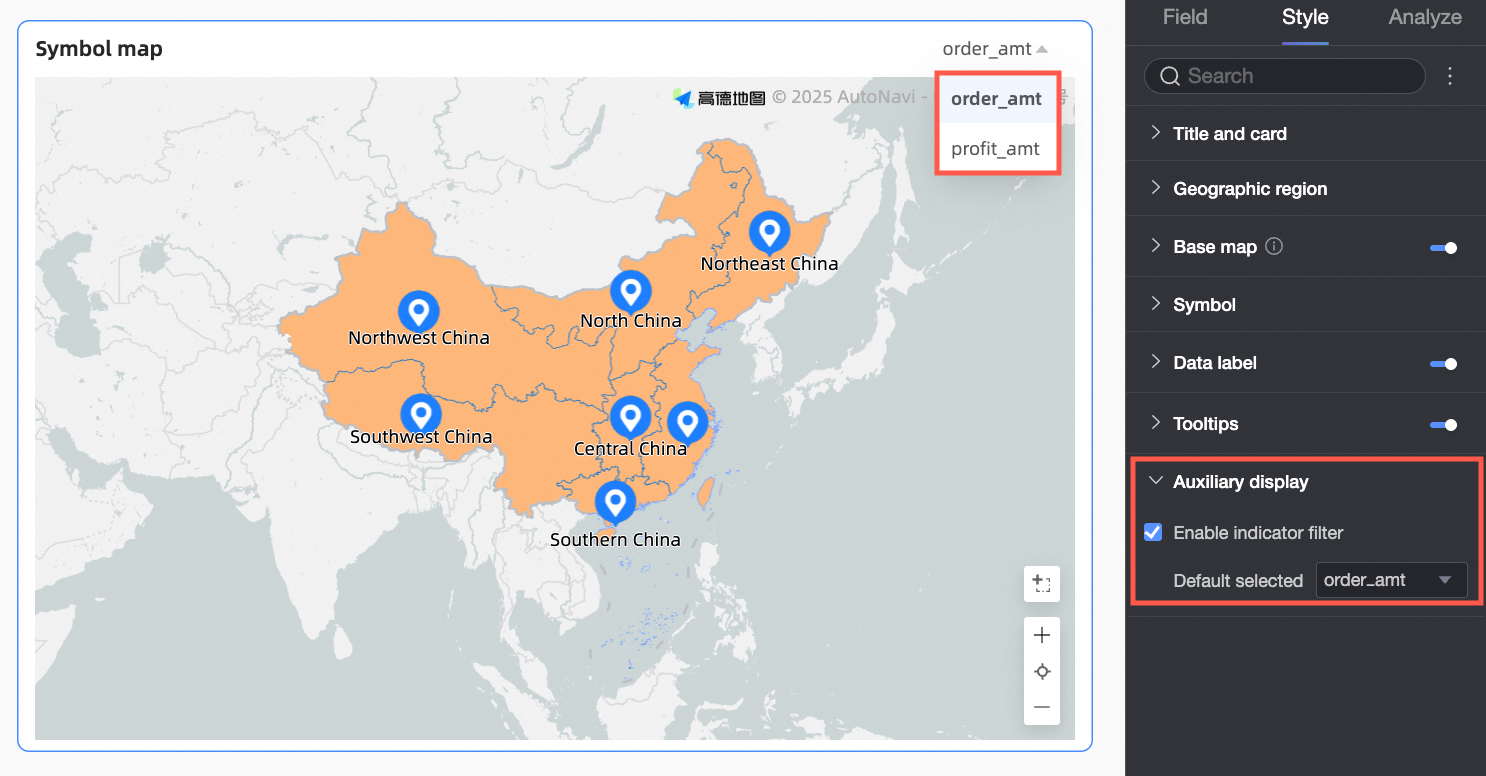
Advanced settings
Parameter | Description |
Auto refresh | When enabled, the chart data refreshes automatically at a specified interval. For example, setting the duration to 5 minutes refreshes the chart every 5 minutes. |
Linking | Use linking to associate multiple charts for data analysis. For more information about the settings, see Drill down. Note Symbol Maps do not support the advanced linking feature. |
Drill-through | Use drill-through to connect multiple dashboards for data analysis. Drill-through includes two methods: Parameter Drill-through and External Link. For more information about the settings, see Drill down. |