Water ripple chart
A liquid fill gauge uses a simulated water wave effect to visualize data completion rates or percentages, typically showing progress toward a target. You can add data to a liquid fill gauge and configure its style.
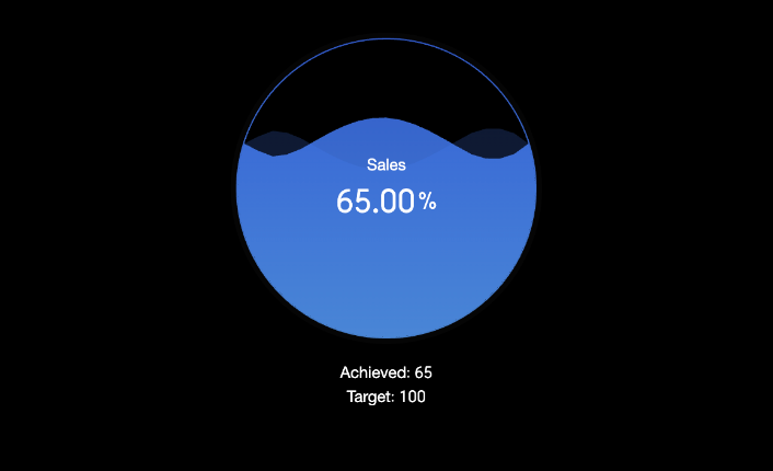
Preview
Configure Data
-
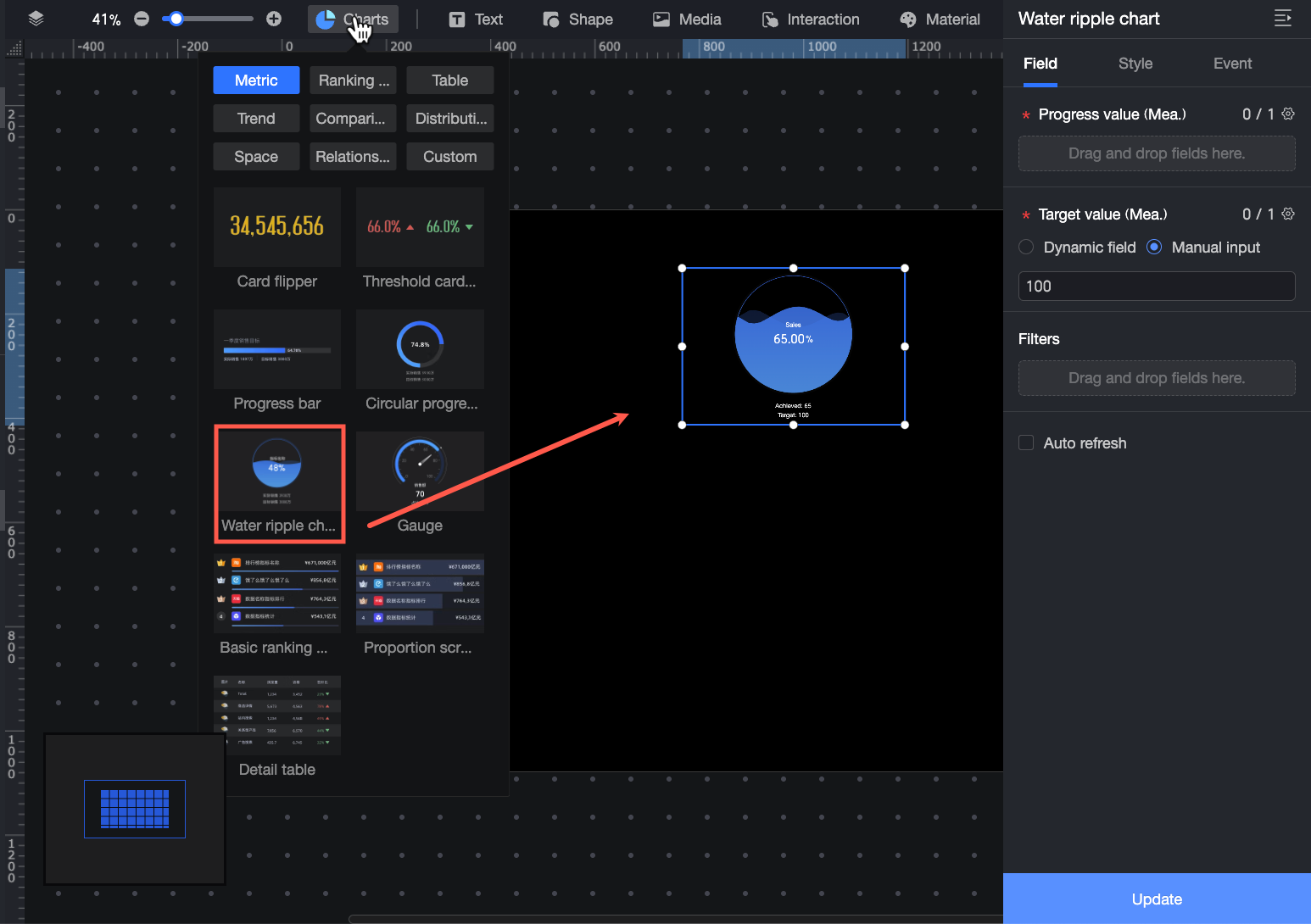
In the Charts tab of the widget library, find and drag Liquid Fill Gauge to the canvas.
-
In the Data pane, select a dataset and configure the chart's fields as follows.
-
① In the Progress value/measure field, add the measure that you want to monitor. For example, to view the completion status of the order amount, drag the Order amount field to this area.
-
② In the Target value/measure field, set a target value for the progress value to view its completion rate or percentage. For example, you can enter a target value for the order amount to see the completion status of the current order amount. You can use a dynamic field or manually enter a target value.
-
Dynamic field: Updates the target value dynamically based on business data. Use this option when the target needs to adjust automatically based on time or business conditions, such as frequently changing metrics like inventory levels.
-
Manual input: Sets a fixed target value. Use this option for fixed targets, such as annual sales goals or project budgets.
-
-
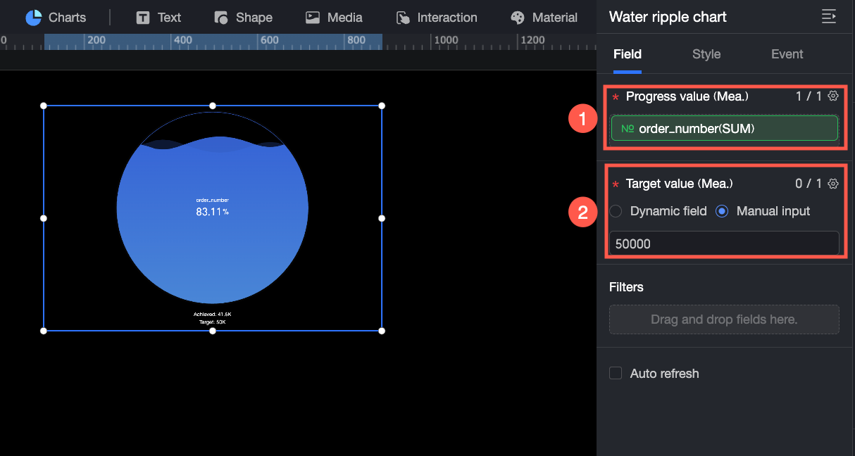
You can also perform these data operations:
-
Configure field styles in batches (①). For more information, see Batch Configure Field Styles.
-
Set field filters (②). For more information, see Filter Data.
-
Set auto-refresh for data (③). For more information, see Set a Data Refresh Schedule.
-
Switch datasets (④). For more information, see Switch Datasets.
-
Edit the dataset (⑤). For more information, see Edit a Dataset.
-
Process data (⑥). For more information, see Create a Calculated Field, Create a Grouped Dimension, and Placeholders.
-
Copy a field (⑦). For more information, see Copy a Field and Convert It to a Dimension.
Configure Styles
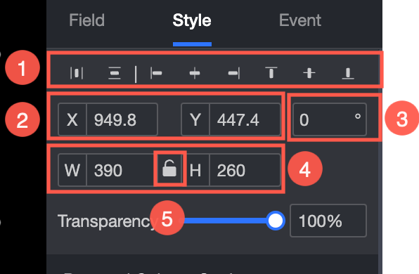
Position and Size
Configure the following widget settings in the configuration pane:
-
Adjust the widget alignment (①). Options include align left, center, and align right.
-
Adjust the widget position (②). Set the x-axis and y-axis values to adjust the widget's position relative to the top-left corner.
-
Adjust the widget angle (③). Set the rotation angle.
-
Adjust the widget size (④). Set the W (Width) and H (Height) values to adjust the widget's size.
-
Lock the widget (⑤). After a widget is locked, you cannot adjust its size.
-
Adjust the transparency (⑥). Set the widget's transparency.
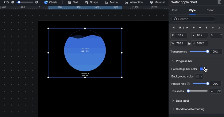
Progress Bar
In the Progress Bar section, configure the style of the percentage area:
-
Percentage Bar Color: Set the color of the percentage area.
-
Background Color: Set the background color.
-
Radius Percentage: Sets the radius of the percentage area. This setting does not take effect if the configured radius percentage is smaller than the minimum size.
-
Percentage Bar Thickness: Set the thickness of the percentage bar.
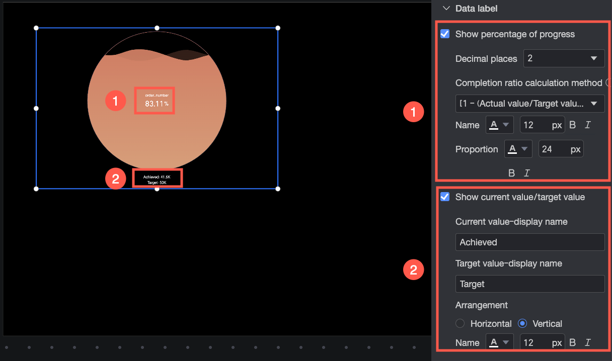
Data Labels
In the Data Labels section, configure the following settings:
-
Show Progress Value Percentage: Sets the number of decimal places, the calculation method for the completion percentage, the name, and the text style for the progress value percentage.
NoteThe selected calculation method takes effect only when the target value is negative.
-
Show Current/Target Value: Sets the display name, arrangement (left-right or top-bottom), and text style for the current and target values.
Conditional Formatting
In the Conditional Formatting section, set the display style for measures that meet specific numerical conditions.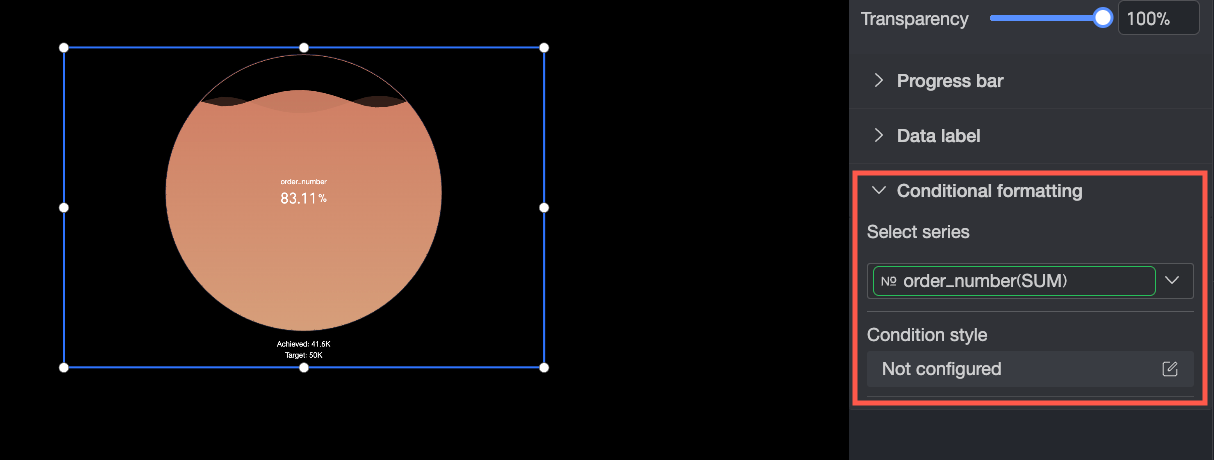
-
Select Series: Select the measure for which you want to configure conditional formatting.
-
Conditional Style: Click the
 icon. In the Conditional Formatting Configuration dialog box, set the condition rules for the measure and the display format when those rules are met. You can configure the display style to Highlight Text/Background. Select the checkbox (
 ) to apply this style.
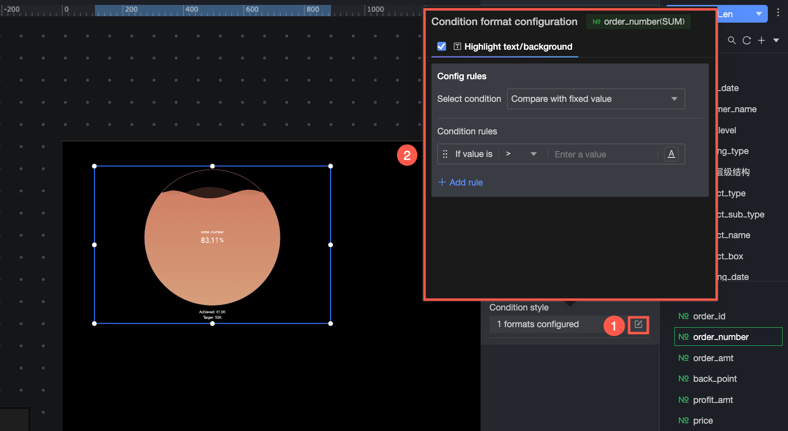
-
Condition selection: Select a comparison method for the condition rule. You can choose to Compare with a static value, Divide by percentage range, or Compare with a dynamic field.
-
Condition rule: Set the value for the condition rule and the display colors for the chart background and text when the rule is met. You can also click
 to add multiple condition rules to display different data stages in different colors.
-