This topic describes the styles and configuration parameters of the arrow plot component.
Chart style
The arrow plot is a media component that lets you add custom-styled arrow elements to a visualization application to enhance its visual appeal.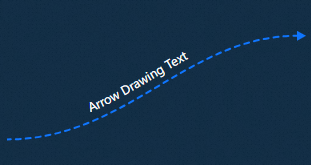
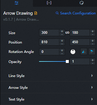
Configuration panel
- Search for Configurations: In the right-side panel of Canvas Editor, click the Settings tab, and click Search for Configurations in the upper-right corner. Enter the required configuration item in the search box, and click the search icon to quickly locate the configuration item. Fuzzy match is supported. For more information, see Search for Configurations.
- Size: indicates the size of a widget, including its pixel width and height. You can click the
 icon to proportionally adjust the width and height of a widget. After you click this icon again, you can adjust the width and height as needed.
 - Position: the position of a widget, which is indicated by pixel X and Y coordinates. X-coordinate indicates the pixel distance between the upper-left corner of the widget and the left border of the canvas. Y-coordinate indicates the pixel distance between the upper-left corner of the widget and the upper border of the canvas.
- Rotation Angle: the angle of a rotation that uses the center point of a widget as the rotation point. The unit is degrees (°). You can use one of the following methods to control the rotation angle of a widget:
- Directly enter the degrees in the Rotation Angle spin box or click the plus sign (+) or minus sign (-) to increase or decrease the value in the Rotation Angle spin box.
- Drag the black dot in the
 icon.
icon. - Click the
 icon to horizontally flip a widget.
 - Click the
 icon to vertically flip a widget.
- Opacity: the opacity of a widget. Valid values: 0 and 1. If this parameter is set to 0, the widget is hidden. If this parameter is set to 1, the widget is completely displayed. Default value: 1.
Line style: Configures the style of the line in the arrow plot.
Parameter
Description
Left height ratio
Specifies the vertical position of the line's left endpoint as a ratio of the component's height. The value ranges from 0 to 1. A larger value moves the endpoint lower.
Right height ratio
Specifies the vertical position of the line's right endpoint as a ratio of the component's height. The value ranges from 0 to 1. A larger value moves the endpoint lower.
Arc thickness
Controls the thickness of the arc line in pixels (px). The value ranges from 0 to 20. A larger value creates a thicker arc.
Line type
Specifies the style of the line curve.
Cap style
Specifies the shape of the line caps. Options include round and butt.
Dash
Specifies the pattern of segments and gaps for a dashed line.
Animation direction
Specifies the direction of the line animation. Options include To Left and To Right.
Dash speed
Controls the speed of the dash animation. The value ranges from 0 to 300. A larger value results in a faster animation.
Fill color
Specifies the fill color of the line. For more information, see Color picker instructions.
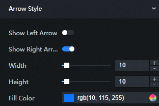
Arrow style: Configures the style of the arrowheads in the arrow plot.
Parameter
Description
Show left arrow
Shows or hides the left arrowhead.
Show right arrow
Shows or hides the right arrowhead.
Width
Specifies the width of the arrowhead in pixels (px). The value ranges from 0 to 100. A larger value creates a wider arrowhead.
Height
Specifies the height of the arrowhead in pixels (px). The value ranges from 0 to 100. A larger value creates a taller arrowhead.
Fill color
Specifies the fill color of the arrowhead. For more information, see Color picker instructions.
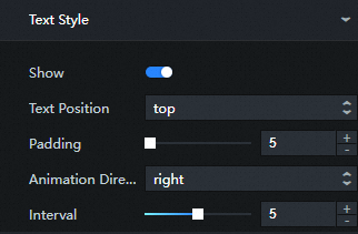
Text style: Configures the style of the text in the arrow plot.
Parameter
Description
Show
Shows or hides the text.
Text position
Specifies the position of the text relative to the line. Options include Text Above and Text Below.
Text and line spacing
Specifies the parallel distance between the text and the line in pixels (px). The value ranges from 0 to 100. A larger value increases the spacing.
Animation direction
Specifies the direction of the text animation. Options include To Left and To Right.
Animation duration
Specifies the duration of one animation cycle, in seconds. The value ranges from 0 to 10. A larger value results in a slower animation.
Font size
Specifies the font size of the text.
Font color
Specifies the font color of the text. For more information, see Color picker instructions.
Font weight
Specifies the weight (thickness) of the font.
Font family
Specifies the font family for the text. Default: Microsoft YaHei.
 icon to vertically flip a widget.
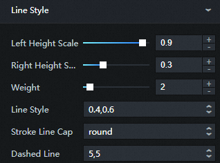
Data panel
Fields
Field | Description |
| Specifies the text to display in the component. |
| Specifies the hyperlink URL for the text content. |
| A boolean that enables ( |
| A boolean that enables ( |
Interaction panel
This component has no configurable interaction events.
Blueprint Editor interaction configuration
- In Canvas Editor, right-click a widget in the Layer panel and select Add to Blueprint Editor.
- Click the icon in the upper-left corner of the page.
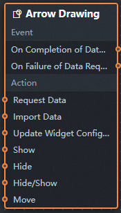
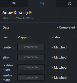
On the Blueprint Editor configuration page, click the arrow plot component in the imported nodes panel. Its configuration parameters appear on the canvas, as shown in the following figure.
Events
Event
Description
On Data Loaded
Triggered after a data API request succeeds and a filter processes the response. It passes the processed data as a JSON object. For a data sample, see the Data Response area on the Data tab of the component's Configuration panel.
On Data Load Failed
Triggered when a data API request fails due to issues such as network problems or an API error. The event passes the error information. For a data sample, see the Data Response area on the Data tab of the component's Configuration panel.
Actions
Action
Description
Request data
Triggers a new data request from the server. This action uses data from upstream processing nodes or layer nodes as parameters. For example, if the arrow plot is configured with the data API source
https://api.testand the data{ id: '1'}is passed to the request data action, the final request URL ishttps://api.test?id=1.Import data
Imports pre-formatted data and redraws the component without initiating a server request. For a data sample, see the Data Response area on the Data tab of the component's Configuration panel.
Update component configuration
Dynamically updates the component's style configuration. To do this, get the configuration by clicking Copy Configuration to Clipboard in the Configuration panel and then use a data processing node on the Blueprint Editor configuration page to modify the style values.
Show
Shows the component. The following is a sample data structure.
return {
  "animationType": "",
  "animationDuration": 1000,
  "animationEasing": "linear"
};
Hide
Hides the component. The following is a sample data structure.
return {
  "animationType": "",
  "animationDuration": 1000,
  "animationEasing": "linear"
};
Toggle visibility
Toggles the visibility of the component. The following is a sample data structure.
return {
  "animationIn": {
    "animationType": "",
    "animationDuration": 1000,
    "animationEasing": "linear"
  },
  "animationOut": {
    "animationType": "",
    "animationDuration": 1000,
    "animationEasing": "linear"
  }
};
Move
Moves the component to a specified position. The following is a sample data structure.
return {
  // Movement type. "to" for absolute positioning, "by" for relative positioning. Default: "to".
  "positionType": "to",
  // Target position. x and y coordinates.
  "attr": {
    "x": 0,
    "y": 0
  },
  // Animation settings.
  "animation": {
    "enable": false,
    // Animation duration.
    "animationDuration": 1000,
    // Easing function. Options: linear, easeInOutQuad, or easeInOutExpo.
    "animationEasing": "linear"
  }
};
 icon in the upper-left corner of the page.