A customized background is a media component that lets you add custom background colors, borders, and filter effects to your visualization application.
Chart Style
A customized background is a media component that supports custom background colors, borders, and filter effects. You can add a customized background block to a visualization application or one of its modules to enhance the visual presentation. 
Settings Panel
- Search for Configurations: In the right-side panel of Canvas Editor, click the Settings tab, and click Search for Configurations in the upper-right corner. Enter the required configuration item in the search box, and click the search icon to quickly locate the configuration item. Fuzzy match is supported. For more information, see Search for Configurations.
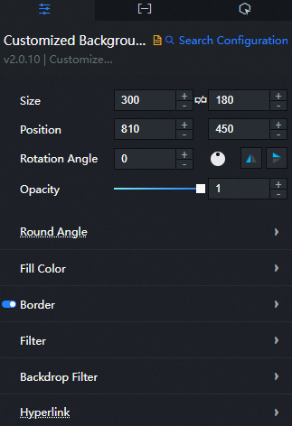
- Size: indicates the size of a widget, including its pixel width and height. You can click the
 icon to proportionally adjust the width and height of a widget. After you click this icon again, you can adjust the width and height as needed.
 - Position: the position of a widget, which is indicated by pixel X and Y coordinates. X-coordinate indicates the pixel distance between the upper-left corner of the widget and the left border of the canvas. Y-coordinate indicates the pixel distance between the upper-left corner of the widget and the upper border of the canvas.
- Rotation Angle: the angle of a rotation that uses the center point of a widget as the rotation point. The unit is degrees (°). You can use one of the following methods to control the rotation angle of a widget:
- Directly enter the degrees in the Rotation Angle spin box or click the plus sign (+) or minus sign (-) to increase or decrease the value in the Rotation Angle spin box.
- Drag the black dot in the
 icon.
icon. - Click the
 icon to horizontally flip a widget.
 - Click the
 icon to vertically flip a widget.
- Opacity: the opacity of a widget. Valid values: 0 and 1. If this parameter is set to 0, the widget is hidden. If this parameter is set to 1, the widget is completely displayed. Default value: 1.
-
Fillet: the fillet style of the widget. When a gradient border or an image border is applied, the fillet setting does not take effect.
-
Fillet Control: the fillet control mode. Valid values: Overall and Custom.
-
Angle: the fillet angle. If you select Whole, you can set the angles of all four corners at the same time. If you select Custom, you can set the rounded corner size for each corner individually, including the upper-left corner, lower-left corner, upper-right corner, and lower-right corner.
-
-
Fill: the fill style of the customized background. Click the
or icon to add or remove a style. Click the or icon to adjust the order of multiple styles. Click the icon to duplicate the selected style configuration. -
Border: the border style of the customized background. Click the
icon on the left to show or hide the border.-
Border Type: the border type. Valid values: Solid Color, Gradient, and Image.
-
Border Configuration: the available configuration items vary based on the selected border type. If you set Border Type to Image, the border configuration options change based on the configuration method.
-
-
filter: the blur radius of the widget border. Unit: pixels.
-
Background Filter: the blur radius applied to the widget background. Unit: pixels. This option takes effect only after Experimental Web Platform features is enabled in the Chrome browser.
To enable Experimental Web Platform features in Chrome:
-
Enter chrome://flags/#enable-experimental-web-platform-features in your Chrome browser.
-
Click the drop-down list to the right of the first Experimental Web Platform features and select Enabled.
-
Restart your browser.
-
-
Hyperlink Configuration: configures a hyperlink that opens when you click the background.
-
Hyperlink: the hyperlink.
-
Open Window: click the
icon to specify whether to open the hyperlink in a new window.
-
 icon to vertically flip a widget.
 or
or  icon to add or remove a style. Click the
  or
or  icon to adjust the order of multiple styles. Click the
  icon to duplicate the selected style configuration.
 icon on the left to show or hide the border.
 icon to specify whether to open the hyperlink in a new window.
You can also adjust the width of the component and stretch it to use as a line.
Data Panel
This component does not support data configuration.
Interaction Panel
This widget does not support interaction events.
Configure interactions in Blueprint Editor
- In Canvas Editor, right-click a widget in the Layer panel and select Add to Blueprint Editor.
- Click the icon in the upper-left corner of the page.
-
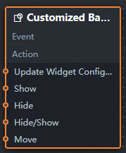
In Blueprint Editor, click customized background in the Added Nodes pane. You can view the customized background parameters in the canvas, as shown in the following figure.
-
Event: The customized background does not support events.
-
Policy Action
Policy Action
Description
Update component configurations
Dynamically updates the style configurations of the widget. Before you use this action, click the widget in Canvas Editor, click the Settings tab in the right-side panel, and click Copy Configurations to... to obtain the widget configurations. Then, modify the style field for the data processing node in Blueprint Editor.
Display
Displays the widget. Example reference data:
return {
  "animationType": "",
  "animationDuration": 1000,
  "animationEasing": "linear"
};
Hide
Hides the widget. Example reference data:
return {
  "animationType": "",
  "animationDuration": 1000,
  "animationEasing": "linear"
};
Switch to the hidden state
Toggles the widget between the displayed and hidden states. Example reference data:
return {
  "animationIn": {
    "animationType": "",
    "animationDuration": 1000,
    "animationEasing": "linear"
  },
  "animationOut": {
    "animationType": "",
    "animationDuration": 1000,
    "animationEasing": "linear"
  }
};
Move
Moves the widget to a specified location. Example reference data:
return {
  // The positioning type. to indicates absolute positioning, whereas by indicates relative positioning. The default value is to.
  "positionType": "to",
  // The location, which is indicated by the x and y coordinates.
  "attr": {
    "x": 0,
    "y": 0
  },
  // The animation type.
  "animation": {
    "enable": false,
    // The duration in which animation is displayed.
    "animationDuration": 1000,
    // The animation curve, which can be set to linear|easeInOutQuad|easeInOutExpo.
    "animationEasing": "linear"
  }
};
-
 icon in the upper-left corner of the page.