This topic describes the styles and configuration items of the Cascader widget.
The Cascader widget is not compatible with mobile devices. For updates, follow the official DataV website.
Chart style
The Cascader is a control widget that you can use as a cascading form in a visualization application. It submits the data that a user selects to the backend for processing. You can also configure interactions to display the user's selections in other widgets.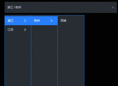
Configuration panel
- Search for Configurations: In the right-side panel of Canvas Editor, click the Settings tab, and click Search for Configurations in the upper-right corner. Enter the required configuration item in the search box, and click the search icon to quickly locate the configuration item. Fuzzy match is supported. For more information, see Search for Configurations.
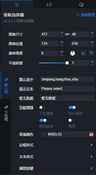
- Size: indicates the size of a widget, including its pixel width and height. You can click the
 icon to proportionally adjust the width and height of a widget. After you click this icon again, you can adjust the width and height as needed.
 - Position: the position of a widget, which is indicated by pixel X and Y coordinates. X-coordinate indicates the pixel distance between the upper-left corner of the widget and the left border of the canvas. Y-coordinate indicates the pixel distance between the upper-left corner of the widget and the upper border of the canvas.
- Rotation Angle: the angle of a rotation that uses the center point of a widget as the rotation point. The unit is degrees (°). You can use one of the following methods to control the rotation angle of a widget:
- Directly enter the degrees in the Rotation Angle spin box or click the plus sign (+) or minus sign (-) to increase or decrease the value in the Rotation Angle spin box.
- Drag the black dot in the
 icon.
icon. - Click the
 icon to horizontally flip a widget.
 - Click the
 icon to vertically flip a widget.
- Opacity: the opacity of a widget. Valid values: 0 and 1. If this parameter is set to 0, the widget is hidden. If this parameter is set to 1, the widget is completely displayed. Default value: 1.
Input Box
Default Selection: You can enter the default selected path, with components separated by a comma (,), such as zhejiang,hangzhou,xihu.
Placeholder Text: Specifies the placeholder text in the input box. This text is displayed by default when no value is selected.
No Data Text: Specifies the text to display when the dropdown list is empty.
Enhanced Features: Specifies the enhanced features of the input box.
Parameter
Description
Dropdown Search
Turn on this switch to enable search in the input box. You can filter the dropdown list. Turn off this switch to disable this feature.
Clear Selection
Turn on this switch to show a clear icon
on mouseover when the input box has a value. Click the icon to clear the content of the input box. Turn off this switch to disable this feature.Take effect immediately
Turn on this switch to update the input box in real time when an item is selected from the dropdown list. Turn off this switch to disable this feature.
Disable
Turn on this switch to disable the cascader. Turn off this switch to use the cascader.
Background Color: Specifies the background color of the cascader.
Border Style: Specifies the style of the cascader border. In the default style, you can set the border weight, line type, line color, border radius, and border shadow color.
Text Style: Specifies the style of the text in the cascader.
Parameter
Description
Text Margin
The margin to the left of the text in the cascader.
Font Style
The font style of the text in the cascader, including the font family, font weight, font size, and font color.
Helper Buttons: Specifies the style of the helper buttons in the cascader, such as the dropdown arrow and the clear icon.
Parameter
Description
Size
The size of the helper buttons.
Right Margin
The margin to the right of the helper buttons.
Dropdown Arrow
Turn on this switch to set the color of the dropdown arrow. Turn off this switch to disable this setting.
Clear Icon
The color and background color of the clear icon.
Dropdown Box
Height: Specifies the height style of the dropdown box.
Parameter
Description
Container Height
The height of the entire dropdown list.
Container Top Margin
The distance from the top of the dropdown container to the cascader, in px.
Background: Specifies the background color of the dropdown box.
Border: Specifies the style of the dropdown box border.
Parameter
Description
Weight
The weight of the dropdown box border.
Type
The type of the dropdown box border. You can select Solid Line, Dashed Line, or Dotted Line.
Color
The color of the dropdown box border.
Radius
The border radius of the dropdown box. The value range is 0 to 360. A value of 0 creates a square. A value of 360 creates a circle.
Option Style: Specifies the style of the option text in the dropdown box.
Parameter
Description
Option Height
The height of the options in the dropdown box, in px.
Text Style
The style of the option text, including the font family, font weight, font size, and font color.
Text Color
The color of the option text on mouseover and when selected.
Background Color
The background color of the options, including the default background color, the background color on mouseover, and the background color when selected.
Rightwards Arrow
Right Margin: The margin to the right of the rightwards arrow.
Size: The size of the rightwards arrow.
Color: The color of the rightwards arrow.
Submenu
The way a submenu expands. You can select Click or Mouseover.
 icon to vertically flip a widget.
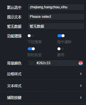
 on mouseover when the input box has a value. Click the icon to clear the content of the input box. Turn off this switch to disable this feature.
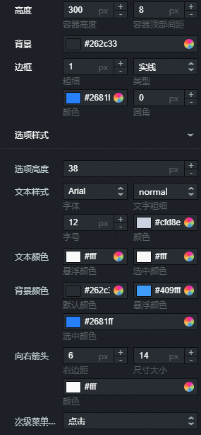
Data panel
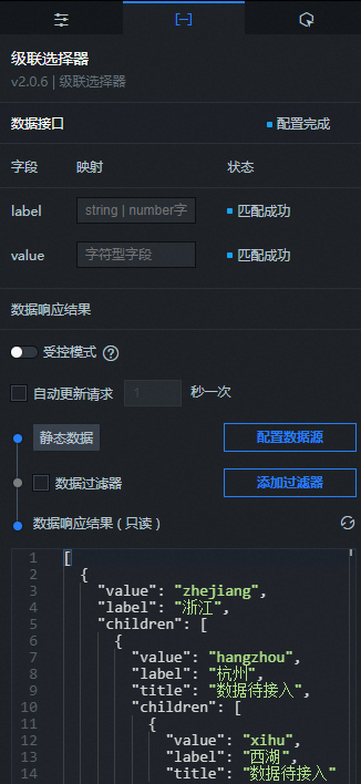
Field description
Field |
Description |
|
The actual value of each option in the cascader. |
|
The text content displayed for the label in the cascader. |
|
The subset of the current data node in the cascader. |
|
Specifies whether the current option can be selected. A value of |
|
The content that is automatically prompted on mouseover. |
| Parameter | Description |
| Controlled Mode | If you turn on the switch, data is not requested when a widget is initialized. Data requests are triggered only based on callback IDs or the method configured in Blueprint Editor. If you turn off the switch, data requests are automatically triggered. By default, the switch is turned off. |
| Auto Data Request | After you select the Auto Data Request check box, you can enable dynamic polling, and manually specify the polling interval. If you do not select this check box, data is not automatically requested. You must manually refresh the page to request data or use Blueprint Editor or callback ID events to trigger data requests. |
| Data Source | In the right-side panel of Canvas Editor, click the Data tab. Click Set next to Static Data. In the Configure Datasource panel, select a data source from the Data Source Type drop-down list. Enter code for data query in the code editor, click Preview Data Response to preview the response of the data source, and then view the response. For more information, see Configure asset data. |
| Data Filter | If you select the Data Filter check box, you can convert the data structure, filter data, and perform simple calculations. If you click the plus sign (+) next to Add Filter, you can configure the script for the data filter in the editor that appears. For more information, see Use the data filter. |
| Data Response Result | The response to a data request. If the data source changes, you can click the  icon next to Data Response Result to view the data response in real time. icon next to Data Response Result to view the data response in real time. |
Interaction panel
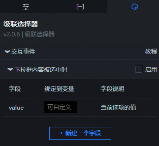
You can select Enable on the right side of When an option is selected to enable the interaction feature. The Cascader widget has an interaction configuration. When an item is selected in the cascader, you can trigger a data request and pass a callback value. You can then use this value in other widgets. By default, the value configured on the Data panel is passed. For more information, see Configure a widget callback ID.
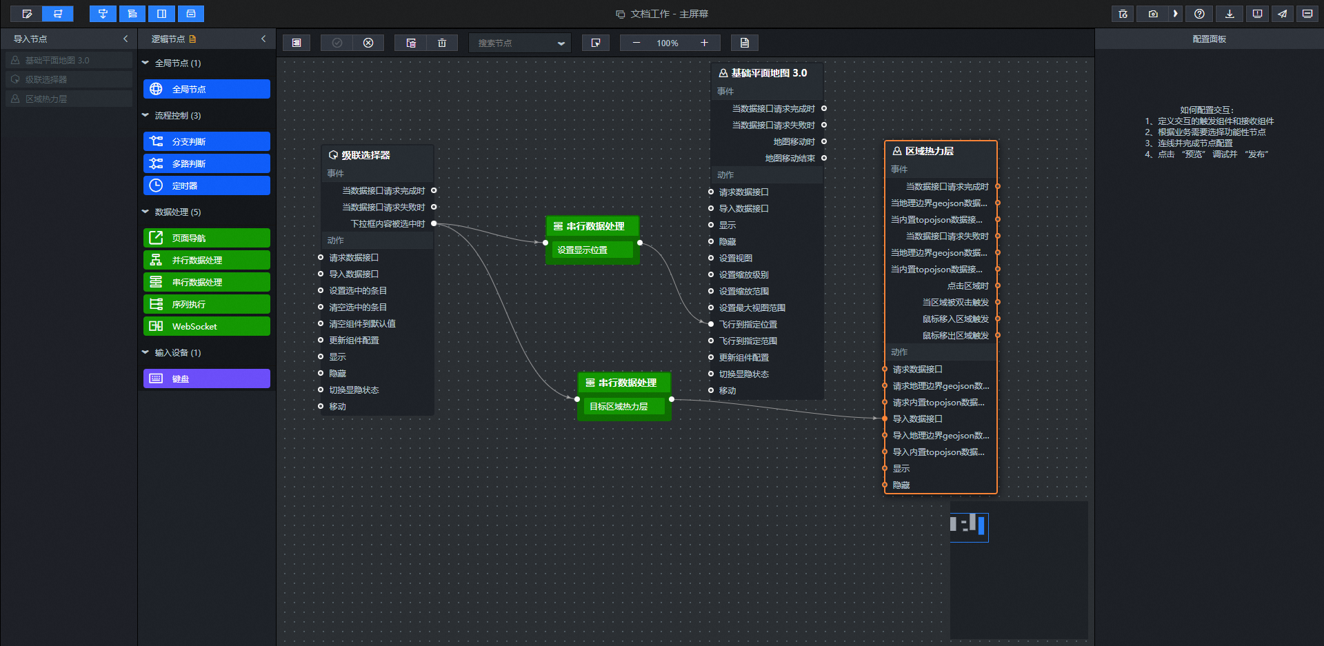
Blueprint editor interaction configuration
- In Canvas Editor, right-click a widget in the Layer panel and select Add to Blueprint Editor.
- Click the icon in the upper-left corner of the page.
On the blueprint editor configuration page, click the Cascader widget in the import node bar. The configuration parameters for the cascader in the blueprint editor appear on the canvas, as shown in the following figure.
Events
Event
Description
On Data API Request Completion
This event is triggered after a data API request is returned and processed by a filter. The processed data is passed in JSON format. For a data example, see the Data Response section on the Data tab of the widget's configuration panel in the canvas editor.
When a data request fails
This event is triggered if a data API request fails and the response is processed by a filter. A request may fail due to network issues or API errors. The processed data is passed in JSON format. For a data example, see the Data Response section on the Data tab of the widget's configuration panel in the canvas editor.
When an option is selected
This event is triggered when a dropdown option is selected. The data item that corresponds to the value is passed.
Actions
Action
Description
Request data API
Re-requests server-side data. Data from input data processing nodes or layer nodes is used as parameters. For example, if a cascade selector has its API data source set to
https://api.testand the data passed to the Request data API action is{ id: '1'}, the final API request ishttps://api.test?id=1.Import data API
Processes data in the component's drawing format, then imports the data to redraw the component. This action does not require re-requesting server-side data. For a data example, see the Data Response area on the Data tab in the component's configuration panel in the canvas editor.
Set selected items
Sets the items currently selected in the cascade selector, such as ['zhejiang','hangzhou','xihu'].
Clear selected items
Clears the values of the selected items in the cascade selector.
Get current selection
Gets the value of the current selection in the cascade selector.
Reset component to default
Resets the component to its default value.
Update component configuration
Dynamically updates the style configuration of the component. First, click Copy Configuration to Clipboard in the component's Configuration panel to get the configuration data. Then, change the style field values as needed in the data processing node of the blueprint editor.
Show
Shows the component. See the data example below.
return {
  "animationType": "",
  "animationDuration": 1000,
  "animationEasing": "linear"
};
Hide
Hides the component. See the data example below.
return {
  "animationType": "",
  "animationDuration": 1000,
  "animationEasing": "linear"
};
Toggle visibility
Toggles the component's visibility. See the data example below.
return {
  "animationIn": {
    "animationType": "",
    "animationDuration": 1000,
    "animationEasing": "linear"
  },
  "animationOut": {
    "animationType": "",
    "animationDuration": 1000,
    "animationEasing": "linear"
  }
};
Move
Moves the component to a specified position. See the data example below.
return {
  // The movement method. Absolute: to. Relative: by. Default: to.
  "positionType": "to",
  // The specified position. x-coordinate, y-coordinate.
  "attr": {
    "x": 0,
    "y": 0
  },
  // The animation method.
  "animation": {
    "enable": false,
    // The animation duration.
    "animationDuration": 1000,
    // The animation curve. Optional values: linear, easeInOutQuad, or easeInOutExpo.
    "animationEasing": "linear"
  }
};
 icon in the upper-left corner of the page.
Demo
This demo shows how to use the multi-selection feature of the Cascader to dynamically display a choropleth layer of city areas on a basic flat map.
Log on to the DataV console.
Select a visualization application and click Edit to go to the canvas editor page.
Add the Cascader widget and the Basic Flat Map widget to the canvas.
Click the Cascader, select the Data panel, and modify the static data.
[
  {
    "value": "zhejiang",
    "label": "Zhejiang",
    "title": "Data to be connected",
    "lng": 120.0321621,
    "lat": 29.08208903,
    "adcode": "330000",
    "colorField": 1200,
    "children": [
      {
        "value": "hangzhou",
        "label": "Hangzhou",
        "title": "Data to be connected",
        "lng": 120.20903104,
        "lat": 30.2431451,
        "adcode": "330100",
        "colorField": 800,
        "children": [
          {
            "value": "xihu",
            "label": "Xihu",
            "title": "Data to be connected",
            "lng": 120.14492733,
            "lat": 30.23851003,
            "adcode": "330106",
            "colorField": 400
          }
        ]
      }
    ]
  },
  {
    "value": "guangdong",
    "label": "Guangdong",
    "title": "Data to be connected",
    "lng": 113.48155805,
    "lat": 23.18033886,
    "adcode": "440000",
    "colorField": 1200,
    "children": [
      {
        "value": "guangzhou",
        "label": "Guangzhou",
        "title": "Data to be connected",
        "lng": 113.26548282,
        "lat": 23.11906084,
        "adcode": "440100",
        "colorField": 800,
        "children": [
          {
            "value": "huangpu",
            "label": "Huangpu",
            "title": "Data to be connected",
            "lng": 113.8141788,
            "lat": 23.25787215,
            "adcode": "440112",
            "colorField": 400
          }
        ]
      }
    ]
  }
]
Right-click the widgets to import the Cascader, Basic Flat Map, and Choropleth Layer into the blueprint editor.
Connect the widgets as shown in the following figure.
Configure the processing methods for the serial data processing nodes.
Set the display position
return {
  zoom: 8,// Set the map zoom level
  lng: data[data.length - 1].lng,// Display the longitude of the last city
  lat: data[data.length - 1].lat,// Display the latitude of the last city
  duration: 0.25// Set the map response interval
}
Target Choropleth Layer
return [
  {
    "colorField": data[data.length - 1].colorField,
    "adcode": data[data.length - 1].adcode
  }]
Click the
icon in the upper-right corner of the page to preview the results.
 icon in the upper-right corner of the page to preview the results.