Ticker board
The Ticker board widget displays values, counts, or time. It can interact with other widgets to show real-time data changes. This topic explains how to configure and use the Ticker board widget.
Widget style
The Ticker board is a text widget. You can customize the style of its title, numbers, prefix, and suffix. It works with other widgets to display real-time data changes through interactions.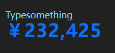
Configuration pane
- Search for Configurations: In the right-side panel of Canvas Editor, click the Settings tab, and click Search for Configurations in the upper-right corner. Enter the required configuration item in the search box, and click the search icon to quickly locate the configuration item. Fuzzy match is supported. For more information, see Search for Configurations.
- Size: indicates the size of a widget, including its pixel width and height. You can click the
 icon to proportionally adjust the width and height of a widget. After you click this icon again, you can adjust the width and height as needed.
 - Position: the position of a widget, which is indicated by pixel X and Y coordinates. X-coordinate indicates the pixel distance between the upper-left corner of the widget and the left border of the canvas. Y-coordinate indicates the pixel distance between the upper-left corner of the widget and the upper border of the canvas.
- Rotation Angle: the angle of a rotation that uses the center point of a widget as the rotation point. The unit is degrees (°). You can use one of the following methods to control the rotation angle of a widget:
- Directly enter the degrees in the Rotation Angle spin box or click the plus sign (+) or minus sign (-) to increase or decrease the value in the Rotation Angle spin box.
- Drag the black dot in the
 icon.
icon. - Click the
 icon to horizontally flip a widget.
 - Click the
 icon to vertically flip a widget.
- Opacity: the opacity of a widget. Valid values: 0 and 1. If this parameter is set to 0, the widget is hidden. If this parameter is set to 1, the widget is completely displayed. Default value: 1.
Basic Style
Parameter
Description
Auto font sizing
If enabled, the widget's width, height, and spacing automatically adjust to the font size, overriding manually set values.
Text style
Configures the font family, weight, color, and size of the text.
NoteThe selected font must be installed on your system. If the specified font is unavailable, the system uses the default font.
Layout
The arrangement and display of the Ticker board on the canvas.
Arrangement: The position of the title relative to the ticker. Options include Title on top, Title on left, and Title on bottom.
Horizontal Alignment: Includes Align left, Align center, and Align right.
Spacing: Sets the distance between the title and the ticker.
Title content
The title of the Ticker board. This field accepts text. It corresponds to the name field in the data. For more information, see Fields.
Title shadow
Click the
 or icon to add or remove a shadow style. Click the or icon to arrange multiple shadow styles. Click the icon to copy the selected shadow style.
Color: Sets the shadow color.
Offset: Sets the shadow's offset on the X and Y axes in pixels.
Blur Radius: Sets the blur radius for the shadow effect in pixels.
Initial characters
The initial value displayed by the ticker. This corresponds to the
valuefield in the data source.Invalid characters
When the
valuein the widget's data source is not of theNumbertype, the platform treats the value as an invalid character. The Digital Flipper then displays the configured value of the Invalid Character parameter.Ticker Board
Layout: Sets the horizontal alignment and digit spacing of the Ticker board.
Numbers: The style of the numbers in the ticker.
Parameter
Description
Text style
The color, size, and weight of the number text.
Layout
Sets the spacing, width, and height for the digits, and enables fixed-width for separators.
Border style
Sets the style, color, and width of the border.
Background
Configures the visual properties of the Ticker board background.
Color: The background color of the block for each digit. You can set it to transparent to hide the background. For more information, see Color picker.
NoteIf the font color is a gradient, the background color effect for the font is disabled.
Separator Background: If enabled, the background color style is applied to the separator.
Corner Radius: Sets the corner radius of each digit's background block.
Digits
Default Digits: The default number of digits to display on the ticker.
NoteIf the Default Digits value is smaller than the number of actual digits, the leading digits are truncated. If it is larger, the number is padded with leading zeros.
Rounding: If enabled, the numeric value is rounded to the nearest integer for display. If disabled, the original value is used.
Thousands separator
If enabled, the configured thousands separator is displayed.
NoteThe separator must be a single character. If you enter more than one character, only the first one is used. Numbers cannot be used as a separator. For example, if you enter
,.', the separator will be,.Decimal symbol
Configures the symbol used for the decimal separator.
NoteThe separator can be only one character long. If you enter more than one character, only the first one is used. Numbers cannot be used as separators.
Text shadow
Click the
or icon to add or remove a shadow style. Click the or icon to arrange multiple shadow styles. Click the icon to copy the selected shadow style.Color: Sets the shadow color.
Offset: Sets the shadow's offset on the X and Y axes in pixels.
Blur Radius: Sets the blur radius for the shadow effect in pixels.
Prefix: Style for the ticker's prefix.
Parameter
Description
Text style
The font family, size, color, and weight of the prefix text.
Content
The content of the prefix, which is usually a symbol such as ¥ or $.
Prefix shadow
Click the
or icon to add or remove a shadow style. Click the or icon to arrange multiple shadow styles. Click the icon to copy the selected shadow style.Color: Sets the shadow color.
Offset: Sets the shadow's offset on the X and Y axes in pixels.
Blur Radius: Sets the blur radius for the shadow effect in pixels.
Suffix: Style for the ticker's suffix.
Parameter
Description
Text style
The font family, color, size, and weight of the suffix text.
Content
The content of the suffix, which is usually a unit such as USD or GB.
Suffix shadow
Click the
or icon to add or remove a shadow style. Click the or icon to arrange multiple shadow styles. Click the icon to copy the selected shadow style.Color: Sets the shadow color.
Offset: Sets the shadow's offset on the X and Y axes in pixels.
Blur Radius: Sets the blur radius for the shadow effect in pixels.
Interaction: Configures the ticker's animation effects (such as duration and data jitter correction) and cursor style.
Animation Duration: The duration of the animation in milliseconds (ms).
Always Animate: If enabled, the animation plays even when the incoming data has not changed.
Data Jitter Correction: If enabled, the ticker only displays increasing values and ignores decreases. If disabled, it shows both increases and decreases.
Hand Cursor: If enabled, the cursor changes to a hand pointer when you hover over the Ticker board widget in preview mode.
 or
or  icon to add or remove a shadow style. Click the
  or
or  icon to arrange multiple shadow styles. Click the
  icon to copy the selected shadow style.
 or
or  icon to add or remove a shadow style. Click the
  or
or  icon to arrange multiple shadow styles. Click the
  icon to copy the selected shadow style.
Data Plane(Default Mode)
By default, the data pane for this widget is in Default mode. You can click Analysis mode in the upper-right corner of the data pane. In the dialog box that appears, confirm that you want to Convert to analysis mode and create an analyzer, then click Confirm Change. After you enable the analysis mode provided by the DataV dataset, the widget is converted to a BI analysis widget, and its data pane switches to analysis mode.
Fields
Field | Description |
| (Optional) The title of the Ticker board. A value in this field overrides the title set in the configuration. |
| The numeric value to display on the Ticker board. |
| (Optional) The prefix for the Ticker board value. A value in this field overrides the prefix set in the configuration. |
| (Optional) The suffix for the Ticker board value. A value in this field overrides the suffix set in the configuration. |
Parameter | Description |
Controlled mode | If enabled, the widget does not request data on initialization. Data is requested only when triggered by a callback ID or a Blueprint Editor action. This setting is disabled by default. |
Auto update | If enabled, the widget polls for data at a specified frequency. If disabled, you must trigger updates manually by refreshing the page or using the Blueprint Editor or a callback ID. |
Data source | Click Configure Data Source to open the Set Data Source pane. You can modify the data source type and query, preview the results, and view the data response. For more information, see Configure a data source for a widget. |
Data filter | Data filters allow you to transform data structures, filter data, and perform simple calculations. Click Add Filter to configure a data filter script in the Set Data Source pane. For more information, see Use data filters. |
Data response | Displays the response from the data request. When the data source changes, click the |
 icon to view the latest data response in real time.
Data (analysis mode)
To use the BI analysis feature, the system makes the following changes to the Ticker board:
The data source Ticker board data API is switched from static data to a DataV dataset.
The DataV dataset configuration is updated. This operation does not cause a loss of field configurations.
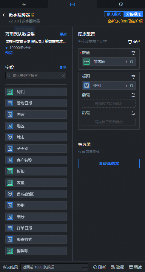
For more information about the BI analysis data configuration pane, see Introduction to the data pane in BI analysis mode.
Fields
Field | Description |
| The numeric value to display on the Ticker board. |
| (Optional) The title of the Ticker board. A value in this field overrides the title set in the configuration. |
| (Optional) The prefix for the Ticker board value. A value in this field overrides the prefix set in the configuration. |
| (Optional) The suffix for the Ticker board value. A value in this field overrides the suffix set in the configuration. |
If a widget is in analysis mode, you can click Default mode in the upper-right corner of the data pane. In the dialog box that appears, you can confirm to exit analysis mode and delete the corresponding BI analysis analyzer for the widget. After you exit analysis mode, the widget's data pane returns to default mode.
Interaction pane
Select Enable to turn on interactions for the widget. The When Value Changes and When the Ticker Board Is Clicked events trigger a callback, passing the value field from the data source by default. For more information about the configuration, see Configure a callback ID for a Ticker board widget.
Blueprint Editor interaction
- In Canvas Editor, right-click a widget in the Layer panel and select Add to Blueprint Editor.
- Click the icon in the upper-left corner of the page.
On the Blueprint Editor configuration page, click the Ticker board widget in the Import Nodes pane. You can see the Blueprint Editor configuration parameters for the Ticker board on the canvas, as shown in the following figure.
Events
Event
Description
When Data Request Succeeds
This event is triggered when the data API request is successful and the data has been processed by filters. The processed data is passed as a JSON object. For a data example, see the Data Response section on the Data tab.
When Data Request Fails
When a data API request fails (for example, due to network issues or API errors), this event is thrown after the response is returned and processed by a filter, and it includes the processed data in JSON format. For a specific data example, see the Data Response Result area on the Data tab of the configuration pane to the right of the widget in the canvas editor.
When Value Changes
This event is triggered when the current numeric value changes. The corresponding data item is passed with the event.
When Ticker Is Clicked
This event is triggered when the ticker is clicked. The corresponding data item is passed with the event.
Actions
Actions
Description
Request data
Re-requests data from the server. Data from upstream nodes is passed as parameters. For example, if a widget's API data source is
https://api.testand the data passed to the Request data action is{ id: '1'}, the final request URL will behttps://api.test?id=1.Import data
Imports data to re-render the widget without making a new server request. For a data example, see the Data response section on the Data tab.
Reset to zero
Resets the current number to zero. No parameters are required.
Update configuration
Dynamically updates the widget's style configuration. First, in the widget's Configuration pane, click Copy Configuration to Clipboard to get the configuration data. Then, modify the corresponding style field values in a data processing node within the Blueprint Editor.
Show
Shows the widget. Example data:
return {
  "animationType": "",
  "animationDuration": 1000,
  "animationEasing": "linear"
}
Hide
Hides the widget. Example data:
return {
  "animationType": "",
  "animationDuration": 1000,
  "animationEasing": "linear"
}
Toggle visibility
Toggles the widget's visibility. Example data:
return {
  "animationIn": {
    "animationType": "",
    "animationDuration": 1000,
    "animationEasing": "linear"
  },
  "animationOut": {
    "animationType": "",
    "animationDuration": 1000,
    "animationEasing": "linear"
  }
}
Move
Moves the widget to a specified position. Example data:
return {
  // Move type. 'to' for absolute positioning, 'by' for relative. Default: 'to'.
  "positionType": "to",
  // Target position. x and y coordinates.
  "attr": {
    "x": 0,
    "y": 0
  },
  // Animation settings.
  "animation": {
    "enable": false,
    // Animation duration.
    "animationDuration": 1000,
    // Easing function. Options: linear|easeInOutQuad|easeInOutExpo.
    "animationEasing": "linear"
  }
}
 icon in the upper-left corner of the page.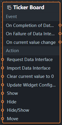
Example
This example uses three Ticker board widgets to dynamically sum values.
Log on to the DataV console.
Select a visualization and click Edit to enter the canvas editor.
Add three Ticker board widgets to the canvas.
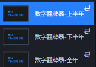
Click one of the tickers, go to the configuration pane, and change the Title > Title Content to First Half Sales. In the layer pane, double-click the widget name and change it to Ticker-FirstHalf. Repeat this process for the other two Ticker board widgets.
Select all widgets, right-click, and select Export to Blueprint Editor.
Add Serial Processing and Sequence Execution nodes, and then connect the widgets.
Serial Processing node: Generates random data when a ticker is clicked. The processing method is the same for both nodes. It generates a new value by adding a random number to a base value.
var value = Math.random() * 10000
return [
  {
    "name": "",
    "value": 12345 + value
  }
]
Sequence Execution node: This node first saves the incoming data to a temporary variable, then adds the values from the two source tickers and sends the sum to the destination widget.
// Variable A
return {
  data: [
    {
      name: "up",
      value: data[0].value || 0
    }
  ]
};
// Variable B return { data: [ { name: "down", value: data[0].value || 0 } ] };// A + Variable B let dowm = getLocalValue('dowm') || 0; let res = data && data.length !== 0 ? data[0].value + dowm : down return [{ value: res }];// B + Variable A let up = getLocalValue('up') || 0; let res = data && data.length !== 0 ? data[0].value + up : up return [{ value: res }];
Click the
icon in the upper-right corner of the page to preview the results.


 icon in the upper-right corner of the page to preview the results.