This topic describes the style and configuration items of the dropdown selector widget.
Chart style
The dropdown selector is a control widget that functions as a dropdown form in a visualization application. You can use it to submit selected data to the backend for processing or configure interactions to display the selected content on other widgets.
Configuration panel
- Search for Configurations: In the right-side panel of Canvas Editor, click the Settings tab, and click Search for Configurations in the upper-right corner. Enter the required configuration item in the search box, and click the search icon to quickly locate the configuration item. Fuzzy match is supported. For more information, see Search for Configurations.
- Size: indicates the size of a widget, including its pixel width and height. You can click the
 icon to proportionally adjust the width and height of a widget. After you click this icon again, you can adjust the width and height as needed.
 - Position: the position of a widget, which is indicated by pixel X and Y coordinates. X-coordinate indicates the pixel distance between the upper-left corner of the widget and the left border of the canvas. Y-coordinate indicates the pixel distance between the upper-left corner of the widget and the upper border of the canvas.
- Rotation Angle: the angle of a rotation that uses the center point of a widget as the rotation point. The unit is degrees (°). You can use one of the following methods to control the rotation angle of a widget:
- Directly enter the degrees in the Rotation Angle spin box or click the plus sign (+) or minus sign (-) to increase or decrease the value in the Rotation Angle spin box.
- Drag the black dot in the
 icon.
icon. - Click the
 icon to horizontally flip a widget.
 - Click the
 icon to vertically flip a widget.
- Opacity: the opacity of a widget. Valid values: 0 and 1. If this parameter is set to 0, the widget is hidden. If this parameter is set to 1, the widget is completely displayed. Default value: 1.
Input Box
Default Selection: Specifies the default selected item. The value must exist in the value field on the data panel. Otherwise, the text specified in Placeholder Text is displayed. The path to this option is .
Enhanced Features: Specifies enhanced styles for the input box.
Parameter
Description
Dropdown Search
Turn on this switch to enable searching and filtering the dropdown list by entering custom text in the input box. Turn off this switch to disable this feature.
Clear Selection
Turn on this switch to display a
 icon on the right side of the input box after an item is selected. Click the icon to clear the selection. Turn off this switch to disable this feature.
Customize Backfilled Content
The type of content to display in the input box after an item is selected from the dropdown list. Options are auto (displays all content by default), value (displays the value of the value field), and title (displays the value of the title field).
Border Style: Specifies the style of the input box border.
Parameter
Description
Default
The line weight, line type, line color, and border radius of the default border.
Hover
The line weight, line type, line color, and border radius of the border when the mouse pointer hovers over it.
Selected
Triggered when the input box border is clicked. Sets the border color. We recommend setting the selected color to the hover color with an opacity of 0.2.
Content Style: Specifies the style of the content in the input box.
Parameter
Description
Alignment
The alignment of the placeholder text in the input box. Options are Align left, Align center, and Align right.
Background Color
The background color of the input box. For more information, see Color picker.
Content Text
The style of the content text in the input box, including font, weight, size, and color.
Text Style
The style of the text entered during a search, the placeholder text, and the text displayed when the dropdown list is empty. Includes font, weight, size, and color.
Placeholder Text
The content of the placeholder text displayed when the input box is empty.
Arrow Style: Specifies the style of the dropdown arrow. You can click the
 icon to show or hide the arrow.
 Parameter
Description
Size
The size of the dropdown arrow.
Color
The color of the dropdown arrow.
Right Margin
The distance between the dropdown arrow and the right border of the widget.
Dropdown Box
Height: Specifies the height of the dropdown box.
Parameter
Description
List Height
The total height of the dropdown list.
Option Height
The height of each option in the dropdown list, in px.
Container Top Margin
The distance from the top of the dropdown container to the dropdown selector, in px.
Background: Specifies the background color of the dropdown box.
Border: Specifies the style of the dropdown box border.
Parameter
Description
Weight
The weight of the dropdown box border line.
Type
The line type of the dropdown box border. Options are Solid line, Dashed line, Dotted line, Double solid line, Groove effect, Emboss effect, Inset effect, and Outset effect.
Color
The color of the dropdown box border.
Border Radius
The border radius of the dropdown box. The value ranges from 0 to 360. A value of 0 creates a square. A value of 360 creates a circle.
Text: Specifies the style of the option text in the dropdown box.
Parameter
Description
Font
The font of the option text in the dropdown box.
Font Weight
The font weight of the option text in the dropdown box.
Font Size
The font size of the option text in the dropdown box.
Color
The color of the option text in the dropdown box.
Margin: Specifies the margin between the content of an option and its border.
Icon Configuration: Specifies the style of the icon to the left of the option text. You can click the
icon to show or hide the icon configuration. NoteThe Icon Configuration settings must correspond to the content of the imgSrc field on the data panel. In the sample data, the icon field is configured only for the first data item by default. To configure icons for other options, you can customize the imgSrc field for each data item.
Parameter
Description
Width
The width of the icon.
Height
The height of the icon.
Spacing from Text
The distance between the icon and the text.
Hover Style for Options
Parameter
Description
Background
The background color of an option when the mouse pointer hovers over it.
Text
The style of the text when the mouse pointer hovers over an option, including font, weight, size, and color.
Option Selected Style: Specifies the style of a selected option. You can configure this style in the same way as the option hover style.
 icon to show or hide the arrow.
 Data panel
Field description
Field |
Description |
|
The text displayed for each option in the dropdown selector. |
|
The actual value of each option in the dropdown selector. This field must be a string. It cannot be an integer. |
|
The default selected value for the dropdown selector. |
|
The icon for each option in the dropdown selector. It is displayed only when Icon Configuration is enabled in the configuration panel. |
| Parameter | Description |
| Controlled Mode | If you turn on the switch, data is not requested when a widget is initialized. Data requests are triggered only based on callback IDs or the method configured in Blueprint Editor. If you turn off the switch, data requests are automatically triggered. By default, the switch is turned off. |
| Auto Data Request | After you select the Auto Data Request check box, you can enable dynamic polling, and manually specify the polling interval. If you do not select this check box, data is not automatically requested. You must manually refresh the page to request data or use Blueprint Editor or callback ID events to trigger data requests. |
| Data Source | In the right-side panel of Canvas Editor, click the Data tab. Click Set next to Static Data. In the Configure Datasource panel, select a data source from the Data Source Type drop-down list. Enter code for data query in the code editor, click Preview Data Response to preview the response of the data source, and then view the response. For more information, see Configure asset data. |
| Data Filter | If you select the Data Filter check box, you can convert the data structure, filter data, and perform simple calculations. If you click the plus sign (+) next to Add Filter, you can configure the script for the data filter in the editor that appears. For more information, see Use the data filter. |
| Data Response Result | The response to a data request. If the data source changes, you can click the  icon next to Data Response Result to view the data response in real time. icon next to Data Response Result to view the data response in real time. |
Interaction panel
To enable the interaction feature, select Enable next to When an item is selected. The Dropdown selector widget has interaction configurations that allow you to change the selected item's content, trigger data requests, and pass callback values for other widgets to use. By default, the title, value, isDefaultShow, and imgSrc values from the data panel are passed. For more information, see How to configure a callback ID for a ticker board widget.
Blueprint editor interaction configuration
- In Canvas Editor, right-click a widget in the Layer panel and select Add to Blueprint Editor.
- Click the icon in the upper-left corner of the page.
On the blueprint editor configuration page, click the Dropdown selector widget in the imported nodes pane. The configuration parameters for the dropdown selector appear on the canvas, as shown in the following figure.
Events
Event
Description
After the API Description Request Completes
An event that is triggered after a data API request is successful and the response is processed by a filter. The processed data is passed in JSON format. For a data example, see the Data Response section on the Data tab of the configuration panel in the canvas editor.
When a request fails
An event that is triggered when a data API request fails (due to network issues, API errors, etc.) and the response is processed by a filter. The processed data is passed in JSON format. For a data example, see the Data Response section on the Data tab of the configuration panel in the canvas editor.
When an item is selected
An event that is triggered when an item in the dropdown list is selected. The data item corresponding to the selected value is passed.
Actions
Action
Description
Request API description
Re-requests data from the server-side. Data from input data processing nodes or layer nodes is used as parameters. For example, if a drop-down selector is configured with an API data source of
https://api.testand the data passed to the Request API description action is{ id: '1'}, the final request API ishttps://api.test?id=1.Import API description
Processes data in the component's drawing format, then imports the data to redraw the component. This action does not re-request server-side data. For a data example, see the Data Response area on the Data tab in the component's configuration panel in the canvas editor.
Set selected item
Sets the value of the current drop-down list. See the following data example.
return {
  "title": "Shanghai",
  "value": "Shanghai"
}
Clear selected item
Clears the value of the selected item in the drop-down list.
Get current drop-down value
Gets the value of the current drop-down list.
Update component configuration
Dynamically updates the style configuration of the component. First, get the component configuration data by clicking Copy Configuration to Clipboard in the component's Configuration panel. Then, change the field values for the corresponding styles in the data processing node on the blueprint editor's configuration page as needed.
Show
Shows the component. See the following data example.
return {
  "animationType": "",
  "animationDuration": 1000,
  "animationEasing": "linear"
};
Hide
Hides the component. See the following data example.
return {
  "animationType": "",
  "animationDuration": 1000,
  "animationEasing": "linear"
};
Toggle visibility
Toggles the component between shown and hidden. See the following data example.
return {
  "animationIn": {
    "animationType": "",
    "animationDuration": 1000,
    "animationEasing": "linear"
  },
  "animationOut": {
    "animationType": "",
    "animationDuration": 1000,
    "animationEasing": "linear"
  }
};
Move
Moves the component to a specified position. See the following data example.
return {
  // The move method. Absolute positioning: to. Relative positioning: by. Default value: to.
  "positionType": "to",
  // The specified position. x-coordinate, y-coordinate.
  "attr": {
    "x": 0,
    "y": 0
  },
  // The animation method.
  "animation": {
    "enable": false,
    // The animation duration.
    "animationDuration": 1000,
    // The animation curve. Optional values: linear, easeInOutQuad, or easeInOutExpo.
    "animationEasing": "linear"
  }
};
 icon in the upper-left corner of the page.
Demo
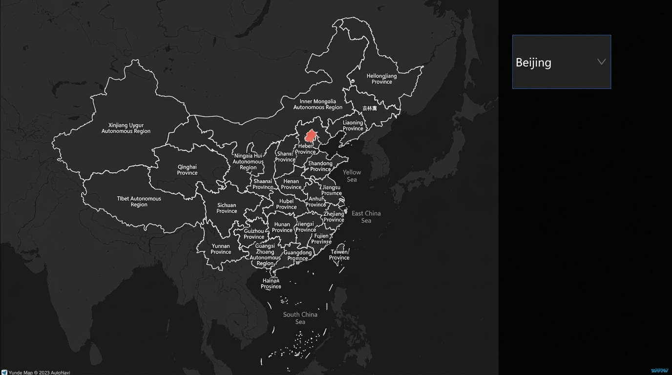
This demo shows how to use the selection feature of the dropdown selector to dynamically display a choropleth layer of city areas on a basic map.
Log on to the DataV console.
Select a visualization application and click Edit to open the canvas editor page.
Add a Dropdown selector widget and a Basic Map widget to the canvas.
Click the dropdown selector, select the Data panel, and modify the static data.
[
  {
    "title": "Beijing",
    "value": "Beijing",
    "lng": 116.40632076,
    "lat": 39.89450291,
    "isDefaultShow": true,
    "adcode": "110000",
    "colorField": 1200,
    "textureShapeField": "A",
    "textureColorField": 1200,
    "info": "Beijing City"
  },
  {
    "title": "Shanghai",
    "value": "Shanghai",
    "lng": 121.47299061,
    "lat": 31.22716135,
    "adcode": "310000",
    "colorField": 1200,
    "textureShapeField": "B",
    "textureColorField": 150,
    "info": "Shanghai City"
  },
  {
    "title": "Guangdong",
    "value": "Guangdong",
    "lng": 113.2571588,
    "lat": 23.09843572,
    "adcode": "440000",
    "colorField": 1200,
    "textureShapeField": "B",
    "textureColorField": 200,
    "info": "Guangdong Province"
  },
  {
    "title": "Shenzhen",
    "value": "Shenzhen",
    "lng": 114.05894426,
    "lat": 22.54231542,
    "adcode": "440300",
    "colorField": 1200,
    "textureShapeField": "B",
    "textureColorField": 700,
    "info": "Shenzhen City"
  },
  {
    "title": "Tianjin",
    "value": "Tianjin",
    "lng": 117.19545325,
    "lat": 39.07749431,
    "adcode": "120000",
    "colorField": 1200,
    "textureShapeField": "B",
    "textureColorField": 1500,
    "info": "Tianjin City"
  },
  {
    "title": "Chongqing",
    "value": "Chongqing",
    "lng": 106.54702949,
    "lat": 29.53667791,
    "adcode": "500000",
    "colorField": 1200,
    "textureShapeField": "B",
    "textureColorField": 800,
    "info": "Chongqing City"
  },
  {
    "title": "Jiangsu",
    "value": "Jiangsu",
    "lng": 118.7892579,
    "lat": 32.04676609,
    "adcode": "320000",
    "colorField": 1200,
    "textureShapeField": "B",
    "textureColorField": 100,
    "info": "Jiangsu Province"
  },
  {
    "title": "Sichuan",
    "value": "Sichuan",
    "lng": 104.04941941,
    "lat": 30.5477514,
    "adcode": "510000",
    "colorField": 1200,
    "textureShapeField": "B",
    "textureColorField": 1200,
    "info": "Sichuan Province"
  },
  {
    "title": "Hubei",
    "value": "Hubei",
    "lng": 114.30359243,
    "lat": 30.57913598,
    "adcode": "420000",
    "colorField": 1200,
    "textureShapeField": "B",
    "textureColorField": 400,
    "info": "Hubei Province"
  },
  {
    "title": "Shaanxi",
    "value": "Shaanxi",
    "lng": 108.92574006,
    "lat": 34.30156022,
    "adcode": "610000",
    "colorField": 1200,
    "textureShapeField": "B",
    "textureColorField": 600,
    "info": "Shaanxi Province"
  },
  {
    "title": "Qinghai",
    "value": "Qinghai",
    "lng": 101.78380219,
    "lat": 36.58760494,
    "adcode": "630000",
    "colorField": 1200,
    "textureShapeField": "B",
    "textureColorField": 200,
    "info": "Qinghai Province"
  }
]
Click the basic map, select Choropleth Layer, and delete the static data from the data source.
Right-click the component to import the dropdown selector, basic plane map, and choropleth layer into the blueprint editor.
Connect the widgets.
Configure the processing method for the serial data processing node.
Set the display position
return {
  "zoom": 7, // Zoom level
  "lat": data.lat, // Latitude
  "lng": data.lng, // Longitude
  "duration": 0.25 // Response time interval
}
Target choropleth layer
return [{
  "adcode": data.adcode,
  "name": data.name,
  "colorField": data.colorField,
  "textureShapeField": data.textureShapeField,
  "textureColorField": data.textureColorField,
  "info": data.info
}]
Click the
icon in the upper-right corner of the page to preview the result.
 icon in the upper-right corner of the page to preview the result.