ECharts basic line chart
This topic describes the styles and configuration options for an ECharts basic line chart.
Chart style
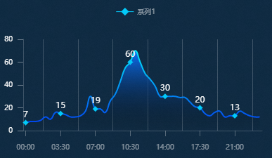
Configuration panel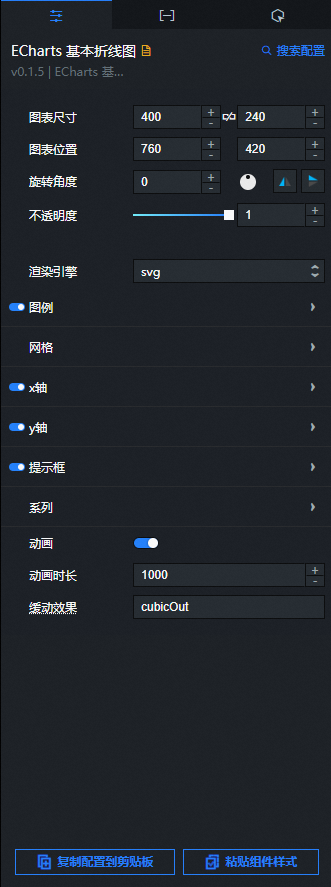
- Search for Configurations: In the right-side panel of Canvas Editor, click the Settings tab, and click Search for Configurations in the upper-right corner. Enter the required configuration item in the search box, and click the search icon to quickly locate the configuration item. Fuzzy match is supported. For more information, see Search for Configurations.
- Size: indicates the size of a widget, including its pixel width and height. You can click the
 icon to proportionally adjust the width and height of a widget. After you click this icon again, you can adjust the width and height as needed.
 - Position: the position of a widget, which is indicated by pixel X and Y coordinates. X-coordinate indicates the pixel distance between the upper-left corner of the widget and the left border of the canvas. Y-coordinate indicates the pixel distance between the upper-left corner of the widget and the upper border of the canvas.
- Rotation Angle: the angle of a rotation that uses the center point of a widget as the rotation point. The unit is degrees (°). You can use one of the following methods to control the rotation angle of a widget:
- Directly enter the degrees in the Rotation Angle spin box or click the plus sign (+) or minus sign (-) to increase or decrease the value in the Rotation Angle spin box.
- Drag the black dot in the
 icon.
icon. - Click the
 icon to horizontally flip a widget.
 - Click the
 icon to vertically flip a widget.
- Opacity: the opacity of a widget. Valid values: 0 and 1. If this parameter is set to 0, the widget is hidden. If this parameter is set to 1, the widget is completely displayed. Default value: 1.
Rendering engine: Sets the rendering engine for the line chart. The options are canvas and svg.
Legend: Click the eye icon to view the legend settings.
Horizontal position: Select the horizontal alignment for the legend markers and text.
Automatic: The default setting is Automatic. The value is determined based on the position and orientation of the component.
Left Align: When the graphic is to the left of the text, it is Left Align.
Center Align: When the legend symbol and text overlap, the alignment is Center Align.
Right align: When the graphic is to the right of the text, it is right-aligned.
Vertical position: Select the vertical alignment for the legend markers and text.
Automatic: The default is Automatic, which is determined by the position and orientation of the component.
Top align: The alignment is Top align when the shape is at the top of the window.
Center alignment: When the graphic is in the center of the window, the alignment is Center alignment.
Bottom Align: When a graphic is at the bottom of the window, this is Bottom Align.
Orientation: Select the legend's layout orientation.
Horizontal: Arranges legend items horizontally.
Vertical: Arranges legend items vertically.
Padding: Enter a value, or click + or -, to set the legend padding in pixels (px). The default padding for all sides is 5.
Item gap: Enter a value, or click + or -, to set the spacing between legend items. This setting controls horizontal spacing in a horizontal layout and vertical spacing in a vertical layout.
Text style
Color: See Color picker instructions to change the color of the legend text.
Font Style: Sets the font style of the legend text.
Font Weight: Sets the font weight of the legend text.
Font: Sets the font family of the legend text.
Font size: Click + or -, or manually enter a value to change the font size of the legend.
Grid: Click the
icon to view the grid settings.Left margin: Click + or -, or enter a value to adjust the left margin of the grid in pixels (px).
Top margin: Click + or -, or enter a value to adjust the top margin of the grid in pixels (px).
Right margin: Click + or -, or enter a value to adjust the right margin of the grid in pixels (px).
Bottom margin: Click + or -, or enter a value to adjust the bottom margin of the grid in pixels (px).
x-axis: Click the eye icon to view the x-axis settings.
Position: Sets the position of the x-axis in the chart area.
Bottom: Places the x-axis at the bottom of the chart area.
Top: Places the x-axis at the top of the chart area.
Name: Sets a custom name for the x-axis.
Name position: Sets the position of the axis name. The options are Start, End, and Center. The default value is End.
Name style
Color: See Color picker instructions to change the color of the x-axis name.
Font Style: Sets the font style of the x-axis name.
Font Weight: Sets the font weight of the x-axis name.
Font: Sets the font family of the x-axis name.
Font size: Click + or -, or manually enter a value to change the font size of the x-axis name.
Name gap: Click + or -, or enter a value to change the distance between the axis name and the axis line.
Name rotation: Click + or -, or enter a value to change the rotation angle of the axis name.
Inverse: If selected, the axis displays in reverse order. If cleared, it displays in the default order.
Boundary gap: If selected, padding is added to both ends of the axis so that the first and last data points do not touch the edges of the chart. If cleared, no padding is added.
Static: If selected, the axis becomes static and does not respond to user interactions.
Axis line: Click the eye icon to view the x-axis line.
On zero: Sets whether the x-axis or y-axis line renders at the other axis's zero-scale mark. This setting applies only when the other axis is numerical and includes a zero-scale mark.
Line style
Color: See Color picker instructions to change the color of the x-axis line.
Width: Click + or -, or enter a value to change the width of the x-axis line.
Type: Sets the type of the axis line. The options are Solid, Dashed, and Dotted.
Opacity: Click + or -, or enter a value to change the opacity of the x-axis line. The value must be between 0 and 1.
Tick lines: Click the eye icon to view the x-axis tick lines.
Align with labels: Aligns tick lines with labels when the margin option is selected.
Inside: When selected, the axis ticks point inward. When cleared, they point outward.
Length: Click + or -, or enter a value to change the length of the axis tick marks.
Line style
Color: See Color picker instructions to change the color of the tick lines.
Width: Click + or -, or enter a value to change the width of the tick lines.
Type: Sets the type of the tick lines. The options are Solid, Dashed, and Dotted.
Opacity: Click + or -, or enter a value to change the opacity of the tick lines. The value must be between 0 and 1.
Tick labels: Click the eye icon to view the x-axis tick labels.
Display format: Sets the display format for tick labels, for example, 06, 06:00, or 06h.
Label Interval: The display interval of tick labels on an axis. This parameter takes effect only on category axes. By default, labels are displayed at an interval that prevents them from overlapping. You can set this parameter to 0 to force all labels to be displayed. If this parameter is set to 1, every other label is displayed. If the value is 2, every third label is displayed, and so on.
Inside: If selected, the tick labels are displayed inside the axis. If cleared, they are displayed outside.
Rotation: The rotation angle of the tick labels, from -90 to 90 degrees. This can prevent labels from overlapping when there is not enough space on the axis.
Margin: The distance between the tick labels and the axis line.
Show min label: If selected, the minimum tick label is always displayed. By default, this is determined automatically; the minimum label is hidden if it overlaps with other labels.
Show max label: If selected, the maximum tick label is always displayed. By default, this is determined automatically; the maximum label is hidden if it overlaps with other labels.
Color: See Color picker instructions to change the color of the tick labels.
Font Style: Sets the font style of the tick labels.
Font Weight: Sets the font weight of the tick labels.
Font: Sets the font family of the tick labels.
Font Size: Sets the font size of the tick labels.
Grid lines: Click the eye icon to view grid lines.
Line style
Color: See Color picker instructions to change the color of the x-axis grid lines.
Width: Click + or -, or enter a value to change the width of the x-axis grid lines.
Type: Sets the type of the x-axis grid lines. The options are Solid, Dashed, and Dotted.
Opacity: Click + or -, or enter a value to change the opacity of the x-axis grid lines. The value must be between 0 and 1.
y-axis: See the x-axis settings for configuration options.
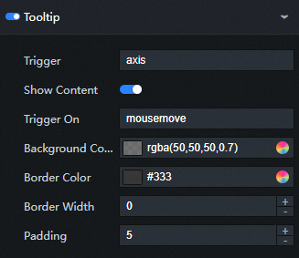
Tooltip: Click the eye icon to view the tooltip settings.
Trigger type: Sets the tooltip trigger method. The default is Axis.
Item: Triggered by a data item. This is typically used for charts without a category axis, such as scatter plots and pie charts.
Axis: Triggered by an axis. This is typically used for charts with a category axis, such as bar charts and line charts.
None: The tooltip is not triggered.
Axis pointer: Click the eye icon to view the axis pointer settings.
Type: Sets the type of the pointer. The options are Line, Shadow, and Cross.
Snap to point: If selected, the axis pointer automatically snaps to the nearest data point. This is useful for numerical and time axes, as it helps to locate specific data points.
Indicator line style
Color: See Color picker instructions to change the color of the indicator line.
Width: Click + or -, or enter a value to change the width of the indicator line.
Type: Sets the type of the indicator line. The options are Solid, Dashed, and Dotted.
Opacity: Click + or -, or enter a value to change the opacity of the indicator line. The value must be between 0 and 1.
Indicator shadow style
Color: See Color picker instructions to change the color of the indicator shadow.
Opacity: Click + or -, or enter a value to change the opacity of the indicator shadow. The value must be between 0 and 1.
Indicator cross style
Color: See Color picker instructions to change the color of the crosshair.
Width: Click + or -, or enter a value to change the line width of the crosshair.
Type: Sets the line type of the crosshair. The options are Solid, Dashed, and Dotted.
Opacity: Click + or -, or enter a value to change the opacity of the crosshair. The value must be between 0 and 1.
Background color: Sets the background color of the tooltip.
Text style
Color: See Color picker instructions to change the color of the tooltip text.
Font Style: Sets the font style of the tooltip text.
Font Weight: Sets the font weight of the tooltip text.
Font: Sets the font family of the tooltip text.
Font Size: Sets the font size of the tooltip text.
Series: Click the
icon to add or the icon to delete a conditional style. Click the or icon to arrange the order of multiple conditional styles. Click the icon to duplicate the currently selected conditional style and add it as a new one.Name: Sets a custom series name. This name must correspond to the value of the s field in the data source.
Symbol: Sets the symbol for data markers. The default is Circle. Symbol types include None, Circle, Rect, Round Rect, Triangle, Diamond, Pin, and Arrow. For more information, see the official ECharts website.
Symbol size: Click + or -, or enter a value to change the size of the markers in pixels (px).
Symbol rotation: Click + or -, or enter a value to change the rotation angle of the markers in degrees.
Show symbol: Click the eye icon to view the symbol style.
Hover animation: If selected, enables animation effects on mouse hover.
Legend hover link: If selected, enables linked highlighting when hovering over the legend.
Step: Sets the style of the step line chart. The options are Off, Start (turns at the current data point), Middle (turns at the midpoint between data points), and End (turns at the next data point).
Label: Click the eye icon to view the label style.
Position: Sets the position of the label relative to the line chart, including but not limited to top, left, and inside.
Distance: Sets the distance of the label from the top border line of the line chart.
Rotation: The rotation angle of the labels, from -90 to 90 degrees. This can prevent labels from overlapping.
Color: See Color picker instructions to change the color of the label text.
Font Style: Sets the font style of the label text.
Font Weight: Sets the font weight of the label text.
Font: Sets the font family of the label text.
Font Size: Sets the font size of the label text.
Item style
Color: See Color picker instructions to change the color of the item style.
Opacity: Click + or -, or enter a value to change the item opacity. The value must be between 0 and 1.
Line style
Color: See Color picker instructions to change the color of the line.
Width: Click + or -, or enter a value to change the line width.
Type: Sets the line type. The options are Solid, Dashed, and Dotted.
Opacity: Click + or -, or enter a value to change the opacity of the line. The value must be between 0 and 1.
Area style
Color: See Color picker instructions to change the color of the area style.
Opacity: Click + or -, or enter a value to change the opacity of the area fill. The value must be between 0 and 1.
Smooth: Adjusts the smoothness of the curve. Click + or -, or enter a value. The value ranges from 0 (for a polyline) to 1 (for a very smooth curve).
Animation: If selected, enables animation effects.
Animation duration: Click + or -, or enter a value to set the duration of the initial animation in milliseconds.
Easing effect: From the drop-down list, select the easing effect for the data update animation. The default is cubicOut.
 icon to vertically flip a widget.
 icon to view the grid settings.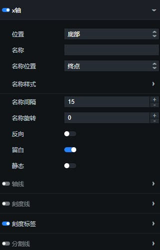
 icon to add or the
  icon to delete a conditional style. Click the
  or
or  icon to arrange the order of multiple conditional styles. Click the
  icon to duplicate the currently selected conditional style and add it as a new one.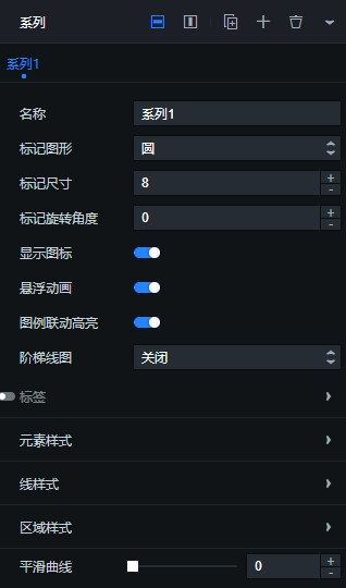
Data panel
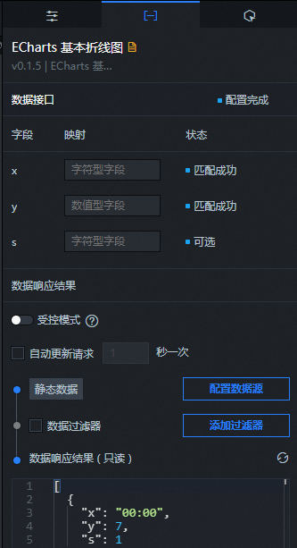
Field descriptions
Field | Description |
| Configures the category values for the x-axis. |
| Configures the value for each data point in the line chart. |
| (Optional) The series value. This is used with the Series configuration in the style panel. |
Parameter | Description |
Controlled mode | If enabled, the component does not request data on initialization. Data requests can be initiated only through a callback ID or a method in the Blueprint Editor. When disabled, data can be requested using the auto-update feature. This option is disabled by default. |
Auto update request | If selected, you can set up dynamic polling and specify the polling frequency. If this option is cleared, data is not updated automatically. You must manually refresh the page or trigger a data update through the Blueprint Editor or a callback ID event. |
Data source | Click Configure data source. In the Set data source panel, you can change the data source type and data query code, preview the response from the data source, and view the data response result. For more information, see Configure asset data. |
Data filter | A data filter provides features for data structure transformation, filtering, and simple calculations. Click Add Filter to configure a data filter script in the Set data source panel. For more information, see Use data filters. |
Data response result | Displays the response from the data request. When the data source changes, you can click the |
 icon on the right to view the real-time data response.
Interaction panel
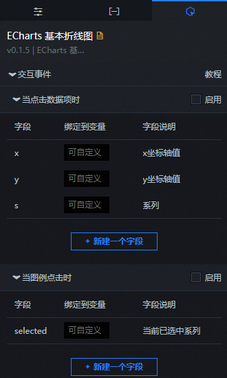
Interaction configuration
Interaction | Description |
When data item is clicked | Select Enable to turn on the component interaction feature. The basic line chart component has interaction configurations and emits a callback value when you click a data item. By default, this value contains the x and y fields from the data. For more information, see How to configure the callback ID of the digital flipper component. |
When legend is clicked | Select Enable to enable the component interaction feature. The Basic line chart component supports interactions. When you click a legend, the component returns a callback value. By default, it returns the selected field from the data. For more information, see How to configure the callback ID for a digital flipper component. |
Blueprint Editor interactions
On the canvas editor page, right-click the component and select Export to Blueprint Editor.
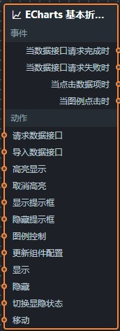
Click the
icon in the upper-left corner of the page.On the Blueprint Editor configuration page, click the basic line chart component in the imported nodes panel. Its configuration parameters then appear on the canvas, as shown in the following figure.
Events
Event
Description
When data request is successful
This event triggers after a data API request is successfully returned and processed by a data filter. It emits the processed data in JSON format. For a data example, see the Data Response Result area on the Data tab of the component's configuration panel in the canvas editor.
When data request fails
This event triggers if a data API request fails (for example, due to a network issue or an API error). It emits the error data after it has been processed by a data filter. For a data example, see the Data Response Result area on the Data tab of the component's configuration panel in the canvas editor.
When data item is clicked
This event is triggered when a data point in the basic line chart is clicked. It emits the corresponding data item.
When legend is clicked
This event is triggered when a legend item in the basic line chart is clicked. It emits the corresponding data item.
Actions
Actions
Description
Request data API
Requests data from the server again, using data from upstream data processing or layer nodes as parameters. For example, if a basic line chart is configured with an API data source of
https://api.testand the data passed to the Request data API action is{ id: '1'}, the final API request will behttps://api.test?id=1.Import data
Imports data that matches the component's format and redraws the chart. This action does not rerequest data from the server. For a data example, see the Data Response Result area on the Data tab of the component's configuration panel in the canvas editor.
Highlight
The data passed to this action is an object. Parameters include
seriesName(series name),seriesIndex(series index),dataIndex(data index), andname(data name). Example data:{ "seriesName": "", "seriesIndex": 1, "dataIndex": 1, "name": "" }Downplay
The data passed to this action is an object. Parameters include
seriesName(series name),seriesIndex(series index),dataIndex(data index), andname(data name). Example data:{ "seriesName": "", "seriesIndex": 1, "dataIndex": 1, "name": "" }Show tooltip
The data passed to this action is an object. Parameters include
dataindex(data index),name(data name),x(X-coordinate position), andy(Y-coordinate position). Example data:{ "dataIndex": 1, "name": "", "x": 1, "y": 1 }Hide tooltip
Hides the tooltip. No parameters are required.
Legend control
The data passed to this action is an object. Parameters include
type(legend action type) andname(legend name). Example data:{ "type": "legendToggleSelect", "name": "" }Update component configuration
Dynamically updates the component's style configuration. To do this, copy the configuration data from the configuration panel by clicking Copy Configuration to Clipboard. Then, use a data processing node in the Blueprint Editor to modify the style fields.
Show
Shows the component. For sample data, see the following example:
return{
  "animationType": "",
  "animationDuration": 1000,
  "animationEasing": "linear"
}
Hide
Hides the component. For sample data, see the following example:
return{
  "animationType": "",
  "animationDuration": 1000,
  "animationEasing": "linear"
}
Toggle visibility
Toggles the visibility of the component. For sample data, see the following example:
return {
  "animationIn": {
    "animationType": "",
    "animationDuration": 1000,
    "animationEasing": "linear"
  },
  "animationOut": {
    "animationType": "",
    "animationDuration": 1000,
    "animationEasing": "linear"
  }
}
Move
Moves the component to a specified position on the canvas. For sample data, see the following example:
    return{
      // Movement method. `to` for absolute positioning, `by` for relative positioning. Default: `to`.
        "positionType": "to",
      // Target position, specified by x and y coordinates.
      "attr": {
        "x": 0,
        "y": 0
      },
      // Animation settings.
      "animation": {
        "enable": false,
        // Animation duration.
        "animationDuration": 1000,
        // Easing curve. Options: `linear`, `easeInOutQuad`, `easeInOutExpo`.
        "animationEasing": "linear"
      }
    }
 icon in the upper-left corner of the page.