This topic describes the chart styles and configuration items for the list carousel widget.
Chart style
The list carousel is a type of table widget. You can customize the style and content of each row and column. You can also configure hyperlinks and use images in the list content. The widget uses a carousel animation to display data in a list on your visualization application.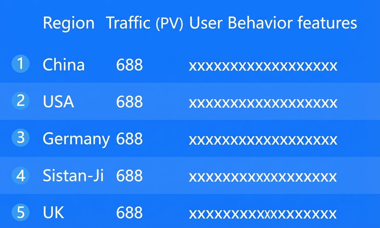
Configuration panel
- Search for Configurations: In the right-side panel of Canvas Editor, click the Settings tab, and click Search for Configurations in the upper-right corner. Enter the required configuration item in the search box, and click the search icon to quickly locate the configuration item. Fuzzy match is supported. For more information, see Search for Configurations.
- Size: indicates the size of a widget, including its pixel width and height. You can click the
 icon to proportionally adjust the width and height of a widget. After you click this icon again, you can adjust the width and height as needed.
 - Position: the position of a widget, which is indicated by pixel X and Y coordinates. X-coordinate indicates the pixel distance between the upper-left corner of the widget and the left border of the canvas. Y-coordinate indicates the pixel distance between the upper-left corner of the widget and the upper border of the canvas.
- Rotation Angle: the angle of a rotation that uses the center point of a widget as the rotation point. The unit is degrees (°). You can use one of the following methods to control the rotation angle of a widget:
- Directly enter the degrees in the Rotation Angle spin box or click the plus sign (+) or minus sign (-) to increase or decrease the value in the Rotation Angle spin box.
- Drag the black dot in the
 icon.
icon. - Click the
 icon to horizontally flip a widget.
 - Click the
 icon to vertically flip a widget.
- Opacity: the opacity of a widget. Valid values: 0 and 1. If this parameter is set to 0, the widget is hidden. If this parameter is set to 1, the widget is completely displayed. Default value: 1.
Global
Number of Rows: The number of rows in the list carousel table.
Enable Carousel: Turn on this switch to automatically scroll the list content in preview or published mode. If this switch is off, you cannot configure animation styles.
Font: The font for all text in the widget. The default font is Microsoft YaHei.
Animation: This setting takes effect only when Enable Carousel is turned on.
Parameter
Description
Animation Mode
The animation mode for the carousel. Options are Scroll All and Scroll One by One.
Carousel Interval (s)
The time between scrolls, in seconds.
No Carousel for Single Page
Turn on this switch to prevent the carousel from scrolling if the number of data entries is less than the number of table rows (only one page of data).
Highlight: The style for a highlighted row in the carousel table. You can click the
 icon to show or hide the highlight style.
Parameter
Description
Auto Highlight in Sequence
Turn on this switch to automatically highlight each row in sequence as the list scrolls. Turn off this switch to highlight a specific row.
Highlight by Serial Number
Enter the serial number of a row to highlight it. This setting takes effect only when Auto Highlight in Sequence is turned off.
Highlight Style
The style of the highlighted row in the carousel table.
Text Style: The text style for the highlighted row, including font style, font weight, font size, and color.
Background Color: The background color of the highlighted row.
Border: The border style of the highlighted row, including border thickness, border line type, and border color.
NoteIf the border color is a gradient, the border type has no effect.
Hide Row on Empty Value: Turn on this switch to automatically hide a row if its content is empty.
Scroll Overflow Text
Parameter
Description
Enable Scrolling
Turn on this switch to automatically scroll overflowing text in preview or published mode.
Constant Speed Scroll
Turn on this switch to scroll overflowing text at a constant speed in preview or published mode.
Speed
Set the speed for constant scrolling in px/s. This can be set only when Constant Speed Scroll is turned on.
Scroll Duration (s)
The time it takes for overflowing text to scroll, in seconds. This can be set only when Constant Speed Scroll is turned off.
Update Immediately: Turn on this switch to update the view as soon as the data changes. If this switch is off, the view updates on the next carousel cycle.
Default Image: The URL of a default image to display when a custom column of the image type does not have a valid image URL.
NoteSupported formats include png, jpg, gif, and jpeg.
Table Header: The style of the table header. You can click the
icon to show or hide the table header.Parameter
Description
Header Row Height (%)
The height of the table header as a percentage of the total chart height. The value range is 0 to 100.
Background Color
The background color of the table header. For more information, see Color picker description.
Text Style
The style of the text in the table header.
Text Alignment: The alignment of the text. Options: Align Left, Align Center, and Align Right.
Font: The font family. The default is Microsoft Yahei.
Font Color: The color of the text.
Font Size: The size of the text. The value range is 0 to 200.
Font Weight: The weight of the text.
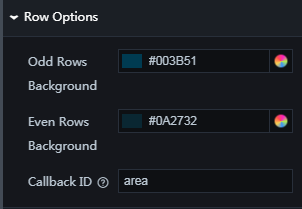
Row Configuration
Parameter
Description
Odd Row Background Color
The background color for odd-numbered rows in the list.
Even Row Background Color
The background color for even-numbered rows in the list.
Callback Field
The field to be used as a callback parameter. You need to select a field from the data.
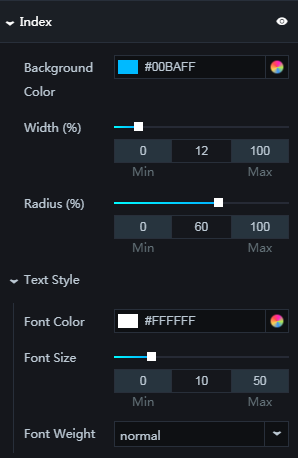
Serial Number: The style of the serial number column. You can click the
icon to show or hide this column.Parameter
Description
Background Color
The background color of the serial number.
Column Width Ratio (%)
The width of the serial number column as a percentage of the list width. The value range is 0 to 100.
Radius Ratio (%)
The radius of the serial number background as a percentage of the serial number column width. The value range is 0 to 100.
Text Style
The style of the serial number text, including font, color, font size, and font weight.
Custom Columns: You can click the
or icon on the right to add or delete a custom column. You can click the or icon to arrange the order of the columns. You can click the icon to copy the selected column's configuration and add it as a new column.NoteThis configuration is an array that can hold multiple custom columns. The editor iterates through the data and renders it using the custom column configurations in a loop. To apply a specific style to certain data, you must sort the data manually.
Parameter
Description
Column Field Name
The field name corresponding to the custom column. This must match the type field in the data.
Column Display Name
The display name for the custom column. This name appears as the table header content.
Column Width Ratio (%)
The width of the custom column as a percentage of the list width. The value range is 0 to 100. The sum of all column width ratios must be 100%. If it exceeds 100%, the widths will deviate from the values you entered.
Content Type
The content type of the custom column. Options are Text and Image.
NoteIf you set Content Type to Image, make sure the corresponding field in your data contains a valid image URL.
Image Width
The width of the image in the custom column, in px. This can be configured only when Content Type is set to Image.
Image Margin
The margin of the image in the custom column, including the margin from the left and top edges of the column, in px. This can be configured only when Content Type is set to Image.
Auto Wrap
Turn on this switch to automatically wrap the content of the custom column. This can be configured only when Content Type is set to Text.
Text Alignment
The text alignment for the custom column. Options: Align Left, Align Center, and Align Right. This can be configured only when Content Type is set to Text.
Text Style
The text style for the custom column. This can be configured only when Content Type is set to Text.
Font: The font for the custom column text. The default is Microsoft Yahei.
Font Weight: The font weight of the custom column text.
Font Size: The text size for the custom column. The value range is 0 to 200.
Color: The text color for the custom column.
 icon to show or hide the highlight style.
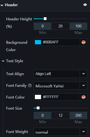
 or
or  icon on the right to add or delete a custom column. You can click the
  or
or  icon to arrange the order of the columns. You can click the
  icon to copy the selected column's configuration and add it as a new column.
Data panel
You can configure the fields as needed. The fields must correspond to the values you set for Column Field Name under Custom Columns on the Configuration tab. To create a hyperlink, you can set the field content as an <a> tag.
| Parameter | Description |
| Controlled Mode | If you turn on the switch, data is not requested when a widget is initialized. Data requests are triggered only based on callback IDs or the method configured in Blueprint Editor. If you turn off the switch, data requests are automatically triggered. By default, the switch is turned off. |
| Auto Data Request | After you select the Auto Data Request check box, you can enable dynamic polling, and manually specify the polling interval. If you do not select this check box, data is not automatically requested. You must manually refresh the page to request data or use Blueprint Editor or callback ID events to trigger data requests. |
| Data Source | In the right-side panel of Canvas Editor, click the Data tab. Click Set next to Static Data. In the Configure Datasource panel, select a data source from the Data Source Type drop-down list. Enter code for data query in the code editor, click Preview Data Response to preview the response of the data source, and then view the response. For more information, see Configure asset data. |
| Data Filter | If you select the Data Filter check box, you can convert the data structure, filter data, and perform simple calculations. If you click the plus sign (+) next to Add Filter, you can configure the script for the data filter in the editor that appears. For more information, see Use the data filter. |
| Data Response Result | The response to a data request. If the data source changes, you can click the  icon next to Data Response Result to view the data response in real time. icon next to Data Response Result to view the data response in real time. |
Interaction panel
Interaction Occurrence |
Description |
On Row Click |
Select Enable to turn on the widget's interaction feature. You can click a row in the list carousel to trigger a callback. By default, the area, pv, and attribute fields are returned. For more information, see Configure widget callback IDs. |
On Data Scroll |
Select Enable to activate the widget's interaction feature. When you scroll through the data in the list, a callback value is emitted. By default, the emitted value is from the index (index value) field. For more information, see Widget Callback ID Configuration. |
On Highlight |
Select Enable to turn on the widget's interaction feature. When a data row in the list is highlighted, a callback is triggered. By default, the index (index value) field is returned. For more information, see Configure widget callback IDs. |
On Carousel Loop End |
Select Enable to turn on the widget's interaction feature. When the data rows have completed one full scroll cycle, a callback is triggered. By default, the message and isEnding fields are returned. For more information, see Configure widget callback IDs. |
Blueprint Editor interaction configuration
- In Canvas Editor, right-click a widget in the Layer panel and select Add to Blueprint Editor.
- Click the icon in the upper-left corner of the page.
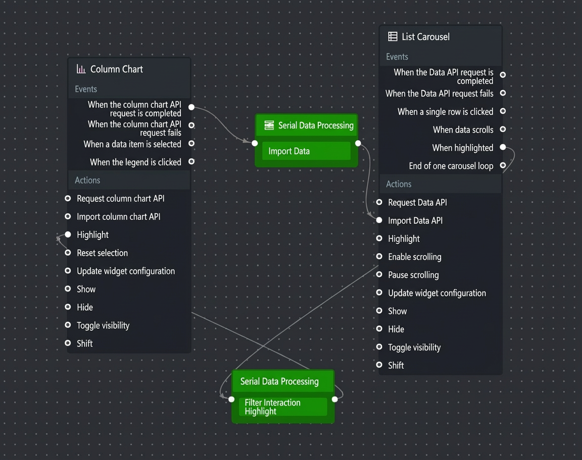
On the Blueprint Editor configuration page, click the List Carousel widget in the imported nodes bar. The configuration parameters for the list carousel in the Blueprint Editor are shown in the following figure.
Events
Event
Description
On Data API Request Completion
An event that is triggered after the data API request is returned and processed by the filter. The processed data is returned in JSON format. For a data sample, see the Data Response area on the Data tab of the widget's configuration panel in the canvas editor.
When data API request fails
An event that is triggered when the data API request fails (due to network issues, API errors, etc.) and is processed by the filter. The processed data is returned in JSON format. For a data sample, see the Data Response area on the Data tab of the widget's configuration panel in the canvas editor.
On Row Click
Triggers an event and returns the data of the current row when a row in the list carousel is clicked.
On Data Scroll
Triggers an event and returns the data and index value of the current page when the data rows in the list carousel scroll.
On Highlight
Triggers an event and returns the data and index value of the current page when a data row in the list carousel is highlighted.
Scroll Cycle Completed
Triggers an event and returns the description message and end status when the list carousel completes one scroll cycle.
Actions
Action
Description
Request data API
Sends a new request for server-side data. Data from upstream data processing nodes or layer nodes is passed as parameters. For example, if a list carousel has its API data source set to
https://api.testand the data passed to the Request data API action is{ id: '1'}, the final API request ishttps://api.test?id=1.Import data API
Processes data in the component's rendering format, then imports the data to redraw the component. For a data example, see the Data Response area on the Data tab in the component's configuration panel in the canvas editor.
Highlight
Highlights a data row in the list carousel. The following is a reference data example.
return {
  "isOrder": true,
  "hightLightIndex": "1",
  "hightLightStyle": {
    "color": "#f00",
    "borderColor": "#f00",
    "borderWidth": 1,
    "backgroundColor": "yellow",
    "fontSize": 12,
    "fontWeight": "normal",
    "fontFamily": "Microsoft Yahei"
  }
}
Start scrolling
Starts the carousel scroll. The action accepts data of the object type. The following is an example.
return {
  "isLoop": true // Specifies whether to loop the carousel. Default: true.
}
Pause scrolling
Pauses the scroll. No parameters are required.
Update component configuration
Dynamically updates the style configuration of the component. In the component's Configuration panel, click Copy Configuration to Clipboard to get the component configuration data. Then, in the data processing node on the blueprint editor's configuration page, change the field values for the corresponding styles as needed.
Show
Shows the component. The following is a reference data example.
return {
  "animationType": "",
  "animationDuration": 1000,
  "animationEasing": "linear"
};
Hide
Hides the component. The following is a reference data example.
return {
  "animationType": "",
  "animationDuration": 1000,
  "animationEasing": "linear"
};
Toggle visibility
Toggles the component's visibility. The following is a reference data example.
return {
  "animationIn": {
    "animationType": "",
    "animationDuration": 1000,
    "animationEasing": "linear"
  },
  "animationOut": {
    "animationType": "",
    "animationDuration": 1000,
    "animationEasing": "linear"
  }
};
Move
Moves the component to a specified position. The following is a reference data example.
return {
  // Movement type. 'to' for absolute, 'by' for relative. Default: 'to'.
  "positionType": "to",
  // Target position (x and y coordinates).
  "attr": {
    "x": 0,
    "y": 0
  },
  // Animation settings.
  "animation": {
    "enable": false,
    // Animation duration.
    "animationDuration": 1000,
    // Animation curve. Valid values: 'linear', 'easeInOutQuad', 'easeInOutExpo'.
    "animationEasing": "linear"
  }
};
 icon in the upper-left corner of the page.
Demo
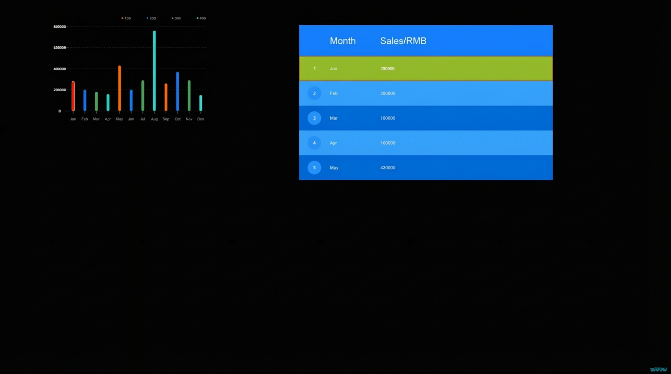
This demo uses a column chart and a list carousel to display annual sales figures, with data scrolling monthly.
Log on to the DataV console.
Select a visualization application and click Edit to go to the canvas editor page.
Add a Column Chart widget and a List Carousel widget to the canvas.
Click the column chart, select the Data panel, and modify the static data.
[
  {
    "colorField": 100,
    "x": "Jan",
    "y": 280000
  },
  {
    "colorField": 200,
    "x": "Feb",
    "y": 200000
  },
  {
    "colorField": 300,
    "x": "Mar",
    "y": 180000
  },
  {
    "colorField": 400,
    "x": "Apr",
    "y": 160000
  },
  {
    "colorField": 100,
    "x": "May",
    "y": 430000
  },
  {
    "colorField": 200,
    "x": "Jun",
    "y": 200000
  },
  {
    "colorField": 300,
    "x": "Jul",
    "y": 290000
  },
  {
    "colorField": 400,
    "x": "Aug",
    "y": 760000
  },
  {
    "colorField": 100,
    "x": "Sep",
    "y": 260000
  },
  {
    "colorField": 200,
    "x": "Oct",
    "y": 370000
  },
  {
    "colorField": 300,
    "x": "Nov",
    "y": 290000
  },
  {
    "colorField": 400,
    "x": "Dec",
    "y": 150000
  }
]
Select the Configuration panel. Set the number of labels to display for Coordinates > X-axis > Axis Label > Label Display to 12, and turn off the Animation Switch.
Select the list carousel. Modify the Column Field Name and Column Display Name for the custom columns, and turn on the Highlight switch under Global Settings.
Column Field Name-Column Display Name: Month-Month
Column Field Name-Column Display Name: Total-Sales
Right-click the widgets and import them into the Blueprint Editor.
Connect the widgets.
Configure the processing method for the serial data processing node.
Import Data
return data.map(i => {
  return {
    month: i.x,
    Total: i.y
  }
})
Filter Interaction Highlight
return {
  "data": {
    "x": data.data[0].month,
    "y": data.data[0].Total
  },
  "style": {
    "fillStyle": "#f00"
  }
}
Click the
icon in the upper-right corner of the page to preview the results.
 icon in the upper-right corner of the page to preview the results.