This topic describes the style and configuration items of the Number Input Box widget.
Chart style
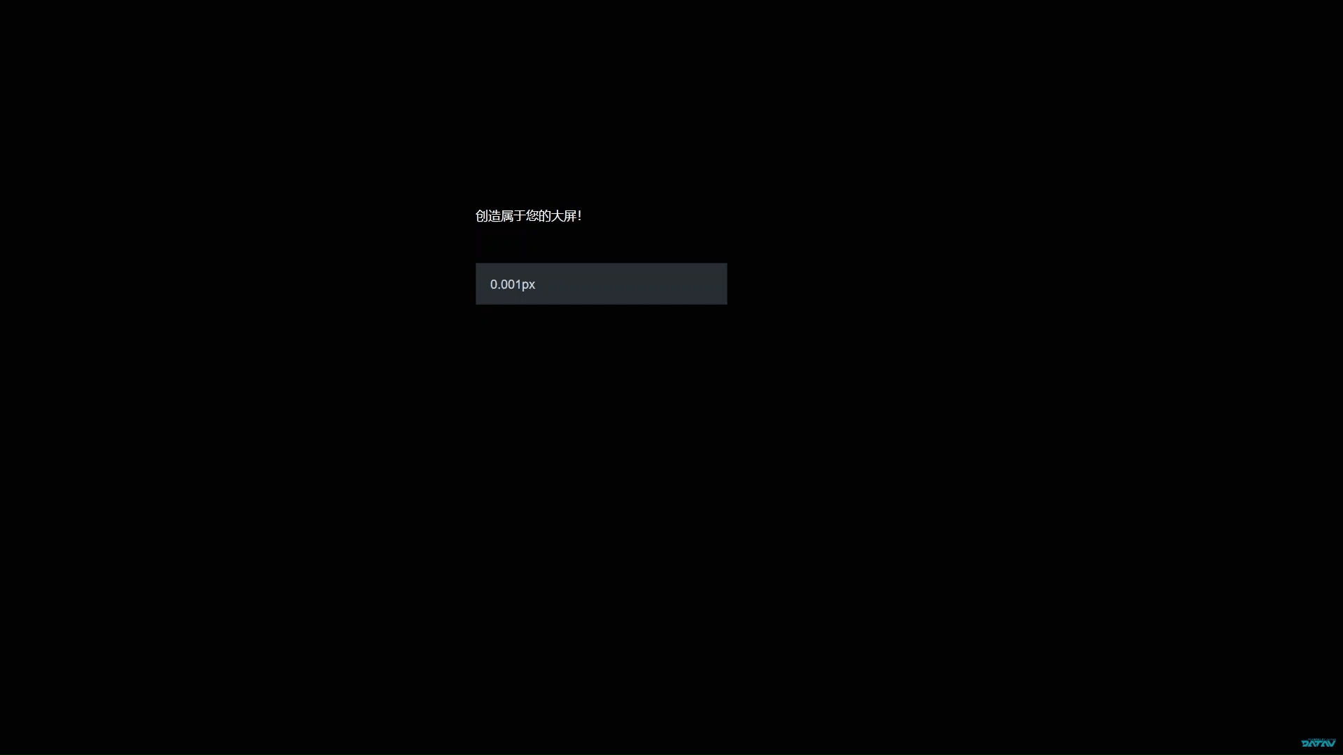
The Number Input Box is a control widget. It supports custom background colors, text styles, border styles, and button styles for different states. You can use it as an input form in a visualization application to submit user input to the backend for processing.
Configuration panel
- Search for Configurations: In the right-side panel of Canvas Editor, click the Settings tab, and click Search for Configurations in the upper-right corner. Enter the required configuration item in the search box, and click the search icon to quickly locate the configuration item. Fuzzy match is supported. For more information, see Search for Configurations.
- Size: indicates the size of a widget, including its pixel width and height. You can click the
 icon to proportionally adjust the width and height of a widget. After you click this icon again, you can adjust the width and height as needed.
 - Position: the position of a widget, which is indicated by pixel X and Y coordinates. X-coordinate indicates the pixel distance between the upper-left corner of the widget and the left border of the canvas. Y-coordinate indicates the pixel distance between the upper-left corner of the widget and the upper border of the canvas.
- Rotation Angle: the angle of a rotation that uses the center point of a widget as the rotation point. The unit is degrees (°). You can use one of the following methods to control the rotation angle of a widget:
- Directly enter the degrees in the Rotation Angle spin box or click the plus sign (+) or minus sign (-) to increase or decrease the value in the Rotation Angle spin box.
- Drag the black dot in the
 icon.
icon. - Click the
 icon to horizontally flip a widget.
 - Click the
 icon to vertically flip a widget.
- Opacity: the opacity of a widget. Valid values: 0 and 1. If this parameter is set to 0, the widget is hidden. If this parameter is set to 1, the widget is completely displayed. Default value: 1.
Number Box
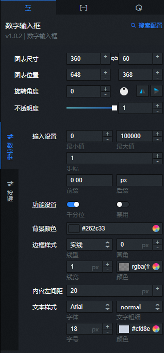
Input Settings
Parameter
Description
Minimum
The minimum value that can be entered.
Maximum
The maximum value that can be entered.
Stride
The increment or decrement value.
Prefix
The prefix for the entered number.
Suffix
The suffix for the entered number, which is usually a unit. The default value is px.
Feature Settings
Parameter
Description
Thousands Separator
Turn on this switch to display a thousands separator for numbers. Turn off this switch to hide the thousands separator.
Disable
Turn on this switch to make the number input box read-only. Turn off this switch to allow editing.
Background Color: Specifies the background color of the number input box. For more information, see Color picker.
Border Style
Parameter
Description
Line Type
The line type of the border. Options include Solid, Dashed, Dotted, Double, Groove, Ridge, Inset, and Outset.
Border Radius
The border radius. The value can be from 0 to 360. A value of 0 creates a square border. A value of 360 creates a circular border.
Line Width
The width of the border line.
Color
The color of the border.
Left Padding: Specifies the distance from the content to the left edge of the number box, in pixels (px).
Text Style: Specifies the style of the text in the number input box.
Parameter
Description
Font
The font family of the text.
Font Weight
The font weight of the text.
Font Size
The font size of the text.
Color
The color of the text in the number input box.
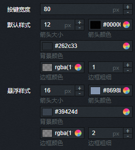
Button: Specifies the style of the buttons in the number input box.
Button Width: Specifies the width of the buttons, in pixels (px).
ImportantIf the width is too small, the button text may overflow.
Default Style
Parameter
Description
Arrow Size
The size of the button arrows.
Arrow Color
The color of the button arrows.
Background Color
The background color of the buttons.
Border Color
The color of the button borders.
Border Weight
The weight of the button borders, in px.
Hover Style: Specifies the style of buttons when you hover the mouse pointer over them. You can configure these settings in the same way as the Default Style.
 icon to vertically flip a widget.
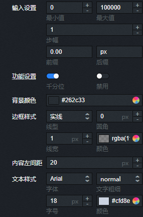
Data panel
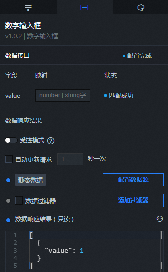
value: The content to display in the number input box. This value overwrites the placeholder text specified in the style settings. If this field is empty, the placeholder text is used.
| Parameter | Description |
| Controlled Mode | If you turn on the switch, data is not requested when a widget is initialized. Data requests are triggered only based on callback IDs or the method configured in Blueprint Editor. If you turn off the switch, data requests are automatically triggered. By default, the switch is turned off. |
| Auto Data Request | After you select the Auto Data Request check box, you can enable dynamic polling, and manually specify the polling interval. If you do not select this check box, data is not automatically requested. You must manually refresh the page to request data or use Blueprint Editor or callback ID events to trigger data requests. |
| Data Source | In the right-side panel of Canvas Editor, click the Data tab. Click Set next to Static Data. In the Configure Datasource panel, select a data source from the Data Source Type drop-down list. Enter code for data query in the code editor, click Preview Data Response to preview the response of the data source, and then view the response. For more information, see Configure asset data. |
| Data Filter | If you select the Data Filter check box, you can convert the data structure, filter data, and perform simple calculations. If you click the plus sign (+) next to Add Filter, you can configure the script for the data filter in the editor that appears. For more information, see Use the data filter. |
| Data Response Result | The response to a data request. If the data source changes, you can click the  icon next to Data Response Result to view the data response in real time. icon next to Data Response Result to view the data response in real time. |
Interaction panel
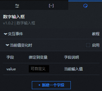
Select Enable next to On Value Change to enable the interaction feature for the Number Input Box widget. When the value in the input box changes, the widget triggers a data request and returns a callback value that can be used by other widgets. By default, the widget returns the value field from the Data panel. For more information, see Configure a widget callback ID.
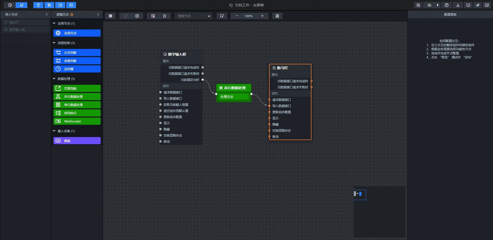
Blueprint Editor interaction configuration
- In Canvas Editor, right-click a widget in the Layer panel and select Add to Blueprint Editor.
- Click the icon in the upper-left corner of the page.
On the Blueprint Editor configuration page, click the Number Input Box widget in the Imported Nodes pane to display its configuration parameters on the canvas, as shown in the following figure.
Events
Event
Description
On Data API Request Completion
This event is triggered after a data API request returns successfully and the data is processed by a filter. The event returns the processed data in JSON format. For a data example, see the Data Response section on the Data tab of the widget's configuration panel in the canvas editor.
When a data API request fails
This event is triggered when a data API request fails due to a network issue or an API error, and the returned data is processed by a filter. The event returns the processed data in JSON format. For a data example, see the Data Response section on the Data tab of the widget's configuration panel in the canvas editor.
On Value Change
This event is triggered when the current value changes. The event returns the data item that corresponds to the new value.
Actions
Action
Description
Request data API
Sends a new request for server-side data. Data from an input data processing node or layer node is used as a parameter. For example, if the API data source for a number input box is set to
https://api.testand the data passed to the Request data API action is{ id: '1'}, the final request URL ishttps://api.test?id=1.Import data API
After the data is processed in the format required for component rendering, the data is imported to redraw the component. You do not need to request the server-side data again. For data examples, see the Data Response Result area on the Data tab in the configuration panel on the right side of the component in the canvas editor.
Get current input box value
Gets the current value in the input box.
Clear component to default value
Reverts to the default selected value.
Update component configuration
You can dynamically update the style configuration of a component. First, in the component's Configuration panel, click Copy Configuration To Clipboard to obtain the component configuration data. Then, in the data processing node on the configuration page of the blueprint editor, change the field values for the corresponding styles as needed.
Show
Shows the component. The following is a reference data example.
return {
  "animationType": "",
  "animationDuration": 1000,
  "animationEasing": "linear"
};
Hide
Hides the component. The following is a reference data example.
return {
  "animationType": "",
  "animationDuration": 1000,
  "animationEasing": "linear"
};
Toggle visibility
Toggles the visibility of the component. The following is a reference data example.
return {
  "animationIn": {
    "animationType": "",
    "animationDuration": 1000,
    "animationEasing": "linear"
  },
  "animationOut": {
    "animationType": "",
    "animationDuration": 1000,
    "animationEasing": "linear"
  }
};
Move
Moves the component to a specified position. The following is a reference data example.
return {
  // Movement type. Absolute positioning: to. Relative positioning: by. Default: to.
  "positionType": "to",
  // The specified position. x-coordinate, y-coordinate.
  "attr": {
    "x": 0,
    "y": 0
  },
  // Animation method.
  "animation": {
    "enable": false,
    // Animation duration.
    "animationDuration": 1000,
    // Animation curve. Possible values: linear|easeInOutQuad|easeInOutExpo.
    "animationEasing": "linear"
  }
};
 icon in the upper-left corner of the page.
Demo
This demo shows how to use the real-time input feature of the Number Input Box to update a Marquee widget in real time.
Log on to the DataV console.
Select a visualization application and click Edit to go to the canvas editor page.
Add the Number Input Box and Marquee widgets to the canvas.
You can right-click a component to import all components into the blueprint editor.
Connect the widgets.
Configure the processing method for the serial processing node.
return [{"value": data.value}]In the upper-right corner of the page, click the
icon to preview the result.
 icon to preview the result.