This topic describes the chart styles of the Geo Search Box widget and the meaning of each configuration items.
Chart style
The geographic search box supports configuration items such as the size, location, color, and text style of the search box and result box. Generally, you need to use the geographic search box together with the map widget to complete the region search task and display it on a visual application. 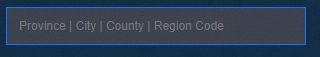
Settings
Search Configuration: Click Search Configuration in the upper-right corner of the Configuration panel. In the Search Configuration panel, enter the name of the configuration items that you want to search for to quickly locate the configuration items. Fuzzy match is supported. For more information, see Search for asset configurations.
Size: indicates the size of a widget, including its pixel width and height. You can click the
 icon to lock the aspect ratio of the widget and modify the width and height of the widget in equal proportion. Click again to unlock. The aspect ratio is not limited after unlocking.
 Position: the position of a widget, which is indicated by pixel X and Y coordinates. X-coordinate indicates the pixel distance between the upper-left corner of the widget and the left border of the canvas. Y-coordinate indicates the pixel distance between the upper-left corner of the widget and the upper border of the canvas.
Rotation Angle: the angle of a rotation that uses the center point of a widget as the rotation point. The unit is degrees (°). You can use one of the following methods to control the rotation angle of a widget:
Directly enter the degrees in the Rotation Angle spin box or click the plus sign (+) or minus sign (-) to increase or decrease the value in the Rotation Angle spin box.
Drag the
 black dot in the icon to control the rotation angle of the widget.
 Click the
 icon to flip the widget style.
 Click the
 icon to flip the widget style.
Opacity: Valid values: 0 to 1. If this parameter is set to 0, the widget is hidden. If this parameter is set to 1, the widget is completely displayed. Default value: 1.
Search box style
Parameter
description
Prompt Text
The prompt description displayed in the input field.
Width
The width of the search box.
Height
The height of the search box.
Lateral Offset
The distance left boundary the search box and the widget edge.
Longitudinal Offset
The distance between the search box and the edge of the widget.
Font size
The size of the font in the search box.
Font weight
The weight of the font in the search box.
Color
The color of the font in the search box. For more information, see color picker description.
Background color
The background color of the search box.
Borders
The style of the border of the search box.
Border Width: the border width of the search box.
Border Color: the border color of the search box.
Border Type: the border type of the search box. The border type can be Solid Line, Dashed Line, or Dotted Line.
Result Box Style
Parameter
description
Maximum Width
The maximum width of the result box.
Maximum height
The maximum height of the result box.
Top Spacing
The distance between the result box and the search box.
Font color
The color of the font in the result box.
Size
The size of the font in the result box.
Border Color
The color of the outer border of the result box.
Bottom Border Color
The color of the bottom border of the result box.
Background color
The background color of the result box.
Hover Style
The style of the hover when you move the pointer over the result box, including the font color, bottom border color, and font size in the result box.
NoteYou can view the style of the result box only on the Preview or Publish page.
Interaction: the callback ID used for interaction between the timeline widget and other widgets. The callback ID must be a parameter on the Data tab.
ImportantIf the version of your widget is not the latest, upgrade the widget and configure callback IDs in the Interaction tab.
Data panel
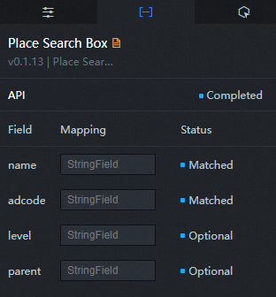
Configuration field description
Column | Description |
| The region name. |
| The code of a region. |
| (Optional) Region level. |
| (Optional) The parent city of the region. |
The field name of this component can be flexibly configured. You can only search for information that has been configured in the data.
Parameter | Description |
Controlled Mode | If you turn on the switch, data is not requested when the asset is in the Initialization state. Data is requested only by using the callback ID or the method configured in Blueprint Editor. If you turn off the switch, you can use Automatic Update to request data. By default, the switch is turned off. |
Auto Data Request | After you select the Auto Data Request check box, you can enable dynamic polling, and manually specify the polling interval. If you clear the check box, the data is not automatically updated. You must manually refresh the page or use the Blueprint Editor and callback ID events to trigger a request to update the data. |
Data Source | Click Configure Data Source. In the Configure Data Source panel, modify the data source type and query code, preview the response of the data source, and view the response results. For more information, see Configure asset data. |
Data Filter | If you select the Data Filter check box, you can convert the data structure, filter data, and perform simple calculations. Click Add Filter. In the Set Data Source panel, configure a data filter script. For more information, see Filter instructions. |
Data Response Result | The response to a data request. If the data source changes, you can click the |
 icon on the right to view the response results in real time.
 Interaction tab
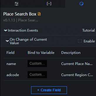
Select the Enable check box to enable interactions between widgets. When the data of the search box changes, a data request is triggered and a callback value is thrown to dynamically load data in different regions. By default, the name and adcode values in the data are returned. For more information, see Configure the callback ID of a ticker board component.
Configure interactions in Blueprint Editor
In Canvas Editor, right-click a widget in the Layer panel and select Add to Blueprint Editor.
Click the
icon in the upper-left corner. In Blueprint Editor, click the Geo Search widget in the Added Nodes pane. On the canvas, you can configure the parameters for the geo search box, as shown in the following figure.
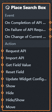
Events
Events
Description
When the data interface request is completed
The event is triggered with the processed JSON data after a data interface request is responded and processed by a filter. For more information about specific data examples, see the Data Response Result section of the Data tab in the right-side configuration panel of the canvas editor.
When a data interface request fails
The event that is returned when a data interface request fails (such as network problems or interface errors) and is processed by the filter. The event also throws the processed JSON data. For more information about specific data examples, see the Data Response Result section of the Data tab in the right-side configuration panel of the canvas editor.
When the current value changes
The event that is raised when the current value changes, along with the search for the place name and region code.
Action
Action
Description
Request Data Interface
This action is performed to request the server data again. The data sent by an upstream converter or layer node is used as a parameter. For example, if the API data source is
https://api.testand the data passed to the request data interface is{ id: '1'}, the final request interface ishttps://api.test?id=1.Import data
After data of a widget is processed in accordance with its drawing format, the widget is imported for redrawing. You do not need to request server data again. For more information about specific data examples, see the Data Response Result section of the Data tab in the right-side configuration panel of the canvas editor.
Obtain the current selected value
Indicates that the currently selected value is obtained.
Clear a component to its default value
The default value is restored.
Update component configurations
Style configurations of widgets are dynamically updated. Before this action is executed, you must click the widget in Canvas Editor, click the Settings tab in the right-side panel, and click Copy Configurations to... to obtain widget configurations. Then, paste the data to the box of a data processing node in the blueprint editor and configure the field values.
Display
Displays the widget. The following example shows the reference data.
return {
  "animationType": "",
  "animationDuration": 1000,
  "animationEasing": "linear"
};
Hide
The following example shows how to hide a widget.
return {
  "animationType": "",
  "animationDuration": 1000,
  "animationEasing": "linear"
};
Switch to the hidden state
Specifies whether to show or hide a widget. The following example shows the reference data.
return {
  "animationIn": {
    "animationType": "",
    "animationDuration": 1000,
    "animationEasing": "linear"
  },
  "animationOut": {
    "animationType": "",
    "animationDuration": 1000,
    "animationEasing": "linear"
  }
};
China Mobile
Move a widget to a specified location. The following example shows the reference data.
return {
  // The positioning type. to indicates absolute positioning, whereas by indicates relative positioning. The default value is to.
  "positionType": "to",
  // The location, which is indicated by the x and y coordinates.
  "attr": {
    "x": 0,
    "y": 0
  },
  // The animation type.
  "animation": {
    "enable": false,
    // The duration in which animation is displayed.
    "animationDuration": 1000,
    // The animation curve, which can be set to linear|easeInOutQuad|easeInOutExpo.
    "animationEasing": "linear"
  }
};
 icon in the upper-left corner.