This topic describes the styles and configuration options for the Progress Doughnut Chart widget.
Chart style
The progress doughnut chart uses a rotating fill to visually display task progress.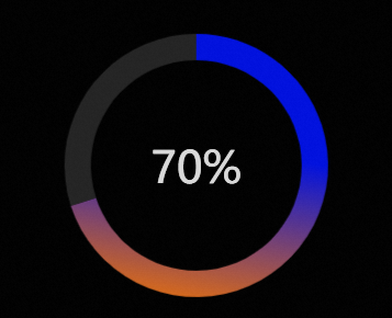
Configuration panel
- Search for Configurations: In the right-side panel of Canvas Editor, click the Settings tab, and click Search for Configurations in the upper-right corner. Enter the required configuration item in the search box, and click the search icon to quickly locate the configuration item. Fuzzy match is supported. For more information, see Search for Configurations.
- Size: indicates the size of a widget, including its pixel width and height. You can click the
 icon to proportionally adjust the width and height of a widget. After you click this icon again, you can adjust the width and height as needed.
 - Position: the position of a widget, which is indicated by pixel X and Y coordinates. X-coordinate indicates the pixel distance between the upper-left corner of the widget and the left border of the canvas. Y-coordinate indicates the pixel distance between the upper-left corner of the widget and the upper border of the canvas.
- Rotation Angle: the angle of a rotation that uses the center point of a widget as the rotation point. The unit is degrees (°). You can use one of the following methods to control the rotation angle of a widget:
- Directly enter the degrees in the Rotation Angle spin box or click the plus sign (+) or minus sign (-) to increase or decrease the value in the Rotation Angle spin box.
- Drag the black dot in the
 icon.
icon. - Click the
 icon to horizontally flip a widget.
 - Click the
 icon to vertically flip a widget.
- Opacity: the opacity of a widget. Valid values: 0 and 1. If this parameter is set to 0, the widget is hidden. If this parameter is set to 1, the widget is completely displayed. Default value: 1.
- Size: indicates the size of a widget, including its pixel width and height. You can click the
Chart
Parameter
Description
Chart Margin
Click the
 icon to show or hide the chart margin settings. When enabled, configure the distance between the doughnut chart area and the widget borders. The default unit is px.
Radius
Set the inner and outer radius of the progress doughnut chart. The unit is percent (%).
Ring Color
Set the background color for the ring when there is progress and when there is no progress. For more information, see Color picker.
Ring Outline
Set the outline style for the progress doughnut chart ring, including the line type, thickness, and color.
Shadow Style
Set the drop shadow style for the progress doughnut chart widget. This includes the blur color, blur radius, and the X and Y offsets of the chart's center relative to the center of the widget's border.
Center Content
Set the style for the text and image in the center of the progress doughnut chart.
Text
Title: Set the title name for the center text.
Title Style: Set the style for the title, including the font, font weight, font size, and color.
Position: Set the X and Y offsets of the center text relative to the widget's center point.
Number: Set the prefix and suffix styles for the number.
Number Style: Set the style for the number, including the font, font weight, font size, and color.
Position: Set the X and Y offsets of the number text relative to the widget's center point.
Image
Image Link: Set the image link for the center of the progress doughnut chart. To use an image from a remote server, enter the image URL in the input box. Click Change or Delete below the image input box to change or delete the image. For more information about other design asset features, see Design assets.
Image Style: Set the style for the image in the center of the progress doughnut chart. This includes the image width, height, opacity, and border radius.
Offset: Set the alignment and offset of the center image relative to the widget's border.
Conditional Formatting: Configures conditional series styles.
Conditional Style: You can click the
icon to add a conditional style or the icon to delete one. You can click the or icons to change the order of conditional styles. You can click the icon to copy the current conditional style configuration to a new one. For more information about the configuration, see Use the condition tree.Progress Color: If this option is enabled, you can configure the progress color for the series in this conditional style. If this option is disabled, you cannot configure the color for this series.
 icon to show or hide the chart margin settings. When enabled, configure the distance between the doughnut chart area and the widget borders. The default unit is px.
 icon to add a conditional style or the
  icon to delete one. You can click the
  or
or  icons to change the order of conditional styles. You can click the
  icon to copy the current conditional style configuration to a new one. For more information about the configuration, see
 Data panel
percent: The progress value, which determines the filled portion of the doughnut chart. The value is a decimal, where 1 corresponds to 100%.
Interaction panel
This widget has no interaction events.
Blueprint editor interaction configuration
On the canvas editor page, right-click the widget and select Export to Blueprint Editor.
Click the
icon in the upper-left corner of the page.On the blueprint editor configuration page, click the Progress Doughnut Chart widget in the Import Nodes section. The configuration parameters for the widget are displayed on the canvas, as shown in the following figure.
Events
Event
Description
On API Description Request Completion
This event is triggered after the data API request is returned and processed by the filter. The processed data is thrown in JSON format. For a data example, see the Data Response area on the Data Source tab in the widget's configuration panel in the canvas editor.
When an API Request Is Sent
This event is triggered when a data API request is initiated. The processed data is thrown in JSON format. For a data example, see the Data Response area on the Data Source tab in the widget's configuration panel in the canvas editor.
When Data Request Fails
This event is triggered when the data API request fails (due to network issues, API errors, etc.) and the response is processed by the filter. The processed data is thrown in JSON format. For a data example, see the Data Response area on the Data Source tab in the widget's configuration panel in the canvas editor.
Actions
Action
Description
Import API Description
The data is processed in the component's drawing format and then imported to redraw the component. Therefore, you do not need to request data from the server-side again. For specific data examples, see the Data Response area on the Data Source tab in the configuration panel to the right of the component in the canvas editor.
Request description
Re-requests data from the server-side. Data thrown by an input data processing node or a layer node is used as a parameter. For example, if the progress doughnut chart is configured with an API data source of
https://api.test, and the data passed to the Request Data action is{ id: '1'}, the final requested API ishttps://api.test?id=1.Update Widget Configuration
Dynamically updates the style configuration of the widget. First, in the widget's Style panel, click Copy Configuration to Clipboard to get the widget configuration data. Then, in a data processing node on the blueprint editor page, change the field values for the corresponding styles as needed.
Show
Shows the widget. The following code provides a data example.
return {
  "animationType": "",
  "animationDuration": 1000,
  "animationEasing": ""
}
Hide
Hides the widget. The following code provides a data example.
return {
  "animationType": "",
  "animationDuration": 1000,
  "animationEasing": ""
}
Toggle Visibility
Toggles the visibility of the widget. The following code provides a data example.
return {
  "animationIn": {
    "animationType": "",
    "animationDuration": 1000,
    "animationEasing": "linear"
  },
  "animationOut": {
    "animationType": "",
    "animationDuration": 1000,
    "animationEasing": "linear"
  }
};
Move
Moves the widget to a specified position. The following code provides a data example.
    return {
      // The movement type. Absolute positioning: to. Relative positioning: by. Default value: to.
        "positionType": "to",
      // The specified position. x-coordinate, y-coordinate.
      "attr": {
        "x": 0,
        "y": 0
      },
      // The animation method.
      "animation": {
        "enable": false,
        // The animation duration.
        "animationDuration": 1000,
        // The animation curve. Optional values: linear|easeInOutQuad|easeInOutExpo.
        "animationEasing": "linear"
      }
    }
 icon in the upper-left corner of the page.
Demo
This demo shows how to use multiple Progress Doughnut Chart widgets to display the development progress and deadline for three features in a project.
Log on to the DataV console.
Select a visualization application and click Edit to go to the canvas editor page.
In the toolbar at the top, click Search, enter `Progress Doughnut Chart`, and then click the widget to add it to the canvas.
Repeat the previous step to add two more Progress Doughnut Chart widgets, one Radial Stacked Bar Chart widget, and one Countdown widget.
Click the Yujue graph, select the Data panel, and modify the static data.
[
  {
    "r": "Multi-frequency modulation feature",
    "t": 0.86,
    "colorField": 100
  },
  {
    "r": "Bluetooth transmission feature",
    "t": 0.64,
    "colorField": 200
  },
  {
    "r": "Mask distribution feature",
    "t": 0.49,
    "colorField": 300
  }
]
Click a Progress Doughnut Chart widget. On the Configuration panel, go to Chart > Center Content > Text and change the title to Multi-frequency modulation feature. Change the widget name to `Progress Doughnut Chart-1`. Repeat this step to configure the center text and names for the other two Progress Doughnut Chart widgets.
Click the Countdown widget, select the Data panel, and modify the static data.
[
  {
    "endTime": "2023-06-20 00:00:00"
  }
]
Click the
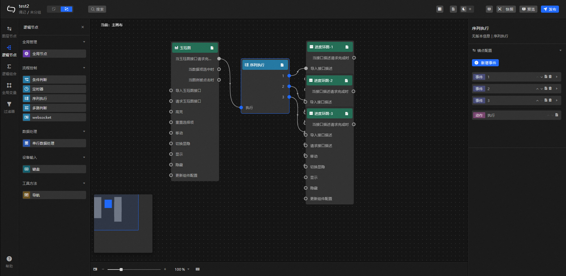
icon to switch to the blueprint editor.On the Import Nodes tab, drag all widgets except the Countdown widget to the main canvas.
Click the Logic Nodes tab, add a Sequence node to the main canvas, and connect the widgets.
Configure the processing method for the Sequence node.
//Progress Doughnut Chart-1
return [{
  "percent": data[0].t
}]
//Progress Doughnut Chart-2
return [{
  "percent": data[1].t
}]
//Progress Doughnut Chart-3
return [{
  "percent": data[2].t
}]
In the upper-right corner of the page, click Preview to view the result.
(Optional) You can adjust the style and position of all widgets and add other decorative widgets to enhance the data screen.
 icon to switch to the blueprint editor.