11.11 Bubble Chart
This document explains the configuration options for the 11.11 Bubble Chart component.
Chart style
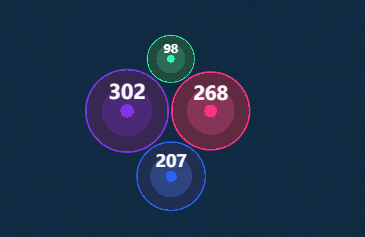
The 11.11 Bubble Chart maps numerical values to bubble sizes, allowing you to visually compare data across different categories, making it ideal for product comparison visualizations, such as comparing items like mobile phones, food, clothing, and home appliances.
Configuration panel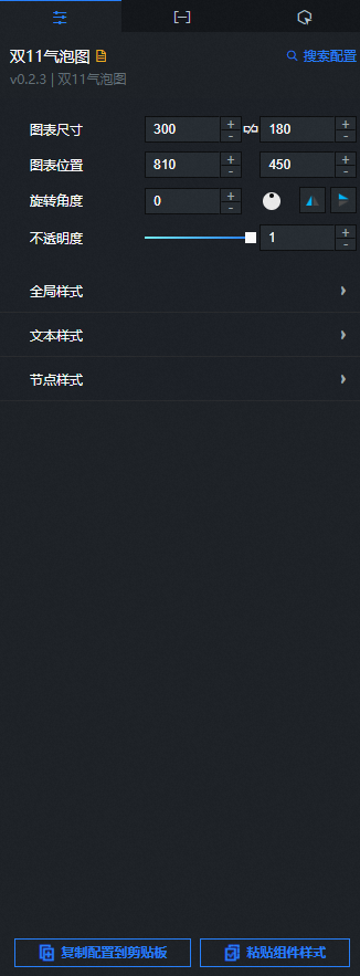
- Search for Configurations: In the right-side panel of Canvas Editor, click the Settings tab, and click Search for Configurations in the upper-right corner. Enter the required configuration item in the search box, and click the search icon to quickly locate the configuration item. Fuzzy match is supported. For more information, see Search for Configurations.
- Size: indicates the size of a widget, including its pixel width and height. You can click the
 icon to proportionally adjust the width and height of a widget. After you click this icon again, you can adjust the width and height as needed.
 - Position: the position of a widget, which is indicated by pixel X and Y coordinates. X-coordinate indicates the pixel distance between the upper-left corner of the widget and the left border of the canvas. Y-coordinate indicates the pixel distance between the upper-left corner of the widget and the upper border of the canvas.
- Rotation Angle: the angle of a rotation that uses the center point of a widget as the rotation point. The unit is degrees (°). You can use one of the following methods to control the rotation angle of a widget:
- Directly enter the degrees in the Rotation Angle spin box or click the plus sign (+) or minus sign (-) to increase or decrease the value in the Rotation Angle spin box.
- Drag the black dot in the
 icon.
icon. - Click the
 icon to horizontally flip a widget.
 - Click the
 icon to vertically flip a widget.
- Opacity: the opacity of a widget. Valid values: 0 and 1. If this parameter is set to 0, the widget is hidden. If this parameter is set to 1, the widget is completely displayed. Default value: 1.
Global style
Parameter
Description
Animation duration (s)
The duration of the bubble animation.
Animation type
The easing function for the bubble animation. You can select from various common animation types, such as ease-in-out.
Padding
The distance between bubbles, in pixels.
Scale
The scaling factor of the bubble chart, where 1 is the original size.
Horizontal offset
The horizontal offset of the bubble chart relative to the component's center, in pixels.
Vertical offset
The vertical offset of the bubble chart relative to the component's center, in pixels.
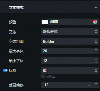
Text style
Parameter
Description
Color
The color of the text. For more information, see Color picker.
Font family
The font family for the text. The default is Microsoft YaHei.
Font weight
The weight of the font.
Max font size
The font size for text in the largest bubble. The font size in other bubbles is scaled proportionally.
Min font size
The font size for text in the smallest bubble. The font size in other bubbles is scaled proportionally.
Label
The content of the bubble's label. Options include Value and Name. Click the
icon to show or hide the label.Vertical offset
The vertical offset of the text label within the bubble, in pixels.
Node style: Use the icons to manage data series. Click the
or icon to add or delete a series. Click the or icon to change the series order. Click the icon to duplicate a series with its current configuration.Color: The color of the bubbles in the series.
 icon to vertically flip a widget.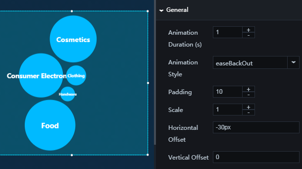
 icon to show or hide the label.
 or
or  icon to add or delete a series. Click the
  or
or  icon to change the series order. Click the
  icon to duplicate a series with its current configuration.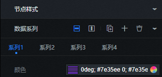
Data panel
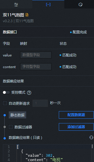
Fields
Field | Description |
| The numerical value that determines the size of a bubble. |
| The text content to be displayed inside a bubble. |
Parameter | Description |
Controlled mode | When enabled, the component does not request data on initialization. Data requests must be triggered by a callback ID or an action in the Blueprint Editor. When disabled, the component can request data through automatic updates. This mode is disabled by default. |
Auto-update requests | Select this option to enable dynamic polling and set the polling frequency. If this option is cleared, data is not updated automatically. You must manually refresh the page or trigger a data request by using the Blueprint Editor or a callback ID event. |
Data source | Click Configure Data Source. In the Set Data Source panel, you can modify the data source type and data query code, preview the data returned by the data source, and view the data response. For more information, see Configure Asset Data. |
Data filter | Data filters allow you to convert, filter, or perform simple calculations on the data. Click Add Filter to configure a data filter in the Set Data Source panel. For more information, see Use filters. |
Data response | Displays the response from the data request. When the data source changes, you can click the |
 icon on the right to refresh and view the latest data response.
Interaction panel
This component has no interaction events.
Blueprint Editor interaction
- In Canvas Editor, right-click a widget in the Layer panel and select Add to Blueprint Editor.
- Click the icon in the upper-left corner of the page.
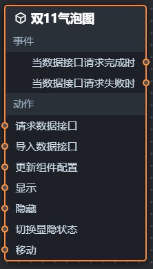
On the Blueprint Editor configuration page, click the 11.11 Bubble Chart component in the Imported Nodes panel. The configuration parameters for the component appear on the canvas, as shown in the following figure.
Events
Event
Description
When the data API is called successfully
This event is triggered when a data API request succeeds and the returned data has been processed by the data filter. An example payload can be found in the Data response field on the Data panel.
When the data API fails to be called
This event is thrown when a data interface request fails, for example, due to network issues or an interface error. The event is triggered after the response is processed by a filter and includes the processed data in JSON format. For a data example, see the Data Response Result area on the Data tab of the component's configuration panel on the right side of the canvas editor.
Actions
Actions
Description
Request data API
Triggers a new request to the data source. Data exposed by upstream data processing nodes or layer nodes is used as parameters. For example, if the data source API for the 11.11 Bubble Chart is set to
https://api.testand the data passed to the Request data API action is{ id: '1'}, the final requested URL ishttps://api.test?id=1.Import data
Updates the component with the provided data and redraws it. This action does not make a new request to the server. For a sample payload, see the Data response field on the Data panel.
Update component configuration
Dynamically updates the style configuration of the component. You must first get the component configuration data by clicking Copy configuration to clipboard in the component's configuration panel. Then, modify the field values for the desired styles in a data processing node within the Blueprint Editor.
Show
Shows the component. The following code provides a sample payload:
return{
  "animationType": "",
  "animationDuration": 1000,
  "animationEasing": "linear"
}
Hide
Hides the component. The following code provides a sample payload:
return{
  "animationType": "",
  "animationDuration": 1000,
  "animationEasing": "linear"
}
Toggle visibility
Toggles the visibility of the component. The following code provides a sample payload:
return {
  "animationIn": {
    "animationType": "",
    "animationDuration": 1000,
    "animationEasing": "linear"
  },
  "animationOut": {
    "animationType": "",
    "animationDuration": 1000,
    "animationEasing": "linear"
  }
}
Move
Moves the component to a specified position. The following code provides a sample payload:
    return{
      // The movement type. 'to' for absolute positioning, 'by' for relative positioning. Default: 'to'.
        "positionType": "to",
      // The target position, specified by x and y coordinates.
      "attr": {
        "x": 0,
        "y": 0
      },
      // The animation settings.
      "animation": {
        "enable": false,
        // The animation duration.
        "animationDuration": 1000,
        // The easing function for the animation. Valid values: linear|easeInOutQuad|easeInOutExpo.
        "animationEasing": "linear"
      }
    }
 icon in the upper-left corner of the page.