The Scatter Chart widget
This topic describes the chart style and configuration panel of a basic scatter chart.
Chart Style
A basic scatter chart is a chart that uses scatter points to display data. It is suitable for displaying the differences of discrete data at different times. Basic scatter charts support custom x-axis, y-axis, and scatter styles, support multi-series data configuration, support dialog box interaction, and display animation effects. 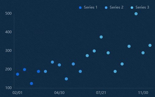
Settings Panel 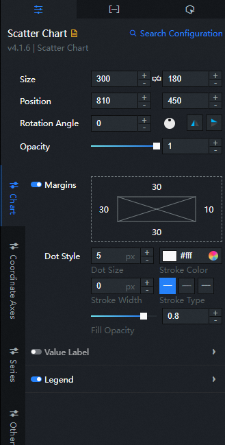
- Search for Configurations: In the right-side panel of Canvas Editor, click the Settings tab, and click Search for Configurations in the upper-right corner. Enter the required configuration item in the search box, and click the search icon to quickly locate the configuration item. Fuzzy match is supported. For more information, see Search for Configurations.
- Size: indicates the size of a widget, including its pixel width and height. You can click the
 icon to proportionally adjust the width and height of a widget. After you click this icon again, you can adjust the width and height as needed.
 - Position: the position of a widget, which is indicated by pixel X and Y coordinates. X-coordinate indicates the pixel distance between the upper-left corner of the widget and the left border of the canvas. Y-coordinate indicates the pixel distance between the upper-left corner of the widget and the upper border of the canvas.
- Rotation Angle: the angle of a rotation that uses the center point of a widget as the rotation point. The unit is degrees (°). You can use one of the following methods to control the rotation angle of a widget:
- Directly enter the degrees in the Rotation Angle spin box or click the plus sign (+) or minus sign (-) to increase or decrease the value in the Rotation Angle spin box.
- Drag the black dot in the
 icon.
icon. - Click the
 icon to horizontally flip a widget.
 - Click the
 icon to vertically flip a widget.
- Opacity: the opacity of a widget. Valid values: 0 and 1. If this parameter is set to 0, the widget is hidden. If this parameter is set to 1, the widget is completely displayed. Default value: 1.
Chart
Custom Margins: Click the
icon to specify the custom margins. The distance between the scatter plot area and the four boundaries of the widget. Unit: px. Scatter Style: the style of the scatter.
Parameter
Description
Size
The size of the scatter.
Stroke Color
The color of the scatter's stroke.
Stroke weight
The stroke weight of the scatter.
Stroke Type
The stroke type of the scatter. You can select Solid, Dashed, or Dotted.
Fill Transparency
The transparency value of the inner fill color of the scatter. Valid values: 0 to 1.
Value Label: the style of the value labels in a basic scatter chart. You can click the
icon to control whether the value labels are visible or hidden. Parameter
Description
Text Style
The font style, text weight, font size, and color of the value label text.
Offset
The offset value of the value label in the horizontal and vertical directions.
Legend: the legend style of a basic scatter chart. You can click the
icon to display the legend. Parameter
Description
Allow Page Turning
If the switch is turned on, page turning can be allowed when the number of legends is too large to be arranged; if the switch is turned off, page turning cannot be allowed.
Layout
The position of the legend relative to the start coordinate of the widget. Valid values: Top Left, Top Center, Top Right, Bottom Left, Bottom Center, and Bottom Left.
Legend Tags
The style of the legend tag, including the shape style and size of the legend.
Legend Text
The style of the legend text, including the font style, text weight, font size, and color of the legend.
Axis: You can select x-axis or y-axis.
x axis
X Axis Visible: If you turn on the switch, the x-axis style in the widget is visible. If you turn off the switch, the x-axis style in the widget is invisible.
Data Type: the type of the x-axis labeled data.
Parameter
Description
Numeric Type
Supports numeric data such as integers and floating-point numbers.
Category Type
Data of category types such as character and string is supported.
Time Type
The data of the time type needs to be configured data format.
Axis Label: the axis label style of the x-axis of a basic scatter chart. You can click the
icon to specify whether the axis labels are displayed or hidden. NoteIf the data format and setting formats are not uniform, the widget will be displayed abnormally.
Parameter
Description
Display Format
The data format you want to display. This parameter is valid only for time-based and numeric data. Please refer to
YYYY/MM/DD HH:mm:sstime, integer referencedand floating point reference.1f.Text Style
The font style, weight, font size, and color of the x-axis label text.
Custom Quantity
The number value displayed by the x-axis label. You can click
the icon to specify the number of x-axis labels. Axis Title: the axis title style of the x-axis of a basic scatter chart. You can click the
icon to display or hide the axis title. Parameter
Description
Title Content
The text content of the x-axis title.
Offset
The offset value of the x-axis title. Unit: px.
Text Style
The font style, text weight, font size, and color of the x-axis title text.
Axis: the style of the x-axis. You can click the
icon to display the x-axis. Color: the color of the x-axis.
Gridlines: the style of the x-axis gridlines. You can click the
icon to display or hide the x-axis gridlines. Color: the color of the x-axis grid lines.
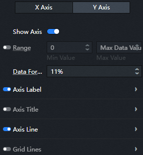
Y axis
Y Axis Visible: If you turn on the switch, the y-axis style in the widget is visible. If you turn off the switch, the y-axis style in the widget is invisible.
Custom Range: the range of the minimum and maximum values of the y-axis. You can click the
icon to specify a custom range. Parameter
Description
Minimum Value
The minimum value of the y-axis. You can customize the value or select the value.
0: The default minimum value is 0.
Minimum Data Value: the minimum value in the data.
Maximum Value
The maximum value of the y-axis. You can specify a custom value. You can also select Maximum Data Value to obtain the maximum value in the data.
NoteIf you enable a custom data range for the y-axis, the data points may not be displayed completely. We recommend that you disable the custom data range.
Display Format: the display format of the y-axis label value. Valid values: Default, 11 (integer), 11.1 (floating-point number), and 11.11 (floating-point number).
Axis Label: the style of the y-axis label. You can click the
icon to display or hide the y-axis label. Parameter
Description
Text Style
The font style, text weight, font size, and color of the y-axis label text.
Custom Quantity
The y-axis label displays the quantity value. You can click the
icon to specify the number of y-axis labels. Axis Title: the style of the y-axis title. You can click the
icon to display or hide the y-axis title. Parameter
Description
Title Content
The text content of the y-axis title.
Offset
The offset value of the title on the y-axis. Unit: px.
Text Style
The font style, text weight, font size, and color of the title text on the y-axis.
Axis: the style of the y-axis. You can click the
icon to display the y-axis. Color: the color of the y-axis.
Gridlines: the style of the y-axis gridlines. You can click the
icon to display or hide the gridlines. Color: the color of the grid lines on the y-axis.
Series
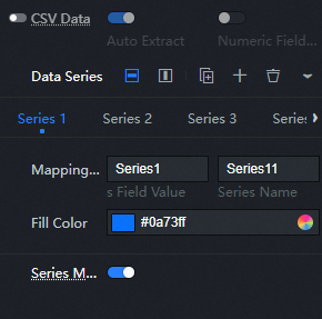
CSV Data: If you turn on the CSV Data switch, you can directly use CSV columns to map values and data series. If you turn off the Series Mapping switch, the configuration items takes effect. You can click the
icon to display or hide the CSV data switch. Parameter
Description
Automatic field parsing
If you turn on the switch, the widget uses CSV data to automatically parse and display the fields. If you turn off the switch, the fields are not automatically parsed.
Only numeric fields
If you turn on the switch, CSV data is parsed only for fields of the data type. If you turn off the switch, CSV data is automatically parsed for all fields.
data series: Click the
or icon on the right to add or delete a data series. Click the or icon to configure the arrangement style of multiple data series. Click the icon to copy the selected data series configurations and add a data series with the same configurations. Parameter
Description
Mapping Field
Column Name /Field Name and Series Name configuration items. This parameter takes effect only when you turn on CSV Data and turn off Auto Parse Field configuration items.
Column Name /Field Name: the data series field value. You can customize the field value. If the field is empty, the system displays s field values in the widget data as series field values. If this parameter is not empty, you must ensure the order in which data is returned.
Series Name: the display name of the data series series, which can be customized.
Series S Value and Series Display configuration items take effect only when CSV Data is hidden and the Series Mapping configuration items switch is turned on.
Series s Value: the data series mapping value, which can be customized. If the field is empty, the system displays s field values in the component data as series field mapping values. If this parameter is not empty, you must ensure the order in which data is returned.
Series Display: the display name of the data series, which can be customized.
Fill Color
The fill color of the basic scatter plot in this series.
Series Mapping: If you turn on the switch, this parameter takes effect only when the data contains series s values. You can set the color of a specific series by using the Mapping Field parameter. If you turn off the switch, this parameter takes effect only when the Mapping Field configuration items is disabled.
Other
Interaction enhancement for large amounts of data: If a basic scatter chart contains too much data, you can set the data interaction enhancement style. You can click the
icon to enable or disable the interaction enhancement effect. Parameter
Description
Interactive Mode
The mode of data interaction. Valid values: Sink Axis and Scroll Bar.
NoteIf the data type is time data, the feature of exchanging large amounts of data is not supported.
Default Range
The range of data displayed on the thumbnail axis. The range can be from 0 to 1. This option is available only when the Thumbnail style is enabled.
Style
The thumbnail axis foreground and background colors. This option is available only when the Thumbnail style is enabled.
Direction
The direction of the scroll bar. Valid values: Horizontal and Vertical. This option is available only when the Scrollbar style is enabled.
Type Width
The width of the data category column. This option is available only when the Scrollbar style is enabled.
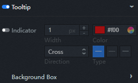
dialog box: the style of the dialog box that appears when you move the pointer over or click a hash on the preview or publish page. You can click the
icon to turn the dialog box on or off. Parameter
Description
Indicator
Indicates the style of the indicator, including the width, color, direction (cross, horizontal, and vertical ), and type (solid line, dotted line, and dotted line) of the indicator. Click on
the icon to turn the indicator on or off. Background Box Style
The background box style of the dialog box.
Background Color: the background color of the dialog box.
Padding: the inner margin of the dialog box. Unit: pixels.
Border
Border Size: the border size of the dialog box. Unit: pixels.
Border Color: The border color of the dialog box.
 icon to vertically flip a widget.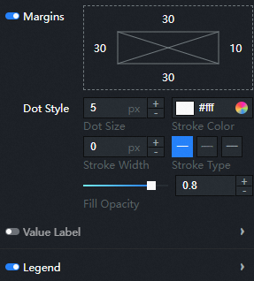
 icon to specify the custom margins. The distance between the scatter plot area and the four boundaries of the widget. Unit: px.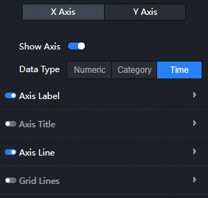
 or
or  icon on the right to add or delete a data series. Click the
  or
or  icon to configure the arrangement style of multiple data series. Click the
  icon to copy the selected data series configurations and add a data series with the same configurations.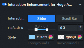
Data Panel
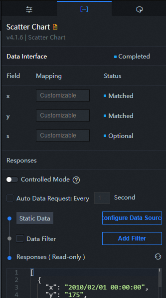
Configuration field description
Parameter |
Description |
x |
The category of each scatter point in the basic scatter chart, that is, the value of the x-axis. The field type and format must be consistent with the label data type and format on the x-axis in the configuration items. |
y |
The value of each scatter point in the basic scatter chart, that is, the value of the y-axis. |
s |
Optional. The series value. The mapping field in the configuration items data series must match the s field. |
| Parameter | Description |
| Controlled Mode | If you turn on the switch, data is not requested when a widget is initialized. Data requests are triggered only based on callback IDs or the method configured in Blueprint Editor. If you turn off the switch, data requests are automatically triggered. By default, the switch is turned off. |
| Auto Data Request | After you select the Auto Data Request check box, you can enable dynamic polling, and manually specify the polling interval. If you do not select this check box, data is not automatically requested. You must manually refresh the page to request data or use Blueprint Editor or callback ID events to trigger data requests. |
| Data Source | In the right-side panel of Canvas Editor, click the Data tab. Click Set next to Static Data. In the Configure Datasource panel, select a data source from the Data Source Type drop-down list. Enter code for data query in the code editor, click Preview Data Response to preview the response of the data source, and then view the response. For more information, see Configure asset data. |
| Data Filter | If you select the Data Filter check box, you can convert the data structure, filter data, and perform simple calculations. If you click the plus sign (+) next to Add Filter, you can configure the script for the data filter in the editor that appears. For more information, see Use the data filter. |
| Data Response Result | The response to a data request. If the data source changes, you can click the  icon next to Data Response Result to view the data response in real time. icon next to Data Response Result to view the data response in real time. |
Interaction Panel
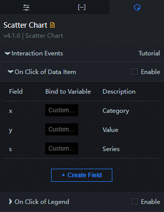
Interaction description
Interaction Event |
Description |
When a data item is clicked |
Select Enable to enable the widget interaction feature. When you click a hash point of a basic scatter chart, a data request is triggered and a callback value is thrown to dynamically load data of different polyline data points. By default, the x, y, and s values are returned. For more information, see Configure the callback ID of a ticker board. |
When you click the legend |
Select Enable to enable the widget interaction feature. When you click the legend of a basic scatter chart, a data request is triggered, a callback value is thrown, and different data is dynamically loaded. By default, the value value in the data is returned. For more information, see Configure the callback ID of a ticker board component. |
Configure interactions in Blueprint Editor
- In Canvas Editor, right-click a widget in the Layer panel and select Add to Blueprint Editor.
- Click the icon in the upper-left corner of the page.
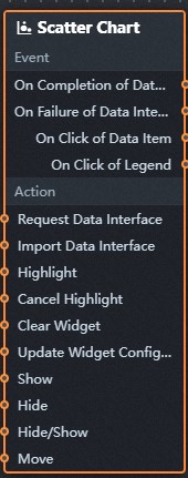
In Blueprint Editor, click the Scatter Chart component in the Added Nodes pane. The following figure shows the basic scatter chart configuration parameters on the canvas.
Event
Event
Description
When the scatter chart interface request is completed
The event is triggered with the processed JSON data after a data interface request is responded and processed by a filter. For more information about specific data examples, see the Data Response Result section of the Data tab in the right-side configuration panel of the canvas editor.
When a scatter chart interface request fails
The event that is returned when a data interface request fails (the request may be due to network problems or interface errors) and is processed by the filter. The event also throws the processed JSON data. For more information about specific data examples, see the Data Response Result section of the Data tab in the right-side configuration panel of the canvas editor.
When a data item is clicked
The event that is raised when a hash point in a basic scatter chart is clicked, and the data item corresponding to the dot is also raised.
When you click the legend
The event that is raised when the legend of a basic scatter chart is clicked, and the data item corresponding to the legend is also raised.
Action
Policy Action
Description
Request Scatter Chart API
This action is performed to request the server data again. The data sent by an upstream data processing node or layer node is used as a parameter. For example, if the API data source is set to
https://api.testand the data passed to the Request Scatter Chart API is set to{ id: '1'}, the final request interface ishttps://api.test?id=1.Import a scatter chart
After data of a widget is processed in accordance with its drawing format, the widget is imported for redrawing. You do not need to request server data again. For more information about specific data examples, see the Data Response Result section of the Data tab in the right-side configuration panel of the canvas editor.
Highlight
Highlight the element corresponding to the data item. The following example shows the reference data.
return {
  "data": {},
  "options": {
    "style": {
      "stroke": "#f00",
      "fill": ""
    },
    "selectMode": "single",
    "cancelHighlightFirst": false
  }
}
Unhighlight
Cancel the highlighting of the element corresponding to the data item. The following example shows the reference data.
return {
  "data": {},
  "options": {
    "mode": "single"
  }
}
Update component configurations
Style configurations of widgets are dynamically updated. In the Configuration panel, click Copy Configuration to Clipboard to obtain the configuration data of the component. After that, change the style field for the data processing node in Blueprint Editor.
Display
The following example shows the widget.
return{
  "animationType": "",
  "animationDuration": 1000,
  "animationEasing": "linear"
}
Hide
The following example shows how to hide a widget:
return{
  "animationType": "",
  "animationDuration": 1000,
  "animationEasing": "linear"
}
Switch to the implicit state
The following example shows whether to show or hide a widget.
return {
  "animationIn": {
    "animationType": "",
    "animationDuration": 1000,
    "animationEasing": "linear"
  },
  "animationOut": {
    "animationType": "",
    "animationDuration": 1000,
    "animationEasing": "linear"
  }
}
Move
Move a widget to a specified location. The following example shows the reference data.
    return{
      // The positioning type. to indicates absolute positioning, whereas by indicates relative positioning. The default value is to.
        "positionType": "to",
      // The location, which is indicated by the x and y coordinates.
      "attr": {
        "x": 0,
        "y": 0
      },
      // The animation type.
      "animation": {
        "enable": false,
        // The duration in which animation is displayed.
        "animationDuration": 1000,
        // The animation curve, which can be set to linear|easeInOutQuad|easeInOutExpo.
        "animationEasing": "linear"
      }
    }
 icon in the upper-left corner of the page.