Area column chart
The area column chart is a layer in 3D City Builder. It displays dynamic metrics for a specific area, such as the number of occupied parking spaces in a parking lot. You can configure the style and data for the area column chart, including the default color, default height, and the radius ratio of the inner and outer columns. This topic describes the configuration items for the area column chart.
In the layer list on the left side of the scene editor, click the Area column chart layer to open the configuration panel. In this panel, you can configure the style and data for the Area column chart layer.
If the Area Column Chart is not in the layer list, it is because you have not added the Area Column Chart layer. To add the layer, see Add a sub-widget.
Style panel
-
Search Configuration: To quickly find a specific configuration item, click on the Configuration panel in the upper right corner and enter the item's name in the Search Configuration field. The system utilizes a fuzzy match to assist in locating items. For more information, see search configuration items.
The following table describes the parameters on the configuration panel of the area column chart.
General: Contains general configuration parameters.
Parameter
Description
Mixed mode
Sets the blending and rendering mode for the material of the area column chart. Options are Additive Mode, Normal Mode, and No Overlay Mode.
Depth Write
If you turn on this switch, the depth value of the area column chart is written to the 3D space. If you turn off this switch, the depth value is not written.
NoteIf depth write is enabled, this object may occlude objects behind it.
Depth Test
If you turn on this switch, the widget determines the relative front-to-back position of the area column chart and other 3D objects from the camera's perspective. Enabling depth test ensures correct object occlusion in the 3D scene. If you turn off this switch, the front-to-back position is not determined, which reduces performance overhead.
NoteIf depth test is enabled, this object may be occluded by objects behind it.
Start Height
Drag the slider to set the default start height of the inner and outer columns from the ground. The value range is 0 to 10000.
Graphics: The following table describes the graphics configuration parameters.
Parameter
Description
Inner Column Color
Sets the color of the inner column in the area column chart. For more information, see Color picker to change the color.
Outer Column Color
Sets the color of the outer column in the area column chart. For more information, see Color picker to change the color.
Inner/Outer Radius Ratio
Drag the slider to set the default radius ratio between the inner and outer columns. The value range is 0.1 to 1. A larger value indicates a smaller difference between the radii of the inner and outer columns.
Outer Column Height
Drag the slider to set the default height of the outer column. The value range is 0.2 to 10000.
Inner/Outer Height Ratio
Drag the slider to set the default height ratio between the inner and outer columns. The value range is 0.1 to 1. A larger value indicates a taller inner column, which represents a larger metric value.
Animation: The following table details the parameters available in the animation configuration panel.
Parameter
Description
Animation Switch
If you turn on this switch, the animation effect for the side of the inner column is enabled. If you turn off this switch, the animation effect is not enabled.
Animation Parameters
After you turn on the animation switch, you can configure the following animation parameters.
Texture Style: The texture style for the animation on the side of the inner column.
Texture Color: The color of the texture for the area column chart.
UV Tiling Value: Controls the UV effect of the texture on the x-axis or y-axis. For very narrow sides, the texture animation may not align with the animation on adjacent wider sides. This is caused by texture compression. You can improve this by reducing the X value of the Texture UV Tiling Value.
Animation Speed: Drag the slider to adjust the moving speed of the highlighted band on the side of the column. The value range is 0 to 0.2.
Data panel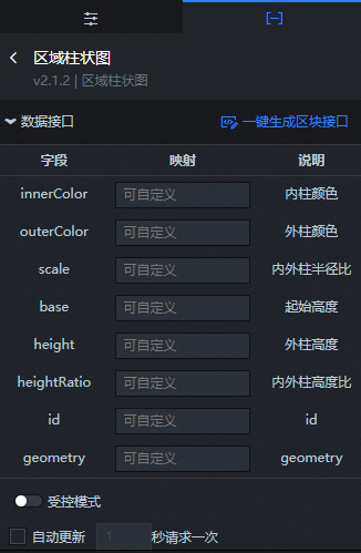
Field |
Description |
innerColor |
The color of the inner column of the area column chart. |
outerColor |
The color of the outer column of the area column chart. |
scale |
The radius ratio of the inner and outer columns of the area column chart. |
base |
The start height of the inner and outer columns of the area column chart. |
height |
The height of the outer column of the area column chart. |
heightRatio |
The height ratio of the inner and outer columns of the area column chart. |
id |
The ID of the inner and outer columns of the area column chart. |
geometry |
The area surface data of the inner and outer columns of the area column chart. |
Configuration Item |
Description |
Controlled Mode |
Turn on the switch to prevent the widget from requesting data upon initialization. Data is requested only through a callback ID or a method configured in the blueprint editor. Turn off the switch to allow automatic data update requests. The switch is off by default. |
Automatic Update Request |
Select this option to enable dynamic polling and manually set the polling frequency. If you clear this option, data is not updated automatically. You must manually refresh the page or trigger data update requests using the blueprint editor or callback ID events. |
Data Source |
Click Configure Data Source. In the Set Data Source panel, you can modify the data source type and data query code, preview the data source return results, and view the data response. |
Data Result |
Displays the response result of a data request. When the data source changes, click the |
 icon on the right to view the real-time data response.
You can also use the layer data API as a block data API to configure more data source types in the data dashboard or to interact with data from common chart widgets. For more information, see One-click generation of block APIs.
If you created your 3D City Builder project in Spatial Data Project mode and the project contains data primitive layer content, you can use the Spatial Build Data Source to obtain spatial map data when you configure the data panel in the scene editor. The steps are as follows:
In the layer configuration panel, select the Data tab. Click the Data Source Type drop-down list at the bottom of the panel and select Spatial Build Data Source.
From the Data Project drop-down list at the bottom of the panel, select an existing data project from the spatial build platform.
After you select a data project, select a matching dataset from the Dataset drop-down list.
NoteIf no configurable data types are available for the Data Project and Dataset configuration items, click Go to Spatial Build Platform to Manage Data in the panel to configure data in the spatial build platform. For more information, see Overview of spatial data management.
Blueprint interaction
In the scene editor, in the layer list on the left, click the
 icon to the right of Area Column Chart.
Click the
 icon in the upper-left corner of the page.
On the blueprint editor configuration page, click the Area column chart layer in the import node bar. The corresponding configuration parameters appear on the canvas, as shown in the following figure.
Events
Event
Description
When data API request is complete
This event is triggered after the data API request is returned and processed by the filter. The event also returns the processed data in JSON format. For a data example, see the Data Response Result area on the Data tab of the widget's configuration panel in the canvas editor.
Rendering complete
This event is triggered when the area column chart is finished rendering. It returns object data.
Actions
Action
Description
Request Data API
Re-requests data from the server-side. Data from an input data processing node or a layer node is used as a parameter. For example, if the API data source for the area column chart is set to
https://api.testand the data passed to the Request Data API action is{ id: '1'}, the final request URL ishttps://api.test?id=1.Import Data API
Processes the data in the format required by the widget, and then imports the data to redraw the widget. This does not require re-requesting data from the server-side. For a data example, see the Data Response Result area on the Data tab of the widget's configuration panel in the canvas editor.
Show Widget
Shows the widget. No parameter is required.
Hide Widget
Hides the widget. No parameter is required.