This topic describes the structure and features of the block editor to help you get started with developing blocks.
Page overview
Block editor page overview
 Widget configuration in a block
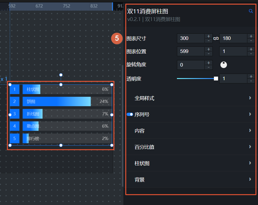 Widget data source configuration in a block
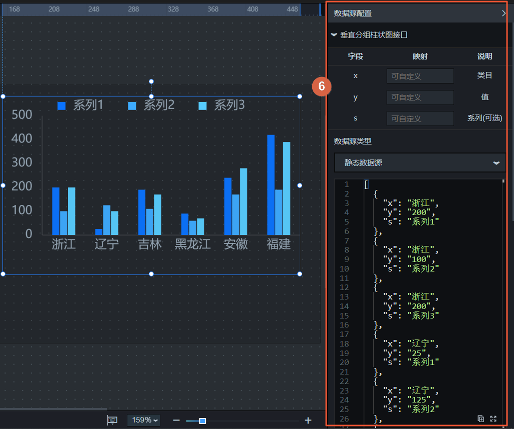
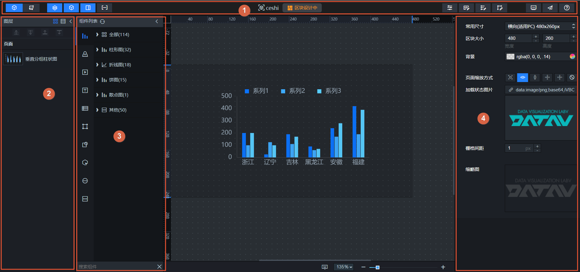
No. | Name | Description |
1 | Toolbar | The toolbar is at the top of the editor page. Use the toolbar to switch editor pages, control module visibility, configure block settings, and preview or publish blocks. |
2 | Layers | The layer list shows the position of each widget on the canvas. You can manually adjust the vertical order of widget layers and the thumbnail style of layer widgets as needed. The layer feature in the block editor is similar to the canvas editor feature in visualization applications. For more information, see Layer management. |
3 | Widget list | In the widget list, view and search for various types of widgets. Drag widgets to the block canvas and configure them to develop the block. |
4 | Block settings | Click a blank area on the block canvas. The basic configuration parameters for the block editor appear on the right. In the block configuration parameters, adjust the common dimensions and size of the block, set the background color and image, select a scaling method, and adjust the grid size. |
5 | Widget configuration items | Click any widget on the block canvas. The widget configuration parameters page automatically opens on the right. The method for configuring widget items in the block editor is the same as in the canvas editor for visualization applications. For more information about the configuration method, see Configuration items. |
6 | Widget data source | Click any widget on the block canvas. The widget data source configuration page automatically opens on the right. The widget data source in the block editor supports two types: Static data source and API. The data source panel supports automatic updates. The API data type supports GET, POST, and PUT requests. The data source configuration panel supports data filters and lets you resend requests through blueprints. |
Block settings
Click a blank area outside the block canvas. The block configuration panel appears on the right.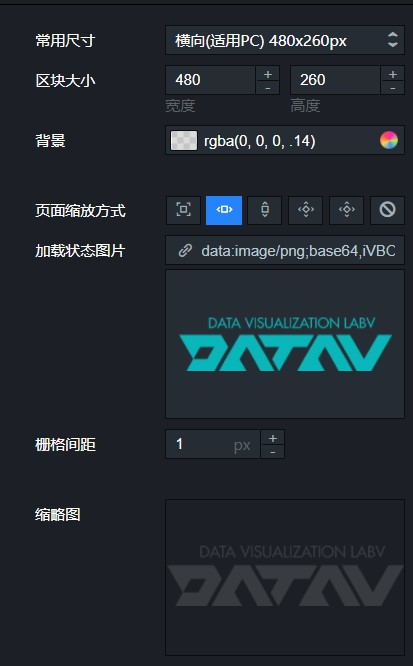
Name | Description |
Common dimensions | Sets the common dimension type for the block on the canvas. The options are Landscape (for PC) 480 × 260 px, Landscape (for PC) 900 × 260 px, Portrait layout (for large screens) 260 × 940 px, Portrait layout (for large screens) 380 × 940 px, Portrait layout (for large screens) 480 × 940 px, and Custom size. |
Block size | Sets the width and height of the block. The default value is Landscape (for PC) 480 × 260 px. The unit is px. |
Background | Adjusts the background color of the block. |
Page scaling method | Selects a scaling method based on the block's display size. The options are Full screen, Fit to width, Fit to height, Fit to height (scrollable), Fit to screen, and No scaling. |
Loading status image | Sets the image to display while the block is loading. You can upload an image by entering its URL. You can also click Change in the image box or drag an image from your computer into the box. |
Grid size | The grid size is the smallest unit a widget can be moved on the block page. Widget borders automatically snap to the grid. The minimum size is 1 px. At this size, widget movement is smooth. |
Thumbnail | Click Click to capture in the image frame to the right of the thumbnail. This captures a cover thumbnail for the current block. |
Configure block widgets
The block editor lets you configure block widgets, including their styles, configuration items, and data interfaces.
Use block interfaces
This section provides an example of how to configure and use block interfaces in the block editor based on the block requirements defined in Block example description.
Iterators
An iterator is a list generator. In the block editor panel, you can add a template unit that consists of one or more grouped widgets. Then, you can use the data-driven iterator to generate a list. The number of items in the list matches the length of the array in the iterator's data.
Publish and preview
In block management, the publish and preview feature lets you preview blocks before you publish them to ensure that their content and style are correct. Previewing a block shows its real-time effect, allowing you to make necessary adjustments and optimizations. This process improves the overall quality and consistency of the block.