Efficient and thoughtful
Slow, high-friction Mini Programs lose users. This guide covers five design principles that reduce wait times, shorten interaction paths, and make your Mini Program feel fast and dependable.
Minimize wait time
How users perceive speed depends on how long they wait — and what they know about why they're waiting.
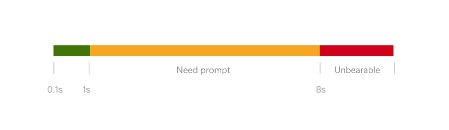
Response time has three meaningful thresholds:
Under 0.1 seconds: The response feels instantaneous. Users feel in direct control.
Around 1 second: Users notice the delay but stay focused. The experience feels continuous.
Up to 10 seconds: Users are aware they're waiting on the system. Attention is at risk.
Pages that take longer than 8 seconds to load are frequently abandoned. Keep page load times well under that limit. For anything that can't load instantly, design for the wait — don't ignore it.
Divert attention
When a wait is unavoidable, shift focus away from the clock.
Match the feedback style to the expected load duration:
Under 1 second: No loading indicator needed. A brief flash can be more disruptive than helpful.
1–3 seconds: Use a spinner or progress bar. Keep it lightweight.
Over 3 seconds: Use skeleton screens. Displaying the page structure while content loads sets user expectations and reduces perceived wait time. Place the loading component below the navigation bar — that's where users look first while waiting. Keep skeleton animations dynamic to signal that the system is actively working.
Skeleton screens reduce perceived wait, but they don't replace performance optimization. Use both.
One click
Every unnecessary tap costs users time and patience. Identify interaction paths where users take extra steps that don't move them toward their goal, and eliminate them.
The phone top-up flow in Alipay illustrates this clearly:
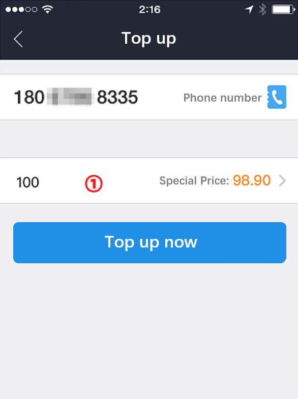
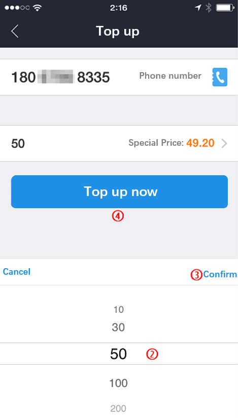
Before Alipay 9.2, topping up required four taps:
Tap the amount field to invoke the selector.
Swipe to select an amount.
Tap Finish to close the selector.
Tap Top Up Now to go to the payment page.
In Alipay 9.2 and later, top-up amounts are displayed as a tiled list. One tap selects the amount and proceeds directly to payment.
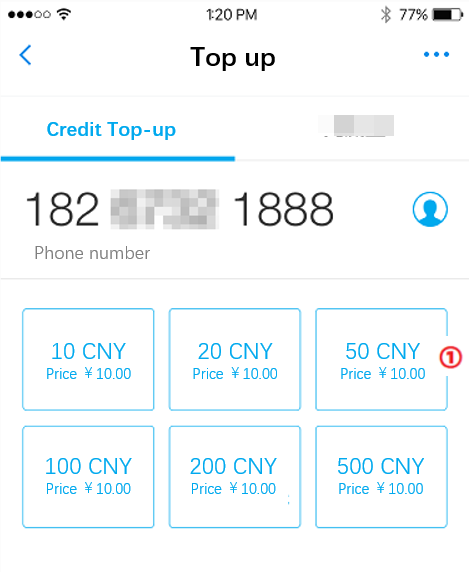
When multiple actions appear on the same page, use visual hierarchy to do the work: give the primary action a distinct style so users don't have to decide what to tap first. Visual priority is its own form of reducing clicks.
Reduce input
Typing on a mobile keyboard is slow and error-prone. Unless input is necessary, give users items to select rather than fields to fill.
Design each flow with the minimum steps needed to complete the task. Remove any step that interrupts the user's focus without contributing to their goal.
Example
Smartphones include built-in sensors — cameras, microphones, and gyroscopes. The mPaaS Mini Program framework also exposes authorization interfaces for geographic location and account information. Use these to replace manual entry wherever possible.
Login page: Use face recognition via the device camera instead of asking users to type a password.
Bank card registration: Pull the user's name, ID card number, and mobile phone number from their account information automatically, eliminating manual form entry.
Clear feedback
Users need to know the system is working. Timely, specific feedback answers the question "what's happening?" and prevents confusion or repeated taps.
Two common scenarios where feedback matters most:
Location services disabled: If the page can't retrieve the user's location automatically, display a clear prompt explaining that location services need to be enabled. Don't silently fail.
Page loading: A blank screen tells users nothing. Show a loading indicator so users know content is on its way.
Good feedback reduces uncertainty. Design it as a first-class part of every flow, not an afterthought.