Simple and clear
Design mPaaS miniapps to be simple and intuitive so users can complete tasks quickly, even in challenging mobile environments. A simple, intuitive design attracts more users and supports business growth.
Focus each page on a single task
Mobile screens have limited space, and users interact with miniapps in constantly shifting environments—walking, commuting, or navigating poor network conditions. Packing too much onto a single page forces users to work harder, and they abandon the task before completing it.
Give each page one clear focus. Most mPaaS miniapp use cases are task-oriented: transferring money, paying a bill, checking a status. When a page does one thing, users understand it instantly and complete the task without friction. Remove anything unrelated to the user's current decision or action.

Example
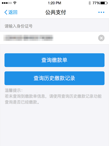
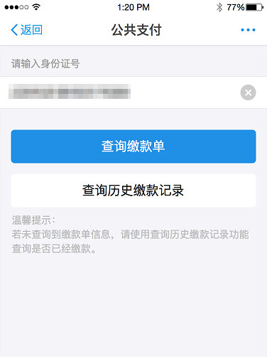
When multiple primary action buttons appear on a page with no clear priority, users stall—they cannot tell which action to take.
Incorrect: three equally weighted primary buttons competing for attention.
Correct: one primary action is visually dominant, guiding the user to the next step.
Delete and hide non-essential elements
Users have a finite capacity to absorb information, especially under the interruptions and distractions of mobile use. Every optional feature, redundant label, or decorative element adds cognitive load and slows users down.
Delete optional features, extra options, and redundant text that do not support the current task.
Delete decorative elements that add visual noise without conveying meaning.
Hide non-core features behind progressive disclosure, surfacing them only when the user needs them.
Reducing on-screen clutter lets users focus on what matters and complete their goal faster.
Provide clear navigation
Poor navigation is a direct cause of app abandonment. When users cannot tell where they are or how to go back, they leave.
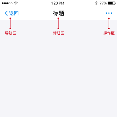
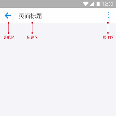
Include a navigation bar on every page of your mPaaS miniapp. A persistent navigation bar:
Tells users where they are in the miniapp.
Shows them where they can go next.
Gives them a reliable way to go back.
Keeping the navigation bar consistent across all pages removes the need for users to learn new interaction patterns each time they switch pages, reducing friction and building trust.