How to use the tab bar
In a multi-tab miniapp, you can add a tab bar at the bottom of the screen. Use the `tabBar` configuration item to define the appearance of the tab bar and the page that is displayed when a tab is selected.
The bottom tab bar does not appear on pages that you navigate to using `my.navigateTo` or `my.redirectTo`. This applies even if the destination page is defined in the `tabBar` configuration.
The first page in the `tabBar` configuration must be the home page.
tabBar configuration
Property | Type | Required | Description |
textColor | HexColor | No | The text color. |
selectedColor | HexColor | No | The color of the selected text. |
backgroundColor | HexColor | No | The background color. |
items | Array | Yes | An array of tab configurations. For the properties of each item, see the table below. |
Item configuration
Property | Type | Required | Description |
pagePath | String | Yes | The path to the page. |
name | String | Yes | Name |
icon | String | No | Path to the icon. The recommended image size is 60 × 60 px. The system stretches or scales any image that does not match this size. |
activeIcon | String | No | The path to the active icon. |
Code example
The following code provides an example of a `tabBar` configuration:
{
  "tabBar": {
    "textColor": "#dddddd",
    "selectedColor": "#49a9ee",
    "backgroundColor": "#ffffff",
    "items": [
      {
        "pagePath": "pages/index/index",
        "name": "Homepage"      },
      {
        "pagePath": "pages/logs/logs",
        "name": "Logs"      }
    ]
  }
}
my.hideTabBar
Prerequisites: Base library 1.11.0 or later. For earlier versions, you must ensure compatibility.
Hides the tab bar. For more information, see the tabBar FAQ.
Code example
The following code provides an example of `my.hideTabBar`:
my.hideTabBar({
    animation: true
})
Input parameters
The input parameter is an Object. Its properties are as follows:
Property | Type | Required | Description |
animation | Boolean | No | Specifies whether to use an animation effect. The default value is `false`. |
success | Function | No | The callback function that is invoked when the API call succeeds. |
fail | Function | No | The callback function that is invoked when the API call fails. |
complete | Function | No | The callback function that is invoked at the end of the API call, regardless of whether it succeeds or fails. |
my.hideTabBarRedDot
Prerequisites: Base library 1.11.0 or later. For earlier versions, you must ensure compatibility.
This feature cannot be simulated in the IDE. You must test the results on a physical device.
Hides the red dot in the upper-right corner of a specific tab bar item. For more information, see the tabBar FAQ.
Example
Code example
The following code provides an example of `my.hideTabBarRedDot`:
my.hideTabBarRedDot({
  index: 0
})
Input parameters
The input parameter is an Object. Its properties are as follows:
Property | Type | Required | Description |
index | Number | Yes | The index of the tab bar item. The index starts from 0 on the left. |
success | Function | No | The callback function that is invoked when the API call succeeds. |
fail | Function | No | The callback function that is invoked when the API call fails. |
complete | Function | No | The callback function that is invoked at the end of the API call, regardless of whether it succeeds or fails. |
my.removeTabBarBadge
Prerequisites: Base library 1.11.0 or later. For earlier versions, you must ensure compatibility.
This feature cannot be simulated in the IDE. You must test the results on a physical device.
Removes the text from the upper-right corner of a specific tab bar item. For more information, see the tabBar FAQ.
Example
Code example
The following code provides an example of `my.removeTabBarBadge`:
my.removeTabBarBadge({
  index: 0
})
Input parameters
An object with the following properties:
Property | Type | Required | Description |
index | Number | Yes | The index of the tab bar item. The index starts from 0 on the left. |
success | Function | No | The callback function that is invoked when the API call succeeds. |
fail | Function | No | The callback function that is invoked when the API call fails. |
complete | Function | No | The callback function that is invoked at the end of the API call, regardless of whether it succeeds or fails. |
my.setTabBarBadge
Prerequisites: Base library 1.11.0 or later.
This feature cannot be simulated in the IDE. You must test the results on a physical device.
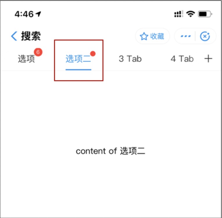
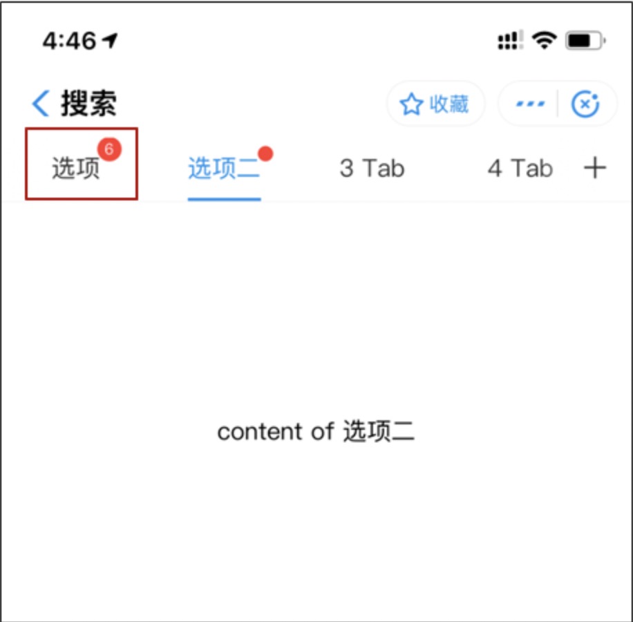
Adds text to the upper-right corner of a specific tab bar item. For example, you can use this feature to display the number of unread messages. For more information, see the tabBar FAQ.
Example
Code example
The following code provides an example of `my.setTabBarBadge`:
my.setTabBarBadge({
  index: 0,
  text: '42'
})
Input parameters
The input parameter is an Object. Its properties are as follows:
Property | Type | Required | Description |
index | Number | Yes | The index of the tab bar item. The index starts from 0 on the left. |
text | String | Yes | The text to display. If the text exceeds three characters, it is truncated to the first two characters followed by an ellipsis (...). For example, "Alipay" is displayed as "Alipay", and "Ant Financial" is displayed as "An...". |
success | Function | No | The callback function that is invoked when the API call succeeds. |
fail | Function | No | The callback function that is invoked when the API call fails. |
complete | Function | No | The callback function that is invoked at the end of the API call, regardless of whether it succeeds or fails. |
my.setTabBarItem
Prerequisites: Base library 1.11.0 or later. For earlier versions, you must ensure compatibility.
This feature cannot be simulated in the IDE. You must test the results on a physical device.
Dynamically sets the content of a specific tab bar item. For more information, see the tabBar FAQ.
Code example
The following code provides an example of `my.setTabBarItem`:
my.setTabBarItem({
    index: 0,
    text: 'text',
    iconPath: '/image/iconPath',
    selectedIconPath: '/image/selectedIconPath'
})
Input parameters
The type is Object and has the following properties:
Property | Type | Required | Description |
index | Number | Yes | The index of the tab bar item. The index starts from 0 on the left. |
text | String | Yes | The text on the tab button. |
iconPath | String | Yes | The path to the image. The recommended size is 81 px × 81 px. Supported formats are PNG, JPEG, JPG, and GIF. Network images are also supported. |
selectedIconPath | String | Yes | The path to the image when the tab is selected. The recommended size is 81 px × 81 px. Supported formats are PNG, JPEG, JPG, and GIF. Network images are also supported. |
success | Function | No | The callback function that is invoked when the API call succeeds. |
fail | Function | No | The callback function that is invoked when the API call fails. |
complete | Function | No | The callback function that is invoked at the end of the API call, regardless of whether it succeeds or fails. |
my.setTabBarStyle
Prerequisites: Base library 1.11.0 or later. For earlier versions, you must ensure compatibility.
This feature cannot be simulated in the IDE. You must test the results on a physical device.
Dynamically sets the overall style of the tab bar, such as text color, background color, and border color. For more information, see the tabBar FAQ.
Code example
The following code provides an example of `my.setTabBarStyle`:
my.setTabBarStyle({
    color: '#FF0000',
    selectedColor: '#00FF00',
    backgroundColor: '#0000FF',
    borderStyle: 'white'
})
Input parameters
The data type is an object containing the following properties:
Property | Type | Required | Description |
color | HexColor | Yes | The default text color on the tab. |
selectedColor | HexColor | Yes | The text color when the tab is selected. |
backgroundColor | HexColor | Yes | The background color of the tab. |
borderStyle | String | Yes | The color of the top border of the tab bar. Only |
success | Function | No | The callback function that is invoked when the API call succeeds. |
fail | Function | No | The callback function that is invoked when the API call fails. |
complete | Function | No | The callback function that is invoked at the end of the API call, regardless of whether it succeeds or fails. |
my.showTabBar
Prerequisites: Base library 1.11.0 or later. For earlier versions, you must ensure compatibility.
Shows the tab bar. For more information, see the tabBar FAQ.
Code example
The following code provides an example of `my.showTabBar`:
my.showTabBar({
    animation: true
})
Input parameters
The input parameter is an Object. Its properties are as follows:
Property | Type | Required | Description |
animation | Boolean | No | Specifies whether to use an animation effect. The default value is `false`. |
success | Function | No | The callback function that is invoked when the API call succeeds. |
fail | Function | No | The callback function that is invoked when the API call fails. |
complete | Function | No | The callback function that is invoked at the end of the API call, regardless of whether it succeeds or fails. |
my.showTabBarRedDot
Prerequisites: Base library 1.11.0 or later. For earlier versions, you must ensure compatibility.
This feature cannot be simulated in the IDE. You must test the results on a physical device.
Shows the red dot in the upper-right corner of a specific tab bar item. For more information, see the tabBar FAQ.
Code example
The following code provides an example of `my.showTabBarRedDot`:
my.showTabBarRedDot({
  index: 0
})
Input parameters
An object with the following properties:
Property | Type | Required | Description |
index | Number | Yes | The index of the tab bar item. The index starts from 0 on the left. |
success | Function | No | The callback function that is invoked when the API call succeeds. |
fail | Function | No | The callback function that is invoked when the API call fails. |
complete | Function | No | The callback function that is invoked at the end of the API call, regardless of whether it succeeds or fails. |
onTabItemTap
Prerequisites: Base library 1.11.0 or later. For earlier versions, you must ensure compatibility.
This API is called when a user taps a tab. You can use this API to listen for tab bar tap events. For more information, see the tabBar FAQ.
Code example
The following code provides an example of `onTabItemTap`:
//.js
Page({
  onTabItemTap(item) {
    console.log(item.index)
    console.log(item.pagePath)
    console.log(item.text)
  }
})
tabBar FAQ
Feature support questions
Q: Do tab bar pages support navigation with parameters?
A: Yes, they do.
Q: How do I listen for tab bar tap events?
A: You can use the onTabItemTap API on the miniapp page.
Q: Does the tab bar icon support the SVG format?
A: No, it does not. Only the PNG, JPEG, JPG, and GIF formats are supported.
Q: How do I set the style of a tab?
A: You can set the style directly in the JSON file, as shown in the code example below, or by calling the my.setTabBarStyle API.
  "tabBar": {
    "textColor": "#404040",
    "selectedColor": "#108ee9",
    "backgroundColor": "#F5F5F9"
  }
Request exception questions
Q: How do I fix the "Cannot read property ‘getCurrentPages’ of undefined" error that occurs when switching a tabBar? A: This error is caused by an incorrect tabBar path. Verify that the path is correct.
AQ: Why is the tab bar not displayed after I navigate to a page?
A: The bottom tab bar does not appear on pages that you navigate to using the my.navigateTo or my.redirectTo APIs. Additionally, ensure that the first page in the `tabBar` configuration is the home page.
Q: Why don't tab bar pages support navigation with parameters?
A: Tab bar pages do not support navigation with parameters. We recommend that you use the cache or global variables to pass parameters.
Q: When a miniapp enters a tab bar page, how can I retrieve the path of the previous page?
A: Before navigating away from a page, store its path in a global property. When you switch to a tab bar page, you can then retrieve the path of the previous page from that global property.
Q: When I debug in the IDE, why are the `onShow` and `onLoad` lifecycle functions not executed when I switch tabs?
A: The tabBar switching function is not triggered when you debug in an IDE, so it must be tested on a real device.