my.getTitleColor
This API retrieves the background color of the navigation bar.
Required version: Base libraries 1.13.0 or later. For earlier versions, see handle compatibility.
Code examples
// API-DEMO page/API/get-title-color/get-title-color.json
{
    "defaultTitle": "Get Navigation Bar Background Color"
}
<!-- API-DEMO page/API/get-title-color/get-title-color.axml-->
<view>
<view class="page-section-demo">
<text>Current navigation bar background color:
</text>
<input type="text" disabled="{{true}}" value="{{titleColor.color}}">
</input>
</view>
<view class="page-section-btns">
<view onTap="getTitleColor">Get navigation bar background color
</view>
</view>
</view>// API-DEMO page/API/get-title-color/get-title-color.js
Page({
data: {
titleColor: {},
},
getTitleColor() {
my.getTitleColor({
success: (res) => {
this.setData({
titleColor: res
})
}
})
}
});Input parameters
An object with the following properties:
Property | Type | Required | Description |
success | Function | No | The callback function for a successful call. |
fail | Function | No | The callback function for a failed call. |
complete | Function | No | The callback function that is executed at the end of the call, regardless of whether the call is successful or failed. |
success callback function
The parameter is an Object with the following properties:
Property | Type | Description |
color | HexColor | The current background color of the navigation bar. The value is a hexadecimal color in ARGB format, such as #323239FF. |
FAQ
Q: Can I set the color of the Share and Favorite icons in the upper-right corner of the miniapp?
A: This color is the default. It cannot be set.
my.hideBackHome
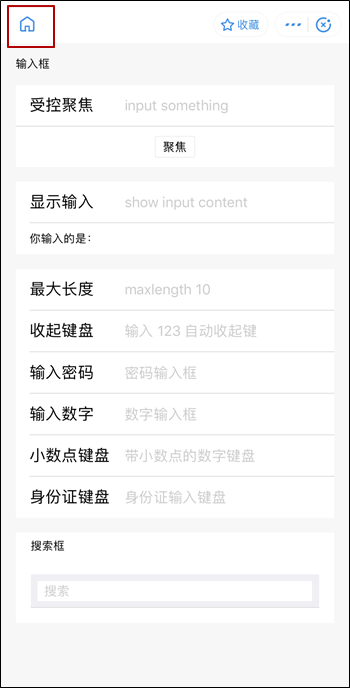
This API hides the Back to Homepage icon on the title bar (as shown in the figure below) and the Back to Homepage feature in the general menu in the upper-right corner.
Required version: Base libraries 1.16.4 or later. For earlier versions, see handle compatibility.
If the entry page of the miniapp is not the homepage, a Back to Homepage icon appears in the upper-left corner.
If the tab bar in
app.jsonis configured to navigate topages/index/index, the Back to Homepage feature does not appear.
Code examples
//.js
Page({
  onReady() {
    if (my.canIUse('hideBackHome')) {
      my.hideBackHome();
    }
  },
});
//.js
onLoad(){
my.reLaunch()({
url:'../swiper/swiper'// A non-homepage page
})
setTimeout(() => {
// Hide the Back to Homepage button after 5 seconds
my.hideBackHome()
}, 5000)
}my.hideNavigationBarLoading
This API hides the loading animation on the navigation bar of the current page.
Code examples
// API-DEMO page/API/navigation-bar-loading/navigation-bar-loading.json
{
    "defaultTitle": "Title Bar Loading Animation"
}
<!-- API-DEMO page/API/navigation-bar-loading/navigation-bar-loading.axml-->
<view class="page">
<view class="page-section">
<button type="primary" onTap="showNavigationBarLoading">Show loading animation</button>
<button onTap="hideNavigationBarLoading">Hide loading animation</button>
</view>
</view>// API-DEMO page/API/navigation-bar-loading/navigation-bar-loading.js
Page({
showNavigationBarLoading() {
my.showNavigationBarLoading()
},
hideNavigationBarLoading() {
my.hideNavigationBarLoading()
}
})/* API-DEMO page/API/navigation-bar-loading/navigation-bar-loading.acss */
button + button {
margin-top: 20rpx;
}my.showNavigationBarLoading
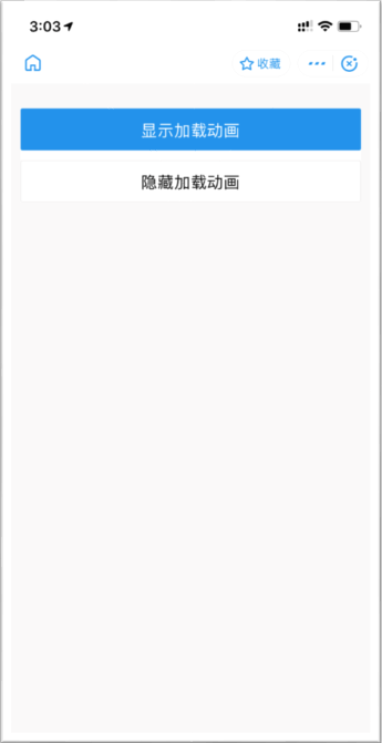
This API displays the loading animation in the current page's navigation bar.
Sample effect
Code examples
// API-DEMO page/API/navigation-bar-loading/navigation-bar-loading.json
{
    "defaultTitle": "Title Bar Loading Animation"
}
<!-- API-DEMO page/API/navigation-bar-loading/navigation-bar-loading.axml-->
<view class="page">
<view class="page-section">
<button type="primary" onTap="showNavigationBarLoading">Show loading animation</button>
<button onTap="hideNavigationBarLoading">Hide loading animation</button>
</view>
</view>// API-DEMO page/API/navigation-bar-loading/navigation-bar-loading.js
Page({
showNavigationBarLoading() {
my.showNavigationBarLoading()
},
hideNavigationBarLoading() {
my.hideNavigationBarLoading()
}
})/* API-DEMO page/API/navigation-bar-loading/navigation-bar-loading.acss */
button + button {
margin-top: 20rpx;
}my.setNavigationBar
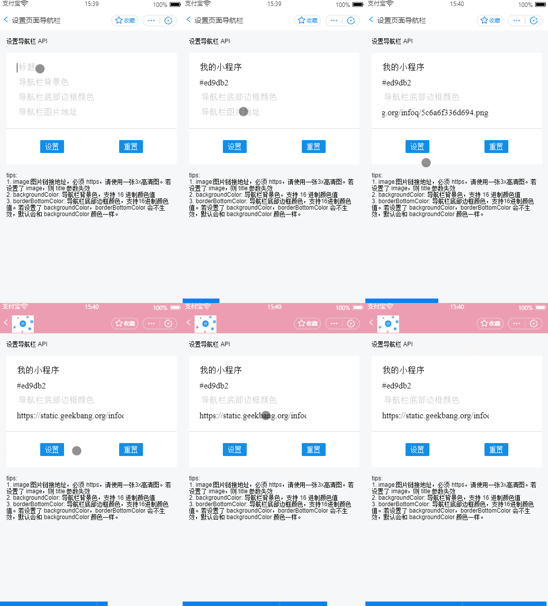
This API sets the style for the navigation bar, including its title, background color, bottom border color, and the logo in the upper-left corner.
The logo image in the upper-left corner of the navigation bar must be in GIF format and use an HTTPS link.
If you set the backgroundColor property, the borderBottomColor property has no effect. The bottom border color defaults to the background color.
The navigation bar background does not support gradient colors.
Sample effect
Code examples
// API-DEMO page/API/set-navigation-bar/set-navigation-bar.json
{
    "defaultTitle": "Set Page Navigation Bar"
}
<!-- API-DEMO page/API/set-navigation-bar/set-navigation-bar.axml-->
<view class="page">
<view class="page-description">Set Navigation Bar API</view>
<form onSubmit="setNavigationBar" style="align-self:stretch">
<view class="page-section">
<view class="page-section-demo">
<input class="page-body-form-value" type="text" placeholder="Title" name="title"></input>
<input class="page-body-form-value" type="text" placeholder="Navigation bar background color" name="backgroundColor"></input>
<input class="page-body-form-value" type="text" placeholder="Navigation bar bottom border color" name="borderBottomColor"></input>
<input class="page-body-form-value" type="text" placeholder="Navigation bar image URL" name="image"></input>
</view>
<view class="page-section-btns">
<button type="primary" size="mini" formType="submit">Set</button>
<button type="primary" size="mini" onTap="resetNavigationBar">Reset</button>
</view>
</view>
</form>
<view class="tips">
Tips:
<view class="item">1. image: The URL of the image. It must be an HTTPS URL. Use a 3x high-definition image. If you set the image, the title parameter is ignored.</view>
<view class="item">2. backgroundColor: The background color of the navigation bar. It supports hexadecimal color values.</view>
<view class="item">3. borderBottomColor: The color of the bottom border of the navigation bar. It supports hexadecimal color values. If you set backgroundColor, borderBottomColor does not take effect and defaults to the same color as backgroundColor.</view>
</view>
</view>// API-DEMO page/API/set-navigation-bar/set-navigation-bar.js
Page({
setNavigationBar(e) {
var title = e.detail.value.title;
var backgroundColor = e.detail.value.backgroundColor;
var borderBottomColor = e.detail.value.borderBottomColor;
var image = e.detail.value.image;
console.log(title)
my.setNavigationBar({
title,
backgroundColor,
borderBottomColor,
image,
})
},
resetNavigationBar() {
my.setNavigationBar({
reset: true,
title: 'Reset navigation bar style',
});
}
})/* API-DEMO page/API/set-navigation-bar/set-navigation-bar.acss */
.page-section-btns {
padding: 26rpx;
}Input parameters
The input parameter is an object with the following properties:
Property | Type | Required | Description |
title | String | No | The title of the navigation bar. |
image | String | No | The URL of the image. The GIF format is supported. It must be an HTTPS URL. Use a high-definition image that meets the iOS @3x resolution standard. If you set the image, the title parameter is ignored. |
backgroundColor | String | No | The background color of the navigation bar. It supports hexadecimal color values. |
borderBottomColor | String | No | The color of the bottom border of the navigation bar. It supports hexadecimal color values. If you set backgroundColor, the borderBottomColor property does not take effect. The bottom border color defaults to the same color as the backgroundColor. |
reset | Boolean | No | Specifies whether to reset the navigation bar to the application's default color scheme. The default value is false. |
success | Function | No | The callback function for a successful call. |
fail | Function | No | The callback function for a failed call. |
complete | Function | No | The callback function that is executed at the end of the call, regardless of whether the call is successful or failed. |
FAQ
Q: Can I set the color of the Share and Favorite icons in the upper-right corner of the miniapp?
A: This color is the default and cannot be changed.
Related information
For more information about the iOS @3x resolution standard, see Image Size and Resolution.
Navigation bar FAQ
Q: Can I set the color of the Share and Favorite icons in the upper-right corner of the miniapp?
A: The default color cannot be changed.
Q: Can the menu page within the miniapp capsule button be customized?

A: You can customize the menu of the miniapp capsule button. For more information, see Customize the control area on the right side of the navigation bar.
Q: Can the font color of the navigation bar be customized?
A: The font color of the navigation bar cannot be customized. It automatically changes to black or white based on the background color.