A gauge visually represents the status of a metric and is primarily used to show a value as a proportion of a total. For example, you can use a gauge to display the inventory status of a product category to check whether stock is sufficient or needs replenishment.
Overview
Use cases
Gauges are commonly used to track progress, metrics, and trends, highlighting key business indicators so you can quickly spot operational anomalies.
Key features
-
Calculation capabilities: Customize the start and end values of the gauge to automatically calculate the metric's proportion.
-
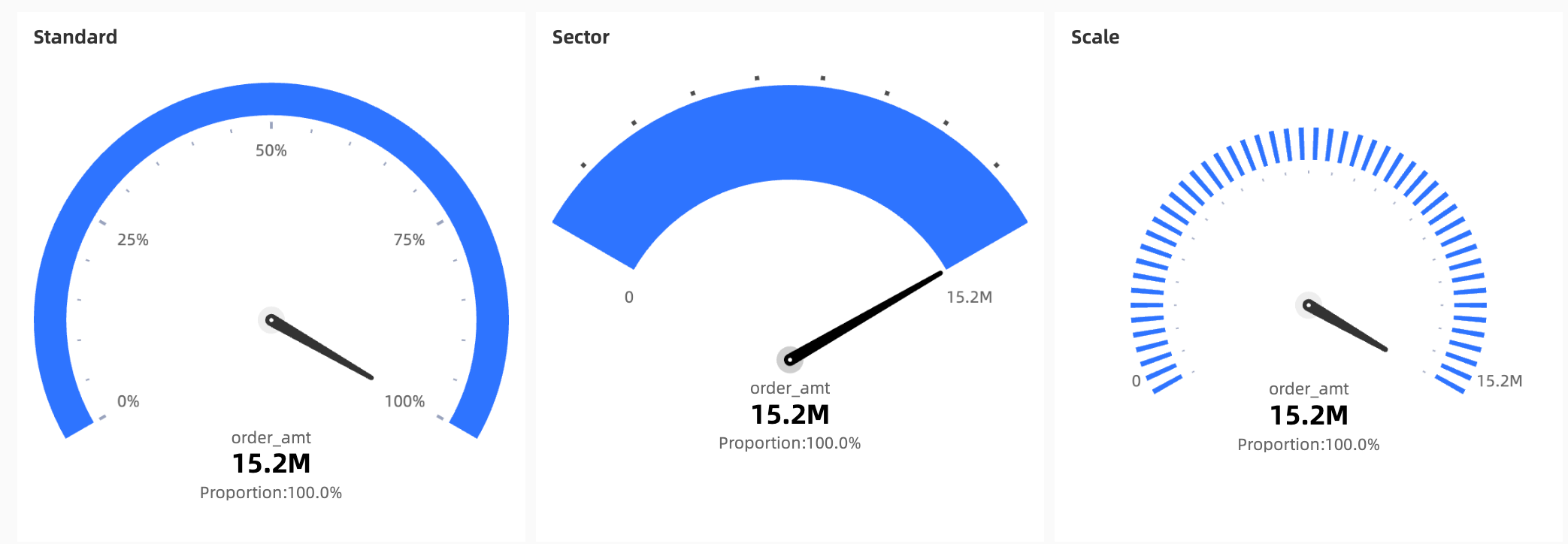
Visual styles: Choose from Standard, Sector, and Scale styles.
-
Annotation capabilities: Add notes and an endnote, and configure an external link to connect your data with other systems.
Sample chart

Limitations
-
Prerequisites: You have created a dashboard. For more information, see Create a Dashboard.
-
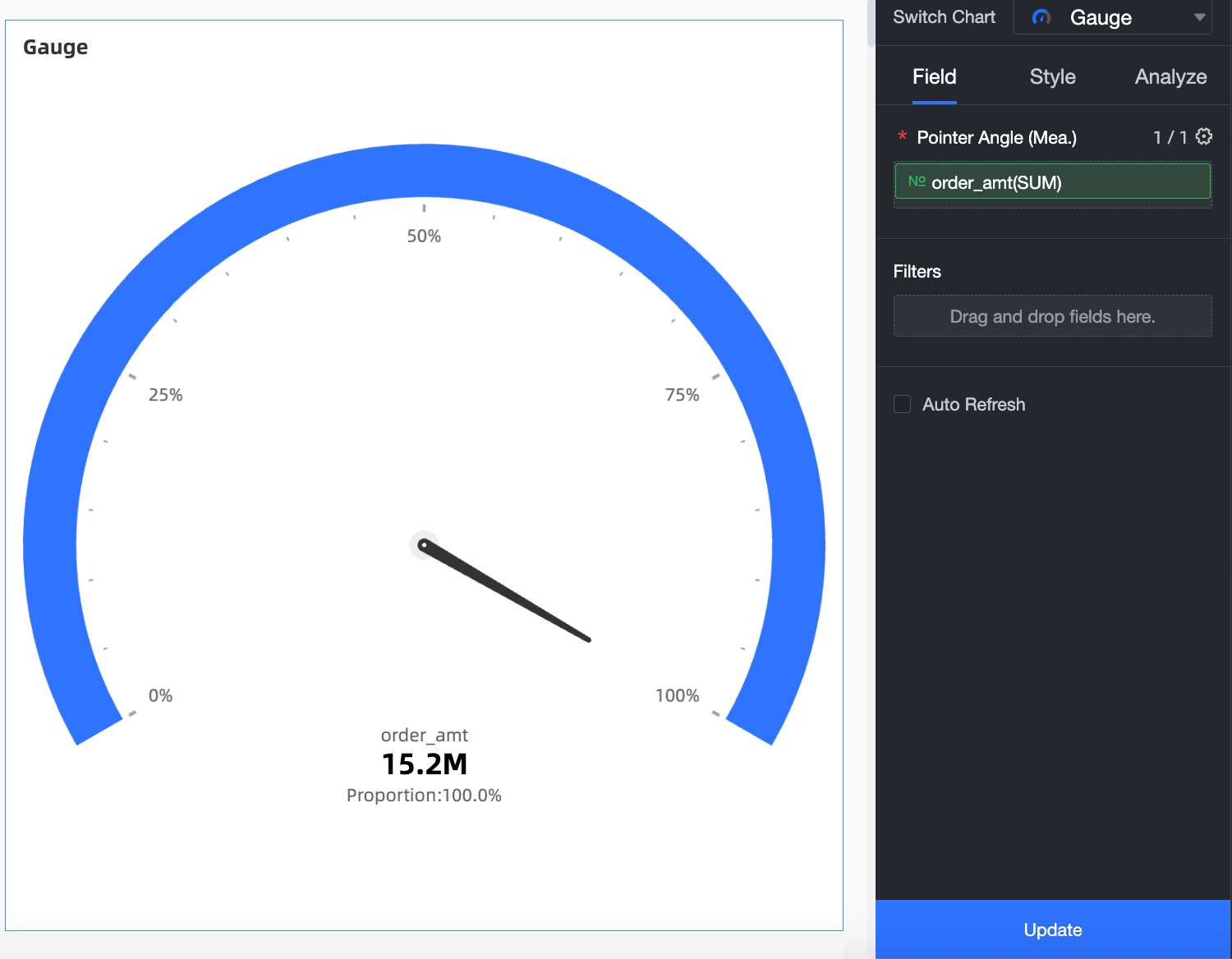
When you add data to a gauge, the Pointer Angle (Mea.) field is determined by a measure from your dataset. You can select only one measure.
Procedure
Configure chart fields
-
From the Measures list, double-click or drag order_amt to the Pointer Angle (Mea.) field.
-
Click Update. The chart updates automatically.
Configure chart styles
The following style settings are specific to gauges. For settings that apply to all chart types, see Configure the chart title area.
Enter a keyword in the search box at the top of the configuration pane to locate a configuration item. Click the  icon on the right to Expand/Collapse All Categories.
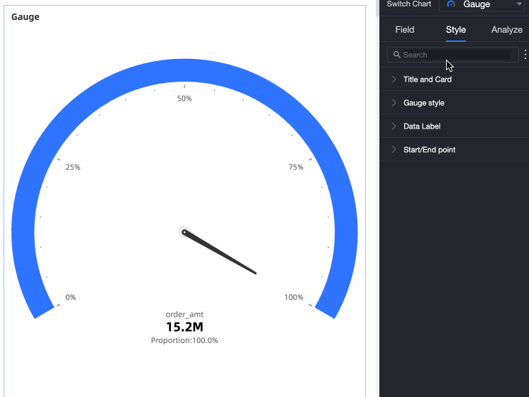
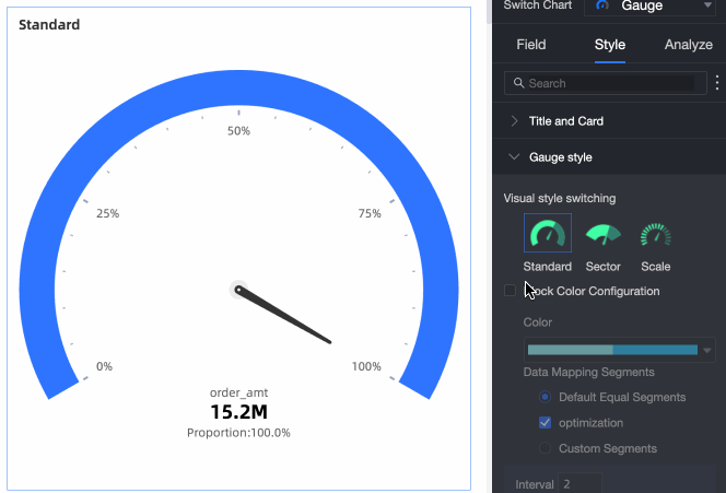
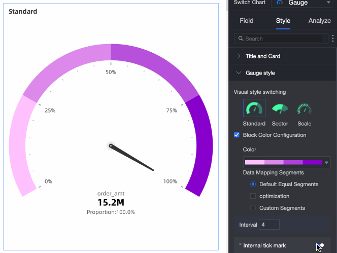
Configure the gauge appearance in the Gauge Style section.
|
Parameter |
Description |
|
Visual Style |
Three styles are available: Standard, Sector, and Scale.
|
|
Color settings |
Set a theme color and configure Data Mapping Ranges. For the ranges, you can choose between Equal Intervals and Custom Range.
|
|
Display internal tick marks |
Select the Display Internal Tick Marks checkbox. When selected, you can choose to display the value as a percentage or the original value.
|
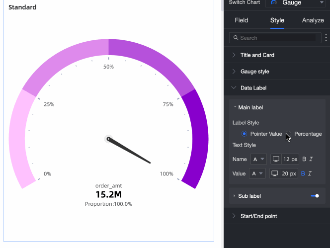
Configure the primary and secondary label styles in the Data Label section.
|
Parameter |
Description |
|
Primary label display |
Choose between Display Pointer Value and Display Percentage. You can also modify the text style.
|
|
Display secondary label |
Select the Display Secondary Label checkbox to show the secondary data label. You can then configure its style. |
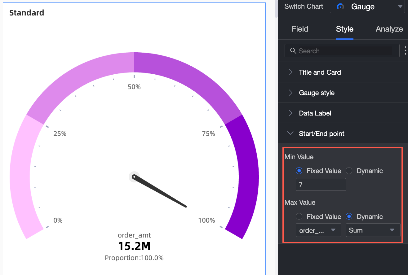
Set the start value and end value for the gauge in the Start/End section.
|
Parameter |
Description |
|
Set start/end value |
Set a fixed value or a dynamic value. For a fixed value, enter a specific number. For a dynamic value, select a measure and an aggregation method. The calculated result is used as the start or end value. |
Next steps
To build topic-based analyses with navigation menus, integrate your dashboards into a data portal. For more information, see Create a data portal.
FAQ
1. Gauge vs. progress bar
A: Both show progress or status, but focus on different aspects. A gauge, much like a speedometer, focuses on showing a value's position within a predefined range (from start value to end value) and offers richer visual styles (such as Standard, Sector, and Scale). A progress bar more directly shows the completion percentage of a current value relative to a target value and has simpler styles (such as bar, ring, and liquid fill).
2. Incorrect pointer position
A: The most common reason is that the start and end values are not set correctly. On the Style tab, go to the Start/End section and define a clear minimum (start value) and maximum (end value) for the gauge's scale. If the start and end values are set improperly (for example, if the start value is greater than the end value, or the range does not match the data), the pointer will be positioned incorrectly.
3. Displaying multiple metrics
A: No. The core design of a gauge is to focus on displaying the status of a single key metric (the measure dragged into the Pointer Angle (Mea.) field) within a specified range.
4. Conditional coloring
A: Configure the Data Mapping Ranges in the Color Settings section. Navigate to Style > Gauge Style > Color Settings, and select Custom Range. Then, you can add different numerical ranges (for example, 0-50, 50-80, 80-end value) and assign a different color (red, yellow, green) to each range.