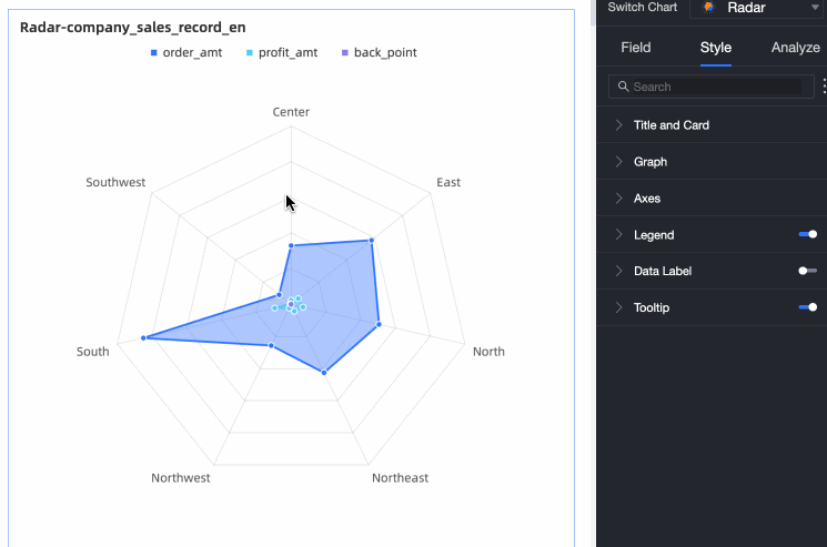
A radar chart displays numbers or ratios, helping you compare multiple metrics and identify trends at a glance.
Prerequisites
You have created a dashboard. For more information, see Create a dashboard.
Chart Overview
Use Cases
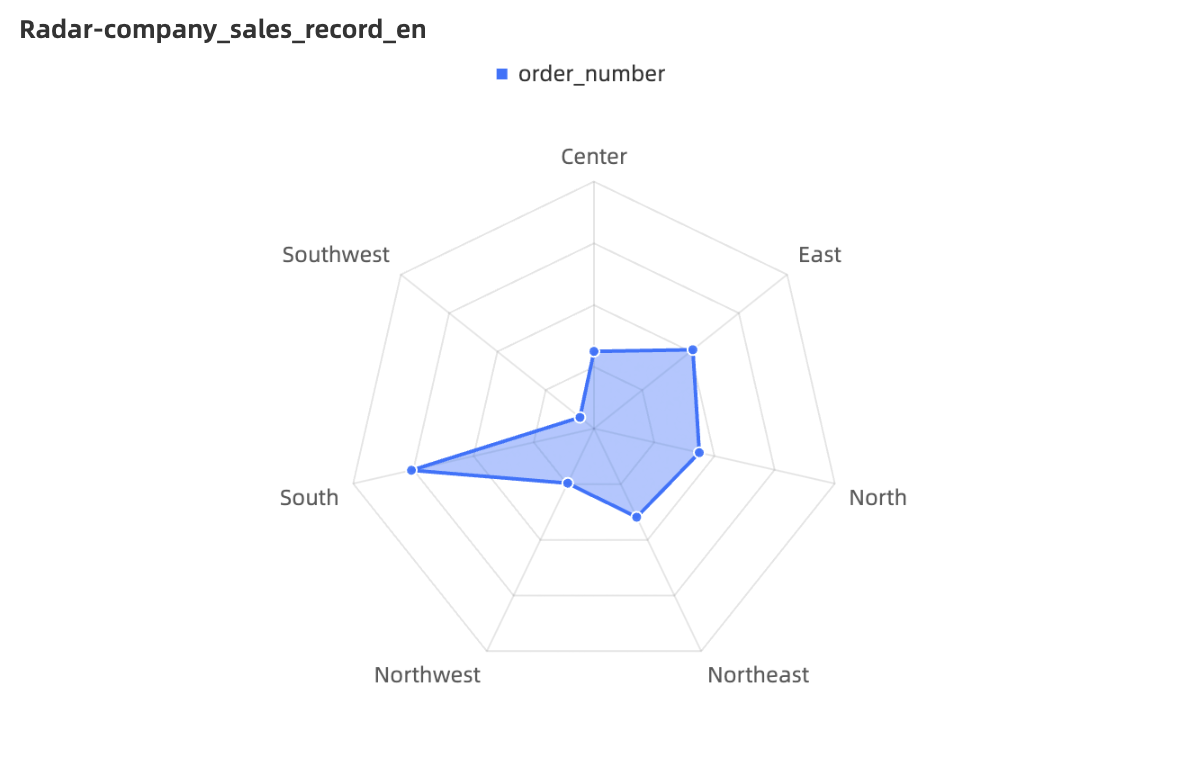
A radar chart, also known as a spider chart, maps data values for multiple dimensions onto axes that start from the same center point and end at the edge of a circle. Lines connect the points for each data series. This chart type is commonly used to visualize the distribution of dimension values.
Key Features
-
Interaction: Switch between measures and configure chart interactions.
-
Visualization: Choose between circle and polygon styles and customize data label display.
-
Annotations: Add custom annotations with text or measures, and configure jumps to external links.
Example
Configure Chart Fields
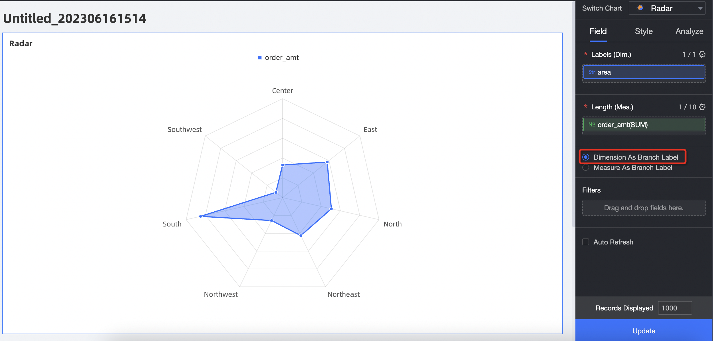
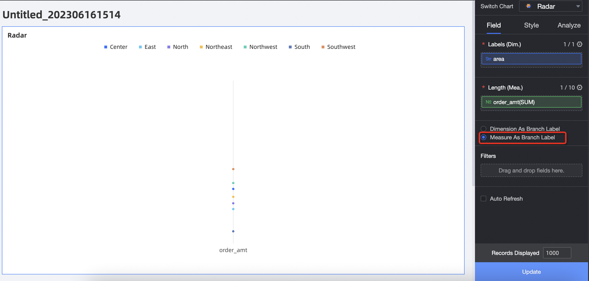
You can add and configure data for a radar chart in two ways: using a dimension as the branch label or using a measure as the branch label.
-
Dimension as branch label: Dimension values serve as the branch nodes on the radar chart, used to compare the area distribution among different measures.
Select dimension and measure fields, then click Update.
-
In the Measures list, find profit_margin and double-click or drag it to the Length/Measure field.
-
In the Dimensions list, find area and double-click or drag it to the Branch Label/Dimension field.
-
-
Measure as branch label: Measure values serve as the branch nodes on the radar chart, used to compare the area distribution among different dimension values.
Select dimension and measure fields, then click Update.
-
In the Measures list, find order_amt, profit_amt, and profit_margin, and then double-click or drag them to the Length/Measure field.
-
In the Dimensions list, find area and double-click or drag it to the Branch Label/Dimension field.
-
Configure Chart Styles
For information about general style settings, see Configure the chart title area.
Enter a keyword in the Search box to quickly find a parameter. You can also click the  icon to Expand All Categories or Collapse All Categories.
Chart
In the Chart section, configure the following parameters.
|
Parameter |
Description |
|
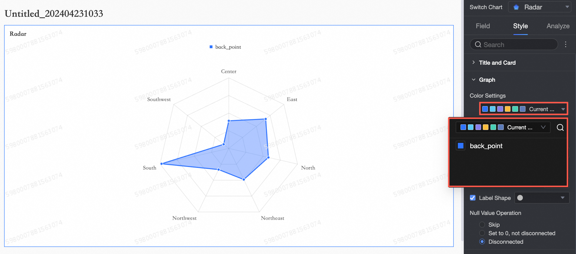
Color settings |
Sets custom colors for the radar chart.
|
|
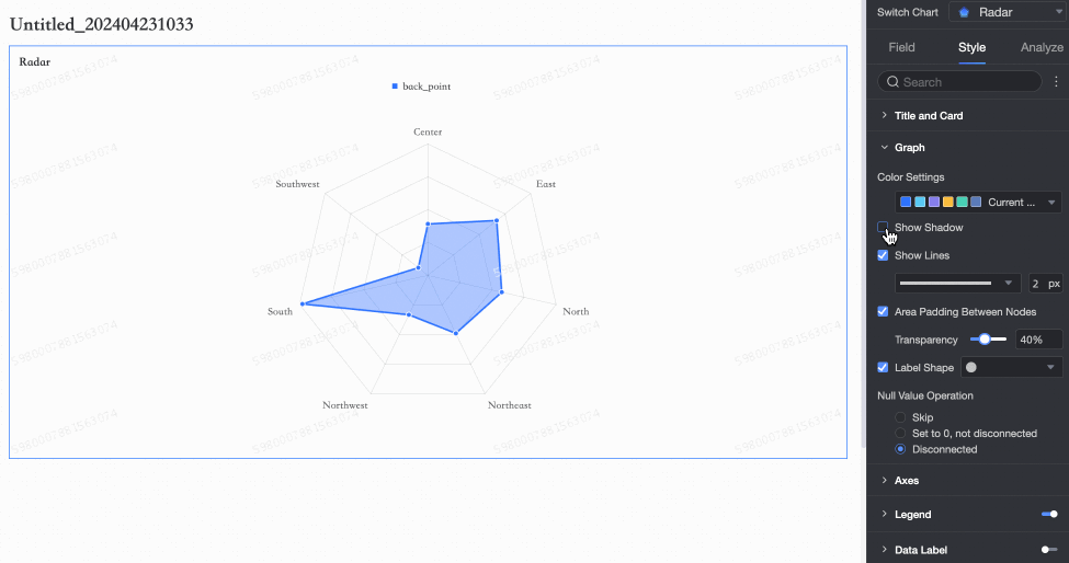
Show shadow |
Toggles a shadow effect.
|
|
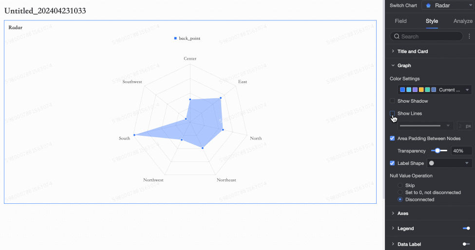
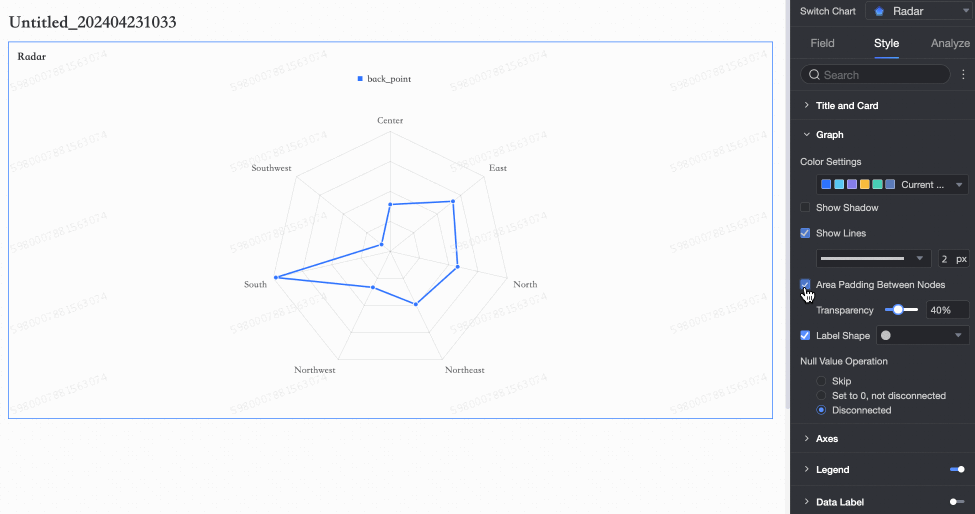
Show lines |
Shows or hides lines connecting the data points and allows you to set their shape and thickness.
|
|
Area fill |
Shows or hides the fill for the area between nodes and allows you to set its opacity.
|
|
Show markers |
Shows or hides markers on data points and allows you to set their shape.
|
|
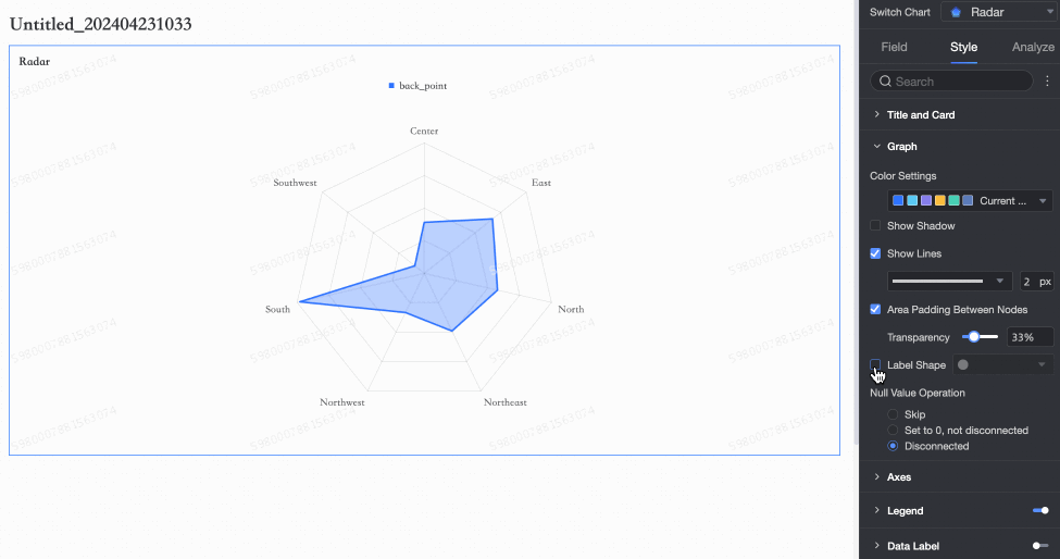
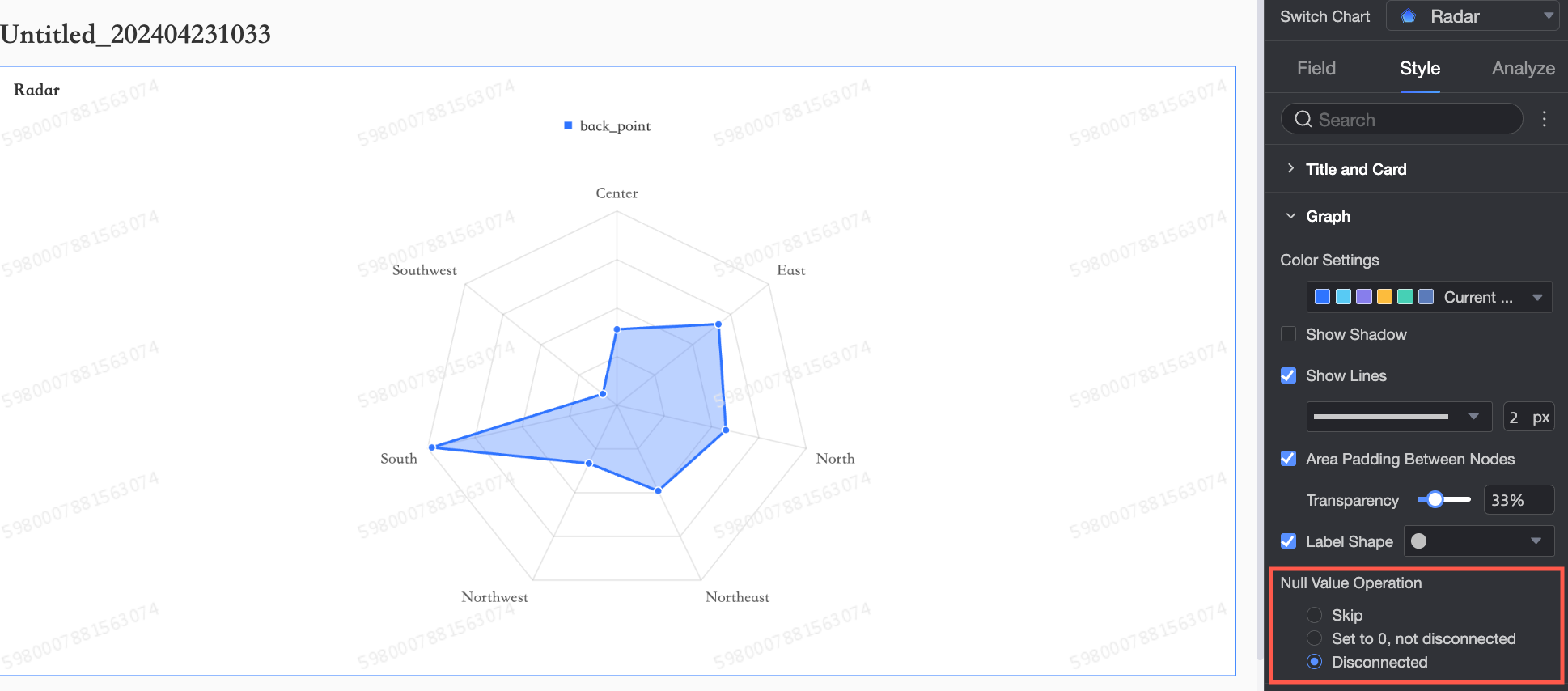
Null value handling |
Defines how null values are handled. Options include Skip over, Set to 0, Connect (do not break the line), and Break line.
|
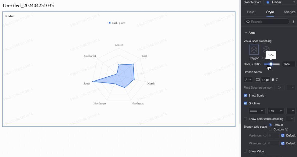
Axis
In the Axis section, configure settings such as visual style, maximum value, and show axis labels.
|
Parameter |
Description |
|
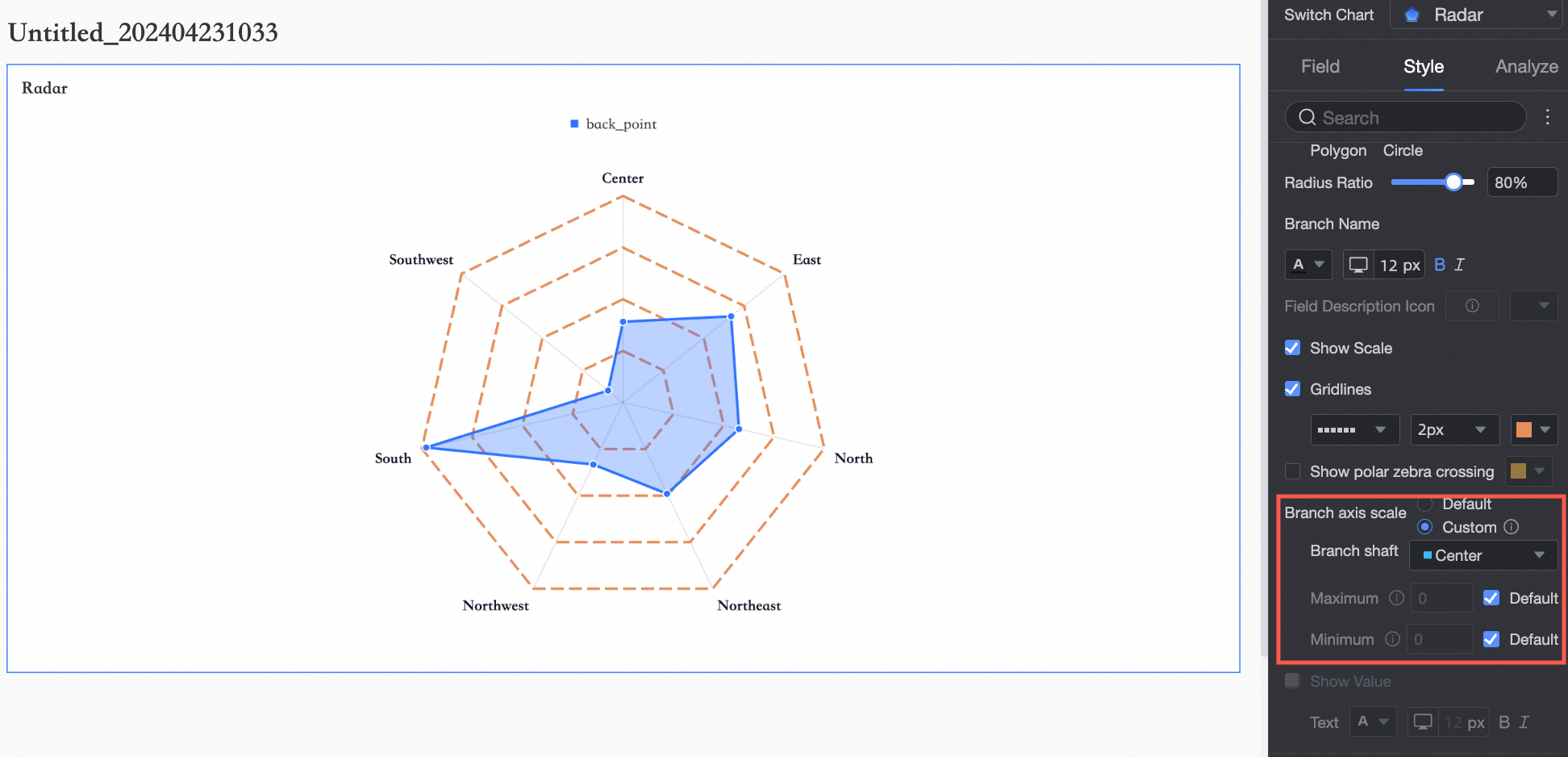
Visual style |
Sets the chart shape. Options: Polygon and Circle.
|
|
Radius ratio |
Adjust the radius of the chart relative to its container.
|
|
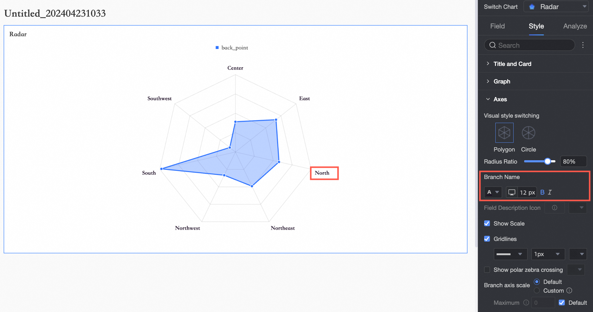
Branch name |
Configures the branch name and its style.
|
|
Field description icon |
Sets the icon and color for the field description. |
|
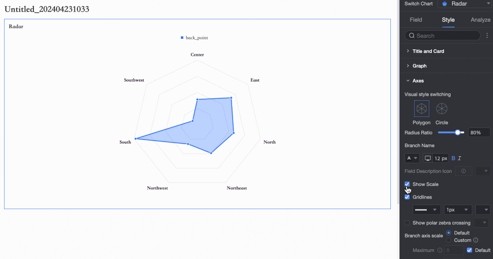
Show ticks |
Show or hide tick marks on the axis.
|
|
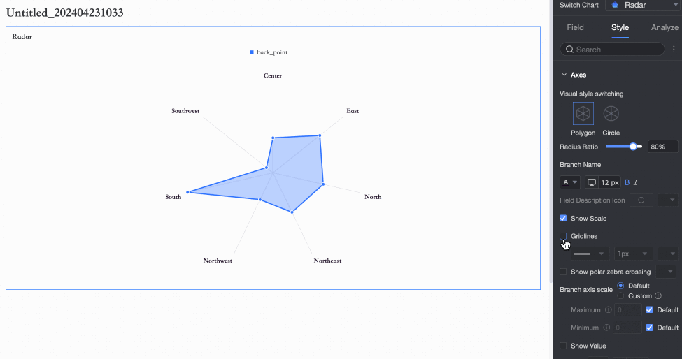
Show grid lines |
Shows or hides grid lines and allows you to set their shape, size, and color.
|
|
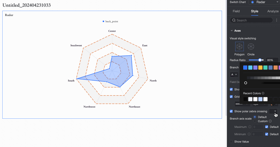
Show polar zebra stripes |
Shows or hides polar zebra stripes and allows you to set their color.
|
|
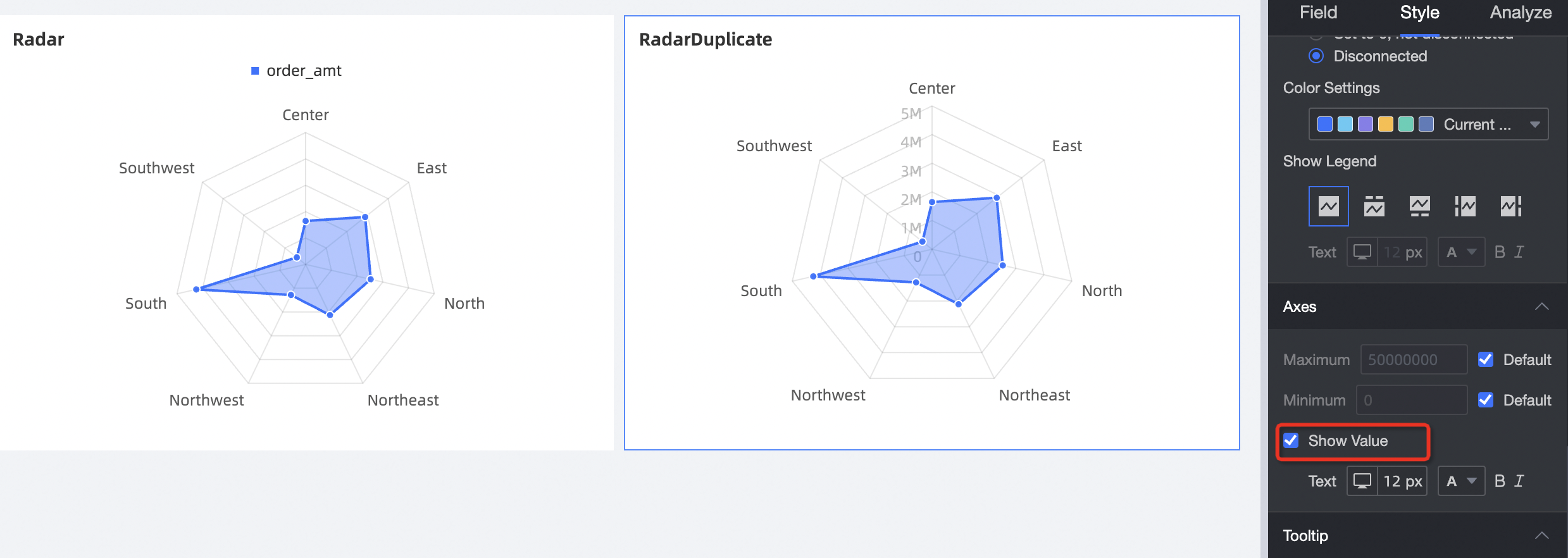
Axis split |
Sets the axis split to Auto or Custom. When you select Custom, you can set the maximum and minimum values for the axis.
Note
|
|
Show axis labels |
Show axis labels to indicate the scale of the concentric grid lines.
|
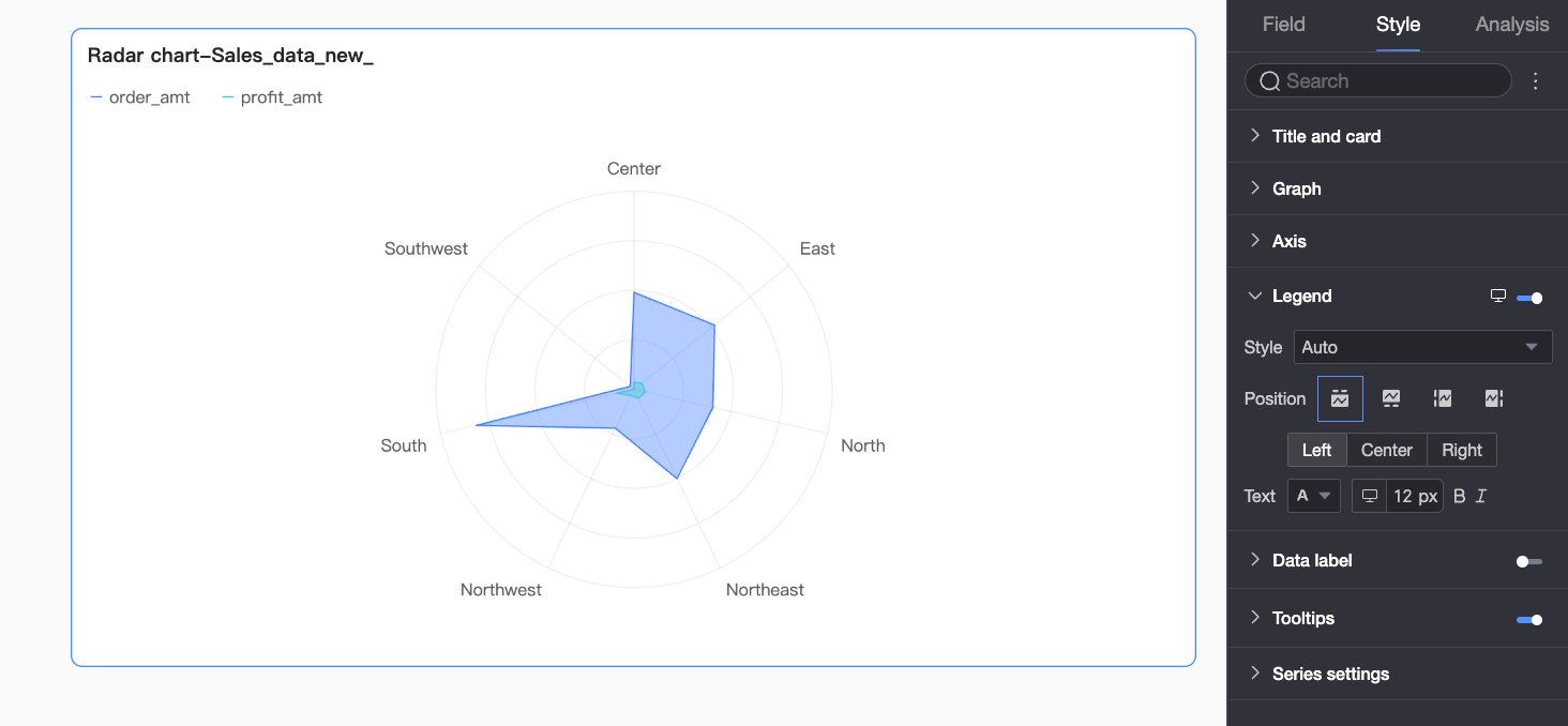
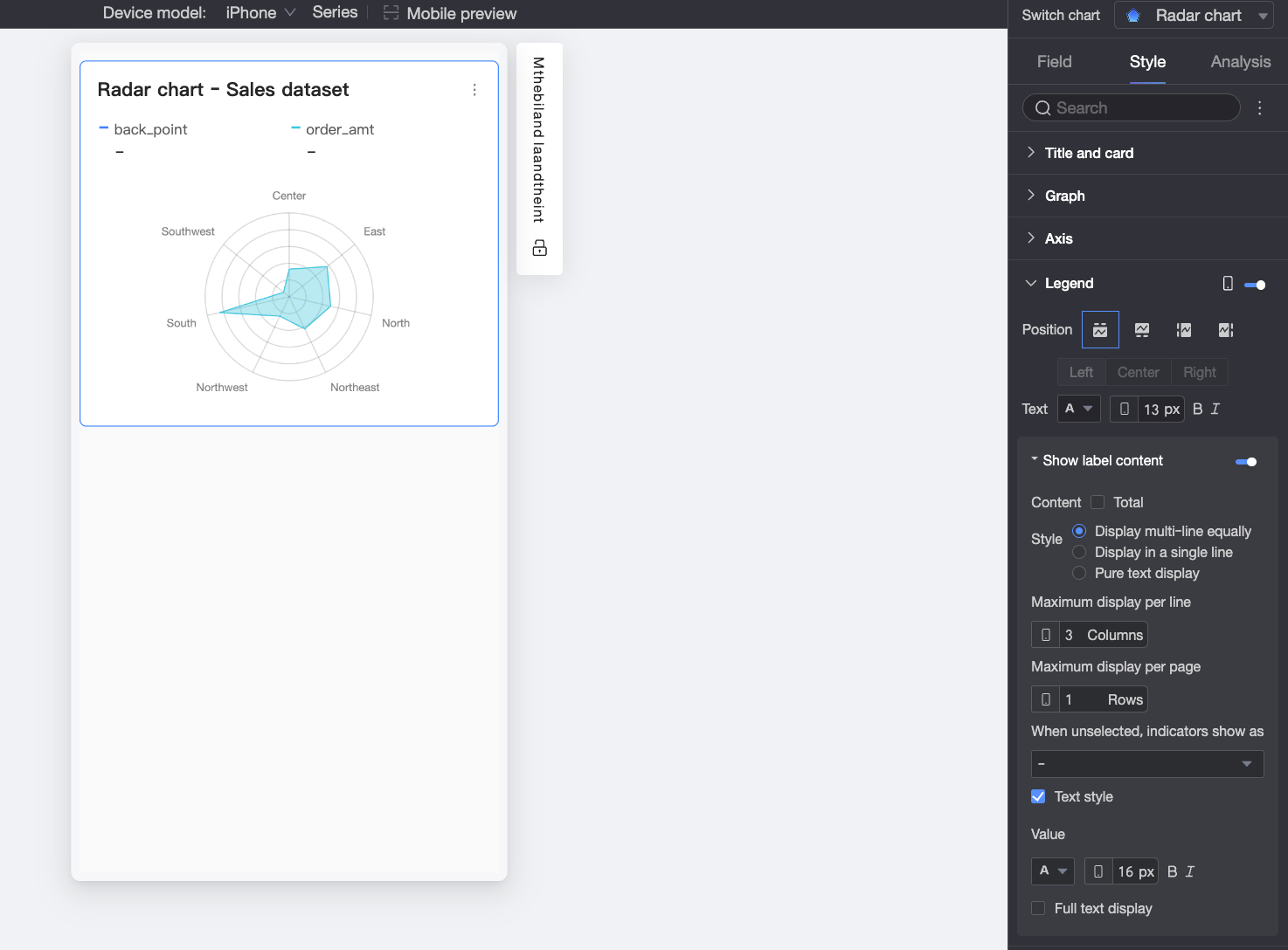
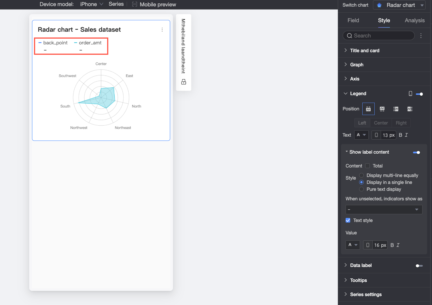
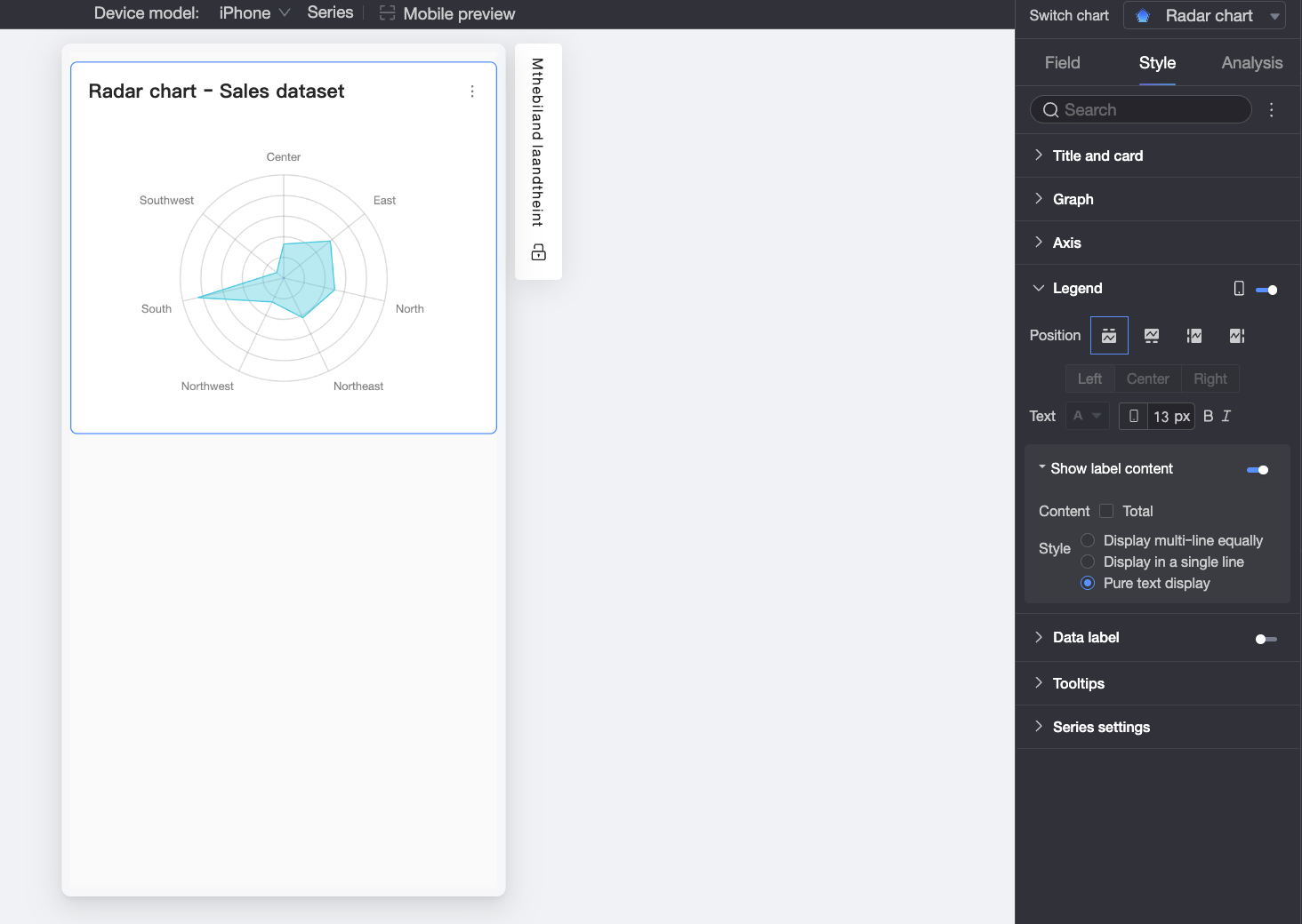
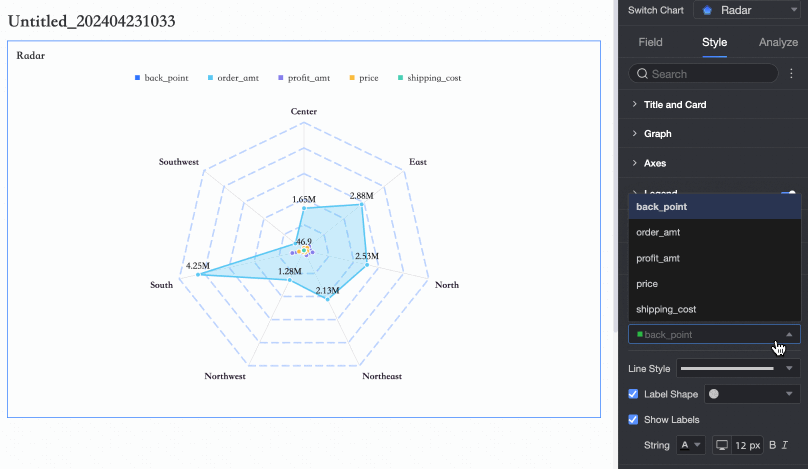
Legend
In the Legend section, click the  icon to show the legend and configure its style.
-
PC settings

Parameter
Description
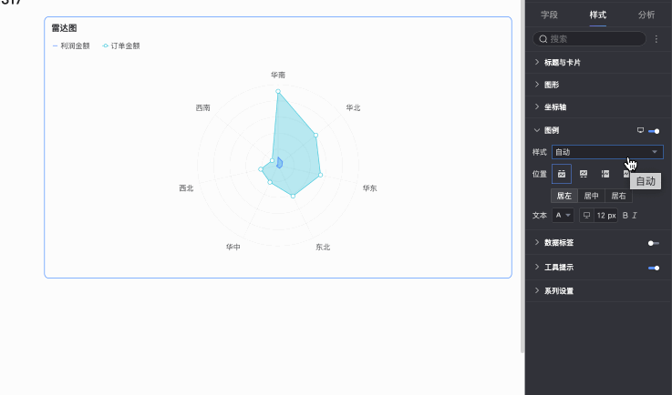
Style
Sets the style of the legend icons. Options include Auto, Line Only, and Line and Marker.
Note-
If you select Line and Marker, the legend synchronizes with the marker style set in the chart. If no marker style is configured, a solid circle is displayed by default.
-
If you select Scale legend symbol with text in Theme Design > General Content Style, the legend icon and line size will scale with the legend text size and the chart's line thickness.
Position
Sets the display position and alignment of the legend for PC view.
-
When the position is set to Top or Bottom, you can select left, center, or right alignment.
-
When the position is set to Left or Right, you can select top, middle, or bottom alignment. You can also set the distance between the legend and the chart.
Text
Sets the style of the legend text for PC view. You can configure the font color, size, weight, and style (italic).
-
-
Mobile settings
Parameter
Description
Position
Sets the display position and alignment of the legend for mobile view.
-
When the position is set to Top or Bottom, you can select left, center, or right alignment.
-
When the position is set to Left or Right, you can select top, middle, or bottom alignment. You can also set the distance between the legend and the chart.
NoteWhen the position is set to Top, you can enable labels below the legend. When enabled, custom alignment is not supported.
Text
Sets the text style of the measure name in the legend for mobile view. You can configure the font color, size, weight, and style (italic).
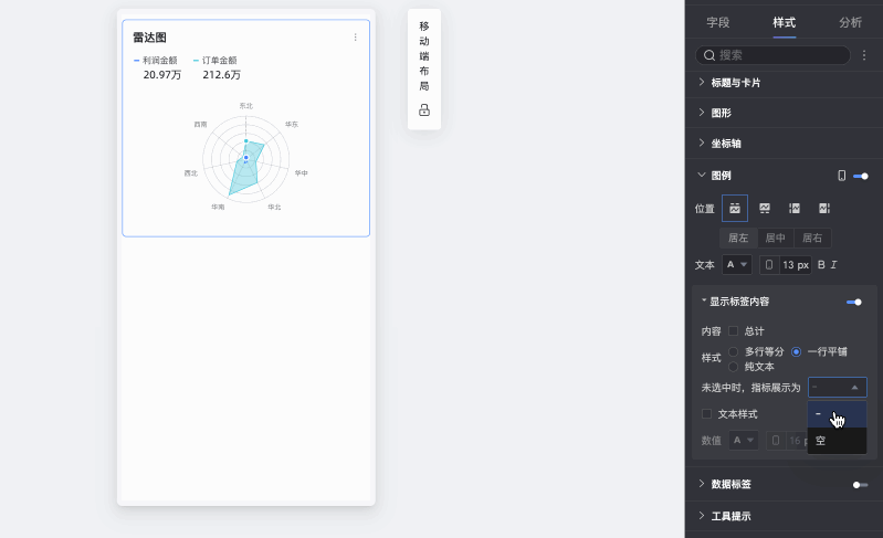
Show label content
When Position is set to Top, you can click the
icon to enable labels below the legend.Content
Controls whether the total value is displayed in the label below the legend.
Style
Sets the layout of the label text below the legend. Options include:
-
Evenly Spaced Multi-line: Automatically arranges labels into evenly spaced columns and rows based on the numbers set in Max Columns per Row and Max Rows per Page.
-
Single-line: Displays all label content on a single line.
-
Text Only: Displays only text without icons. The text color matches the line color of the corresponding measure in the chart.
When unselected, display metric as
When Style is set to Evenly Spaced Multi-line or Single-line, you can define how unselected metrics are displayed. Options include showing a "-" or showing a blank space.
Text style
When Style is set to Evenly Spaced Multi-line or Single-line, you can configure the style for the Value text.
-
 icon to enable labels below the legend.
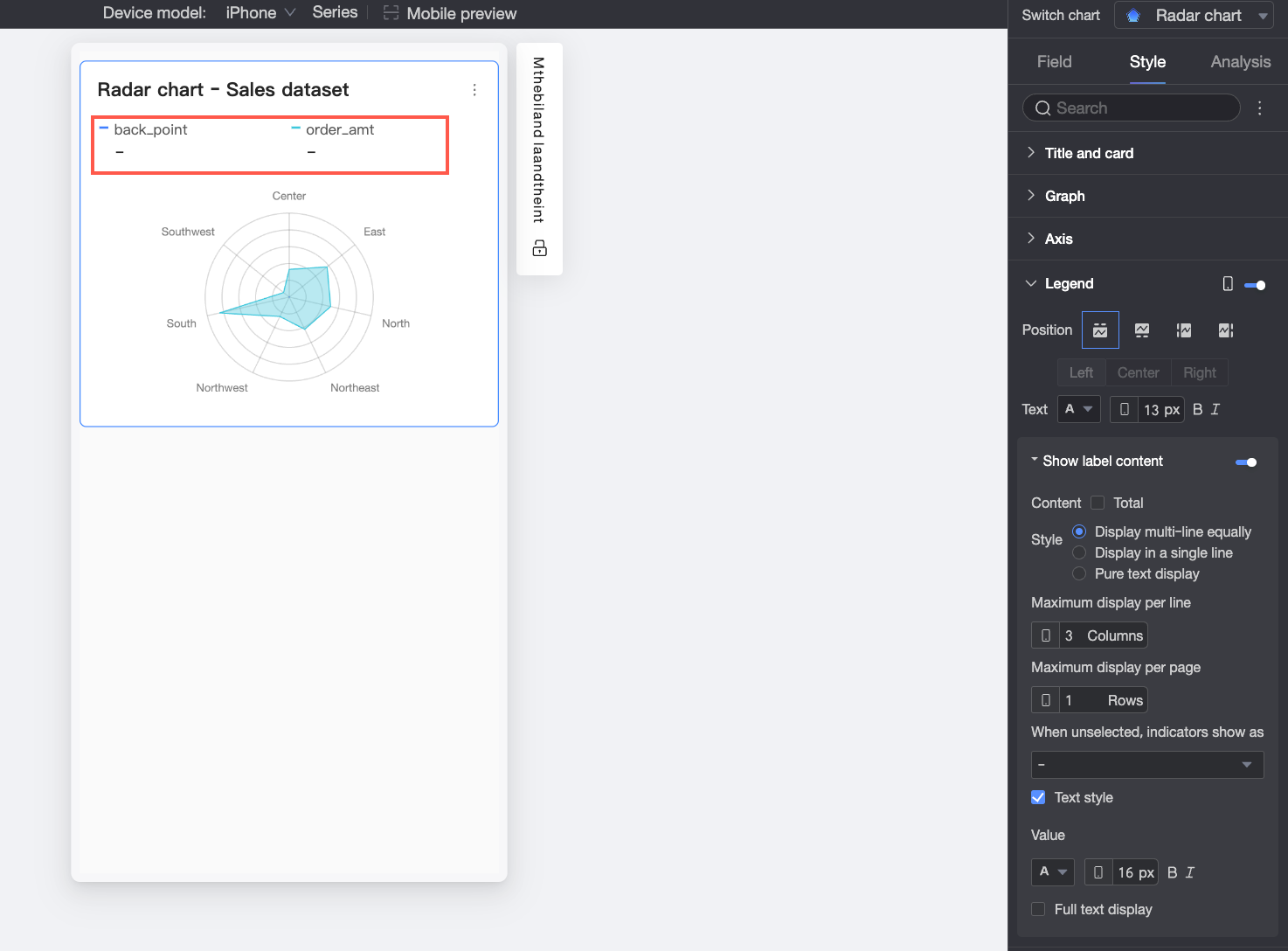
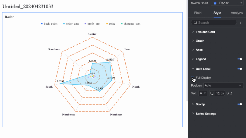
Data Labels
In the Data labels section, you can show or hide data labels and configure their position and style.
Tooltips
In the Tooltips section, click the icon to enable and configure tooltips.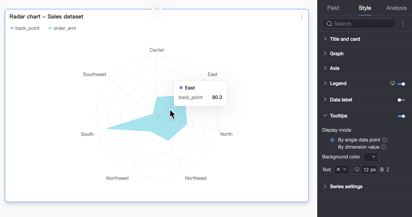
|
Parameter |
Description |
|
Display mode |
Sets how tooltips are displayed. You can display them per data point or per dimension value. |
|
Background color |
Sets the background color of the tooltip box. |
|
Text |
Sets the style of the text in the tooltip box. You can configure the font color, size, weight, and style (italic). |
|
Mobile tooltips |
Tooltips can be configured independently for PC and mobile views. To edit mobile tooltips, switch to the mobile editor using the |
 toggle at the top of the dashboard. Font size can be set separately for each view; other styles are shared.
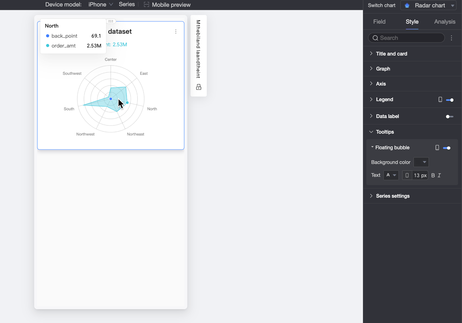
Series Settings
In the Series settings section, configure the line style and show markers.
Configure Chart Analysis
|
Parameter |
Parameter |
Description |
|
Data interaction |
Drill-down |
After you configure drill-down fields in the fields pane, you can set the display style for the drill-down hierarchy. |
|
Chart interaction |
If you need to analyze data across different charts, use chart interaction to link them. For more information, see Configure and display chart interactions. |
|
|
Jump |
If the data you need to analyze is in multiple dashboards, use jumps to link them. Jumps can be configured as parameter jumps or external links. For more information, see Configure and display jumps. |
|
|
Analysis and alerting |
Reference line |
Use a reference line to compare a measure's value against a reference value. The reference value can be a fixed value or a calculated value, such as average, maximum, minimum, or median. For more information, see Reference lines. |
|
Annotation |
- |
When chart data is anomalous or requires special attention, use annotations such as color highlights, icons, or comments to mark specific data points. For more information, see Annotations. |
Limitations
A radar chart is configured using the Length/Measure and Branch Label/Dimension fields. You can configure data in two ways:
-
Dimension as branch label: Dimension values become the chart's branches, used to compare the areas of different measures.
-
Branch Label/Dimension: Select a maximum of one dimension. Its values become the chart's branches.
-
Length/Measure: Select 1 to 10 measures. Each measure forms a separate radar area.
-
-
Measure as branch label: Measure values become the chart's branches, used to compare the area distribution of different dimension values.
-
Branch Label/Dimension: Select a maximum of one dimension. The dimension values form the radar areas of the chart.
-
Length/Measure: Select 1 to 10 measures. Each measure forms a branch.
-
Next Steps
-
To allow others to view the dashboard, share it with specific users. For more information, see Share dashboards.
-
If you need to create a complex analysis project with navigation menus, you can integrate your dashboard into a Data Portal. For more information, see Create a Data Portal.