Percentile
A percentile calculation ranks the data points in a dataset to show their relative position. This topic describes how to configure percentile calculations.
Prerequisites
You have created a dashboard. For more information, see Create a Dashboard.
You have selected a dataset and configured chart fields. For more information, see Configure Chart Fields.
Background information
A percentile is another way to express rank. To calculate a percentile, first sort the data, and then apply the following formula:

Where  represents the calculated percentile,
  represents the total number of data points, and
  represents the rank of a specific data point.
The following table shows an example of a percentile calculation for a dataset.
Original data | 20 | 10 | 30 | 40 | 50 | 20 |
Ascending rank | 3 | 1 | 4 | 5 | 6 | 3 |
Ascending percentile | 40% | 0% | 60% | 80% | 100% | 40% |
Descending rank | 5 | 6 | 3 | 2 | 1 | 5 |
Descending percentile | 80% | 100% | 40% | 20% | 0% | 80% |
When duplicate values exist, this calculation uses a sparse ranking method (for example, 1, 3, 3, 4), not a dense ranking method (for example, 1, 2, 2, 3).
Usage notes
Percentile calculations exclude grand totals and subtotals, and you cannot use these features concurrently. If you apply a percentile calculation, grand totals and subtotals are automatically disabled and display as "-".
Percentile calculations ignore nulls, which does not affect the results for other data. A null result remains null and displays as "-".
This analysis method is based on the result set. The public cloud has a limit of 10,000 rows. If your result set exceeds this limit, the calculations may be inaccurate.
The following charts support percentile calculations.
Percentile ranking method
Description
Supported chart types
Overall percentile
Sorts the entire dataset before calculating the percentile.
Line/area charts: Line Chart, Area Chart, Stacked Area Chart, 100% Stacked Area Chart, Combo Chart.
Column/bar charts: Column Chart, Stacked Column Chart, 100% Stacked Column Chart, Circular Bar Chart, Leaderboard, Bar Chart, Stacked Bar Chart, 100% Stacked Bar Chart, Waterfall Chart, Bullet Chart, Box Plot, Histogram.
Bubble/scatter charts: Bubble Chart, Scatter Plot, Trellis Scatter Plot.
Table charts: crosstab, Detail Table, Heat Map.
Pie/donut charts: Pie Chart, Rose Chart, Radar Chart, Treemap.
Geo charts: Choropleth Map, Bubble Map, Heatmap, Flow Map, Symbol Map.
KPI charts: indicator card, KPI Trend Chart.
Funnel/conversion charts: Funnel Chart, Comparison Funnel Chart.
Other charts: Word Cloud.
In-group percentile
Sorts the data within its group before calculating the percentile.
Table charts: crosstab.
Configuration
In the Fields pane of the chart, find the measure you want to use. Click the  icon next to it, select advanced calculation > percentile, and then choose a calculation method based on your business requirements.

The available percentile calculation methods for a crosstab differ from other chart types, as described below.
Chart type | Calculation method | Limitation | Calculation logic | |
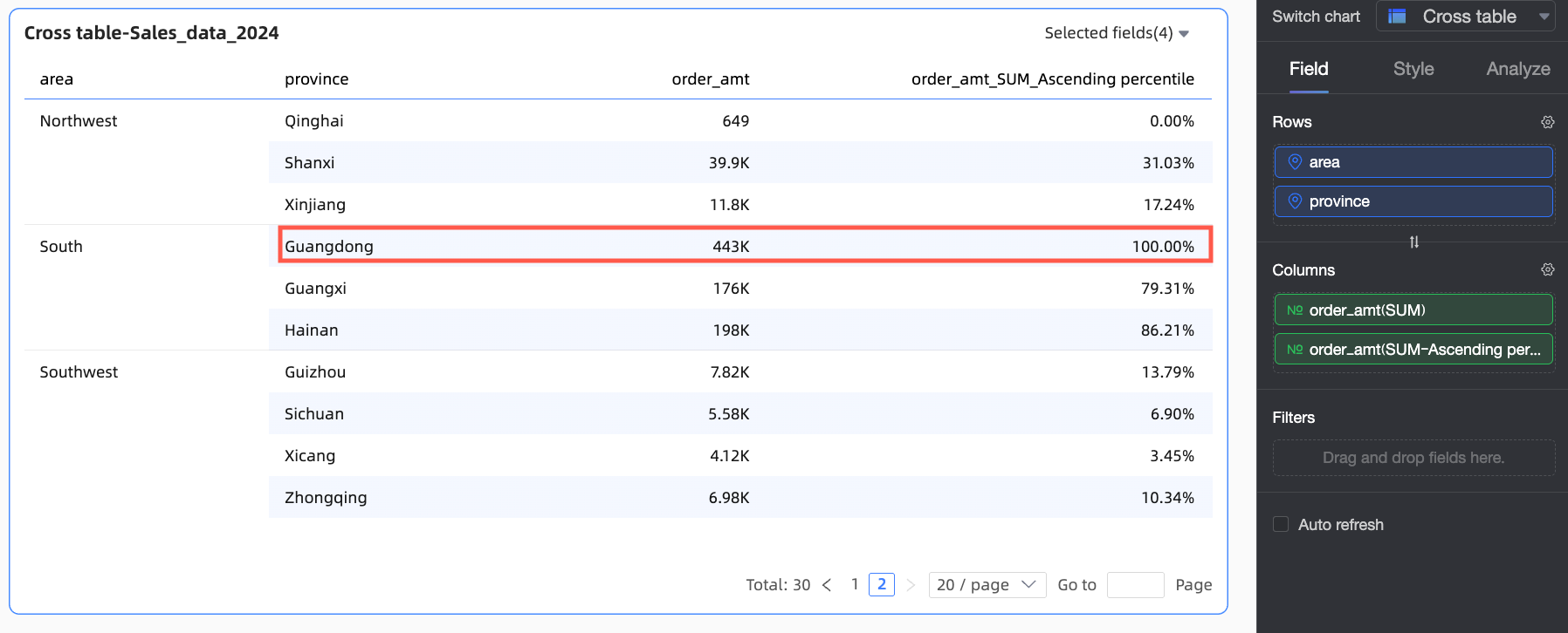
crosstab | Ascending | N/A | Ranks the entire dataset from smallest to largest based on the measure value, then calculates the percentile. | |
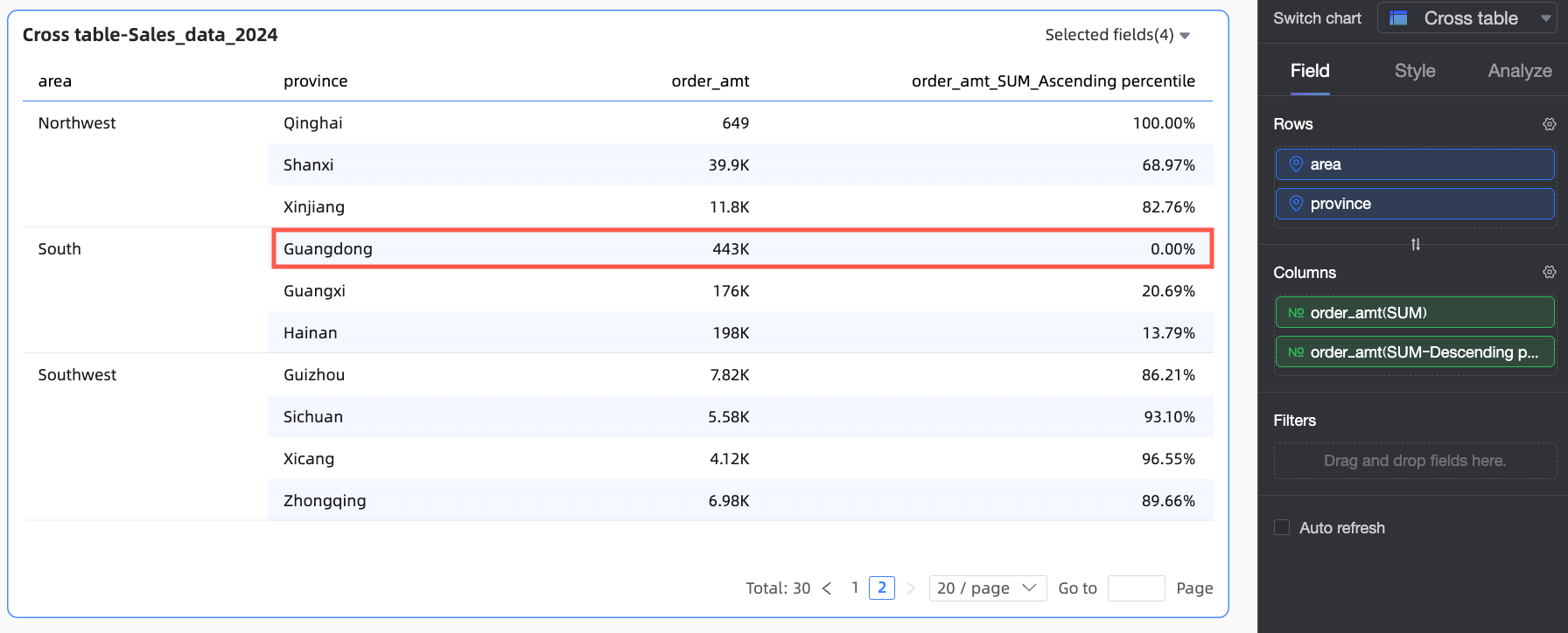
Descending | N/A | Ranks the entire dataset from largest to smallest based on the measure value, then calculates the percentile. | ||
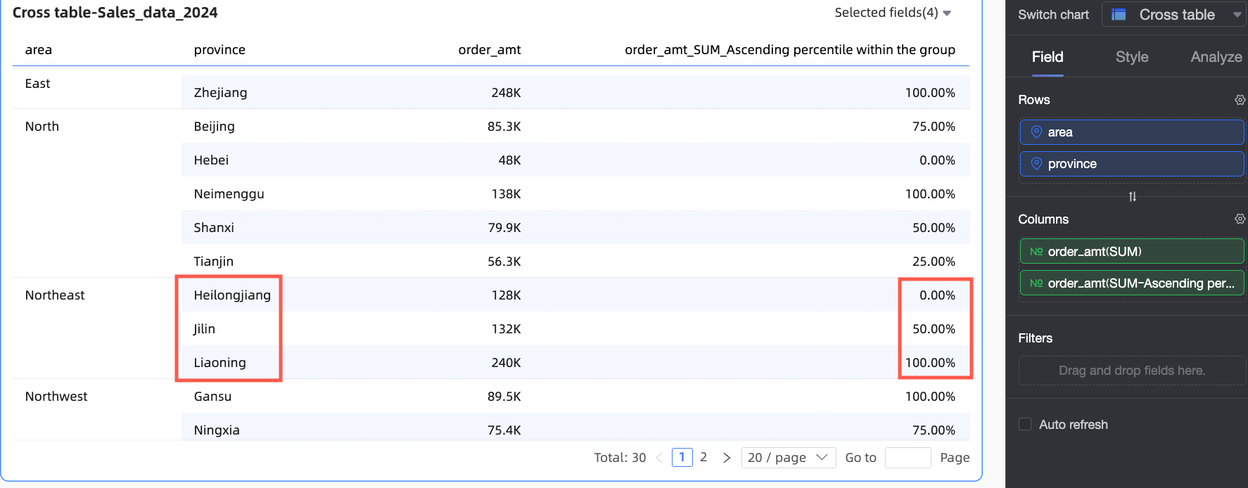
In-group ascending | N/A | Groups data by the finest granularity, ranks data points within each group from smallest to largest, and then calculates the percentile. For example, if you have Region, Province, and City dimensions, the system groups the data by region and province, ranks it in ascending order, and then calculates the percentile. | ||
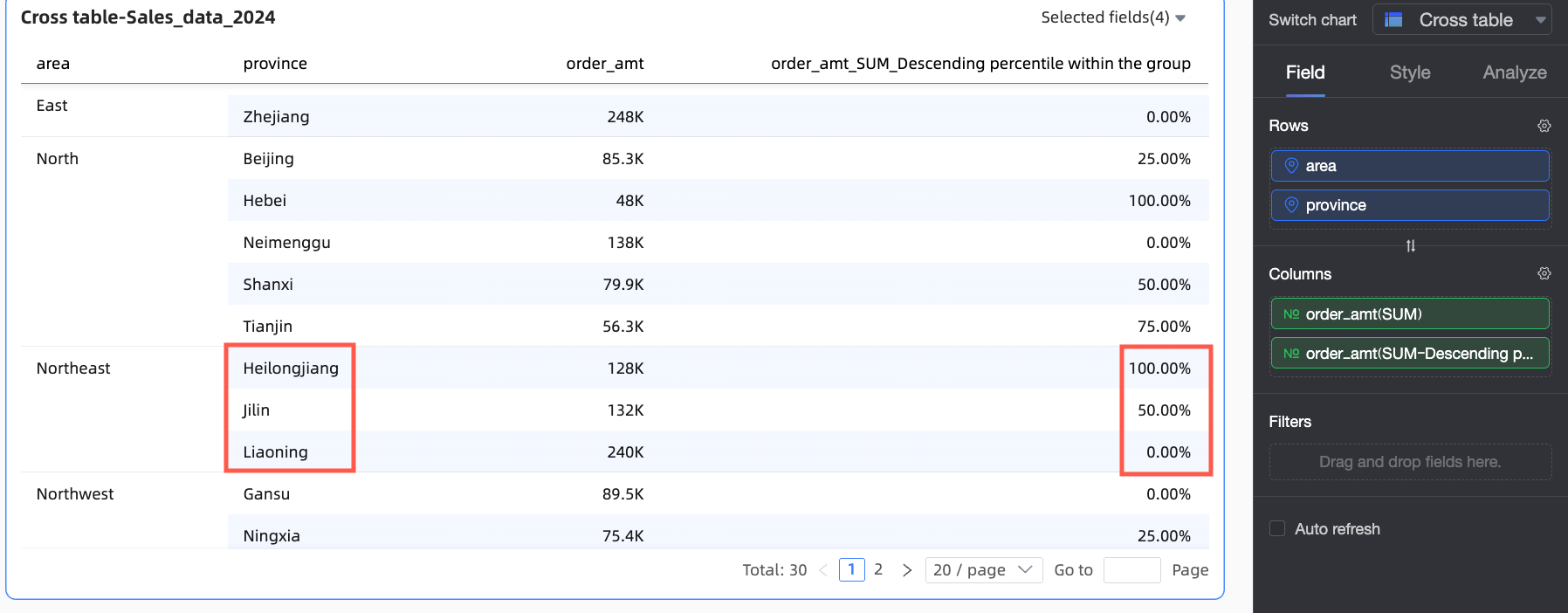
In-group descending | N/A | Groups data by the finest granularity, ranks data points within each group from largest to smallest, and then calculates the percentile. | ||
Custom | By column | The Row area must contain a dimension field. | Treats each column as a separate analytical unit. It sorts the data points within each column and then calculates the percentile. | |
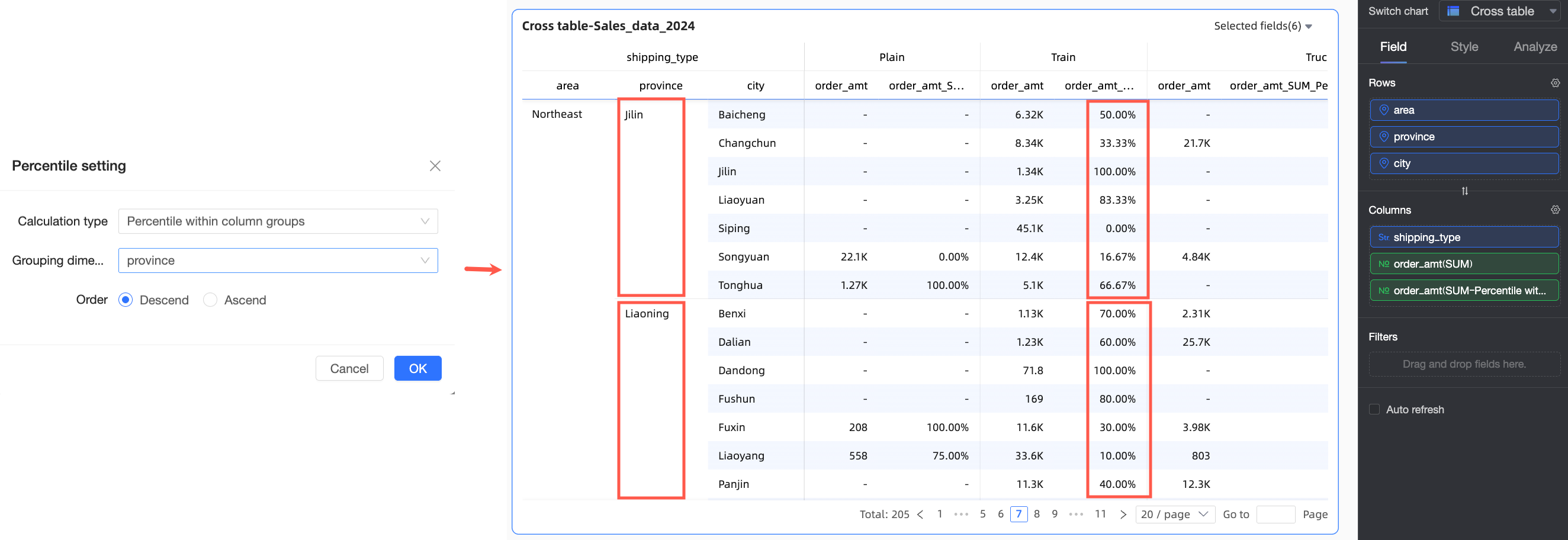
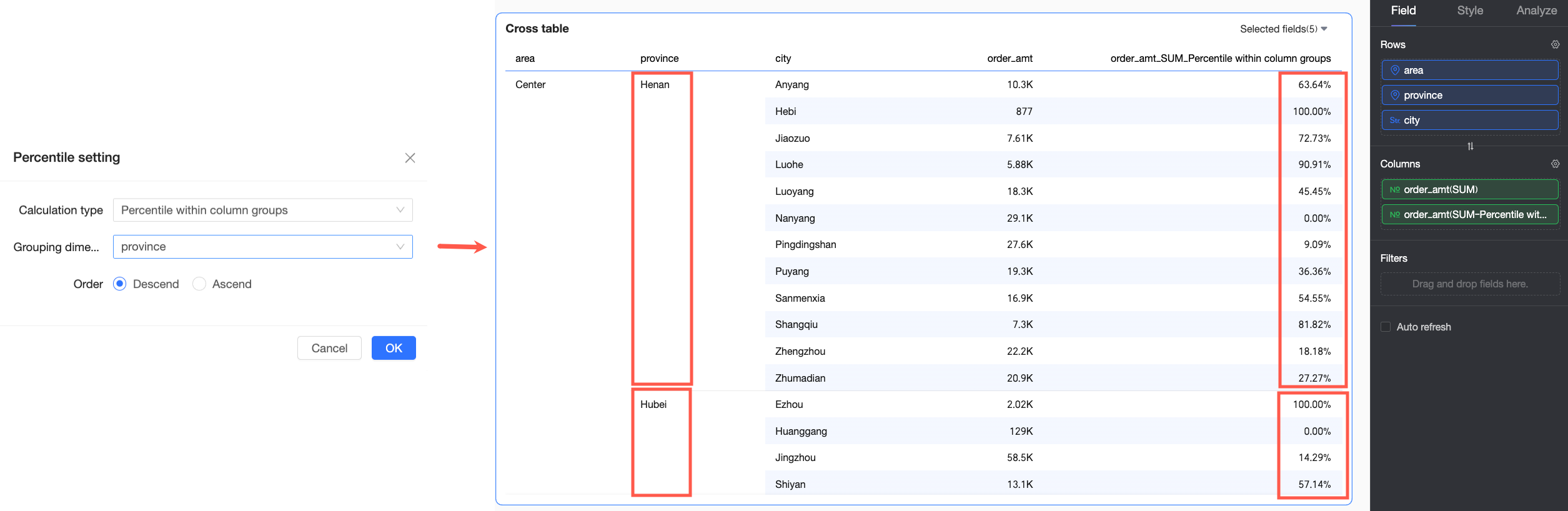
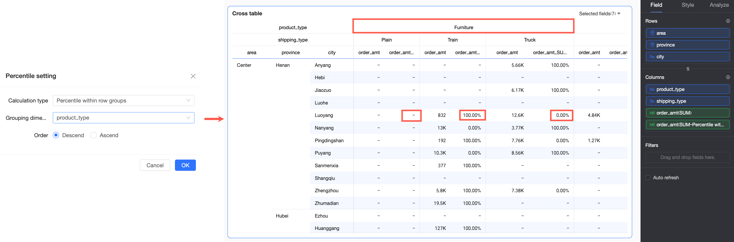
In-group by column | The Row area must contain two or more dimension fields. | Sorts the data points within their respective column groups and then calculates the percentile. The grouping logic is as follows: The system forms a group by using all dimensions from the first dimension in the Row area to the selected grouping dimension. For example, in the figure below, a group is formed by matching the Region and Province fields. The percentile is then calculated after ranking the data. | ||
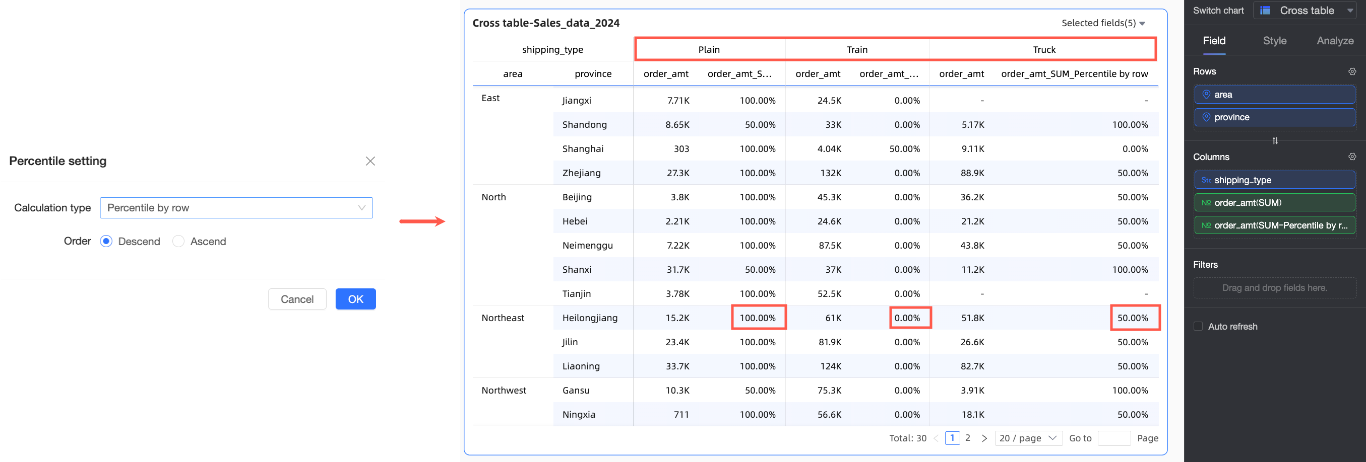
By row | The Column area must contain a dimension field. | Treats each row as a separate analytical unit. It sorts the data points within each row and then calculates the percentile. | ||
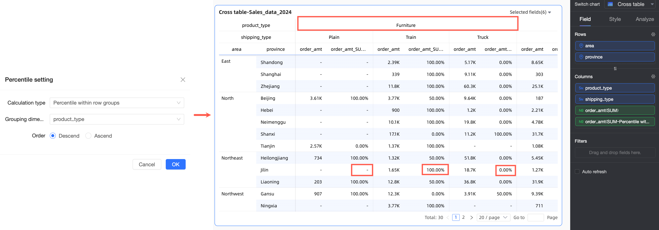
In-group by row | The Column area must contain two or more dimension fields. | Sorts the data points within their respective row groups and then calculates the percentile. The grouping logic is as follows: The system forms a group by using all dimensions from the first dimension in the Column area to the selected grouping dimension. For example, in the figure below, groups are formed by matching the Product Type field. The percentile is then calculated after sorting the data within that dimension. | ||
Other charts | Ascending | N/A | Ranks the entire dataset from smallest to largest based on the measure value, then calculates the percentile. | |
Descending | N/A | Ranks the entire dataset from largest to smallest based on the measure value, then calculates the percentile. | ||

Examples
The following examples provide a more detailed look at percentile calculations.
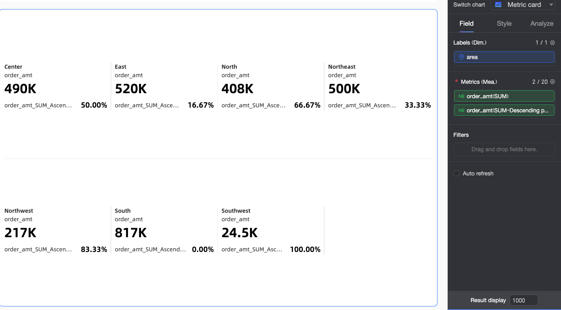
Example 1: Indicator card
This example shows how to configure a percentile for an indicator card.
Log on to the Quick BI console.
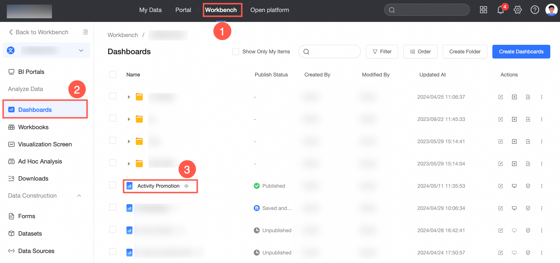
Open the dashboard editor as shown in the figure below.

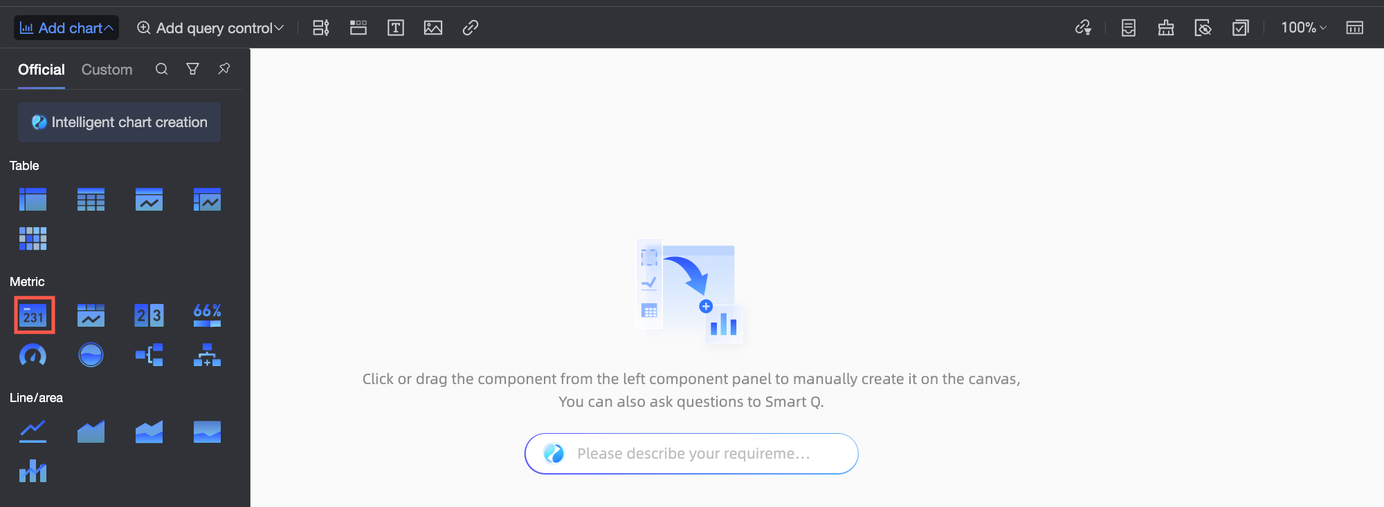
In the top menu bar, click Add Chart, find indicator card, and then click or drag it to the dashboard area.
In the Data pane, on the Fields tab, configure the data for the indicator card.
Select the required dimension and measure fields, and then double-click or drag them to the target area.
From the Dimensions list, find Region, and then double-click or drag it to the Rows area.
From the Measures list, find Order Amount, and then double-click or drag it to the Columns area twice.
NoteOne of the two Order Amount fields in the Columns area displays the original data, and you will use the other for the percentile calculation.
If you add a duplicate field to the measures area, a "Duplicate measures exist" prompt appears. You can ignore this and update the data after you finish the configuration.
Click the
icon next to the second Order Amount field, and then select advanced calculation > percentile. Set the percentile calculation method for the chart. The following table shows examples.Calculation type
Description
Example result
Ascending
Ranks the entire dataset from smallest to largest and then calculates the percentile. In this example, the region with the highest order amount is ranked last. South China has the highest order amount and is ranked last, with a percentile of 100%.
Descending
Ranks the entire dataset from largest to smallest and then calculates the percentile. In this example, the region with the lowest order amount is ranked last. Southwest China has the lowest order amount and is ranked last, with a percentile of 100%.
 icon next to the second Order Amount field, and then select advanced calculation > percentile. Set the percentile calculation method for the chart. The following table shows examples.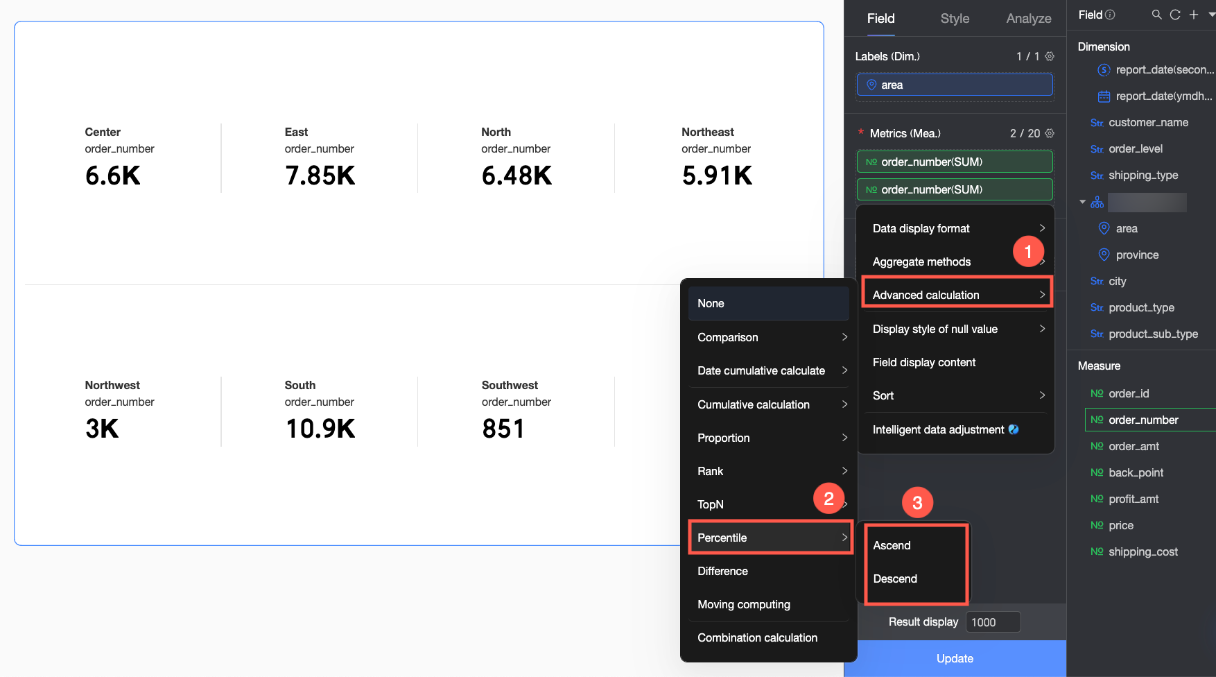

Example 2: Crosstab
A crosstab supports different percentile calculation methods than other chart types. The following table provides examples.
Calculation type | Configuration | Example result | |
Ascending | The system ranks the entire dataset from smallest to largest and then calculates the percentile. Therefore, the largest order amount is ranked last. For example: Guangdong province has the largest order amount, so it is ranked last with a percentile of 100%. |
| |
Descending | The system ranks the entire dataset from largest to smallest and then calculates the percentile. Therefore, the largest order amount is ranked first. For example: Guangdong province has the largest order amount, so it is ranked first with a percentile of 0%. |
| |
In-group ascending | In this example, provinces are grouped by region. Within each region, the order amounts are ranked from smallest to largest, and then the percentile is calculated. For example: In the Northeast region, Heilongjiang province has the smallest order amount, so it is ranked first with a percentile of 0%. |
| |
In-group descending | In this example, provinces are grouped by region. Within each region, the order amounts are ranked from largest to smallest, and then the percentile is calculated. For example: In the Northeast region, Heilongjiang province has the smallest order amount, so it is ranked last with a percentile of 100%. |
| |
Custom This example uses descending order. | By column | The dataset is ranked in descending order within each column, and then the percentile is calculated. As a result, provinces with larger order amounts rank higher and have smaller percentiles. For example: In the "Large truck" transport column, Liaoning province has a larger order amount than Jilin province, so Liaoning has a smaller percentile than Jilin. |
|
In-group by column | In this example, the first dimension in the Row area is Region, and the grouping dimension is Province. Therefore, the system groups the data by matching the Region and Province fields, ranks it in descending order, and then calculates the percentile. For example: Within Jilin province, truck transport in Changchun city has the largest order amount, so it is ranked first with a percentile of 0%. |
| |
By row | The dataset is ranked in descending order within each row, and then the percentile is calculated. As a result, transport methods with larger order amounts rank higher and have smaller percentiles. For example: In Jilin province, the order amount for train transport is the largest, so it is ranked first with a percentile of 0%. |
| |
In-group by row | In this example, the first dimension and the grouping dimension in the Column area are both Product Type. Therefore, the system groups the data by the Product Type dimension, ranks it in descending order, and then calculates the percentile. For example: Among the office supply orders in Jilin province, the train transport method has the highest order amount, so it is ranked first with a percentile of 0%. |
| |