Story Builder
Story Builder is an interactive navigation widget in Quick BI dashboards. It links multiple charts on a dashboard into a logical sequence, analytical path, or business scenario. This allows report creators to control the navigation flow and presentation of content, creating a guided and logical data narrative. This topic describes how to add and configure the Story Builder widget.
Prerequisites
A dashboard has been created. For more information, see Create a dashboard.
Use cases
Story Builder is ideal for presenting the overall analytical flow of a single report. For example, in a Monthly Business Review report, you can organize multiple analysis views into a step-by-step narrative. You can present data sequentially, following a path like "Target vs. Actual → Variance Analysis → Root Cause → Improvement Suggestions." This creates a cohesive data story that flows from problem discovery to cause analysis and finally to decision-making.
Step 1: Add the Story Builder widget
On the dashboard editing page, click the  icon in the top menu bar to add a Story Builder widget.
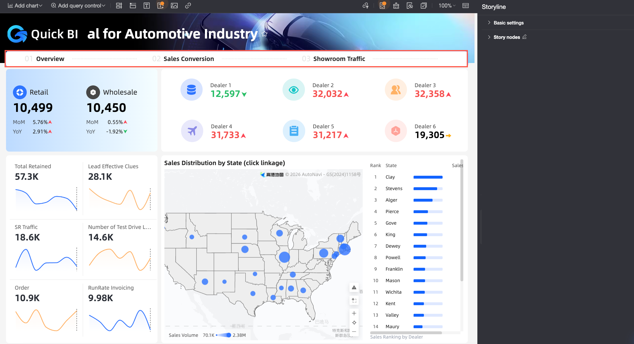
Step 2: Configure styles
In the Story Builder panel, define the widget's visual style in the Basic Settings section and configure its content in the Story Nodes section.
Basic Settings
This section contains settings for the position and style of the Story Builder widget. Available settings vary depending on the widget's position.
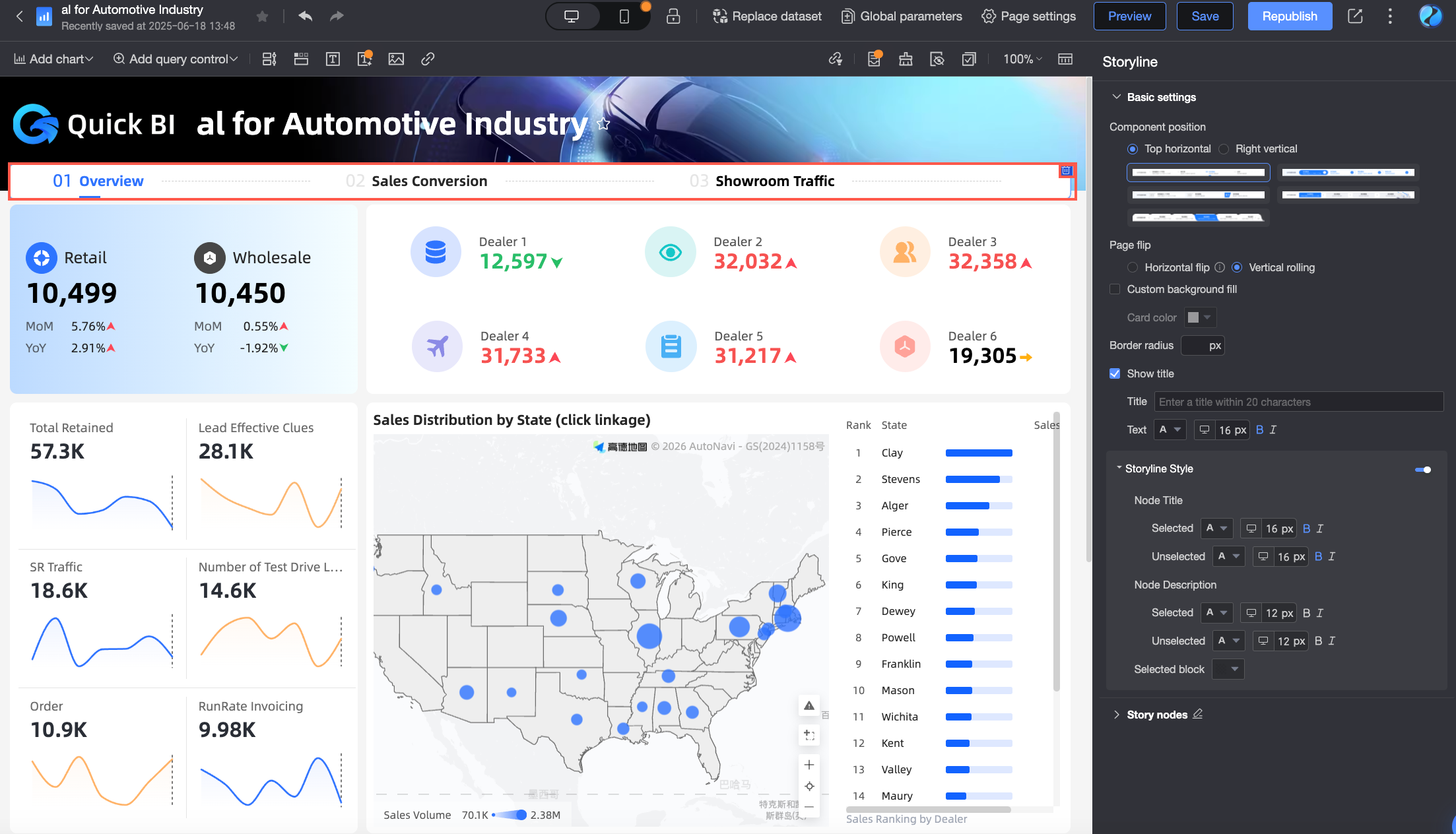
When the widget position is set to Top Horizontal, the following settings are available:
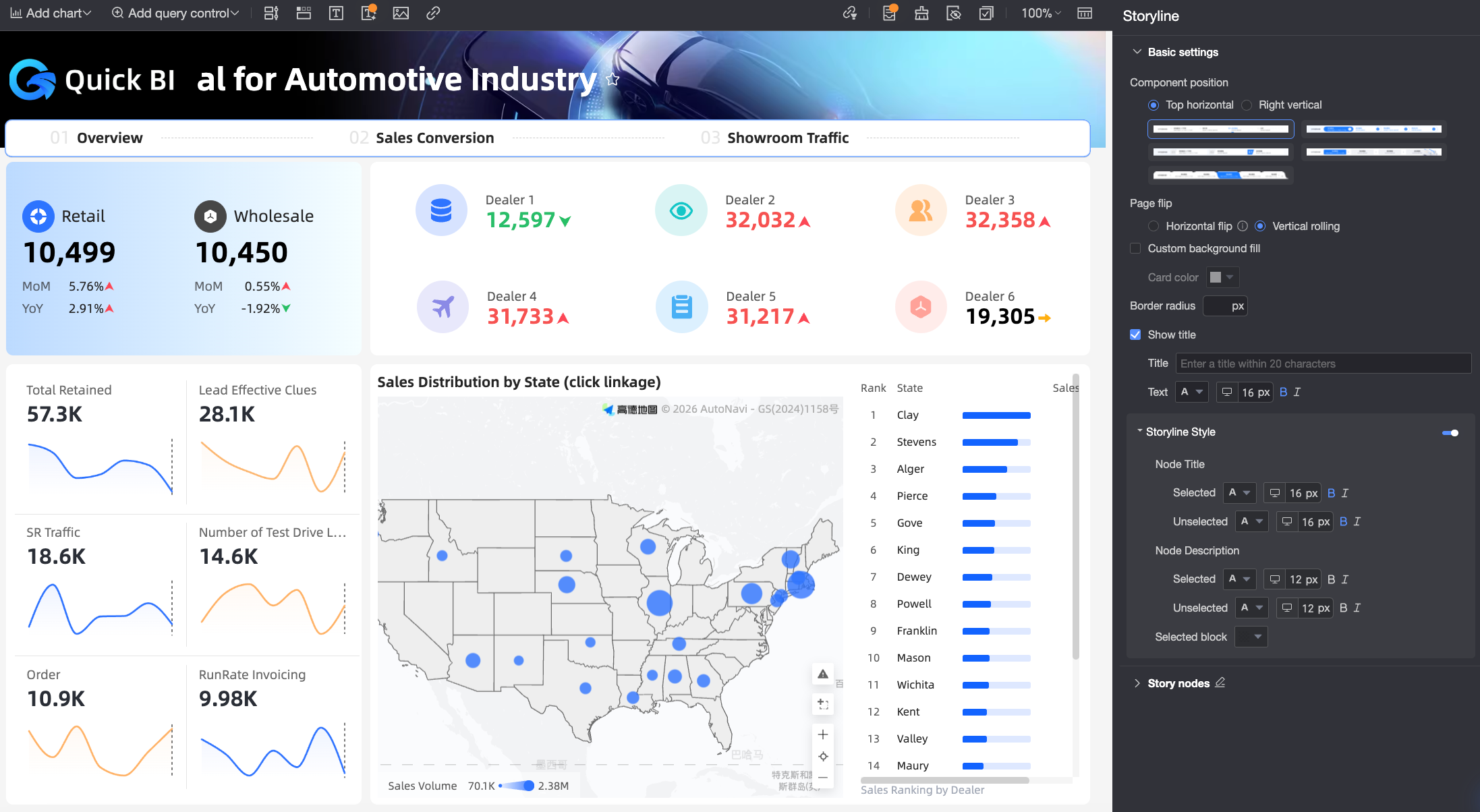
Parameter
Description
Widget Style
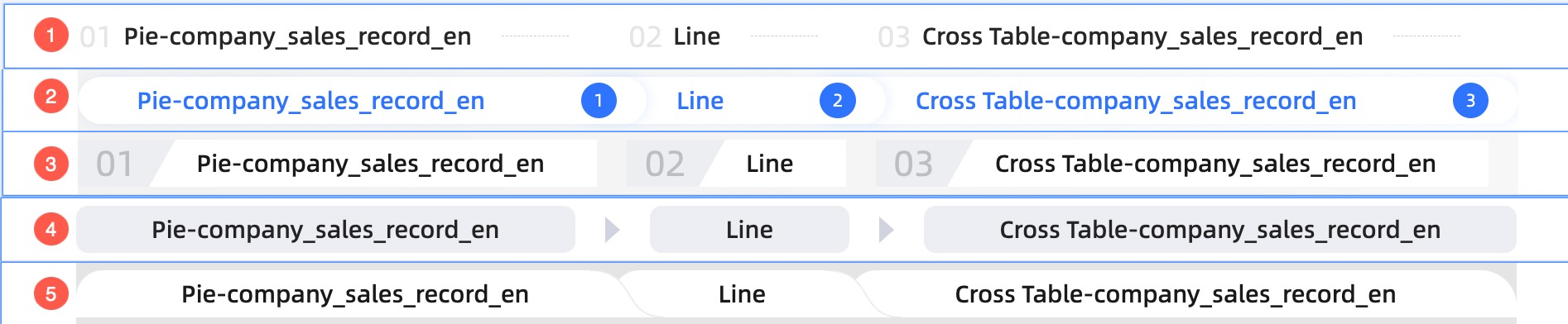
Options include Progress Bar (①), Rounded Progress Bar (②), Chapter Directory (③), Data Model (④), and Minimalist (⑤).
Paging Style
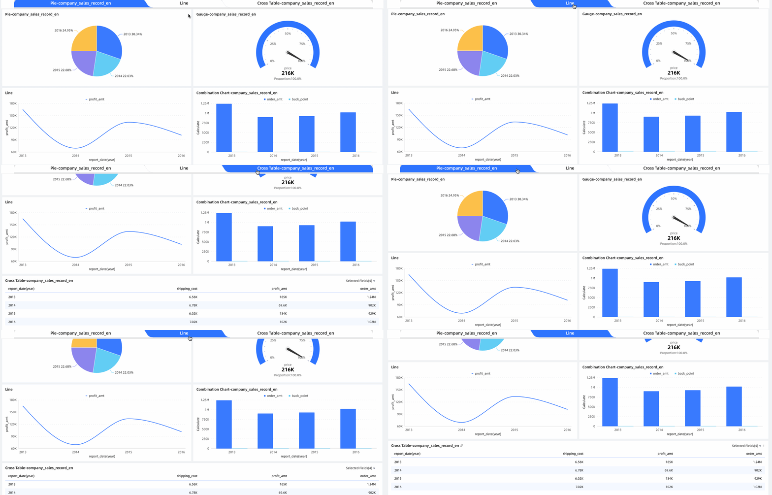
Supports horizontal paging and vertical scrolling:
Horizontal Paging
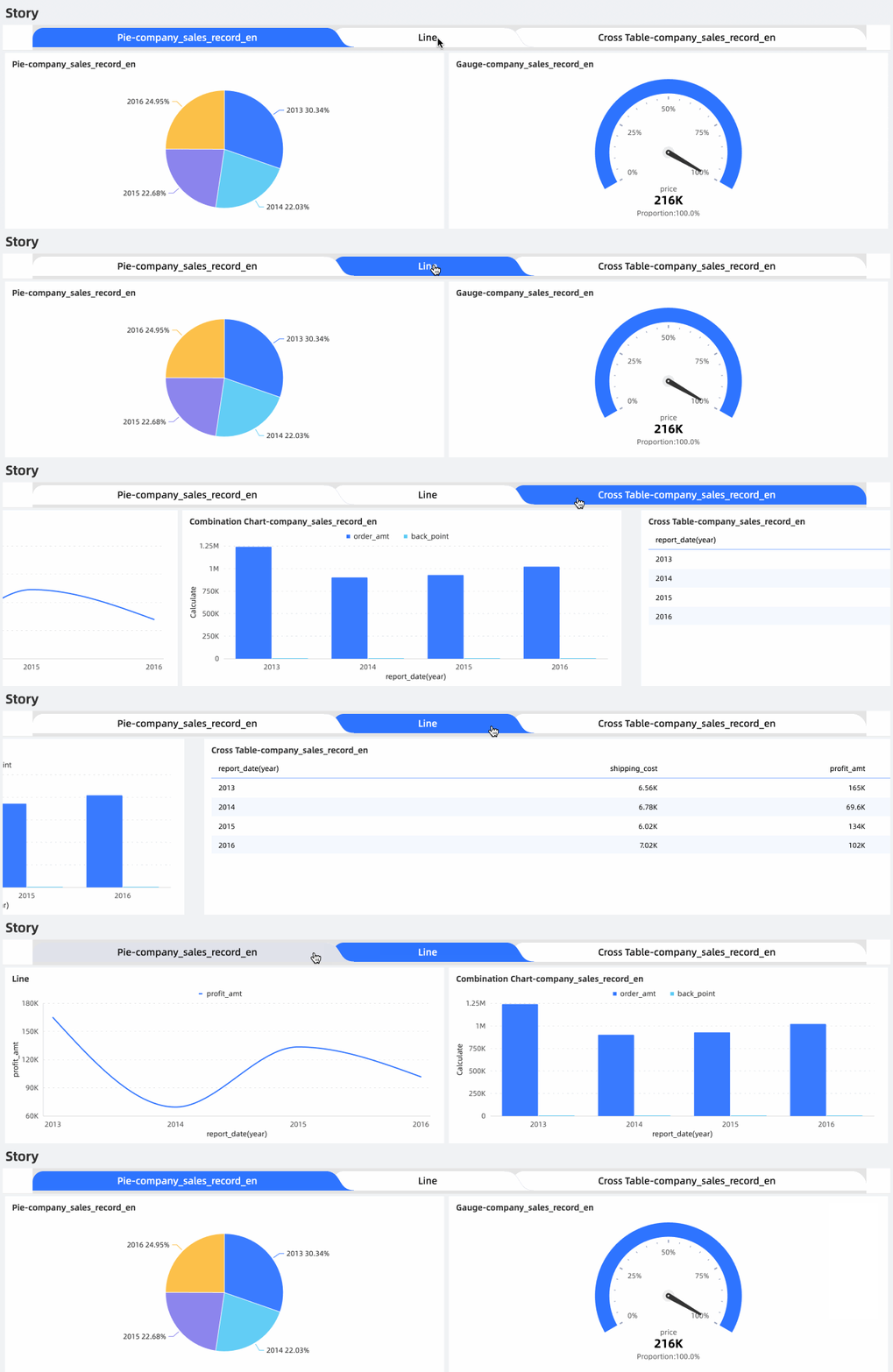
Vertical Scrolling

Custom Background Fill
When enabled, set the background color of the widget in Card Color. Options include Solid or Gradient.
Rounded Corner
Sets the corner radius value for the widget.
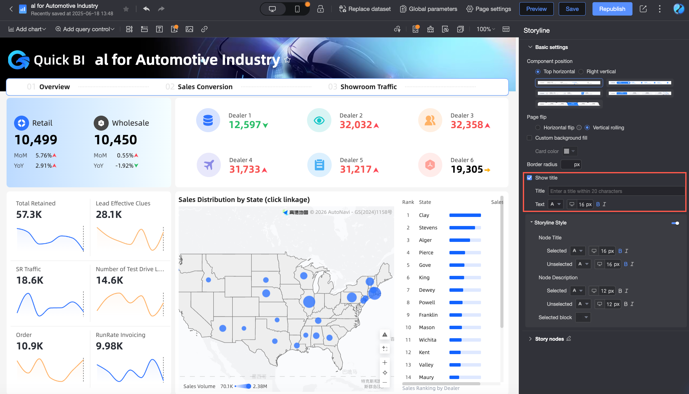
Show Title
When enabled, the widget displays a title. Customize the title text and style, including font color, size, weight, and italicization.
Story Builder Style
Click the
icon to customize the node's text and background color. When enabled, these style settings override the theme's color scheme.Set the text styles for the node title (①) and description (②) for both selected and unselected states, as well as the color of the node block (③) for the selected state.
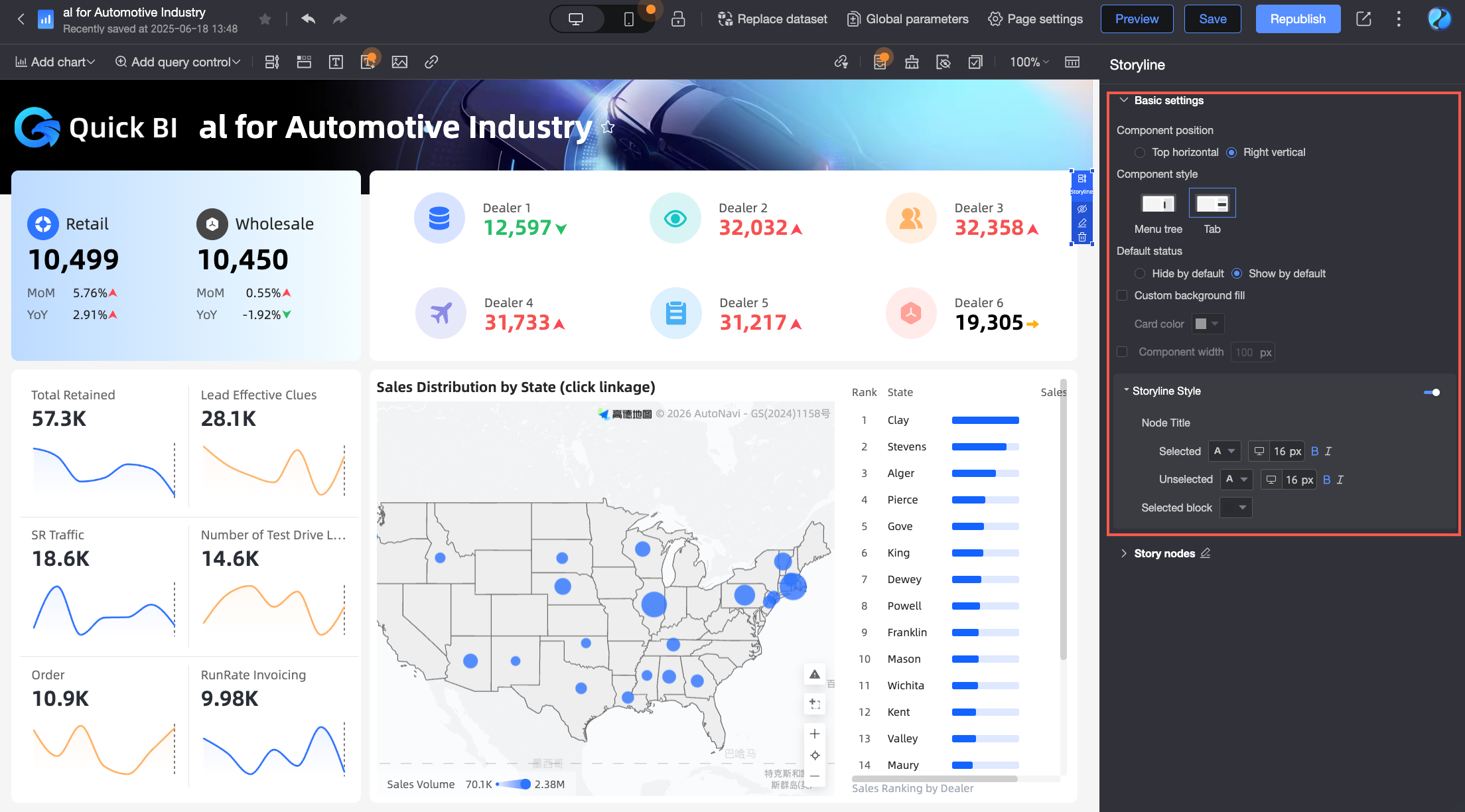
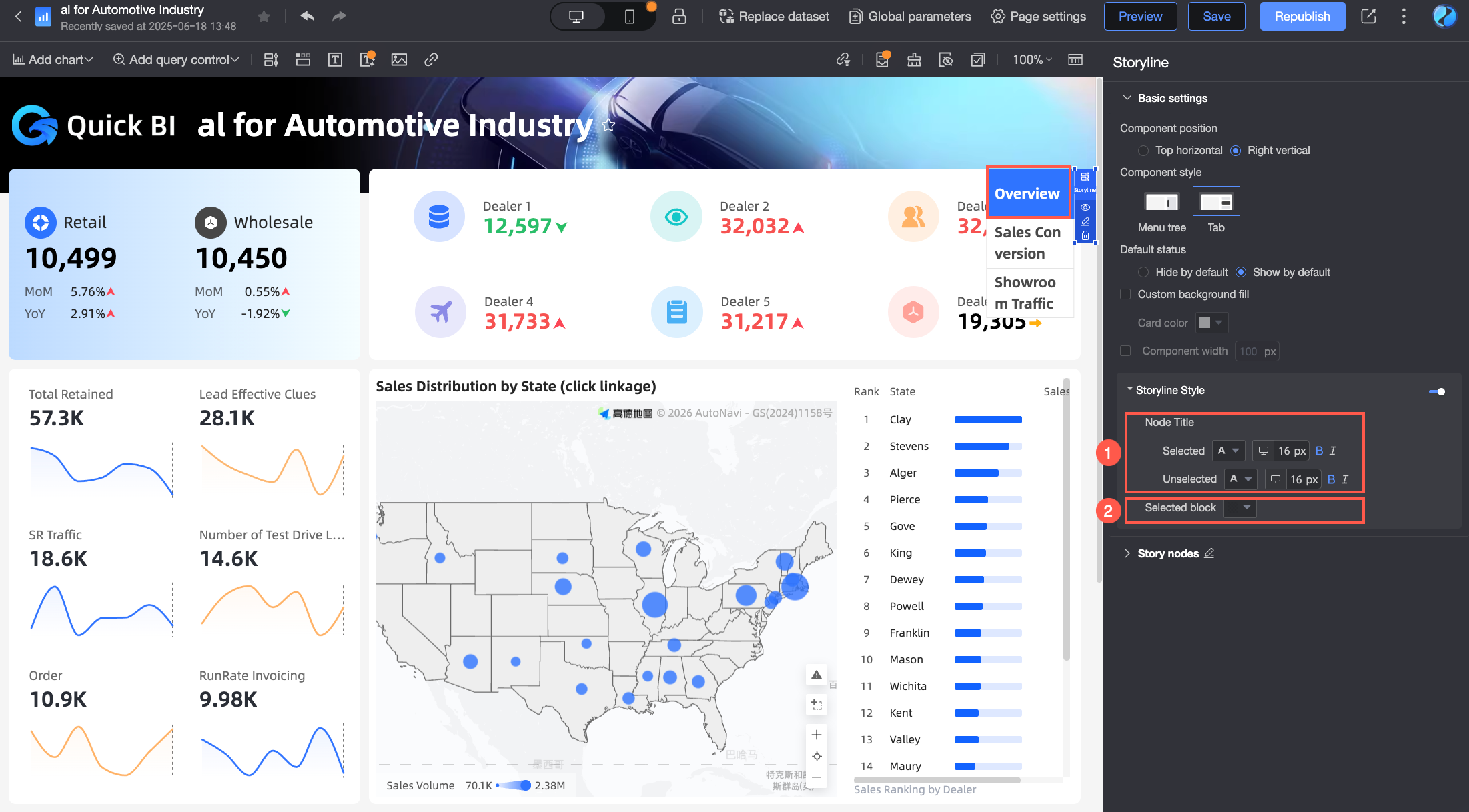
When the widget position is set to Right Vertical, the following settings are available:
Parameter
Description
Widget Style
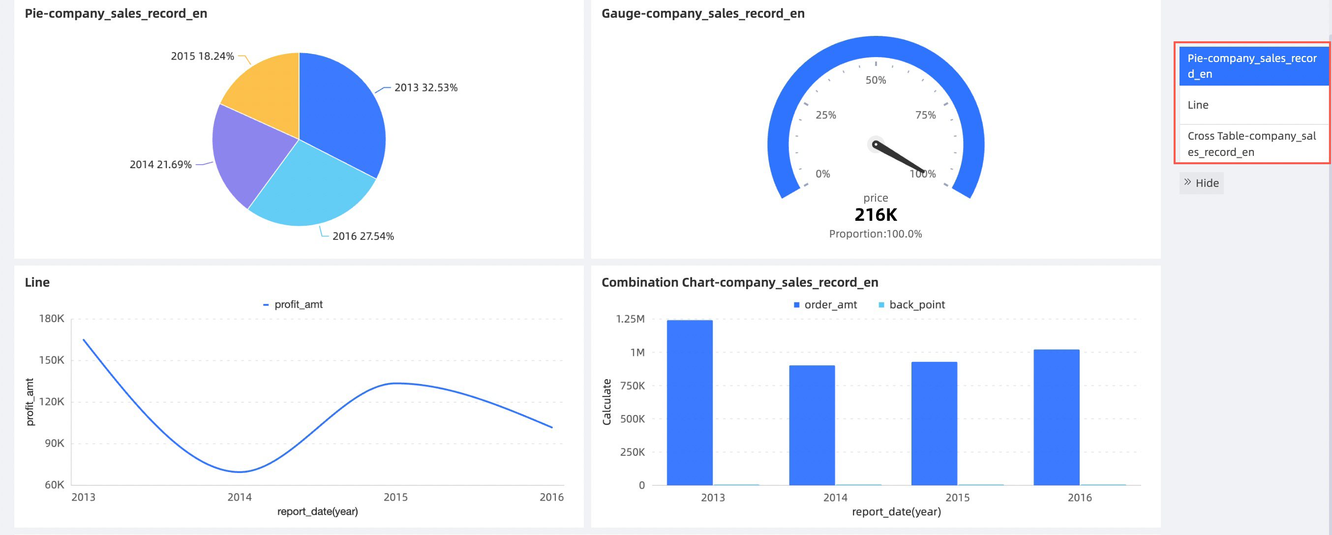
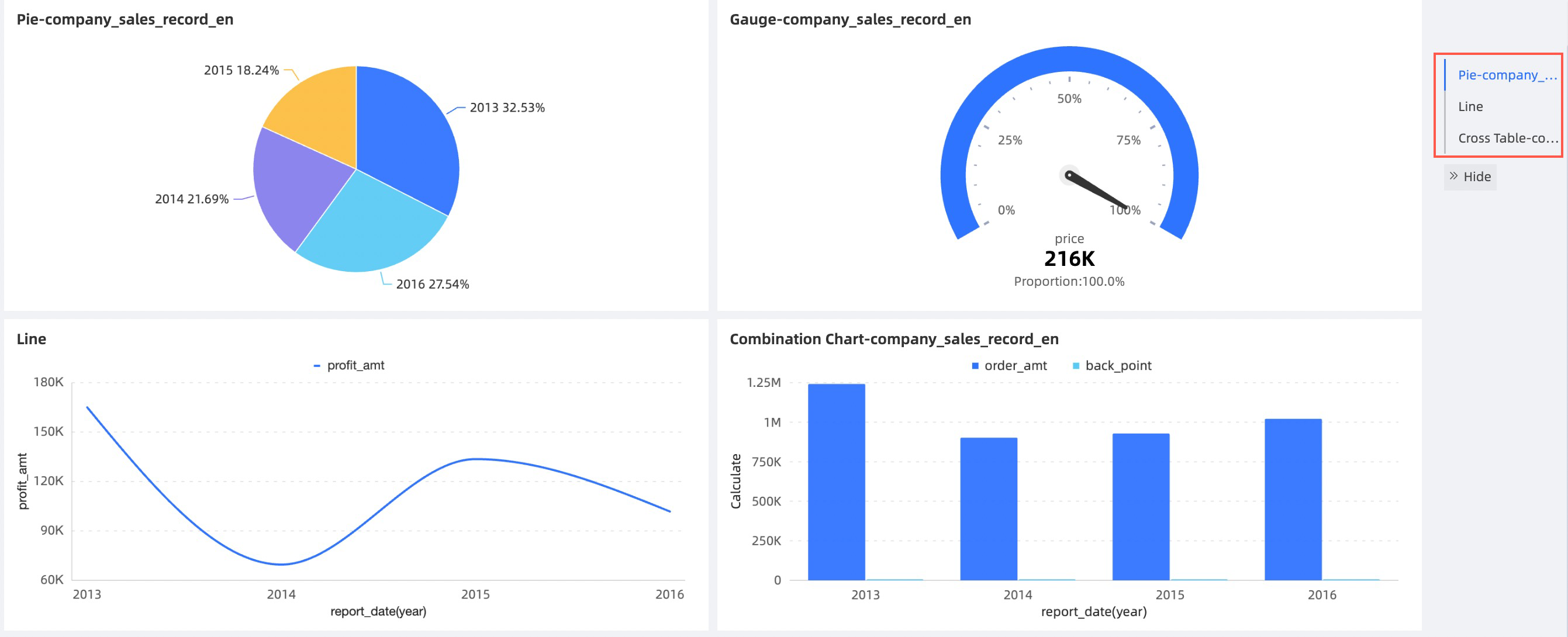
Options include Menu Tree and Tab.
Tab
Menu Tree
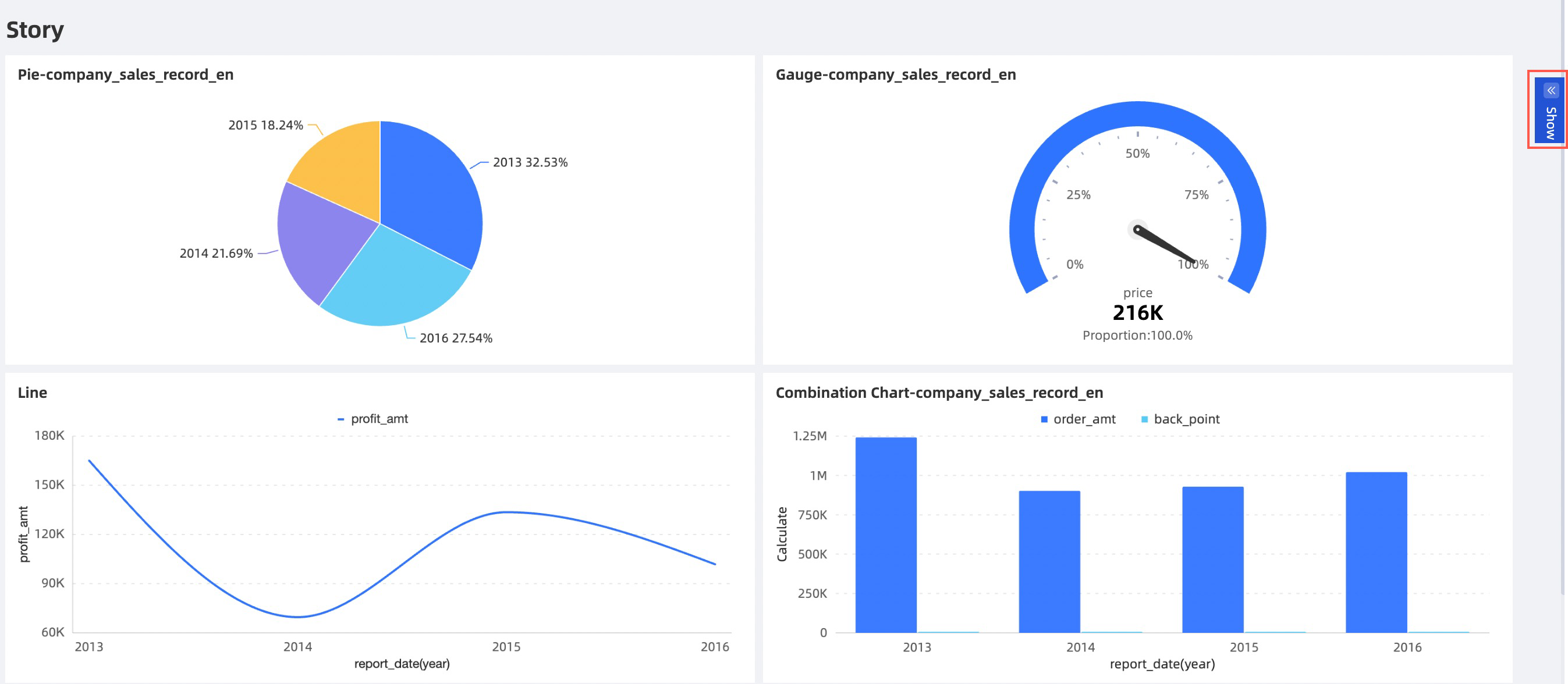
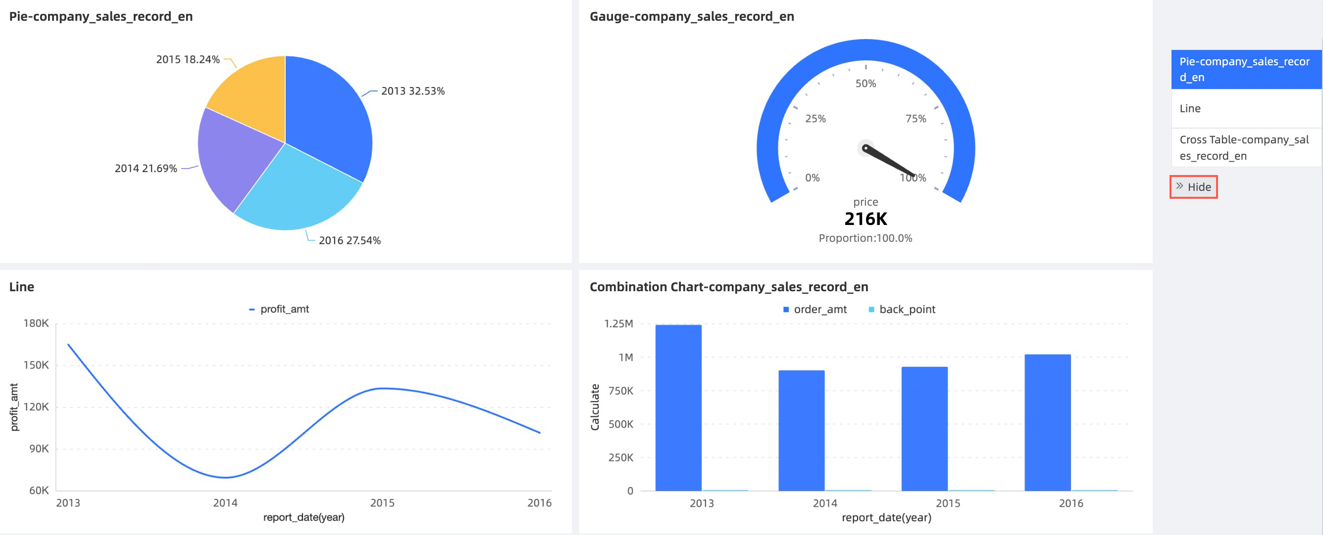
Default Status
Options include Hide by Default and Show by Default. The effect is visible in the dashboard view.
Hide by Default
Show by Default
Custom Background Fill
When enabled, set the background color of the widget in Card Color.
Widget Width
When enabled, set the width of the widget.
Story Builder Style
Click the
icon to customize the node's text and background color. When enabled, these style settings override the theme's color scheme.Set the text styles for the node title (①) for both selected and unselected states, and the color of the node block (②) for the selected state.
 icon to customize the node's text and background color. When enabled, these style settings override the theme's color scheme.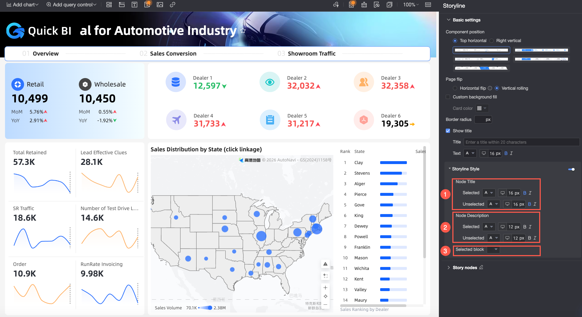
Story Nodes
In the Story Nodes section, set the node mode and edit the descriptions for the story nodes.
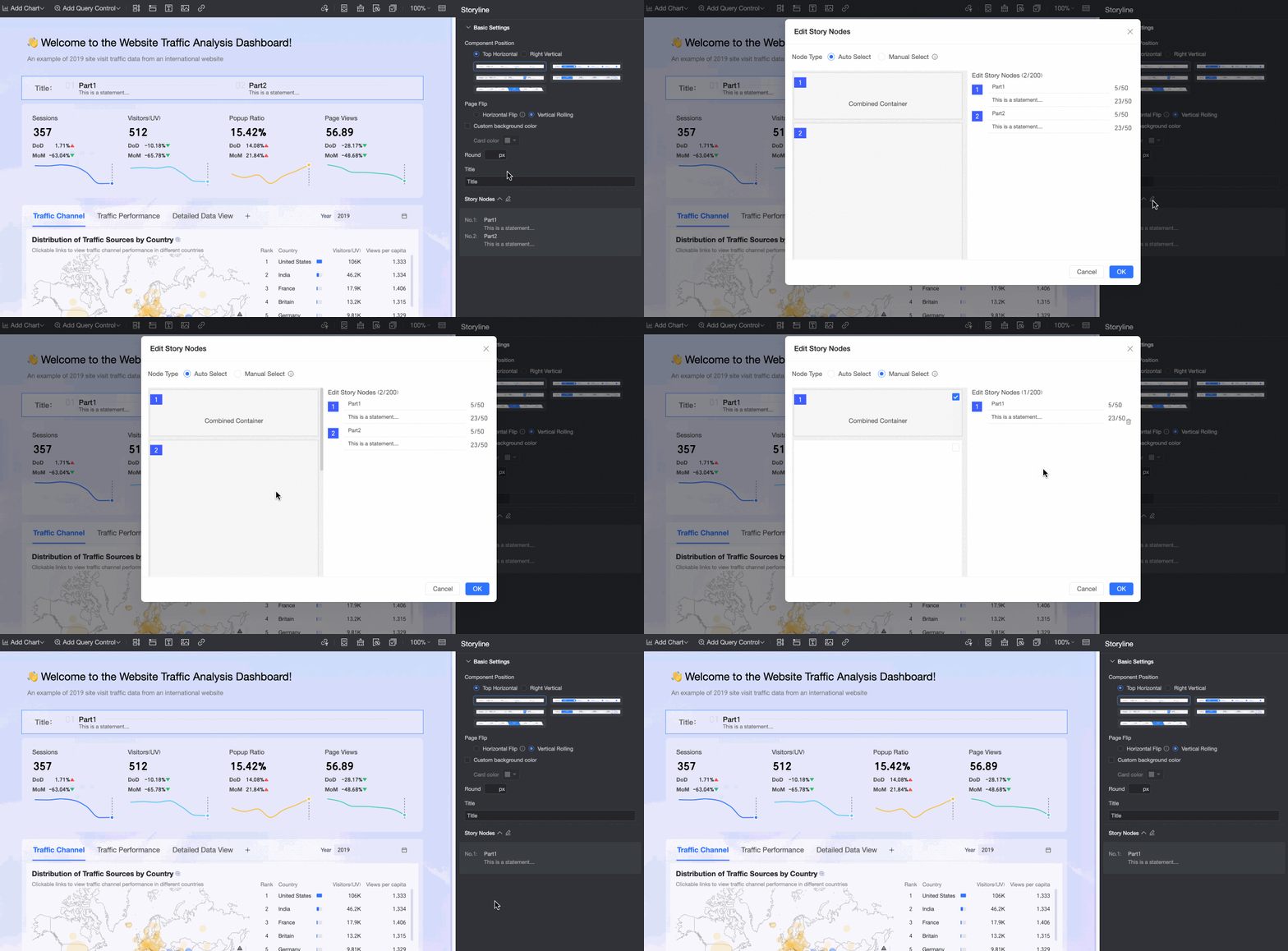
Node mode can be set to Auto Select or Manual Select:
When node mode is set to Auto Select, the system automatically generates a list of story nodes based on the dashboard layout. The node order updates automatically if the chart layout changes.
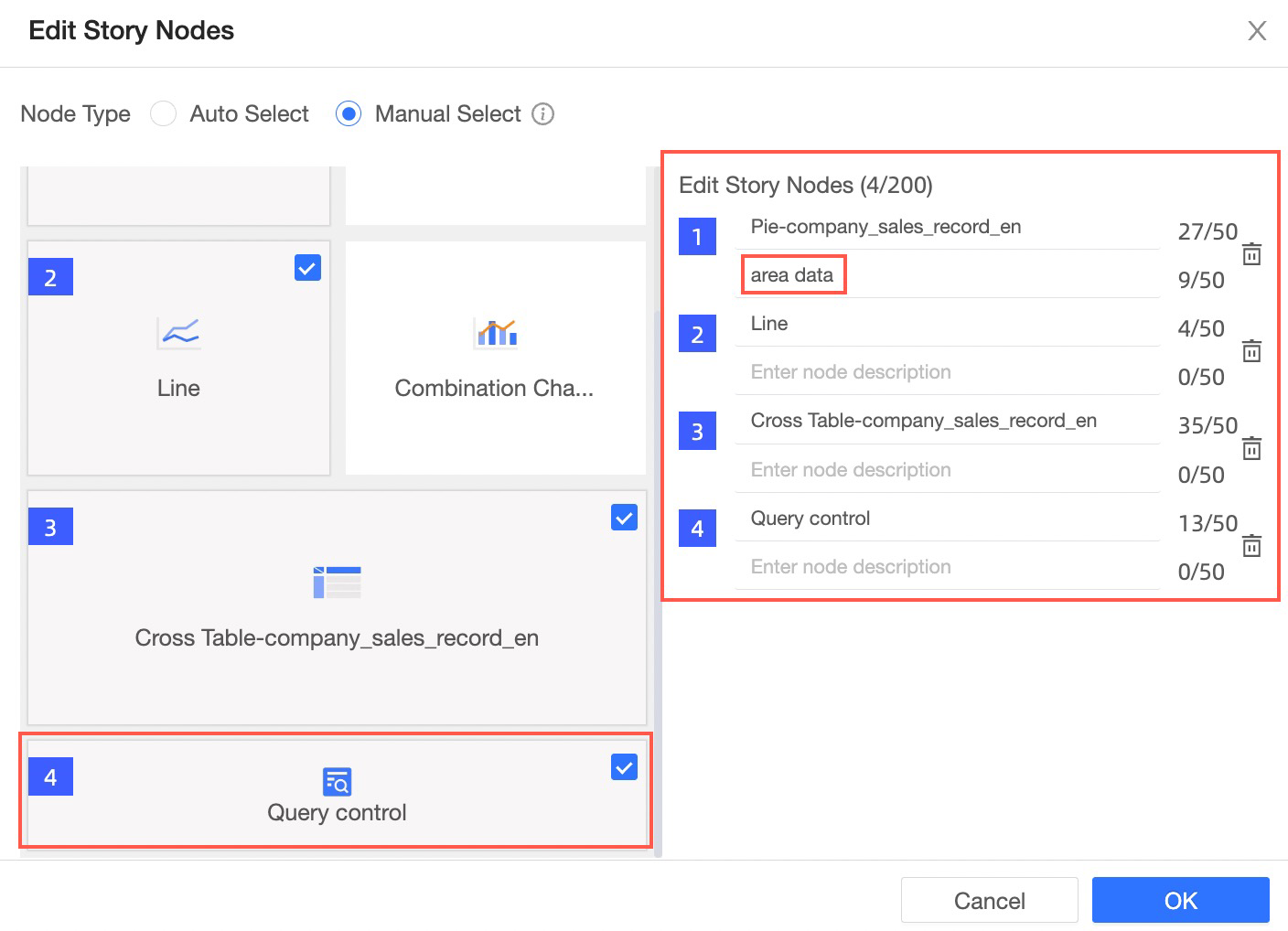
When node mode is set to Manual Select, you can manually select charts from the thumbnail view to create the story node list. Charts that are not selected, or that are added after configuration, will not appear in the story node list.
In the Edit Story Nodes section, change the name of each story node.
On the story node editing page, bind a query control and add an annotation, as shown in the figure.
NoteA story node list can contain a maximum of 20 story nodes. Each story node name cannot exceed 50 characters.
Step 3: Manage Story Builder
Manage an existing Story Builder widget with the following operations.
When the widget position is set to Top Horizontal:
Select the Story Builder widget (①) to open the Story Builder panel and edit its settings. For more information, see Step 2: Configure styles.
Click ② to delete the Story Builder widget.
When the widget position is set to Right Vertical:
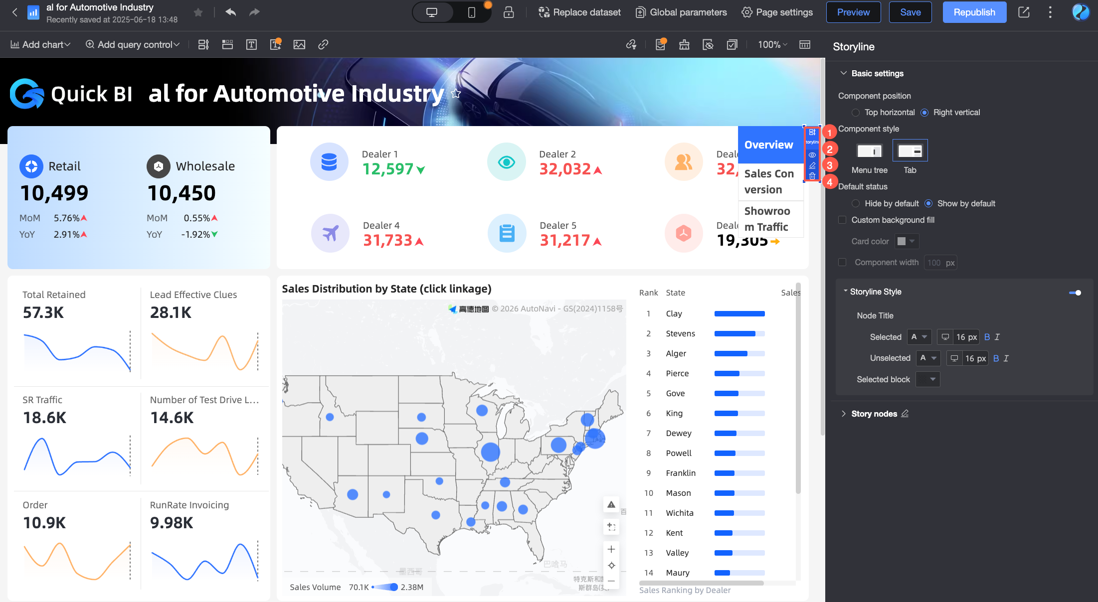
Click ① to open the Story Builder panel and edit its settings. For more information, see Step 2: Configure styles.
Click ② to expand the story node list.
Click ③ to edit the story nodes.
Click ④ to delete the Story Builder widget.
FAQ
1. BI portal, tab widget, and Story Builder
A BI portal, a tab widget, and the Story Builder are all interactive navigation features in Quick BI, but they have different uses and are suited for different scenarios:
BI portal: Organizes multiple report objects based on a business analysis logic. This is typically used in scenarios that require displaying multiple reports. For configuration details, see BI portal.
Tab widget: Places multiple charts within a single tab widget for unified viewing. This is often used when you need to organize and efficiently display multiple charts within the limited space of a single dashboard. For configuration details, see Tab.
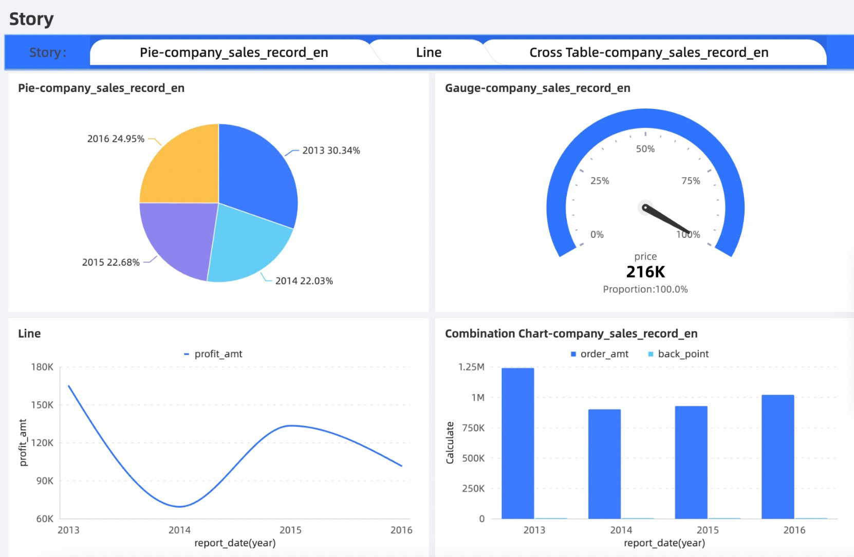
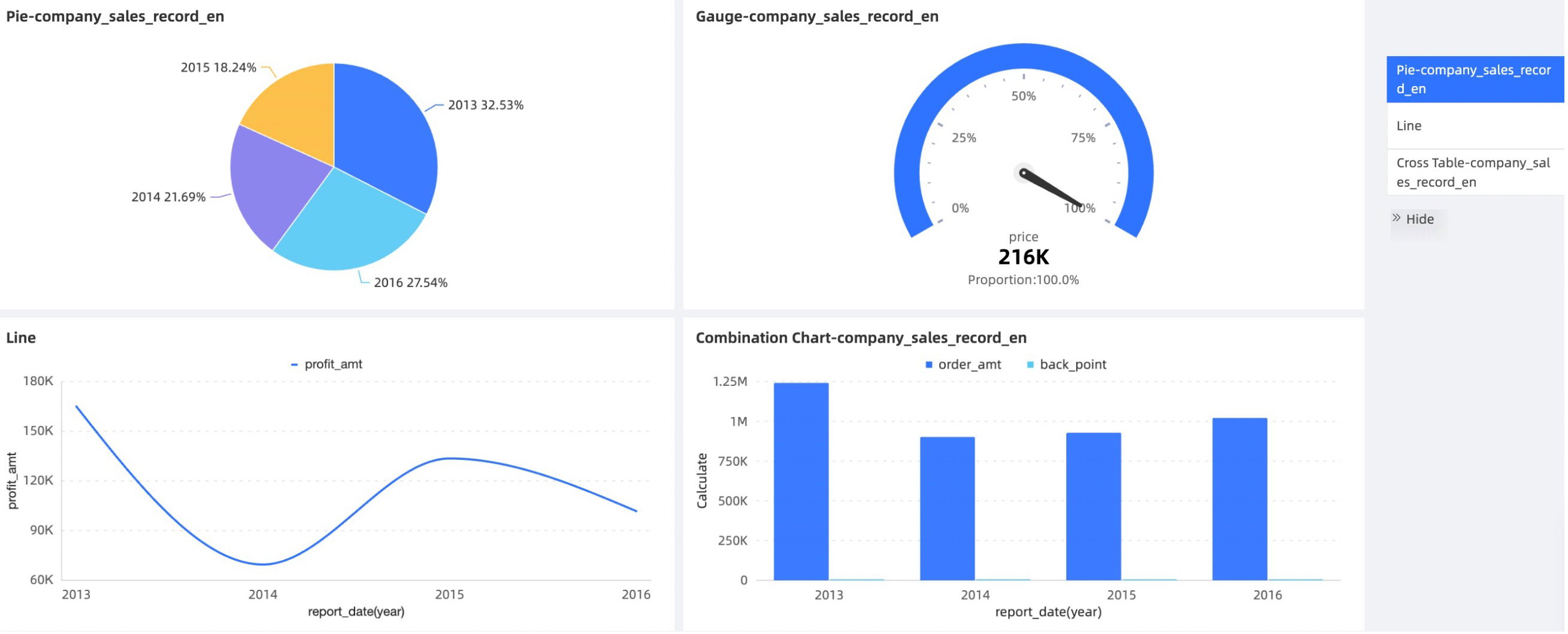
Story Builder: Presents the data analysis flow within a report as a storyline. It is typically used for scenarios that require presenting a comprehensive analytical narrative within a single report. The Story Builder can be positioned at the top or on the right side of the dashboard. For configuration details, see this topic.
Top Horizontal
Right Vertical
2. Missing charts in story node list
The story node list can display only one chart from each row of the dashboard:
If a row contains only one chart, it can appear in the story node list regardless of its position (left, center, or right).
If a row contains two or more charts, only the leftmost chart can appear in the story node list.