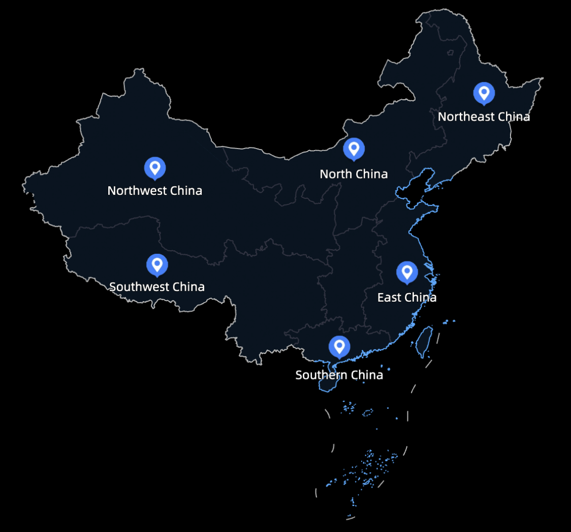
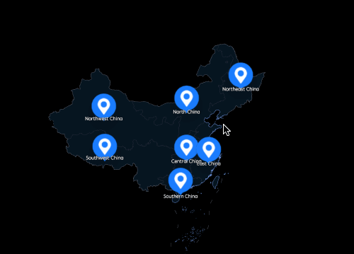
A symbol map uses a map outline as a background and marks data points with icons or images. You can configure the map style, symbols, data labels, and tooltips.
Prerequisites
A data visualization screen has been created. For more information, see Create a Data Visualization Screen.
Preview
Configure chart fields
-
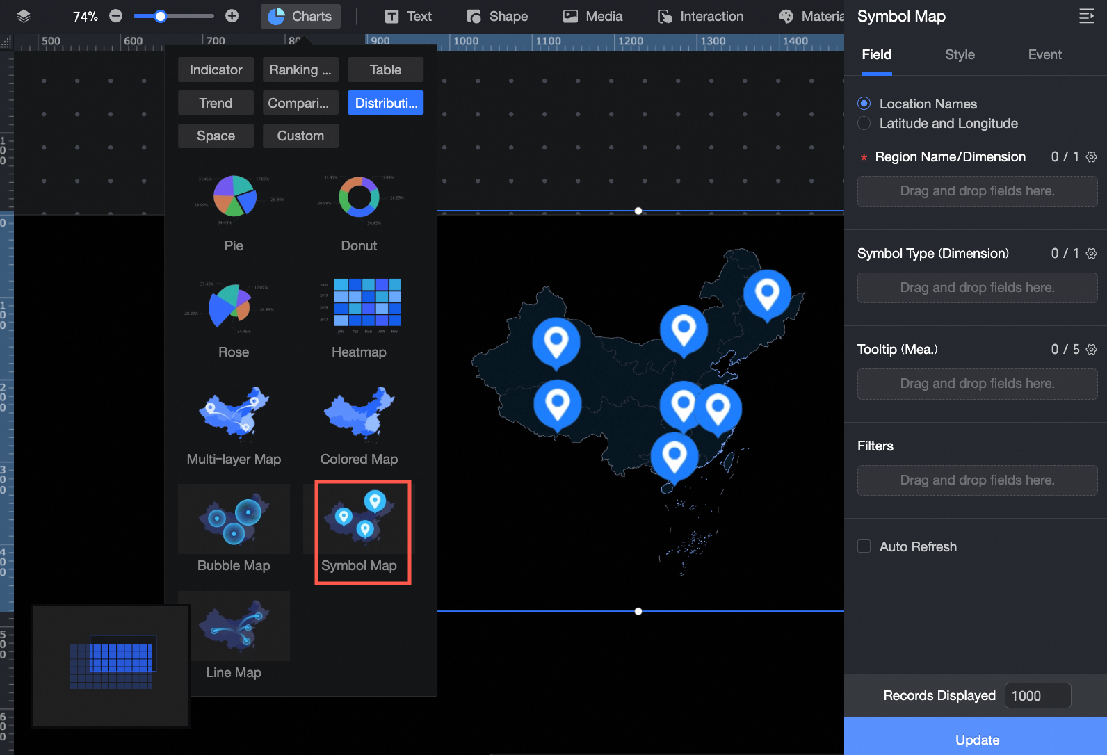
In the Charts section of the widget library, find the Symbol Map widget and drag it to the canvas.
-
On the Fields tab, select the dimension and measure fields that you need:
-
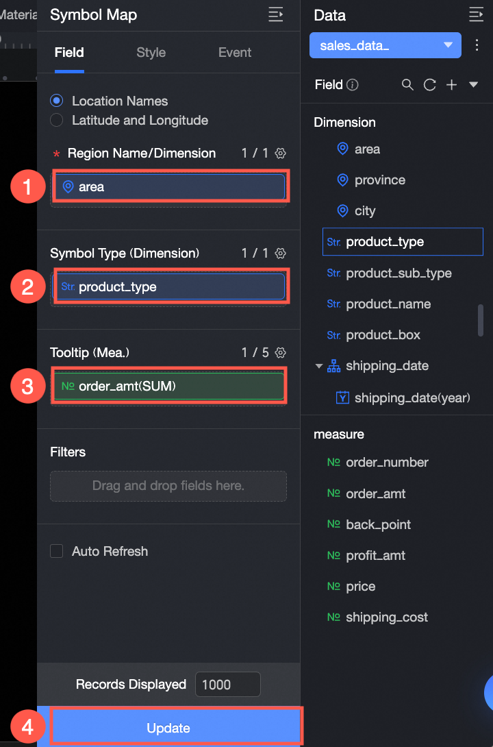
You can specify geographic information using either an area name or latitude and longitude coordinates.
If you select Area Name, double-click or drag an area field to the Area Name/Dimension field.
If you select Latitude and Longitude, double-click or drag a longitude field to Longitude/Dimension and a latitude field to Latitude/Dimension. The Location Label/Dimension field is optional.
-
The symbol type determines the style of the symbol based on the selected dimension value. Double-click or drag the Product Type field to Symbol Type/Dimension.
-
From the list of measures, double-click or drag Profit Amount to Tooltip/Measure.
-
-
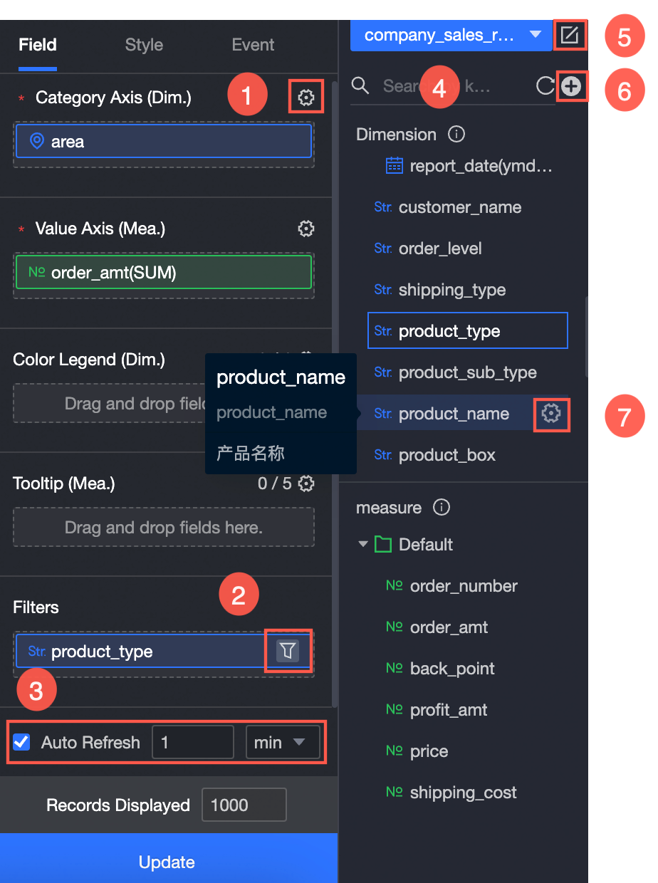
You can perform the following operations on the data as needed:
-
① Configure field formats in batches. For more information, see Batch Configure Field Styles.
-
② Filter data. For more information, see Filter data.
-
③ Configure auto-refresh for data. For more information, see Refresh data on a schedule.
-
④ Switch datasets. For more information, see Switch datasets.
-
⑤ Edit the dataset. For more information, see Edit a dataset.
-
⑥ Process data by creating a calculated field or a new grouped dimension. For more information, see Create a Calculated Field and Create a new grouped dimension.
-
⑦ Copy a field. For more information, see Copy and convert to dimension.
-
Configure chart style
The following style settings are specific to the symbol map. For common chart style settings, see Configure Chart Style.
-
Geographic area
Configure the following settings:
-
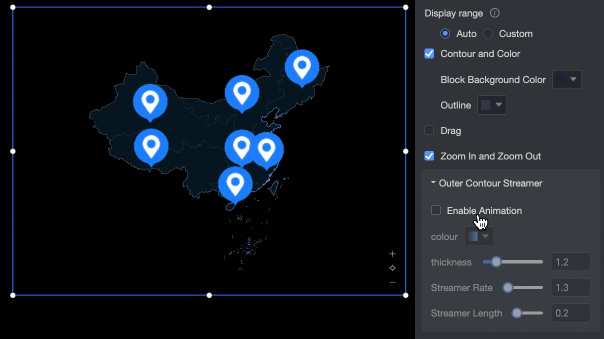
For Display Range, select Auto or Custom.
Note-
Auto adjusts the range based on the data. Custom lets you set the range manually. In interactive analysis scenarios, the range is always automatically adjusted based on the data.
-
Custom display ranges currently support only continents, countries, and regions, provinces, and cities in China.

You can also enable Manual Adjustment. The current centroid and scaling values are automatically generated, and you can modify them.

-
-
In the Outline and Fill section, configure the background color of the area and the color of the outline.
NoteOutlines are not supported for some regions.
-
Select Enable Drag and Enable Zoom to allow users to drag and zoom the chart in the preview of the data visualization screen.
-
In the Outer Outline Streamer section, enable or disable the streamer effect. When enabled, you can configure the Streamer Color (Solid/Gradient), Thickness, Speed, and Length.
-
-
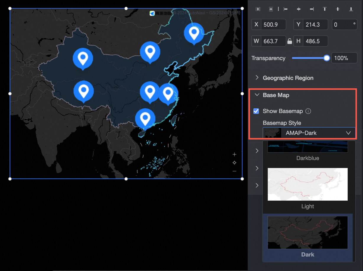
Base map
In the Display Base Map section, you can select one of the Gaode Map styles to use as the base map.
-
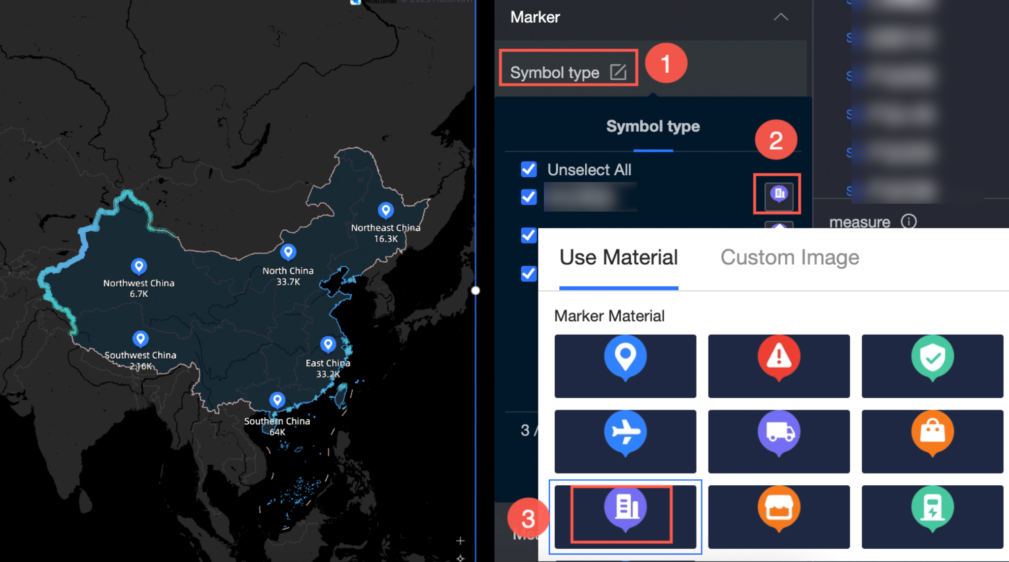
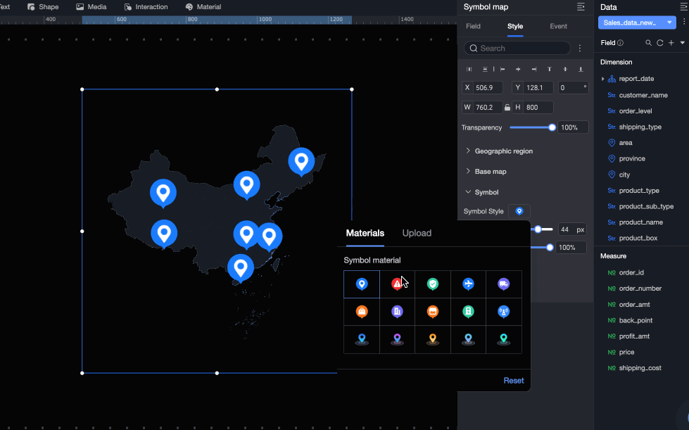
Symbol
Configure the Symbol Type, Symbol Size, and Symbol Opacity.
-
Symbol Type:
-
If you configured a field for Symbol Type/Dimension on the Fields tab, symbol styles are automatically generated based on the dimension values. You can modify the symbol styles in this section. In this example, Symbol Type is set to the Outlet Type field, with different symbols for directly-managed and franchised outlets across regions.
-
If you did not configure a field for Symbol Type/Dimension on the Fields tab, you can manually select an icon or upload an image link.
-
-
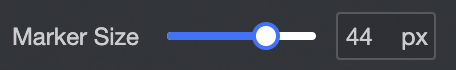
Symbol Size: Drag the slider to change the symbol size.
-
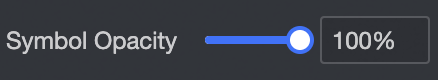
Symbol Opacity: Drag the slider to change the symbol opacity.
-
-
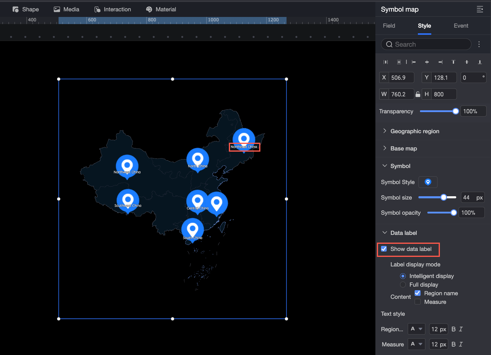
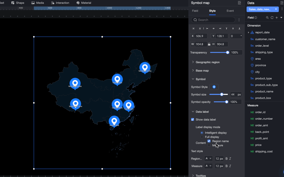
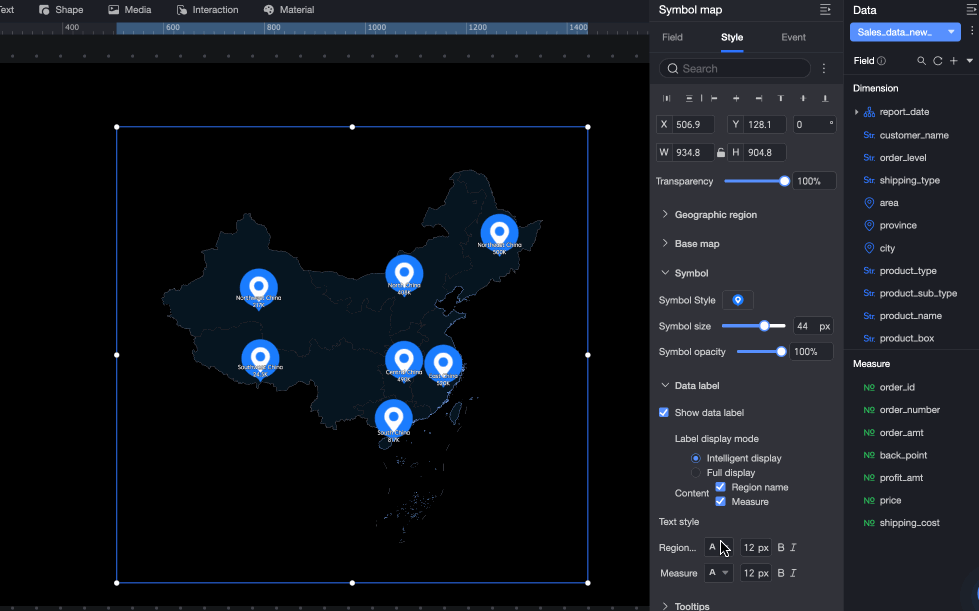
Data label
Configure the following settings:
-
Show Data Label:
If you create a map using the Area Name mode, you can display both the area name and the measure.
If you create a map using the Latitude and Longitude mode, you can display the latitude and longitude and the measure. If you have configured a Location Label/Dimension, you can also display the location label.
-
Label Display Mode: Smart Display and Full Display are supported. Smart Display is suitable for maps with many place names.
-
Text Style: Set the text style for the Area Name, Latitude and Longitude, and Measure data labels.
-
-
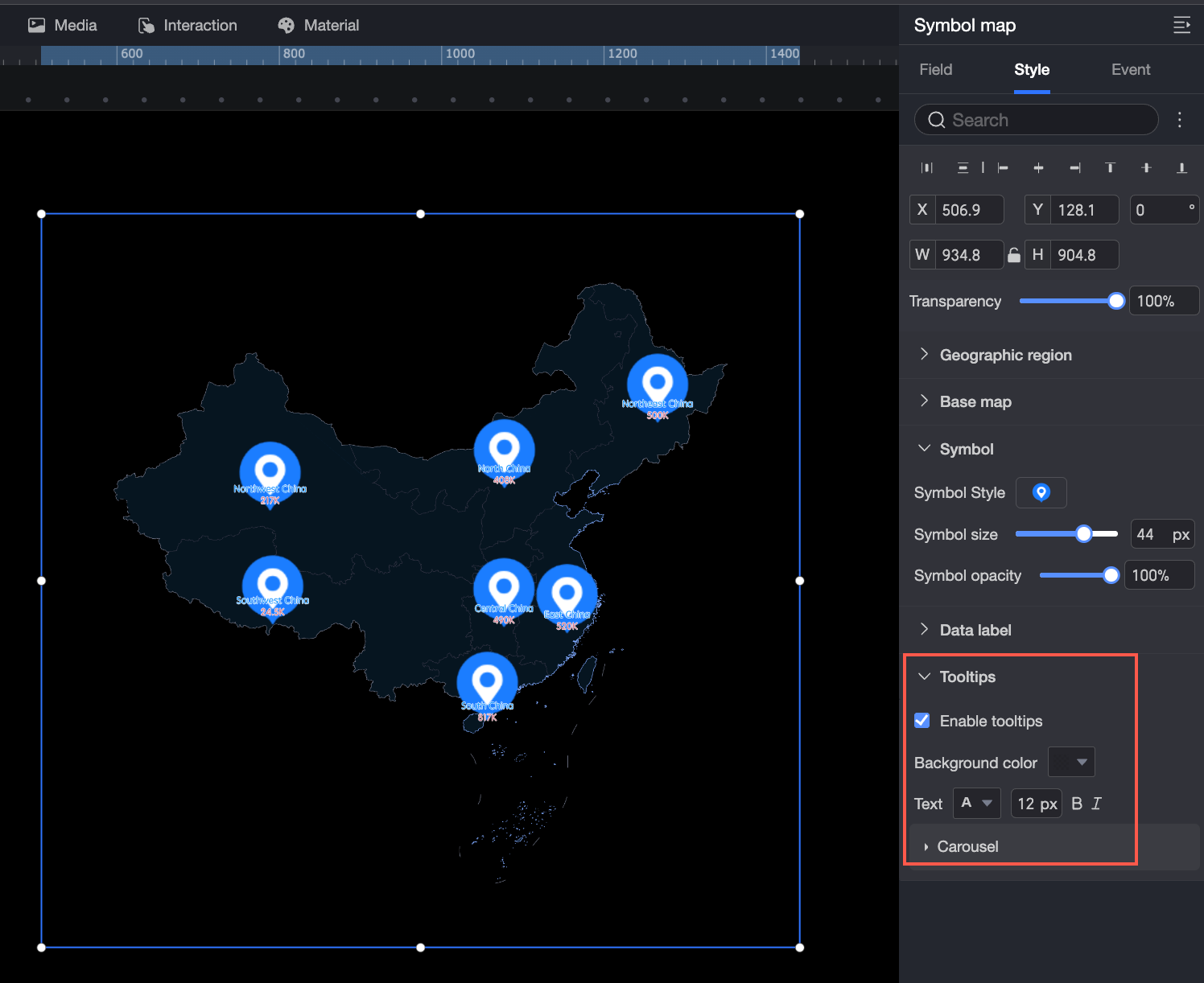
Tooltip
Configure the Background Color, Text, Enable Tooltip, and Carousel settings.
Enable Tooltip is enabled by default. The tooltip appears when you hover over an area.
You can enable Auto Carousel to cycle through tooltips automatically. Configure the Duration and Interval for the carousel.


Configure chart events
|
Configuration item |
Name |
Configuration example |
Description |
|
Data event |
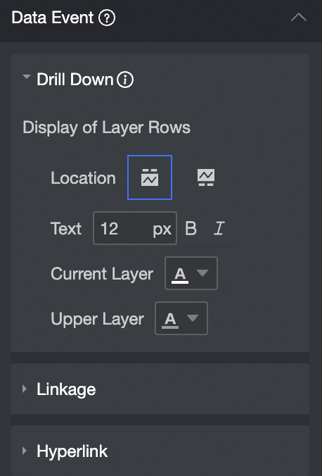
Drill Down |
|
Configure drilling for a dimension field to analyze data at different levels. Clicking the field changes the analysis granularity. For more information, see Drill Down Settings. |
|
Filter Interaction |
Use filter interactions to associate multiple charts for cross-chart data analysis. For more information, see Filter Interaction Settings. |
||
|
Navigation |
Use hyperlinks to associate data across multiple data visualization screens or dashboards. Hyperlinks include parameter-based hyperlinks and external links. For more information, see Drill Down/Linkage/Hyperlink. |
||
|
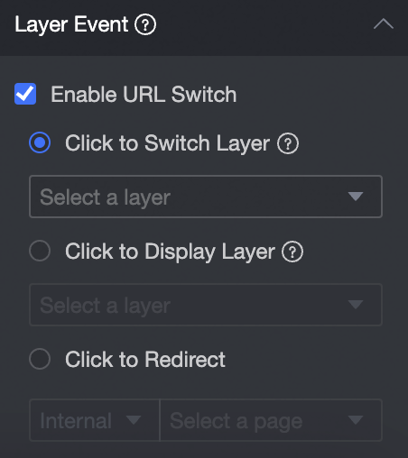
Layer event |
Enable Link Redirection |
|
For layer events, you can select Enable Link Redirection, Click to Pop Up Layer, or Click to Go to Page. For more information, see Set click events. |