A ticker board is a Quick BI visualization widget that dynamically displays a single core KPI. It uses a flip animation to highlight a key business metric, helping you quickly assess performance and spot anomalies.
Chart Overview
Scenarios
Displays a single metric to highlight business performance. Observe changes in the metric to quickly identify operational anomalies.
Benefits
-
Calculation: Configure year-on-year and month-on-month calculations with one click.
-
Visualization: Display icon logos and customize backgrounds, font sizes, and colors.
-
Annotations: Add text or metric annotations and configure external link paths for cross-system data interaction.
Example Output
Limits
-
Prerequisite: You have created a dashboard. For more information, see Create a Dashboard.
-
Ticker boards apply only to group spaces in the Premium Edition and Professional Edition.
-
When adding data to a ticker board, the display indicator/measure is determined by the data's measure. Select only one measure.
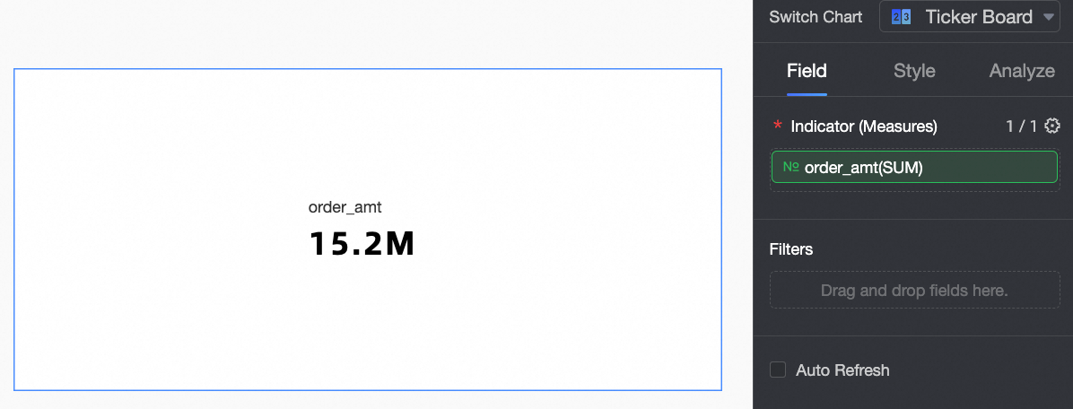
Configure Chart Data
-
In the Measure list, find order amount and double-click or drag it to the Display Metrics/Measures area.
-
Click Update.
Configure Chart Styles
The following describes ticker board-specific style settings. For general chart styling, see Configure the chart title.
In the search box at the top of the configuration area, enter keywords to find configuration items. Click the  icon to expand or collapse all categories.
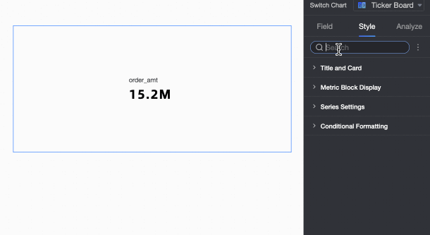
-
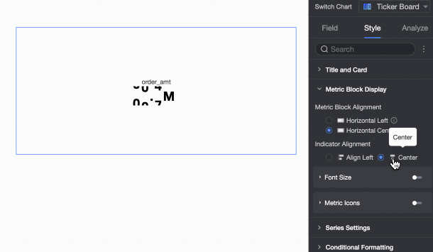
In Indicator Content, configure how the indicator content is displayed.
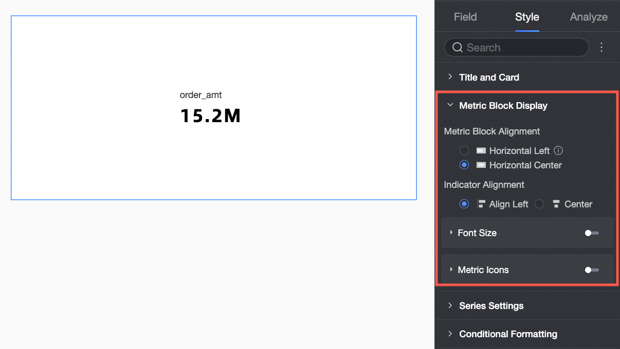
Chart Configuration Item
Description
Position of Content in Indicator Block
Set to align left or center.
Alignment with Indicator
Set the position of the indicator name relative to the indicator value. Options: align left or align center.

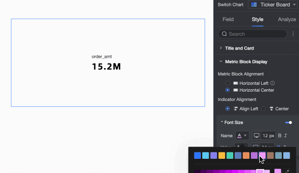
Font Size Settings
Enable this option to customize the style of the indicator name and value fonts.
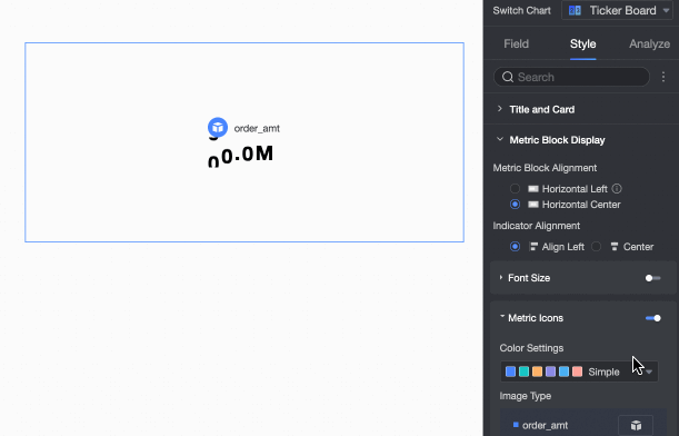
Indicator Decoration Icon
Enable this option to add a decoration icon before the indicator and configure its styles.
Upload a local image to use as a custom decoration icon.
NoteSupported formats: JPG, JPEG, PNG, GIF, and SVG. Maximum file size: 1 MB.
-
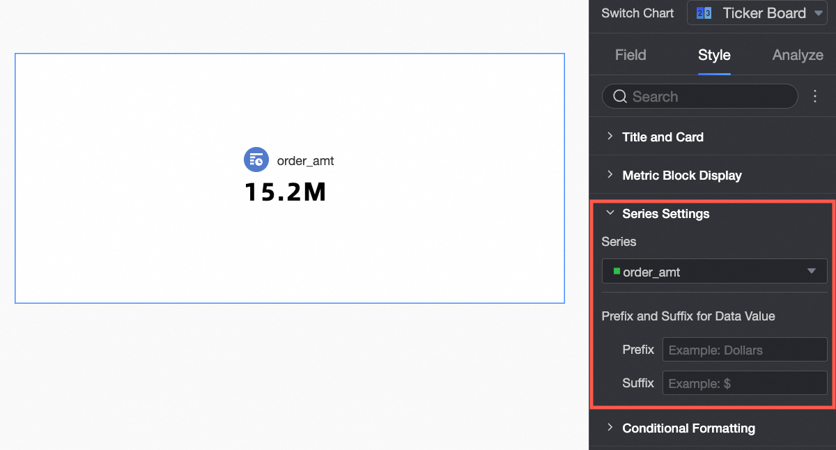
In Series Settings, set Select Series and Indicator Data Value Prefix and Suffix.
Chart Configuration Item
Configuration Item Descriptions
Select Series
Configure the measure in the Scorecard Indicator/Measure area.
Indicator Data Value Prefix and Suffix
Set a prefix and suffix for the indicator data value displayed on the chart.
-
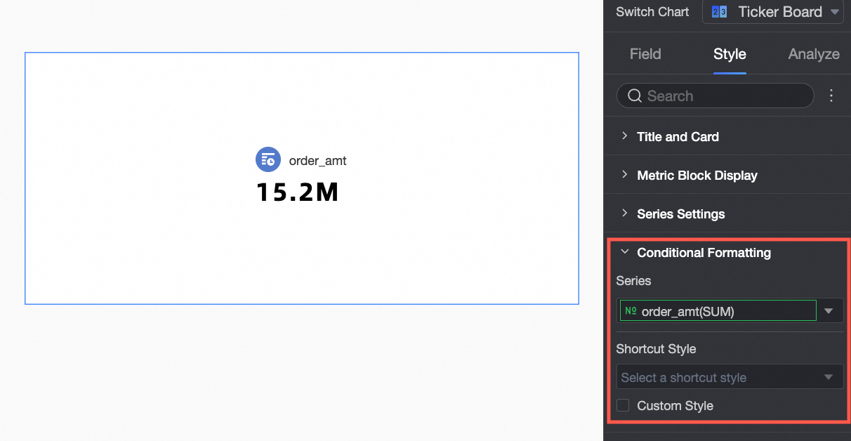
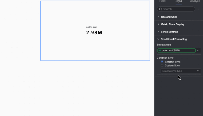
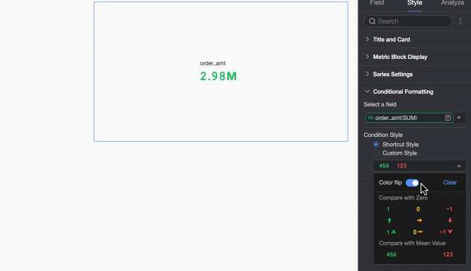
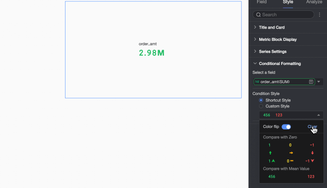
In Conditional Formatting, set the conditional formatting for measure data.
Chart Configuration Item
Description
Select Field
Select the measure field to apply conditional formatting to. Any measure in the Indicator/Measure area is available.
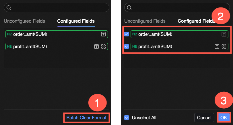
To remove conditional formatting after configuration, click Batch Purge Format in the lower-right corner of the field panel. Select the formats to clear, then click OK.
Quick Styles
Choose from system-provided styles to set the tag icon or font color for the current measure field.
-
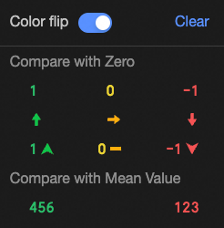
Comparison: Select compare with 0 or compare with mean.
-
Color Flip: Reverses the color scheme. For example, when comparing with 0, values below 0 are red and values above 0 are green by default. After flipping, values below 0 become green and values above 0 become red.
-
Clear: Remove the applied quick style.
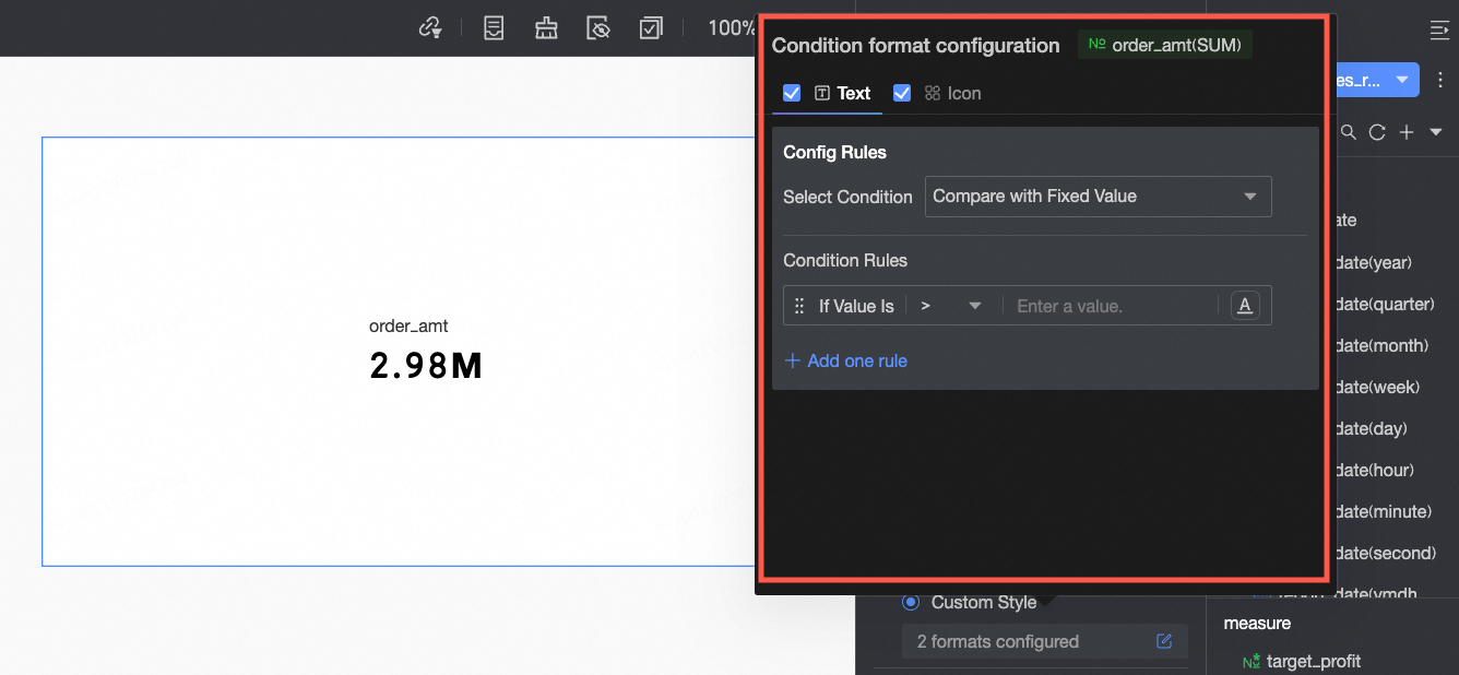
Custom Styles
Beyond quick styles, you can define custom styles for the current measure field.
-
Text: Set rules to highlight field values with specific text colors, visually emphasizing key data.
Configure the following information:-
Condition Selection: Set the comparison baseline. Options: compare with static value or compare with dynamic field.
-
Conditional Rule: Define the condition logic and the text style (color, bold, italic) to apply when the rule is met.
-
Add Rule: Click to add a new rule.
-
-
Icon: Display a tag icon based on a numerical comparison, showing the relationship between current data and target data.
Configure the following information:-
Condition Selection: Set the comparison baseline. Options: compare with static value or compare with dynamic field.
-
Conditional Rule: Click the Tag Icon selection box and choose an icon type from the system-provided styles. Define the condition logic for each icon. You can also assign a different tag icon to each rule.
-
Add Rule: Click to add a new rule.
-
-
 Configure the following information:
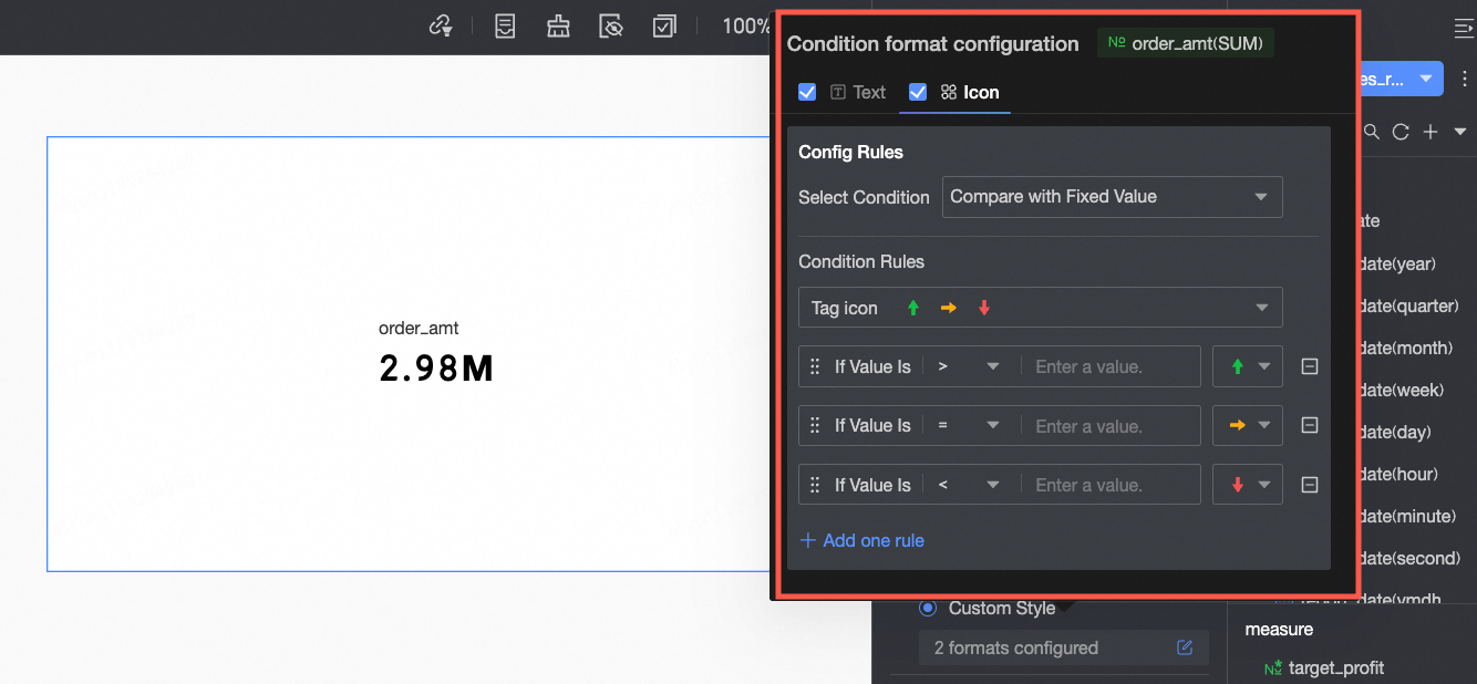 Configure the following information:
What to do next
-
To share the dashboard with others, see Share a Dashboard.
-
To create navigation menus for thematic analysis, integrate the dashboard into the BI portal. For more information, see BI portal.
FAQ
1. What is the main difference between a ticker board and a scorecard?
Answer: The main difference is the number of metrics displayed. A ticker board displays only one core metric with dynamic effects. A scorecard can display one or more metrics simultaneously and supports dimensional grouping, such as showing sales and profit by region.
2. I want to use a ticker board to display "sales" and also see its month-on-month growth rate. Is this possible?
Answer: A ticker board supports only one measure field. To display both sales and its month-on-month growth rate, pre-calculate the growth rate as a new measure in your dataset. Then use two ticker board widgets—one for sales and one for the growth rate—or use a “scorecard” or “metric trends” widget that supports primary and secondary metrics.
3. How do I make the numbers in a ticker board display in red when they exceed 1,000,000?
Answer: Use conditional formatting. Go to Style > Conditional Formatting, open the Text tab under Custom Styles, add a rule with the condition “When [Your metric field] > 1000000”, and set the text color to red.