Use the theme design feature to customize a dashboard's themes, global styles, page layout, and component styles. This topic describes the theme settings in the Page Settings pane.
Prerequisites
Log in to the Quick BI console and open a dashboard for editing. For more information, see Create a dashboard.
Procedure
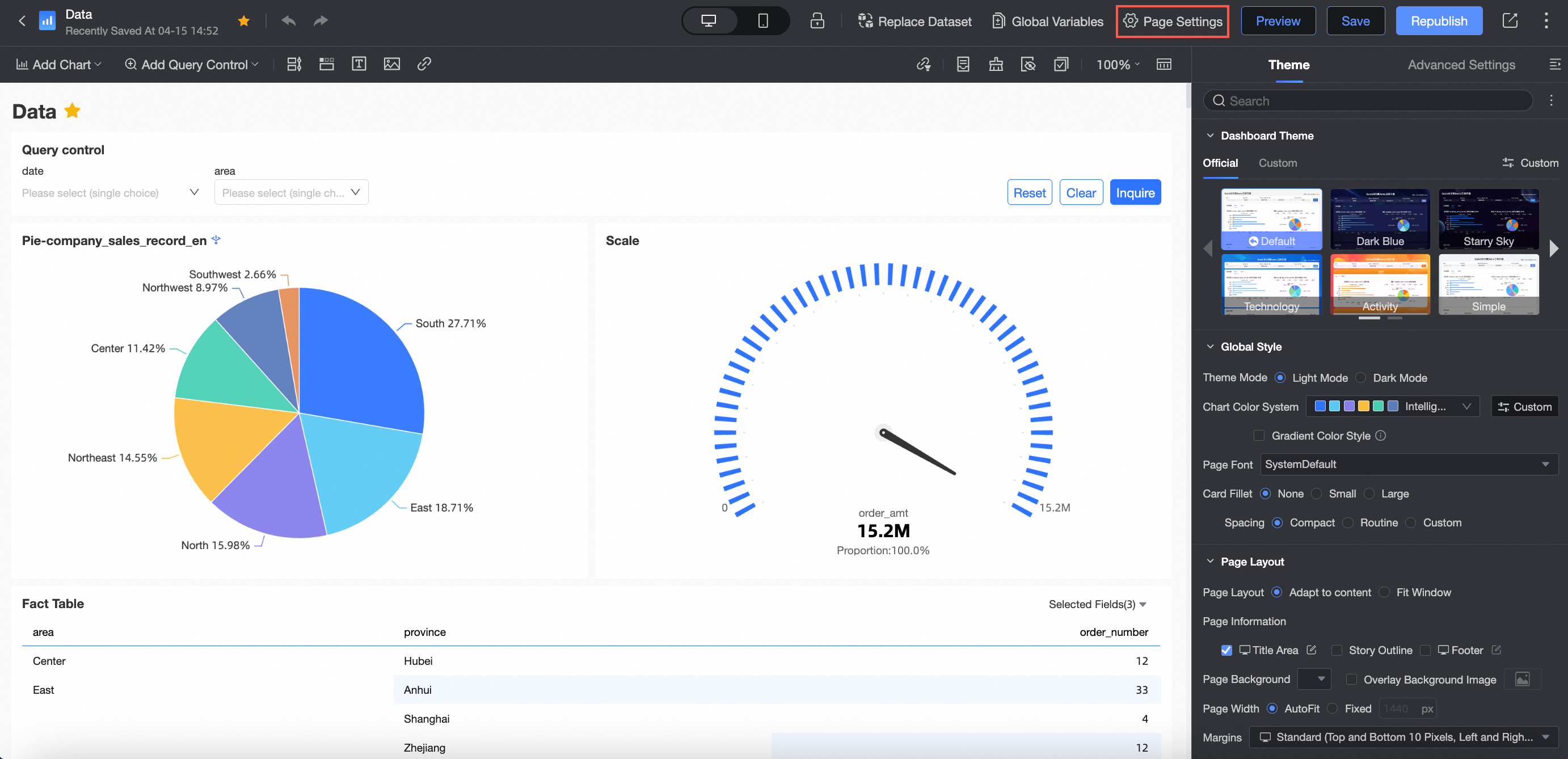
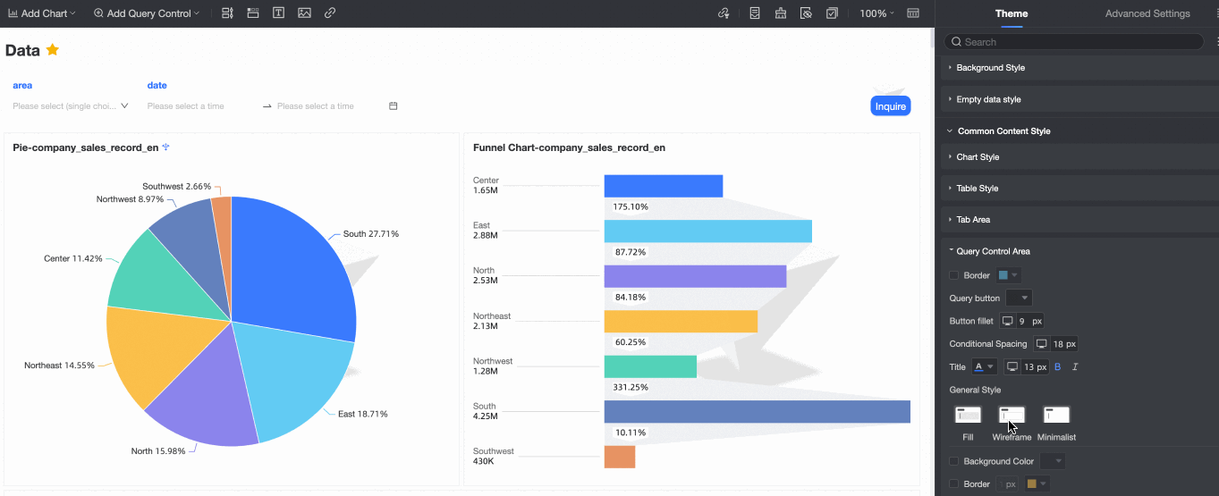
On the dashboard editing page, click Page Settings in the top menu bar.
You can click the
 icon to expand or collapse the Page Settings pane.
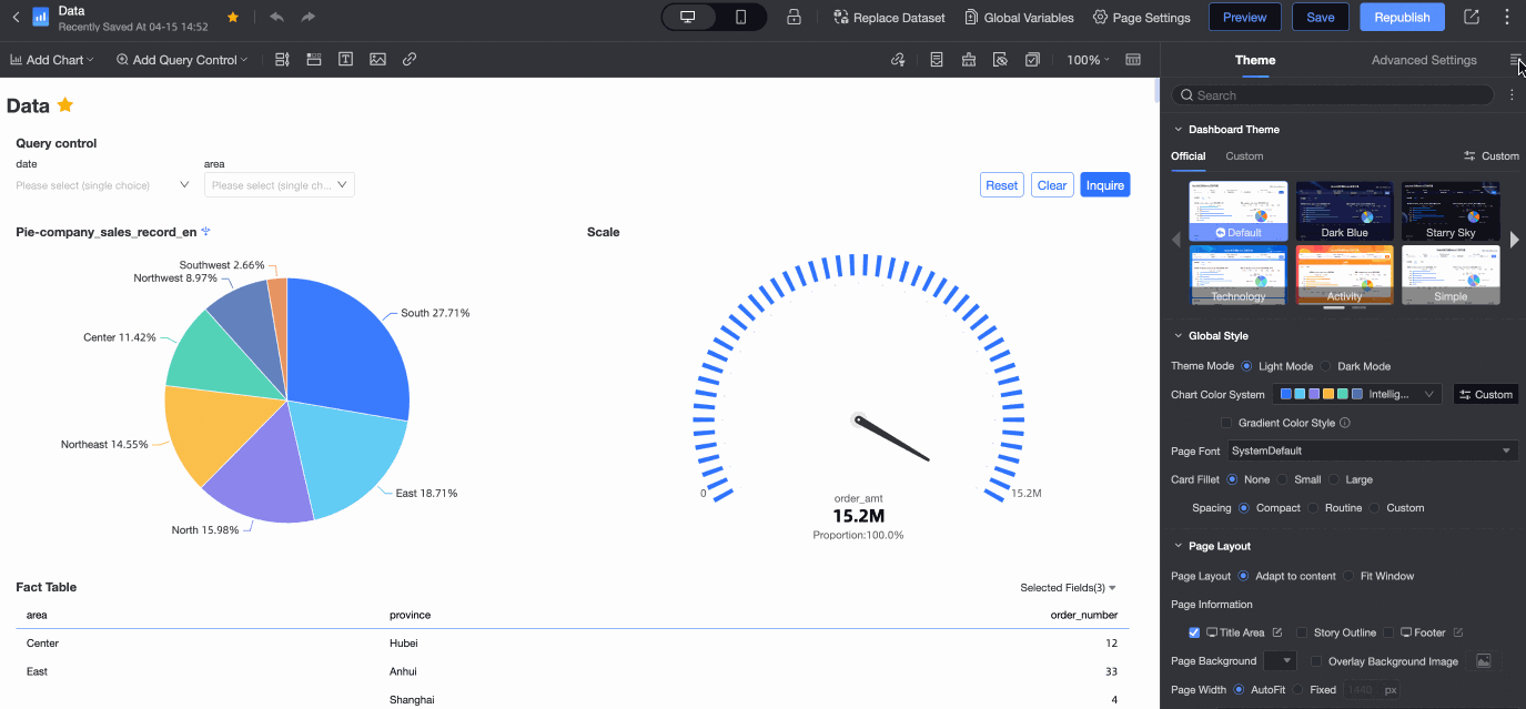
On the Theme tab in Page Settings, configure settings such as Dashboard Theme Template, Global Style, and Page Layout.
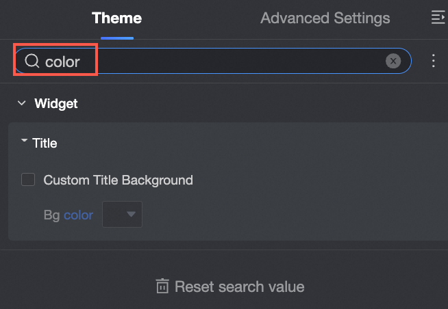
To find a specific setting, enter a keyword in the search box at the top. The matching settings are displayed.
To collapse all configuration categories, click the
 icon to the right of the search box and select Collapse all categories.
Configure the following parameters:
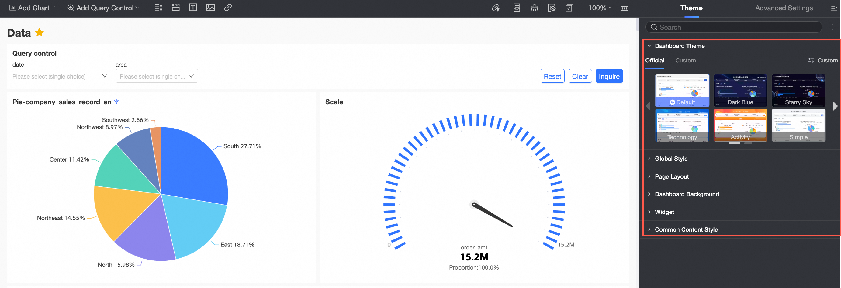
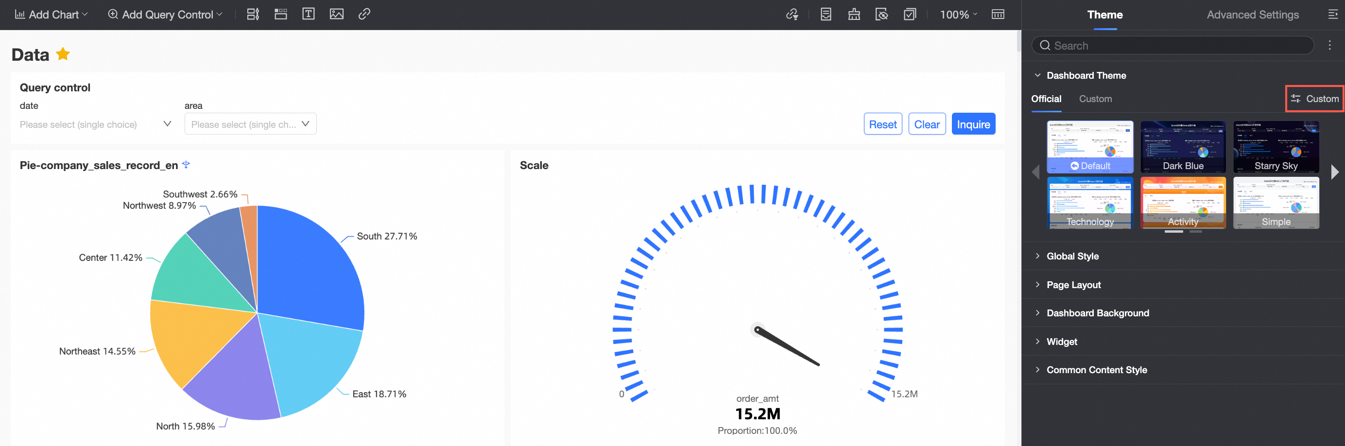
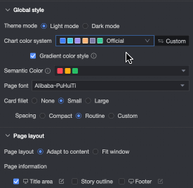
In the Dashboard theme section, select an official theme or a custom theme.
Official theme: Choose from Default, Dark Blue, Starry Night, Technology, Activity, Minimalist, and Indigo.
Custom theme: Select an existing custom theme.
An organization administrator can click Customize to go to the Report Theme Management page and manage custom themes.
NoteQuick BI Professional Edition supports custom dashboard themes:
Organization administrators can select an official theme or create a custom theme.
Other users can select an official theme or an existing custom theme, but cannot create them.
In the Global style section, configure styles that apply across the dashboard.
Parameter
Description
Theme mode
Select a light mode or dark mode.
When you select light mode, the dashboard background is white.
The default is light mode.
When you select dark mode, the dashboard background is black.
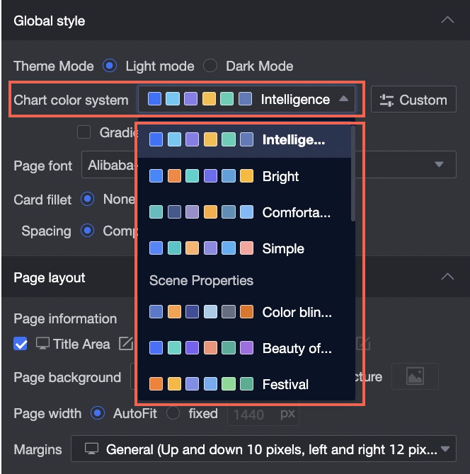
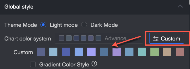
Chart color scheme
Choose from system-configured template color schemes or create custom color schemes.
When you set Chart Color Scheme to Template Color Scheme, you can select a color scheme from the drop-down list.
For example, if you select the Advanced Gray color scheme, the chart changes as shown in the following figure.If you set the chart color scheme to Custom, you can modify the color of each swatch.
NoteGradient color styles apply to indicator, trend, and comparison charts.
Page font
Configure the font for the dashboard.
Card corner radius
Configure the corner radius for chart cards. Options include no radius, small radius, and large radius.
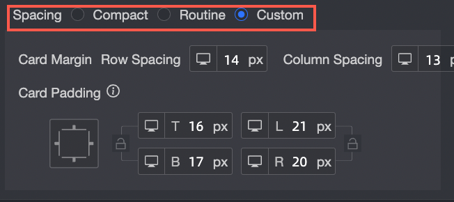
Spacing
Choose from Compact, Standard, or Custom mode.
Spacing between cards
This setting is available only when Spacing is set to Custom. Adjusts the row and column spacing between cards.
Card padding
This setting is available only when Spacing is set to Custom. Adjusts the top, bottom, left, and right padding within cards.
Semantic colors
In features like conditional formatting, semantic colors use color to convey meaning, such as increases or decreases in data. In the Semantic Colors settings, the system automatically selects default colors based on the current chart color scheme. You can customize these colors for data changes (like up/down or positive/negative) to match your business conventions. These settings apply to the entire dashboard.
In the Page layout section, configure the following parameters.
Parameter
Description
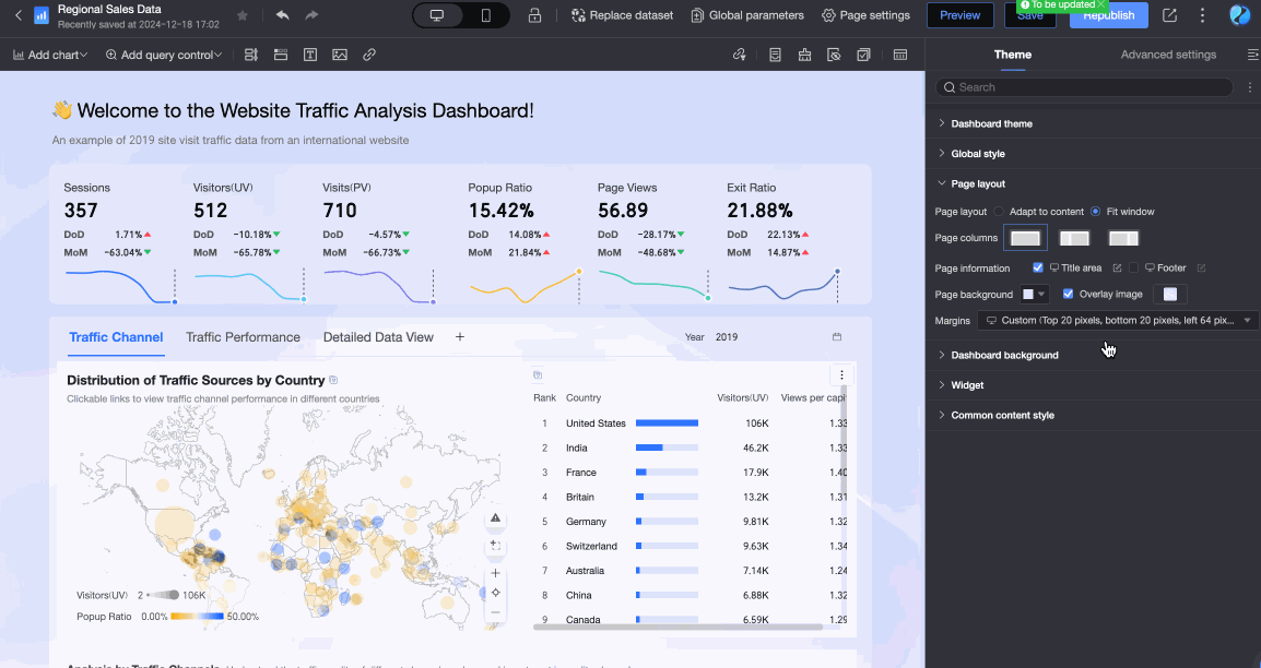
Page layout
Select a layout mode for the dashboard content: Fit to content or Fit to window.
Fit to content: Adjusts the dashboard dimensions to fit the actual size and position of all its components, such as charts and query controls.
Fit to window: The dashboard resizes to fit the browser window. You can also configure the page column layout.
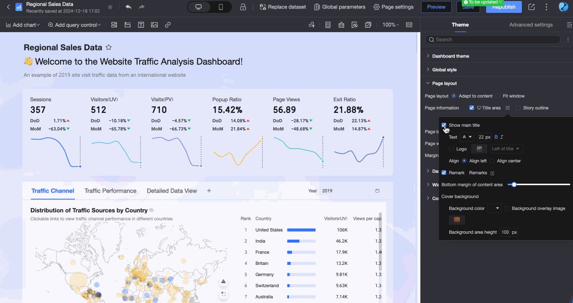
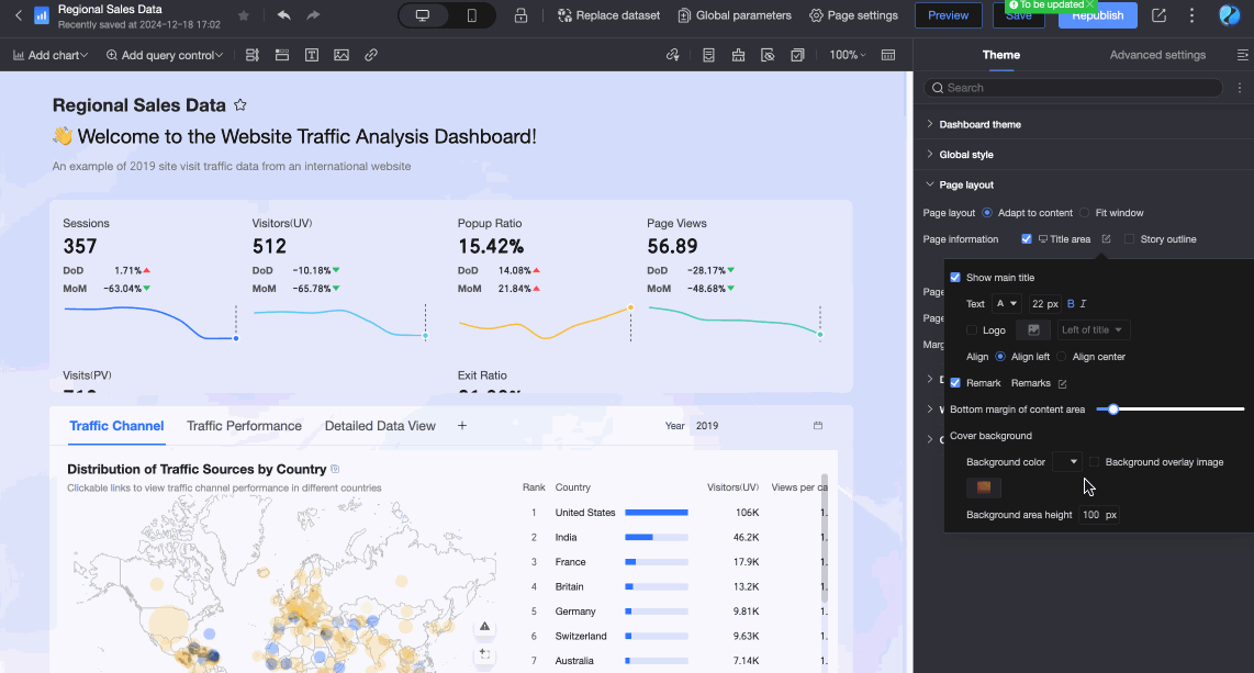
Page information
Configure the information displayed on the dashboard, including Title area, Storyline, and Footer.
Title area: Show or hide the dashboard title area. If the title area is displayed, you can click the
icon to configure the following settings.Show main title: Shows or hides the dashboard's main title. If the main title is displayed, you can adjust the title's text style, configure a logo, and set the content alignment.
Notes: Specifies whether to display notes in the title area. If notes are displayed, you can click the
icon to customize the note content.Content area bottom margin: Adjusts the bottom margin of the title area.
Cover background: Sets the background color, overlay image, and height for the title area.
Storyline: Specifies whether to insert a storyline below the title area. When selected, the system automatically generates a storyline based on the layout of existing charts in the dashboard. You can click the
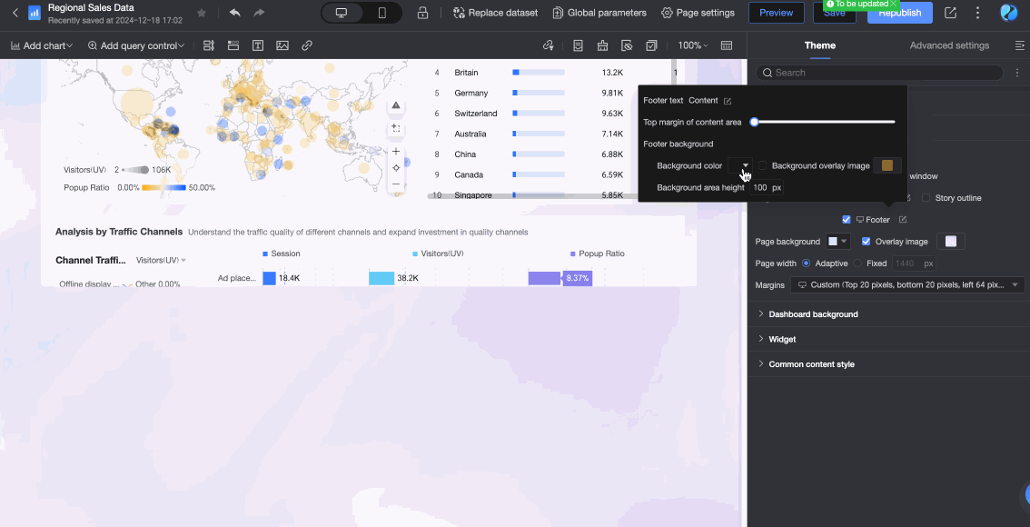
icon next to a Story node to customize the storyline in the Story Node Editing dialog box.Footer: Specifies whether to display the dashboard footer area. If the footer is displayed, you can click the
icon to configure the following settings.Footer text content: Sets the text to be displayed in the footer area.
Footer background: Sets the background color, overlay image, and height for the footer area.
Page background
Configure the background color. Supports Solid color and Gradient modes. You can also choose whether to overlay a background image.
Page width
Supports Adaptive and Fixed modes.
NoteIf you select Fixed mode, you must set the left and right page margins in pixels. After this setting is applied, the left and right margins are fixed and cannot be adjusted.
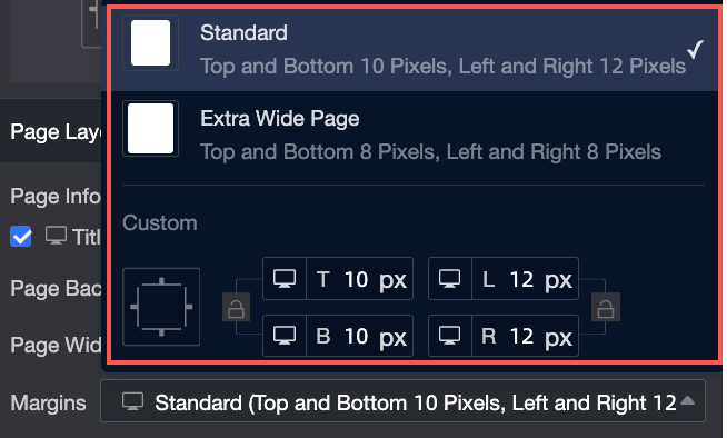
Page margins
Supports three modes: Standard, Extra-wide, and Custom.
In the Dashboard background section, configure the following parameters.
Parameter
Description
Top image and Bottom image
When you select an image, you can choose from Existing images or upload a Custom image.
NoteWhen you select a custom image, you can upload an image from your local device or provide an image URL.
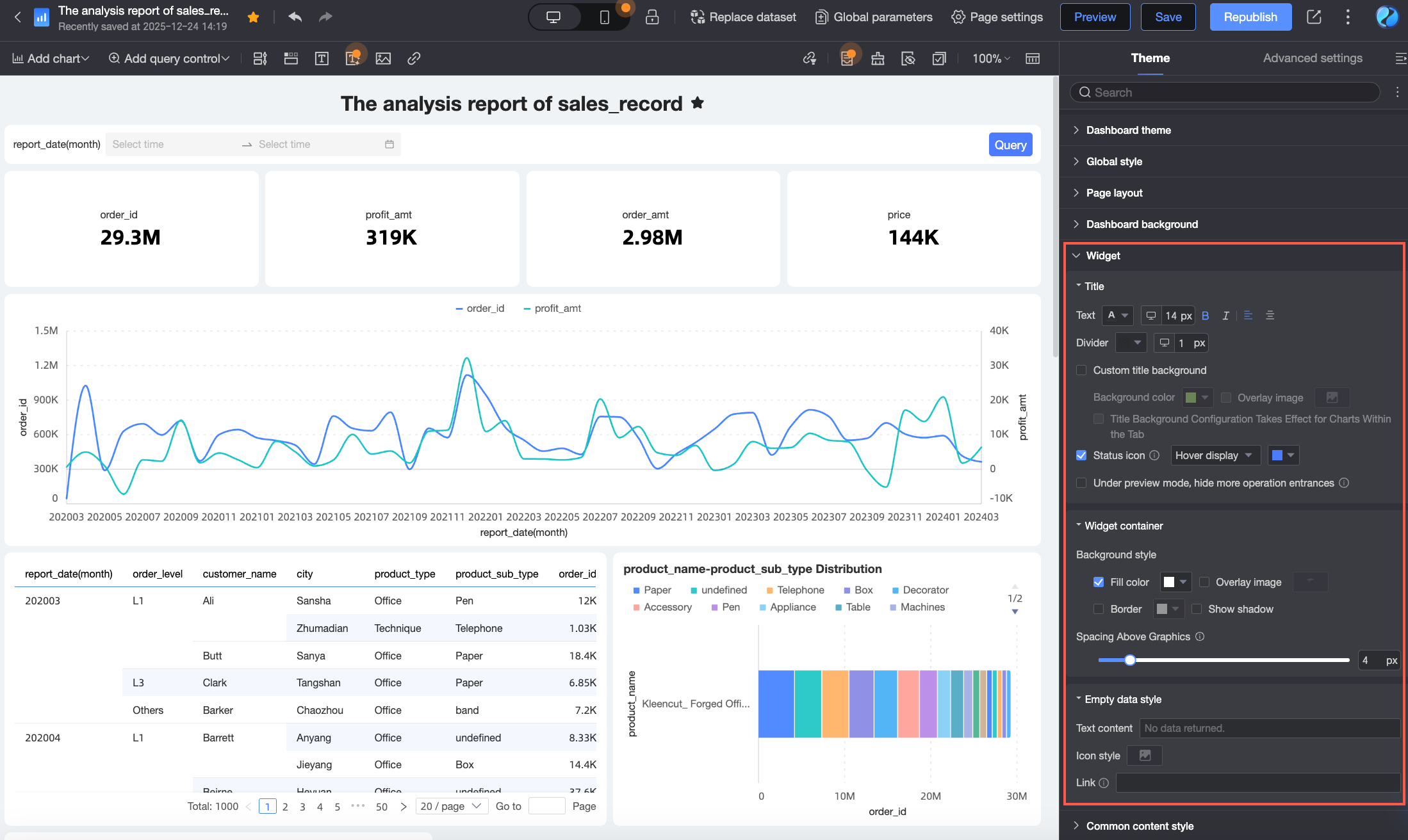
In the Dashboard components section, configure the following parameters.
Parameter
Description
Title
Text
Set the font size and alignment of the chart title.
Separator
Set the color and width of the title separator line.
Custom title background
Select this option to set a custom title background to match the overall report theme. The following options are available.
Background color: Select the fill color for the title background. Supports Solid color or Gradient.
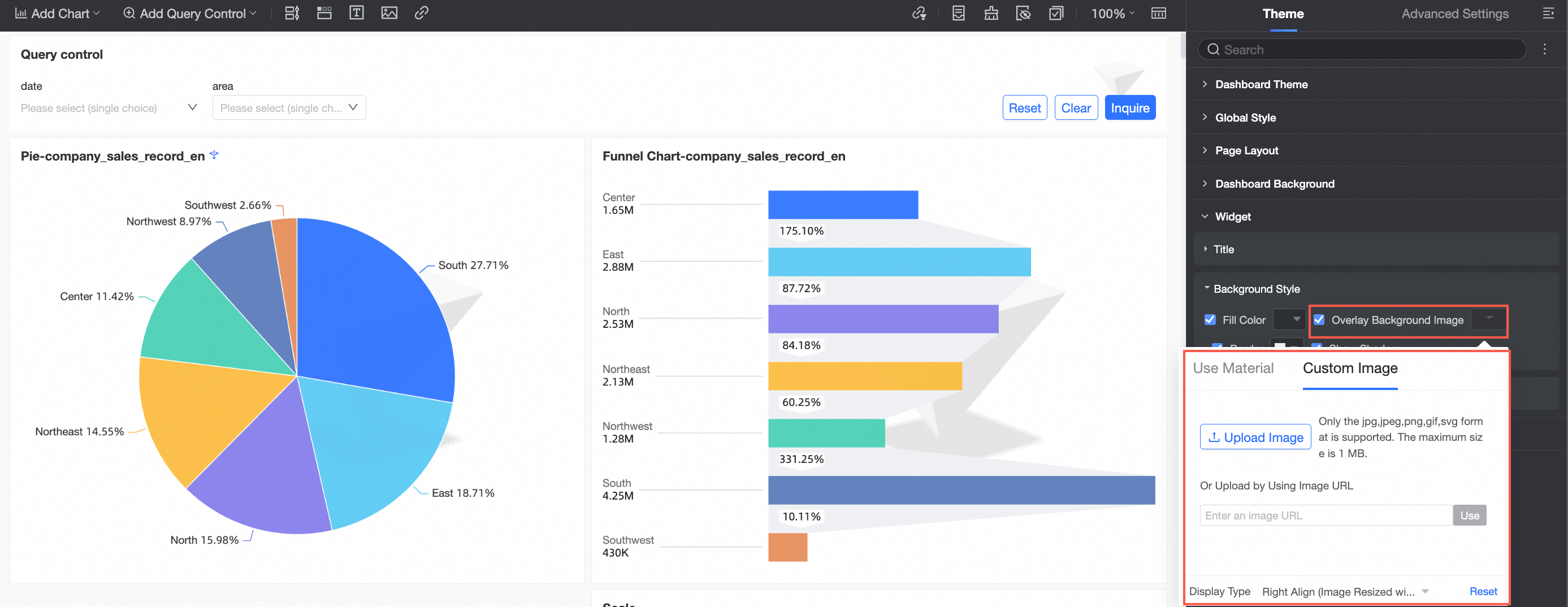
Overlay background image: Select this option to overlay an image on the title background. You can use default background materials or upload a custom image.
NoteWhen you upload a custom image, you can upload an image from your local device or provide an image URL.
Title area position: Set the position of the title area. Supports Inside chart or Above chart.
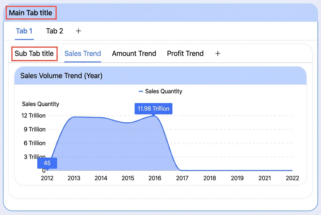
Apply title background to charts in Tab: Specifies whether to apply the title background settings to charts within a Tab component. If selected, all charts within the Tab component inherit the background color, overlay image, and title area position settings.
In scenarios with nested tabs, if Apply title background to charts in Tab is enabled, only the main tab's title style is synchronized. The sub-tab titles remain unchanged.
Status icon
You can set the status icon to be always visible or to appear on hover, and set the icon's color.
Hide more actions entry in preview mode
If selected, this option hides the More actions menu in preview mode.
Background style
Fill
Specifies whether to display a fill color for the background.
Overlay background image
Overlay a background material or custom image on the chart background.
Border
Specifies whether to display a border for the background and sets the border color.
Show shadow
Specifies whether to display a shadow for the background.
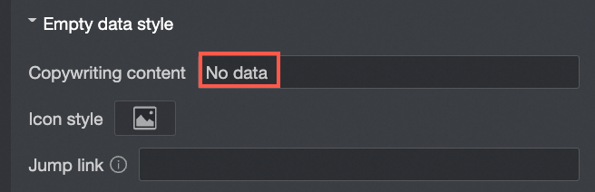
Empty data style
Text content
Customize the text displayed when no data is returned. The default text is "No data returned."
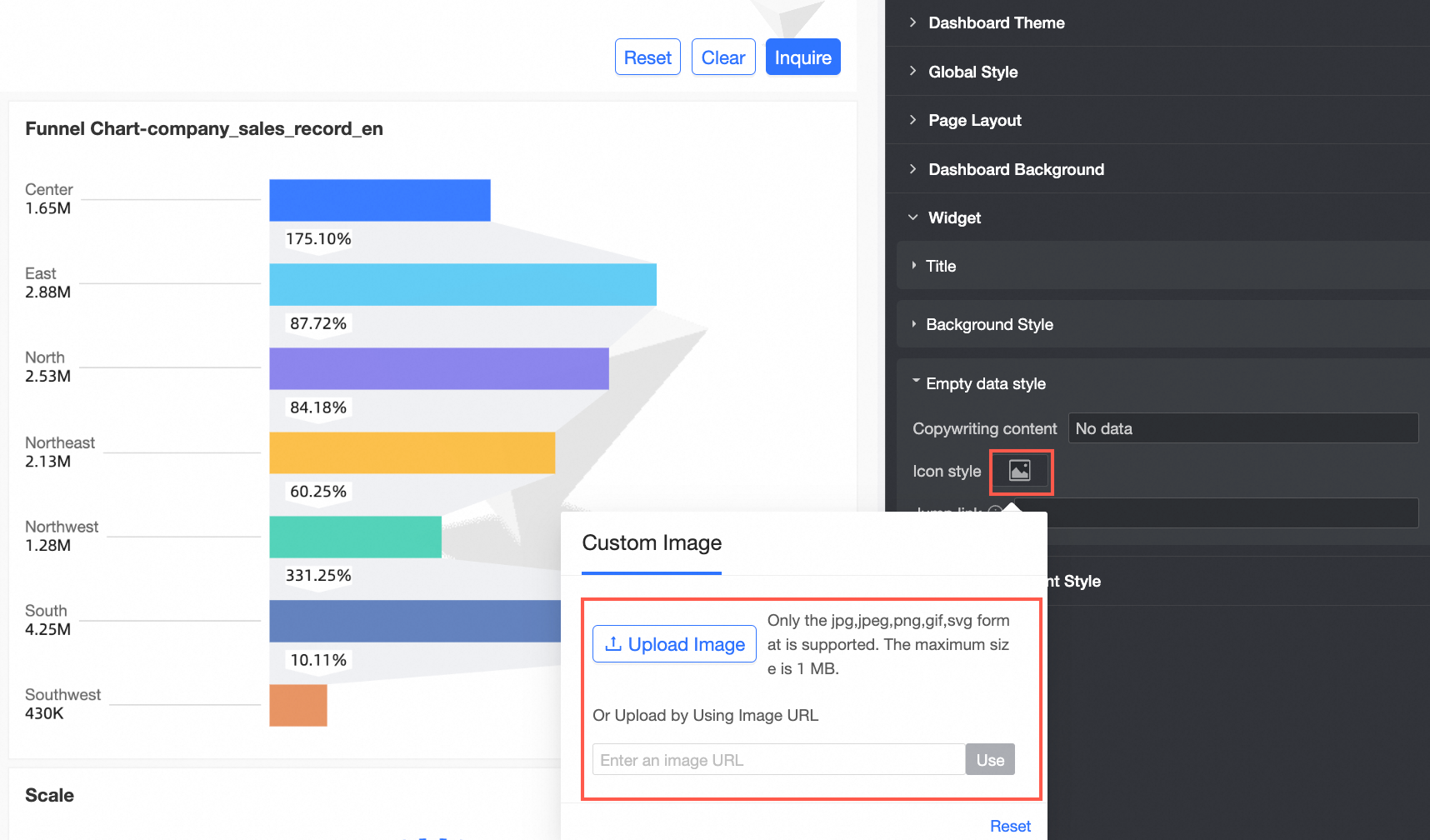
Icon style
Customize the icon style for when no data is available.
NoteIf you select Custom image, you can upload an image from your local device or provide an image URL.
Jump link
When configured, clicking the icon or text opens the specified URL.
In the General content style section, configure the following parameters.
Parameter
Description
Chart styles
Axis title
Set the font size, color, and style for the axis title.
Axis label
Set the font size, color, and style for the axis labels.
Data label
Set the font size, color, and style for data labels.
Tooltip
Set the font size, color, and style for the tooltip.
Legend
Set the font size, color, and style for the legend, and choose whether the legend symbols scale with the text. If selected:
For line charts, the line thickness of the legend symbol adjusts proportionally to the chart's line thickness.
For other charts, the size of the legend symbol adjusts proportionally to the legend font size.
Table styles
Style settings
Set the table style. Four styles are available: Zebra, Grid, Simple, and Minimalist.
Primary color scheme
Set the primary color scheme. Supports Theme Color, Gray, and Custom.
Header
Set the font size, color, and other styles for the table header.
Content
Set the font size, color, and other styles for the table content.
In the Tab component section, configure the following parameters.
Parameter
Description
Tab selected style
Set the style for a selected tab. Options include Underline, Separator, and Selected Block.
Tab label style
Set the tab label font size and styles for the default and selected states.
Show border for visual cards inside Tab
Specifies whether to display borders for visual cards inside a Tab component and sets the border color.
Customize spacing between components inside Tab
Select this option to specify custom spacing values between components within a tab. If not selected, the spacing follows the dashboard's row and column spacing settings.
NoteOn a PC, the valid spacing range is -32px to 32px. On mobile devices, the range is 0 to 20px.
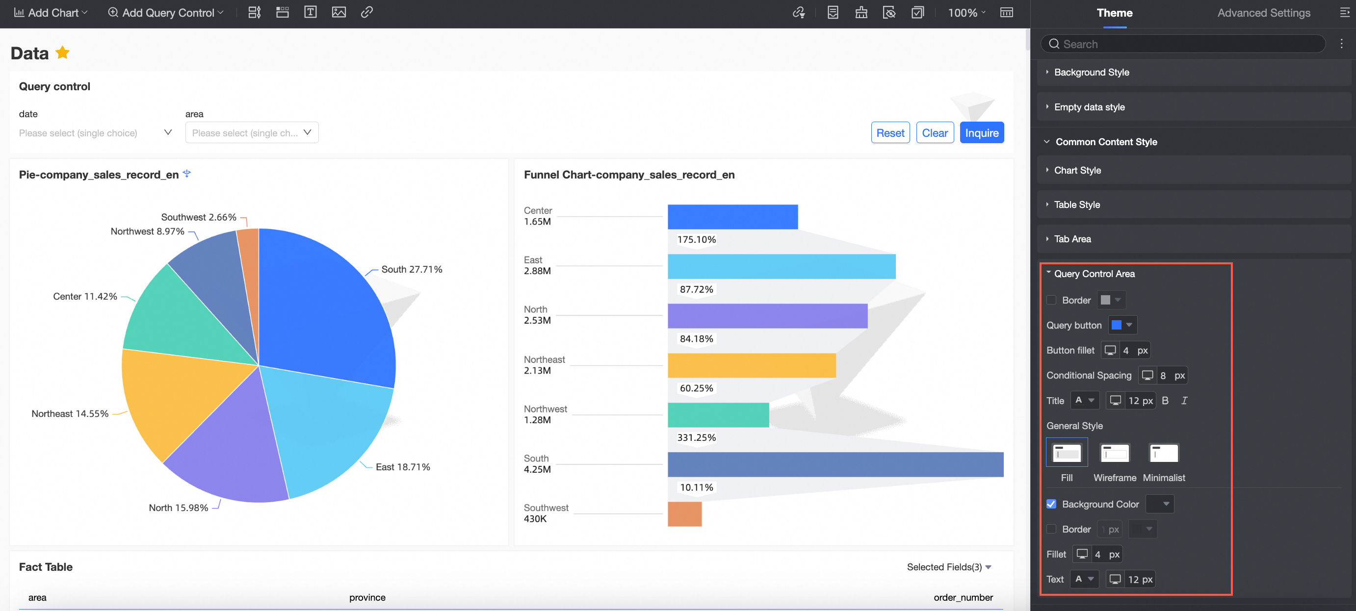
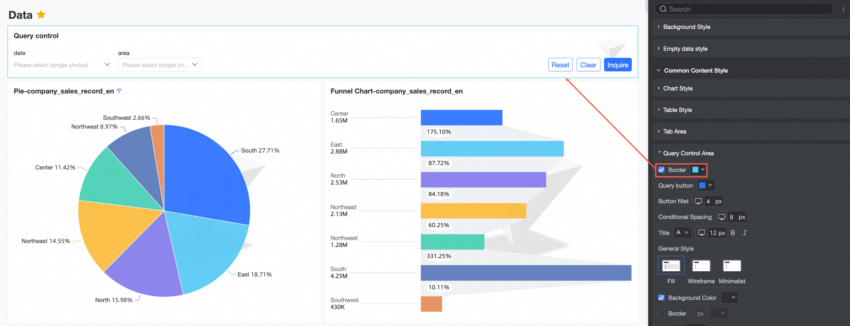
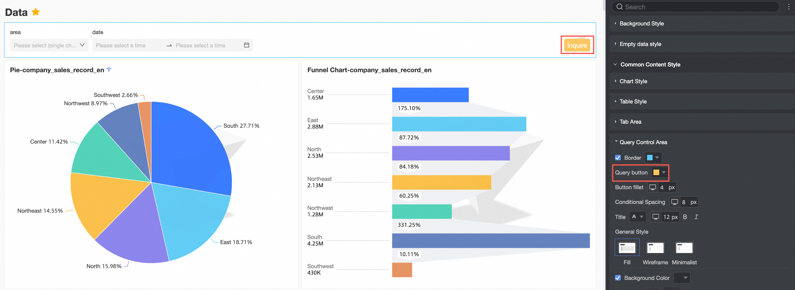
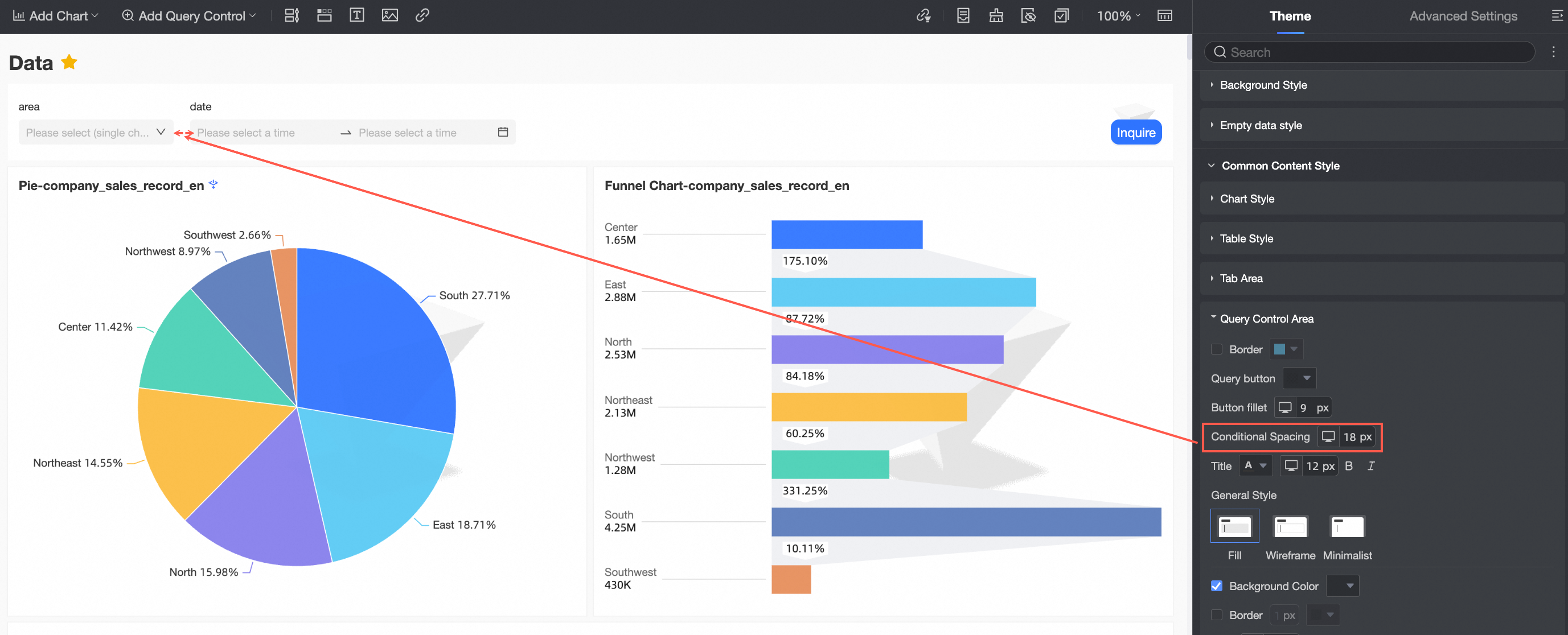
In the Query control section, configure the following parameters.
Parameter
Description
Border
Specifies whether to display the query control border and sets its color.
Interaction buttons
Set the color for interaction buttons.
Button corner radius
Set the corner radius for interaction buttons.
Condition spacing
Set the spacing between conditions.
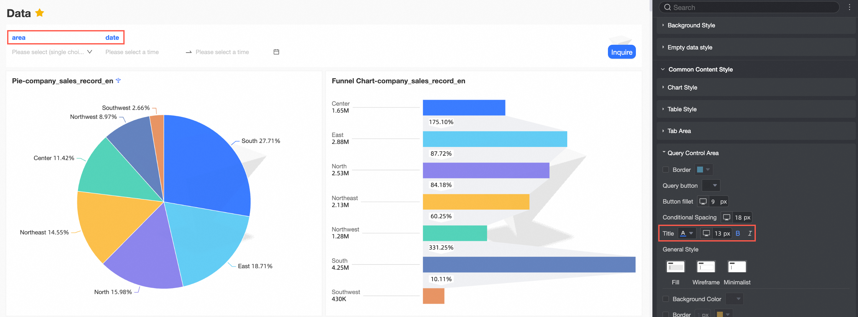
Condition name
Set the text style for the condition name.
Selection box style
Set the style for the selection box.
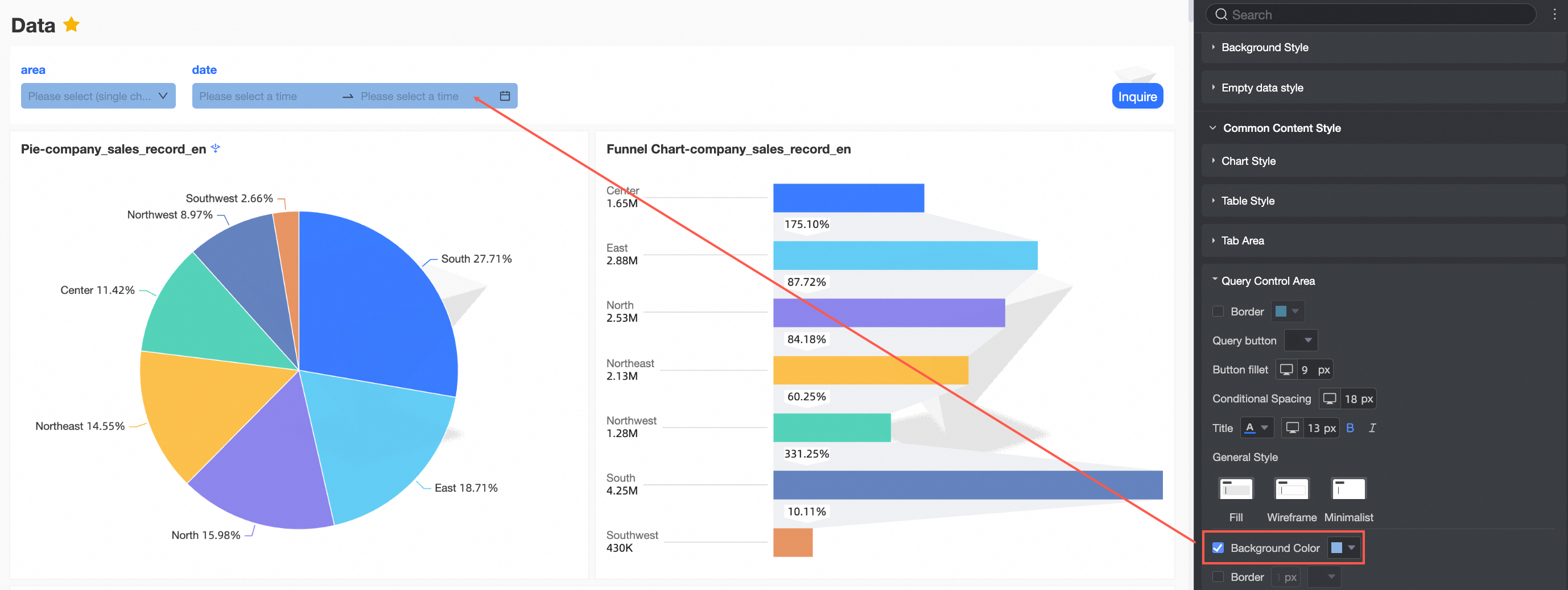
Background color
Set the background color for the selection box.
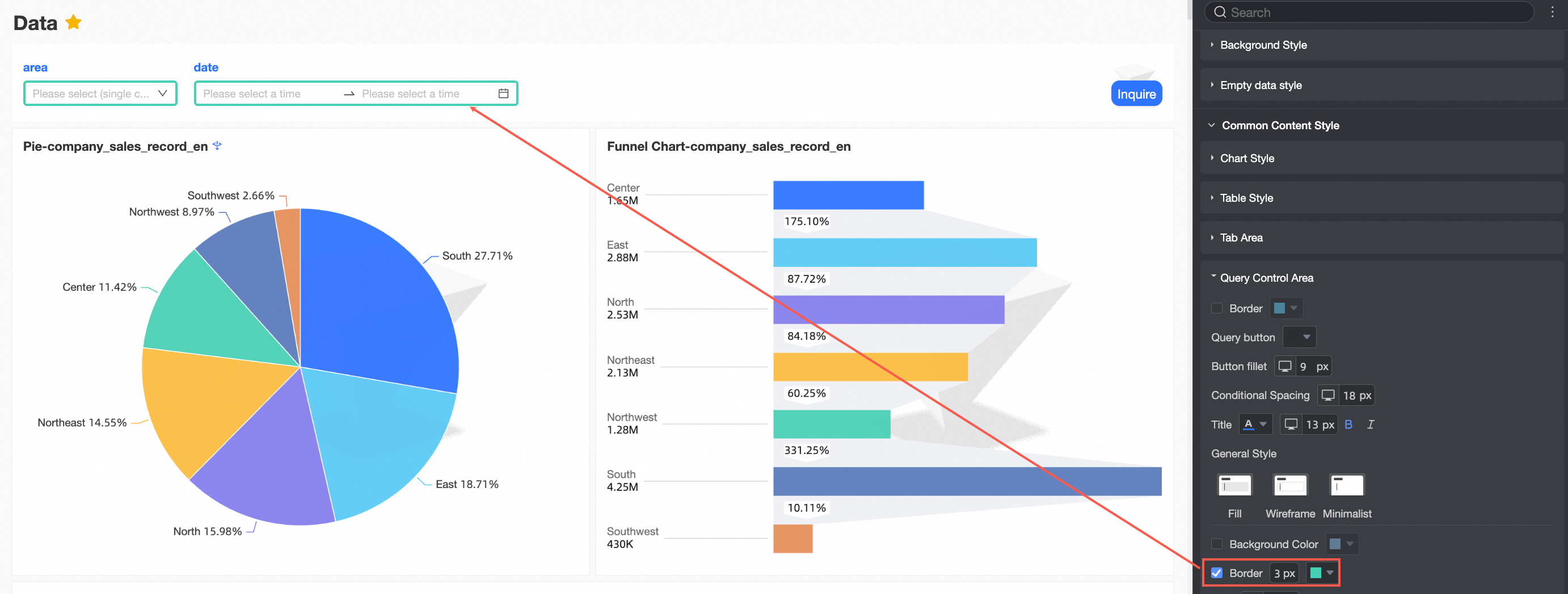
Border
Set the thickness and color of the selection box border.
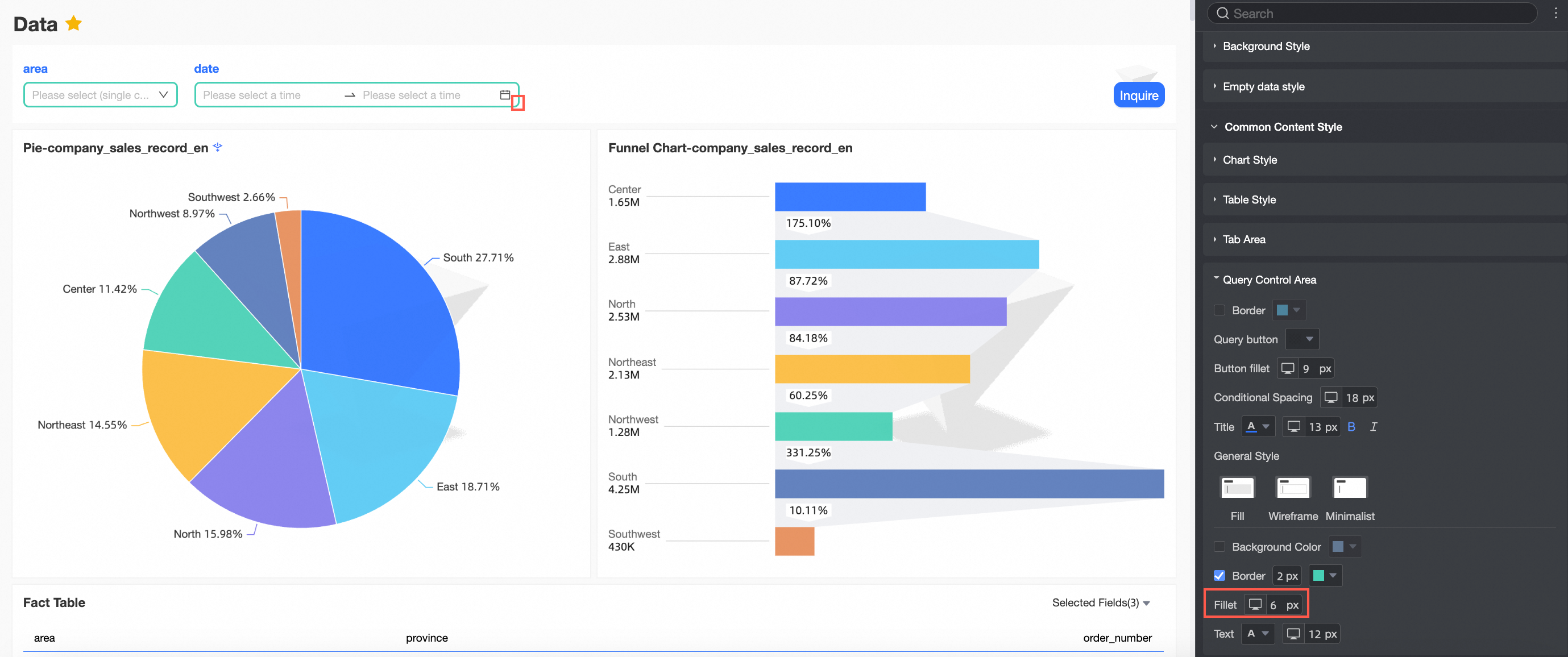
Corner radius
Set the corner radius for the selection box.
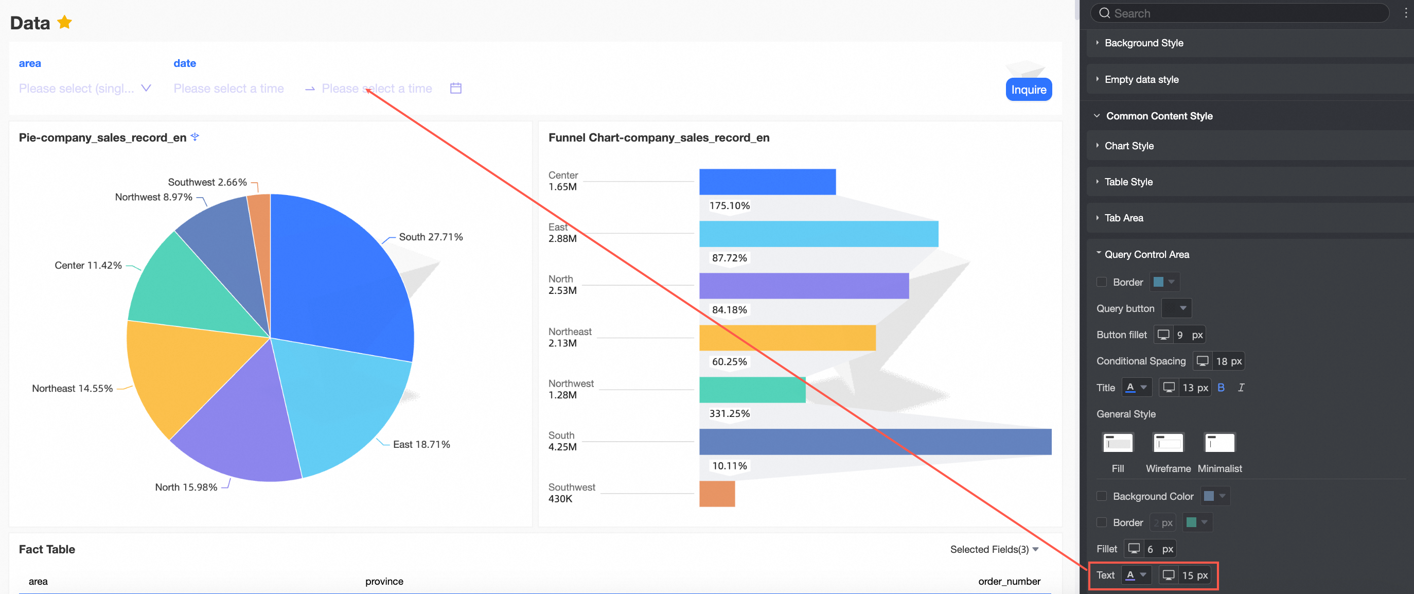
Text
Set the text color and font size for the selection box.
NoteSettings in the query control section apply globally to all query controls. However, custom style configuration for an individual query control overrides these global settings. For example, if the global selection box style is set to Fill, but an individual control's style is set to Border, that specific control will use the Border style.
 icon to the right of the search box and select Collapse all categories.
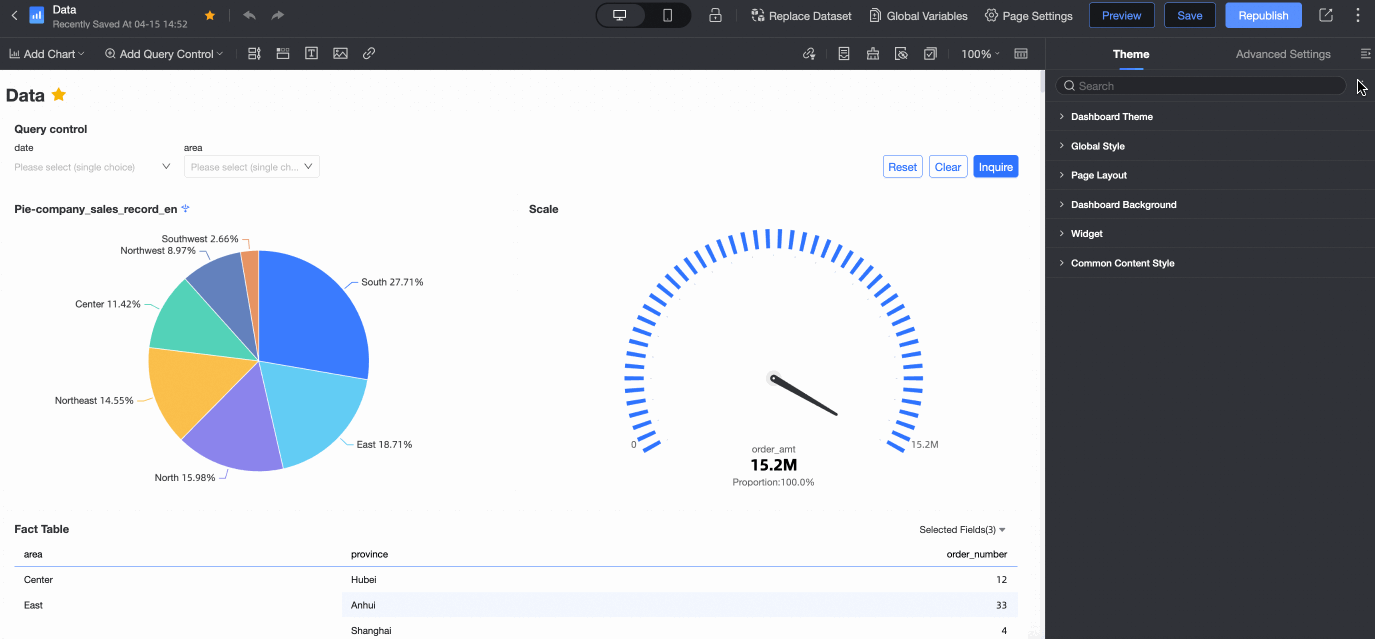

 For example, if you select the Advanced Gray color scheme, the chart changes as shown in the following figure.
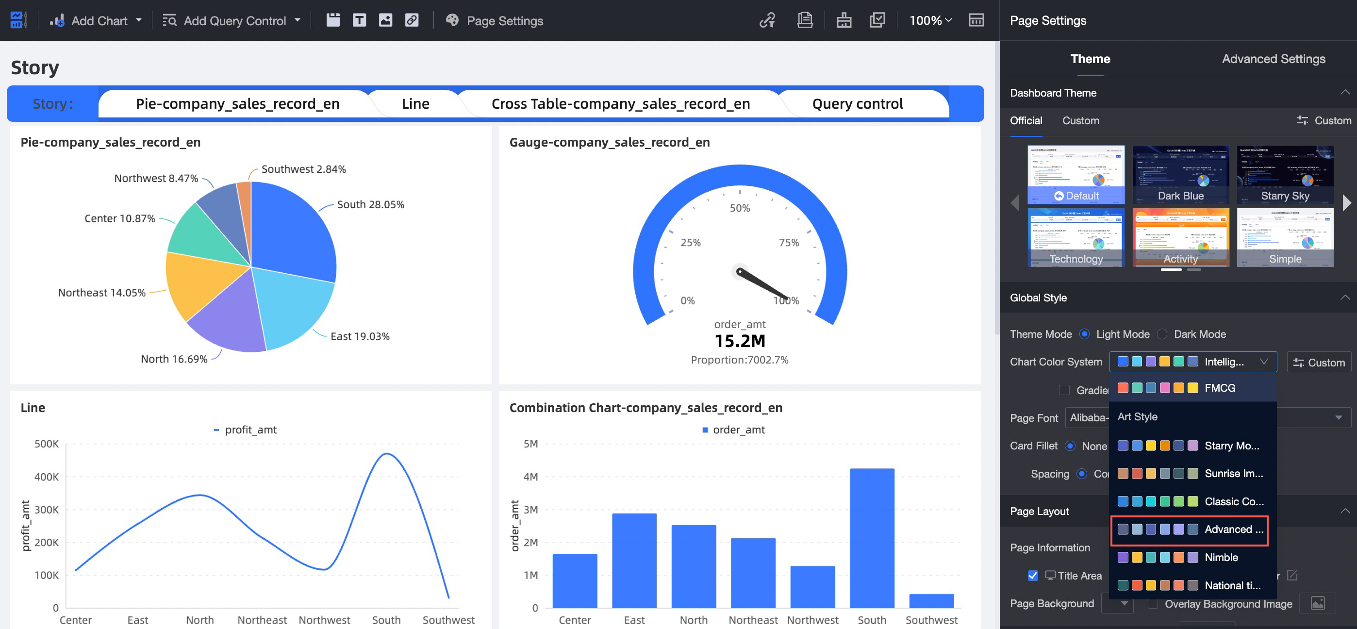
 icon to configure the following settings.


 icon next to a Story node to customize the storyline in the Story Node Editing dialog box.
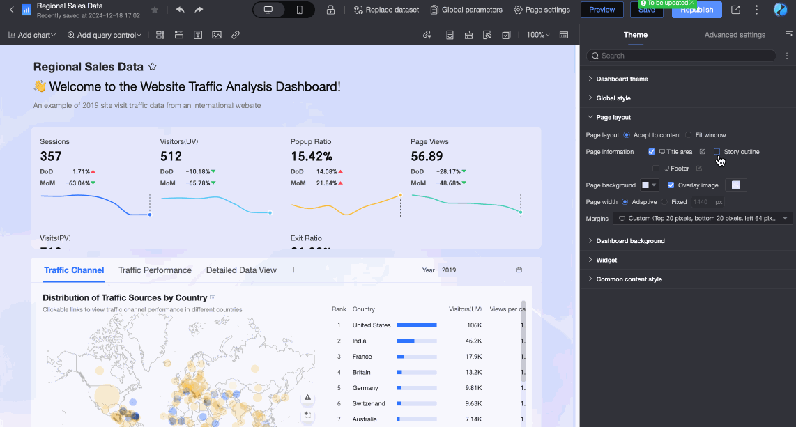


After configuring the settings, click Save.