Metric relation graph
The metric relation graph is a Quick BI component that visualizes the mathematical relationships between metrics. It is particularly useful for metric decomposition analysis, especially in scenarios like building and presenting the classic DuPont analysis model. The graph shows how formulas derive a top-level metric from multiple underlying metrics.
Overview
Use cases
It is ideal for metric decomposition analysis, especially in scenarios like the DuPont analysis model.
Key advantages
Calculation capabilities: Supports advanced calculations, YoY and MoM comparisons, and conditional formatting.
Example
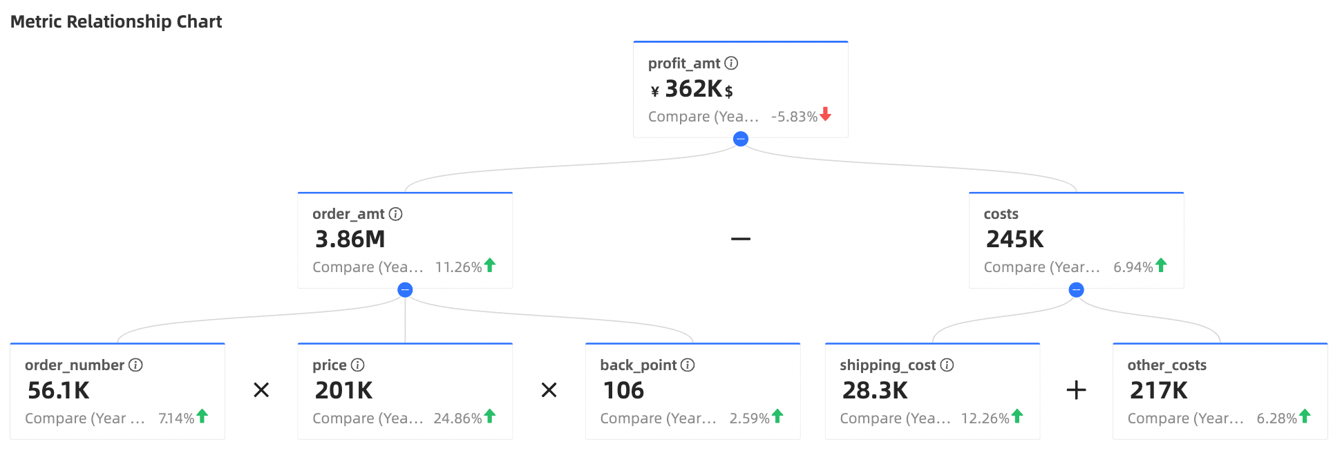
Limitations
Prerequisites: You have created a dashboard. For more information, see Create a dashboard.
Field configuration limits
top indicator/measure: Typically, you select one core measure field to serve as the starting point and final analytical target of the entire relation graph.
decomposition indicators/measure: Select multiple measure fields used in the calculation formula. These are the base or intermediate metrics used to calculate the top-level indicator.
comparison date/dimension: Optional. Select one date-type dimension field. This field is required to configure the YoY and MoM (secondary metric) feature.
Core configuration: You must define the calculation logic between metrics by clicking the Edit Metric Decomposition Relationship button and manually entering mathematical expressions. Without these formulas, the chart cannot correctly display the decomposition relationship.
Procedure
Configure chart fields
Data pane
On the Fields tab, select the required dimension and measure fields:
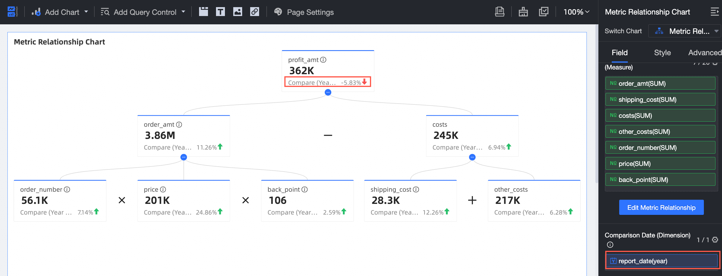
From the measures list, find Profit Amount and double-click or drag it to the top indicator/measure area.
From the measures list, find Order Amount, Shipping Cost, Cost, Other Costs, Order Quantity, Unit Price, and Discount Rate, then double-click or drag them to the decomposition indicators/measure area.
Click Edit Metric Decomposition Relationship to open the configuration panel.
In the Branch Row Expression field, enter an expression. The chart updates in real time.
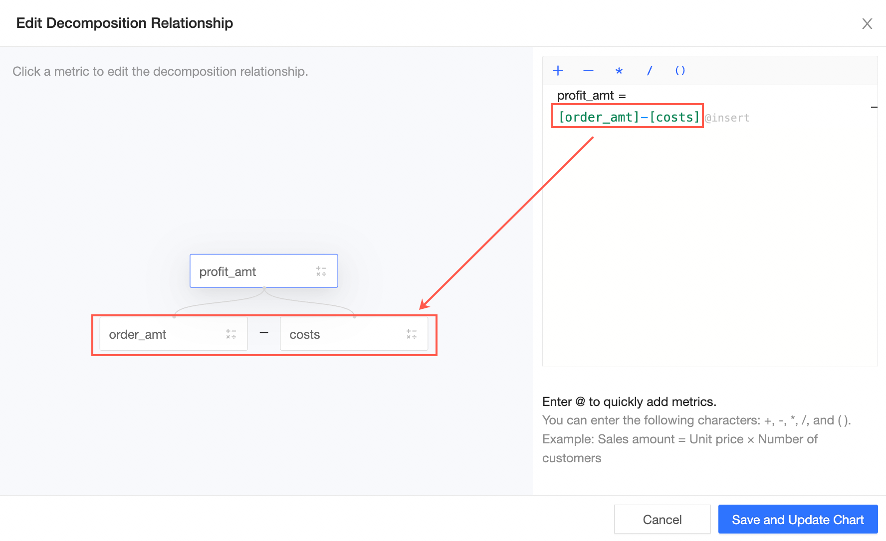
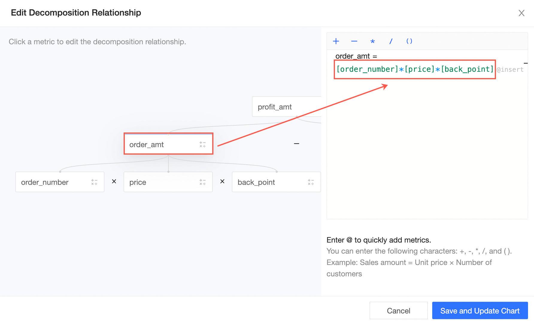
You can decompose multiple metrics by clicking the target field and entering an expression. For example, to decompose the order amount, click Order Amount and enter [Order Quantity]*[Unit Price]*[Discount Rate].
 Note
NoteYou can use the keyboard to enter
+,-,*,/,(, and). Type @ to quickly add a metric.Example: Sales Performance = Average Order Value * Number of Buyers
Click Save and Exit Edit. The system automatically updates the chart.
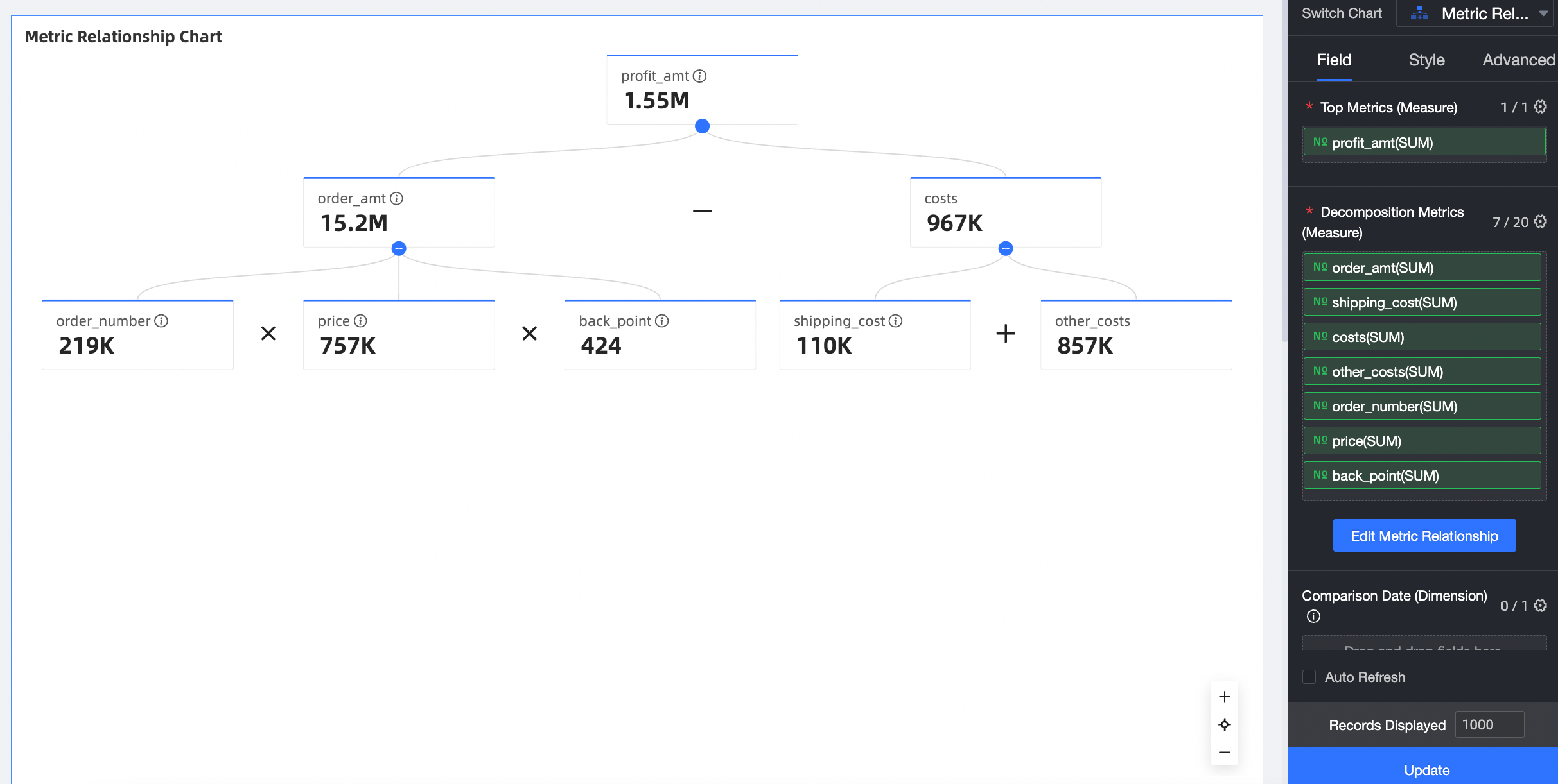
From the dimensions list, find the Order Date (year) field, and double-click or drag it to the comparison date/dimension area to generate YoY and MoM comparisons.
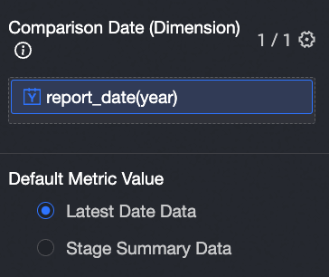
You can select Data for the latest date or Aggregated data by phase as the default value for the metric.

After updating the data, go to the Advanced tab to configure the details for YoY and MoM comparisons.
Click Update. The system automatically updates the chart.
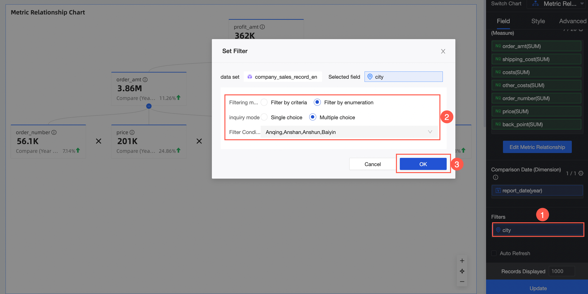
(Optional) To view data for specific cities, apply a filter.
Auto refresh
When this option is enabled, the system automatically refreshes the chart data. For example, if you enable this option, set the interval to 5, and select Minutes as the unit, the system will refresh the chart data every 5 minutes.
Configure chart styles
This section describes how to configure the styles for a metric relation graph. For general chart style configurations, see Configure the chart title area.
Indicator block style
In the indicator block style section, configure the Display Direction and Default Expand options.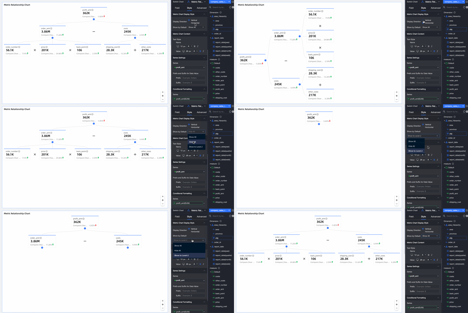
Parameter | Description |
Display direction | Supported options are Vertical and Horizontal. |
Default expand | Supported options are Expand All, Collapse All, and Expand to Level N, where N is your current relationship level. |
Indicator content
In the indicator content section, you can configure text styles for the Name and Value.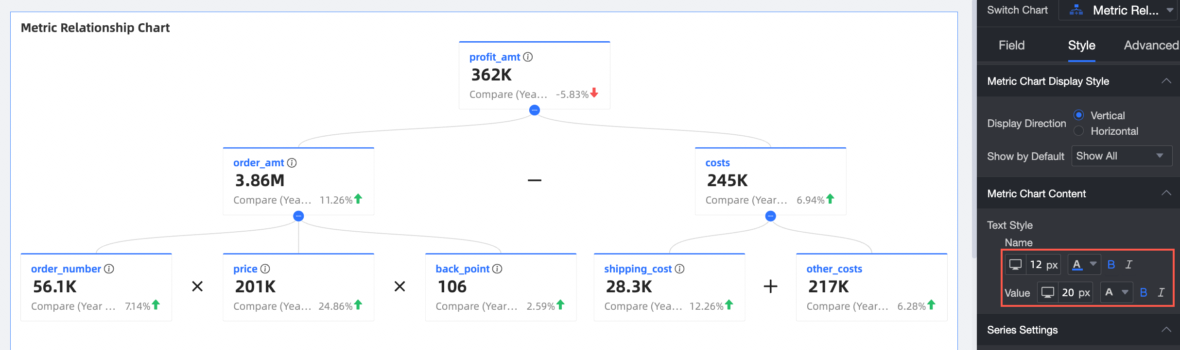
Series settings
In the series settings section, configure Select Series and Indicator Data Value Prefix and Suffix.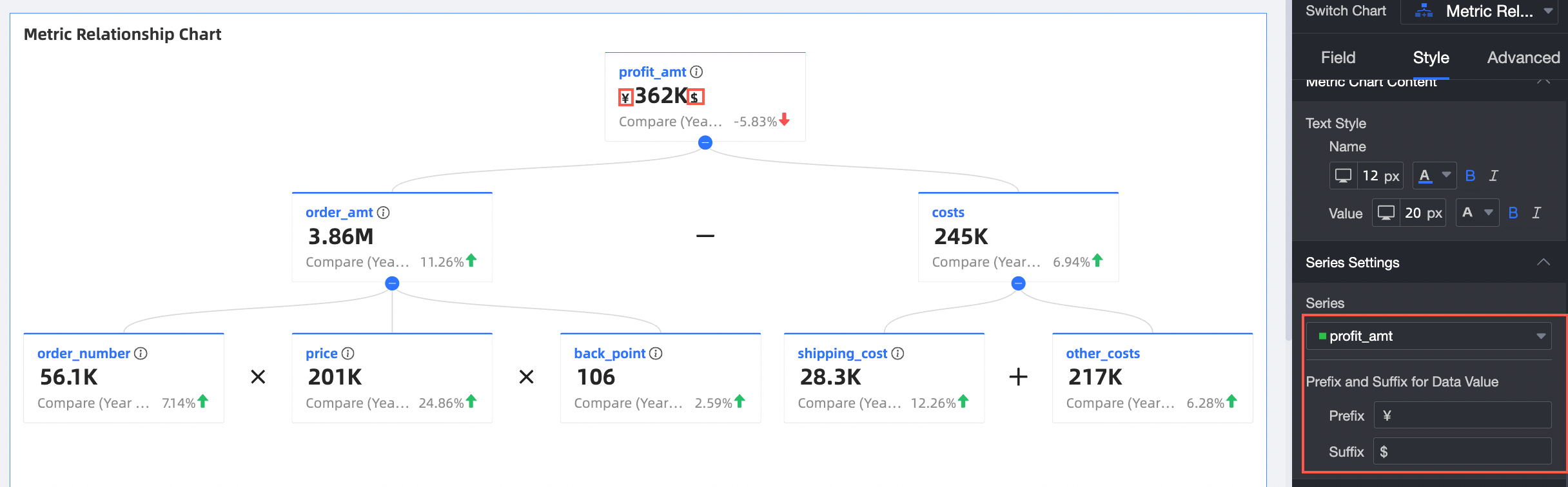
Parameter | Description |
Select series | Specifies the measure items added to the top indicator/measure and decomposition indicators/measure areas. |
Indicator data value prefix and suffix | Sets a prefix and suffix for the metric data values in the chart. |
Conditional formatting
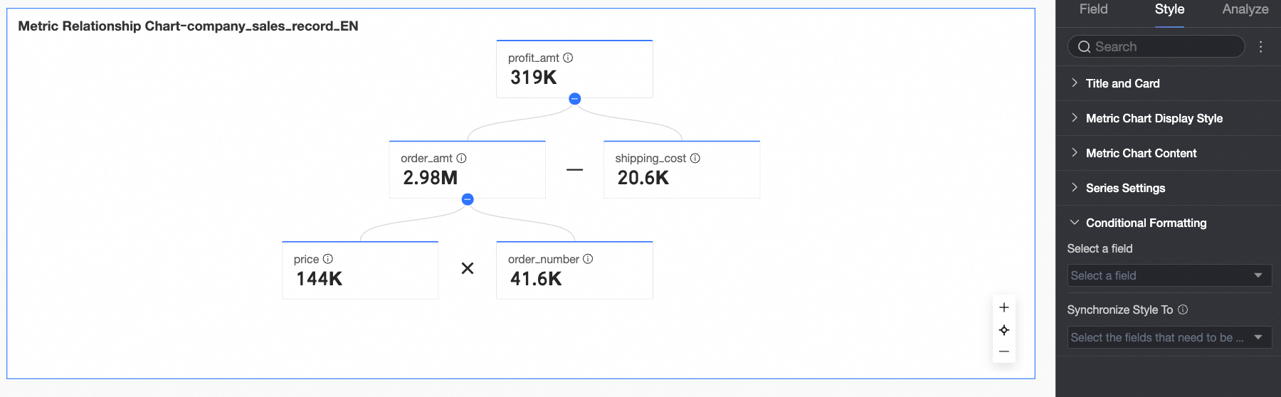
In the conditional formatting section, configure conditional formatting for a field.
Parameter | Description |
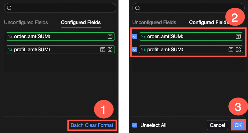
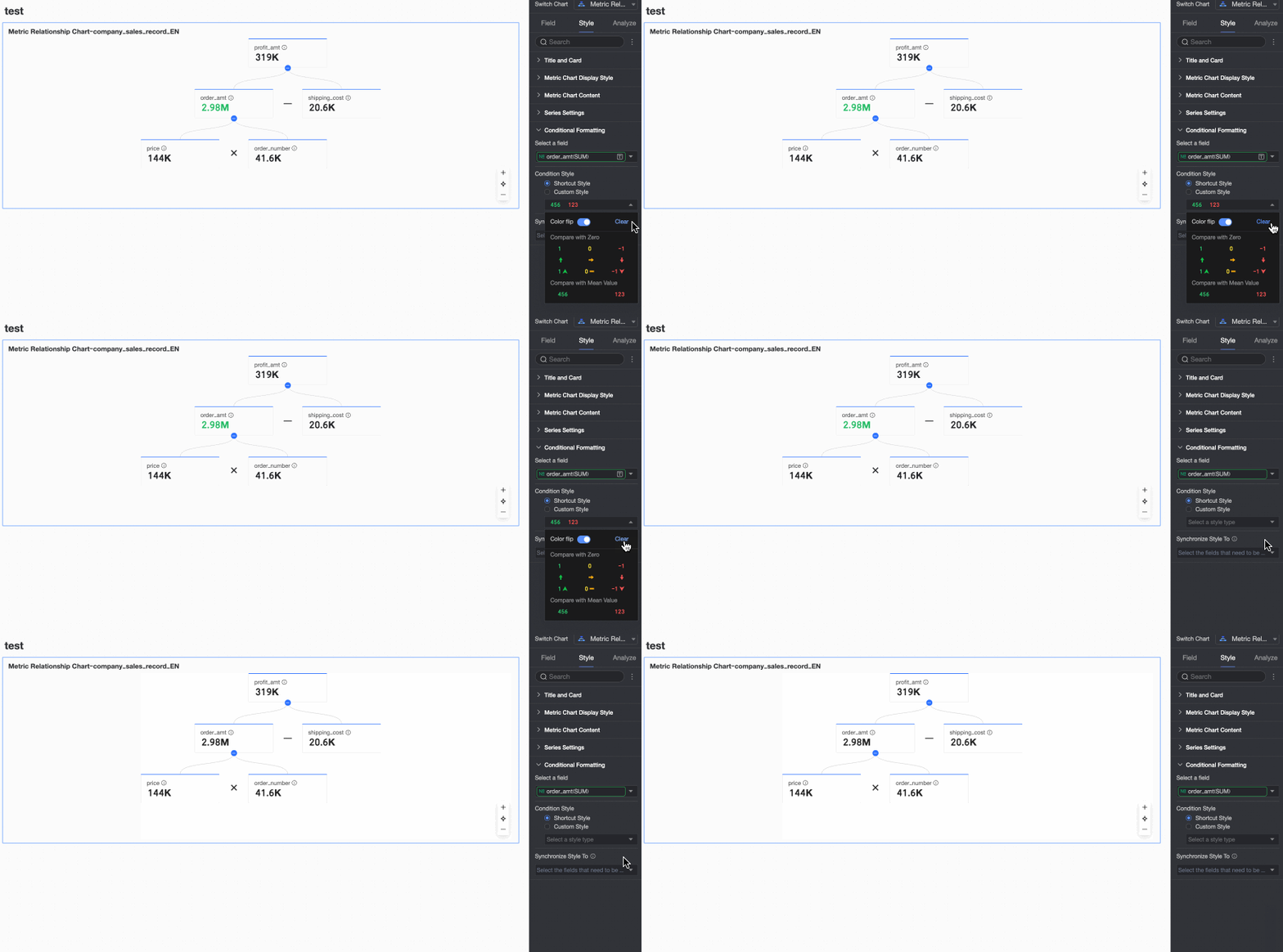
Select field | Select the measure field to which you want to apply conditional formatting. You can select any measure added to the indicators/measures area. After configuring styles, if you no longer need some of them, you can click Clear Formats in Batches in the lower-right corner of the field pane. In the list that appears, select the conditional formats you want to remove and click OK. |
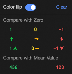
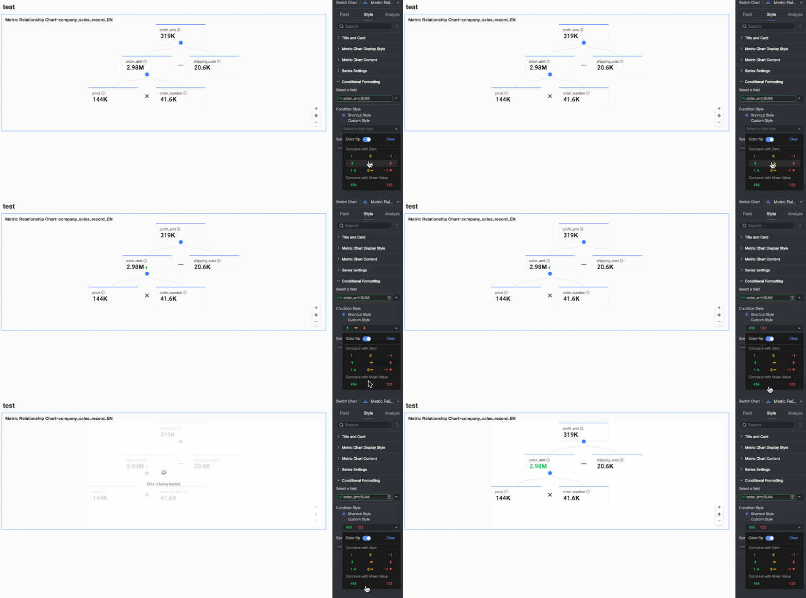
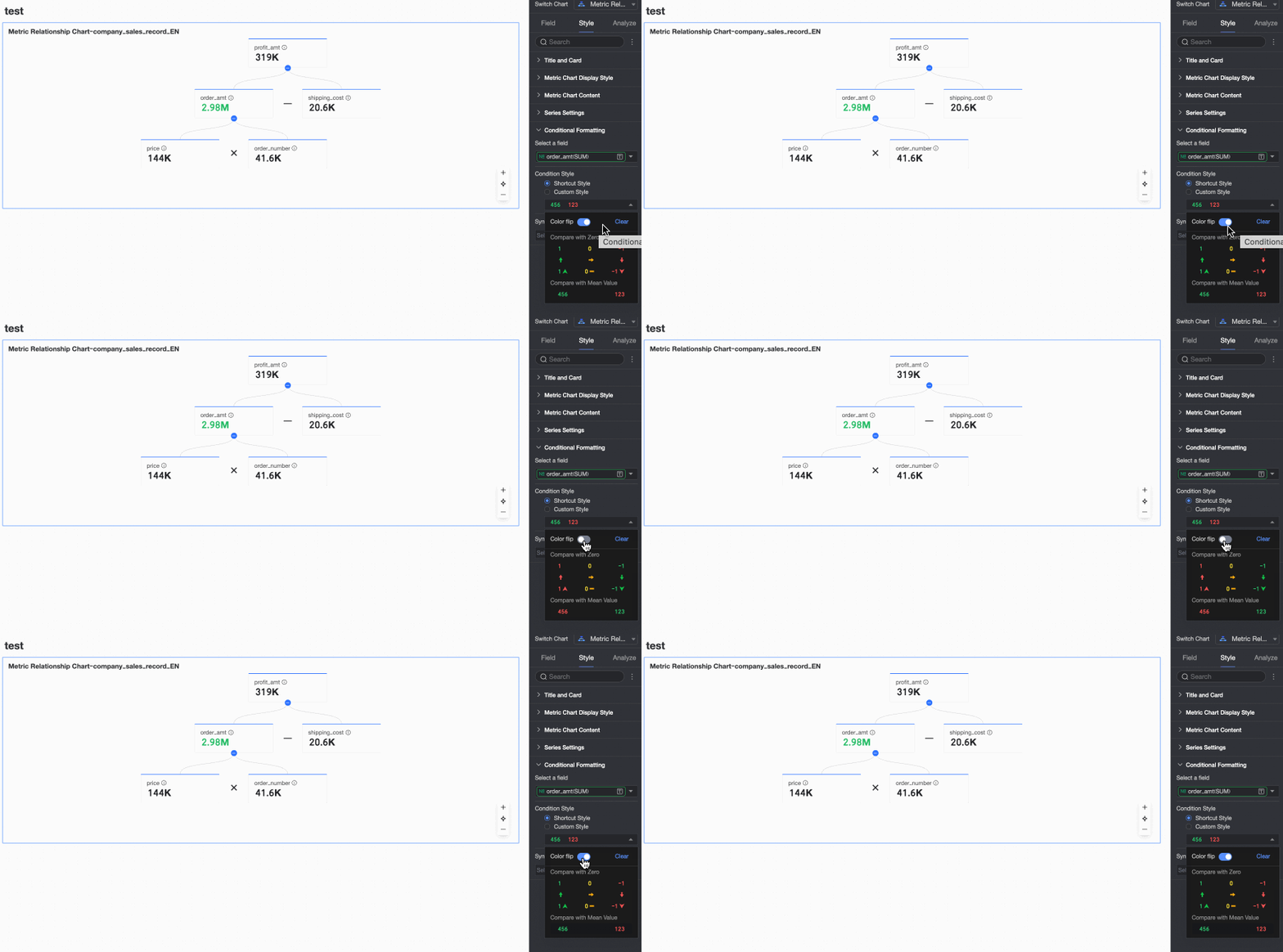
Shortcut style | Set the marker icon or font color for the current measure field from a set of predefined system styles.
|
Custom style | In addition to the predefined shortcut styles, you can configure custom styles for the current measure field.
|
Sync style to | Syncs the current conditional formatting to other measures. |
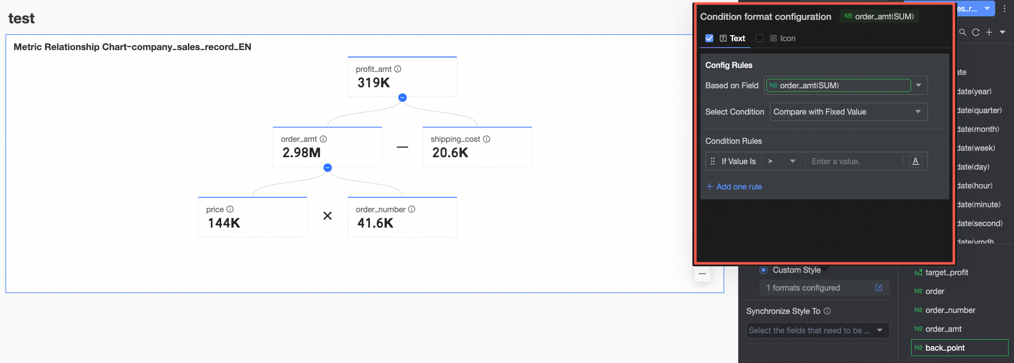 You need to configure the following information.
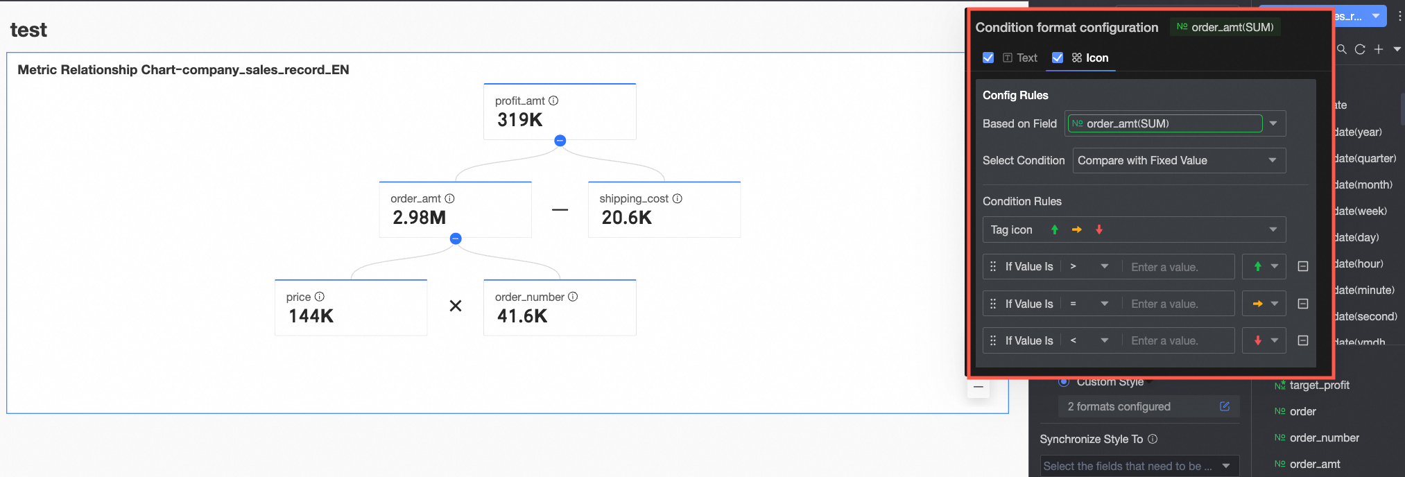 You need to configure the following information.
Configure chart analysis
Data interaction
Parameter | Description |
Jump | The jump feature supports three methods: In-product Parameter Jump, In-page Component, and External Link. You can also configure a jump icon. For more information, see Jump.
|
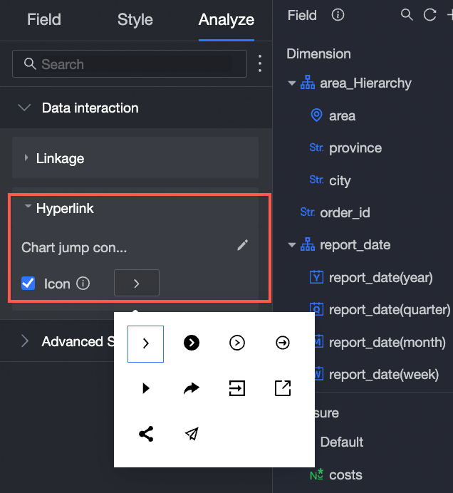
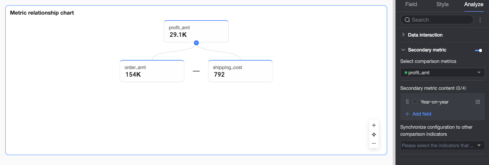
Secondary metric
When you enable the secondary metric display, the following options become available.
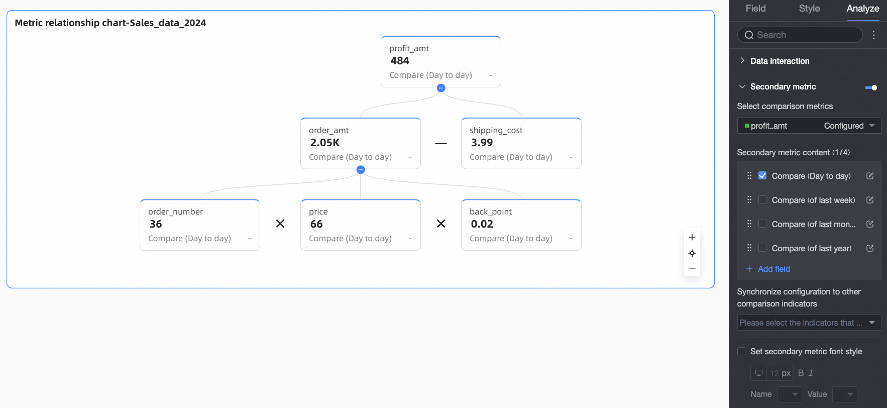
Parameter | Description |
Select comparison metric | Select the measure field for which you want to configure a secondary metric comparison. |
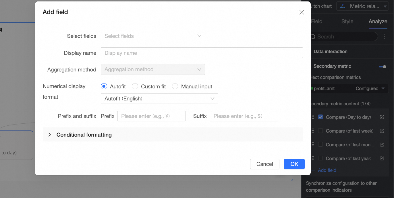
Secondary metric content | Configure the specific content for the secondary metric comparison. The system automatically generates corresponding YoY and MoM options based on the granularity of the date field you configured in comparison date/dimension. For example, if the date field type is "day", options such as day-over-day, week-over-week, and month-over-month comparisons are available. If no date field is configured in comparison date/dimension, you must manually add a custom secondary metric field. You can perform the following actions:
|
Sync configurations to other comparison metrics | Select the measure fields to which you want to apply the current secondary metric configuration. |
Set secondary metric font styles | Configure text styles for the Name and Value. |
 icon to drag and reorder the metrics, which adjusts their display order in the chart.
 icon. In the Secondary metric content settings dialog box, adjust the current metric's display format, conditional formatting, and other settings.
FAQ
1. Metric relation graph vs. metric decomposition tree
A: Both are used for metric decomposition, but in different ways. A metric relation graph displays the calculation and composition relationships between metrics based on manually defined mathematical formulas, emphasizing the calculation logic between metrics. It is often used for models like DuPont analysis. In contrast, a metric decomposition tree breaks down a metric by drilling down through successive levels of a dimension. It emphasizes segmentation by dimension to show the contribution and proportion of different dimension members to the whole.
2. Define metric calculation relationships
A: On the Fields tab, add the three measures A, B, and C to their respective areas (A is usually at the top, while B and C are in the decomposition area). Then, click the Edit Metric Decomposition Relationship button. In the dialog box that appears, find the node representing A (or use the input box at the very top if it is the top-level metric) and enter the expression [B]*[C]. You must enclose metric names in square brackets []. For more details, see Data pane in this topic.
3. Display MoM and YoY values
A: First, on the Fields tab, ensure that a date dimension field containing year and month information has been added to the comparison date/dimension area. Next, switch to the Analysis tab, find the secondary metric setting, and enable it. In the Secondary Metric Content section, select the system-generated MoM and YoY options if they are available. If you need a custom calculation, click Add Field to configure it.
4. Troubleshoot chart display or relationship errors
A: This issue is typically caused by an incorrect configuration of the metric decomposition relationship. Be sure to click the Edit Metric Decomposition Relationship button to check and ensure that the correct calculation formulas have been entered for all metrics that need to be decomposed. Also, verify that all underlying metrics used in the calculations have been added to the decomposition indicators/measure area.