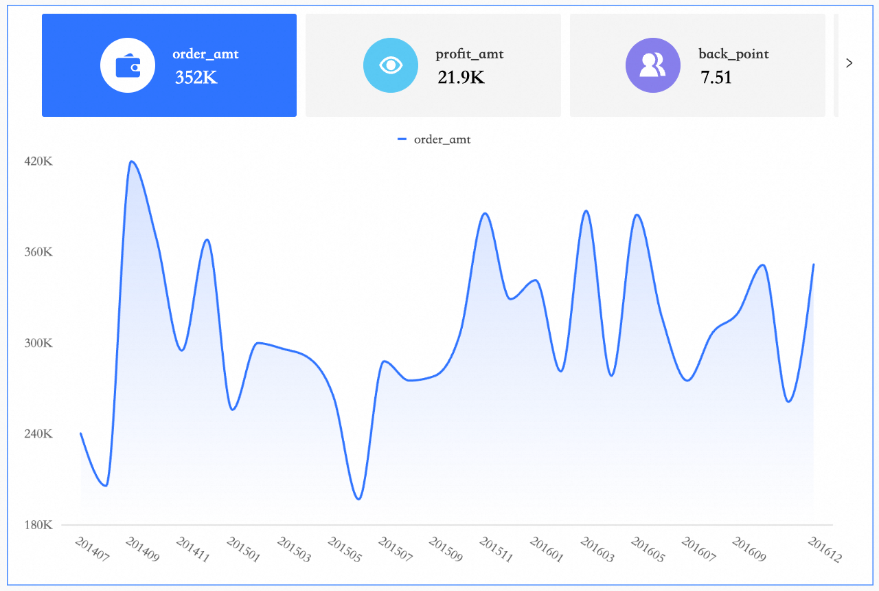
A metric trend chart displays the latest or aggregated values for one or more key metrics, combined with a trend line, area chart, or bar chart over a selected time period. Use this chart to quickly assess metric performance and spot business anomalies or highlights.
Version 5.5.2 improves the visual configuration and rendering of trend charts. This update may affect the styles of some components on PC and mobile. Please review your dashboards after the upgrade. If necessary, manually adjust the styles or contact the Quick BI support team.
Prerequisites
You have created a dashboard. For instructions, see Create a dashboard.
Chart
Benefits
-
Calculation capability: Configure advanced calculations, such as period-over-period and year-over-year comparisons, with a single click.
-
Data visualization: Add logos and customize the background, font size, and color.
-
Remarks: Add custom text or metrics, and configure hyperlinks to interact with other systems.
Use Cases
Indicator trend charts display metric data and trends over a specific period, helping you quickly identify business anomalies.
Example
Limitations
Before using a metric trend chart, review the following prerequisites and limits.
-
Prerequisite: You have created a dashboard. For more information, see Create a dashboard.
-
Field configuration limits:
A metric trend chart consists of a metric/measure and a date/dimension:
-
The date axis is defined by a single dimension from your data, such as order date (day).
-
The chart values are defined by one or more measures from your data, such as order count and order amount.
-
Configure Chart Data
-
On the field tab, select the dimension and measure fields you need:
-
From the dimension list, double-click or drag
order_date (day)to the Date (Dimensions) area. -
From the measure list, double-click or drag
order_quantity,order_amount,shipping_cost, andprofit_amountto the Indicator (Measures) area.
-
-
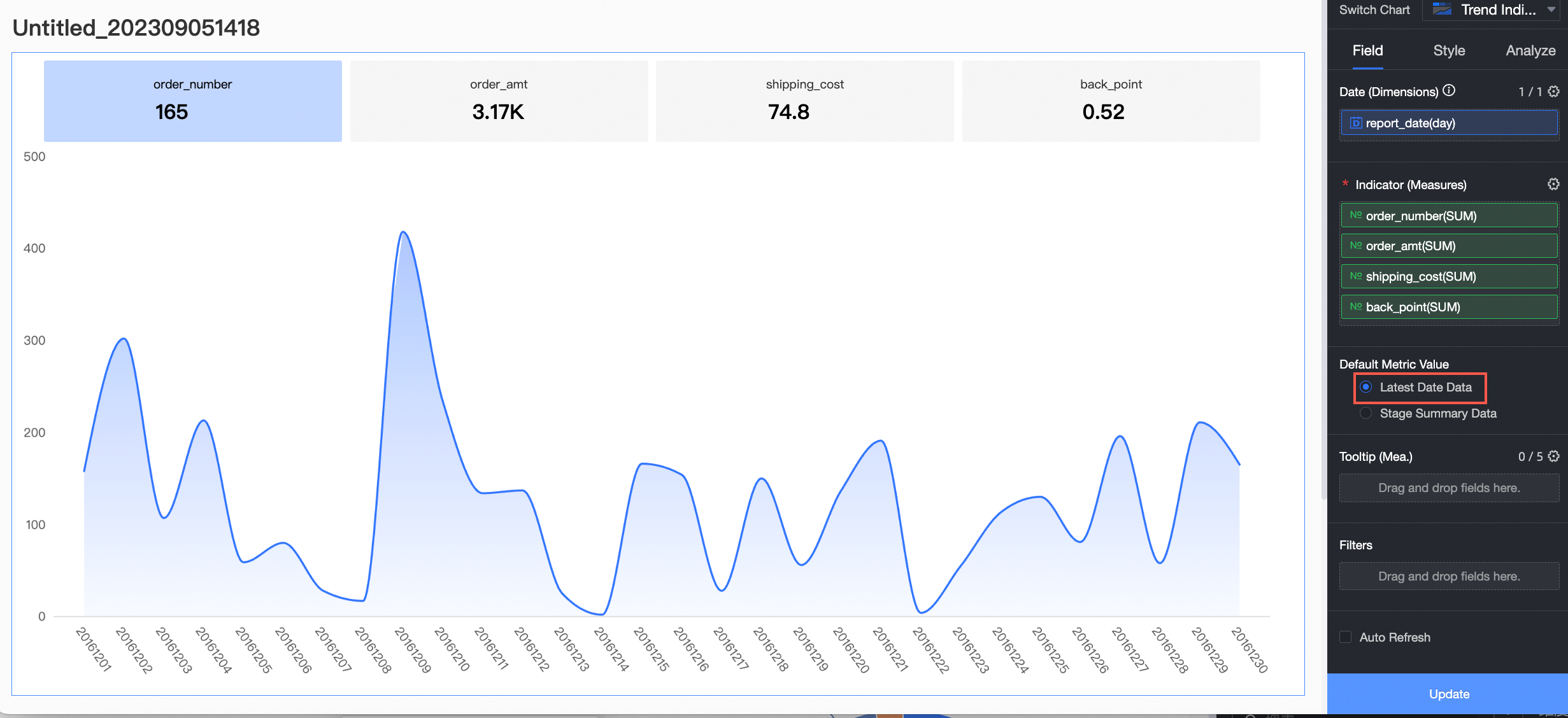
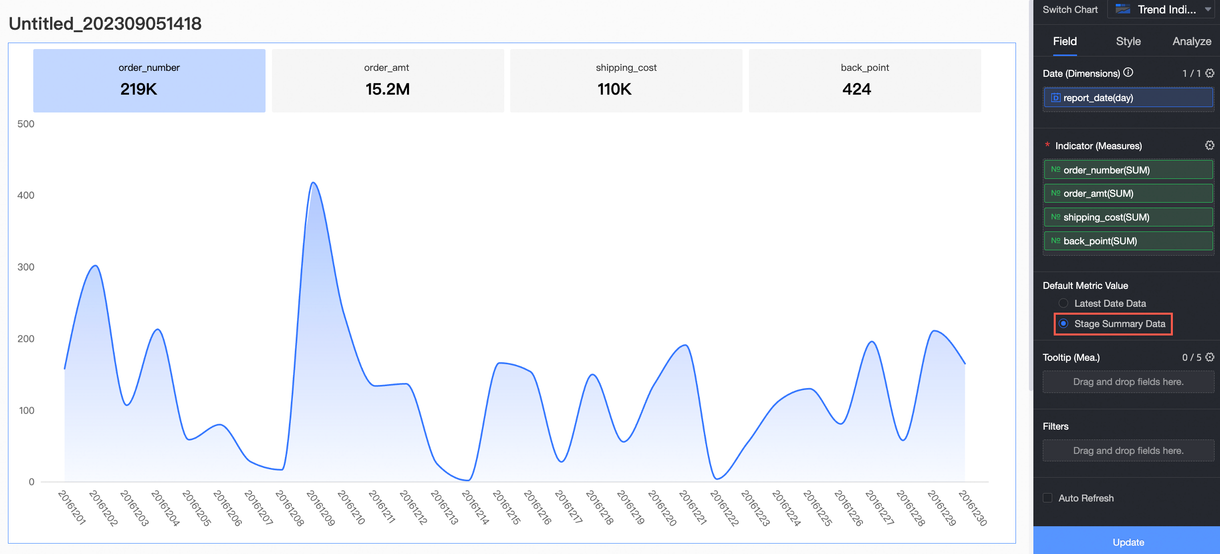
Select a default metric value and click update. The chart updates automatically.
-
Latest date data: Shows data for the most recent date in the selected time range.
For example, if you select latest date data, the metric card shows the data for the last day of the period, December 30, 2016.
-
Aggregated data: Shows the aggregated value for the selected time range.
For example, if you select aggregated data, the metric card shows the aggregated value for the period from December 1, 2016 to December 30, 2016.
-
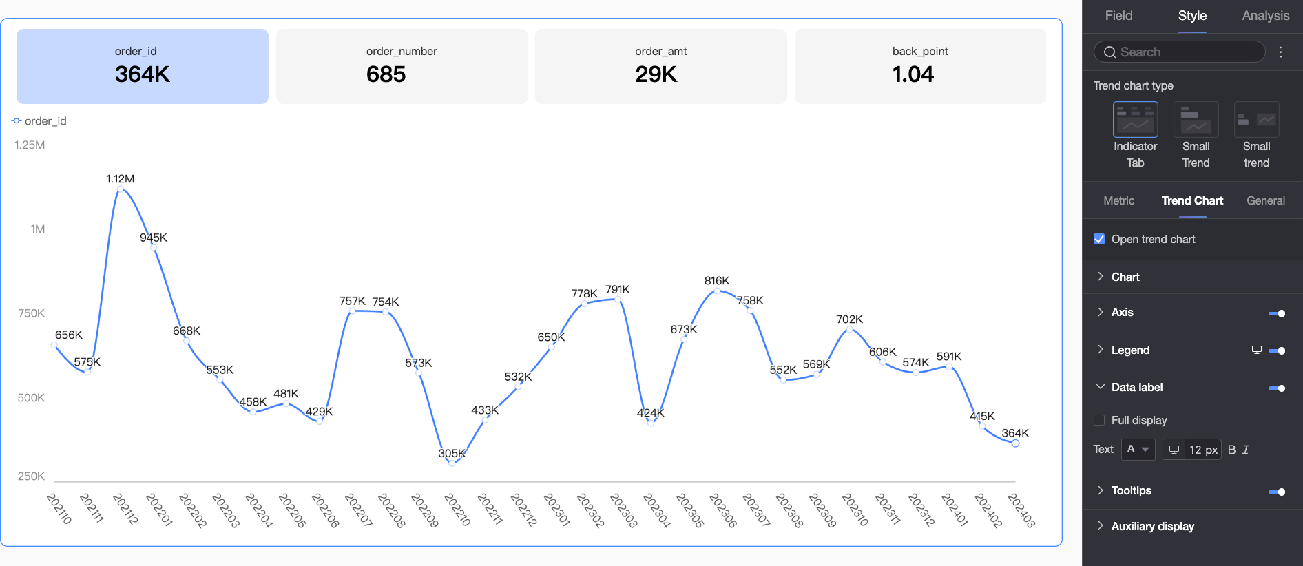
Chart Styles
Configure the visual style of a metric trend chart.
Chart Type
Select a layout type for the chart. This type determines how metric blocks and trend charts are arranged. Three types are available.
|
Chart type |
Description |
|
Metric tab trend chart |
Displays each metric and its corresponding trend chart in a separate tab. Click a tab to view the trend chart for that metric. This chart type keeps the report interface clean and uncluttered, helping users focus on a single metric.
|
|
Mini trend chart (top and bottom) |
Stacks each metric's value above its trend chart. This layout is ideal for viewing a metric's value and trend together, helping users quickly see how the metric is changing.
|
|
Mini trend chart (left and right) |
Displays each metric value side-by-side with its corresponding trend chart. This layout helps users compare metric values and their trends at a glance. Compared to the mini trend chart (top and bottom), this layout is better for wider screens that can clearly display both the value and the chart.
|


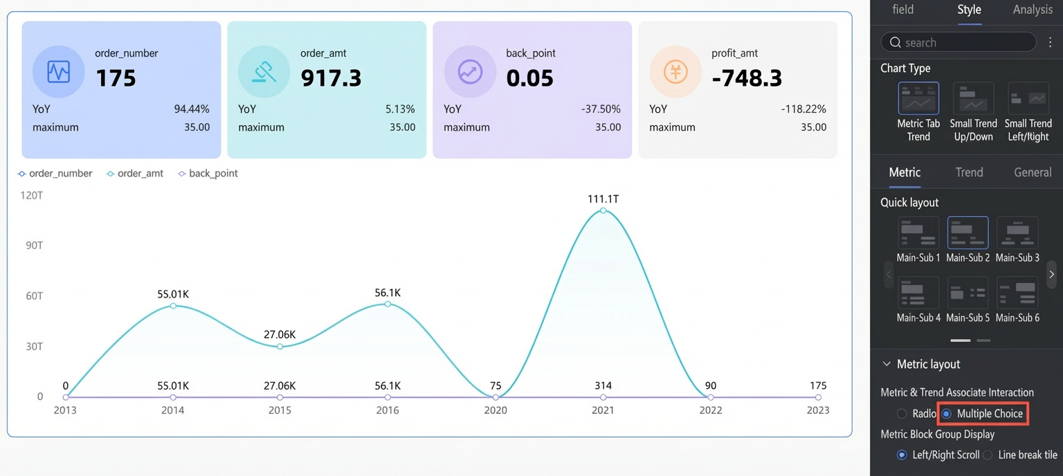
Metrics
Configure the metrics displayed in the chart.
-
Quick layout
Set the layout of primary and secondary indicators. For example, if a secondary indicator shows the year-over-year (YoY) change for a primary indicator, you can arrange the indicator and its YoY value. If secondary indicators are disabled, this option controls the layout between the indicator name and its value.
Layout type
Example
Primary/Secondary 1

Primary/Secondary 2
Primary/Secondary 3
Primary/Secondary 4
Primary/Secondary 5
Primary/Secondary 6
Primary/Secondary 7
-
Indicator layout
Set the layout of the indicator blocks. The available options vary by chart layout type.
-
When Chart type is set to Indicator Tab Trend Chart, you can configure the following options.
Parameter
Description
Indicator and trend chart interaction
Supports single-select and multi-select modes.
-
Single-select: Displays the trend chart for only one metric at a time.
-
Multi-select: Displays trend charts for multiple metrics simultaneously.
Indicator block group display format
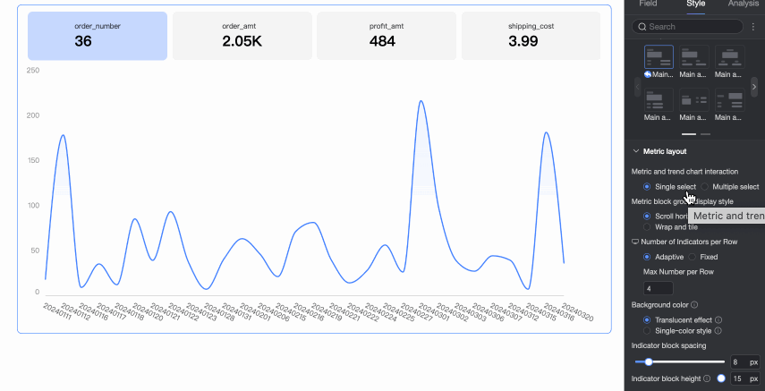
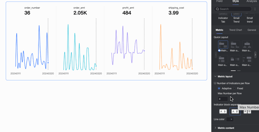
When a chart contains too many metrics to display all at once, you can choose Horizontal scrolling to view additional indicators by swiping, or Wrap to new lines to display all indicators. You can also set the number of indicator blocks per row.
Background color
Set the background color mode for indicator blocks. The indicator block color matches the trend chart's color scheme. The following modes are available: Translucent effect and Solid style.
-
Translucent effect: Applies the trend chart's color scheme with added transparency.
-
Solid style: Matches the trend chart's color scheme exactly.
Indicator block spacing
Set the distance between indicator blocks.
Indicator block height
Adjust the indicator block height by setting the distance between the indicator content and the indicator block border.
-
-
When Chart type is set to Mini Trend Chart (Vertical/Horizontal), you can configure the following options.
Parameter
Description
Indicator block group display format
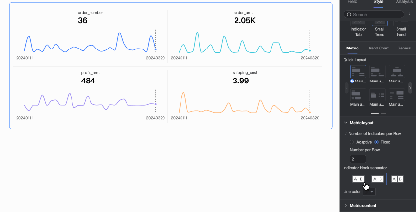
Set the number of indicator blocks per row.
Indicator block separation
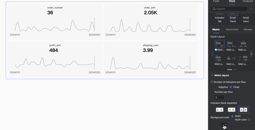
Set the separation mode between indicator blocks. Options include No separation, Divider, and Background fill.
Divider color
When the separation mode is set to Divider, you can set the divider color.
Background color
When the separation mode is set to Background fill, you can set the background color. You can set a uniform single color for all indicator block backgrounds, or use the multi-color mode, where the background color matches the trend chart's color configuration.
Indicator block spacing
Set the distance between indicator blocks.
-
-
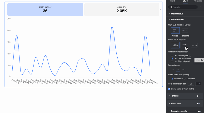
Indicator content
Set the content position, display method, font style, and indicator decoration style for the indicator blocks.
Parameter
Description
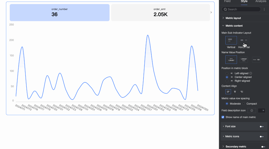
Primary and secondary indicator layout
Set the arrangement of primary and secondary indicators. Options include Vertical and Horizontal.
Name and value position
When Primary and Secondary Indicator Layout is set to Vertical, you can set the layout of the indicator name and value.
Content position in indicator block
Set the position of the content within the indicator block:
-
When Indicator Layout is Vertical, options are Align left, Align center, or Align right.
-
When Indicator Layout is Horizontal, options are Justify or Align left.
Content alignment
Set the text alignment within the indicator block. Supported options are Left, Center, and Right.
Indicator value line spacing
Supports Medium and Compact modes.
Field description icon
Enable Use asset and set the color of the field description icon.
Null value handling
If enabled, the indicator block displays "-" when a query for a single time granularity returns no data.
Display primary indicator name
Specify whether to display the name of the primary indicator in the indicator block.
Font size settings
Select Enable font size settings to set the font size, color, and bold/italic styles for the primary indicator name and primary indicator value.
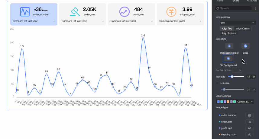
Indicator decoration
Select Display primary indicator decoration to configure its style. The following settings are available.
-
Decoration position: In a horizontal layout, you can set the position to Left, Top, Right, or Left of name. In a vertical layout, you can align it to the top, center, or bottom.
-
Circle style: Supports Translucent, Solid, and No background.
-
Corner radius: Set the corner radius for the decoration icon.
-
Distance from indicator: Set the distance between the indicator decoration and the indicator.
-
Icon size: When selected, you can customize the size of the indicator decoration.
-
Decoration type: Supports Asset and Image field.
-
The Image field option is available only if the dataset contains an image field (
). -
When you select Asset, you can use asset icons or upload a local image. You can specify a unique asset style for each metric.
NoteOnly PNG, JPG, and GIF formats are supported, with a maximum file size of 1 MB.
-
-
-
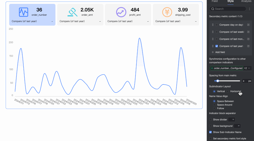
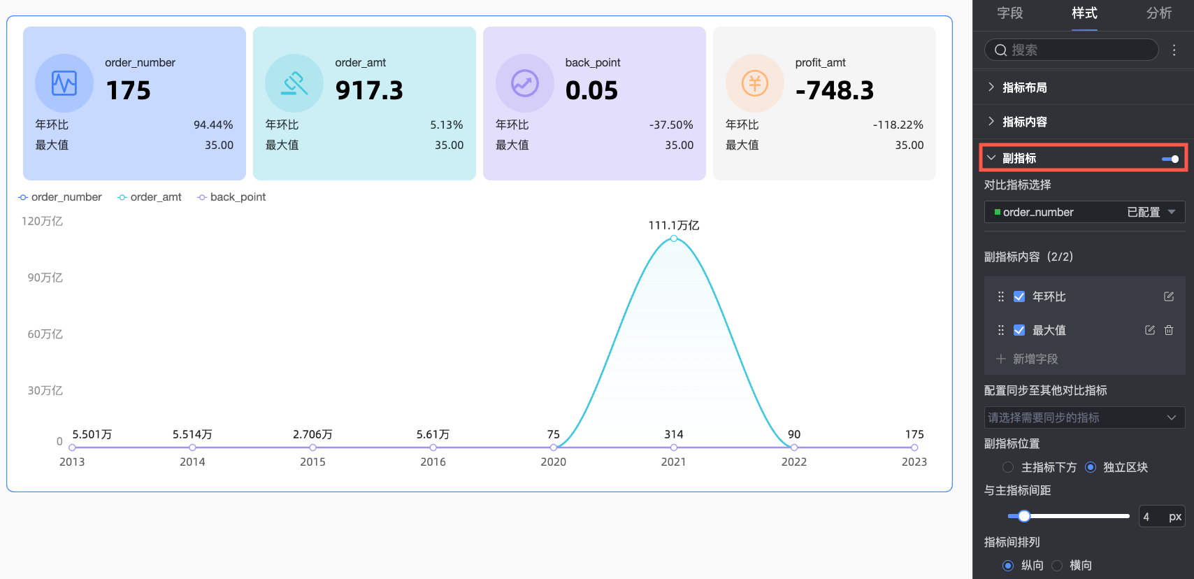
Secondary indicator
Enable and configure secondary indicators, including their content, layout style, and other settings.
Parameter
Description
Comparison indicator selection
Enable the secondary indicator and select a metric for comparison from the dropdown list.
Secondary indicator content
Set the comparison content for the secondary indicator. The system automatically generates period-over-period comparison options based on the date field granularity configured in Date/Dimension. For example, if the date field granularity is 'day', day-over-day, week-over-week, and month-over-month comparisons become available.
Here you can:
-
Select the checkbox next to an option to display its secondary indicator content. You can select up to two indicators.
-
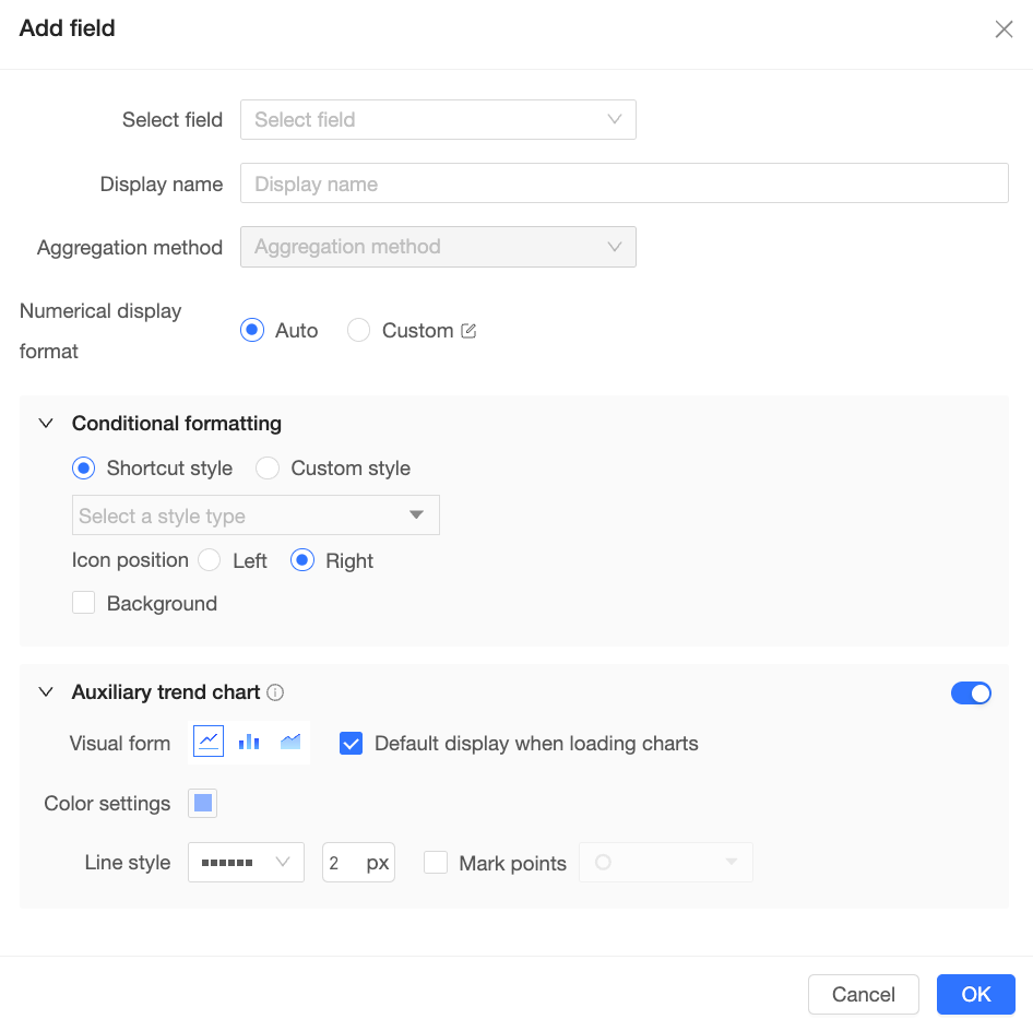
Click Add Field to open the Add Field dialog, where you can customize the comparison content for the secondary indicator, including its aggregation method, display format, conditional formatting, and auxiliary trend chart.
-
-
Click the
icon to drag and reorder the indicators to adjust their display order in the chart. -
Click the
icon to open the Secondary Indicator Content Settings dialog, where you can adjust the current indicator's display format, conditional formatting, and auxiliary trend chart.
Sync configuration to other comparison indicators
Select the metrics to apply the current configuration to.
Secondary indicator position
Set the position of the secondary indicator. You can place it Below primary indicator or in a Separate block. When placed in a separate block, you can also adjust the spacing between the primary and secondary indicators.
Indicator arrangement
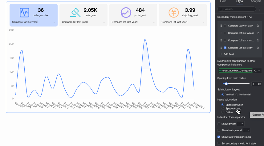
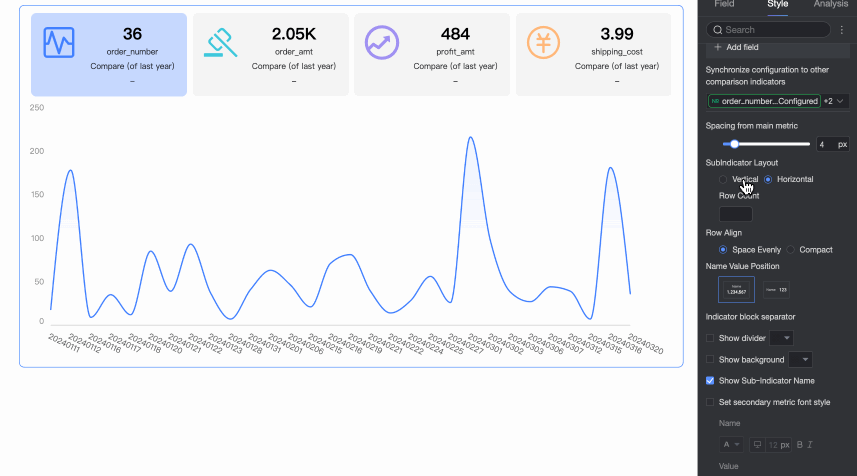
When there are multiple secondary indicators, you can arrange them either vertically or horizontally.
-
With a Vertical arrangement, you can configure the alignment of the secondary indicator's name and value.
-
With a Horizontal arrangement, you can configure the number of secondary indicators per row, the layout style for their names and values, and their position and alignment.
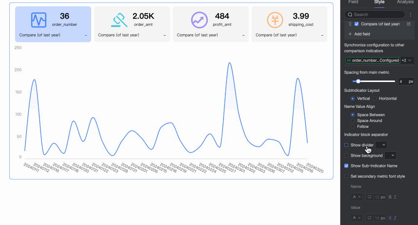
Indicator block separation
Set whether to display a divider and background between secondary indicators. You can also customize the color of the divider and background.
Display secondary indicator name
Specify whether to display the names of the secondary indicators.
Set secondary indicator font style
Set the font style and color for the secondary indicators.
-
-
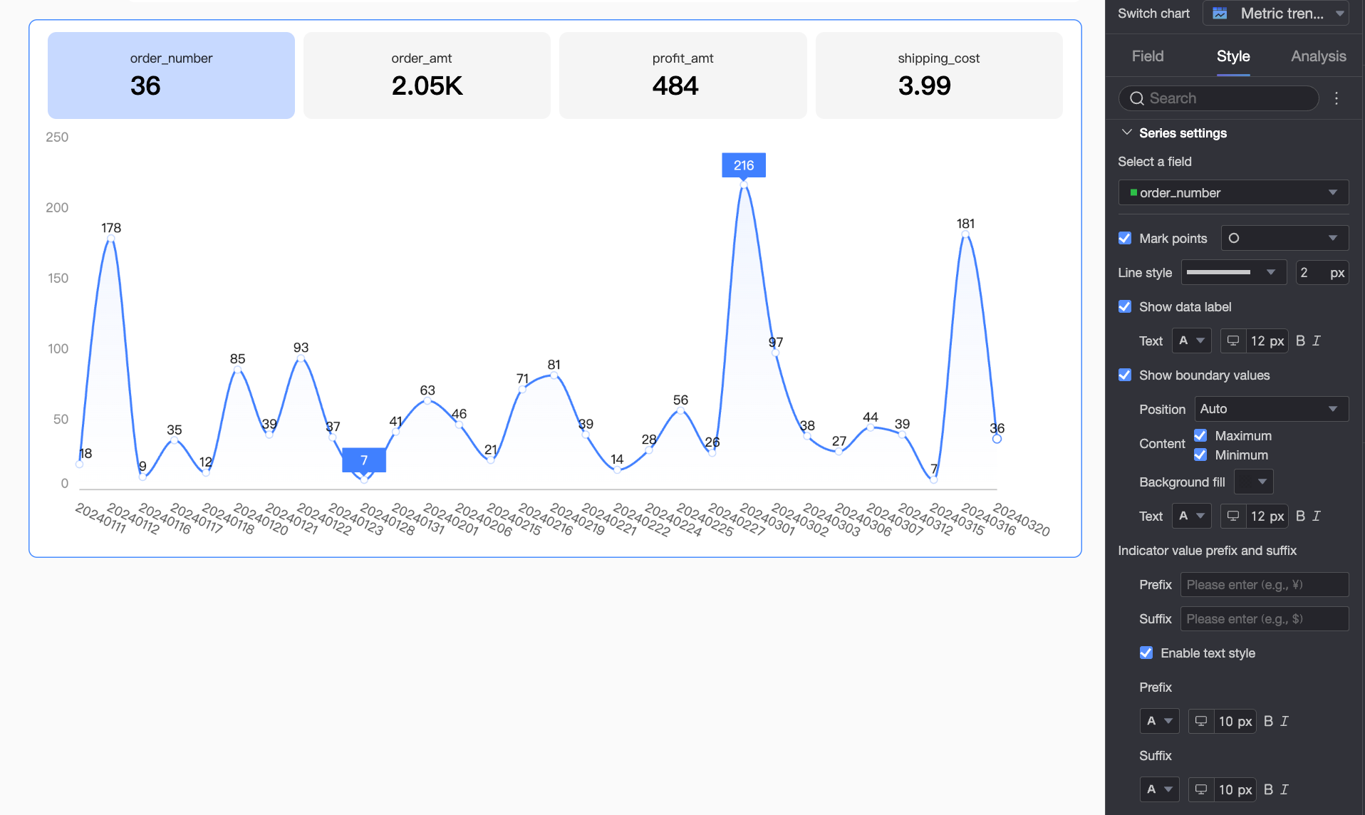
Series settings
Set markers, data labels, maximum/minimum value labels, and prefixes/suffixes for each data series.
Parameter
Description
Select field
Select a field to configure. The available fields are the metric items added to the Indicator/Metric area.
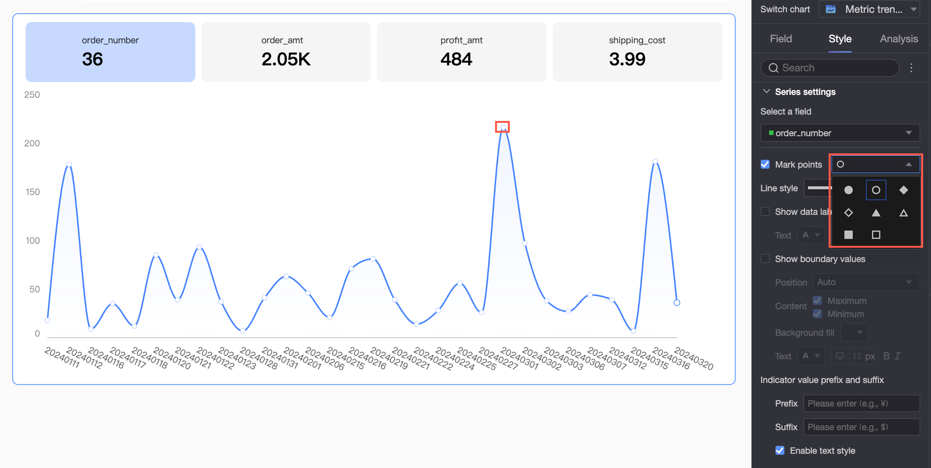
Display markers
Show or hide markers on the trend chart and select a marker style.
NoteThis option is available only when the trend chart is a line chart or area chart.
Line style
Set the style and thickness of the lines in the trend chart.
NoteThis option is available only when the trend chart is a line chart or area chart.
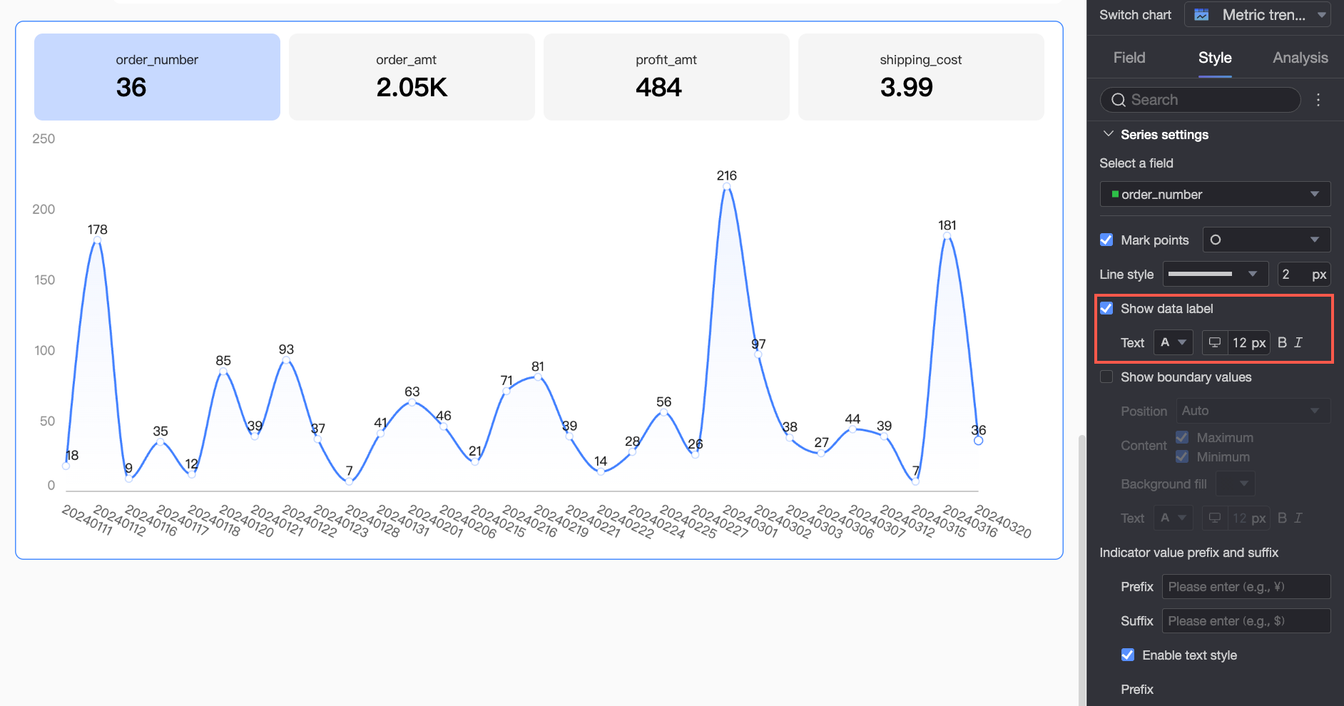
Display data labels
Show or hide data labels and set their text format, including font color, size, weight, and italic style.
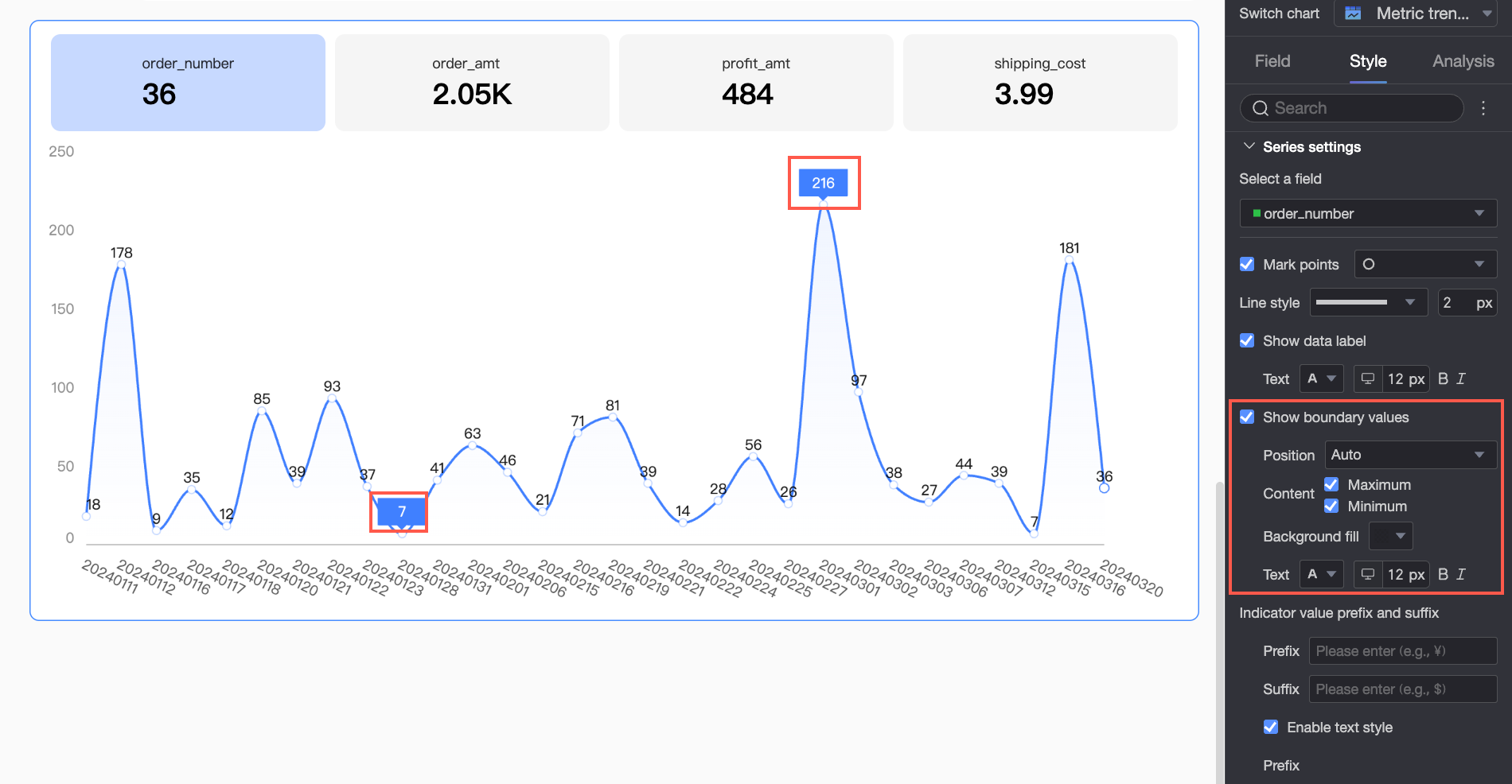
Display maximum/minimum values
Show or hide labels for the maximum and minimum values on the chart, and set the label position, display content, background color, and text format.
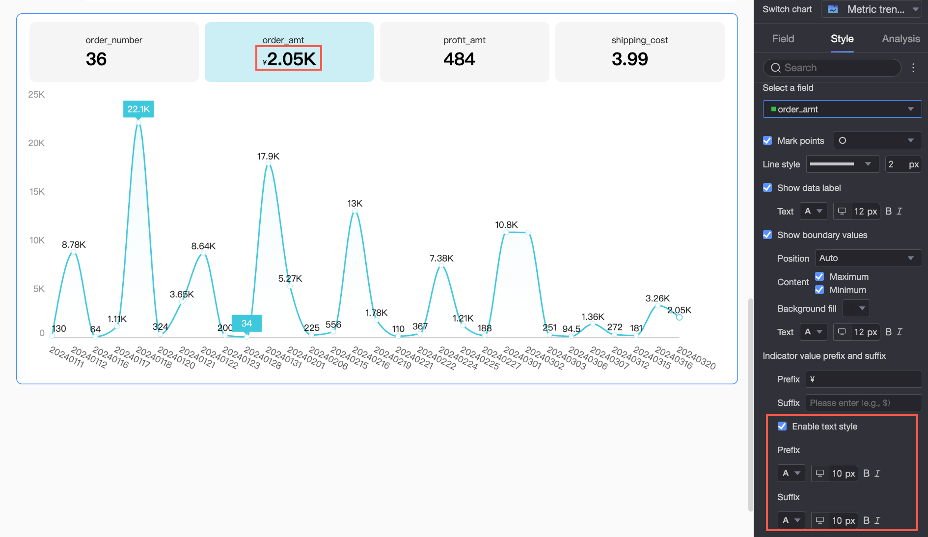
Prefix and suffix for metric values
Set prefixes and suffixes for metric data values on the chart. If style settings are enabled, you can also configure the text style of the prefix and suffix.
-
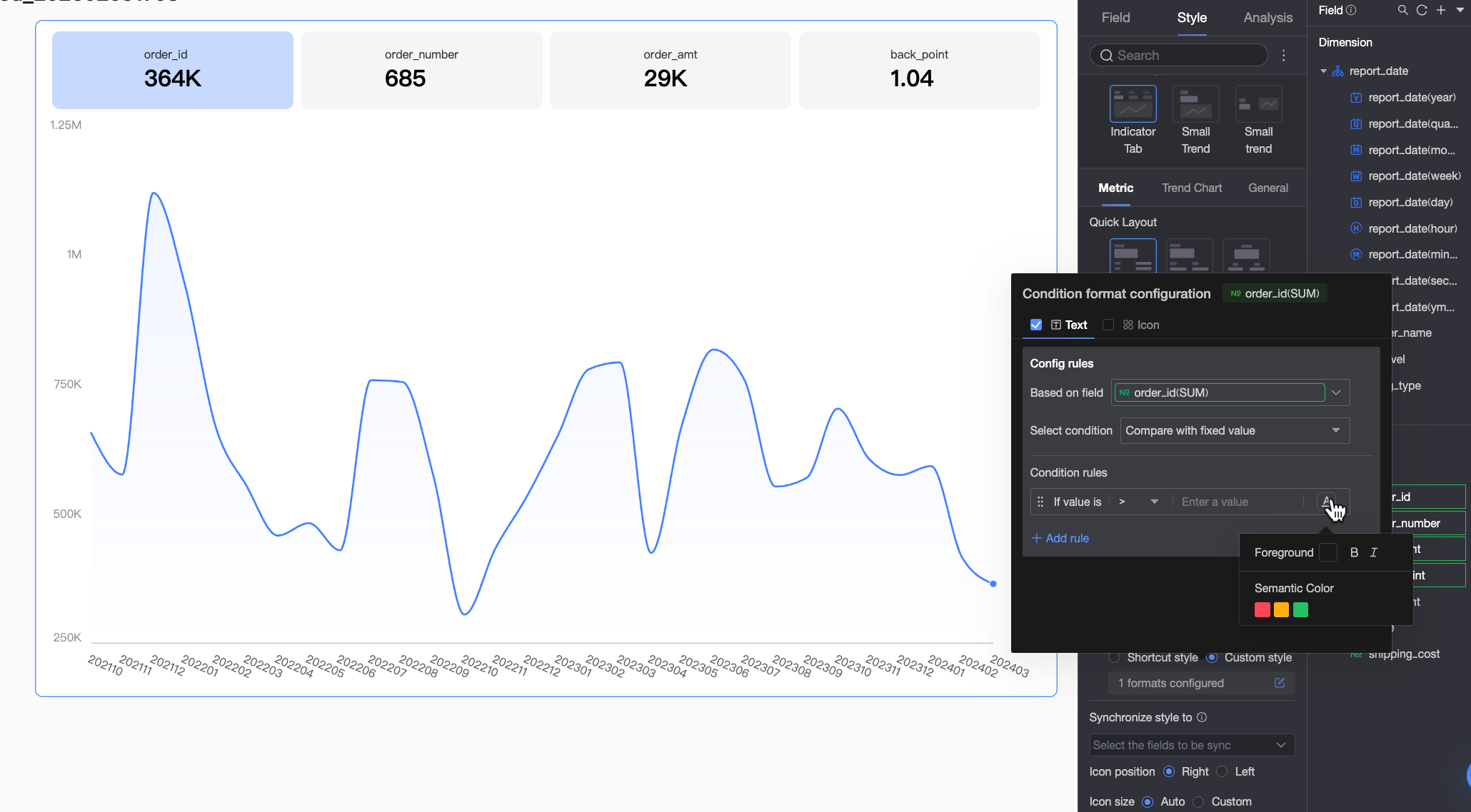
Conditional formatting
Set conditional formatting for metrics.
Parameter
Description
Select field
Select the metric field for which to configure conditional formatting. Any metric item added to the Indicator/Metric area is selectable.
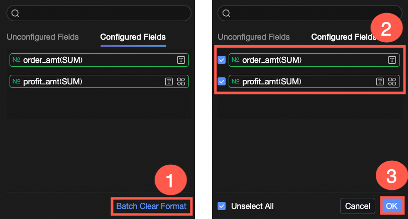
To remove formats after setting them, click Clear Formats in Bulk in the lower-right corner of the field panel. In the selection list, choose the formats to clear and click OK to remove them.
Quick styles
Set the marker icon or font color for the current metric field from a selection of built-in styles.
-
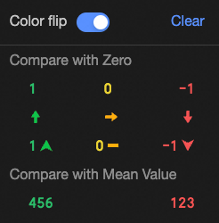
Compare: You can choose to Compare with 0 or Compare with average.
-
Invert colors: For example, when comparing with 0, values less than 0 are typically red and values greater than 0 are green. Inverting the colors reverses this logic, making values less than 0 green and values greater than 0 red.
-
Clear: If you no longer need a quick style, click Clear to remove it.
Custom styles
In addition to the quick styles, you can configure custom styles for the current metric field. Supported styles include Text and Icon.
-
Text: Set rules to display field values in a specific style to visually highlight key data in the chart.
You need to configure the following information:-
Base Field: The data field the rule applies to. By default, this is the field selected under Select Field. You can also choose another metric from the chart to create more complex rules based on that metric's value.
-
Condition Type: Set the comparison baseline for the conditional rule. You can set it to Compare with a fixed value or Compare with a dynamic field.
-
Conditional Rule: Define the specific logic for the rule and the display style of the text when the rule is met. You can set the text color, bold, and italic styles.
-
Add Rule: Click to add a new conditional rule.
-
-
Icon: Display a specific marker icon next to data based on a comparison result, clearly showing the relationship between the current data and a target value.
You need to configure the following information:-
Base Field: The data field the rule applies to. By default, this is the field selected under Select Field. You can also choose another metric from the chart to create more complex rules based on that metric's value.
-
Condition Type: Set the comparison baseline for the conditional rule. You can set it to Compare with a fixed value or Compare with a dynamic field.
-
Conditional Rule: Click the Marker Icon selector to choose an icon type from the system-provided icon sets. Then, define the specific logic for the corresponding data condition. You can also select a unique marker icon for each comparison rule.
-
Add Rule: Click to add a new conditional rule.
-
Sync style to
Apply the current conditional formatting to other metrics.
Icon position and size
Set the position and size of the conditional formatting icon within the indicator block.
-


 ).
).


 icon to drag and reorder the indicators to adjust their display order in the chart.
 icon to open the Secondary Indicator Content Settings dialog, where you can adjust the current indicator's display format, conditional formatting, and auxiliary trend chart.
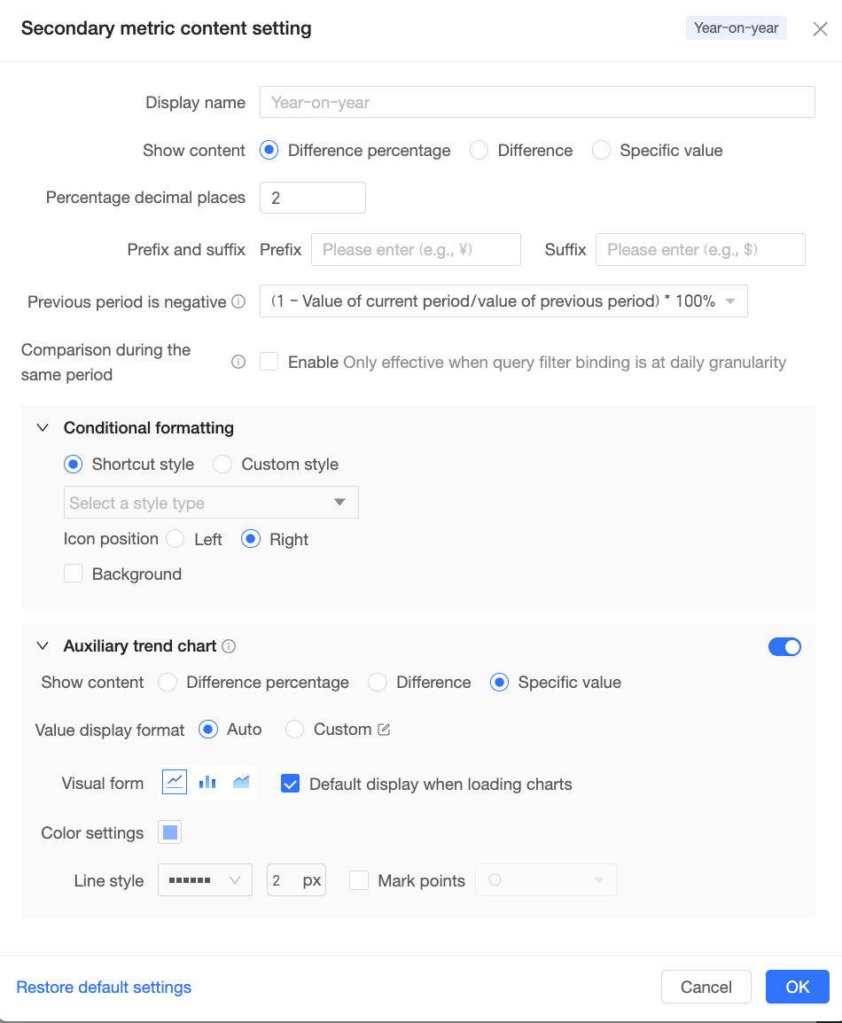

 You need to configure the following information:
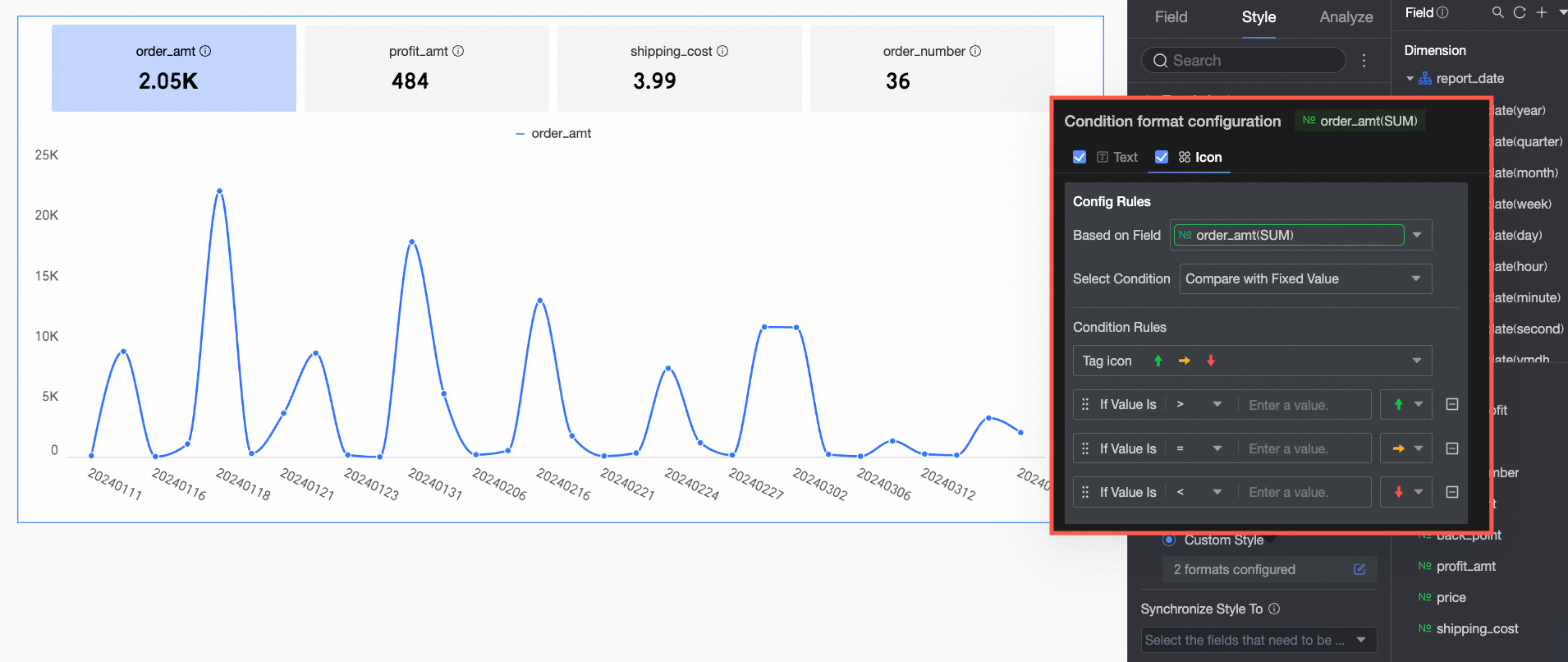 You need to configure the following information:
Trend Chart
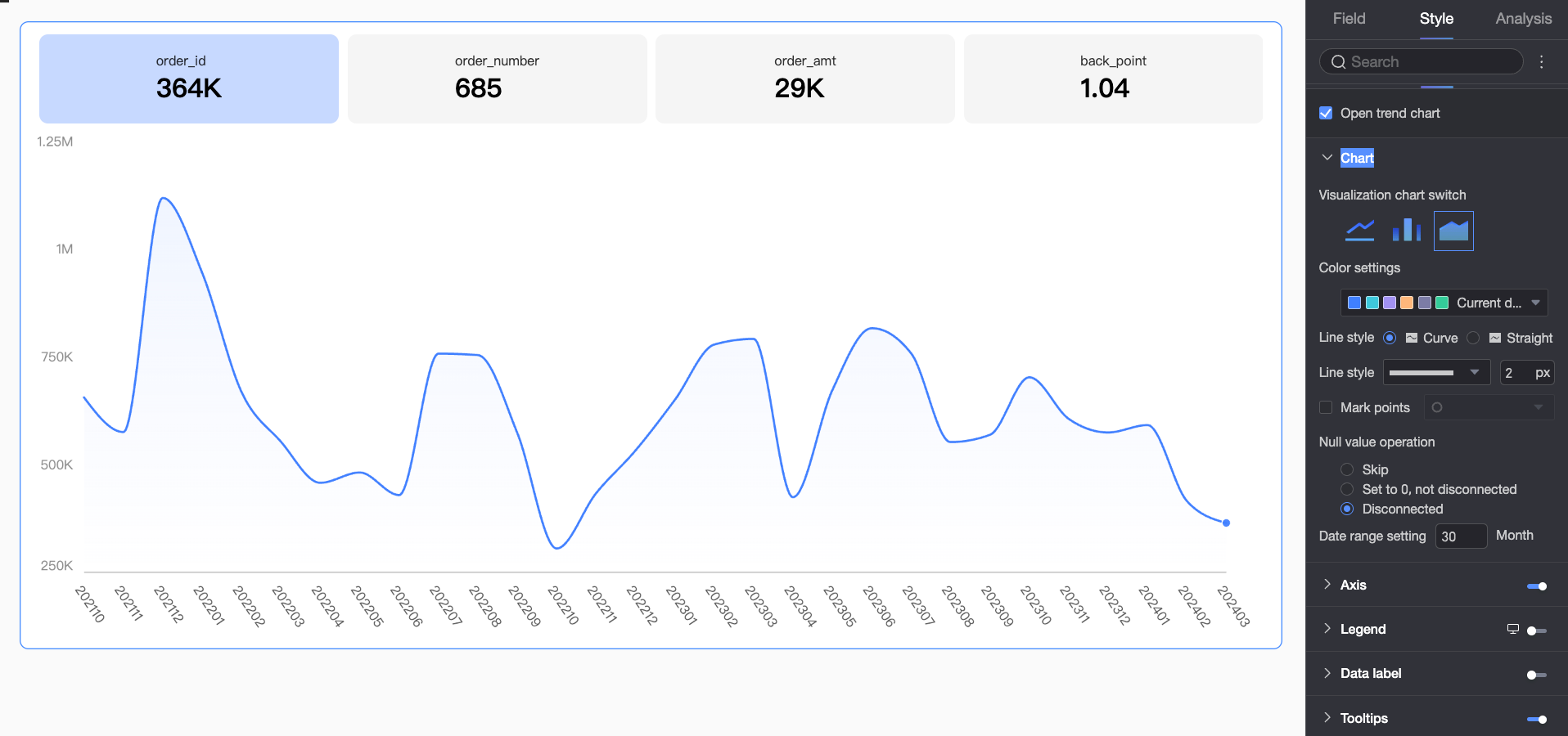
Select Enable Trend Chart to configure the trend chart settings.
-
Chart area
Configure the chart type, color settings, and more.
Parameter
Description
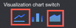
Chart type switch
Lets you switch between a line chart, area chart, and column chart.
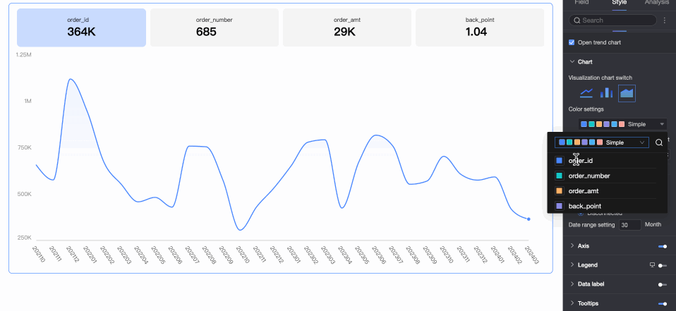
Color settings
Configure the overall color scheme for metrics. You can also assign a specific color to each metric.
Line shape
(For line and area charts)
Supports smooth line and straight line.
Line style
(For line and area charts)
Set the line style and thickness.
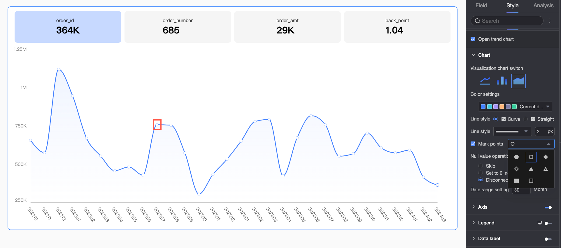
Show markers
(For line charts)
Set whether to show markers and customize their shape.
Null value handling
(For line and area charts)
Supports three methods: Connect Over Nulls, Set to 0, and Break Line.
Date range setting
Defaults to 30 days.
-
Axis
Configure the styles for the X-axis, left Y-axis, and right Y-axis.
Parameter
Parameter
Description
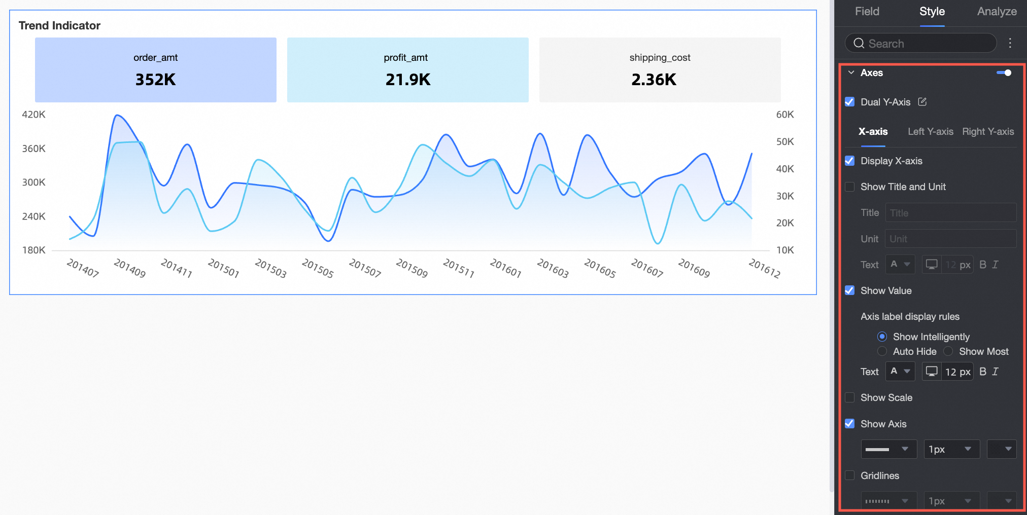
Show Dual Y-Axes
Shows or hides dual Y-axes.
X-axis
Show X-axis
Shows or hides the X-axis.
Show title and unit
Shows or hides the axis title and unit on the X-axis.
Show axis labels
Shows or hides labels on the X-axis.
Show ticks
Shows or hides ticks on the X-axis.
Show axis line
Toggles the display of the axis line and lets you configure its type, width, and color.
Show grid lines
Toggles the display of grid lines for the X-axis and lets you configure their line type, width, and color.
Left Y-axis
Show left Y-axis
Shows or hides the left Y-axis.
Invert Y-axis
Inverts the Y-axis scale.
Show title and unit
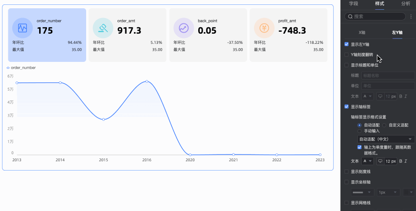
Shows or hides the axis title and unit. You can also configure their name, position, and text style.
Show axis labels
Shows or hides labels on the left Y-axis. When enabled, you can configure the axis label format and text style. The axis label format has two modes: auto and custom.
-
The default mode is auto. In this mode, axis labels inherit the data format settings of the metric field. If multiple metric fields exist, the format of the first field is used.
-
In custom mode, click the
icon to open the data format settings dialog box and configure the data format. For a description of the options in this dialog box, see Data display format > Custom.
Show ticks
Shows or hides ticks on the left Y-axis.
Show axis line
Toggles the display of the left Y-axis line and lets you configure its line type, width, and color.
Show grid lines
Toggles the display of grid lines for the left Y-axis and lets you configure their line type, width, and color.
Axis range and interval
-
You can set the axis range automatically or manually define the max/min values for the left Y-axis.
-
You can set a custom interval by step size or by the number of segments.
NoteThe right Y-axis is configurable only when Show Dual Y-Axes is enabled. Its parameters are the same as those for the left Y-axis.
-
-
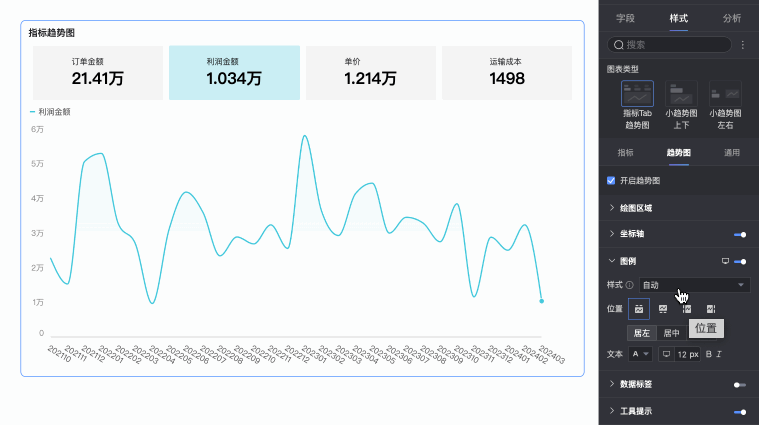
Legend
Click the
icon to enable the chart legend and configure its style.Parameter
Description
Style
Set the style for the legend icons. Choose from auto, line only, and line and marker.
Note-
When you select line and marker, the legend inherits the marker style already set in the chart. If no marker style is configured, it defaults to a solid circle.
-
If you select Scale legend symbol with text in Theme Design > Common Content Style, the size and thickness of the legend icon will scale proportionally with the chart's line thickness and legend text size.
-
This setting applies only to line and area charts.
Position
Set the legend's position and alignment.
-
When the position is set to Top or Bottom, you can align the legend to the left, center, or right.
-
When the position is set to Left or Right, you can align the legend to the top, center, or bottom. You can also set the distance between the legend and the chart content.
Text
Configure the text style for the legend, including font color, size, weight, and italics.
Mobile legend settings
Legend settings are configured independently for desktop and mobile. Use the desktop/mobile switch (
) at the top of the dashboard editor to customize the legend's position and text style for each platform. -
-
Data label
Configure how data labels are displayed on the chart.
Parameter
Description
Show all labels
When enabled, the system intelligently adjusts label positions to prevent overlap. However, if there are too many data labels, some that extend beyond the axis area may be hidden. With this option enabled, you can also choose to allow data labels to overlap.
Text
Configure the text style for the labels.
-
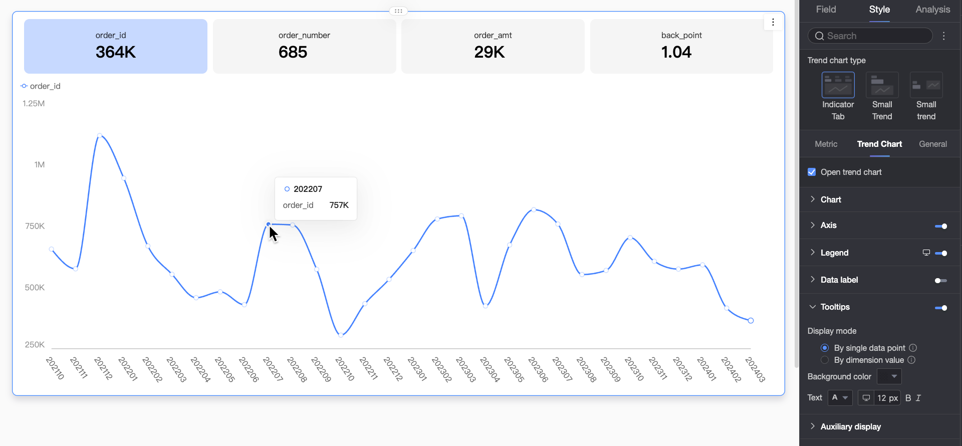
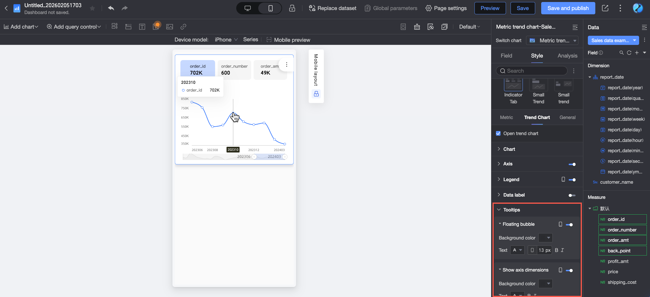
Tooltip
Configure how tooltips appear when hovering over data points.
-
Desktop settings
Parameter
Description
Display mode
Sets how tooltip information is displayed. Options include by data point and by dimension value.
Content
Specify the data content to display in the tooltip. The available options vary based on other settings.
-
When multi-select is enabled for Metric Layout > Metric and Trend Chart Interaction, the content options include total and percentage. The available options depend on the display mode: percentage is available for the by data point mode, while both total and percentage are available for the by dimension value mode.
-
When the secondary metric is enabled, you can select it in the content options.
Background color
Set the tooltip's background color.
Text
Configure the text style within the tooltip, including font color, size, weight, and italics.
-
-
Mobile settings
Tooltip settings are configured independently for desktop and mobile. Use the desktop/mobile switch (
) at the top of the dashboard editor to configure tooltips for mobile devices.Parameter
Description
Floating bubble
Click the
icon to enable the floating bubble display (①).Content
Set the data content to display in the floating bubble. The available options vary based on other settings.
-
When multi-select is enabled for Metric Layout > Metric and Trend Chart Interaction, the content options include total and percentage.
-
When the secondary metric is enabled, you can select it in the content options.
Background color
Set the floating bubble's background color.
Text
Configure the text style within the floating bubble, including font color, size, weight, and italics.
Show axis dimension
Click the
icon to enable the axis dimension display (②).Background color
Set the background color for the axis dimension label.
Text
Configure the text style for the axis dimension label, including font color, size, weight, and italics.
-
-
-
Display helper
When a chart contains too much data to fit in its container, click the
icon to enable display helpers. These controls let viewers scroll and dynamically adjust the visible range, improving interactivity and readability.You can use the following two control types to manage the visible area of the chart axis: thumbnail axis and scrollbar.
Parameter
Description
Thumbnail axis
When you select thumbnail axis, a simplified trend chart showing all data appears at the bottom of the chart. Viewers can drag the selection area to quickly browse all data or focus on a specific range. The thumbnail axis uses an absolute coordinate system, meaning the selected interval corresponds to a fixed number of data points on the actual axis. This is suitable for comparative analysis or complex scenarios requiring direct navigation.
By default, the thumbnail axis appears only when the amount of data exceeds the chart container's width. To display it at all times, select always show. It will then remain visible even if the chart data does not fill the screen.Scrollbar
When you select Scrollbar, a horizontal scrollbar is displayed at the bottom of the chart. Report viewers can drag the slider to scroll the view horizontally. The scrollbar is proportional, meaning the length and position of the slider are determined by the ratio of the visible window to the total data range. This is suitable for general browsing scenarios.
You can also set the minimum category width to limit the amount of data in the current window. This ensures that the chart content is clearly displayed in the visible area and prevents visual clutter from overlapping data labels or overly dense data points. The default minimum category width is 32 px, and the value can range from 16 px to 100 px.If the space required to display all data categories is less than this minimum, a scrollbar appears. When the scrollbar is enabled, chart elements and data labels are confined to the plot area. Any overflowing parts, such as markers and data labels, are automatically clipped or repositioned to fit.
NoteIf a chart is too small for its data and has no display helper configured, the system automatically enables a thumbnail axis that appears only when the amount of data exceeds the chart container's width.
 icon to open the data format settings dialog box and configure the data format. For a description of the options in this dialog box, see
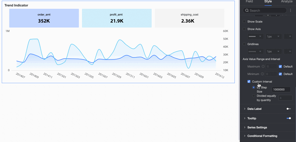
 icon to enable the chart legend and configure its style.
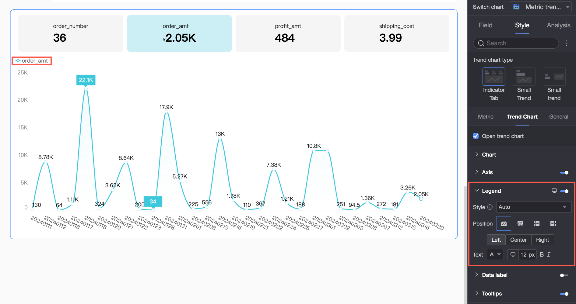
 ) at the top of the dashboard editor to customize the legend's position and text style for each platform.
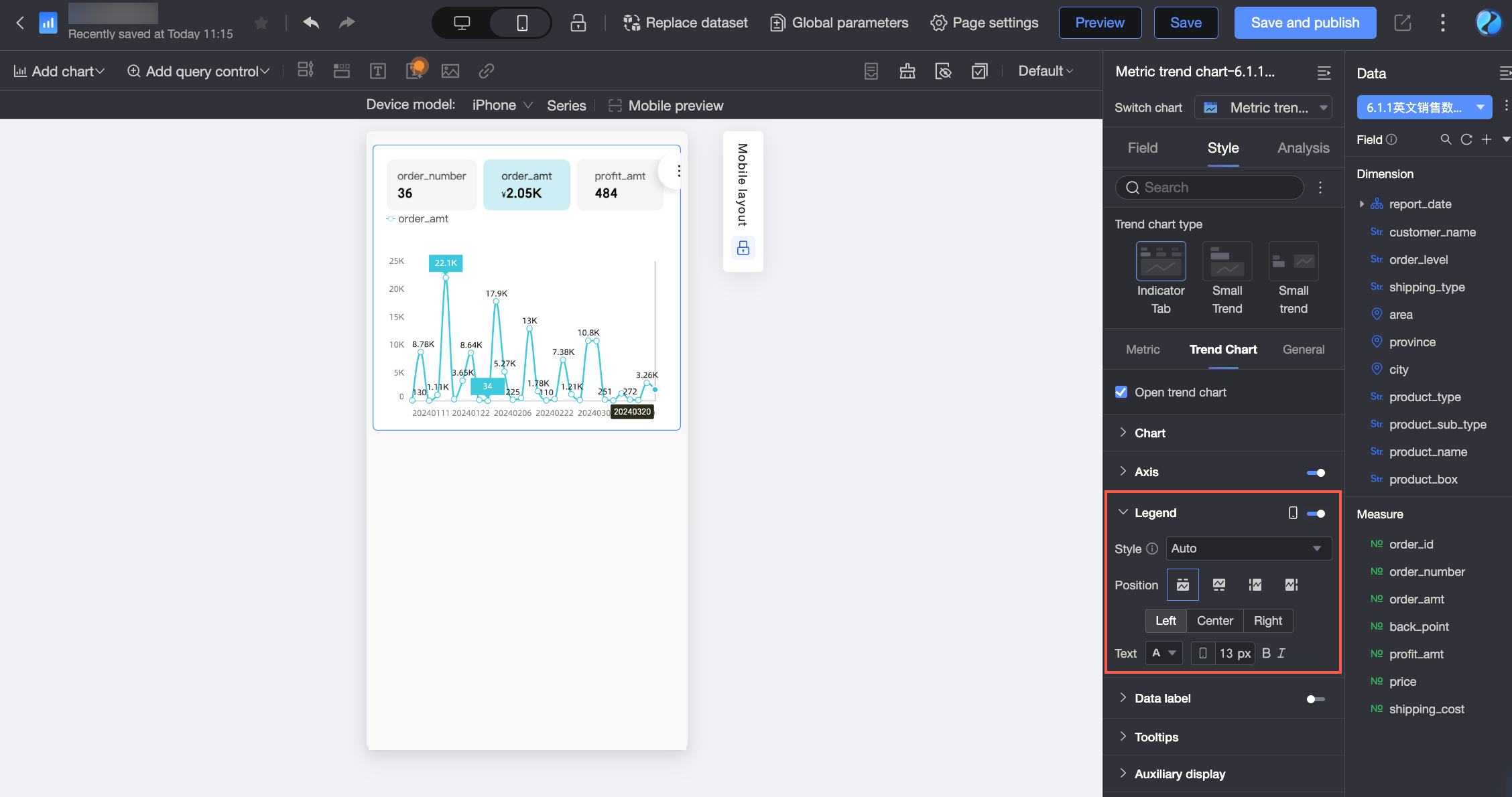
 icon to enable the floating bubble display (①).
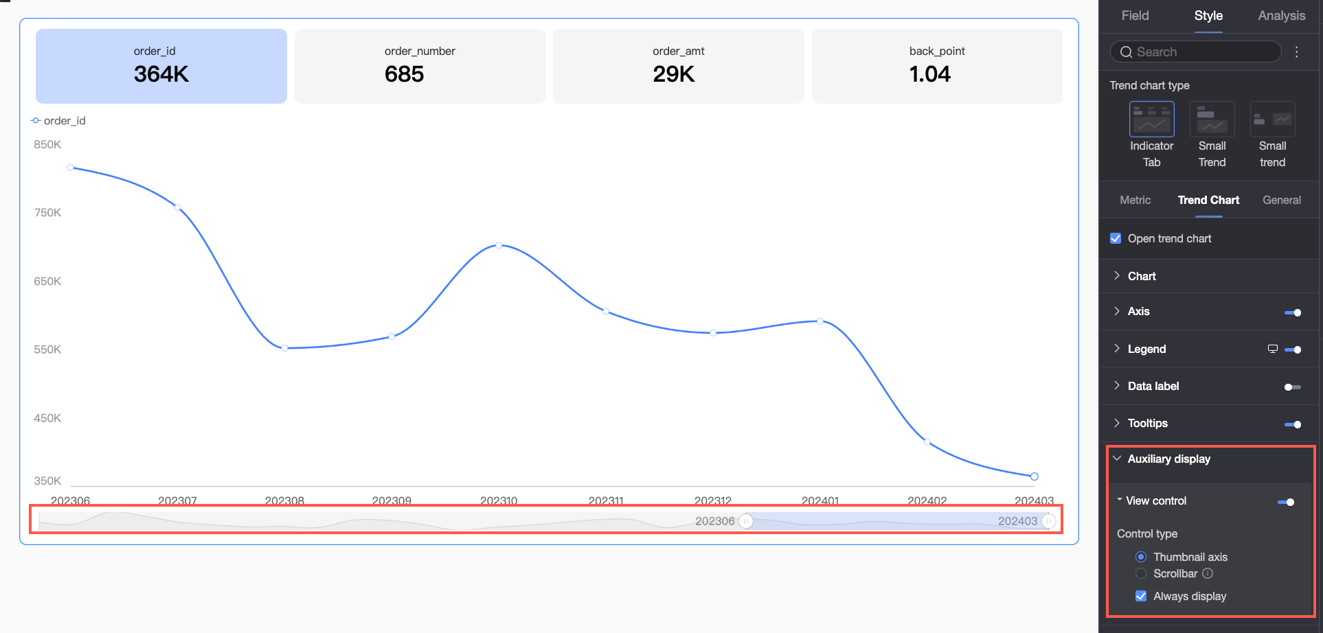
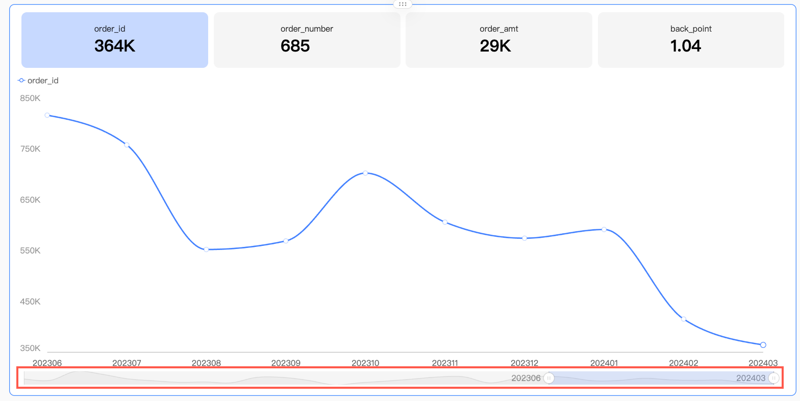 By default, the thumbnail axis appears only when the amount of data exceeds the chart container's width. To display it at all times, select always show. It will then remain visible even if the chart data does not fill the screen.
 You can also set the minimum category width to limit the amount of data in the current window. This ensures that the chart content is clearly displayed in the visible area and prevents visual clutter from overlapping data labels or overly dense data points. The default minimum category width is 32 px, and the value can range from 16 px to 100 px.
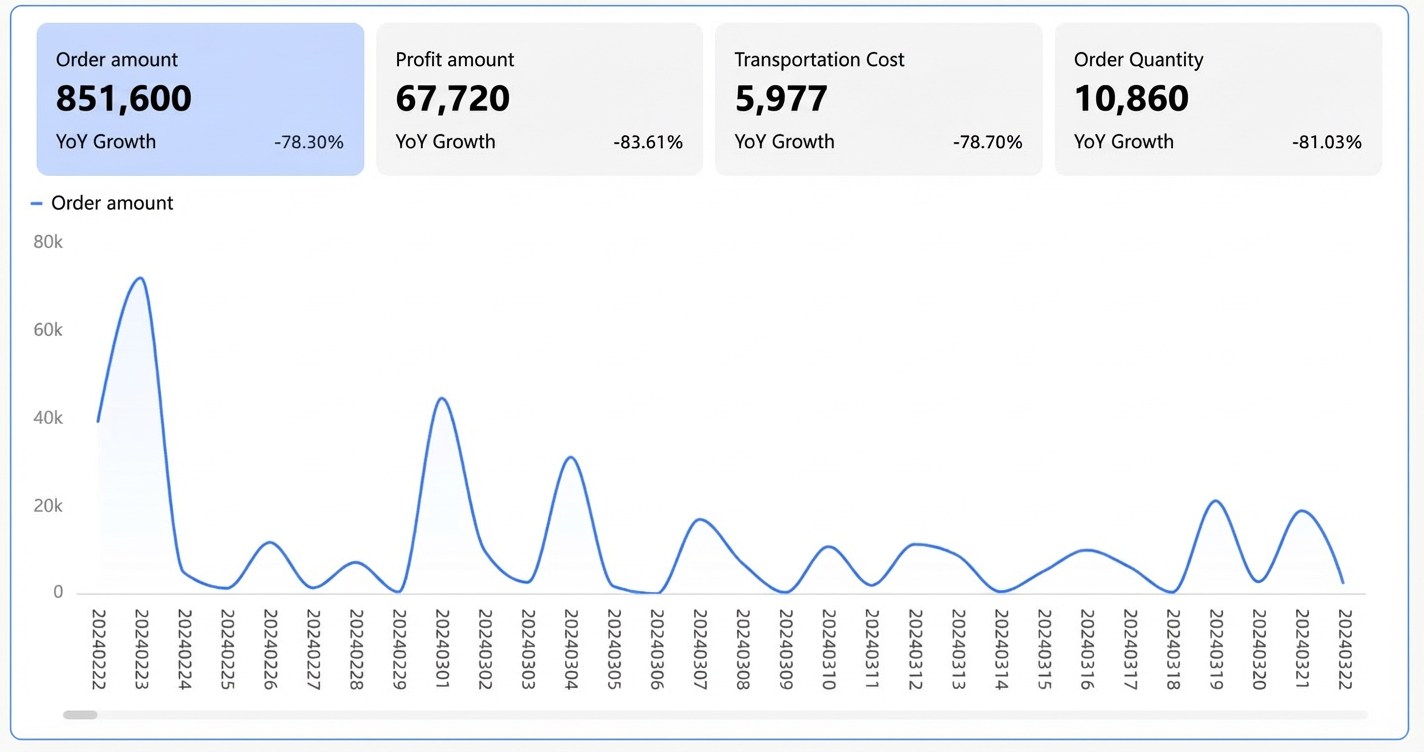
General
Configure general chart settings such as titles and auxiliary displays.
-
Title and card
For general chart style settings, see Configure the chart title area.
-
Auxiliary display
In Auxiliary Display, turn on Enable Indicator Filtering and select the default tab.
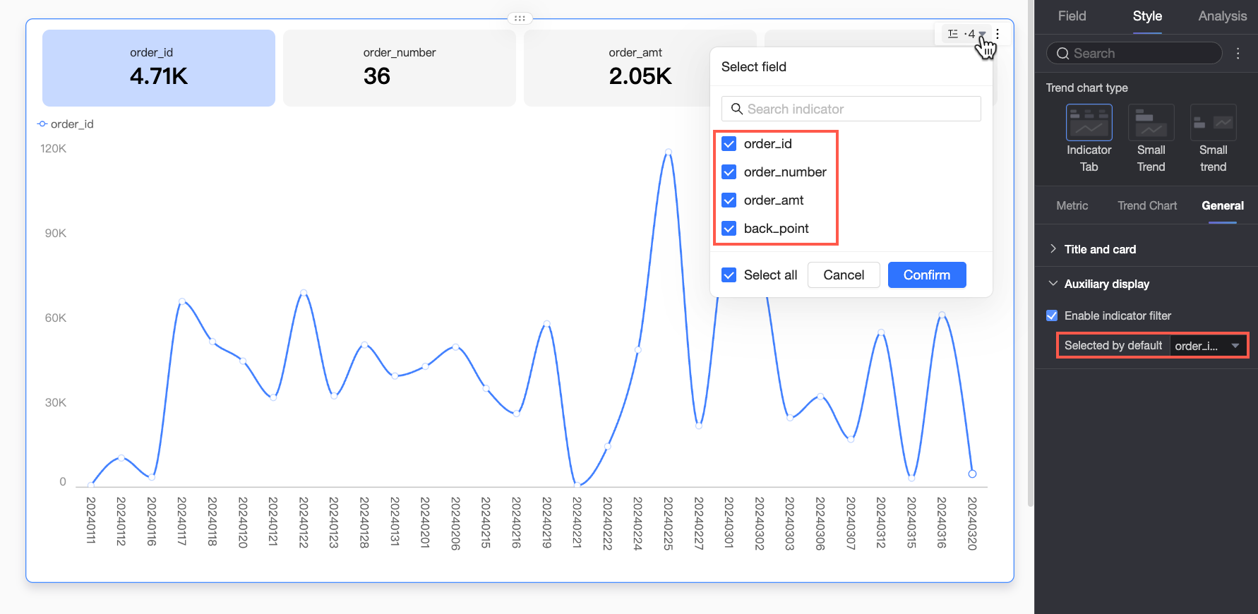
Chart Analysis Configuration
|
Category |
Parameter |
Description |
|
Data Interaction |
Linkage |
To analyze data spread across multiple charts, create a linkage between them. For more information, see Linkage. |
|
Hyperlink |
To analyze data across multiple dashboards, use hyperlinks to connect them. Two types are supported: parameter hyperlinks and external links. For more information, see Hyperlink. |
|
|
Secondary Metric |
Secondary Metric Content |
Configure the secondary metric comparison. The system automatically generates period-over-period and year-over-year options based on the date granularity set in Date/Dimension. For example, when the date field type is day, you can select day-over-day, week-over-week, and month-over-month options. You can perform the following operations:
|
|
Sync Configuration to Other Comparison Metrics |
Select the measure fields to apply the current secondary metric configuration to. |
|
|
Secondary Metric Position |
Set where the secondary metric appears: Below the primary metric or in a separate block. |
|
|
Set Secondary Metric Font Style |
Set the font style and color for the secondary metrics. |
|
|
Analysis and Alerts |
Reference Line |
Use a reference line to compare the current measure's value against a set value. The set value can be fixed or calculated (such as average, maximum, minimum, or median). For more information, see Reference Line. |
|
Annotation |
- |
When data in a chart is abnormal or requires special attention, you can add an annotation using color highlights, icons, or notes on specific data points. This helps you identify anomalies and take appropriate action. For more information, see Annotation. |


Next Steps
-
Share the dashboard with specific users, as described in Share Dashboard.
-
Integrate the dashboard into a data portal to create an analytical hub with a navigation menu, as described in Create a PC Data Portal.
FAQ
1. Metric trend chart vs. metric dashboard
A: A metric dashboard displays static values for key metrics, emphasizing the values themselves. A metric trend chart adds a time dimension to show how a metric changes over time, displaying either the latest-date value or the aggregated value for a period, with a focus on trends and dynamic changes.
2. Display sales and MoM change rate
A: To do this, configure a secondary metric. On the Analysis tab, go to the secondary metric settings. First, enable the secondary metric, and under Comparison Metric Selection, select sales amount. Then, in the Secondary Metric Content section, select the system-generated month-over-month option (if available for your date dimension) or click Add Field to create a custom calculation. You can also configure the secondary metric's position and font style.
3. Latest date data vs. aggregated data
A: "Latest date data" is the value from the last data point in your selected time range. For example, if the time range is December 1–30, it shows the data for December 30. "Aggregated data" is a single value computed across the entire time range (for example, a sum or average). The aggregation method depends on the default aggregation configured for your measure field.
4. Change trend chart to a bar chart
A: On the Style tab, go to the trend chart settings. If the chart type is set to Show Trend Chart, the Visualization Switcher option appears. Use this switcher to change the main trend chart to a bar chart. If metric with sparkline is selected, the sparkline (typically a line chart or an area chart) cannot be changed to a bar chart.