A treemap chart displays hierarchical data as a set of nested rectangles. The area of each rectangle is proportional to a specific measure, making it easy to compare parts of a whole. This topic describes how to add data to a treemap chart and configure its style.
Prerequisites
You have created a dashboard. For more information, see Create a dashboard.
Chart overview
Use cases
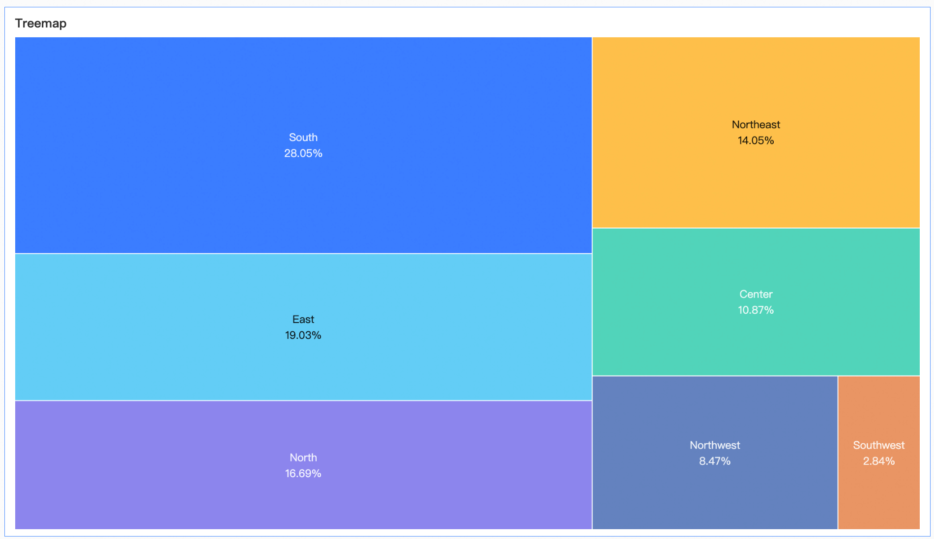
Treemap charts are ideal for displaying the distribution of dimension values based on the proportion of a measure. They effectively highlight data results, making them useful for visualizing hierarchical or categorical data.
Advantages
Visualization: Visualizes data as rectangles with customizable labels.
Annotations and interactivity: You can add annotations and configure hyperlinks to interact with external systems.
Example
Limitations
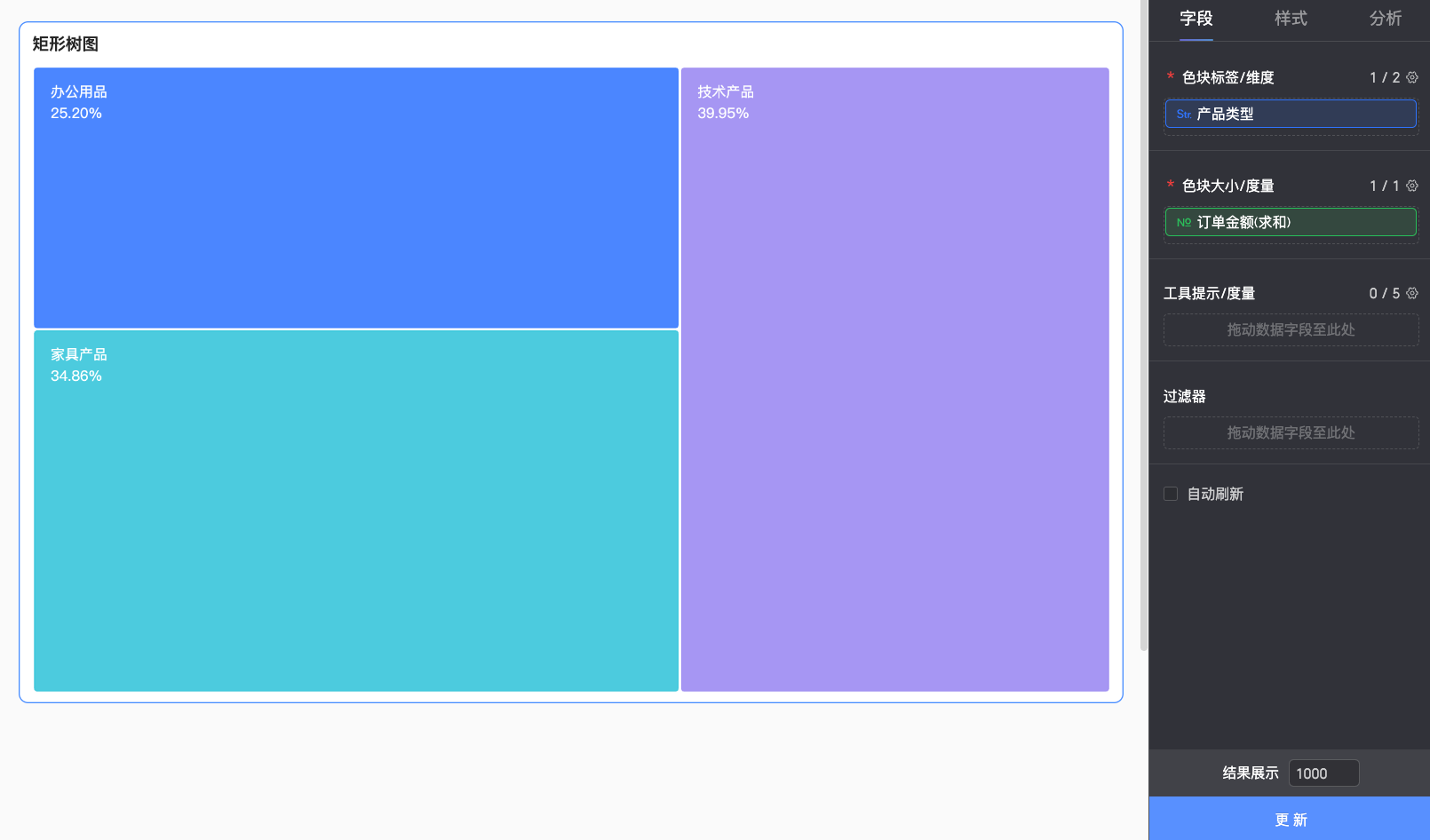
A treemap chart consists of Labels (Dim.) and Size (Mea.):
Labels (Dim.): This field accepts up to two dimensions to define the hierarchy of the rectangles. For example, product category.
Size (Mea.): This field accepts one measure to determine the size of each rectangle. For example, shipping cost.
When a treemap chart contains more than one dimension field, the chart does not support the drilling feature.
Configure chart fields
On the Data tab of the dashboard edit page, add the required dimension and measure fields:
From the Dimensions list, find product type, and then double-click or drag it to the Labels (Dim.) area.
From the Measures list, find order amount, and then double-click or drag it to the Size (Mea.) area.
Click Update. The chart updates automatically.
Configure chart style
For information about general title and card settings, see Configure the chart title area.
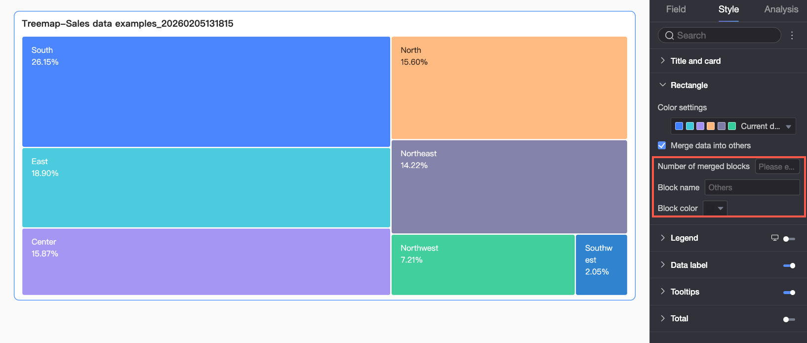
On the Style tab, configure the chart style in the Style Settings section.
Parameter | Description |
Rectangle | Configure color schemes and group data into an 'Other' category.
|
Legend | In the Legend section, click the Note
|
Data label | Set whether to display a data label and configure its format.
|
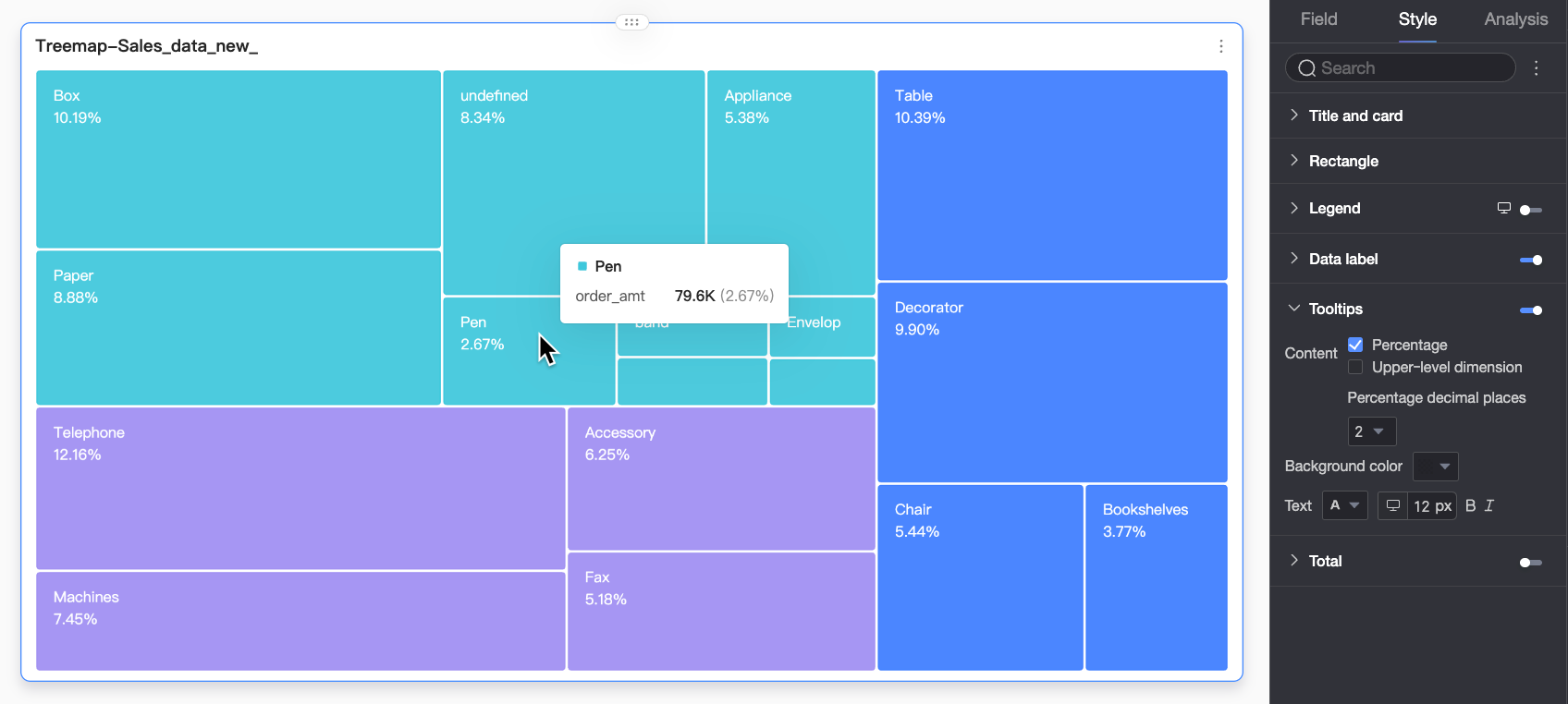
Tooltip | Configure the content, background color, and text style of the tooltip.
Note
|
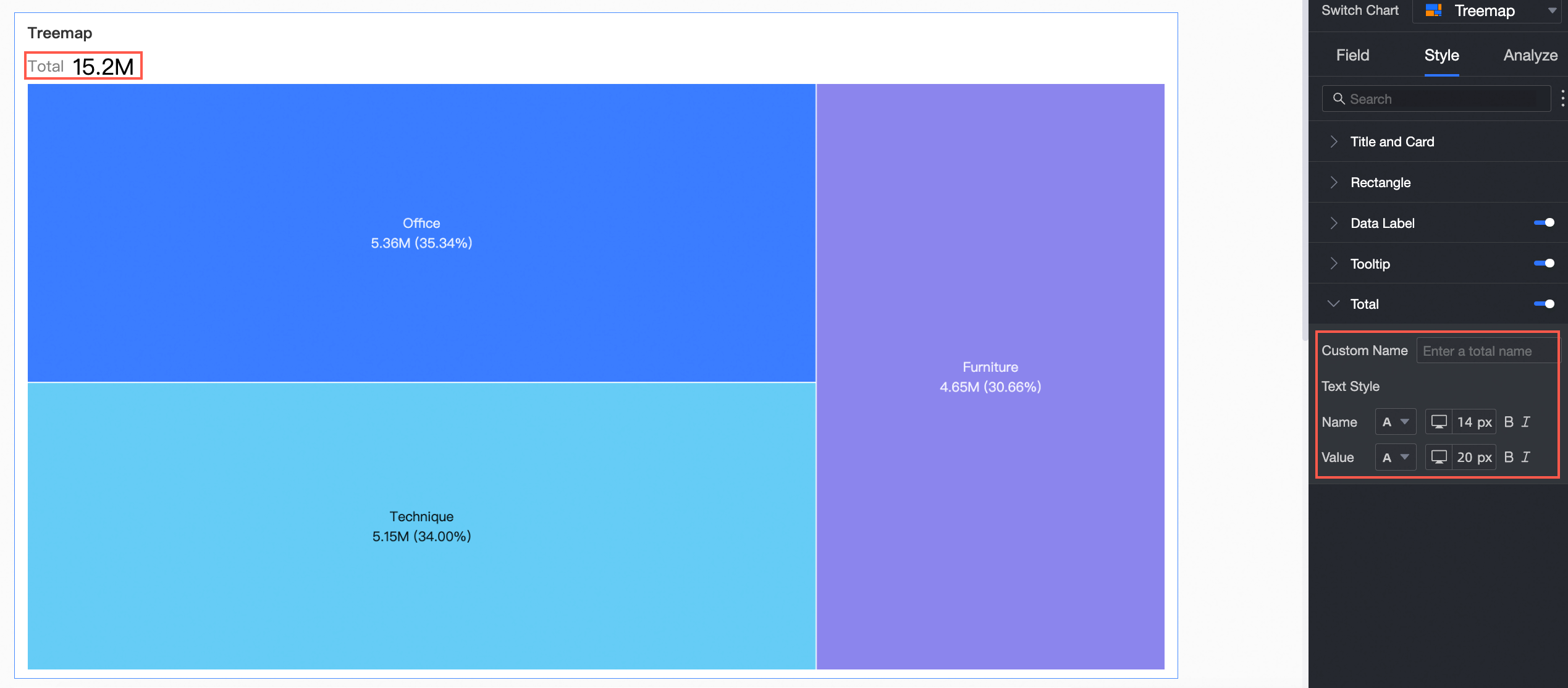
Total | Configure the name and text style for the total value.
|
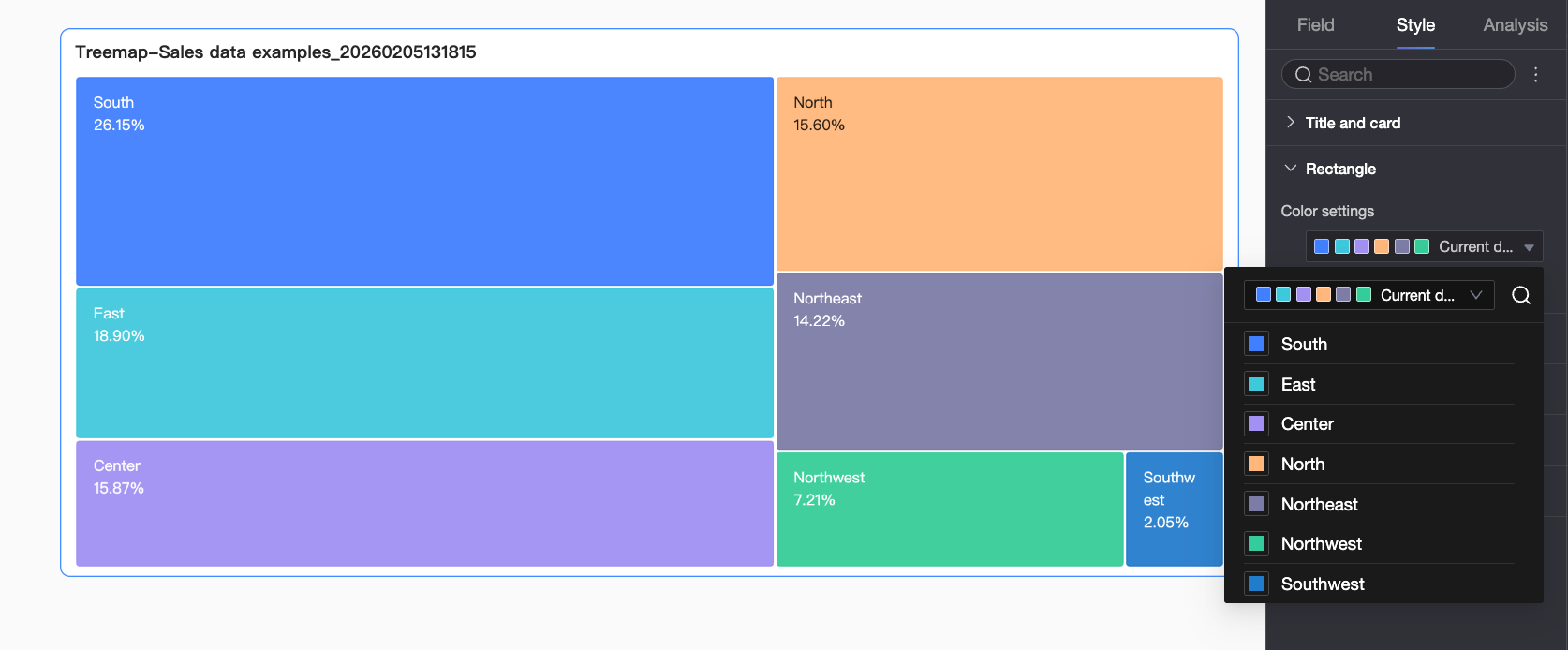
 icon to enable the chart legend and configure its style.
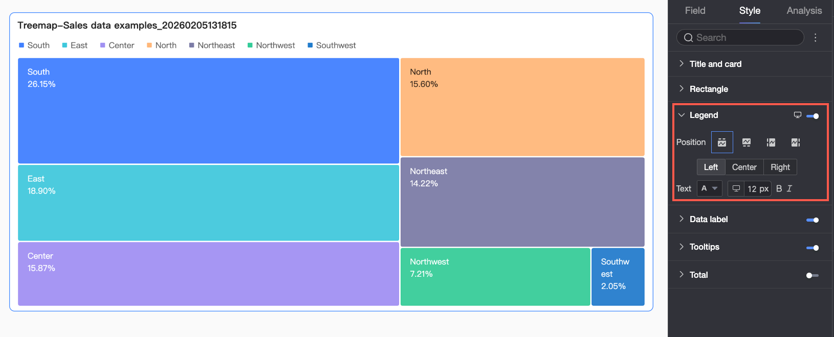
 ) at the top of the dashboard edit page.
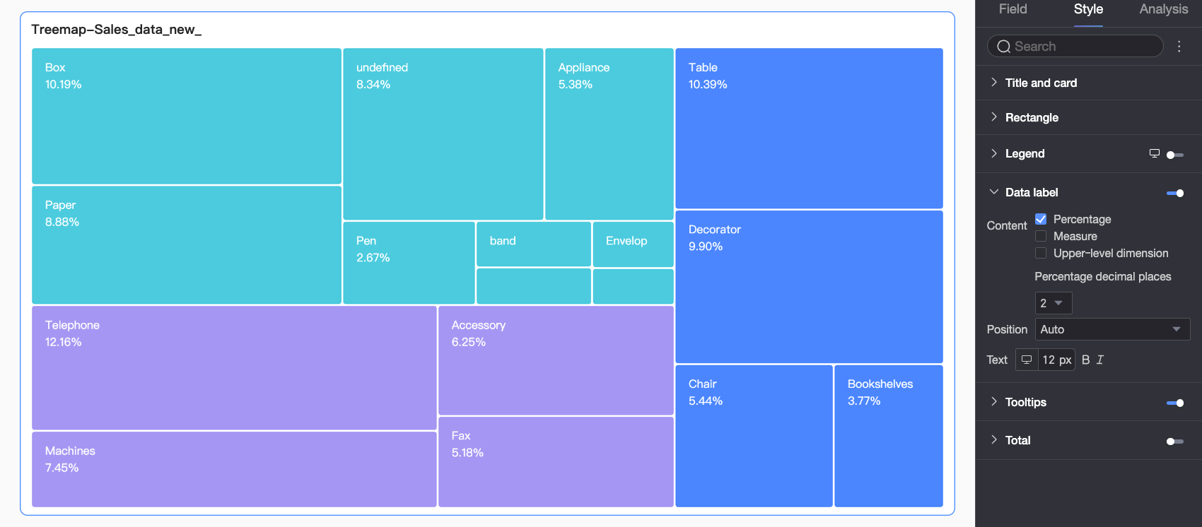
Advanced chart configuration
Parameter | Description |
Filter Interaction | If you need to analyze data across different charts, you can enable Filter Interaction to link multiple charts. When you interact with one chart, the others update automatically. For more information, see Filter Interaction. |
Hyperlink | If you need to analyze data that is spread across multiple dashboards, you can use hyperlinks to link them together for data analysis. Hyperlinks include three types: internal navigation, links to in-page components, and external links. For configuration details, see Hyperlinks. |
Annotation | If chart data shows anomalies or requires special attention, you can add an annotation. Annotations can be color highlights, icons, comments, or data points that help you identify issues and take action. For more information, see Annotation. |
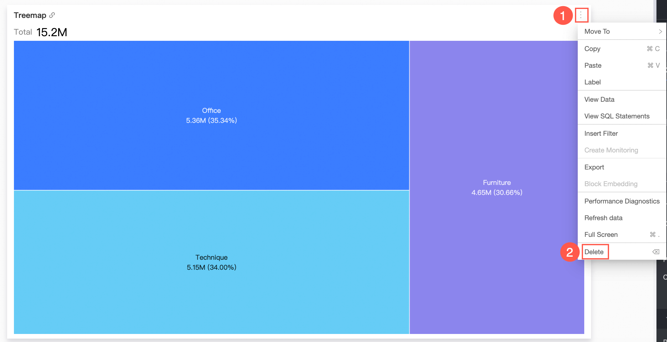
Delete chart
To delete a chart, follow the steps shown in the figure.
Next steps
To let specific users view your dashboard, share it with them. For more information, see Share a dashboard.
To create a comprehensive analysis report with navigation menus, you can integrate a dashboard into a data portal. For more information, see Create a PC data portal.