The multi-dimensional analysis table extends trend analysis by introducing dimension fields. You can analyze measure trends across time granularities (day, week, month) while gaining insights from business perspectives such as region, product category, or channel. By examining data across dimension combinations at the same point in time, you can perform multi-angle business or user behavior analysis.
Chart overview
Use cases
A trend analysis table shows how measures change over time. A multi-dimensional analysis table adds dimension fields, letting you analyze combined data effects across different dimensions at the same point in time.
Example

Key advantages
-
Multi-dimensional cross-analysis: Supports the simultaneous use of time and multiple business dimensions for cross-analysis.
-
Combines trends and structure: Displays time-based trends while also revealing the data structure across different dimensions.
Limitations
-
Prerequisites
-
You have modeled your data. The dataset must contain a date field with daily granularity, such as Order Date (day). For more information, see Create a dataset.
-
You have created a dashboard. For more information, see Create a dashboard.
-
-
Field configuration limits
-
The number of columns depends on the date field and the number of time periods. You can select only one date field with daily granularity, and the number of time periods cannot exceed 100.
-
The number of rows depends on the number of dimension values and measure fields. You must select at least 1 dimension and no more than 10 dimensions. You must select at least 1 measure and no more than 50 measures.
-
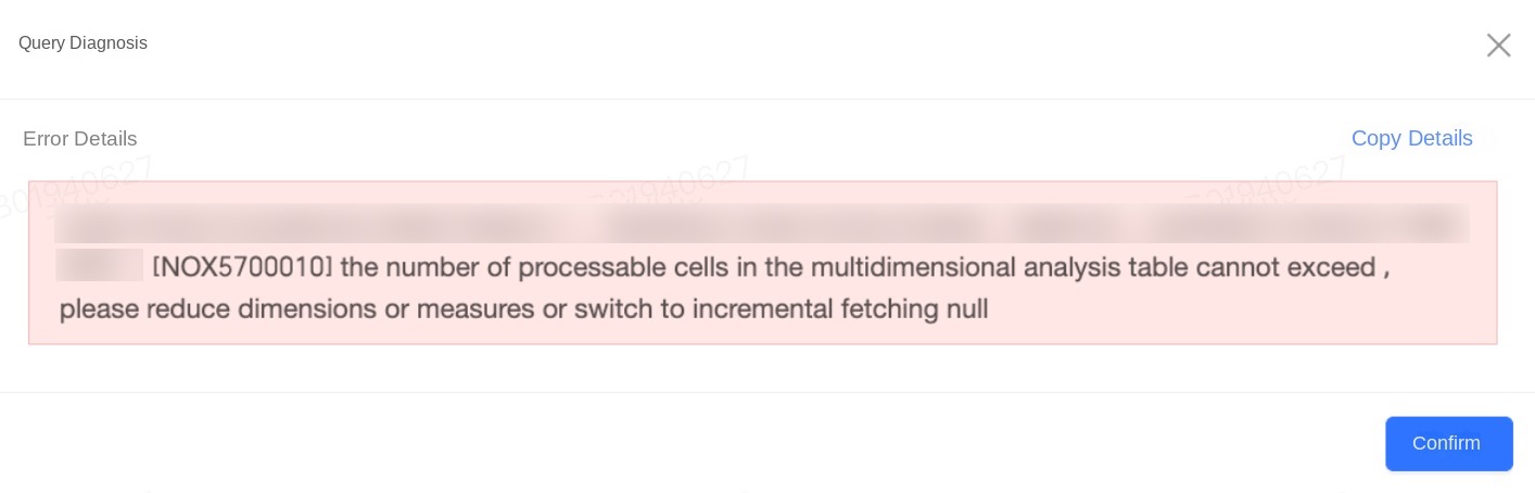
The number of measures multiplied by the number of dimension values in the chart cannot exceed 200,000.
-
The total number of cells in the chart cannot exceed 2,000,000.
-
-
Calculation limits: The "Display xxx rows" setting only affects front-end display and does not reduce backend cell calculations. If the table returns an error because the cell count or "dimension values × measures" count exceeds the limit, reduce the number of dimension and measure fields, or change the data retrieval mode to "Incremental".
Procedures
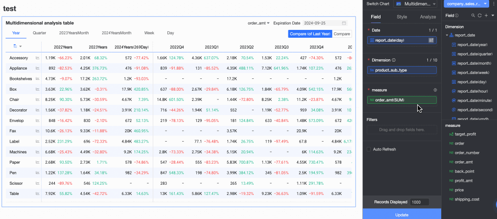
Configure chart fields
-
On the Chart Design panel, go to the Fields tab and select the dimension and measure fields you need.
-
From the Date list, find a field with the Date (day) dimension, and then double-click it or drag it to the Date area.
-
From the Dimensions list, find the dimension fields you need, and then double-click them or drag them to the Dimensions area.
-
From the Measures list, find the measure fields you need, and then double-click them or drag them to the Measures area.
-
-
Configure sorting, aggregation methods, advanced calculations, and other settings for the chart fields based on your analysis needs. You can sort a measure field within a specified time period, as shown in the following figure.
For more information about configuring chart fields, see Configure chart fields.
-
Click Update. The system automatically updates the chart.

Chart style
-
On the Style tab, configure the style of the multi-dimensional analysis table. For information about general style settings, see Configure the chart title section.
You can enter keywords in the Search box at the top of the configuration pane to quickly find a configuration item. You can also click the
 icon on the right to Expand/Collapse All categories.
-
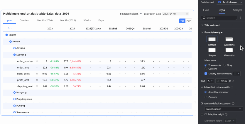
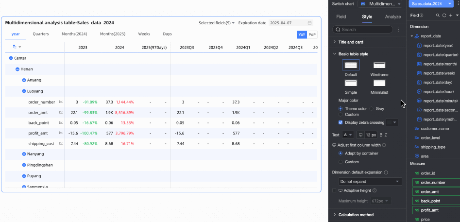
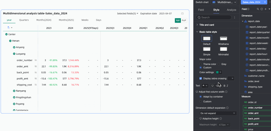
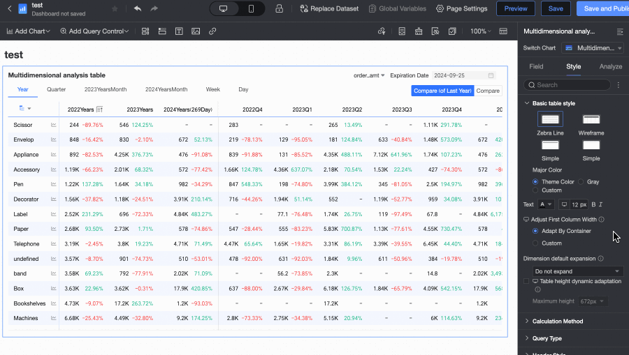
In the Basic table styles section, configure the basic style properties of the table.
Parameter
Description
Customize table theme
Sets the table appearance.
-
Theme style: Supported types: Default, Wireframe, Simple, and Minimal.
-
Primary color scheme: For tables with a Default, Wireframe, or Simple theme, the available primary color schemes for the multi-dimensional analysis table are Theme Color, Gray, and Custom.
-
Show zebra stripes: Choose whether to display zebra stripes in the multi-dimensional analysis table and set their color.
First column width adjustment
Set the first column width. Toggle the preview mode
at the top of the page to configure the width for PC and mobile separately. The following adjustment methods are supported:-
Auto-fit to container: The system automatically adjusts the column width based on the field values.
-
Custom: Set the display width of field values. The unit is pixels, and the default value is 160.
-
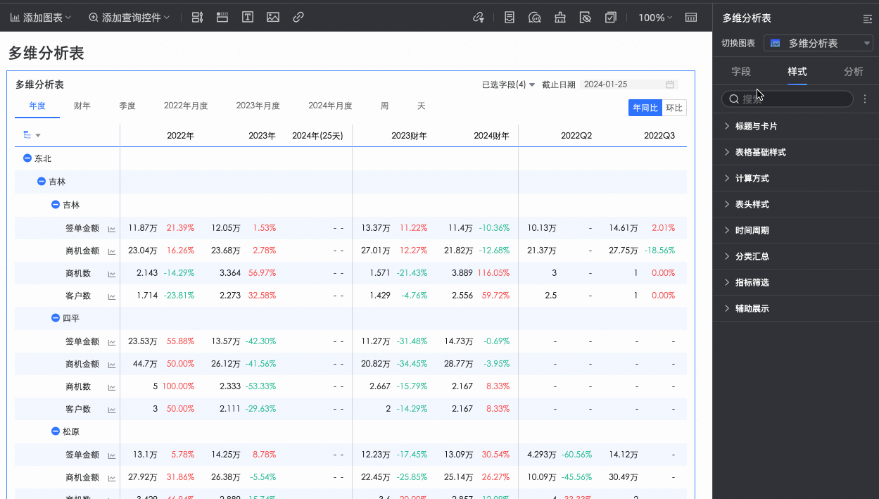
Default dimension expansion: You can configure the number of dimension expansion levels. The maximum number of levels is 3. This setting takes effect on both PC and mobile.
Dynamic table height adaptation
Specify whether the table height adjusts automatically based on content.
Toggle the
icon at the top of the page to configure height adaptation for PC and mobile separately. When enabled, the table container height adjusts based on data content, which may affect the overall report layout.Maximum height
When dynamic table height adaptation is enabled, you can set the maximum adaptive height. If the adaptive height exceeds this value, the table uses the maximum height; otherwise, it uses the adaptive height.
Toggle the
icon at the top of the page to configure maximum height for PC and mobile separately. The following height options are supported: 192px (approximately 5 rows), 352px (approximately 10 rows), 672px (approximately 20 rows), 1632px (approximately 50 rows), and Custom. -
-
In the Calculation Method section, set the calculation method for the multi-dimensional analysis table.
Parameter
Description
Calculation Method
Sets the table calculation method.
-
The available calculation methods are Average/Cumulative and Standard Calculation. The default is Average/Cumulative.
NoteFor more information about the data sources that support Standard Calculation and Average/Cumulative, see Data Source Feature List.
-
Clicking Average/Cumulative opens additional configuration settings. Switching to Standard Calculation does not.
NoteStandard Calculation: Quick BI uses the aggregation method configured for a metric to perform calculations within a date range. This range can have a weekly, monthly, quarterly, yearly, or custom granularity. For example, for a monthly range, the calculation is
monthly cumulative numerator / monthly cumulative denominator. This method is useful for analyzing how data changes over time. -
Select Enable Average/Cumulative Toggle. Toggle buttons for Average and Cumulative appear in the upper-right corner of the chart. The button color matches the Primary Color Scheme setting for the table.
Select the Customize Average/Cumulative Toggle checkbox to manually set the Average/Cumulative calculation method for each measure.
-
-
For Data Retrieval Mode, select either full data retrieval or incremental data retrieval.
-
Full data retrieval: The table retrieves all data at once when it loads. The number of retrieved records is limited by the display setting in the field panel, up to a maximum of 10,000. Data beyond this limit is not retrieved. This mode is suitable for small datasets or tables with simple structures.
-
Incremental data retrieval: After the table's initial data load, expanding a new node triggers a new data retrieval. Each retrieval is limited by the display setting in the field panel, up to a maximum of 10,000 records. However, the total number of retrieved records can exceed this limit through multiple retrievals. This mode is suitable for large datasets or tables with complex structures.
-
-
In the Header Style section, configure the styles for row and column headers.
Option
Setting
Description
Column Header
Background Fill
Set the background fill color for the column header.
Text
Set the text style for the column header.
Row Header
Background Fill
Set the background fill color for the row header.
Text
Set the text style for the row header.
-
In the Time Period section, configure the period switch and the default end date.
Parameter
Description
Time Period Switch
Switch between periods such as Year, Quarter, Month, Week, Day, and Fiscal Year. Periods with a Custom Time Granularity are also supported.
Note1. Configure the Fiscal Year Start Month. Select a month from 1 to 12. The default is April.
2. Defining a Week range: To define a custom week when the calculation method is Standard Calculation or the aggregation method is Start Time or End Time, download the function script and run it on the corresponding data source.
For a list of data sources that support custom weeks (week start time), see List of data source features.
Default End Date Value
Configure the Show Date Filter option and set a default value. Select the Show Date Filter checkbox. The End Date text appears in the upper-right corner of the chart.
Set the End Date Value to T-X, Custom Date, or Associate with Filter.
-
T-X: The end date is set to X days before the current date (Today). X must be a positive integer. For example, if X is 1 and the current date is 2024-01-16, the end date is 2024-01-15.
-
Custom Date: Set a custom end date as needed.
-
Associate with Filter: Links the end date to the table's time-based filter. In preview mode, the value from the selected filter is automatically applied as the table's end date. This improves data analysis efficiency and is useful for controlling the data range of multiple trend or multi-dimensional analysis tables with a single filter control. The rules are as follows:
-
When you add a standard filter control to a dashboard, in the Associated Charts and Fields section, select the associated chart and its date field. Set the Display Type of the filter control to Date Picker.
-
If the Filter Method is Range, the Range Type cannot be Starts With. You must select a range type that includes a time that can be resolved to an end date. The end date is then set to the end of the specified range. For example, if the range is 2023-10-19 to 2023-11-30, the end date becomes 2023-11-30.
-
If the Filter Method is Single Day/Month/Year, the end date is set to the last day of the selected period. For example, the last day of 2024 or the last day of December.
-
If you select Associate with Filter but do not select a specific filter from the drop-down list, the end date defaults to the T-X value. For example, if the current date is 2024-12-13, the end date becomes 2024-12-12 (T-1).
-
Default Time Period
Set the Default Time Period. The first option on the left is selected by default.
-
-
Supports custom configuration of subtotals.
-
In Metric Filter, change the default selected value of a field as needed.
-
In the Auxiliary Display section, you can configure the Scrollbar Display Mode and Scrollbar Thickness.
-
When you set the display mode to Show on Hover, the scrollbar appears only when you move the mouse pointer over the table.
-
Select Always Show to make the scrollbar permanently visible.
-
To make the scrollbar more prominent, adjust the Thickness.
-

 icon at the top of the page to configure height adaptation for PC and mobile separately. When enabled, the table container height adjusts based on data content, which may affect the overall report layout.
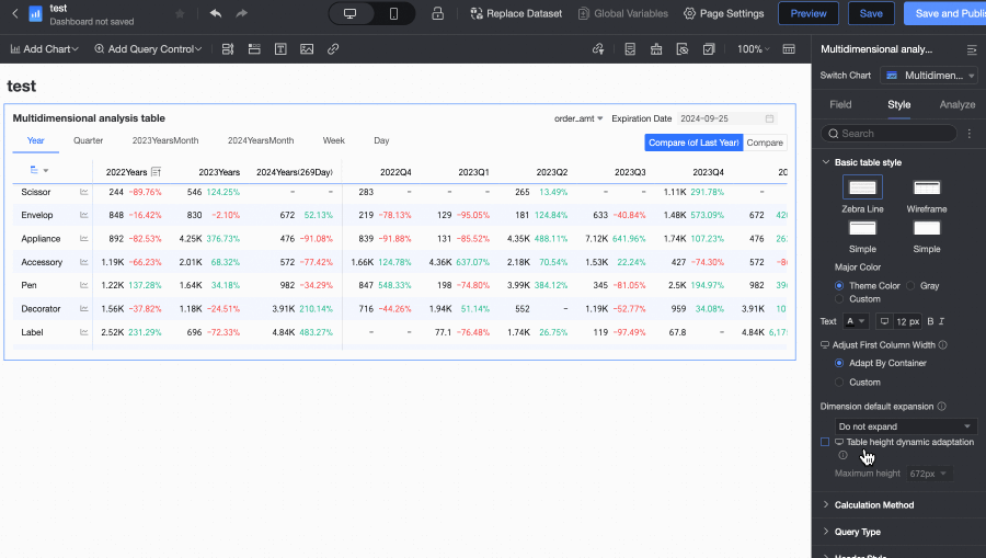


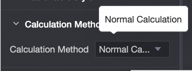
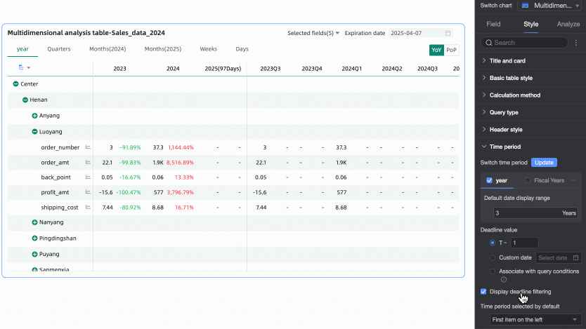

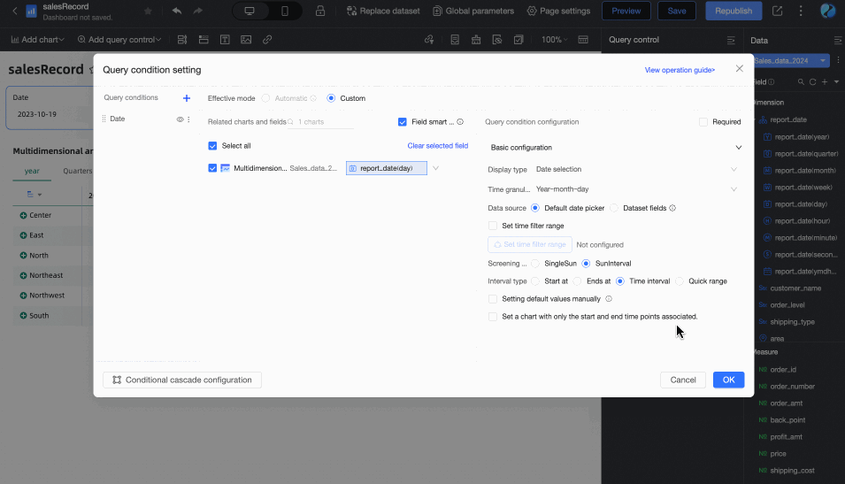
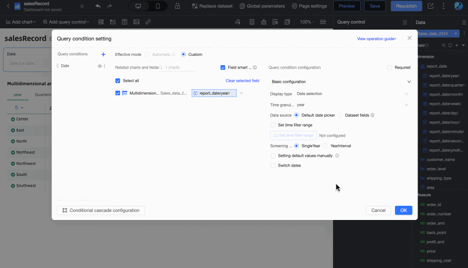
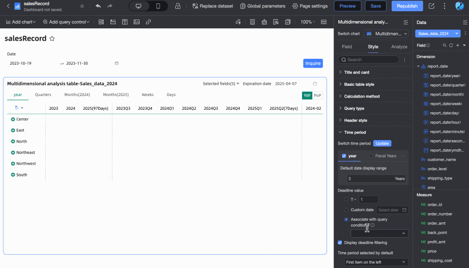
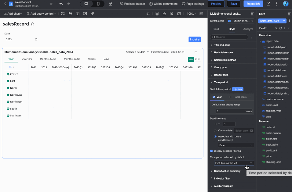

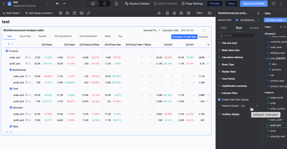
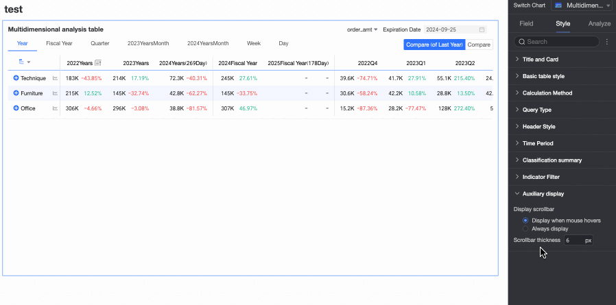
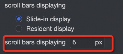
Chart analysis configuration
-
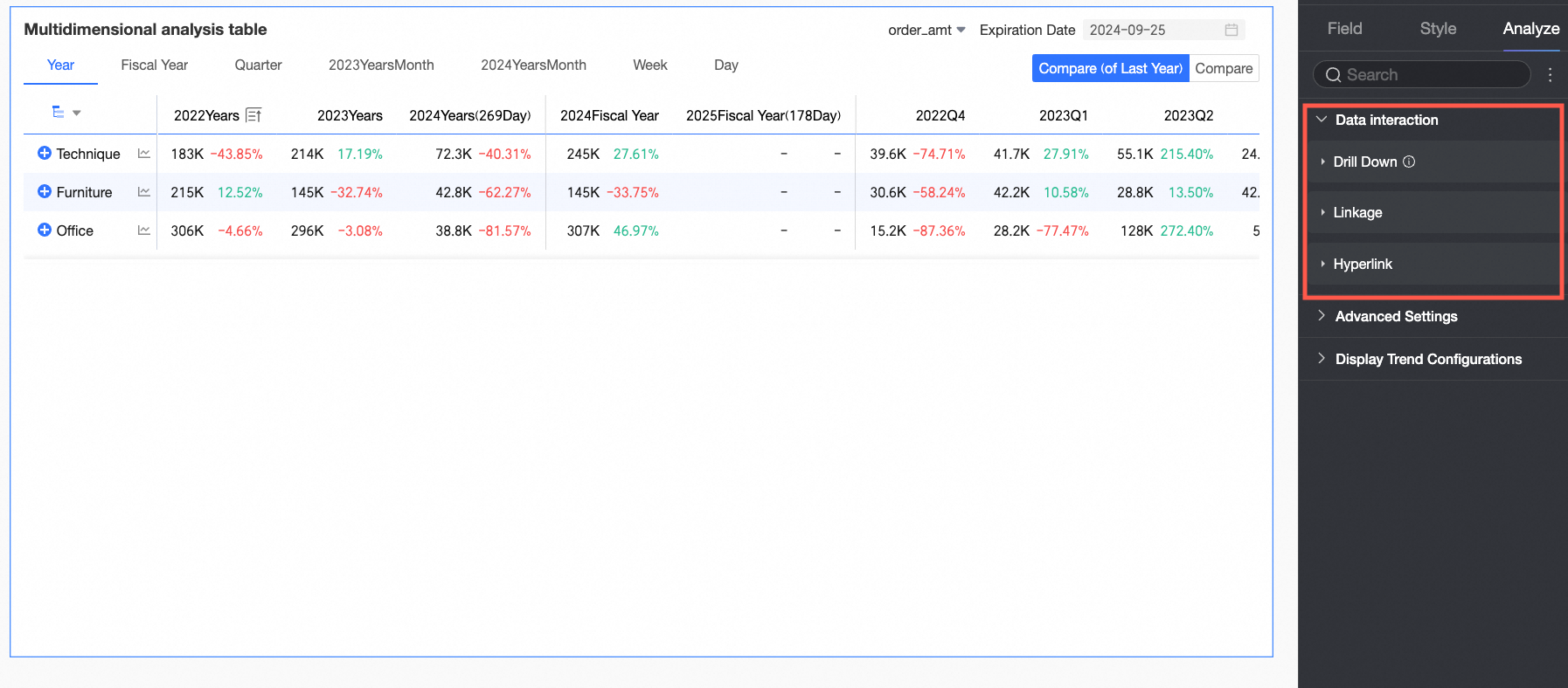
On the Analysis tab, under Data Interaction, the multi-dimensional analysis table can only receive interactions from other charts.
-
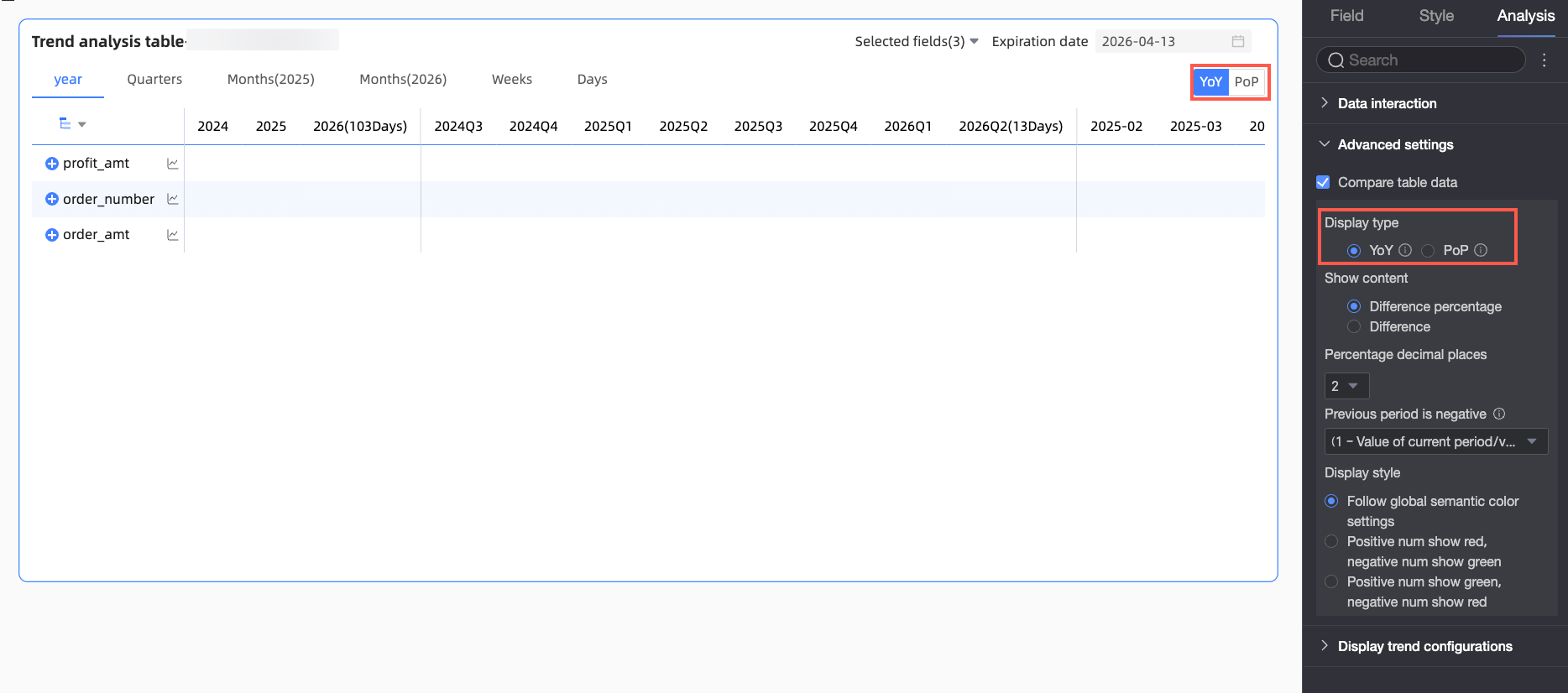
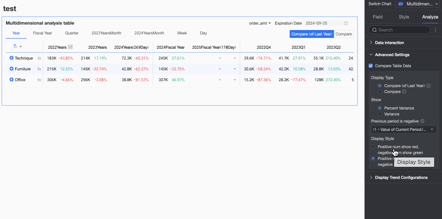
On the Analysis tab, under Advanced Settings, configure data comparison for trend analysis.
Select the Enable table data comparison checkbox. Year-on-year and Month-on-month options are added to the upper-right corner of the chart.
-
Display Type: Supported comparison types include Year-on-year and Month-on-month.
NoteBecause the date field has daily granularity, the chart supports year-on-year and month-on-month comparisons for daily, weekly, monthly, quarterly, yearly, and custom ranges. Select the comparison content as needed.
-
Display Content: Supported content includes Difference percentage and Difference.
-
Difference = Current period data - Previous period data
-
Difference percentage = [(Current period data - Previous period data) / Previous period data] × 100%
NoteConfigure the number of decimal places for the percentage to 0, 1, or 2. This setting is available when you select Difference percentage, or when you select Difference and select the Calculate difference for percentage metrics pt checkbox.
-
-
Display Style: Configure the display style for positive and negative numbers. Options include Follow global semantic color settings (which uses the settings in Page Settings > Global Style > Semantic Colors), Positive numbers are red, negative numbers are green, and Positive numbers are green, negative numbers are red.
-
Configure trend analysis
In the chart, click the trend icon (① in the figure below), and you can see the trend analysis chart for the metric (②).

You can configure a trend analysis chart in Pop-up Trend Settings on the Analysis tab in Chart Design.

|
Configuration |
Description |
|
Enable daily trend and Enable monthly trend |
Lets you view the daily and monthly trends of a metric on the trend analysis chart. |
|
Data comparison analysis |
Includes Same period last year, Same period last month, Same period last week, Previous day, and Custom date.
|
|
Special value and other analysis |
Includes Remove peaks, Average line, and Normalization. Analyzes special values to help you evaluate data and make decisions. |
|
Compare metrics, Compare dimensions |
Lets you select multiple metrics or dimensions at the same time for data analysis.
Note
If you configure comparison dimensions, the comparison period and reference lines are disabled. |

Chart preview configuration
Adjust the table appearance in preview mode to improve data viewing efficiency.
Hide empty value columns
When previewing, operations such as time filtering can create empty columns whose data falls outside the selected time range. Use the hide empty columns feature to quickly remove these from view. You can choose to Hide a single column or Hide all empty value columns.
-
Hide all empty value columns: Click any column header and select Hide all empty value columns from the drop-down list. This action hides all columns where every displayed cell is empty (shown as '-').
Click the
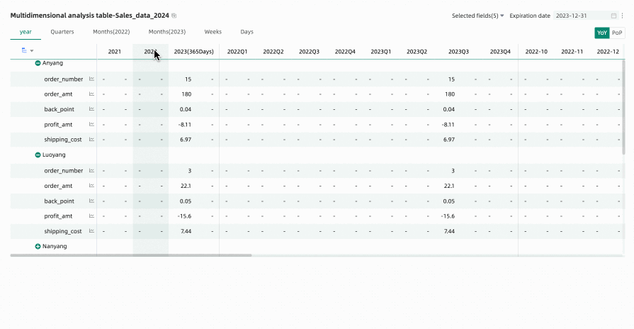
icon to unhide specific columns. To unhide all columns, click any column header and select Show all hidden columns from the drop-down list.NoteUnexpanded rows are not included in the empty value check. For example, the Anyang row in the following figure.
-
Hide a single column: To temporarily hide a specific column when editing or previewing a multi-dimensional analysis table, click the column header and select Hide Column from the drop-down list.
Click the
icon to unhide the column.
 icon to unhide specific columns. To unhide all columns, click any column header and select Show all hidden columns from the drop-down list.
Restore default filter fields
Use the field filter panel to select which metrics to display. To restore defaults after changing the selection, click the  icon in the upper-right corner of the table or click Restore Default in the upper-right corner of the field filter panel.
FAQ
1. What is the main difference between a multi-dimensional analysis table and a trend analysis table?
A: The main difference is the use of dimensions. A trend analysis table shows how one or more measures change over time. In contrast, a multi-dimensional analysis table adds dimension fields. These fields let you perform deeper cross-analysis by observing measures from different business dimensions, such as region or product line, over time.
2. How do I view year-on-year and month-on-month data in a multi-dimensional analysis table?
A: In chart edit mode, go to the Analysis tab. Under Advanced Settings, select Enable Table Data Comparison. Then, select the comparison type, such as year-on-year or month-on-month, and the content to display, such as difference or difference percentage. Configure the display style as needed. After you complete the configuration, a toggle button for year-on-year and month-on-month comparisons appears in the upper-right corner of the chart in preview mode.
3. What can I do if my chart loads slowly after I add many dimensions?
A: First, check if the number of dimensions exceeds the recommended limit of 10. Too many dimensions significantly increase the database query load. Also, try changing the data retrieval method. Go to Style > Data Retrieval Method and change the setting from full data retrieval to incremental data retrieval. In incremental data retrieval mode, the chart does not load all data at once. Instead, it loads data in steps as you expand dimension nodes. This improves performance when you work with large amounts of data or complex structures.
4. How can I quickly hide columns that only contain null values ("-") in preview mode?
A: In preview mode, hover over any column header and click the drop-down arrow that appears. In the menu, select Hide All Null Value Columns. The system automatically finds and hides columns where all visible cells are null. You can also restore the hidden columns using the prompt that appears above the chart.