A filled map uses color shading to represent the magnitude and distribution of data across geographical areas. You can add data to a filled map and configure its styles to visualize regional patterns.
Prerequisites
-
You have created a dashboard. For more information, see Create a dashboard.
-
You have converted the fields for geographical areas. For more information, see Configure fields.
NoteFor example, if the geographical area field you want to add to the chart is named area, you can add the field only after it is converted to a geographical information type. The
 icon appears next to the field name to confirm the conversion. For a detailed list of regions, see public-area-info.xlsx. This file is for geographical area matching reference only and does not represent the political position of Quick BI.
Limitations
A filled map consists of a Geo Location (Dim.) and a Colorscale (Mea.):
-
The geographical area is determined by a dimension. You must select one dimension, and it must be a geographical information type, such as a province.
-
The color saturation is determined by measures. You must select at least one measure and up to five measures, such as order amount and profit amount.
Overview
Use cases
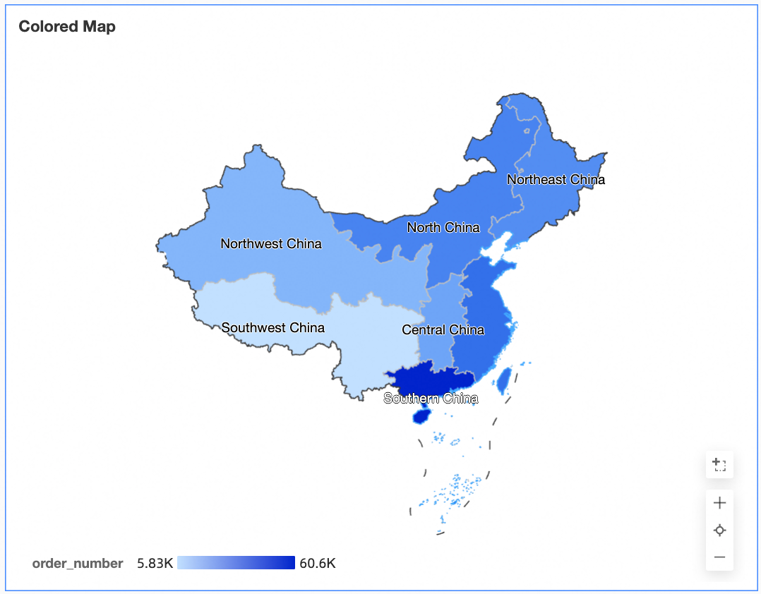
Filled maps are ideal for visualizing spatially distributed data. They work best with datasets that contain geographical information, displaying aggregated, continuous data for specific regions. Shape positions represent geographical locations, and color mapping shows data distribution across those locations.
Benefits
-
Visual effects: Supports area-based map styles.
-
Interactive operations: You can zoom in by selecting an area, switch between measures, and filter within the component.
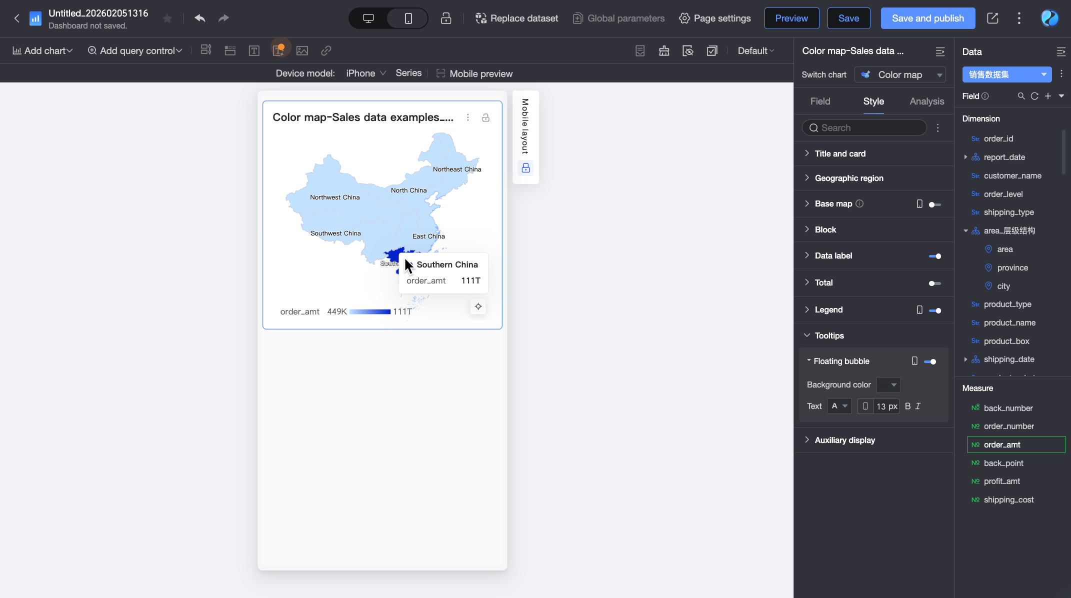
Example visualization
Animated example
Configure chart data
-
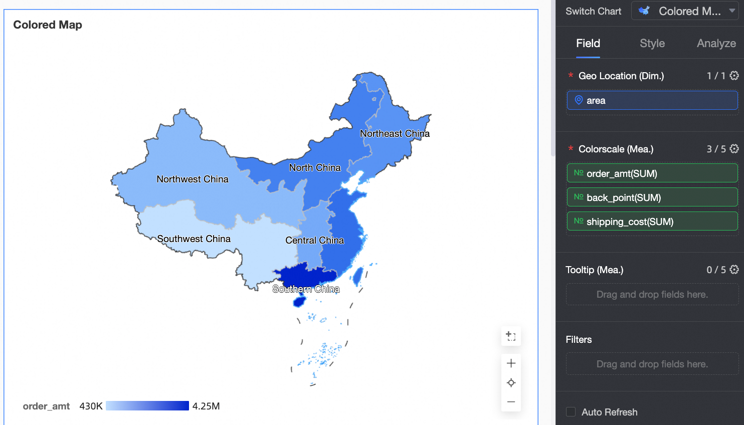
On the Data tab, select the required dimension and measure fields:
-
From the Dimensions list, find the area field and double-click it or drag it to the Geo Location (Dim.) field.
-
From the Measures list, find the order amount, profit amount, and shipping cost fields, and then double-click them or drag them to the Colorscale (Mea.) field.
-
-
Click Update. The chart updates automatically.
 Note
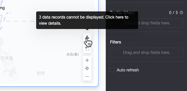
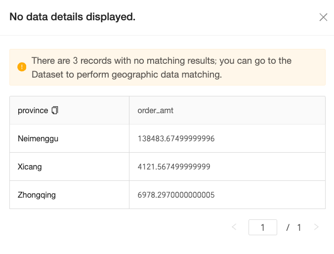
NoteIf area values in your data do not match the standard geographical names supported by the system, a notification icon appears in the lower-right corner of the chart. Click the icon to view details about unmatched data and troubleshoot data issues.
-
On the Unmatched Data Details pane, view the unmatched data details and copy them with a single click. Then go to the Configure fields page of the dataset to batch add or process the copied content for faster data correction.

-
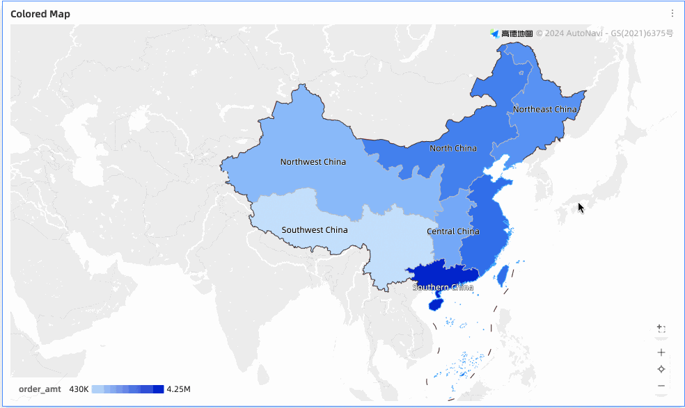
After you complete the configuration, the map displays the data correctly.
-
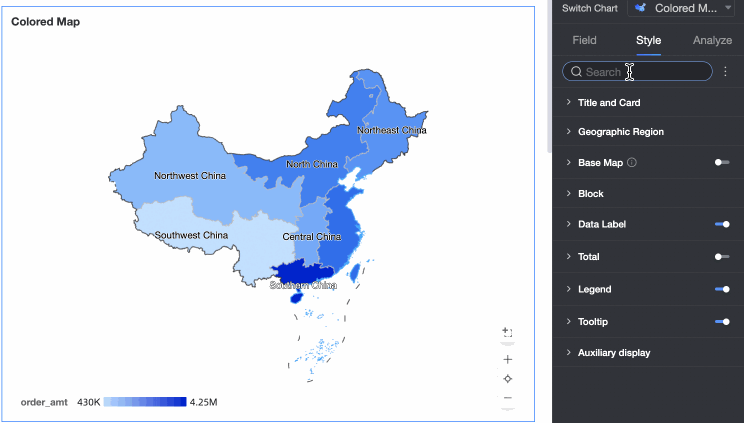
Configure chart styles
For common style settings, see Configure the chart title area.
You can enter a keyword in the search box at the top of the configuration pane to quickly find a configuration item. You can also click the  icon to Expand/Collapse All Categories.
Geographical area
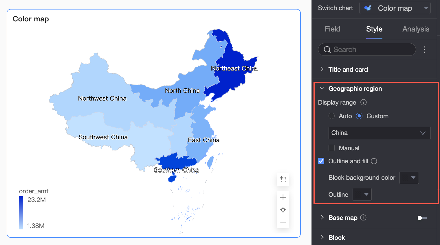
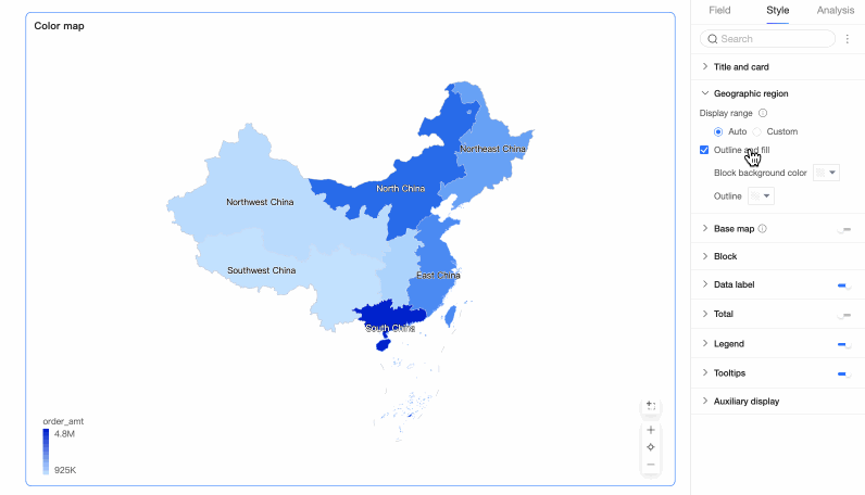
In the Geographical area section, configure Display range and Border and fill.
-
Display range: You can select Auto or Custom. This example uses China.
Note-
Auto adjusts the map view based on the data range. Custom allows you to set the range manually. In interactive analysis scenarios, the map is always automatically displayed based on the data range.
-
The custom display range currently supports continents and countries globally, as well as regions, provinces, and cities in China.
If you enable Manual adjustment, the current Center point and Zoom level are automatically generated, which you can then modify.
-
-
In the Border and fill section, configure whether to show borders and areas, set the area fill color, and set the border line color.
NoteBorders are not supported for some regions.


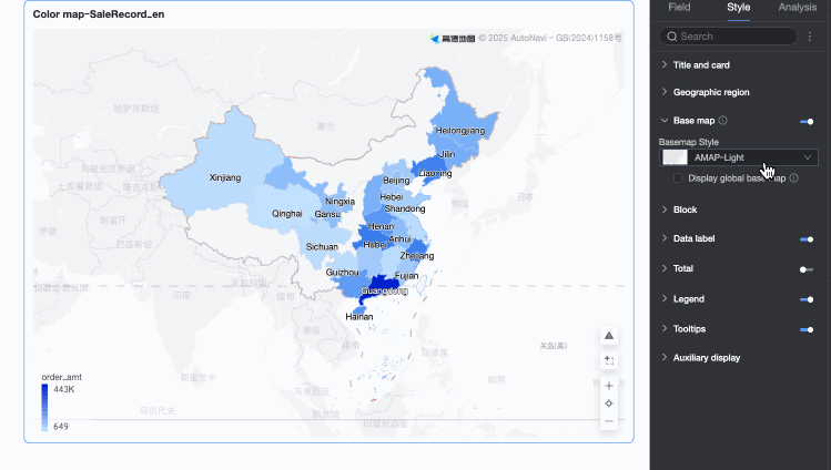
Basemap
In the Basemap section, configure whether to Show basemap, the Basemap style, and whether to Show global basemap.
-
Show basemap: Click the
switch to show or hide the basemap. -
Basemap style: Multiple Amap basemap styles are available.
-
Show global basemap: Enable this option to display global information such as cities on the basemap.
NoteGlobal basemap usage limit: Each Quick BI organization can preview map charts containing the global basemap up to 1,000 times per month, calculated by the number of basemap tile initializations. If the limit is exceeded, the map chart displays only the Chinese mainland basemap.
-
Mobile basemap settings: Click the mobile icon (
) at the top of the page to switch to the mobile view. You can enable the basemap for the mobile filled map and configure its Basemap style and whether to Show global basemap.
 switch to show or hide the basemap.
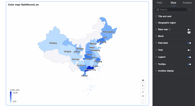

 ) at the top of the page to switch to the mobile view. You can enable the basemap for the mobile filled map and configure its Basemap style and whether to Show global basemap.
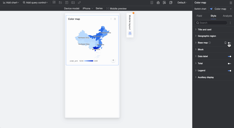
Areas
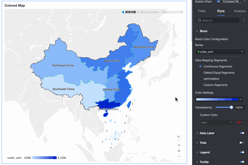
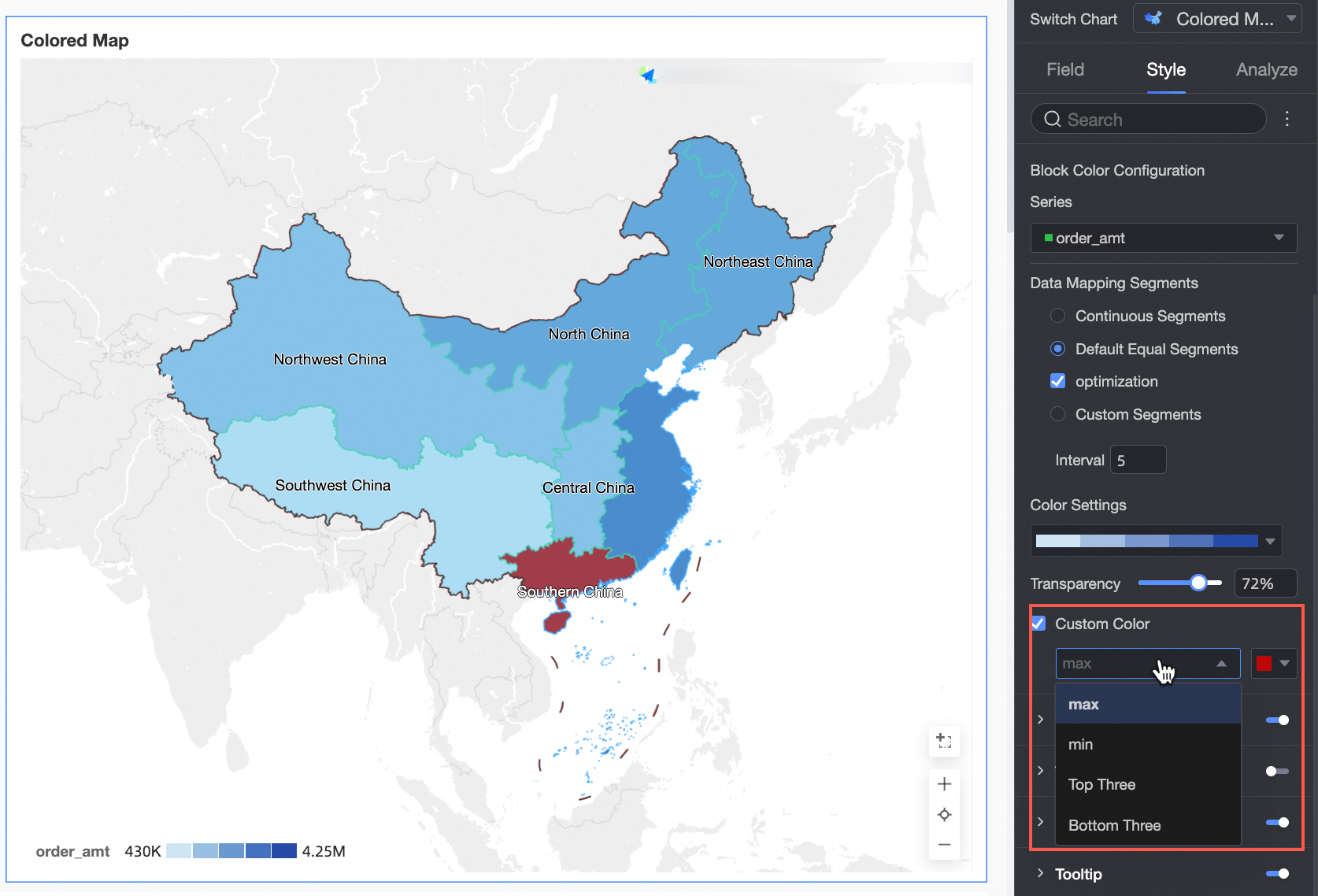
In the Areas section, configure Area color configuration and Custom color.
-
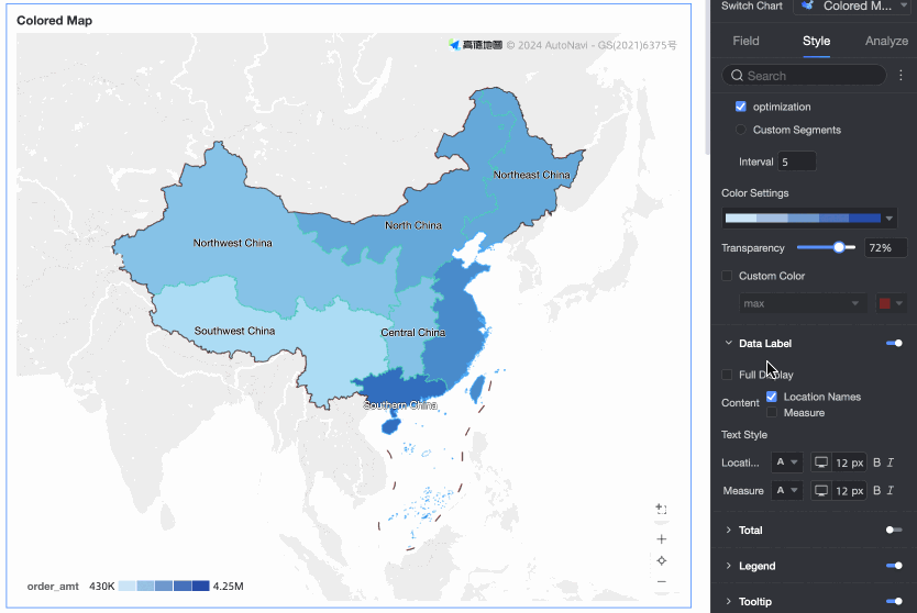
Area color configuration: Select a measure series and configure the theme color, opacity, and data mapping range.
-
Custom color: Configure and mark colors for the maximum value, minimum value, top three, and bottom three.
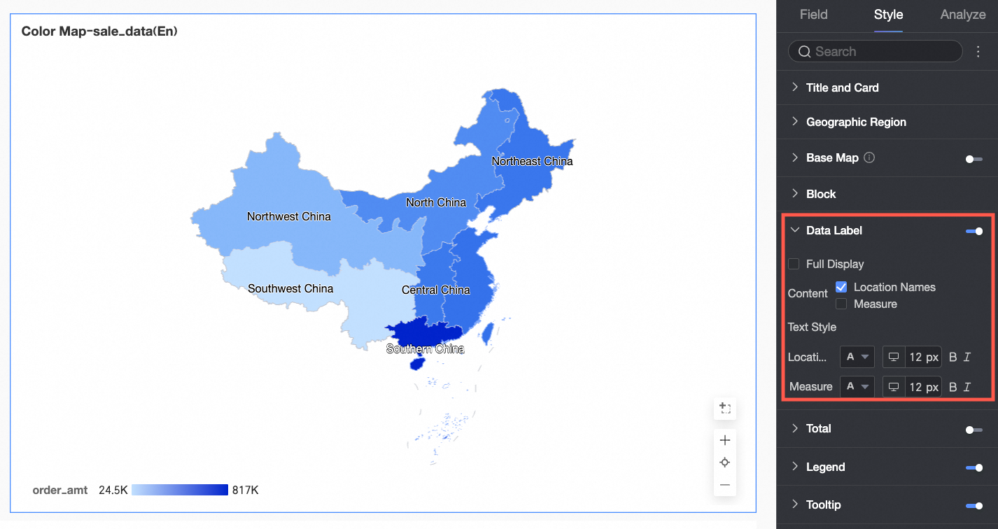
Data label
In the Data label section, configure whether to show data labels and their styles.
-
Content: You can show the Area name and Measure at the same time. If you select Full display, all data labels are shown.
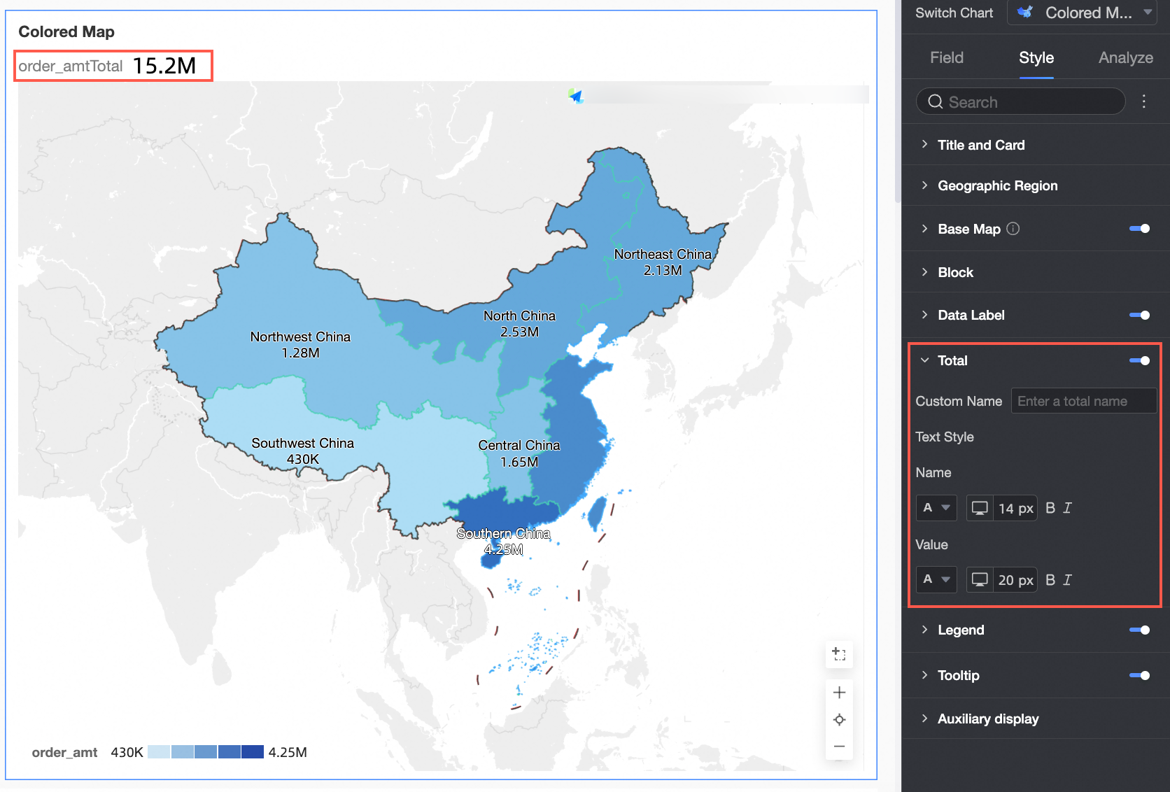
Total
In the Total section, configure whether to show the total, and set its Custom name and Style.
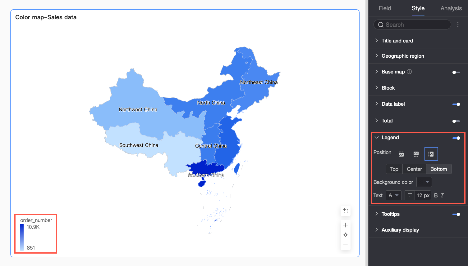
Legend
In the Legend section, click the  icon to enable the chart legend and configure its style.
|
Parameter |
Description |
|
Position |
Set the display position and alignment of the legend.
|
|
Background color |
Set the background fill color for the legend. |
|
Text |
Set the text style for the legend, including font color, size, weight, and whether it is italicized. |
|
Mobile legend configuration |
PC and mobile legend settings are independent. Use the toggle button ( |
 ) at the top of the dashboard edit page to switch between views and configure each separately. You can customize the position, background color, and text style for the mobile legend.
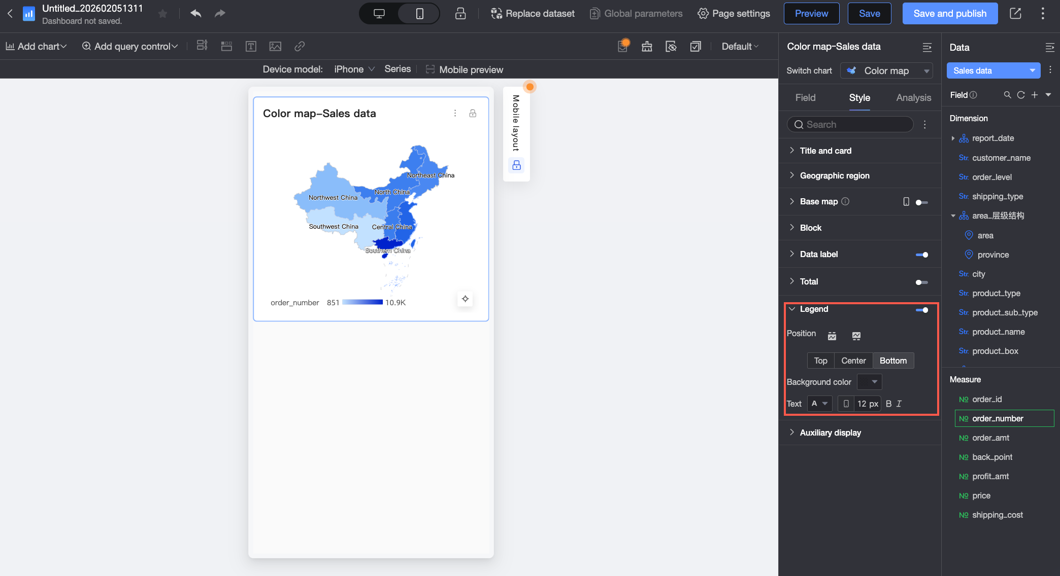
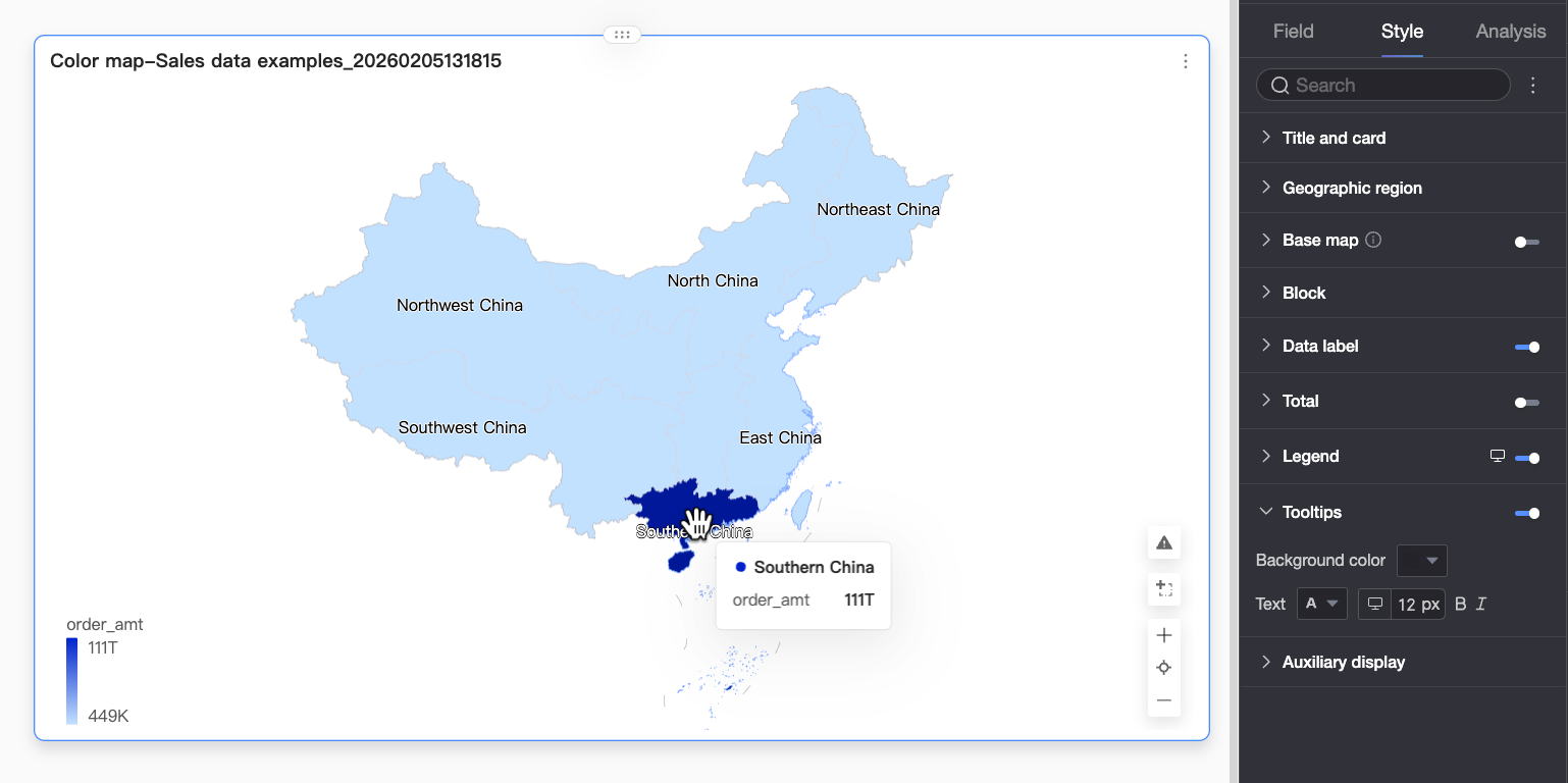
Tooltip
In the Tooltip section, click the icon to enable tooltips and configure their style.
|
Parameter |
Description |
|
Background color |
Set the background fill color for the tooltip box. |
|
Text |
Set the text style for the tooltip box, including font color, size, weight, and whether it is italicized. |
|
Mobile tooltip |
PC and mobile tooltip switches are independent. Use the toggle button ( |
Functionality settings
In the Functionality settings section, enable Indicator Filter to configure which measure items to display.
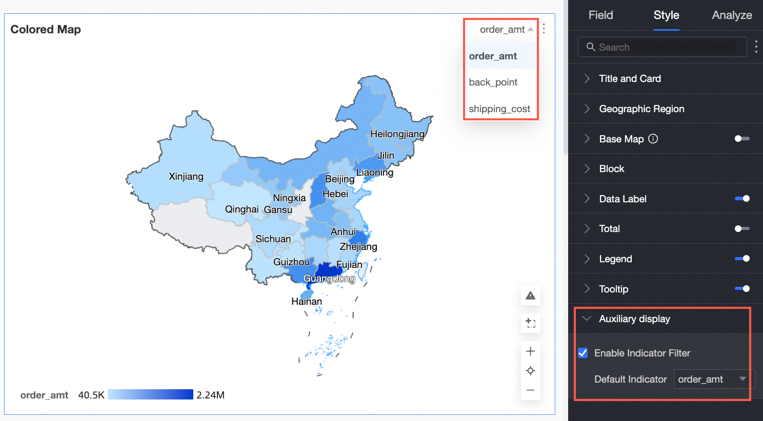
Chart analysis
|
Parameter |
Name |
Description |
|
Data interaction |
Drill down |
If you have already configured drill-down fields in the data pane, you can configure the display style for drill-down levels here. For more information, see Drill Down. |
|
Filter interaction |
To link multiple charts for cross-chart data analysis, use filter interactions. For more information, see Filter Interaction. |
|
|
Hyperlink |
To link multiple dashboards for cross-dashboard data analysis, use hyperlinks. Hyperlinks include two types: Parameter and External Link. For more information, see Hyperlink. |
|
|
Annotation |
- |
When chart data is abnormal or needs attention, use color highlighting, icons, comments, or data points for annotation to help you identify issues and take action. For more information, see Annotation. |