This topic describes the chart styles and configuration items for the pivot table widget.
Chart style
A pivot table is a type of table widget that supports custom data display. It clearly presents data in a table format within a visualization application.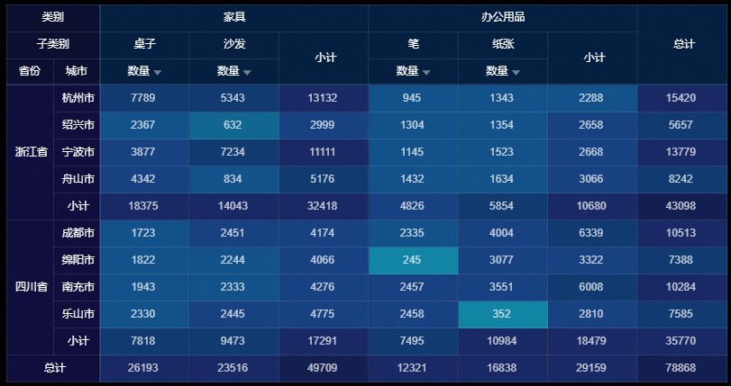
Configuration panel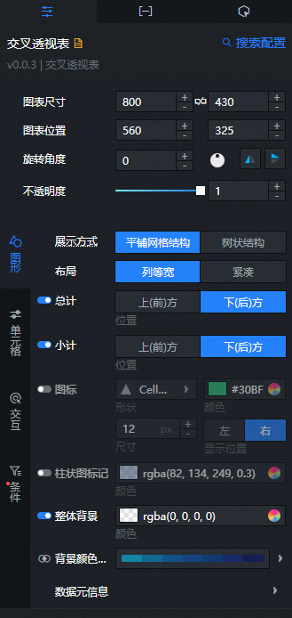
- Search for Configurations: In the right-side panel of Canvas Editor, click the Settings tab, and click Search for Configurations in the upper-right corner. Enter the required configuration item in the search box, and click the search icon to quickly locate the configuration item. Fuzzy match is supported. For more information, see Search for Configurations.
- Size: indicates the size of a widget, including its pixel width and height. You can click the
 icon to proportionally adjust the width and height of a widget. After you click this icon again, you can adjust the width and height as needed.
 - Position: the position of a widget, which is indicated by pixel X and Y coordinates. X-coordinate indicates the pixel distance between the upper-left corner of the widget and the left border of the canvas. Y-coordinate indicates the pixel distance between the upper-left corner of the widget and the upper border of the canvas.
- Rotation Angle: the angle of a rotation that uses the center point of a widget as the rotation point. The unit is degrees (°). You can use one of the following methods to control the rotation angle of a widget:
- Directly enter the degrees in the Rotation Angle spin box or click the plus sign (+) or minus sign (-) to increase or decrease the value in the Rotation Angle spin box.
- Drag the black dot in the
 icon.
icon. - Click the
 icon to horizontally flip a widget.
 - Click the
 icon to vertically flip a widget.
- Opacity: the opacity of a widget. Valid values: 0 and 1. If this parameter is set to 0, the widget is hidden. If this parameter is set to 1, the widget is completely displayed. Default value: 1.
 icon to vertically flip a widget.
Graphic
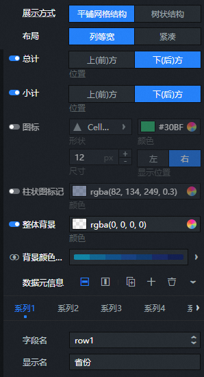
Display Mode: Specifies the display mode for table row headers. Valid values are Tiled grid structure and Tree structure.
Layout: Specifies the layout of the table. Valid values are Equal width columns and Compact.
Grand Total: Calculates and displays the grand total for the data in the table. Click
to show or hide the grand total. You can select Top (Front) or Bottom (Back) to specify the display position.Subtotal: This feature calculates subtotals for the data in the table. You can click the
icon to show or hide the subtotal and select Top (Front) or Bottom (Back) as the display position.Icon: An icon that indicates a month-over-month increase
or a month-over-month decrease of the data in the table. You can click to show or hide these icons.Shape: Specifies the shape of the icon.
Color: Specifies the color of the icon.
Size: Specifies the size of the icon in pixels.
Display Position: Specifies the position of the icon relative to the data in the table. Valid values are Left and Right.
Column Chart Mark: Specifies the background display of the column chart for data in the table. You can click
to show or hide the column chart mark. You can also customize the color of this mark.Custom Mark Range: Specifies the mark range of the column chart mark in the table. You can click
to enable or disable this feature.NoteTo use the Custom Mark Range feature, you must first enable Column Chart Mark.
Overall Background: Specifies the background color of the table header section. You can click
to enable or disable this feature.Background Color Mapping: Specifies the background color of the data section in the table. You can click
to enable or disable visual mapping.Mapping Type: The type of mapping for the background color. The options are Categorical, Continuous, and Discretized.
Color Template: Specifies the color template for the background color mapping.
Custom Mapping: Set custom value ranges based on your data. Available operations include add, delete, and reverse order.
NoteIf you cannot modify the Custom Mapping settings, confirm that the Custom Mapping switch is enabled.
Data Element Information: Specifies the display name for each row or column header in the table. You can click the
or icon on the right to add or delete a data element. You can click the or icon to configure the arrangement of multiple data elements.
Cell
Cell Size: Sets the width and height of the cell. Click
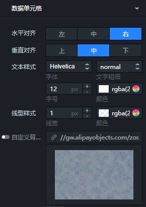
to enable or disable the Cell Size setting. Click the icon to add a width or height value, or click the icon to delete a value. Click the icon to arrange multiple width or height values vertically, or click the icon to arrange them horizontally. You can also drag the table lines to adjust the row height and column width.Data Cell: Specifies the alignment, text style, and line style of the data in the cell.
Parameter
Description
Horizontal Alignment
The horizontal alignment of the data. Valid values: Align Left, Align Center, and Align Right.
Vertical Alignment
The vertical alignment of the data. Valid values: Align Top, Align Center, and Align Bottom.
Text Style
The text style of the data, including the font, color, font size, and font weight.
Line Style
The line style of the data, including the line width and color.
Custom Background Image
The background image for the data.
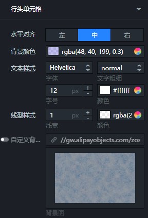
Row Header Cell: Specifies the alignment, background color, and text style of the data in the row header cell.
Parameter
Description
Horizontal Alignment
The horizontal alignment of the data. Valid values: Align Left, Align Center, and Align Right.
Background Color
You can set the background color for the data.
Text Style
The text style of the data, including the font, color, font size, and font weight.
Line Style
The line style of the data, including the line width and color.
Custom Background Image
The background image for the data cell.
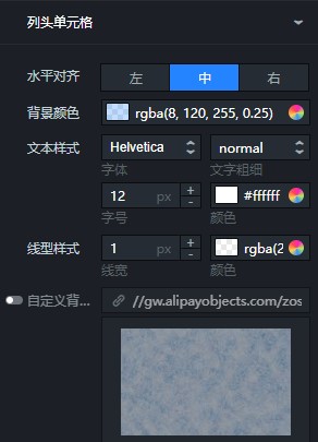
Column Header Cell: Specifies the alignment, background color, and text style of the data in the column header cell.
Parameter
Description
Horizontal Alignment
The horizontal alignment of the data. Valid values: Align Left, Align Center, and Align Right.
Background Color
Set the data background color.
Text Style
The text style of the data, including the font, color, font size, and font weight.
Line Style
The line style of the data, including the line width and color.
Custom Background Image
You can set the background image of the data grid.
Corner Header Cell: Specifies the alignment, background color, and text style of the data in the corner header cell.
Parameter
Description
Horizontal Alignment
The horizontal alignment of the data. Valid values: Align Left, Align Center, and Align Right.
Background Color
You can set the background color for the data.
Text Style
The text style of the data, including the font, color, font size, and font weight.
Line Style
The line style of the data, including the line width and color.
Custom Background Image
The background image for the data cell.
Line Separator: The line width and color of the separators in the table.
Drag Hotzone Line: Specifies the line type, thickness, color, length, and spacing of the drag line in the table.
NoteWhen the line type of the drag line is set to solid, the length and spacing settings are not available.
Interaction
Tooltip: Specifies the interaction information for the tooltip. You can click
to enable or disable this feature.Parameter
Description
Trigger Method
The trigger method for the tooltip. Valid values: Hover and Click.
Content Display
The content of the tooltip. Click the
or icon on the right to add or delete a piece of content information. Click the or icon to configure the arrangement of multiple pieces of content information.Content Spacing
The content spacing of the tooltip in pixels.
Content Text
The text style of the content, including the font, color, font size, and font weight.
Popup Background
The popup background of the tooltip.
Background Margin: The horizontal and vertical margins in pixels.
Background Color: The background color.
Border Style: The border style, including the line type, border radius, line width, and color.
Mark
The mark for the tooltip.
Shape: The shape of the mark.
Size: The size of the mark in pixels.
Custom Color: The color of the mark.
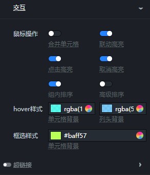
Interaction: Specifies the mouse operation, hover style, and marquee selection style for table interactions.
Parameter
Description
Mouse Operation
The type of mouse operation. Options include but are not limited to Merge Cells, Highlight Interaction, and Sort Within Group.
Hover Style
The Cell Background and Column Header Background when you hover the mouse pointer over them.
Marquee Selection Style
The cell background color when you select cells with the mouse.
Hyperlink
The hyperlink configuration style for the table. Click
to show or hide the hyperlink configuration.Text Color: The text color.
Fields Setting: The field, link URL, and other settings. Click the
or icon on the right to add or delete a hyperlink. Click the or icon to configure the arrangement of multiple hyperlinks.Link Field: Select the column to which you want to add a hyperlink.
Field Mapping: The field mapping for the column to which you want to add a hyperlink.
Redirect Link: The URL to which users are redirected.
Open in New Window: Specifies whether to open the hyperlink in a new window.
NoteYou can drag the table lines to adjust the row height and column width. When you select a range of cells, the sum of the selected cells is displayed.
Condition
Conditional Formatting: Specifies the conditional formatting for the pivot table. You can click
to show or hide the conditional formatting. You can click the or icon on the right to add or delete a conditional format. You can click the or icon to configure the arrangement of multiple conditional formats. You can click the icon to copy the currently selected conditional format configuration and add a new one with the same configuration. For more information about how to configure the styles, see Instructions on how to use the condition tree.Condition Name: Specifies the name of the conditional format. You can double-click to modify the condition name.
Text Color: Specifies the text color.
Background Color: Specifies the background color.
Icon: Specifies the shape and color of the icon.
 to show or hide the grand total. You can select Top (Front) or Bottom (Back) to specify the display position.
 icon to show or hide the subtotal and select Top (Front) or Bottom (Back) as the display position.
 or a month-over-month decrease
  of the data in the table. You can click
  to show or hide these icons.
 to show or hide the column chart mark. You can also customize the color of this mark.
 to enable or disable this feature.
 to enable or disable this feature.
 to enable or disable visual mapping.
 or
or  icon on the right to add or delete a data element. You can click the
  or
or  icon to configure the arrangement of multiple data elements.
 to enable or disable the Cell Size setting. Click the
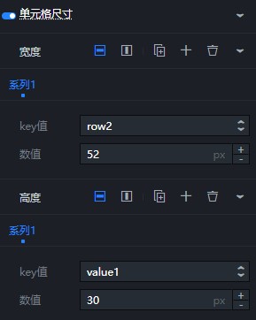

 to enable or disable this feature.
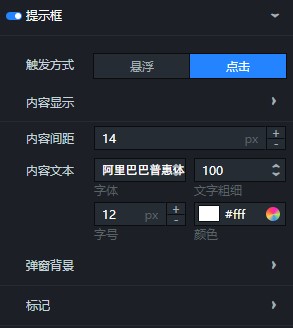
 to show or hide the hyperlink configuration.
 to show or hide the conditional formatting. You can click the
  or
or  icon on the right to add or delete a conditional format. You can click the
  or
or  icon to configure the arrangement of multiple conditional formats. You can click the
  icon to copy the currently selected conditional format configuration and add a new one with the same configuration. For more information about how to configure the styles, see
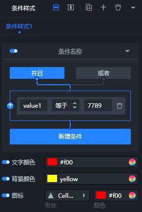
Data panel
Field descriptions
Field |
Description |
|
The data for the first row. |
|
(Optional) The data for the second row. |
|
The data for the first column. |
|
(Optional) The data for the second column. |
|
The value description of the table. |
Configuration item descriptions
Configuration item |
Description |
Controlled Mode |
When this mode is enabled, the Asset does not request data upon initialization. Data requests are initiated only through a callback ID or a method configured in the blueprint editor. When this mode is disabled, you can use automatic updates to request data. This mode is disabled by default. |
Automatic Update Requests |
Select this option to enable dynamic polling and specify a polling frequency. If you clear this option, automatic updates are disabled. You must manually refresh the page or trigger data update requests using the blueprint editor or callback ID events. |
Data Source |
Click Configure Data Source. In the Set Data Source panel, you can change the data source type, modify the data query code, preview the data source response, and view the data response. For more information, see Configure asset data. |
Data Filter |
A data filter provides features such as data structure transformation, filtering, and simple calculations. Click Add Filter. In the Set Data Source panel, you can configure a data filter script. For more information, see Instructions on how to use filters. |
Data Results |
Displays the response of a data request. When the data source changes, you can click the |
 icon on the right to view the real-time data response.
Interaction panel
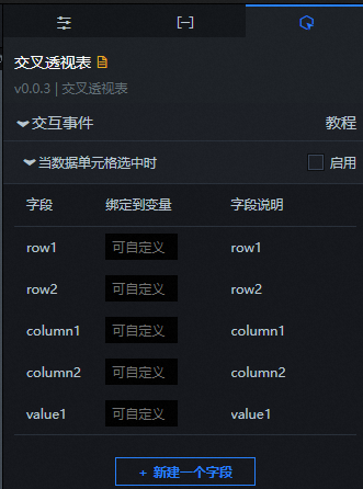
Interaction Occurrence |
Description |
When a data cell is selected |
Select Enable to enable the widget interaction feature. The pivot table widget has interaction configurations. When a data cell is selected, a callback value is returned. For more information about the configurations, see How to configure a callback ID for a ticker board widget. |
Blueprint editor interaction configuration
In the canvas editor, right-click the widget and select Export to Blueprint Editor.
Click the
icon in the upper-left corner of the page.On the blueprint editor configuration page, click the pivot table widget in the imported nodes pane. The configuration parameters for the pivot table in the blueprint editor are displayed on the canvas, as shown in the following figure.
Events
Event
Description
On Pivot Table API Request Completion
This event is triggered after the filter processes the response from a pivot table API request, returning the processed data in JSON format. For an example, see the Data Response section on the Data tab of the widget's configuration panel in the canvas editor.
When a pivot table API request fails
This event is triggered when a pivot table API request fails due to a network issue or an API error. The filter processes the event and returns the data in JSON format. For an example, see the Data Response section on the Data tab of the widget's configuration panel in the canvas editor.
When a data cell is selected
This event is triggered when a data cell is selected and its data is processed by the filter. The event returns the processed data in JSON format. For an example, see the Data Response section on the Data tab of the widget's configuration panel in the canvas editor.
Actions
Action
Description
Request Pivot Table API
Resends a request to the server-side for data. The data passed from an input data processing node or a layer node is used as a parameter. For example, if the API data source for the pivot table is set to
https://api.testand the data passed to the Request Pivot Table API action is{ id: '1'}, the final request URL ishttps://api.test?id=1.Import Pivot Table API
The event that is triggered after a pivot table API request fails (due to a network issue or an API error) and is processed by the filter. The processed data in JSON format is also returned. For an example, see the Data Response section on the Data tab of the widget's configuration panel in the canvas editor.
Update Widget Configuration
Dynamically updates the style configuration of the widget. First, go to the Configuration panel of the widget and click Copy Configuration to Clipboard to obtain the widget configuration data. Then, in the data processing node on the blueprint editor configuration page, change the field values for the corresponding styles as needed.
Show
Shows the widget. The following code provides a data example.
return {
  "animationType": "",
  "animationDuration": 1000,
  "animationEasing": "linear"
};
Hide
Hides the widget. The following code provides a data example.
return {
  "animationType": "",
  "animationDuration": 1000,
  "animationEasing": "linear"
};
Toggle Visibility
Shows or hides the widget. The following code provides a data example.
return {
  "animationIn": {
    "animationType": "",
    "animationDuration": 1000,
    "animationEasing": "linear"
  },
  "animationOut": {
    "animationType": "",
    "animationDuration": 1000,
    "animationEasing": "linear"
  }
};
Move
Moves the widget to a specified position. The following code provides a data example.
return {
  // The moving mode. Absolute positioning: to. Relative positioning: by. Default value: to.
  "positionType": "to",
  // The specified position. x-coordinate, y-coordinate.
  "attr": {
    "x": 0,
    "y": 0
  },
  // The animation method.
  "animation": {
    "enable": false,
    // The animation delay.
    "animationDuration": 1000,
    // The animation curve. Valid values: linear|easeInOutQuad|easeInOutExpo.
    "animationEasing": "linear"
  }
};
 icon in the upper-left corner of the page.