Configure chart styles and settings for the table with progress charts widget.
Chart style
This widget combines a table with progress bars. You can configure styles for the table, table columns, and the pager.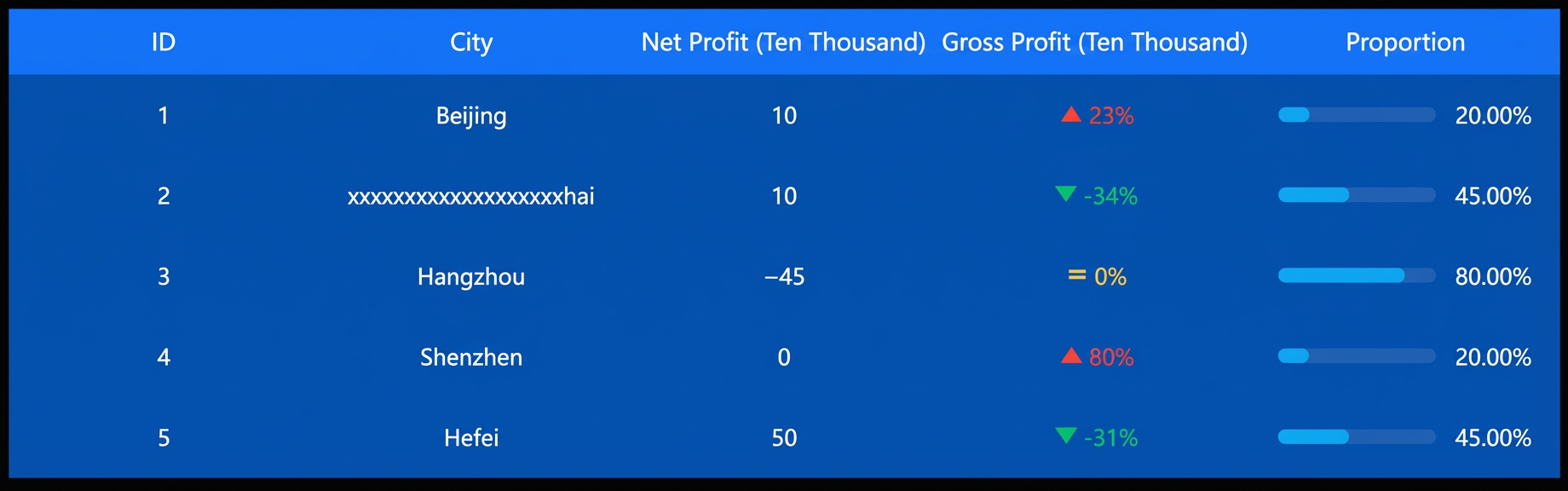
Configuration panel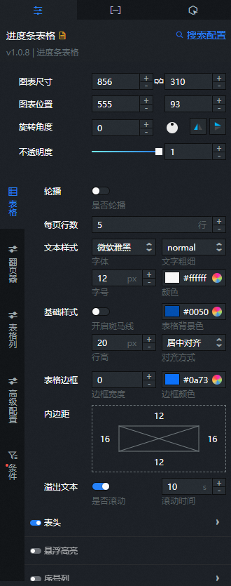
- Search for Configurations: In the right-side panel of Canvas Editor, click the Settings tab, and click Search for Configurations in the upper-right corner. Enter the required configuration item in the search box, and click the search icon to quickly locate the configuration item. Fuzzy match is supported. For more information, see Search for Configurations.
- Size: indicates the size of a widget, including its pixel width and height. You can click the
 icon to proportionally adjust the width and height of a widget. After you click this icon again, you can adjust the width and height as needed.
 - Position: the position of a widget, which is indicated by pixel X and Y coordinates. X-coordinate indicates the pixel distance between the upper-left corner of the widget and the left border of the canvas. Y-coordinate indicates the pixel distance between the upper-left corner of the widget and the upper border of the canvas.
- Rotation Angle: the angle of a rotation that uses the center point of a widget as the rotation point. The unit is degrees (°). You can use one of the following methods to control the rotation angle of a widget:
- Directly enter the degrees in the Rotation Angle spin box or click the plus sign (+) or minus sign (-) to increase or decrease the value in the Rotation Angle spin box.
- Drag the black dot in the
 icon.
icon. - Click the
 icon to horizontally flip a widget.
 - Click the
 icon to vertically flip a widget.
- Opacity: the opacity of a widget. Valid values: 0 and 1. If this parameter is set to 0, the widget is hidden. If this parameter is set to 1, the widget is completely displayed. Default value: 1.
-
Table
-
Carousel: Toggles the carousel feature. When enabled, the chart content scrolls vertically. Click
to control the carousel. You can also set the carousel interval and mode (full screen scroll or item-by-item scroll). -
Rows per page: The number of rows displayed per page.
-
Text style: The text style for the table, including font, font weight, font size, and color.
-
Basic style: The basic style of the table.
Parameter
Description
Enable striped rows
Toggles striped rows on or off.
Table background color
The table background color.
Row height
The row height in the table.
Alignment
The table alignment: align left, align center, or align right.
-
Stripe color: The background color for striped rows. Available only when Enable striped rows is turned on.
-
Table border: The table border style, including border width and color.
-
Padding: The distance between the table's inner border and its content on all four sides.
-
Overflow text: Controls text overflow behavior in cells. You can set whether to scroll the text and the scroll duration.
-
Table header: The table header style. Click
to show or hide the table header. Parameter
Description
Alignment
The table header alignment: align left, align center, or align right.
Text style
The table header text style, including font, font weight, font size, and color.
Selected sort style
The color applied when a column's sort button is selected during preview or after publishing.
NoteThe Selected sort style can be configured only after Enable sorting is turned on for a column in the Column configuration section.
Border style
The table header border style, including border width and color.
Background color
The table header background color.
Row height
The table header row height.
-
Hover highlight: The highlight style for table rows. Click
to show or hide the ordinal number column. Parameter
Description
Text style
The table text style, including font, font weight, font size, and color.
Highlight style
The highlight style for table text, including row background color, border radius, x-axis/y-axis shade offset, shade thickness, and shade color.
-
Ordinal number column: The ordinal number column style. Click
to show or hide the ordinal number column. Parameter
Description
Column display name
The ordinal number column field name. Must match a field from the data panel. Default:
imgSrc.Column width
The ordinal number column width ratio. A larger value produces a wider column.
Text style
The ordinal number column text style, including font, font weight, font size, and color.
Text background
The ordinal number column text background style, including width, height, border radius, and color.
-
Featured Items: The featured items style in the table. Click
to show or hide the ordinal number column. Parameter
Description
Specific Quantity
Select the top N items as featured items and set their styles separately.
Options
The display type for featured items: image or text.
Image style
The image width, height, and border radius for featured items. Available only when Options is set to Image.
Text style
The text style for featured items, including text color and background color. Available only when Options is set to Text.
Default image
Sets the default display image for featured items. To use an image from a remote server, enter the image URL in the input box above. Click Preview inside the image box to preview a larger version of the button image. Click Change inside the dashed box below the image input box to change the image. For more information about the design asset feature, see Use the interface features. If an image is configured on both the Configuration tab and the Data tab, the image from the Data tab takes precedence. This can be set only when Options is set to Image.
Column field name
Takes effect only when an image field is added to the data. The image field in the data takes priority over this configuration setting.
Custom images
The serial number can be set to an image. Dynamic images can be added by adding an image field in the data. Click the
or icon on the right to add or delete an image data item. Click the or icon to configure the arrangement of multiple custom image data items. Click the icon to copy the configuration of the selected image data series and add a new series with the same configuration.
-
-
Pager
Parameter
Description
Hide pager
When enabled, the pager is hidden and its parameters cannot be configured. When disabled, the pager is shown and the following parameters can be configured.
Hide on single page
When enabled, hides the pager when the table has only one page. When disabled, the pager is always visible.
General settings
General pager style settings, including size, alignment, and fast forward/rewind style.
Number of Pages
The number of page numbers displayed in the pager. Additional pages beyond this count are represented by an ellipsis (...).
Ellipsis color
The ellipsis color when page count exceeds the displayed range.
Input box
When enabled, displays a page input box for direct page navigation. Takes effect when the total number of pages exceeds the Number of page items. When disabled, the input box is hidden.
Current page style
The current page style in the pager, including text color and background color.
Normal page style
The normal page style in the pager, including text color and background color.
Disabled style
The disabled state style, including text color and background color.
Margin
The distance from the pager to the top, bottom, left, and right edges of the table.
-
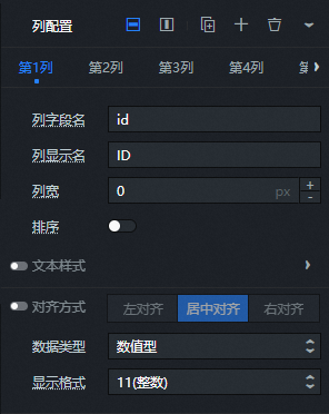
Table columns
You can click the
icon or the icon to add or delete a column configuration, respectively. You can click the icon or the icon to change the arrangement of multiple column configurations. You can also click the icon to copy the configuration of the selected column and add a new column with the same configuration. -
Column field name: The name of the column field. This name must match a field in the data.
-
Column display name: The column name displayed in the header.
-
Column width: The column width. A value of 0 makes the column auto-fit its content. If content exceeds the specified width, the content width takes precedence.
-
Sort: A switch that displays a sort button in the header of the current column. You can click the sort button to choose a sorting method for the table data. If this switch is turned off, the sort button is hidden and the data in the column cannot be sorted.
-
Text style: The column text style, including font, color, font size, and font weight.
-
Alignment: A switch that lets you adjust the alignment of the column. The options are align left, align center, and align right. If this switch is turned off, you cannot adjust the alignment of the column.
-
Data type: The data type for the current column: numeric, categorical, time, image, trend chart, or progress chart.
-
Display format: If you select the numeric or time data type, you can use this option to specify the display format for the current column.
-
Image: If you select the image data type, you can use this option to specify the display format for the current column.
-
Metric trends: You can click
to enable the metric trends style. NoteThis option is available only when the Data type of the current column is set to trend chart.
Parameter
Description
Icon
The metric trend icon style. You can choose from five icon styles and set the icon size. Click
to enable the icon style.Trend color
The colors for the three trends: up, flat, and down.
Sync text color
Turn on the switch to synchronize the icon color with the numeric text color. Turn off the switch to not synchronize the colors.
Metric settings
The base value and numeric suffix style for the metric.
Thousands separator
The thousands separator symbol. Click
to enable the thousands separator style. NoteIf you enter multiple separator symbols, only the first symbol is used as the thousands separator for the data. Numbers cannot be used as thousands separators.
Display
Turn on the switch to display invalid data in the metric trend style. Turn off the switch to hide invalid data that appears in the metric trend style.
NoteIf all data is valid, this configuration is ignored.
-
Progress chart: You can click
to enable the progress chart style. The value of the progress chart must be the numberdata type.NoteThis option is available only when the Data type of the current column is set to progress chart.
Parameter
Description
Progress chart type
The progress chart type style. Options are ring and bar.
Style
The progress color, background color, and progress bar size of the progress chart.
Value information
The precision, suffix style, font, font weight, font size, and color of the value. Click
to enable the value information style.
-
-
Advanced Configuration
-
Selection column: You can click
to show or hide the selection column on the far left of the table.Parameter
Description
Default selection
The rows that are selected by default in the selection column. You can enter custom row numbers, separated by commas (,).
Button size
The width and height of the selection column button.
Select Hook
The color and size of the selection checkmark in the selection column.
Button background color
The background color of the selection column button.
-
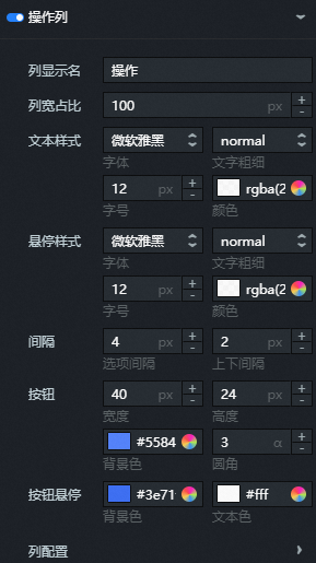
Action column: You can click
to show or hide the action column on the far right of the table.Parameter
Description
Column display name
The display name for the action column header.
Column width ratio
The width ratio of the action column.
Text style
The text style for the action column. Includes font, font weight, font size, and color.
Hover style
The text style when the mouse hovers over the text in the action column. Includes font, font weight, font size, and color.
Spacing
The spacing between multiple option buttons within the action column and the top and bottom spacing for each row in the action column.
Button
The width, height, background color, and border radius of the buttons in the action column.
Button hover
The background color and button text color when the mouse hovers over a button in the action column.
Column configuration
Configuration content for multiple column actions within the action column.
Click the
or icon on the right to add or delete a column configuration. Click the or icon to configure the arrangement of multiple column configurations. Click the icon to copy the configuration of the selected column and add a new column with the same configuration.-
Content type: The type of action content. Options are button or text.
-
Action name: You can customize the action name.
-
Action type: You can customize the action type. The default is edit.
-
-
Hyperlink configuration: The hyperlink style for the table. Click
to show or hide the hyperlink configuration. Parameter
Description
Hyperlink field name
The name of the hyperlink field. You must set the link field for the hyperlink in the data panel. After setting a hyperlink for a table row, click anywhere in that row to navigate to the hyperlink.
Open in new window
Turn on the switch to open the hyperlink in a new browser window. Turn off the switch to open the hyperlink in the same window.
-
Virtual scroll: Virtual scroll settings for the table. Click
to enable or disable virtual scroll.Content area height: The height of the table's content area. If table data exceeds this height, a scroll bar appears.
Border style: The border width and color for the virtual scroll area.
NoteEnsure that the ID value in the data is unique.
-
-
Conditions: Conditional styles for the table.
Conditional style: You can click the icon or the icon to add or delete a conditional style, respectively. You can click the icon or the icon to change the arrangement of multiple conditional styles. You can also click the icon to copy the configuration of the selected conditional style and add a new conditional style with the same configuration. For more information about specific configurations, see Instructions for using the condition tree.-
Selection scope: Specifies whether the style applies to a single cell or an entire row.
-
Text: Specifies the text style for a cell or an entire row. The options include font, font weight, font size, and color.
-
Background color: Specifies the background color for a cell or an entire row.
-
Row height: When the selection scope is set to the entire row, this setting defines the height of all table rows in pixels.
-
Data type: Specifies the data type for a cell or an entire row. The options include trend chart and progress chart.
-
Trend chart: Specifies the icon size, font, font weight, and font size of the trend chart.
-
Progress chart: Specifies the bar color, background color, font, font weight, font size, and color of the progress chart.
-
-
 icon to vertically flip a widget.
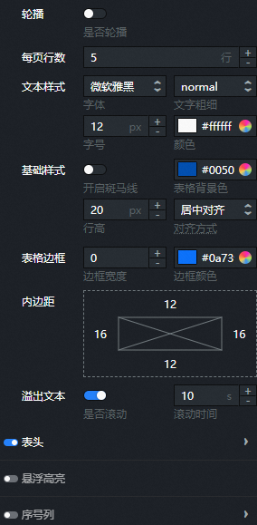
 to control the carousel. You can also set the carousel interval and mode (full screen scroll or item-by-item scroll).
 or
or  icon on the right to add or delete an image data item. Click the
  or
or  icon to configure the arrangement of multiple custom image data items. Click the
  icon to copy the configuration of the selected image data series and add a new series with the same configuration.
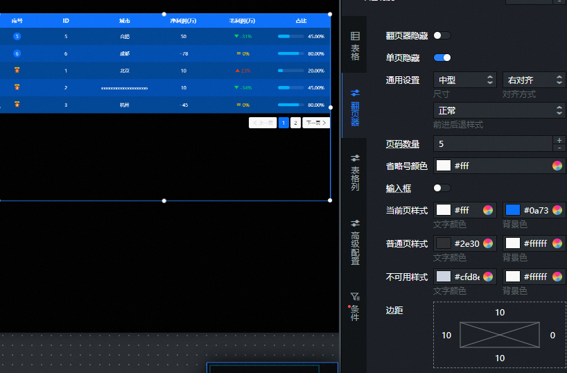
 icon or the
  icon to add or delete a column configuration, respectively. You can click the
  icon or the
  icon to change the arrangement of multiple column configurations. You can also click the
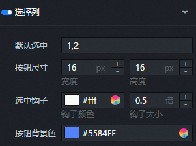
 icon to copy the configuration of the selected column and add a new column with the same configuration.
 to enable or disable virtual scroll.
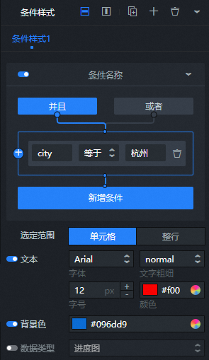 Conditional style: You can click the
  icon or the
  icon to add or delete a conditional style, respectively. You can click the
  icon or the
  icon to change the arrangement of multiple conditional styles. You can also click the
  icon to copy the configuration of the selected conditional style and add a new conditional style with the same configuration. For more information about specific configurations, see
 Data panel
Field description
|
Field |
Description |
|
|
Table values. Custom field values must match the column field names in the column configuration on the Configuration panel. |
| Parameter | Description |
| Controlled Mode | If you turn on the switch, data is not requested when a widget is initialized. Data requests are triggered only based on callback IDs or the method configured in Blueprint Editor. If you turn off the switch, data requests are automatically triggered. By default, the switch is turned off. |
| Auto Data Request | After you select the Auto Data Request check box, you can enable dynamic polling, and manually specify the polling interval. If you do not select this check box, data is not automatically requested. You must manually refresh the page to request data or use Blueprint Editor or callback ID events to trigger data requests. |
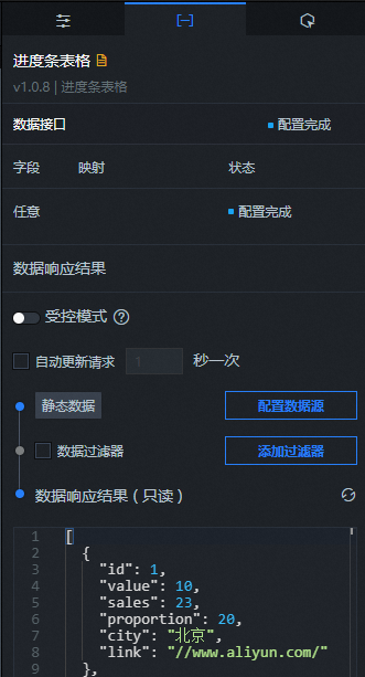
| Data Source | In the right-side panel of Canvas Editor, click the Data tab. Click Set next to Static Data. In the Configure Datasource panel, select a data source from the Data Source Type drop-down list. Enter code for data query in the code editor, click Preview Data Response to preview the response of the data source, and then view the response. For more information, see Configure asset data. |
| Data Filter | If you select the Data Filter check box, you can convert the data structure, filter data, and perform simple calculations. If you click the plus sign (+) next to Add Filter, you can configure the script for the data filter in the editor that appears. For more information, see Use the data filter. |
| Data Response Result | The response to a data request. If the data source changes, you can click the  icon next to Data Response Result to view the data response in real time. icon next to Data Response Result to view the data response in real time. |
Interaction panel
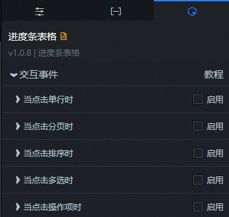
|
Interaction occurrence |
Description |
|
When a row is clicked |
Select Enable to turn on the widget's interaction feature. When a row in the table with progress charts is clicked, a callback value can be passed. By default, the |
|
When paging is clicked |
Select Enable to turn on the widget's interaction feature. When paging for the table with progress charts is clicked, a callback value can be passed. By default, the custom |
|
When sorting is clicked |
Select Enable to turn on the widget's interaction feature. When a sort button for the table with progress charts is clicked, a callback value can be passed. By default, the custom |
|
When multiple items are selected |
Select Enable to turn on the widget's interaction feature. When multiple items are selected in the selection column of the table with progress charts, a callback value can be passed. By default, the custom |
|
When an action item is clicked |
Select Enable to turn on the widget's interaction feature. When an action item in the table with progress charts is clicked, a callback value can be passed. By default, the custom |
Blueprint editor interaction configuration
- In Canvas Editor, right-click a widget in the Layer panel and select Add to Blueprint Editor.
- Click the icon in the upper-left corner of the page.
-
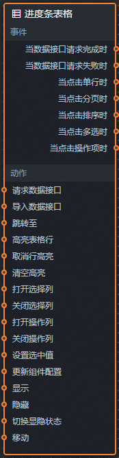
On the blueprint editor configuration page, click the Table with progress charts widget in the import nodes bar. The configuration parameters for the table with progress charts appear on the canvas, as shown in the following figure.
-
Events
Event
Description
On Data API Request Completion
This event is triggered after a data API request is successfully returned and processed by the filter. The processed data is passed in JSON format. For a data example, see the Data Response section on the Data tab of the widget's configuration panel in the canvas editor.
When a data API request fails
This event is triggered after a data API request fails due to network issues or API errors. The error information is processed by the filter and passed in JSON format. For a data example, see the Data Response section on the Data tab of the widget's configuration panel in the canvas editor.
When a row is clicked
This event is triggered when a user clicks a row in the table. The data for the clicked row is passed.
When paging is clicked
This event is triggered when a user clicks a page number in the pager. The data for the current page is passed.
When sorting is clicked
This event is triggered when a user clicks a sort button. The current sorting data is passed.
When multiple items are selected
This event is triggered when a user selects multiple items in the selection column. The data for the selected items is passed.
When an action item is clicked
This event is triggered when a user clicks an action item button. The data for the current action item is passed.
-
Actions
Action
Description
Request data API
Requests server-side data again. Data from input data processing nodes or layer nodes is used as a parameter. For example, if a table with progress charts has its API data source set to
https://api.test, and the data passed to the Request data API action is{ id: '1'}, the final API request ishttps://api.test?id=1.Import data API
Processes data in the component's drawing format, then imports the data to redraw the component. This action does not request server-side data again. For a data example, see the Data Response area on the Data tab of the component's configuration panel in the canvas editor.
Go to page
Goes to a specific page in the component. Page numbering starts at 0 by default. The following is a reference data example.
return {
  "current":1       // To go to the fourth page, use {current: 3}
}
Highlight table row
Highlights a specific row in the table. The following is a reference data example.
return {
  "data": {
    id:3,           // The data to highlight.
    name:'John Doe'
  },
  "style": {
    color:'#ff0',   // The style for the highlighted data.
    background:'#f00'
  }
}
Remove row highlight
Removes the highlight from a specific row.
Clear all highlights
Clears all highlight effects from the component. No parameters are needed.
Show selection column
Shows the selection column of the table with progress charts.
Hide selection column
Hides the selection column of the table with progress charts.
Show operation column
Shows the operation column of the table with progress charts.
Hide operation column
Hides the operation column of the table with progress charts.
Set selected value
Sets the selected value. The following is a reference data example.
return {
  "value": 1
}
Update component configuration
Dynamically updates the style configuration of the component. First, copy the component configuration data from the Configuration panel by clicking Copy Configuration to Clipboard. Then, in the data processing node of the blueprint editor, change the field values for the required styles as needed.
Show
Shows the component. The following is a reference data example.
return {
  "animationType": "",
  "animationDuration": 1000,
  "animationEasing": "linear"
};
Hide
Hides the component. The following is a reference data example.
return {
  "animationType": "",
  "animationDuration": 1000,
  "animationEasing": "linear"
};
Toggle visibility
Toggles the visibility of the component. The following is a reference data example.
return {
  "animationIn": {
    "animationType": "",
    "animationDuration": 1000,
    "animationEasing": "linear"
  },
  "animationOut": {
    "animationType": "",
    "animationDuration": 1000,
    "animationEasing": "linear"
  }
};
Move
Moves the component to a specified position. The following is a reference data example.
return {
  // The movement method. Absolute positioning: to. Relative positioning: by. Default value: to.
  "positionType": "to",
  // The specified position. x-coordinate, y-coordinate.
  "attr": {
    "x": 0,
    "y": 0
  },
  // The animation method.
  "animation": {
    "enable": false,
    // The animation delay.
    "animationDuration": 1000,
    // The animation curve. Optional values: linear, easeInOutQuad, or easeInOutExpo.
    "animationEasing": "linear"
  }
};
-
 icon in the upper-left corner of the page.