Trapezoid column chart (versions earlier than v3.0)
The Trapezoid Column Chart is a type of column chart that supports custom y-axis ranges, multiple data series, and automatic grouping by category. It clearly visualizes data differences both between and within categories but can take up significant space in a visualization application. This topic describes the settings for the Trapezoid Column Chart widget.
Settings
This topic describes the settings for the Trapezoid Column Chart widget for versions earlier than v3.0. For versions 3.0 and later, see Trapezoid Column Chart (v3.0 and later).
- Search for Configurations: In the right-side panel of Canvas Editor, click the Settings tab, and click Search for Configurations in the upper-right corner. Enter the required configuration item in the search box, and click the search icon to quickly locate the configuration item. Fuzzy match is supported. For more information, see Search for Configurations.
- Size: indicates the size of a widget, including its pixel width and height. You can click the
 icon to proportionally adjust the width and height of a widget. After you click this icon again, you can adjust the width and height as needed.
 - Position: the position of a widget, which is indicated by pixel X and Y coordinates. X-coordinate indicates the pixel distance between the upper-left corner of the widget and the left border of the canvas. Y-coordinate indicates the pixel distance between the upper-left corner of the widget and the upper border of the canvas.
- Rotation Angle: the angle of a rotation that uses the center point of a widget as the rotation point. The unit is degrees (°). You can use one of the following methods to control the rotation angle of a widget:
- Directly enter the degrees in the Rotation Angle spin box or click the plus sign (+) or minus sign (-) to increase or decrease the value in the Rotation Angle spin box.
- Drag the black dot in the
 icon.
icon. - Click the
 icon to horizontally flip a widget.
 - Click the
 icon to vertically flip a widget.
- Opacity: the opacity of a widget. Valid values: 0 and 1. If this parameter is set to 0, the widget is hidden. If this parameter is set to 1, the widget is completely displayed. Default value: 1.
Global settings
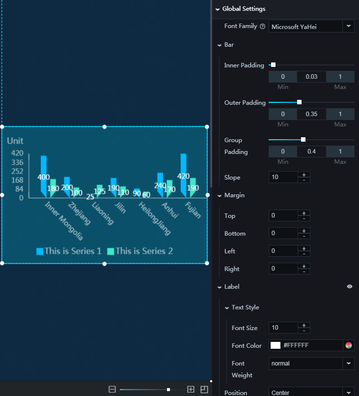
Font: Sets the font family for all text in the widget. The default is Microsoft YaHei.
Bar style
Inner padding: Sets the spacing between bars. The value ranges from 0 to 1.
Outer padding: Sets the spacing between the outermost bars and the widget's left and right borders. The value ranges from 0 to 1.
Group padding: Sets the spacing between bars within a group. The value ranges from 0 to 1.
Slope: Specifies the angle of the slope at the bottom of each trapezoid bar.
Margin
Top: The space between the chart and the widget's top border.
Bottom: The space between the chart and the widget's bottom border.
Left: The space between the chart and the widget's left border.
Right: The space between the chart and the widget's right border.
Value label: Configures the value labels on each bar. Click the
 icon to show or hide the value labels.
 Text
Font size: The font size of the value label text.
Color: The color of the value label text.
Font weight: The font weight of the value label text.
Position: The position of the value labels. Options: Right, Center, and Left.
Max records: The maximum number of records the system loads for layout, rendering, and calculation. This setting optimizes display performance.
X-axis: Configures the style of the x-axis. Click the
icon to show or hide the x-axis.Text
Font size: The font size of the x-axis text.
Color: The color of the x-axis text.
Font weight: The font weight of the x-axis text.
Axis label: Configures the labels on the x-axis. Click the
icon to show or hide the axis labels. Angle: The display angle of the axis labels. Options: Horizontal, Slant, and Vertical.
Quantity: The maximum number of labels to display on the x-axis.
NoteIf Quantity is set to 0, the system automatically determines the number of labels based on the data.
Axis line: Configures the x-axis line. Click the
icon to show or hide the axis line. Color: The color of the axis line.
Grid lines: Configures the grid lines for the x-axis. Click the
icon to show or hide the grid lines. Color: The color of the grid lines.
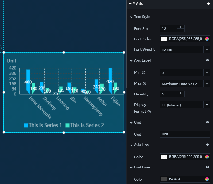
Y-axis: Configures the style of the y-axis. Click the
icon to show or hide the y-axis.Text
Font size: The font size of the y-axis text.
Color: The color of the y-axis text.
Font weight: The font weight of the y-axis text.
Axis label: Configures the labels on the y-axis. Click the
icon to show or hide the axis labels. Min: Sets the minimum value for the y-axis. You can enter a custom value or select one of the following options:
Minimum data value: Uses the minimum value from the data.
Automatic rounding: The system automatically calculates a rounded value based on the data range and the number of axis labels.
Max: Sets the maximum value for the y-axis. You can enter a custom value or select one of the following options:
Maximum data value: Uses the maximum value from the data.
Automatic rounding: The system automatically calculates a rounded value based on the data range and the number of axis labels.
Quantity: The number of axis labels.
Display format: The display format of the axis labels. You can enter a custom format or select a system-defined format. If you select Default, the system displays the data in its original format.
Axis unit: The unit for the y-axis. You can enter a custom unit. Click the
icon to show or hide the unit.Axis line: Configures the y-axis line. Click the
icon to show or hide the axis line. Color: The color of the axis line.
Grid lines: Configures the grid lines for the y-axis. Click the
icon to show or hide the grid lines. Color: The color of the grid lines.
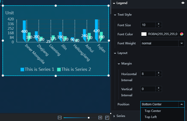
Legend: Configures the chart legend. Click the
icon to show or hide the legend.Text
Font size: The font size of the legend text.
Color: The color of the legend text.
Font weight: The font weight of the legend text.
Layout
Spacing
Horizontal spacing: The horizontal distance between adjacent legend items. This setting applies only when there are multiple data series.
Vertical spacing: The vertical distance between the legend and the top and bottom borders of the widget and chart.
Position: The position of the legend relative to the widget's top-left corner. Options: Top Left, Top Center, Top Right, Bottom Left, Bottom Center, and Bottom Right.
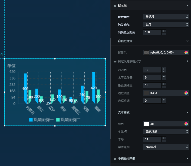
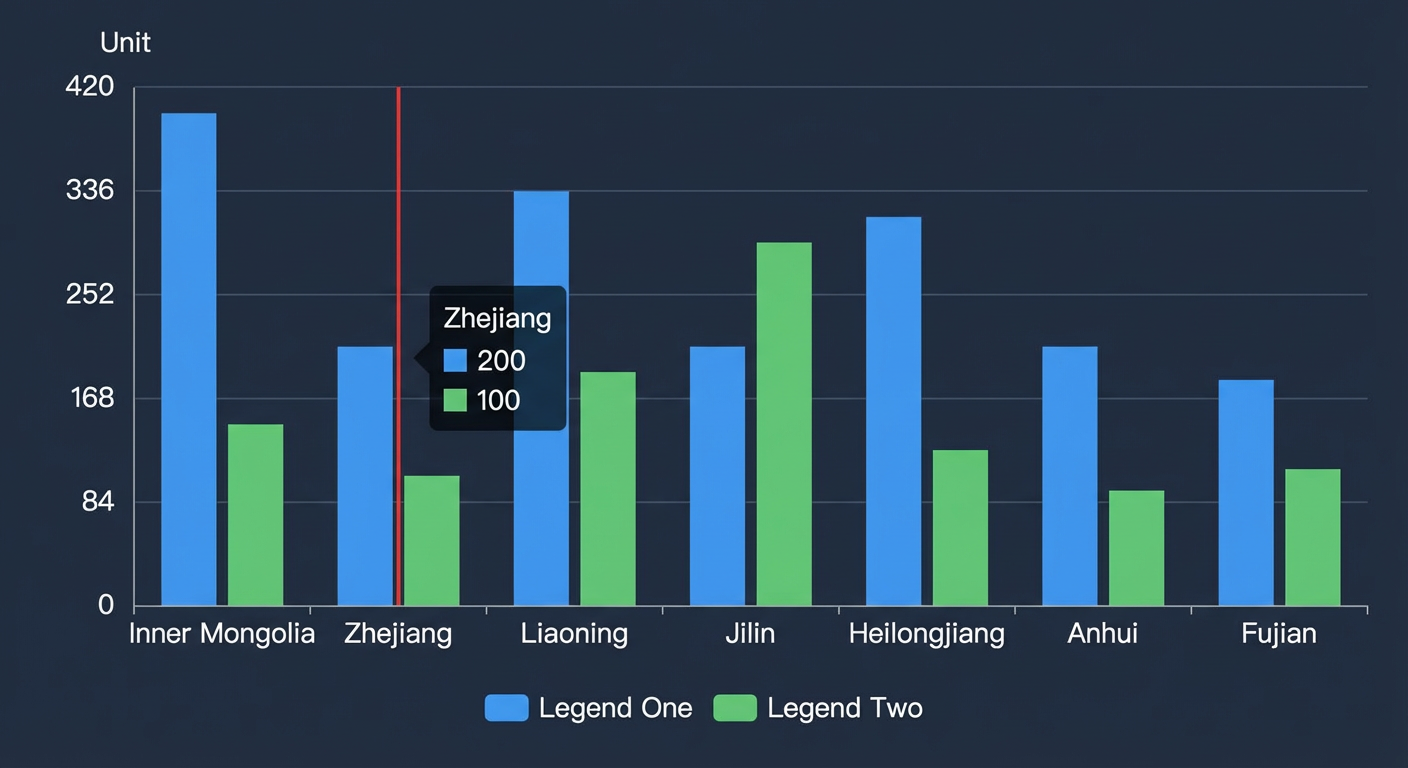
Tooltip: Configures the style of the tooltip that appears when you hover over or click a bar on the preview or published page.
Figure 1. Tooltip panel
Figure 2. Tooltip example
Trigger type: The element that triggers the tooltip. Options: Data Item and Coordinate Axis.
Trigger action: The action that triggers the tooltip. Options: Hover and Click.
Disappear delay: The delay in milliseconds (ms) before the tooltip disappears after its trigger condition is no longer met.
Background box style: The style of the tooltip's background box.
Background color: The background color of the tooltip.
Custom background size: The width and height of the tooltip, in pixels (px).
Padding: The inner padding of the tooltip, in pixels (px).
Horizontal offset: The horizontal offset of the tooltip relative to the mouse pointer, in pixels (px).
Vertical offset: The vertical offset of the tooltip relative to the mouse pointer, in pixels (px).
Border color: The border color of the tooltip.
Border thickness: The border thickness of the tooltip, in pixels (px).
Text style: The style of the text in the tooltip.
Color: The color of the tooltip text.
Font: The font family of the tooltip text.
Font size: The font size of the tooltip text.
Font weight: The font weight of the tooltip text.
Axis pointer: The style of the axis pointer displayed when the trigger type for the tooltip is axis and a trigger action is performed.
Type: The type of the axis pointer. Currently, only Line Indicator is supported.
Indicator line style: Specifies the color, width, and type of the indicator line. Type options: Solid, Dashed, and Dotted.
Data series: Click the
or icon to add or delete a data series.Series name: The name of the data series. This can be customized. If left empty, the system uses the value of the s field from the data as the series name. When providing custom series names, you must ensure the data is returned in the correct order.
Color: The color of the bars in this series. Solid and gradient fills are supported.
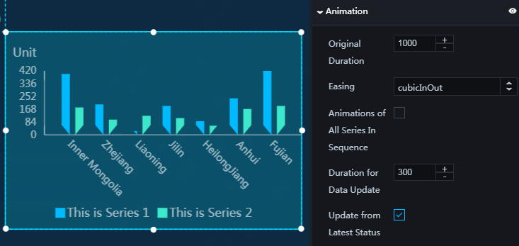
Animation: Configures the animation effects for the chart. Click the
icon to enable or disable animations.Initial animation duration: The duration of the initial animation when the widget is first rendered, in milliseconds (ms).
Easing: The easing effect for the animation. The system provides various common easing effects.
Animate series sequentially: If enabled, data series animate sequentially. If disabled, they animate simultaneously.
Update animation duration: The duration of the animation when the widget's data is updated, in milliseconds (ms).
Start from previous position: If enabled, when the widget's data is updated, the animation starts from the previous data position. If disabled, the animation starts from the initial position.
 icon to show or hide the value labels.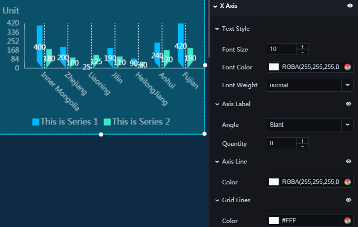
 or
or  icon to add or delete a data series.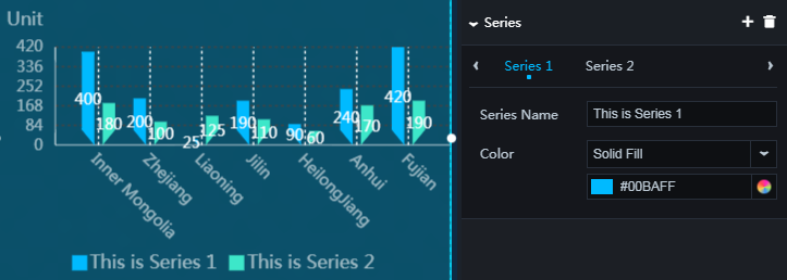
Data
The following JSON code is an example of the data structure. 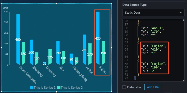
[
  {
    "x": "Inner Mongolia",
    "y": "400",
    "s": "1"
  },
  {
    "x": "Inner Mongolia",
    "y": "180",
    "s": "2"
  },
  {
    "x": "Zhejiang",
    "y": "200",
    "s": "1"
  },
  {
    "x": "Zhejiang",
    "y": "100",
    "s": "2"
  },
  {
    "x": "Liaoning",
    "y": "25",
    "s": "1"
  },
  {
    "x": "Liaoning",
    "y": "125",
    "s": "2"
  },
  {
    "x": "Jilin",
    "y": "190",
    "s": "1"
  },
  {
    "x": "Jilin",
    "y": "110",
    "s": "2"
  },
  {
    "x": "Heilongjiang",
    "y": "90",
    "s": "1"
  },
  {
    "x": "Heilongjiang",
    "y": "60",
    "s": "2"
  },
  {
    "x": "Anhui",
    "y": "240",
    "s": "1"
  },
  {
    "x": "Anhui",
    "y": "170",
    "s": "2"
  },
  {
    "x": "Fujian",
    "y": "420",
    "s": "1"
  },
  {
    "x": "Fujian",
    "y": "190",
    "s": "2"
  }
]x: The category for each bar in the chart, which corresponds to the x-axis value.
y: The value for each bar in the chart, which corresponds to the y-axis value.
s: (Optional) The data series to which the data item belongs.
Parameter | Description |
Controlled mode | If enabled, the widget does not request data on its initial load. Data requests are initiated only by a callback ID or a method configured in the Blueprint Editor. If disabled, data can be requested through automatic updates. This setting is disabled by default. |
Auto update request | When enabled, you can set a polling interval for dynamic data updates. When disabled, data is not updated automatically. You must manually refresh the page or trigger a data request through the Blueprint Editor or a callback ID event. |
Data source | Click Configure Data Source to open the Set Data Source panel. In this panel, you can change the data source type, modify the data query code, preview the results, and view the data response. For more information, see Configure widget data. |
Data filter | A data filter lets you transform, filter, and perform simple calculations on data. Click Add Filter to configure a filter script in the Set Data Source panel. For more information, see Use filters. |
Data response result | Displays the response from the data request. When the data source changes, you can click the |
 icon on the right to view the real-time data response.
Interaction
Select Enable to activate the widget's interaction features. Clicking a bar in the Trapezoid Column Chart triggers a data request and emits a callback value that can be used for dynamic data loading. By default, this event passes the x, y, and s values from the clicked item's data. For configuration details, see Configure a widget callback ID.
Blueprint Editor interaction configuration
In the canvas editor, right-click the widget and select Export to Blueprint Editor.
Click the
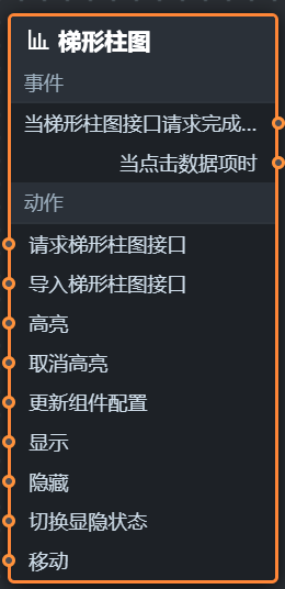
icon in the upper-left corner of the page.On the Blueprint Editor configuration page, click the Trapezoid Column Chart widget in the Imported Nodes panel. The configuration parameters for the widget are displayed on the canvas as shown in the following figure.
Events
Event
Description
On data request complete
Triggered after a data request is returned and processed by a data filter. This event passes the processed data. For a data example, see the Data section.
On data item click
Triggered when a chart bar is clicked. This event passes the data for the clicked bar.
Actions
Action
Description
Request data
Re-requests data from the server, using data from upstream data processing nodes or layer nodes as request parameters. For example, if the widget's API data source is set to
http://api.testand the data passed to the Request Trapezoid Column Chart Data action is{ id: '1'}, the final request URL ishttp://api.test?id=1.Import data
Processes and imports data into the widget for re-rendering, without re-requesting data from the server. For a data example, see the Data section.
Highlight
Highlights elements corresponding to a data item. The following code shows an example of the parameters.
{
  data: {
    x: 'Shanghai' // You can list multiple highlight conditions, similar to a filter.
  },
  options: {
    style: {
      fill: 'red'
    },
    selectMode: 'single',
    cancelHighlightFirst: true
  }
}
Remove highlight
Removes the highlight from elements corresponding to a data item. The following code shows an example of the parameters.
{
  data: {
    x: 'Shanghai'
  },
  options: {
    mode: 'single' // When set to 'single', only one highlight is removed if multiple data items match. When set to 'multiple', all highlights are removed.
  }
}
Update widget configuration
You can dynamically update the style configuration of a widget. First, in the widget's Configuration panel, click Copy configuration to clipboard to obtain the widget configuration data. Then, in the data processing node on the configuration page of the Blueprint Editor, change the field values for the corresponding styles as needed.
Show
Shows the widget. No parameters are required.
Hide
Hides the widget. No parameters are required.
Toggle visibility
Toggles the visibility of the widget.
    {
      // Set to true to show, false to hide.
      "status": true,
      // Show animation.
      "animationIn": {
        // Animation type. Can be 'fade'. If not specified, there is no animation.
        "animationType": "fade",
        // Show delay, in milliseconds (ms).
        "animationDuration": 1000,
        // Show animation function. Options: linear|easeInOutQuad|easeInOutExpo.
        "animationEasing": "linear"
      },
      // Hide animation.
      "animationOut": {
        // Animation type. Can be 'fade'. If not specified, there is no animation.
        "animationType": "fade",
        // Hide delay, in milliseconds (ms).
        "animationDuration": 1000,
        // Hide animation function. Options: linear|easeInOutQuad|easeInOutExpo.
        "animationEasing": "linear"
      }
    }
Move
Moves the widget to a specified position.
    {
      // Move type. 'to' for absolute positioning, 'by' for relative positioning. Default is 'to'.
        "positionType": "to",
      // Target position: x and y coordinates.
      "attr": {
        "x": 0,
        "y": 0
      },
      // Animation settings.
      "animation": {
        "enable": false,
        // Animation duration, in milliseconds.
        "animationDuration": 1000,
        // Easing curve. Options: linear|easeInOutQuad|easeInOutExpo.
        "animationEasing": "linear"
      }
    }
 icon in the upper-left corner of the page.