3D globe
The map container is the container of a 3D globe widget that carries the map and all sub-components. You can configure its rendering mode, background, viewpoint, and sub-components such as sphere layers and flying-line layers.
Chart Style
The map container carries the map and all sub-components in a 3D globe. You can add sub-components such as sphere layers and flying-line layers, and configure the rendering mode, background, and viewpoint. The container renders real-time geographic data in 3D from multiple angles and in multiple forms. 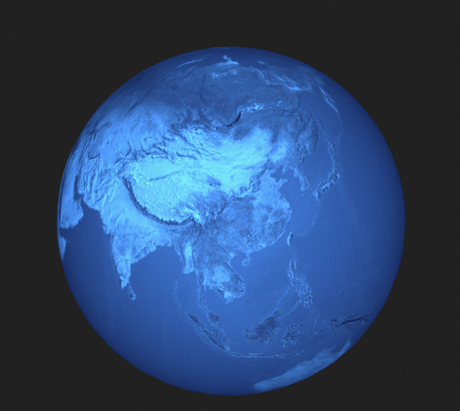
Settings
-
Manage sub-components
-
Add a component
-
In the left-side navigation pane, click the 3D Map widget.
-
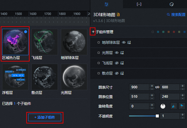
Click the
 icon on the left of Sub-components.
 -
Select one or more components and click Add Component in the lower part of the page. After the component is added, the component appears on the Manage Components page.
-
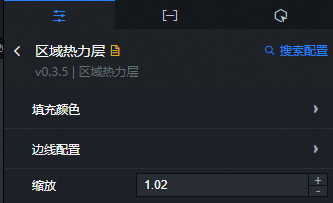
Click the added component and configure the component parameters.
-
After the configuration is complete, click the
 icon in the upper-left corner to return to the configuration tab of the 3D globe and configure other components.
-
-
To copy, rename, or delete a component, move the pointer over the component and click the
 icon to copy the component. Click the icon to rename the component. Click to delete the child widget.
-
- Search for Configurations: In the right-side panel of Canvas Editor, click the Settings tab, and click Search for Configurations in the upper-right corner. Enter the required configuration item in the search box, and click the search icon to quickly locate the configuration item. Fuzzy match is supported. For more information, see Search for Configurations.
- Size: indicates the size of a widget, including its pixel width and height. You can click the icon to proportionally adjust the width and height of a widget. After you click this icon again, you can adjust the width and height as needed.
- Position: the position of a widget, which is indicated by pixel X and Y coordinates. X-coordinate indicates the pixel distance between the upper-left corner of the widget and the left border of the canvas. Y-coordinate indicates the pixel distance between the upper-left corner of the widget and the upper border of the canvas.
- Rotation Angle: the angle of a rotation that uses the center point of a widget as the rotation point. The unit is degrees (°). You can use one of the following methods to control the rotation angle of a widget:
- Directly enter the degrees in the Rotation Angle spin box or click the plus sign (+) or minus sign (-) to increase or decrease the value in the Rotation Angle spin box.
- Drag the black dot in the icon.
- Click the icon to horizontally flip a widget.
- Click the icon to vertically flip a widget.
- Opacity: the opacity of a widget. Valid values: 0 and 1. If this parameter is set to 0, the widget is hidden. If this parameter is set to 1, the widget is completely displayed. Default value: 1.
-
Global Settings
-
Camera rotation
Parameter
Description
Horizontal Direction
The longitude of the camera viewpoint.
Vertical
The latitude of the camera viewpoint.
-
Camera Center: the offset of the globe relative to the x, y, and z axes.
-
Camera Distance: the distance between the camera and the globe. A larger value makes the globe appear smaller.
-
Auto Rotation Speed: the rotation speed of the globe. Valid values: 0 to 1. A value of 0 stops the rotation.
-
Map Interaction: specifies whether to enable map interaction. After you enable this feature, users can drag, zoom in, and zoom out the map on the preview or publish page.
-
carousel options
Parameter
Description
carousel
Specifies whether to cycle through the longitude-latitude pairs configured on the Data tab.
Animation Time
The duration for the animation to transition from one longitude-latitude pair to another.
dwell time
The duration for which the animation stays on one longitude-latitude pair before moving to the next.
-
 icon to copy the component. Click the
  icon to rename the component. Click
  to delete the child widget.
  icon to proportionally adjust the width and height of a widget. After you click this icon again, you can adjust the width and height as needed.
 icon.
icon. icon to horizontally flip a widget.
 icon to vertically flip a widget.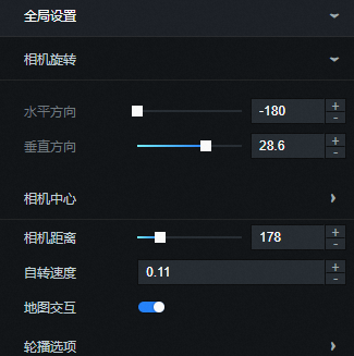
Data Panel
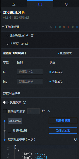
Configuration field description
|
Parameter |
Description |
|
|
The latitude of the location. |
|
|
The longitude of the location. |
| Parameter | Description |
| Controlled Mode | If you turn on the switch, data is not requested when a widget is initialized. Data requests are triggered only based on callback IDs or the method configured in Blueprint Editor. If you turn off the switch, data requests are automatically triggered. By default, the switch is turned off. |
| Auto Data Request | After you select the Auto Data Request check box, you can enable dynamic polling, and manually specify the polling interval. If you do not select this check box, data is not automatically requested. You must manually refresh the page to request data or use Blueprint Editor or callback ID events to trigger data requests. |
| Data Source | In the right-side panel of Canvas Editor, click the Data tab. Click Set next to Static Data. In the Configure Datasource panel, select a data source from the Data Source Type drop-down list. Enter code for data query in the code editor, click Preview Data Response to preview the response of the data source, and then view the response. For more information, see Configure asset data. |
| Data Filter | If you select the Data Filter check box, you can convert the data structure, filter data, and perform simple calculations. If you click the plus sign (+) next to Add Filter, you can configure the script for the data filter in the editor that appears. For more information, see Use the data filter. |
| Data Response Result | The response to a data request. If the data source changes, you can click the  icon next to Data Response Result to view the data response in real time. icon next to Data Response Result to view the data response in real time. |
Interaction tab
This widget does not support interaction events.
Configure interactions in Blueprint Editor
-
In Canvas Editor, right-click a widget in the Layer panel and select Add to Blueprint Editor.
-
Click the
icon in the upper-left corner. -
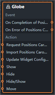
In Blueprint Editor, click the 3D Spherical Map widget in the Import Nodes pane. On the canvas, you can configure the parameters for the 3D spherical map, as shown in the following figure.
-
Event
Event
Description
When the location carousel data interface request is completed
Triggered after a data interface request is responded and processed by a filter, carrying the processed JSON data. For specific data examples, see the Data Response Result section of the Data tab in the right-side configuration panel of the canvas editor.
When the location carousel data port request fails
Triggered when a data interface request fails, for example, due to network issues or interface errors. The processed JSON data is returned after filtering. For specific data examples, see the Data Response Result section of the Data tab in the right-side configuration panel of the canvas editor.
-
Policy Action
Policy Action
Description
Request Location Data Interface
Requests server data again, using data from an upstream data processing node or layer node as parameters. For example, if the API data source is
https://api.testand the data sent to the Request Location Carousel Data Interface is{ id: '1'}, the final request URL ishttps://api.test?id=1.Import location carousel data interface
Imports data that has been processed into the widget's drawing format for redrawing, without re-requesting server data. For specific data examples, see the Data Response Result section of the Data tab in the right-side configuration panel of the canvas editor.
Update component configurations
Dynamically updates the style configurations of a widget. Before you use this action, click the widget in Canvas Editor, click the Settings tab in the right-side panel, and click Copy Configurations to... to obtain the widget configurations. Then, modify the style field for the data processing node in Blueprint Editor.
Display
Shows the widget. The following example shows the reference data.
return {
  "animationType": "",
  "animationDuration": 1000,
  "animationEasing": "linear"
}
Hide
Hides the widget. The following example shows the reference data.
return {
  "animationType": "",
  "animationDuration": 1000,
  "animationEasing": "linear"
}
Switch to the hidden state
Toggles the visibility of a widget. The following example shows the reference data.
return {
  "animationIn": {
    "animationType": "",
    "animationDuration": 1000,
    "animationEasing": "linear"
  },
  "animationOut": {
    "animationType": "",
    "animationDuration": 1000,
    "animationEasing": "linear"
  }
}
Move
Moves a component to a specified position. The following example shows the reference data.
return {
  // The positioning type. to indicates absolute positioning, whereas by indicates relative positioning. The default value is to.
  "positionType": "to",
  // The location, which is indicated by the x and y coordinates.
  "attr": {
    "x": 0,
    "y": 0
  },
  // The animation type.
  "animation": {
    "enable": false,
    // The duration in which animation is displayed.
    "animationDuration": 1000,
    // The animation curve, which can be set to linear|easeInOutQuad|easeInOutExpo.
    "animationEasing": "linear"
  }
}
-
 icon in the upper-left corner.