Learn about the chart styles and configuration items of the Model Viewer component.
Chart style
The Model Viewer is a 3D animation model loader built on the DataV team's WebGL rendering engine datav.vangogh. It supports glTF and GLB format models, PBR maps, instanced mesh parsing, an immersive animation editor, and configurable light sources and post-processing effects. 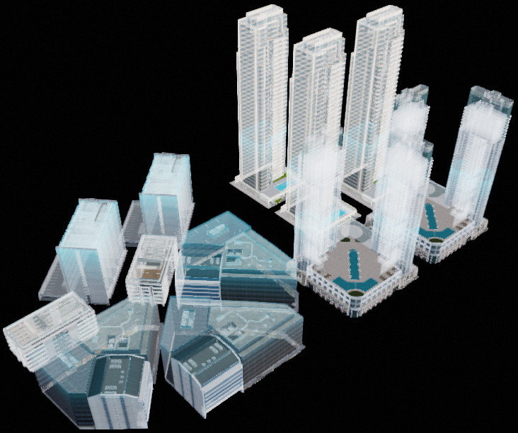
Settings
-
Search Configuration: Click Search Configuration in the upper-right corner of the Configuration panel. In the Search Configuration panel, enter the name of the configuration items that you want to search for to quickly locate the configuration items. Fuzzy match is supported. For more information, see Search for asset configurations.
-
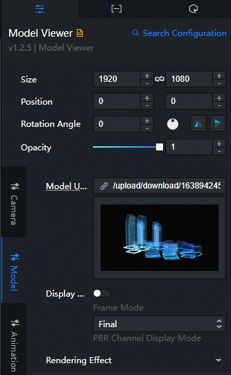
Size: The size of the widget in pixels, including width and height. You can click the
 icon to lock the aspect ratio and scale the width and height proportionally. Click the icon again to adjust width and height independently.
 -
Position: The position of the widget, specified by pixel X and Y coordinates. X-coordinate indicates the pixel distance between the upper-left corner of the widget and the left edge of the canvas. Y-coordinate indicates the pixel distance between the upper-left corner of the widget and the top edge of the canvas.
-
Rotation Angle: The rotation angle in degrees (°), measured from the center point of the widget. You can control the rotation angle in the following ways:
-
Enter a value in the Rotation Angle spin box, or click the plus (+) or minus (-) sign to adjust the value.
-
Drag the
 black dot in the icon to control the rotation angle of the widget.
 -
Click the
 icon to flip the widget style.
 -
Click the
 icon to flip the widget style.
-
-
Opacity: Valid values: 0 to 1. A value of 0 hides the widget. A value of 1 makes the widget fully visible. Default value: 1.
-
Camera
Parameter
description
Perspective
The field of view (FOV) angle of the camera. Drag the slider to adjust the viewing angle. Valid values: 0.1 to 180.
Camera Position
The camera position along the X, Y, and Z axes. Drag the slider to adjust each axis value. Valid values: -1000 to 1000.
Target location
The point the camera faces along the X, Y, and Z axes. Drag the slider to adjust each axis value. Valid values: -1000 to 1000.
-
Model
Parameter
description
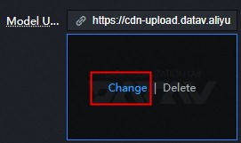
Model address
A default model URL is preconfigured. To use a different model, you can upload one in two ways:
-
Enter the model URL in the link input box next to the model address.
-
Click Change in the dashed box below the address field. In the Select Assets dialog box, select a model from Official Design Assets or from My Design Assets. You can also click the + icon in My Design Assets to upload a local model. For more information, see Function description.
NoteIf the
urlfield is configured in the data panel, the model address in the data panel is read first.Display Mode
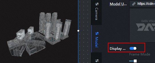
Turn on the switch to enable wireframe mode, which overlays a solid-color wireframe on the original model texture.
-
Wireframe Type: The wireframe type. Valid values: Triangle Mesh and Quad Mesh.
-
Wireframe Width: Drag the slider to adjust the width and thickness of the wireframe. This parameter is available only when you turn on Wireframe Mode.
-
Wireframe Color: The color of the wireframe. This parameter is available only when you turn on Wireframe Mode.
-
PBR Channel Display Mode: The Model Viewer supports PBR map display. In addition to base color, only Metal-Roughness is supported. Select a map style from the PBR Channel Display Mode drop-down list. Available styles include Final, Base Color, AO, Metalness, Roughness, Normal, and Illumination.
Rendering Effect
The rendering effect of the model, including:
-
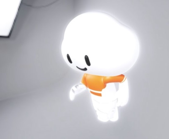
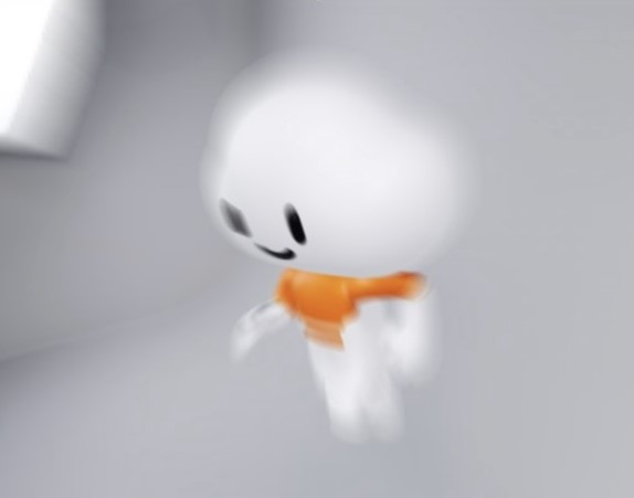
Shadow Settings: Configure the shadow style of the model. Turn Emit Shadow or Receive Shadow on or off to control the shadow behavior.
NoteEmit Shadow casts shadows onto other meshes. Receive Shadow allows the model to receive shadows from other meshes. To display shadows between the meshes of the model itself, turn on both options. To display only the overall model shadow on the projection plane, turn on only Emit Shadow to reduce rendering overhead.
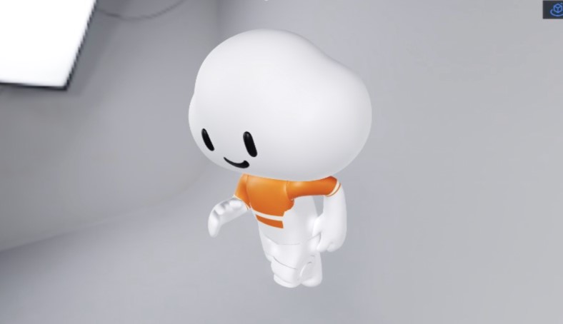
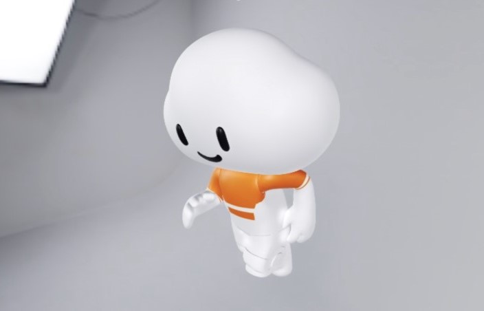
Figure 1. Effect of only open emission shadow
Figure 2. The launch and receive shadows are open renderings
-
Opacity: Drag the slider to adjust the opacity of the model.
NoteAdjusting opacity may cause some post-processing effects to not render correctly. If you need translucent objects in the model, we recommend that you adjust the materials in your modeling software instead.
Change configuration
-
Position: Drag the slider to adjust the position of the model in the x-axis, Y, and Z directions. The value range is -1000 to 1000.
-
Rotate: You can drag the slider to adjust the selected angle of the model in the x-axis, Y, and Z directions. The value range is 0 to 100.
-
Scale: Drag the sliders to adjust the scale of the model along the x-axis, Y, and Z axes. Valid values: 0 to 100.
-
-
-
Animation
Parameter
description
Model Animation
Turn on the switch to play model animations. Both morph animation and skeletal animation are supported.
-
For a single-animation model, turn on the Animation Model switch to play the animation.
-
Multi-animation model: If a model has multiple animations, the first animation is played by default after you turn on Animation Model. To select a different animation, click Use Position and Animation Settings.
NoteTo configure animation details, click the
icon in the upper-right corner of the model widget on the canvas to enter the immersive editor. To configure animation details in the immersive editor:
-
Click Position and Animation Settings in the upper-right corner of the model widget in Canvas Editor. The Animation Settings dialog box appears.
-
In the dialog box, turn on the Auto Play switch to enable auto-play. You can also preview or stop individual animations for a multi-animation model.
-
In the Model Preview panel on the left, drag the model to adjust the camera angle and select the optimal display angle.
-
Click the drop-down list next to Default Animation to view all available animations. Select an animation to set it as the default.
-
After you finish configuring animations, click Exit and Save Settings in the upper-left corner or the
icon in the upper-right corner to exit the Animation Settings dialog box.
-
Sweep animation
Click the icon on the
left to turn on the switch and add a light-sweep animation effect to the model. You can customize sweep parameters to create visual effects. -
Front Type: You can select Plane or Surface.
-
Scan Axial: Select an axial direction for scanning the light-sweeping animation. Valid values: x-axis, Y, and Z.
-
Positive or Negative Direction: Select the direction of the light-sweeping animation. Valid values: Positive and Negative.
-
Color: the color of the sweep animation.
-
Sweep Length: Drag the slider to set the sweep length of the animation. Valid values: 0 to 100.
-
Sweep Speed: Drag the slider to set the sweep speed of the animation. Valid values: 0 to 100.
Rotation around an axis
Click the
icon on the left to turn on axis rotation for the model. -
Rotation Axis: Select a rotation axis. Valid values: x-axis, Y, Z, and Custom.
-
Direction: The rotation direction. Valid values: Counterclockwise and Clockwise.
-
Rotation Speed: Drag the slider to set the rotation speed around the axis.
-
-
Environment and Lighting
Parameter
description
Background information
The Model Viewer supports different backgrounds for different scenarios. Three background types are available. Click the
icon on the left to toggle background display. -
None: Select None or turn off the Background switch to disable the background. The layer widget below the Model Viewer widget is then visible on the canvas.
-
Color: If you select this option, the background is set to a solid color. You can customize the background color and translucency.
-
Environment Map: If you select this option, the environment map is displayed as the background.
Environment Map
Click the
icon on the left to turn on the environment map. The environment map provides image-based lighting. Only HDR format is supported. -
Environment Map: You can enter a custom map URL or select a map from the image box below. DataV provides ten built-in map styles.
-
Direction: The direction of the texture map. Valid values: 0 to 360. Unit: degree.
-
Intensity: The intensity of the environment map. Valid values: 0 to 5.
Ambient light
Ambient light illuminates all objects uniformly without casting shadows. Click the
or icon on the right to add or remove an ambient light series. Click the or icon to switch the layout of multiple series. Click the icon to duplicate the selected series. -
Color: the color of the ambient light in the series.
-
Intensity: the intensity of the ambient light. Valid values: 0 to 10.
ImportantIf the model material metalness is 1, the model appears completely black when ambient light is the only light source.
parallel light
Directional light is the only light source that can produce shadows, and it faces the model origin by default. Click the
or icon on the right to add or remove a directional light series. Click the or icon to switch the layout of multiple series. Click the icon to duplicate the selected series. -
Color: the color of the parallel light in the series.
-
Intensity: the intensity of the parallel beam. Valid values: 0 to 10.
-
Position: the position of the parallel beam in the X, Y, and Z directions.
Projection plane
Click the
icon on the left to turn on the projection plane, which displays the model shadow on a flat surface. The projection plane takes effect only when Directional Light is configured and is turned on. -
Edge Fade: Drag the slider to fade out the shadow. Valid values: 0 to 10.
-
Height: Drag the slider to set the height of the shadow. Valid values: -5 to 5.
-
Size: Drag the slider to set the size of the shadow. Valid values: 1 to 10.
-
Opacity Value: Drag the slider to set the opacity value of the shadow. The value ranges from 0 to 1.
-
-
Post- processing: Post-processing applies full-screen effects using digital image processing techniques on the rendered output, similar to filters, to enhance visual quality.
Parameter
description
Anti-aliasing Type
The default anti-aliasing type is FXAA. You can also select SSAA, but SSAA has significantly higher performance costs than FXAA. We recommend that you do not select SSAA.
Sharpen vignetting
Sharpen Vignette combines image sharpening with lens vignetting to create a cinematic look. Click the icon to the left of
Sharpen Vignette to turn on this effect. -
Sharpness: Drag the slider to adjust the sharpness value. The larger the value, the sharper the image.
-
Vignette Radius: Drag the slider to adjust the value of the vignette radius. The larger the value, the larger the vignette radius and the smaller the vignette.
-
Vignette Softness: Drag the slider to adjust the value of the vignette softness. The larger the value, the more obvious the vignette transition effect.
-
Granularity: Drag the slider to adjust the granularity. A larger value indicates more graininess.
SSR
SSR (Screen Space Reflection) simulates reflections by computing light interactions with scene objects. Smoother surfaces produce clearer reflections. Click the icon to the left of the
SSR to turn on this effect. -
Reflection Range: Drag the slider to adjust the value of the reflection range. The larger the value, the larger the range and the lower the reflection quality.
-
Number of Light Steps: Drag the slider to adjust the number of light steps for reflection. The larger the number, the higher the reflection quality and the higher the computing overhead.
-
Light step size: Drag the slider to adjust the reflected light step size. The larger the value, the wider the scene the light can reach.
-
Reflective Surface Glossiness: Drag the slider to adjust the gloss of the reflective surface. A larger value indicates a smoother surface and a clearer reflection image.
-
Blur Degree: Drag the slider to adjust the blur degree of reflection. The larger the value, the more blurred the image.
AO Shadow
AO (Ambient Occlusion) shadow enhances the depth of an image by calculating occlusion between adjacent pixels and darkening edges and crevices. Click the icon to the left of the
AO shadow to turn on this effect. -
Offset: Drag the slider to adjust the AO shadow offset. The larger the value, the larger the shadow offset.
-
AO Intensity: Drag the slider to adjust the AO Intensity value to exponentially adjust the contrast.
-
Sharpness: Drag the slider to adjust the sharpness. The larger the value, the sharper the value.
-
AO Radius: Drag the slider to adjust the value of the AO Radius. The larger the value, the larger the range.
-
Blur Strength: Drag the slider to adjust the blur strength of AO shadows. A larger value indicates smoother shadows and higher overhead.
Lens blurring
Configure lens blur to produce a depth-of-field effect. Click the icon to the left of the
lens blur to turn on this effect. -
Blur Degree: Drag the slider to adjust the blur degree of the shot. The larger the value, the more blurred the image.
-
Aperture Size: Drag the slider to adjust the value of the blurred aperture. The smaller the value, the clearer the image.
-
Focal Length: Drag the slider to adjust the focal length of the lens. The larger the value, the more blurred the image.
-
Focus Size: Drag the slider to adjust the focus size of the lens. The larger the value, the more blurred the image.
Glow
Glow enhances the light-dark contrast of the image and generates an outer glow effect on bright areas. Click the icon to the left of the
glow to turn on this effect. -
Mask: Turn on the switch to set a glow effect beyond the model boundary when using a mask.
-
Intensity: Drag the slider to adjust the intensity of the glow. The larger the intensity, the more outward the glow.
-
Brightness: Drag the slider to adjust the brightness of the glow. The larger the value, the brighter the glow.
-
Brightness Threshold: Drag the slider to adjust the glow brightness threshold. The larger the value, the less obvious the glow effect.
-
Smoothing Width: Drag the slider to adjust the width of glow smoothing. The larger the width, the smoother the glow transition.
-
Spot Radius: Drag the slider to adjust the spot radius. The larger the value, the more obvious the spot effect.
Motion Blur
Motion blur simulates the blur effect of fast-moving objects. Click the icon to the left of the
motion blur to turn on this effect. -
Blur Degree: Drag the slider to adjust the motion blur degree. The larger the value, the more blurred the motion blur degree.
-
Motion Rate: Drag the slider to adjust the motion rate. The larger the value, the more blurred the value.
Color correction
Adjust the hue, saturation, brightness, and contrast of the final output image.
-
Tint: Drag the slider to adjust the tint value. The larger the value, the warmer the tint.
-
Saturation: Drag the slider to adjust the saturation value. A smaller value indicates a higher saturation.
-
Brightness: Drag the slider to adjust the brightness value. The larger the value, the brighter the screen.
-
Contrast: Drag the slider to adjust the value of Contrast. The larger the value, the higher the image contrast.
-
 icon to flip the widget style.
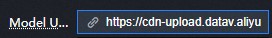
 icon in the upper-right corner of the model widget on the canvas to enter the immersive editor.
  icon in the upper-right corner to exit the Animation Settings dialog box.
  left to turn on the switch and add a light-sweep animation effect to the model. You can customize sweep parameters to create visual effects.
  or
or  icon on the right to add or remove an ambient light series. Click the
  or
or  icon to switch the layout of multiple series. Click the
  icon to duplicate the selected series.
Data tab
url: The URL of the model.
Interaction tab
This widget does not support interaction events.
Configure interactions in Blueprint Editor
-
In Canvas Editor, right-click a widget in the Layer panel and select Add to Blueprint Editor.
-
Click the
icon in the upper-left corner. -
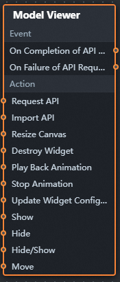
In the blueprint editor, click the Model Viewer component in the Import Nodes pane. You can view the parameters of the model viewer on the canvas, as shown in the following figure.
-
Event
Event
Description
When the data interface request is completed
The event is triggered after a data interface request is responded to and processed by a filter, returning the processed JSON data. For specific data examples, see the Data Response Result section on the Data tab in the right-side panel of the canvas editor.
When a data interface request fails
This event is triggered when a data interface request fails (due to network issues or interface errors) and is processed by the filter. The processed JSON data is returned. For specific data examples, see the Data Response Result section on the Data tab in the right-side panel of the canvas editor.
-
Action
Action
Description
Request Data Interface
Requests data from the server again, using data from an upstream processing node or layer node as parameters. For example, if the API data source is
https://api.testand the data passed to Request Data Interface is{ id: '1'}, the final request URL ishttps://api.test?id=1.Import data
Imports pre-processed data in the widget's drawing format for redrawing without re-requesting server data. For specific data examples, see the Data Response Result section on the Data tab in the right-side panel of the canvas editor.
Canvas Size Change
The size of the canvas changes. The input data of the action is of the number type.
Animation playback
The animation is played. The input data of the motion is of the object and string types.
Animation Stop
The animation stops. The input data of the motion is of the object and string types.
Update component configurations
Dynamically updates widget style configurations. Before using this action, click the widget in Canvas Editor, go to the Settings tab in the right-side panel, and click Copy Configurations to... to obtain the widget configurations. Then modify the style field in the data processing node in Blueprint Editor.
Display
Displays the widget. The following example shows reference data.
return {
  "animationType": "",
  "animationDuration": 1000,
  "animationEasing": "linear"
};
Hide
Hides the widget. The following example shows reference data.
return {
  "animationType": "",
  "animationDuration": 1000,
  "animationEasing": "linear"
};
Switch to the implicit state
Toggles widget visibility. The following example shows reference data.
return {
  "animationIn": {
    "animationType": "",
    "animationDuration": 1000,
    "animationEasing": "linear"
  },
  "animationOut": {
    "animationType": "",
    "animationDuration": 1000,
    "animationEasing": "linear"
  }
};
China Mobile
Moves the widget to a specified location. The following example shows reference data.
return {
  // The positioning type. to indicates absolute positioning, whereas by indicates relative positioning. The default value is to.
  "positionType": "to",
  // The location, which is indicated by the x and y coordinates.
  "attr": {
    "x": 0,
    "y": 0
  },
  // The animation type.
  "animation": {
    "enable": false,
    // The duration in which animation is displayed.
    "animationDuration": 1000,
    // The animation curve, which can be set to linear|easeInOutQuad|easeInOutExpo.
    "animationEasing": "linear"
  }
};
-
 icon in the upper-left corner.