This topic describes the styles and configuration items for the Range Slider widget.
Chart style
The Range Slider is a control widget that you can use to select a range of values by sliding. You can customize its global and slider styles.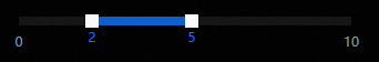
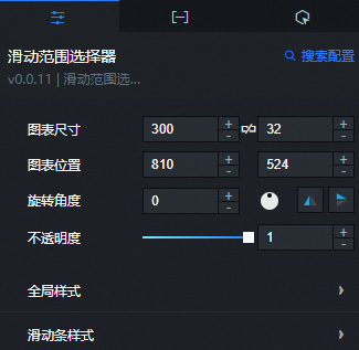
Configuration panel
- Search for Configurations: In the right-side panel of Canvas Editor, click the Settings tab, and click Search for Configurations in the upper-right corner. Enter the required configuration item in the search box, and click the search icon to quickly locate the configuration item. Fuzzy match is supported. For more information, see Search for Configurations.
- Size: indicates the size of a widget, including its pixel width and height. You can click the
 icon to proportionally adjust the width and height of a widget. After you click this icon again, you can adjust the width and height as needed.
 - Position: the position of a widget, which is indicated by pixel X and Y coordinates. X-coordinate indicates the pixel distance between the upper-left corner of the widget and the left border of the canvas. Y-coordinate indicates the pixel distance between the upper-left corner of the widget and the upper border of the canvas.
- Rotation Angle: the angle of a rotation that uses the center point of a widget as the rotation point. The unit is degrees (°). You can use one of the following methods to control the rotation angle of a widget:
- Directly enter the degrees in the Rotation Angle spin box or click the plus sign (+) or minus sign (-) to increase or decrease the value in the Rotation Angle spin box.
- Drag the black dot in the
 icon.
icon. - Click the
 icon to horizontally flip a widget.
 - Click the
 icon to vertically flip a widget.
- Opacity: the opacity of a widget. Valid values: 0 and 1. If this parameter is set to 0, the widget is hidden. If this parameter is set to 1, the widget is completely displayed. Default value: 1.
Global Styles
Parameter
Description
Minimum
Enter a custom minimum value for the range slider.
Maximum
Enter a custom maximum value for the range slider.
Stride
Enter a custom step value for the slider. The default value is 0.5.
Default Opacity
The opacity of the range slider in its default state. The value is between 0 and 1.
Default Transparency
The opacity of the range slider when you hover the mouse over it. The value is between 0 and 1.
Alignment
The alignment of the range slider. You can select Horizontal or Vertical.
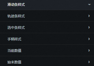
Slider Style
Parameter
Description
Track Style
The style of the range slider track.
Border Style: The border style of the track, including the border width, color, and border radius.
Background Color: The background color of the track.
Selected Bar Style
Set the background color of the selected bar in the range slider.
Handle Style
The style of the range slider handle.
Size: The size of the handle.
Background Color: The background color of the handle.
Border Style: The border style of the handle, including the border width, color, and border radius.
Current Value
The style of the value for the currently selected range.
Background Color: The background color of the current value display.
Offset: Set the offset for the current value display.
Padding: The internal spacing of the current value display.
Border Style: The border style of the current value display, including the border width, color, border radius, and line type.
Text Style: Set the text style for the current value, including the color, font, weight, and font size.
Start and End Values
The style of the start and end values of the range slider.
Background Color: The background color of the start and end value displays.
Offset: Set the offset for the start and end value displays.
Padding: The internal spacing of the start and end value displays.
Border Style: The border style of the start and end value displays, including the border width, color, border radius, and line type.
Text Style: Set the text style for the start and end values, including the color, font, weight, and font size.
 icon to vertically flip a widget.
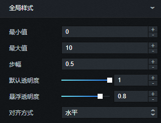
Data panel
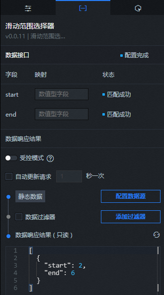
Field description
Field |
Description |
|
The start value of the selected bar in the range slider. |
|
The end value of the selected bar in the range slider. |
| Parameter | Description |
| Controlled Mode | If you turn on the switch, data is not requested when a widget is initialized. Data requests are triggered only based on callback IDs or the method configured in Blueprint Editor. If you turn off the switch, data requests are automatically triggered. By default, the switch is turned off. |
| Auto Data Request | After you select the Auto Data Request check box, you can enable dynamic polling, and manually specify the polling interval. If you do not select this check box, data is not automatically requested. You must manually refresh the page to request data or use Blueprint Editor or callback ID events to trigger data requests. |
| Data Source | In the right-side panel of Canvas Editor, click the Data tab. Click Set next to Static Data. In the Configure Datasource panel, select a data source from the Data Source Type drop-down list. Enter code for data query in the code editor, click Preview Data Response to preview the response of the data source, and then view the response. For more information, see Configure asset data. |
| Data Filter | If you select the Data Filter check box, you can convert the data structure, filter data, and perform simple calculations. If you click the plus sign (+) next to Add Filter, you can configure the script for the data filter in the editor that appears. For more information, see Use the data filter. |
| Data Response Result | The response to a data request. If the data source changes, you can click the  icon next to Data Response Result to view the data response in real time. icon next to Data Response Result to view the data response in real time. |
Interaction panel
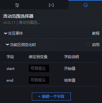
To enable widget interactions, select Enable next to When the current range changes. The Range Slider widget has an interaction configuration. When you slide the control to adjust the range, it triggers a data request and passes a callback value. You can then configure other widgets to use this value. By default, the start and end values that are configured on the Data panel are passed. For more information about the configuration, see Configure a widget callback ID.
Blueprint editor interaction configuration
- In Canvas Editor, right-click a widget in the Layer panel and select Add to Blueprint Editor.
- Click the icon in the upper-left corner of the page.
On the blueprint editor configuration page, click the Range Slider widget in the imported nodes panel. The configuration parameters for the Range Slider widget are displayed on the canvas.
Events
Event
Description
Data Interface Request Completed
This event is triggered after a data API request is successfully returned and processed by the filter. The processed data is passed as a parameter in JSON format. For a data example, see the Data Response section on the Data tab of the widget's configuration panel in the canvas editor.
When a data API request fails
This event is triggered when a data API request fails. A request can fail because of network issues or API errors. The processed data is passed as a parameter in JSON format. For a data example, see the Data Response section on the Data tab of the widget's configuration panel in the canvas editor.
When the current range changes
This event is triggered when the current range value changes. The data item that corresponds to the value is also passed as a parameter.
Actions
Action
Description
Request data API
Requests server-side data again. Data from input data processing nodes or layer nodes is used as parameters. For example, if a range selector is configured with an API data source of
https://api.testand the data passed to the Request data API action is{ id: '1'}, the final API request ishttps://api.test?id=1.Import data API
The data is processed in the component's drawing format and then imported to redraw the component. You do not need to request server-side data again. For a data example, see the Data Response Result area on the Data tab of the configuration panel to the right of the component in the canvas editor.
Get current range value
Gets the value of the current range.
Clear component to default
Clears the component data to the default value.
Update component configuration
Dynamically updates the component's style configuration. In the component's Configuration panel, click Copy Configuration to Clipboard to get the component configuration data. Then, change the field values for the corresponding styles in the data processing node on the blueprint editor's configuration page as needed.
Show
Shows the component. See the following data example.
return {
  "animationType": "",
  "animationDuration": 1000,
  "animationEasing": "linear"
};
Hide
Hides the component. See the following data example.
return {
  "animationType": "",
  "animationDuration": 1000,
  "animationEasing": "linear"
};
Toggle visibility
Toggles the component's visibility. See the following data example.
return {
  "animationIn": {
    "animationType": "",
    "animationDuration": 1000,
    "animationEasing": "linear"
  },
  "animationOut": {
    "animationType": "",
    "animationDuration": 1000,
    "animationEasing": "linear"
  }
};
Move
Moves the component to a specified position. See the following data example.
return {
  // The movement method. Absolute positioning: to. Relative positioning: by. Default: to.
  "positionType": "to",
  // The specified position. x-coordinate, y-coordinate.
  "attr": {
    "x": 0,
    "y": 0
  },
  // The animation method.
  "animation": {
    "enable": false,
    // The animation duration.
    "animationDuration": 1000,
    // The animation curve. Optional values: linear, easeInOutQuad, or easeInOutExpo.
    "animationEasing": "linear"
  }
};
 icon in the upper-left corner of the page.