This topic describes the style and configuration items of the Time range picker widget.
The Time range picker is not compatible with mobile devices. For updates, check the official DataV website.
Chart style
The Time range picker is a control widget. You can customize its basic settings, input box style, and drop-down list style. You can use it to create a custom time range selection feature.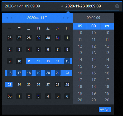
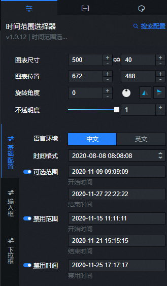
Configuration panel
- Search for Configurations: In the right-side panel of Canvas Editor, click the Settings tab, and click Search for Configurations in the upper-right corner. Enter the required configuration item in the search box, and click the search icon to quickly locate the configuration item. Fuzzy match is supported. For more information, see Search for Configurations.
- Size: indicates the size of a widget, including its pixel width and height. You can click the
 icon to proportionally adjust the width and height of a widget. After you click this icon again, you can adjust the width and height as needed.
 - Position: the position of a widget, which is indicated by pixel X and Y coordinates. X-coordinate indicates the pixel distance between the upper-left corner of the widget and the left border of the canvas. Y-coordinate indicates the pixel distance between the upper-left corner of the widget and the upper border of the canvas.
- Rotation Angle: the angle of a rotation that uses the center point of a widget as the rotation point. The unit is degrees (°). You can use one of the following methods to control the rotation angle of a widget:
- Directly enter the degrees in the Rotation Angle spin box or click the plus sign (+) or minus sign (-) to increase or decrease the value in the Rotation Angle spin box.
- Drag the black dot in the
 icon.
icon. - Click the
 icon to horizontally flip a widget.
 - Click the
 icon to vertically flip a widget.
- Opacity: the opacity of a widget. Valid values: 0 and 1. If this parameter is set to 0, the widget is hidden. If this parameter is set to 1, the widget is completely displayed. Default value: 1.
Basic settings
Parameter
Description
Time format
Click the drop-down list to select a format for the time range picker, or enter a custom format. The format must follow the YYYY/MM/DD HH:mm:ss pattern (Year/Month/Day Hour:Minute:Second).
Selectable range
Enter a custom time range, including a start time and an end time. Click the
icon to show or hide the selectable range. The value of the selectRange field in the Data panel has a higher priority than this setting. Make sure to use the correct time format.Disabled range
Enter a time range to disable, including a start time and an end time. Click the
icon to show or hide the disabled range. The value of the disabledRange field in the Data panel has a higher priority than this setting. Make sure to use the correct time format.Disabled time
Enter a specific time point to disable. Click the
icon to show or hide the disabled time. The value of the disabled field in the Data panel has a higher priority than this setting. Make sure to use the correct time format.Input box
Parameter
Description
Background color
The background color of the input box.
Border style
The border style of the input box. You can set the border line type, border radius, border width, and border color.
Text style
The text style of the input box. You can set the text color, font, font weight, and font size.
Hover style
The style when you move the mouse pointer over the input box. You can set the border color and font color.
Connector icon
The style of the connector icon in the input box. You can set the icon size and color.
Calendar icon
The style of the calendar icon in the input box. You can set the icon size and color.
Clear icon
The style of the clear icon in the input box. You can set the icon size, color, default background color, and background color on hover.
NoteThe size of the clear icon should be the same as the size of the calendar icon.
Drop-down list
Parameter
Description
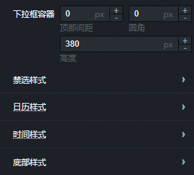
Drop-down container
The style of the drop-down container in the time range picker. You can set the top margin, border radius, width, and height.
Disabled style
The style for disabled items in the drop-down list. You can set the font size, background color, and font color for disabled dates and times.
Calendar style
The style of the selectable calendar in the drop-down list.
Sub-item fill: The fill color for each selectable sub-item in the calendar. You can set the default color, hover color, and selected color.
Sub-item text: The text style for each selectable sub-item in the calendar. You can set the font, font weight, font size, default color, hover color, and selected color.
Range dashed line: The color of the dashed line for the selected range.
Content background: The background color of the entire calendar content area.
Header style: The style of the calendar header. You can set the background color, text style, button colors for different states, and the line separator width and color.
Weekday style: The style of the weekday section in the calendar. You can set the background color, border style, and text style.
NoteIf you set the border width and border radius, and set the border color to be the same as the background color, the rounded corners may be partially clipped.
Time style
The style of the selectable time section in the drop-down list.
Overall background: The overall background color of the time section.
Header style: The style of the time section header. You can set the background color, font size, and font color.
Separator style: The style of the line separators in the time section. You can set the width and color for the left, top, and column separators.
Content background: The background color of the entire time content area.
Sub-item fill: The fill color for each selectable sub-item in the time section. You can set the default color, hover color, and selected color.
Sub-item border: The border style for sub-items in the time section. You can set the border line type, border radius, width, default color, hover color, and selected color.
Sub-item text: The text style for each selectable sub-item in the time section. You can set the font, font weight, font size, default color, hover color, and selected color.
Top Style: The style of the calendar header. This includes the background color, text style, button colors for different states, and the width and color of the line separator.
Footer style
The style of the footer in the time range picker drop-down list.
Background color: The background color of the drop-down list footer.
Separator style: The style of the line separator in the drop-down list footer. You can set the width and color.
Confirm button: The style of the confirm button in the drop-down list footer. You can set the button background color, border style, and text style.
 icon to vertically flip a widget.
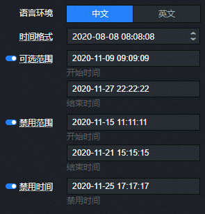
 icon to show or hide the selectable range. The value of the
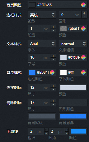
Data panel
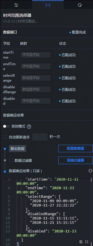
Field descriptions
Field |
Description |
|
The start time of the time range picker. |
|
The end time of the time range picker. |
|
The selectable time range. This is an optional field. If this field is not configured in the Data panel, the default range ['1000-01-01 00:00:00', '5999-12-31 23:59:59'] is used. |
|
The disabled time range. This is an optional field. If this field is not configured in the Data panel, the default range ['1000-01-01 00:00:00', '5999-12-31 23:59:59'] is used. |
|
A specific time point to disable. This is an optional field. If the content is incomplete, '5999-12-31 23:59:59' is used. |
| Parameter | Description |
| Controlled Mode | If you turn on the switch, data is not requested when a widget is initialized. Data requests are triggered only based on callback IDs or the method configured in Blueprint Editor. If you turn off the switch, data requests are automatically triggered. By default, the switch is turned off. |
| Auto Data Request | After you select the Auto Data Request check box, you can enable dynamic polling, and manually specify the polling interval. If you do not select this check box, data is not automatically requested. You must manually refresh the page to request data or use Blueprint Editor or callback ID events to trigger data requests. |
| Data Source | In the right-side panel of Canvas Editor, click the Data tab. Click Set next to Static Data. In the Configure Datasource panel, select a data source from the Data Source Type drop-down list. Enter code for data query in the code editor, click Preview Data Response to preview the response of the data source, and then view the response. For more information, see Configure asset data. |
| Data Filter | If you select the Data Filter check box, you can convert the data structure, filter data, and perform simple calculations. If you click the plus sign (+) next to Add Filter, you can configure the script for the data filter in the editor that appears. For more information, see Use the data filter. |
| Data Response Result | The response to a data request. If the data source changes, you can click the  icon next to Data Response Result to view the data response in real time. icon next to Data Response Result to view the data response in real time. |
Interaction panel
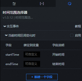
To enable the interaction feature for the widget, select Enable next to When the current time range changes. The Time range picker widget has an interaction configuration. When the time range value changes, it can trigger a data request and expose a callback value. You can then use this value in other widgets. By default, the widget exposes the startTime and endTime values configured in the Data panel. For more information, see Configure a callback ID for a widget.
Blueprint editor interaction configuration
- In Canvas Editor, right-click a widget in the Layer panel and select Add to Blueprint Editor.
- Click the icon in the upper-left corner of the page.
On the blueprint editor configuration page, click the Time range picker widget in the import node bar. The configuration parameters for the Time range picker appear on the blueprint editor canvas, as shown in the following figure.
Events
Event
Description
When a data API request is successful
This event is triggered when a data API request is successful and the returned data is processed by the filter. The processed data is exposed in JSON format. For a data example, see the Data Response section on the Data tab of the widget's configuration panel in the canvas editor.
When a data API request fails
This event is triggered when a data API request fails due to a network issue or an API error. The processed data is exposed in JSON format. For a data example, see the Data Response section on the Data tab of the widget's configuration panel in the canvas editor.
When the current time range changes
This event is triggered when the current time range value changes. The corresponding data item is exposed.
Actions
Action
Description
Request data API
Requests server-side data again. Data from upstream data processing nodes or layer nodes is used as parameters. For example, if a time range selector has its API data source set to
https://api.test, and the data passed to the Request data API action is{ id: '1'}, the final API request ishttps://api.test?id=1.Import data API
Processes data in the component's drawing format, then imports the data to redraw the component. This action does not request server-side data again. For a data example, see the Data Response area on the Data tab of the component's configuration panel in the canvas editor.
Get current time range
Gets the value of the current time range.
Reset component to default
Resets the component data to its default value.
Update component configuration
Updates the component's style configuration dynamically. In the component's Configuration panel, click Copy Configuration to Clipboard to get the component configuration data. Then, as needed, change the style field values in the data processing node on the blueprint editor's configuration page.
Show
Shows the component. See the data sample below.
return {
  "animationType": "",
  "animationDuration": 1000,
  "animationEasing": "linear"
};
Hide
Hides the component. See the data sample below.
return {
  "animationType": "",
  "animationDuration": 1000,
  "animationEasing": "linear"
};
Toggle visibility
Toggles the component between shown and hidden. See the data sample below.
return {
  "animationIn": {
    "animationType": "",
    "animationDuration": 1000,
    "animationEasing": "linear"
  },
  "animationOut": {
    "animationType": "",
    "animationDuration": 1000,
    "animationEasing": "linear"
  }
};
Move
Moves the component to a specified position. See the data sample below.
return {
  // Move method. Use 'to' for absolute positioning and 'by' for relative positioning. Default value: 'to'.
  "positionType": "to",
  // The target position, specified by x and y coordinates.
  "attr": {
    "x": 0,
    "y": 0
  },
  // Animation settings.
  "animation": {
    "enable": false,
    // Animation duration.
    "animationDuration": 1000,
    // Animation curve. Optional values: linear, easeInOutQuad, or easeInOutExpo.
    "animationEasing": "linear"
  }
};
 icon in the upper-left corner of the page.