3D donut chart
This topic describes the style and configuration options for the 3D donut chart component.
Chart style
A 3D donut chart is a type of pie chart that visualizes the proportion of each category.
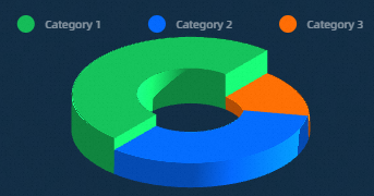
Configuration panel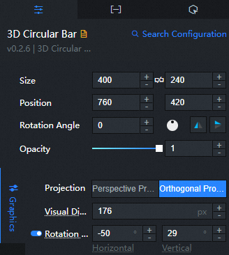
- Search for Configurations: In the right-side panel of Canvas Editor, click the Settings tab, and click Search for Configurations in the upper-right corner. Enter the required configuration item in the search box, and click the search icon to quickly locate the configuration item. Fuzzy match is supported. For more information, see Search for Configurations.
- Size: indicates the size of a widget, including its pixel width and height. You can click the
 icon to proportionally adjust the width and height of a widget. After you click this icon again, you can adjust the width and height as needed.
 - Position: the position of a widget, which is indicated by pixel X and Y coordinates. X-coordinate indicates the pixel distance between the upper-left corner of the widget and the left border of the canvas. Y-coordinate indicates the pixel distance between the upper-left corner of the widget and the upper border of the canvas.
- Rotation Angle: the angle of a rotation that uses the center point of a widget as the rotation point. The unit is degrees (°). You can use one of the following methods to control the rotation angle of a widget:
- Directly enter the degrees in the Rotation Angle spin box or click the plus sign (+) or minus sign (-) to increase or decrease the value in the Rotation Angle spin box.
- Drag the black dot in the
 icon.
icon. - Click the
 icon to horizontally flip a widget.
 - Click the
 icon to vertically flip a widget.
- Opacity: the opacity of a widget. Valid values: 0 and 1. If this parameter is set to 0, the widget is hidden. If this parameter is set to 1, the widget is completely displayed. Default value: 1.
Style
Projection method: Sets the 3D projection method for the chart to either perspective projection or orthographic projection.
Visual distance: Adjusts the overall size of the chart by changing the camera distance. The default unit is pixels.
Rotation angle: Sets the horizontal and vertical rotation angles of the chart. Click the
icon to show or hide this setting.NoteEnabling this setting disables interactive mouse rotation.
Inner/outer radius ratio: Sets the ratio between the inner and outer radii.
Height mapping: When enabled, the height of each slice is mapped to its corresponding
valuein the data. When disabled, all slices have the same height.Height ratio: Adjusts the overall height of the 3D donut chart.
Chart color: Sets the colors for the chart slices. For more information, see Use the color mapper to configure color mapping for different slices.
Merge small slices: Merges the smallest slices into a single "Other" slice to limit the number of visible categories. The name of the merged category is customizable. Click the
icon to enable or disable this feature.Chart label: Configures the labels for the chart slices. Click the
icon to show or hide the label settings.Parameter
Description
Type
For Data Type, you can select Percentage or Default Value, and for Display Type, you can select Normal or Spider.
NoteIf there are more than 3 data items, change the Display Type to Standard.
Label field
The label field for the donut chart can be name+value, name, or value.
Separator
Set the separator for the labels of the donut chart. Enter
brto insert a line break. This option is available only when name+value is selected in the label field.Decimal places
Sets the number of decimal places to display for the label value.
Line height
Specifies the line height for the label field, in px. This setting is available only when the label field of the donut chart is set to name+value.
Spacing
Sets the distance between the label and the chart in pixels.
Text style
Configures the text style for the labels, including font family, weight, size, and color.
Animation: Configures animation settings for the chart.
Auto rotate: When enabled, the chart rotates automatically.
NoteAuto-rotation is supported only when the annotation display type is Standard.
Rotation direction: Sets the rotation direction. You can choose Counter-clockwise or Clockwise. This option is available only when Auto rotate is enabled.
Rotation speed: Sets the speed of the rotation animation. This option is available only when Auto rotate is enabled.
Interaction
Mouse interaction: Supports multiple mouse interactions, such as rotation, zooming, and zoom on hover. Rotation and zooming are supported only for the Normal annotation display type.
Tooltip: Configures the tooltip that appears when a user hovers over or clicks a chart slice. Click the
icon to show or hide the tooltip settings.Parameter
Description
Trigger
Specifies the action that triggers the tooltip. Options include Hover and Click.
Position
Specifies the position of the tooltip relative to the cursor. Options include Top, Bottom, Left, and Right.
Title spacing
Sets the spacing in pixels between the title and the content.
Title text
Configures the text style for the tooltip title, including font family, weight, size, and color.
Content text
Configures the text style for the tooltip content, including font family, weight, size, and color.
Popup background
Configures the background style of the tooltip.
Background Padding: Sets the horizontal and vertical padding for the background.
Background Color: Sets the background color of the tooltip.
Border Style: Sets the style for the tooltip border, including border width and color.
Legend: Configures the chart legend.
Parameter
Description
Show legend
Shows or hides the chart legend. When enabled, you can configure the legend's style.
Orientation
Sets the orientation of the legend. Options include Horizontal and Vertical.
Horizontal align
Sets the horizontal alignment of the legend. Options include Left, Center, and Right.
Vertical align
Sets the vertical alignment of the legend. Options include Top, Center, and Bottom.
Text style
Configures the text style for the legend, including font family, weight, size, and color.
Category legend
Configures the style of the category legend.
Legend Marker: Sets the shape and size of the legend markers.
Legend Spacing: Sets the horizontal and vertical distance between different legend items.
Allow pagination
When enabled, pagination is used for legends with too many items, and you can configure the style of the page numbers and arrows. When disabled, all legend items are displayed on a single page.
Page Number Style: Configures the style of the page numbers, including font, weight, size, and color.
Arrow Style: Configures the size and color (default and disabled states) of the pagination arrows.
Effects: Configures the shading effects for the 3D graphic.
Parameter
Description
Shading
Options include Color Only and Shading.
Lighting
This option is available when Shading is set to Shading.
Main Light: Sets the intensity, color, horizontal and vertical rotation, projection, and shadow quality of the main light.
Ambient light: Sets the intensity and color of the ambient light.
Post effects
Configures post-processing effects for the 3D graphic.
Bloom: Sets the bloom intensity for post-processing highlights.
Depth of field: Sets the depth of field and blur radius.
Conditional formatting: Defines conditional styles.
Conditional style: Click the
or icon to add or remove a conditional style. Click the or icon to reorder the styles. Click the icon to duplicate the currently selected style. For detailed instructions, see Use the condition tree.Slice color: Turn on to configure the slice color for this conditional style. Turn off to disable the color configuration for this condition.
 icon to vertically flip a widget.
 icon to show or hide this setting.


 or
or  icon to add or remove a conditional style. Click the
  or
or  icon to reorder the styles. Click the
  icon to duplicate the currently selected style.
Data panel (default mode)
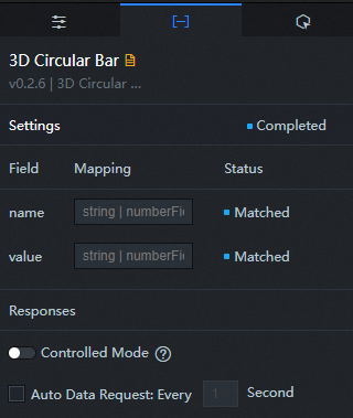
Fields
Field | Description |
| The category name for each slice. |
| The value for each slice, which determines its proportion of the total. |
Configuration options.
Parameter | Description |
Controlled mode | When enabled, the component does not request data on initialization. Data requests are triggered only through a callback ID or a Blueprint Editor action. When disabled, the component can use auto-update requests. This option is disabled by default. |
Auto-update request | When enabled, you can set a polling interval to automatically refresh the data. When disabled, data is updated only by manually refreshing the page or by triggering an update through the Blueprint Editor or a callback ID. |
Data source | Click Configure Data Source to open the Set Data Source panel. In this panel, you can change the data source type, modify data queries, preview the data response, and view the final data result. For more information, see Configure asset data. |
Data filter | A data filter can be used to transform, filter, or perform simple calculations on your data. Click Add Filter to configure a filter script in the Set Data Source panel. For more information, see Use filters. |
Data response result | Displays the response from the data request. When the data source changes, you can click the |
 icon to view the latest data response in real time.
Data panel (analysis mode)
To use the BI analysis feature with a DataV dataset, the component configuration is updated as follows:
The data source is switched from a static API to a DataV dataset.
The DataV dataset configuration is updated. This action does not cause field configurations to be lost.
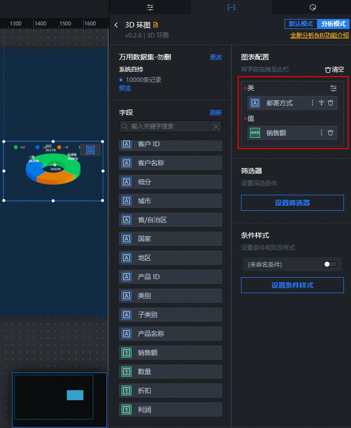
For detailed information about the BI analysis data panel, see BI analysis mode data panel features.
Fields
Field | Description |
Category | The category name for each slice. |
Value | The value for each slice, which determines its proportion of the total. |
To exit analysis mode, click Default Mode in the upper-left corner of the data panel. Exiting deletes the associated analyzer and reverts the panel to default mode.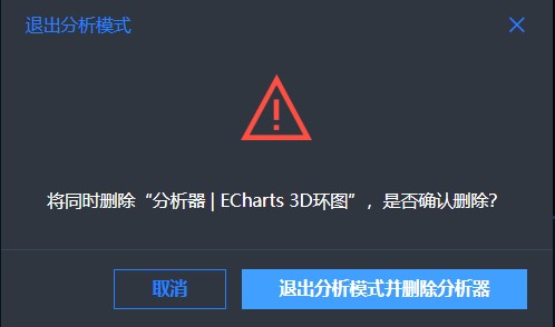
Interaction panel
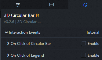
Events
Event | Description |
On chart click | Select Enable to turn on the component's interactive features. When you click a segment of the 3D donut chart, a data request is triggered, a callback value is returned, and data for different sectors is dynamically loaded. By default, the name and value values in the data are returned. For more information about the configuration, see How to configure the callback ID for the digital flipper component. |
On legend click | Select Enable to enable the interactive features of the component. When you click the legend of the 3D donut chart, a data request is triggered, a callback value is returned, and the data for the corresponding legend item is dynamically loaded. By default, the name and checked values in the data are returned. For more information, see How to configure the callback ID for the Digital Flipper component. |
Blueprint editor interactions
- In Canvas Editor, right-click a widget in the Layer panel and select Add to Blueprint Editor.
- Click the icon in the upper-left corner of the page.
On the Blueprint Editor page, click the 3D donut chart component in the Imported Nodes panel to see its configuration parameters on the canvas.
Events
Event
Description
On API request succeeded
This event is triggered after the data is successfully fetched and processed by any filters. The processed data is exposed in JSON format. For a data sample, see the Data Response Result section on the Data tab of the configuration panel.
On API request failed
This event is triggered if the data request fails due to network issues, API errors, or other problems. The error information is exposed in JSON format. For a data sample, see the Data Response Result section on the Data tab of the configuration panel.
On chart click
This event is triggered when a user clicks a slice of the 3D donut chart. The data item corresponding to that slice is exposed.
On legend click
This event is triggered when a user clicks a legend item. The data item corresponding to that legend item is exposed.
Actions
Action
Description
Request API
Triggers a new request to the data source, using data from upstream nodes as request parameters. For example, if the API data source is set to
https://api.testand the data passed to the Request API action is{ id: '1'}, the final request URL will behttps://api.test?id=1.Import data
Updates the component with new data without sending a new request to the server. The data must be in the format required by the component. For a data sample, see the Data Response Result section on the Data tab of the configuration panel.
Update component configuration
Dynamically updates the component's style configuration. This action applies a configuration object from an upstream node. To obtain the required object structure, in the component's Configuration panel, click Copy Configuration to Clipboard.
Show
Shows the component. Sample data:
return{
  "animationType": "",
  "animationDuration": 1000,
  "animationEasing": "linear"
}
Hide
Hides the component. Sample data:
return{
  "animationType": "",
  "animationDuration": 1000,
  "animationEasing": "linear"
}
Toggle visibility
Toggles the visibility of the component. Sample data:
return {
  "animationIn": {
    "animationType": "",
    "animationDuration": 1000,
    "animationEasing": "linear"
  },
  "animationOut": {
    "animationType": "",
    "animationDuration": 1000,
    "animationEasing": "linear"
  }
}
Move
Moves the component to a specified position. Sample data:
    return{
      // Movement type. "to" for absolute positioning, "by" for relative. Default: "to".
        "positionType": "to",
      // Target position (x and y coordinates).
      "attr": {
        "x": 0,
        "y": 0
      },
      // Animation settings.
      "animation": {
        "enable": false,
        // Animation duration in ms.
        "animationDuration": 1000,
        // Easing function. Options: "linear", "easeInOutQuad", "easeInOutExpo".
        "animationEasing": "linear"
      }
    }
 icon in the upper-left corner of the page.