Arc diagram
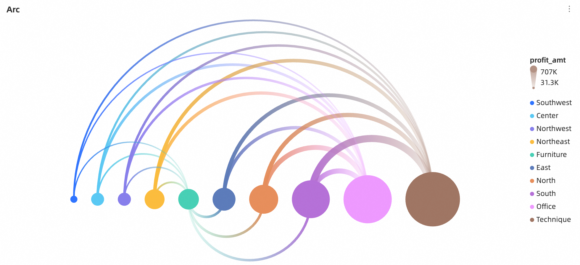
An arc diagram is a common data visualization that uses arcs to show relationships and distributions within data, helping users better understand complex networks.
Prerequisites
You have created a dashboard. For more information, see Create a Dashboard.
Overview
Use cases
An arc diagram is ideal for visualizing and analyzing complex networks. It can reveal patterns, trends, and correlations in various scenarios, such as sales data analysis, financial market analysis, transportation network analysis, and cybersecurity analysis.
Benefits
Arc diagrams offer an intuitive and effective way to display data by visualizing complex relationships, highlighting key nodes, and identifying patterns and trends.
Example
Limitations
An arc diagram consists of Source/Dimension, Target/Dimension, and Connection Value/Measure.
source/dimension and target/dimension are defined by the dimensions in your data. You can select only one dimension for each field, such as a region or product type.
connection value/measure is defined by a measure in your data. You can select only one measure, such as total sales for a region.
Configure chart fields
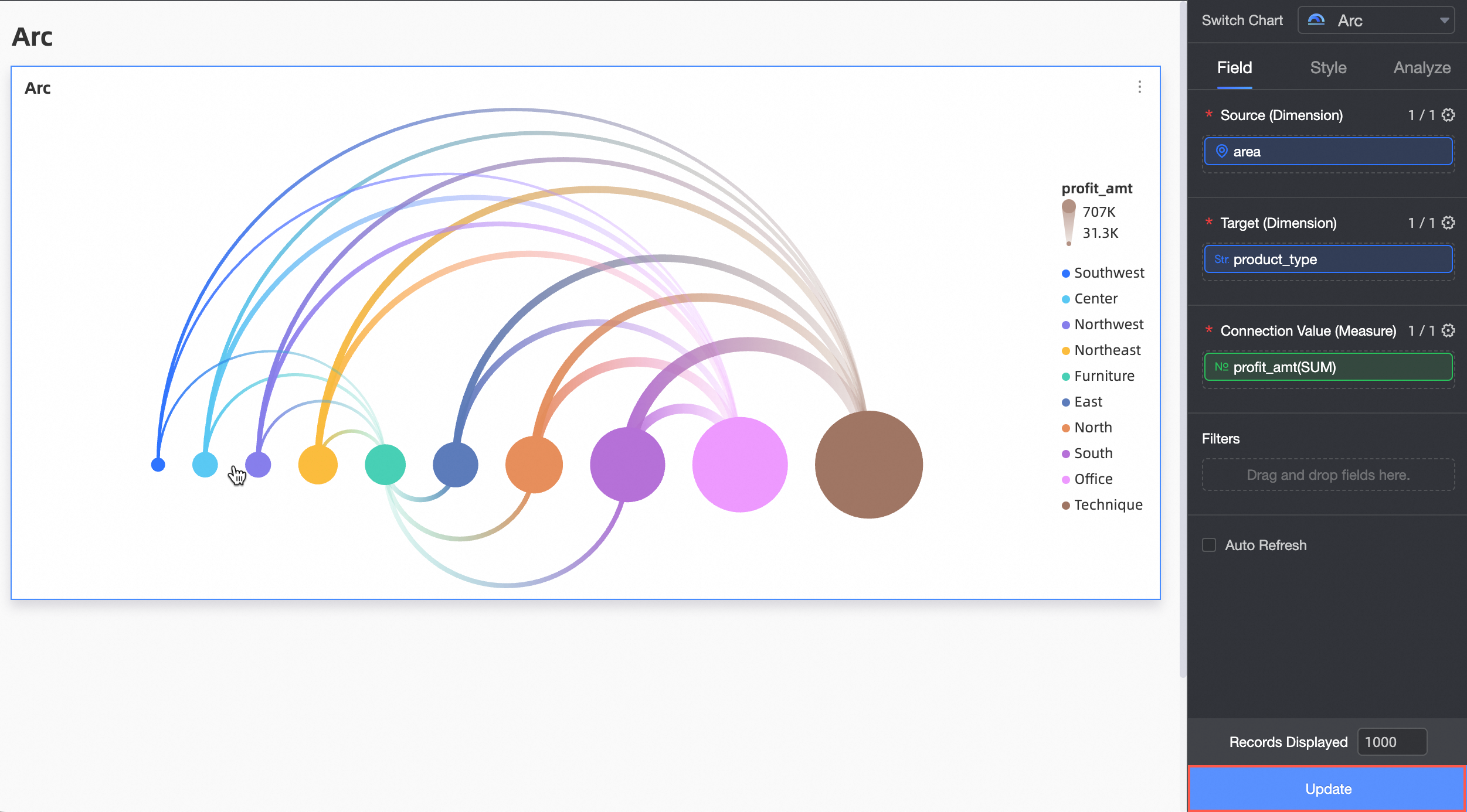
In the data pane, select the required dimension and measure fields.
In the source/dimension field, add a dimension by double-clicking it or dragging it into the field.
In the target/dimension field, select a target dimension.
In the connection value/measure field, select a measure to represent the connection value.
Click Update. The chart updates automatically.
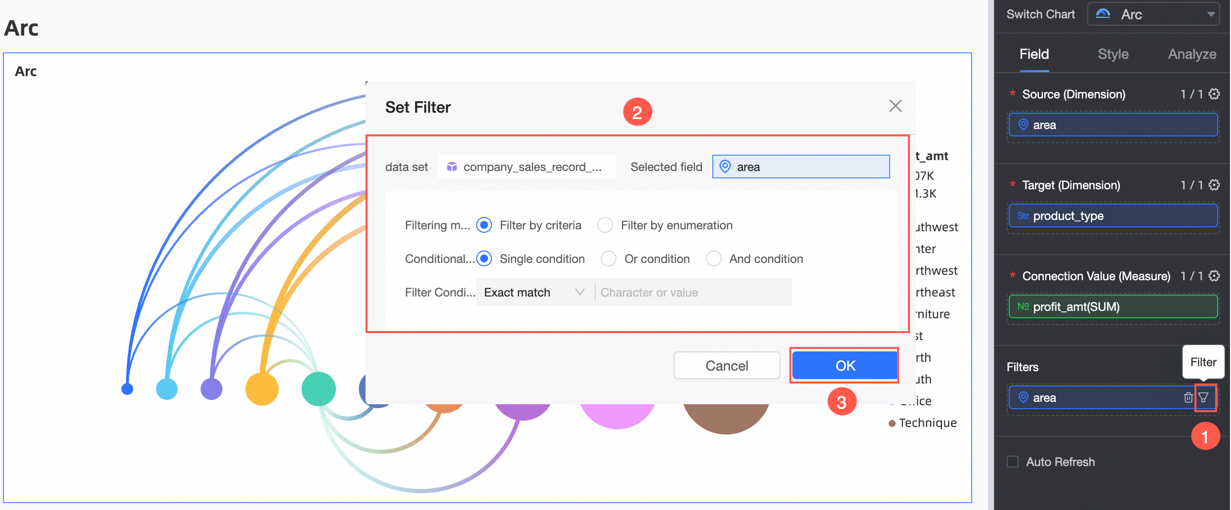
To view data for a specific region, you can apply a filter.
auto-refresh
If you enable this option, the chart data refreshes automatically. For example, setting the interval to 5 and the unit to minute causes the chart to refresh every 5 minutes.
Configure chart style
This section describes the style settings for the chart. For information about common style settings, see Configure the Chart Title Area.
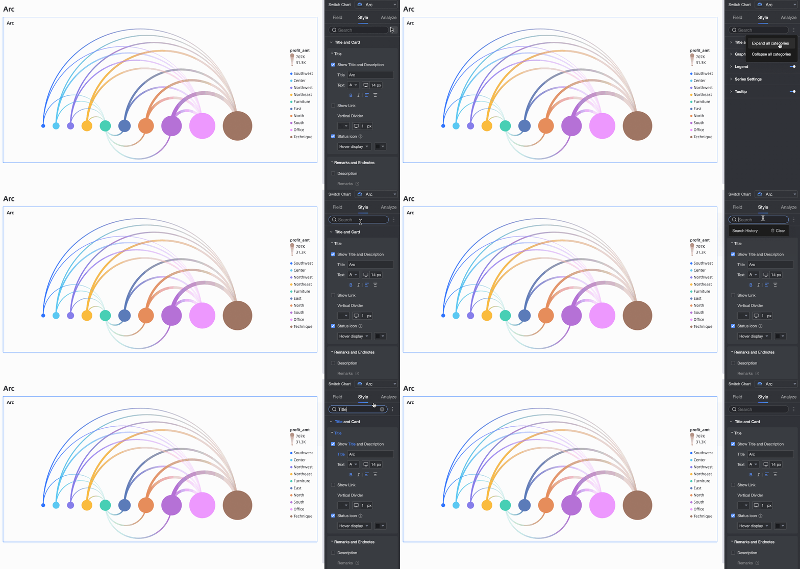
You can enter keywords in the search box at the top of the configuration pane to quickly find a configuration setting. You can also click the  icon on the right to expand or collapse all categories.
Graphic
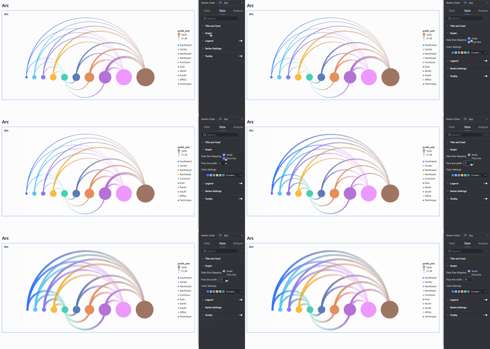
In the Graphic section, you can customize the chart's appearance.
For Data-to-size mapping, you can select one or both node and arc. If you do not select the arc option, you can customize the arc width. The default value is 6px, with a maximum of 12px and a minimum of 2px.
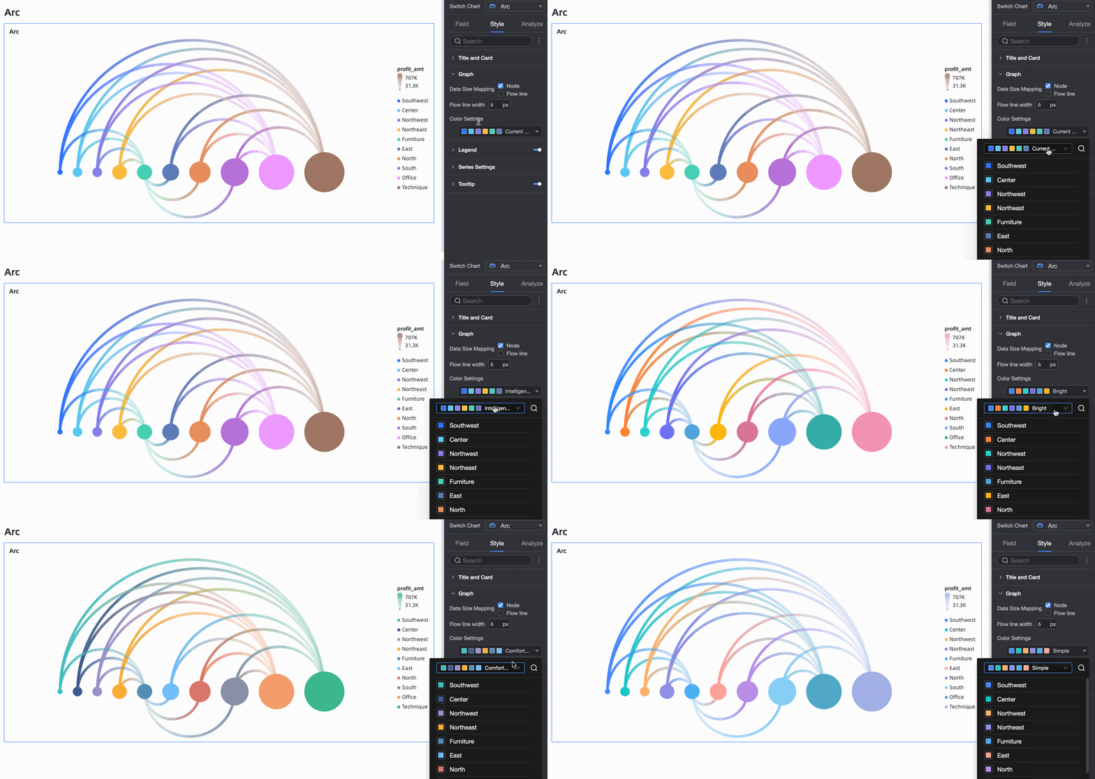
In the Graphic section, you can customize the color scheme.
Legend
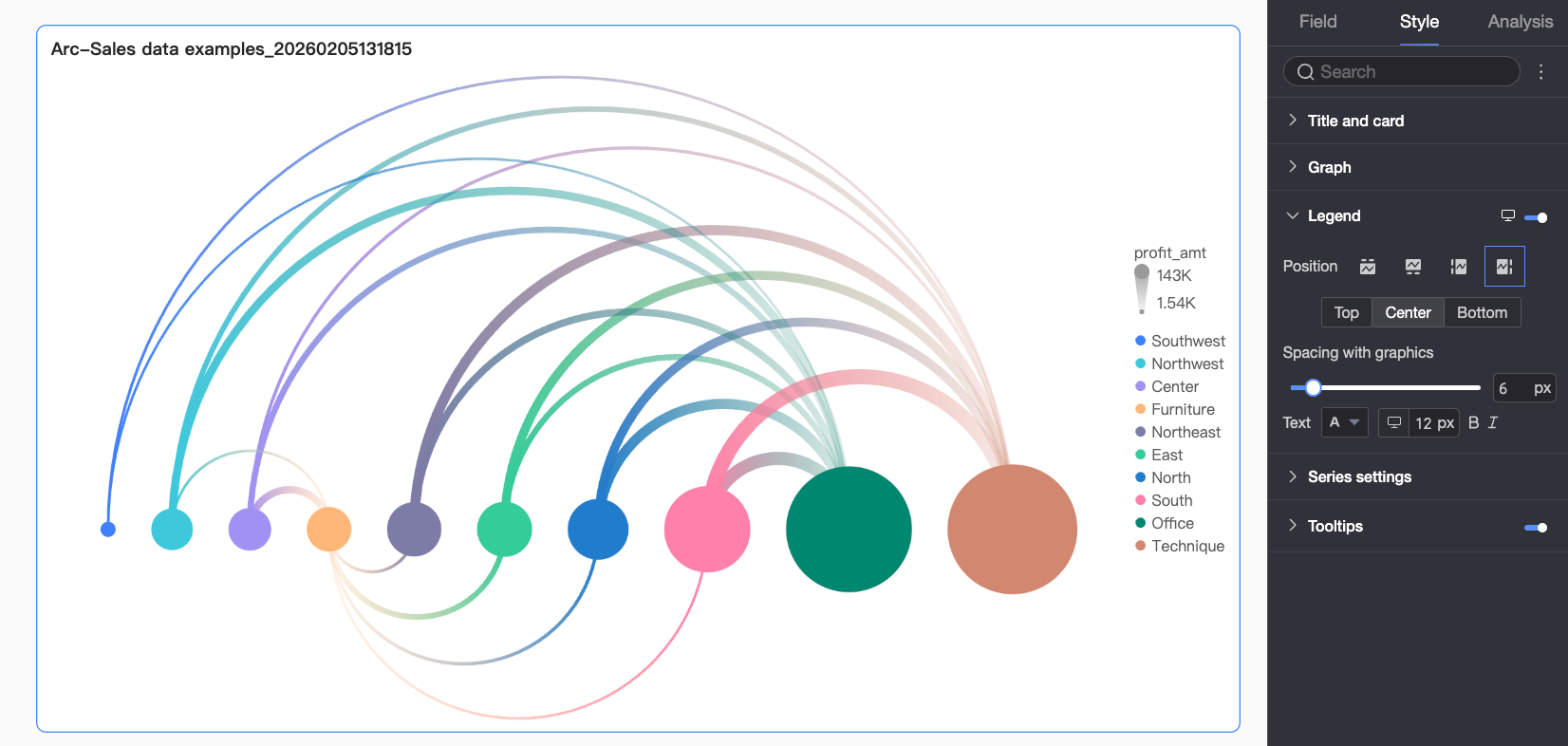
In the Legend section, click the  icon to enable the chart legend and configure its style.
Parameter | Description |
Position | Sets the display position and alignment of the legend.
|
Text | Sets the text style for the legend, including font color, size, weight, and style (italic). |
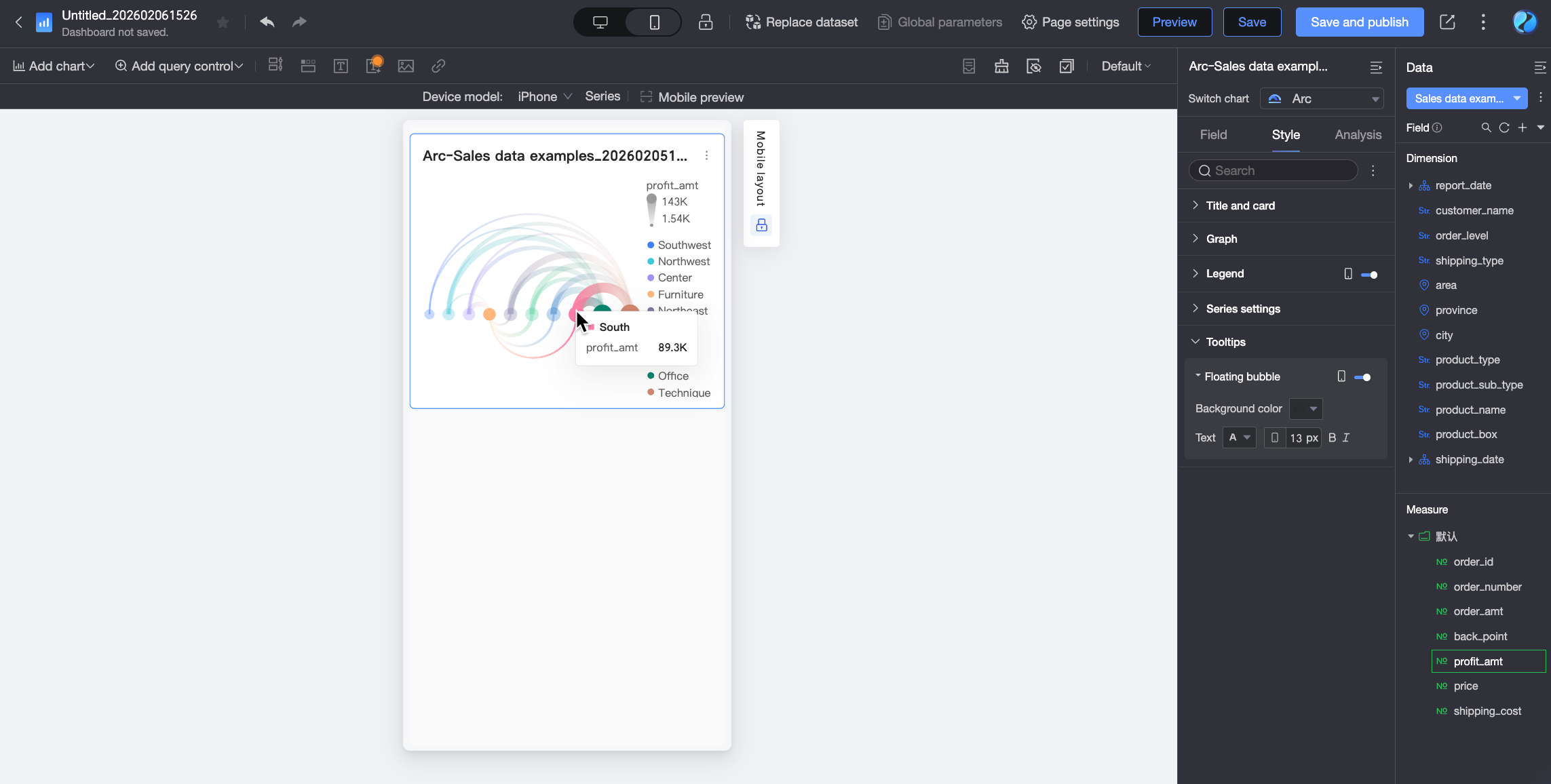
Mobile legend | Desktop and mobile legend settings are independent. You can switch to the mobile editing view by clicking the desktop/mobile toggle button ( |
 ) at the top of the dashboard editing page. In this view, you can set a separate position and text style for the mobile legend.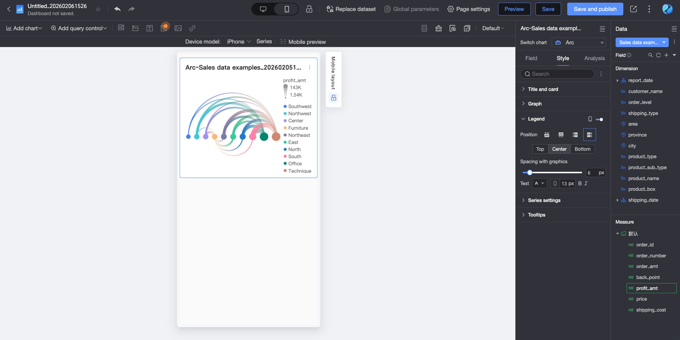
Series settings
In the series settings section, configure the styles for each series.
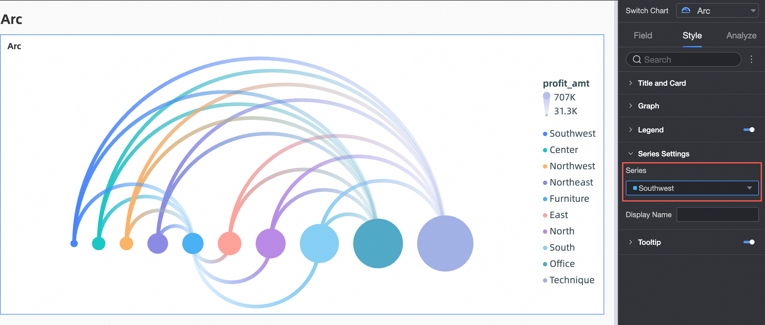
Parameter | Description |
Select series | Select a dimension or measure based on your business scenario. |
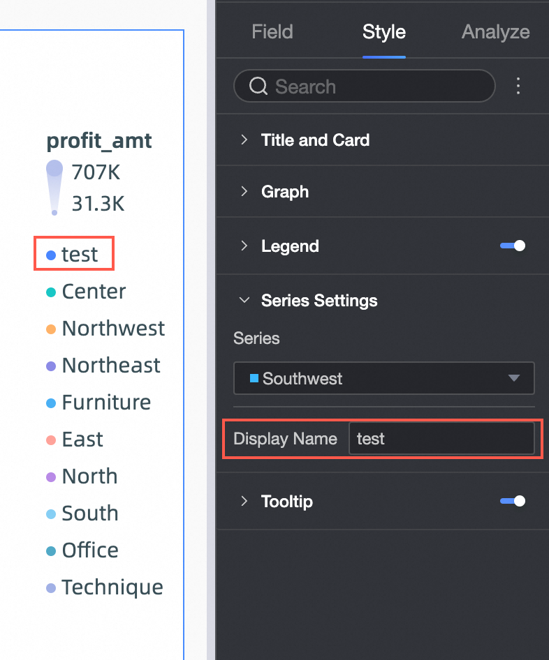
Alias | You can set an alias for the series name. For example:
|
Tooltip
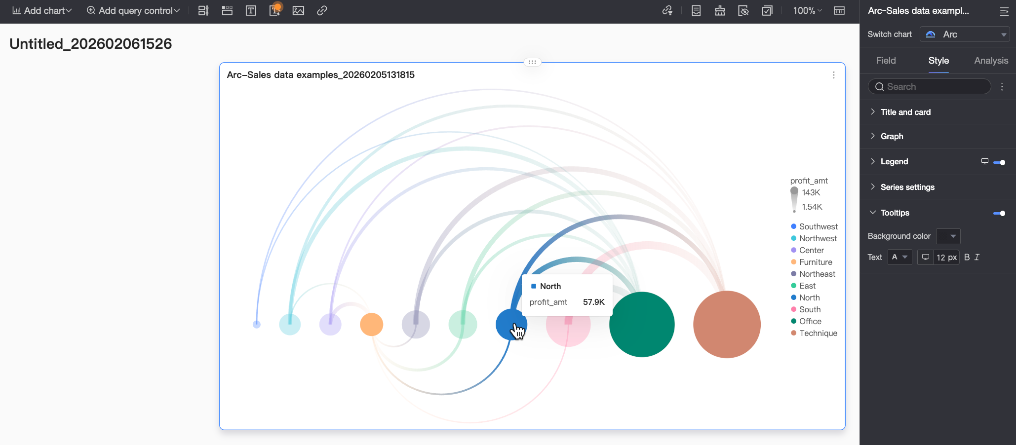
In the tooltip section, click the icon to enable tooltips and configure their style.
Parameter | Description |
Background color | Sets the background color of the tooltip. |
Text | Sets the text style within the tooltip, including font color, size, weight, and style (italic). |
Mobile tooltip | Tooltips can be enabled or disabled independently on desktop and mobile. You can switch to the mobile editing view by clicking the desktop/mobile toggle button ( |
Next steps
To share the dashboard with other users, see Share a Dashboard.
You can integrate your dashboards into a data portal to create an advanced, menu-driven site for topical analysis. For more information, see Create a Desktop Data Portal.