A bullet chart compares a measure to a target value and tracks progress through various stages, helping you quickly assess data performance.
Prerequisites
You have created a dashboard. For more information, see Create a dashboard.
Chart Overview
Use Cases
Bullet charts display progress toward a goal using a measurement scale relevant to your business scenario. They can also show multiple dimension values for side-by-side comparison. Common use cases include:
-
Tracking goal completion, such as company revenue and performance.
-
Tracking project progress, such as budget usage and milestone completion.
-
Comparing indicators, such as current performance against industry benchmarks.
Benefits
-
Calculation capabilities: Provides advanced calculation functions, such as cumulative totals, period-over-period comparisons, and TopN analysis. Also supports adding intelligent reference lines.
-
Visualization: Adjust chart styles and add elements like data labels, a legend, and a thumbnail axis for a more intuitive display.
-
Data comparison and annotation: Supports period-over-period comparisons across dimension values and lets you add numerical annotations.
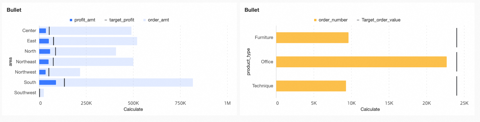
Example
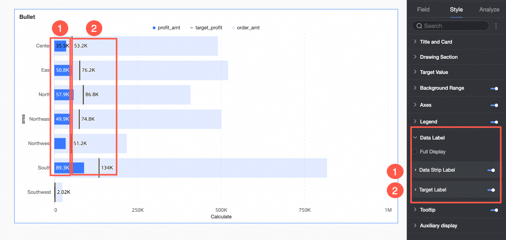
The main components of a bullet chart include:
-
Measure bar: The primary measure for analysis in the chart.
-
Target value: The target value corresponding to the primary measure, which serves as a performance benchmark.
-
Background bar: Represents another measure for comparison with the primary measure or indicates different levels or stages of project progress.
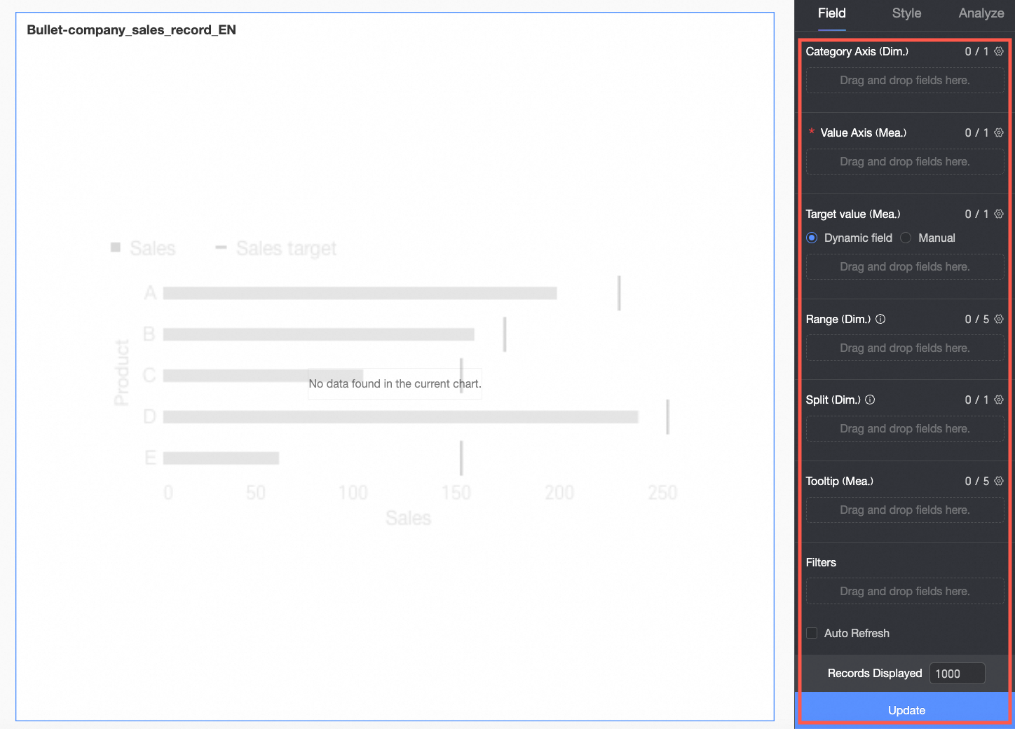
Configure Chart Fields
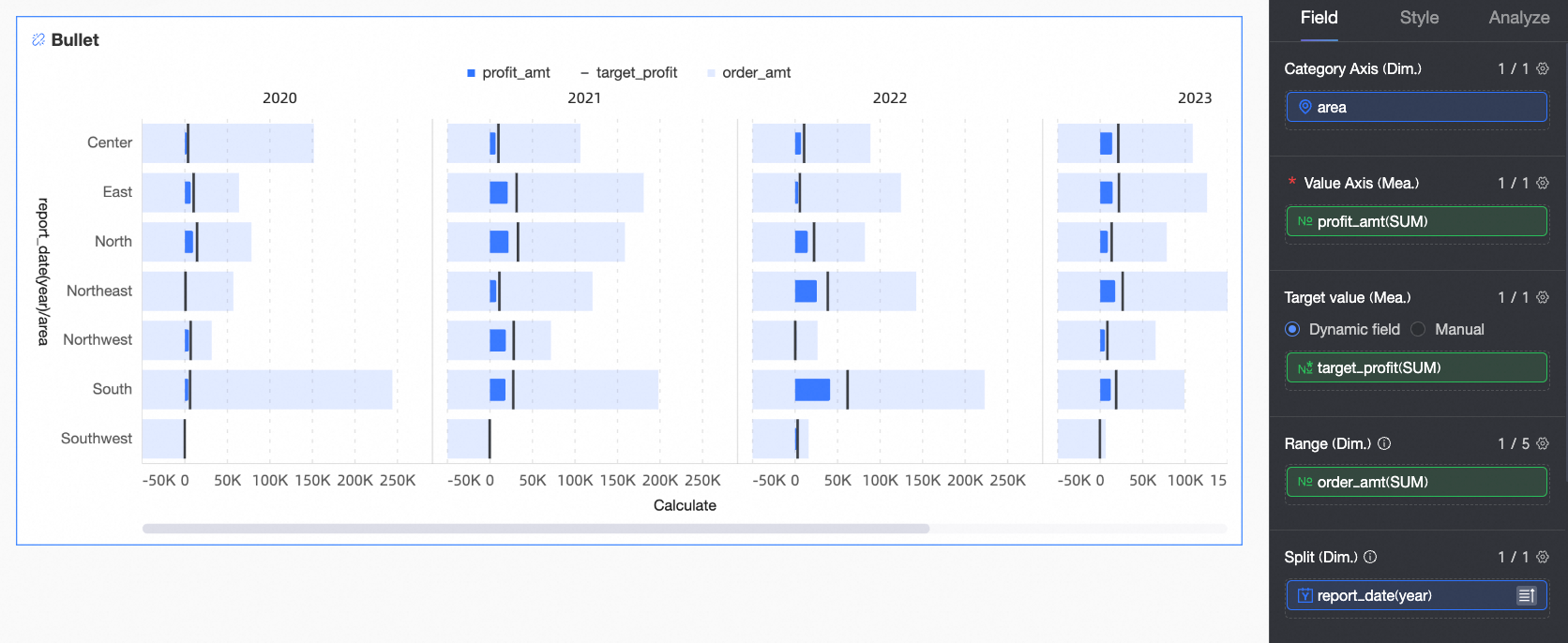
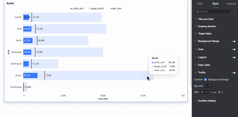
The following example uses regional profit completion to show how to configure chart fields.
-
In the Data pane, select the required dimension and measure fields. Double-click or drag the fields to the corresponding areas on the Fields tab.
-
In the Category Axis/Dimension area, add the dimension you want to use for comparison.
In this example, drag the Region field to compare the profit completion of each region.
-
In the Value Axis/Measure area, configure the primary measure for the chart.
In this example, drag the Profit field as the primary measure for analysis.
-
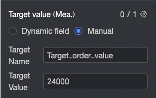
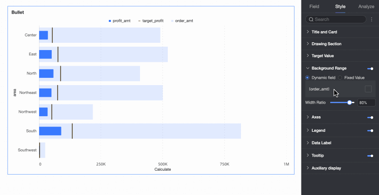
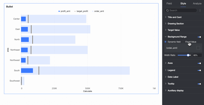
In the Target Value/Measure area, configure the target value for the primary measure. You can use one of two methods.
-
Dynamic field: If each dimension value has a different target value, you can drag the relevant target field here to create a dynamic target.
-
Manual input: If all dimension values share the same target value, you can enter a fixed target value here and customize its name.
In this example, select Dynamic Field and drag the Target Profit field to serve as the benchmark for the profit of each region.
-
-
In the Background Area/Measure area, you can add another measure (like order amount) for comparison with the primary measure. Alternatively, you can define fixed numerical ranges (such as poor, good, and excellent) to represent different progress levels.
In this example, select the dynamic field method and drag the Order Amount field for comparison with the primary measure.
-
If you need to analyze data from different dimensions, you can add other dimension fields to the Split/Dimension area as needed. The chart will be split into multiple charts, one for each value in the added dimension.
In this example, drag the Year field to analyze profits for different years.
-
-
Click Update. The chart updates automatically.
-
To display a measure's value in the tooltip, add the field to the Tooltip/Measure area.
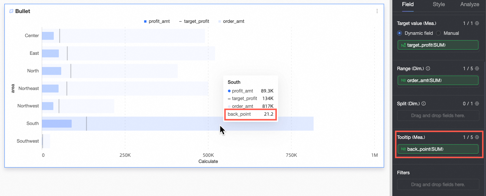
-
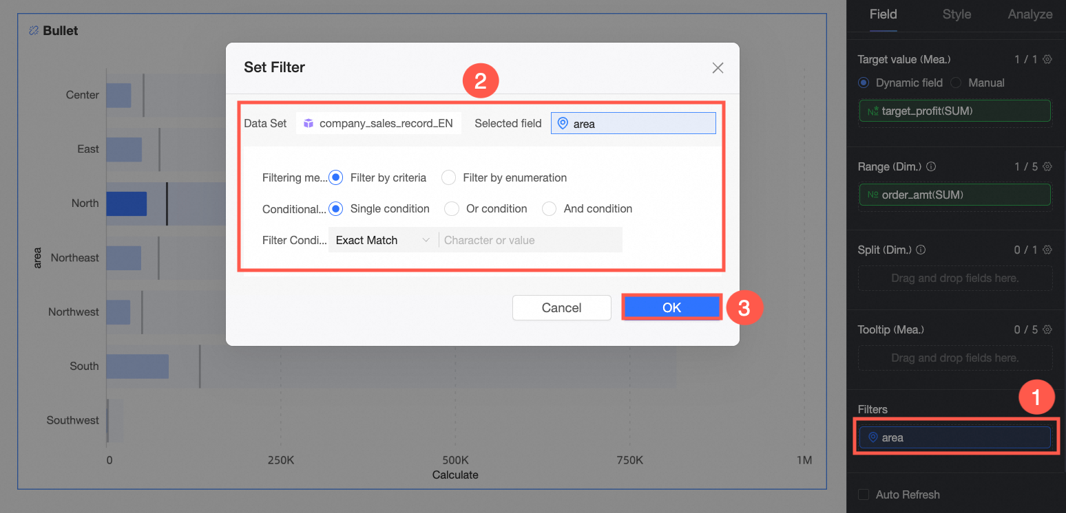
To view data only for a specific Region, set a filter to select the required data.

-
Auto refresh
If you select this option, the system automatically refreshes the chart data. For example, if you set the duration to 5 and select Minutes as the unit, the system automatically refreshes the chart data every 5 minutes.
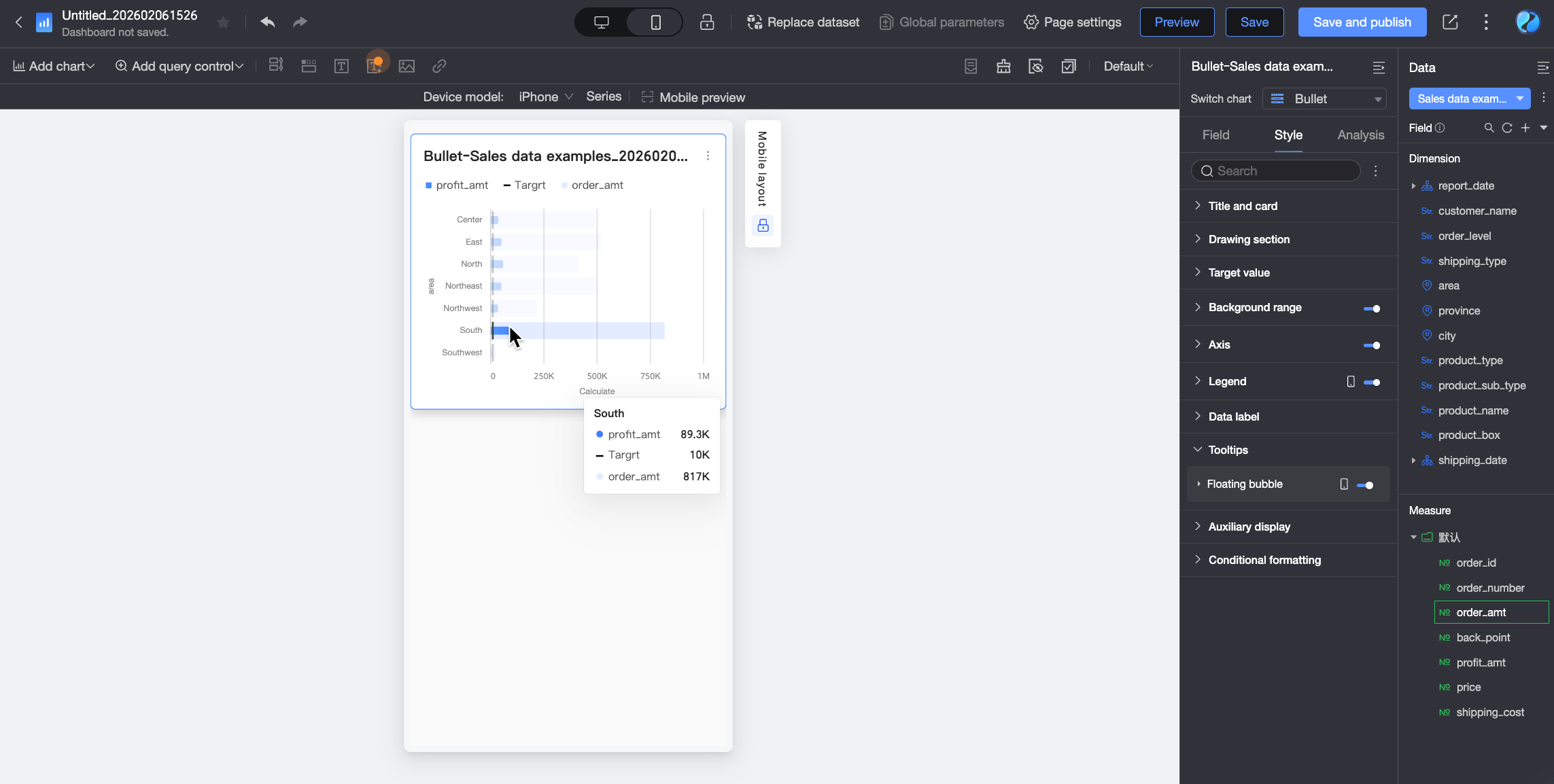
Configure Chart Styles
Configure chart styles on the Style tab. For general chart style settings, see Configure the chart title area.
Chart Area
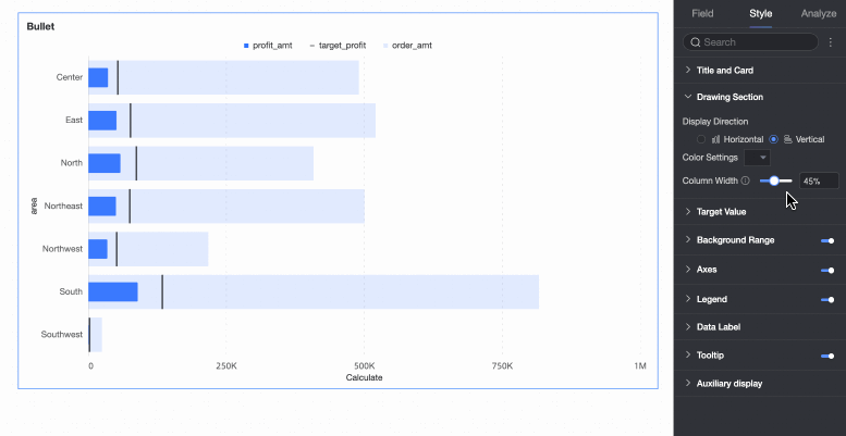
On the Style tab, configure the bullet chart in the Chart Area section.
|
Parameter |
Description |
|
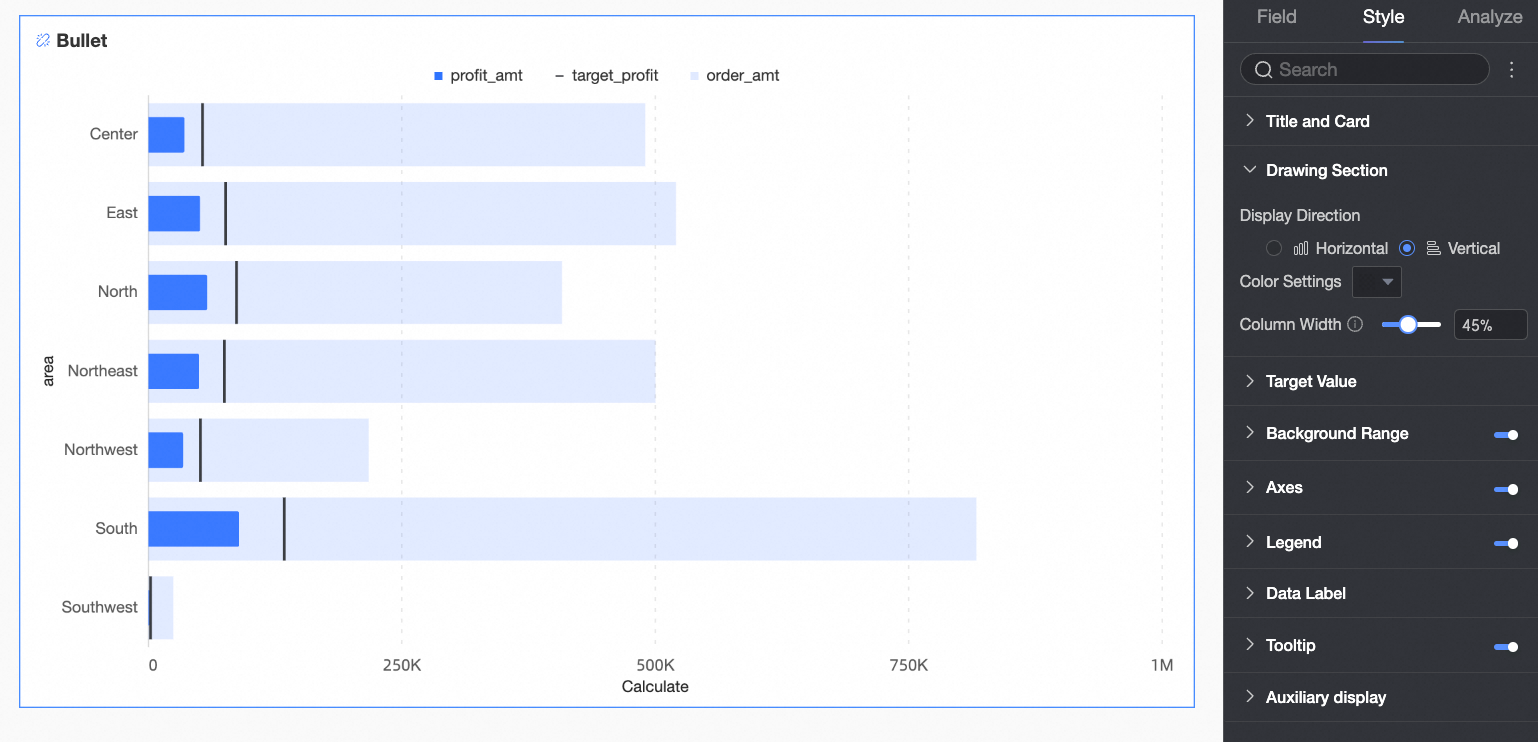
Chart orientation |
Sets the orientation of the bars in the chart. Options: Horizontal and Vertical. |
|
Bar color |
Sets the bar color for the field configured in the Value Axis/Measure area. You can set the color to Solid or Gradient. |
|
Bar width |
Sets the bar width for the field configured in the Value Axis/Measure area. |


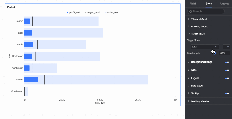
Target Value
On the Style tab, configure the style of the target value marker in the Target Value section. 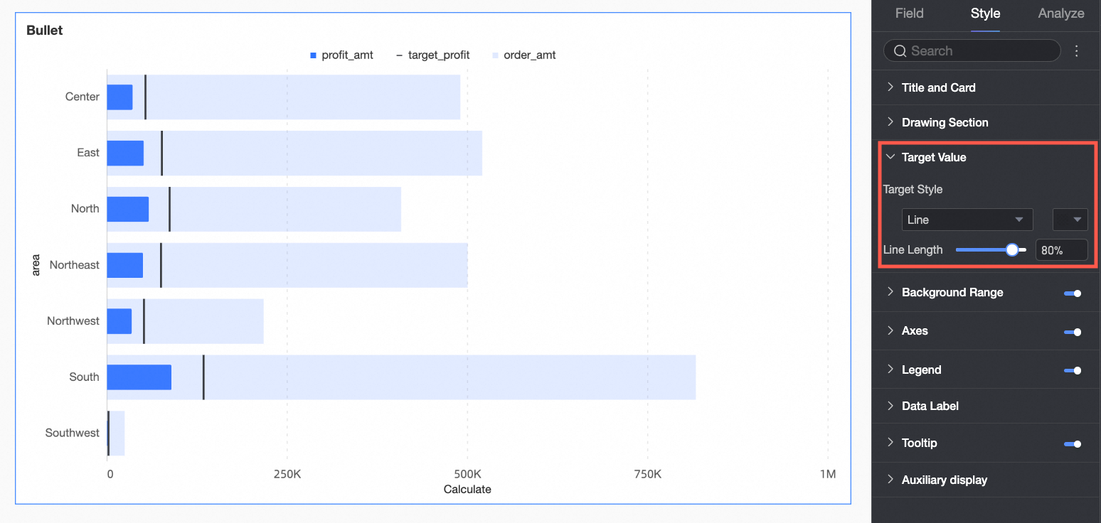
|
Parameter |
Description |
|
Target value style |
Configure the shape and color of the target value marker. |
|
Vertical line length |
If the target value style is a vertical line, you can set the length of the line. |
Background Area
On the Style tab, configure the style of the background bar in the Background Area section. By default, the background area is shown.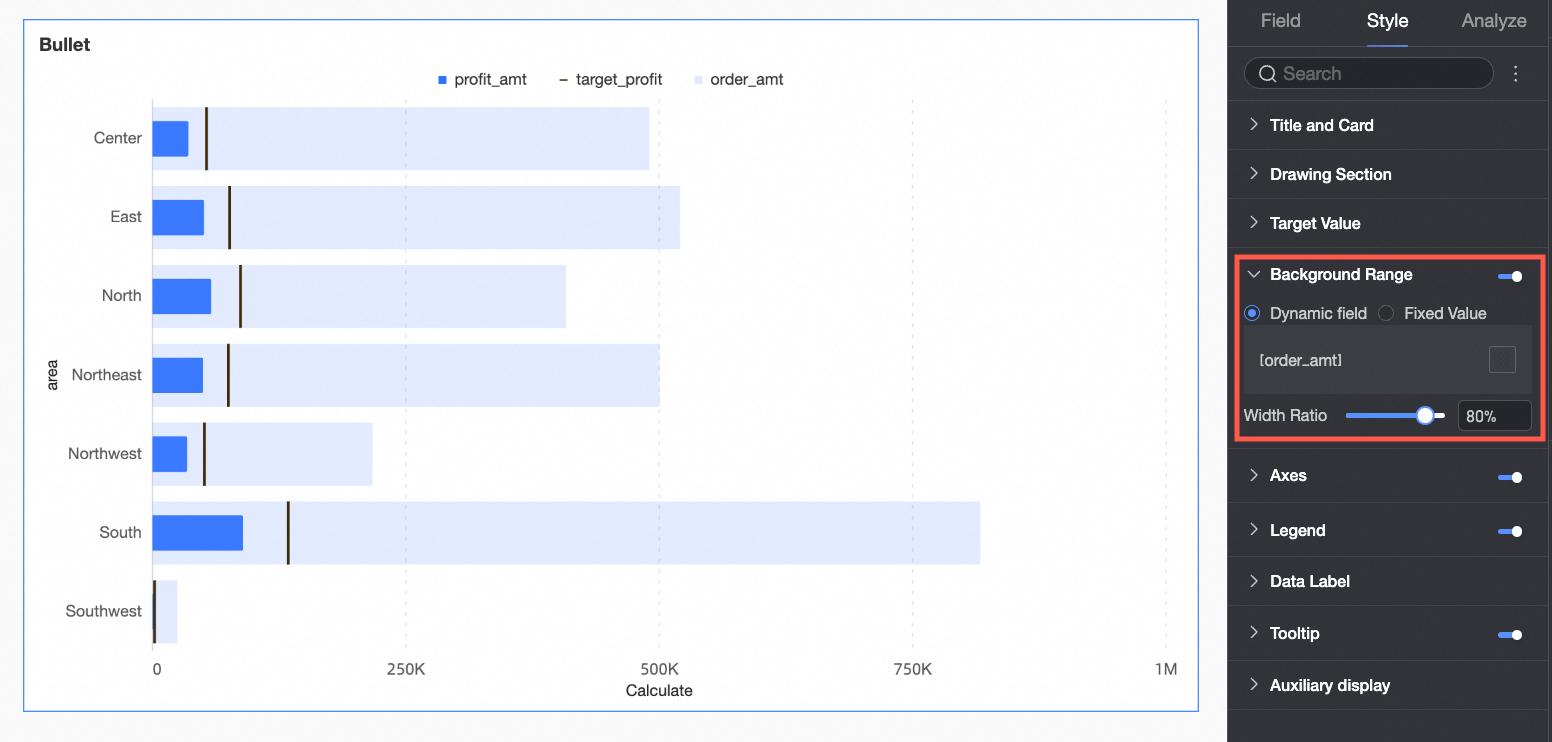
|
Parameter |
Description |
|
Dynamic field |
If you have configured a dynamic field in the Background Area/Measure area on the Fields tab, you can customize the legend name and bar color for that field. |
|
Fixed value |
If you set the background area to a fixed value, any field in the Background Area/Measure area on the Fields tab is ignored. Instead, you must configure the ranges here. This option is useful for representing different performance levels or project stages. You can set the Number of Ranges, Range Value, Range Name, and Range Color. |
|
Width ratio |
Configures the width of the background area bar. |
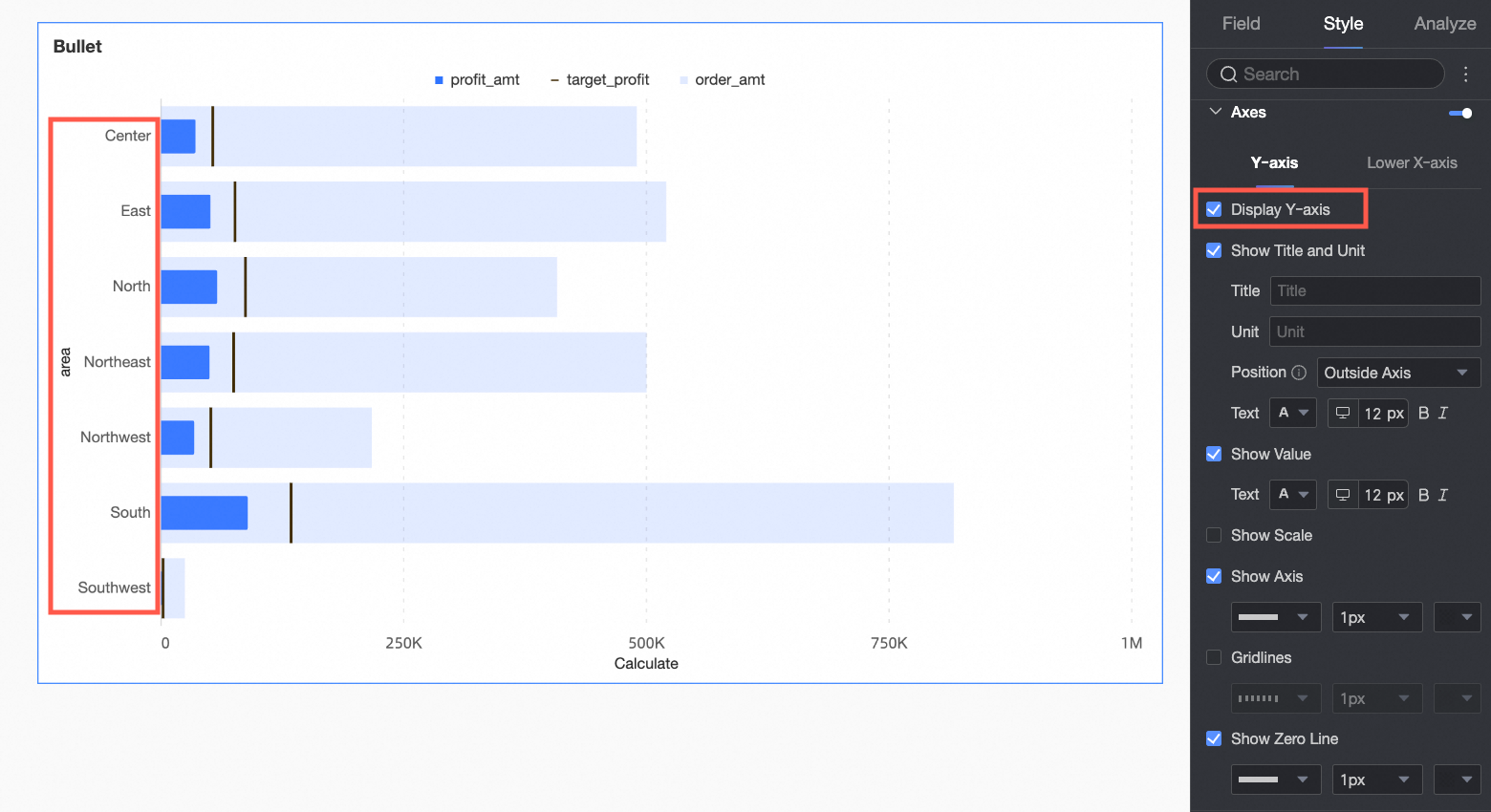
Axis
On the Style tab, configure the axis style in the Axis section. By default, the axis is shown.
|
Configuration group |
Parameter |
Description |
|
Y-axis |
Show Y-axis |
Shows or hides the Y-axis. |
|
Show title and unit |
Shows or hides the Y-axis Axis Title and Unit. You can configure the text style. |
|
|
Show axis labels |
Shows or hides Y-axis labels. You can configure their text style. |
|
|
Show tick marks |
Shows or hides tick marks on the Y-axis. |
|
|
Show axis line |
Shows or hides the Y-axis line. If shown, you can customize its line style, width, and color. |
|
|
Show grid lines |
Shows or hides grid lines for the Y-axis. If shown, you can customize their line style, width, and color. |
|
|
Show zero tick mark |
Shows or hides a tick mark at the zero value on the Y-axis. If shown, you can customize its line style, width, and color. |
|
|
Bottom X-axis |
Show bottom X-axis |
Shows or hides the bottom X-axis. |
|
X-axis position |
Sets the position of the X-axis in the chart. Options: Top of Chart and Bottom of Chart. |
|
|
Show title and unit |
Shows or hides the axis Title and Unit. You can configure their names and text styles. |
|
|
Show axis labels |
Shows or hides labels on the bottom X-axis. If shown, you can set the Axis Label Display Format and Text Style. The axis label format can be set to Auto or Custom.
|
|
|
Show tick marks |
Shows or hides tick marks on the bottom X-axis. |
|
|
Show axis line |
Shows or hides the bottom X-axis line. If shown, you can customize its line style, width, and color. |
|
|
Show grid lines |
Shows or hides grid lines for the bottom X-axis. If shown, you can customize their line style, width, and color. |
|
|
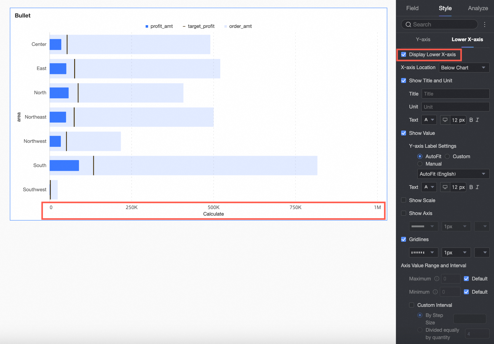
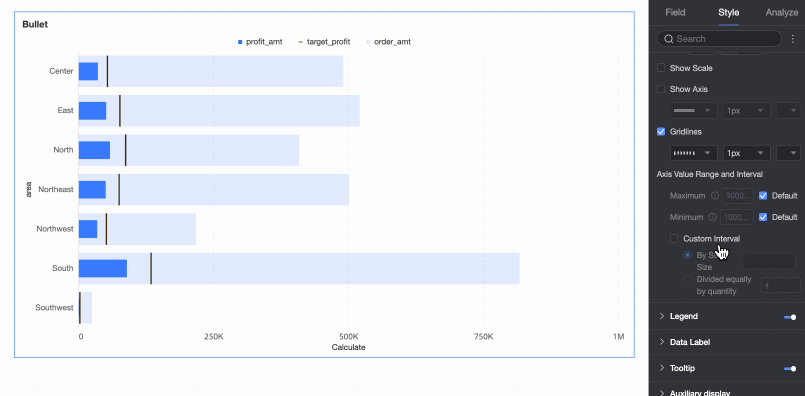
Axis range and interval |
Sets the maximum and minimum values for the bottom X-axis, as well as the interval size between axis values.
|
 icon to open the Data Display Format Settings dialog box and configure the data format based on your requirements. For more information about the items in the dialog box, see
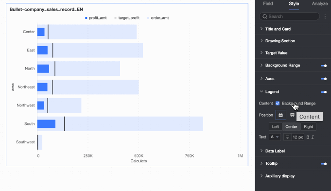
Legend
In the Legend section, click the  icon to enable the chart legend and configure its style.
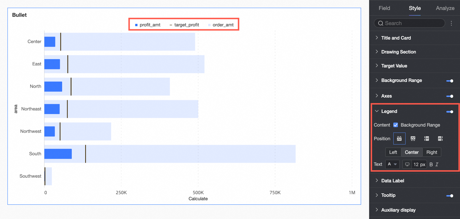
|
Parameter |
Description |
|
Content |
Controls whether the background area measure appears in the legend. |
|
Position |
Sets the display position and alignment of the legend.
|
|
Text |
Sets the legend text style, including font color, size, weight, and whether it is italicized. |
|
Mobile legend |
Legend settings for PC and mobile are independent. You can switch to the mobile editing view by using the PC/Mobile toggle button ( |
 ) at the top of the dashboard editing page to set a separate legend for mobile devices. You can customize the position and text style for the mobile legend.
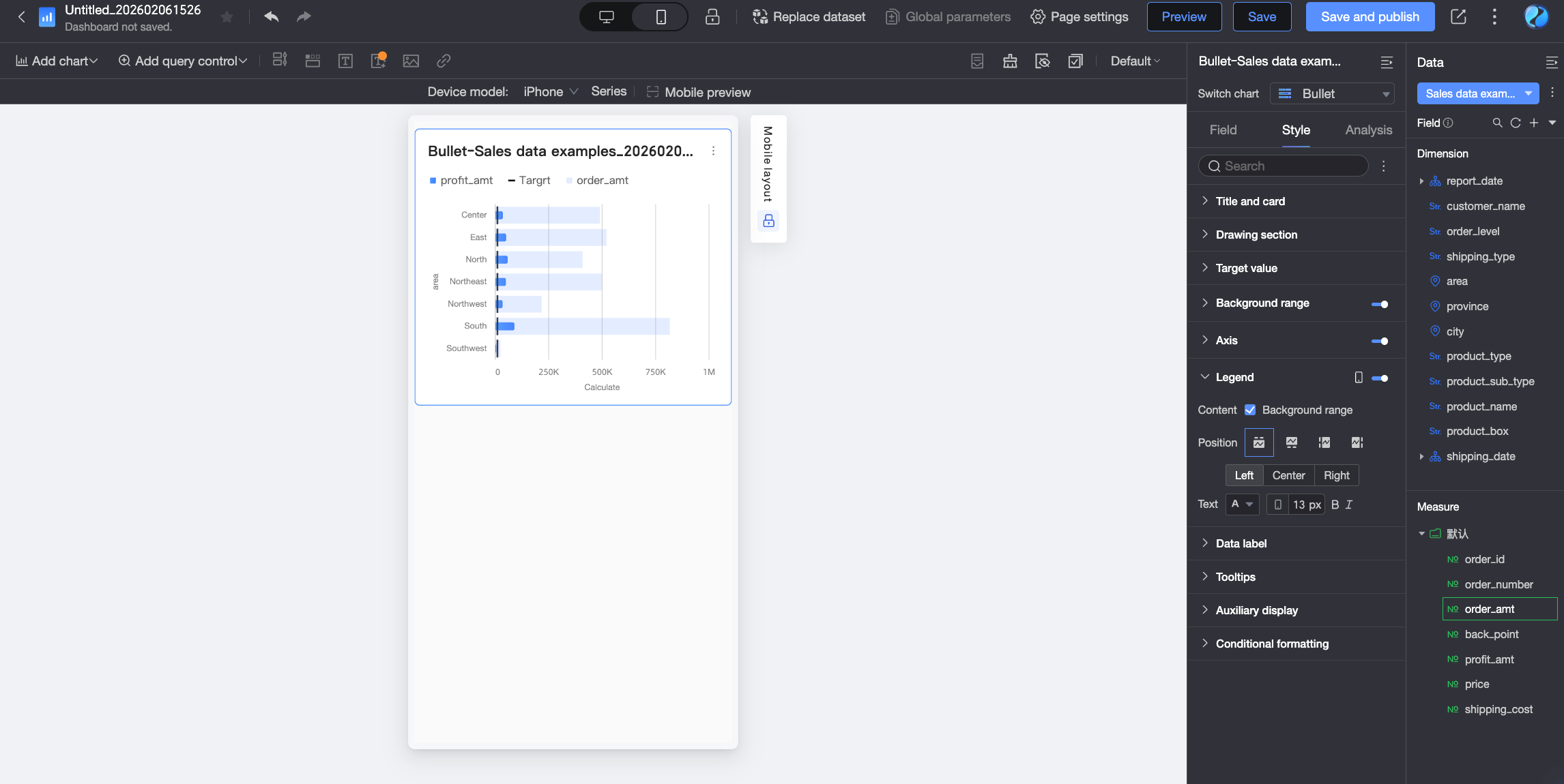
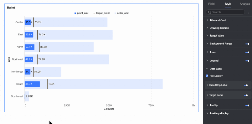
Data Labels
In the Data Labels section, configure whether to show data labels and their styles.
|
Parameter |
Description |
|
Display all labels |
When both the data bar label and target value label are enabled, this setting determines whether to show both labels simultaneously. For example, if the data value is close to the target value and their labels are positioned similarly, the labels may overlap. You can turn off this option to improve visual clarity. |
|
Data bar label |
Controls whether to show the data bar label. You can configure its position and text style. |
|
Target value label |
Controls whether to show the target value label. You can configure its position and text style. |
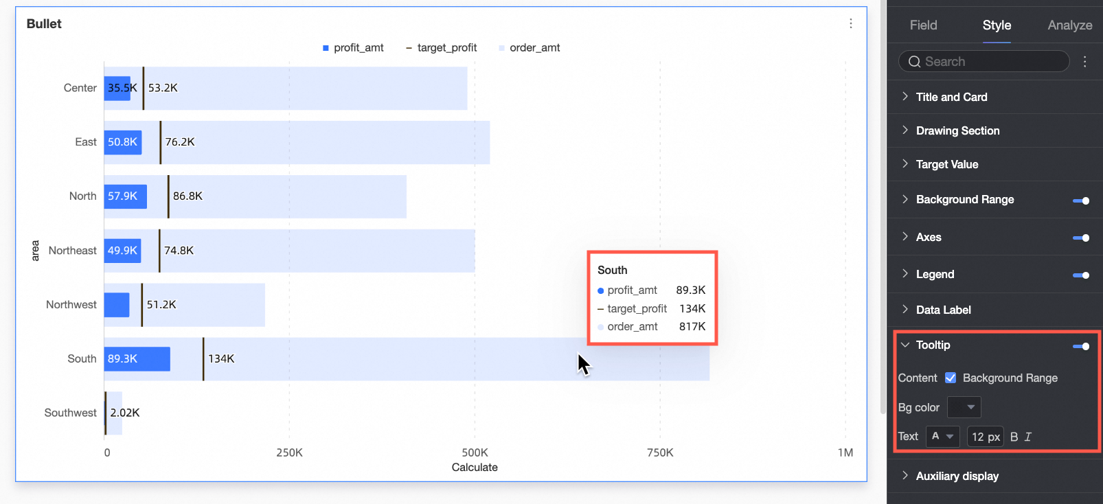
Tooltip
In the Tooltip section, click the icon to enable the tooltip and configure its style.
|
Parameter |
Description |
|
Content |
Controls whether the background area field appears in the tooltip. |
|
Background color |
Sets the background fill color of the tooltip. |
|
Text |
Sets the text style within the tooltip, including font color, size, weight, and whether it is italicized. |
|
Mobile tooltip |
The tooltip settings for PC and mobile are independent. You can switch to the mobile editing view by using the PC/Mobile toggle button ( |
Auxiliary Display
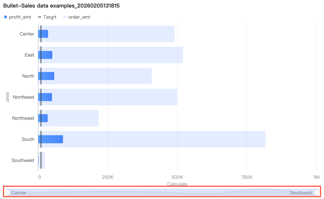
When a chart contains too much data for its container, enable view controls by clicking the  icon in the Auxiliary Display section. These controls let viewers scroll and adjust the visible range for better readability.
Two control types are available: thumbnail axis and scrollbar.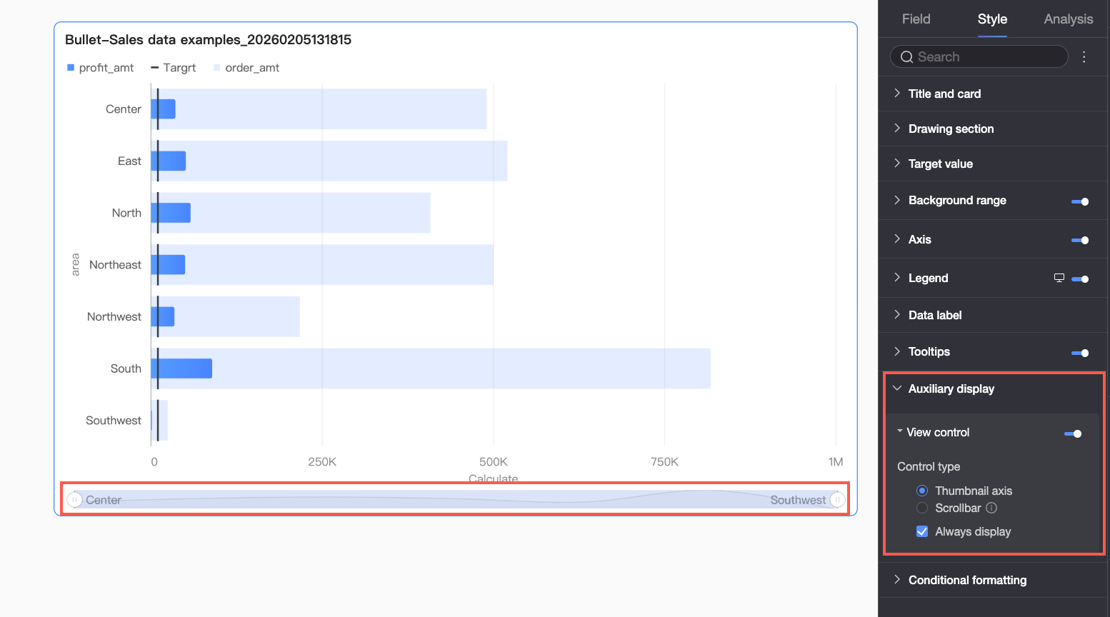
|
Parameter |
Description |
|
Thumbnail axis |
After you select thumbnail axis, a simplified trend chart of the full dataset (the thumbnail axis) appears at the bottom of the chart. Report viewers can drag the selection area to quickly browse all data or focus on a specific range. The thumbnail axis uses absolute coordinates, meaning the selected range directly corresponds to a fixed number of data bars on the actual axis. This is suitable for comparative analysis or complex scenarios requiring direct navigation. |
|
Scrollbar |
After you select scrollbar, a horizontal scrollbar appears at the bottom of the chart. Report viewers can drag the slider horizontally to move the view window left and right. The scrollbar uses a relative scale, meaning the slider's length and position are determined by the ratio of the visible window to the total data range. This is suitable for general browsing scenarios. After you set the minimum category width, the scrollbar appears if the actual category width allocated for the chart is less than this value when all data is shown. When the scrollbar is enabled, elements like markers and data labels are clipped to fit within the chart area. |
 By default, the thumbnail axis is displayed only when the amount of data exceeds the display width of the chart container. To always display the thumbnail axis, select Always Show. After you select this option, the thumbnail axis is always displayed, even if the chart data does not fill the screen.
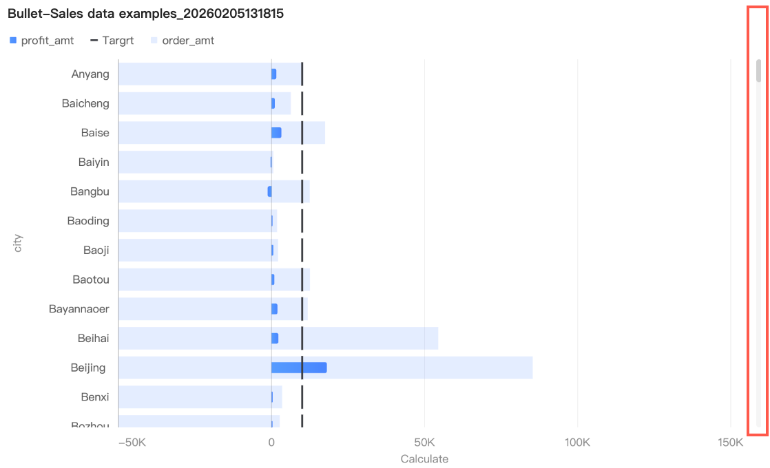 You can further set the minimum category width for the scrollbar to limit the amount of data in the chart's current window. This ensures that the chart content remains clear and avoids visual clutter from overlapping data labels or overly dense data points. The default minimum category width is 32px, with a value range of 16-100px.
If a chart has too much data for its container size and no view control is configured, the system automatically enables the thumbnail axis.
Conditional Formatting
You can use conditional formatting to apply different colors to various value ranges, making performance easier to interpret.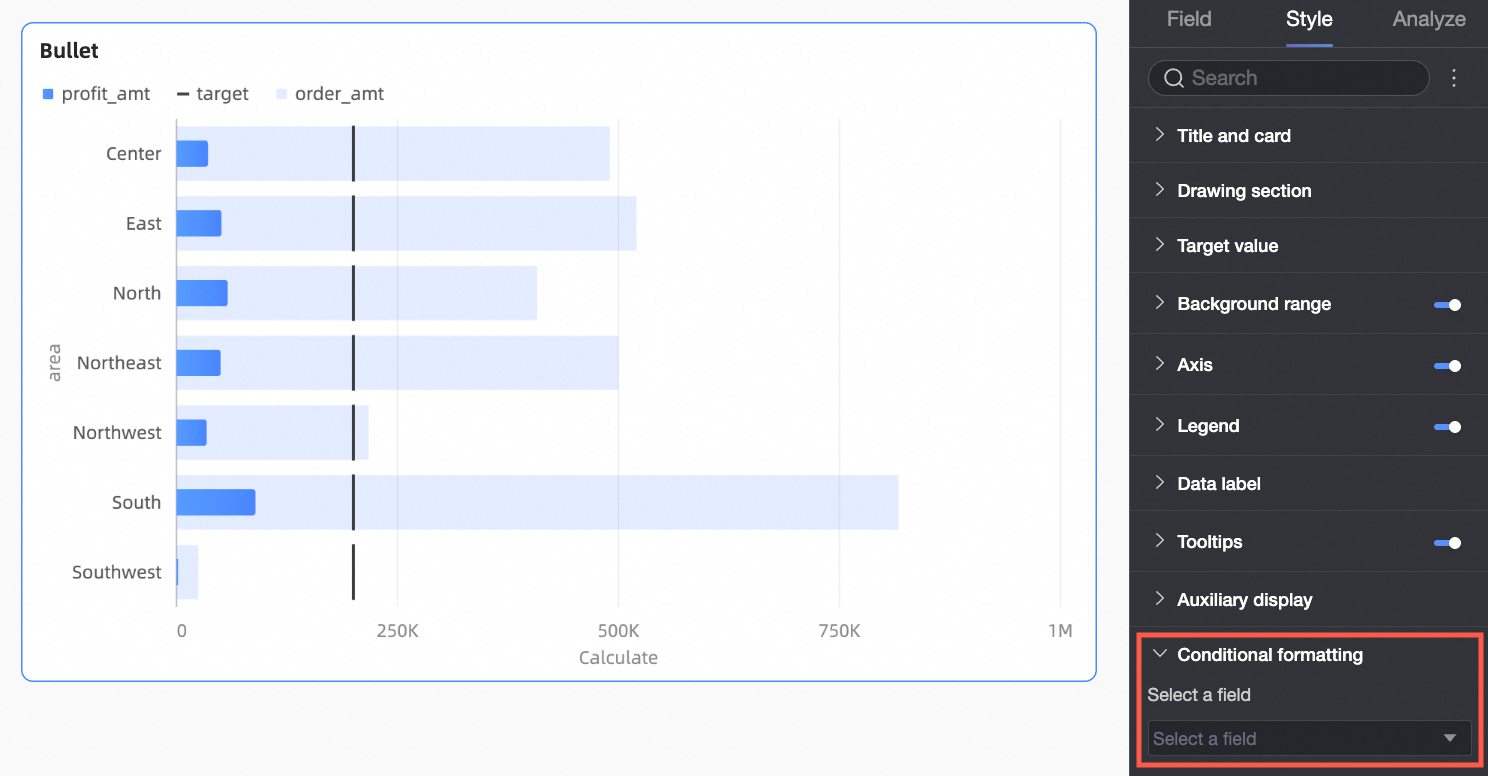
|
Parameter |
Description |
|
Select field |
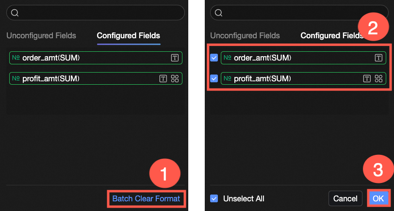
Select the measure field for which you want to configure conditional formatting. This is the measure field added to the Value Axis/Measure area. After the style is configured, if you no longer need the conditional formatting, you can click Batch Clear Formatting in the lower-right corner of the field panel. In the list that appears, select the conditional format to be cleared and click OK. |
|
Conditional style |
Click the Configure the following settings:
Note
When setting a conditional rule for the text color of a measure field, ensure that the Data bar label in the Data Labels section is enabled. |
 icon to open the conditional formatting panel. Here, you can set rules to highlight the text and background of the selected measure field. You can also configure conditional rules for the current field based on the values of another field.
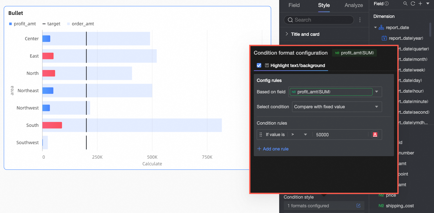
Configure Chart Analysis
|
Configuration group |
Parameter |
Description |
|
Data interaction |
Drill down |
After you have configured drill-down fields in the fields panel, you can set the display style for the drill-down hierarchy rows here. For more information, see Drill down. |
|
Linkage |
If the data you need to analyze is in different charts, you can use chart linkage to connect multiple charts for interactive data analysis. For more information, see Linkage. |
|
|
Jump |
If the data you need to analyze spans multiple dashboards, you can use dashboard jumps to connect them for data analysis. Jumps can be configured in three ways: Internal Jump, In-page Component, and External Link. For more information, see Jump. |
|
|
Analysis and alerting |
Reference line |
A reference line helps you compare a measure's value against a benchmark. This benchmark can be a fixed value or a calculated value. Calculated values include average, maximum, minimum, and median. For more information, see Analysis and Alerting. |
|
Annotation |
- |
When data in the chart is abnormal or needs special attention, you can use color highlighting, icons, comments, or data points for annotation. This helps you identify anomalies and take appropriate action. For more information, see Annotation. |
Next Steps
-
If you want others to view the dashboard, you can share it with specific users. For more information, see Share a dashboard.
-
If you need to create complex, topic-based analyses with navigation menus, you can integrate your dashboards into a data portal. For more information, see Data portal.