Details table
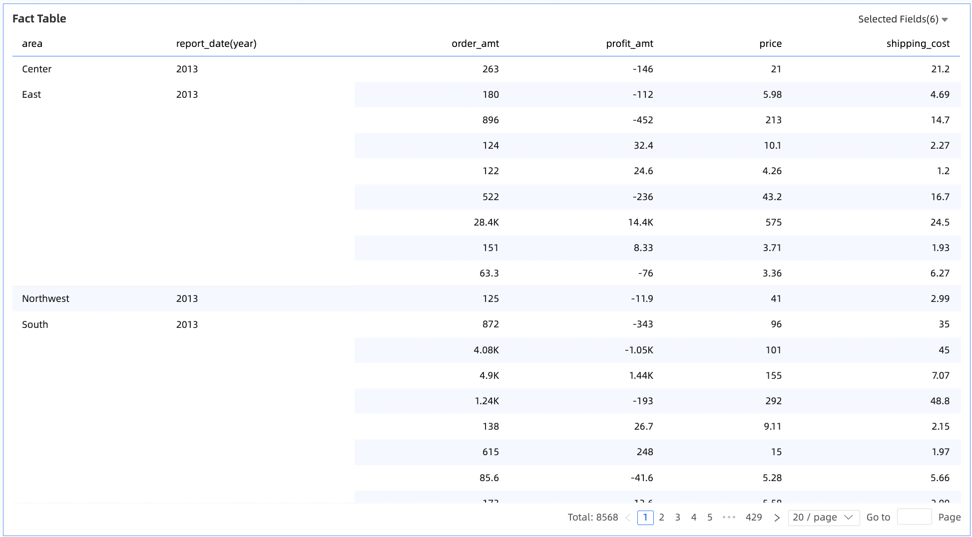
A details table displays how measures are distributed and ranked across dimensions, with built-in support for advanced calculations, visual customization, and interactive features.
Chart overview
-
Use cases
Analyze the distribution and ranking of measures across dimensions to support data-driven decisions.
-
Key advantages
-
Powerful calculations: Configure advanced calculations like year-over-year (YoY) and month-over-month (MoM) comparisons, cumulative calculations, totals, and subtotals with a single click.
-
Visual customization: Customize visual elements such as table themes, freezing panes, text wrapping, and column widths.
-
Annotation capabilities: Add custom text, measures, and other information in notes and endnotes. You can also define external navigation links to enable interaction between your data and other systems.
-
-
Example
Limitations
-
Prerequisites: You have created a dashboard. For more information, see Create a dashboard.
-
Note the following limitations for proper configuration and display:
-
A details table consists of only dimensions and measures. You can add both dimension and measure fields.
-
Procedure
Configure chart data
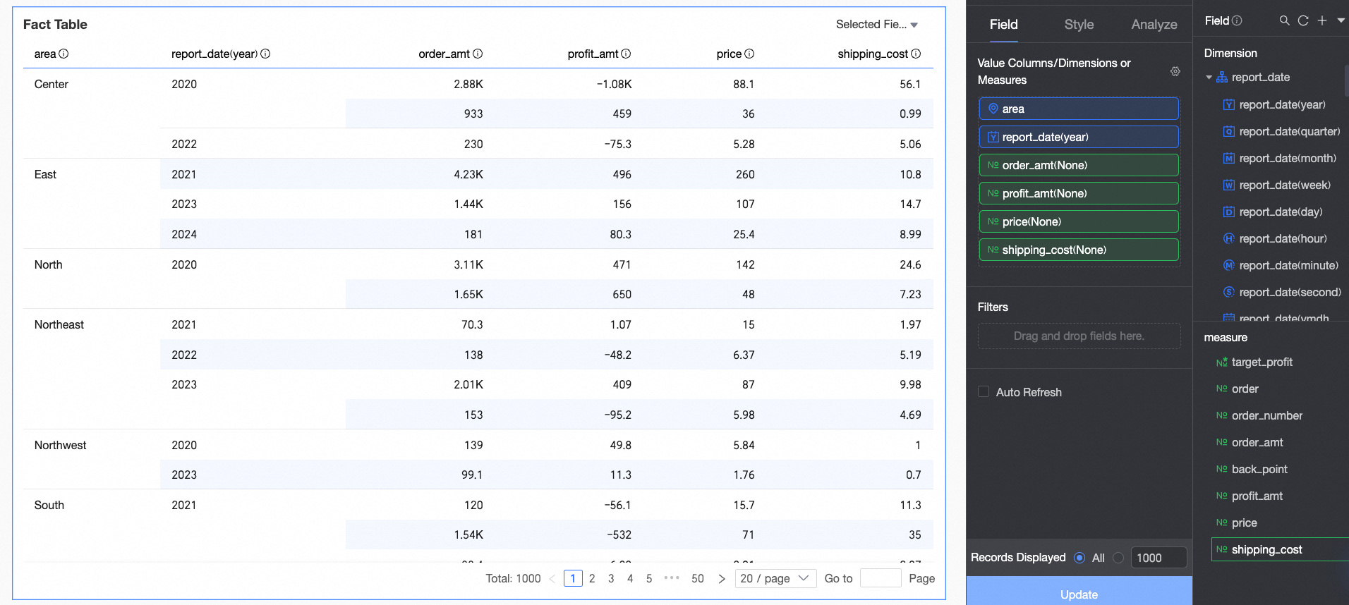
A details table is built from fields placed in the Value Columns / Dimensions or Measures area, which accepts both dimension and measure fields.
-
On the Data tab, select the required dimension and measure fields:
-
In the Dimensions list, find Area and Order Date (year), and then double-click or drag them to the Value Columns / Dimensions or Measures area.
-
In the Measures list, find Order Amount, Unit Price, Shipping Cost, and Profit Amount, and then double-click or drag them to the Value Columns / Dimensions or Measures area.
NoteWhen a field is an image, you can set its display size. On mobile devices, its width and height default to half the size used on a PC.

-
-
Click Update. The system automatically updates the chart.
Configure chart styles
The following style settings are specific to this chart. For general style settings, see Configure the chart title area.
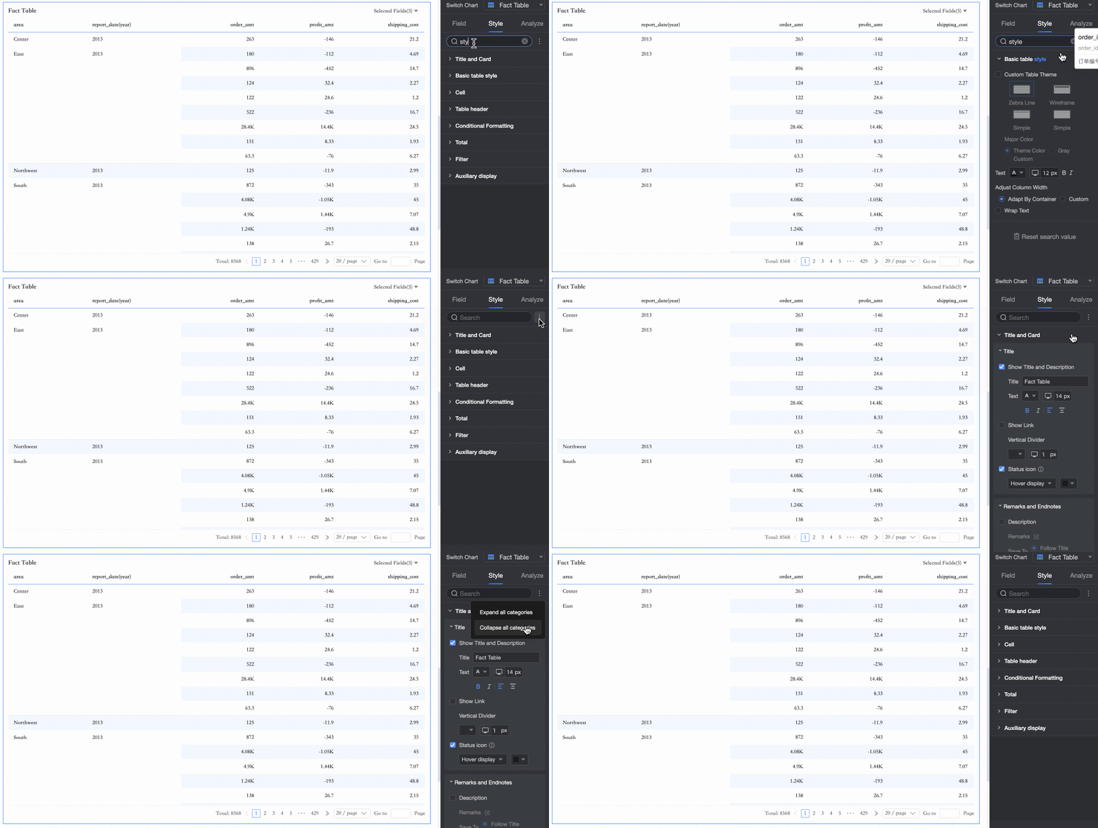
You can enter keywords in the Search Box at the top of the configuration pane to quickly find a Configuration Item. You can also click the  icon on the right to Expand/Collapse All Categories or switch between the New/Old versions of the details table.
-
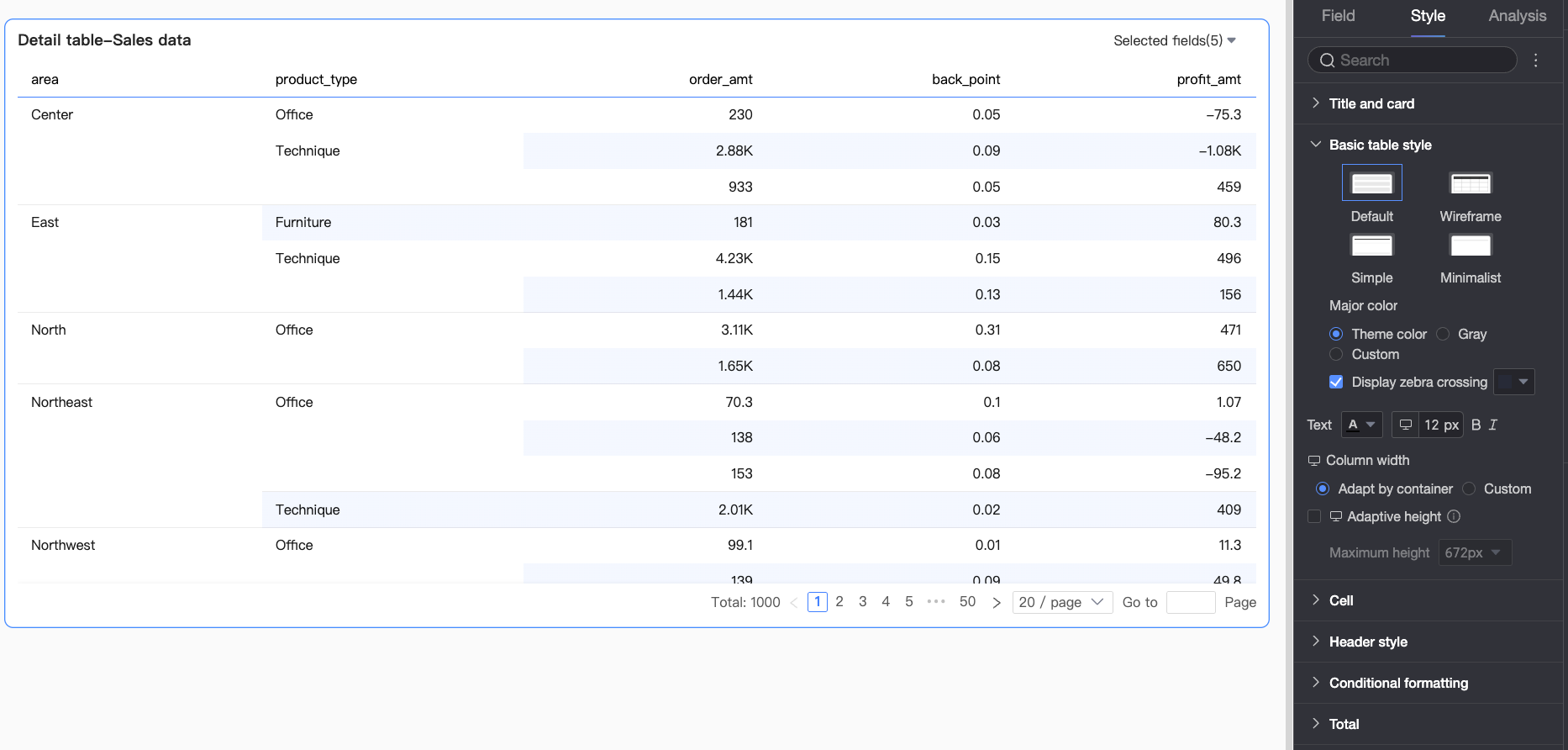
In the Basic Table Styles section, configure the styles for the details table.

Parameter
Description
Customize Table Theme
Configure the appearance of the details table.
-
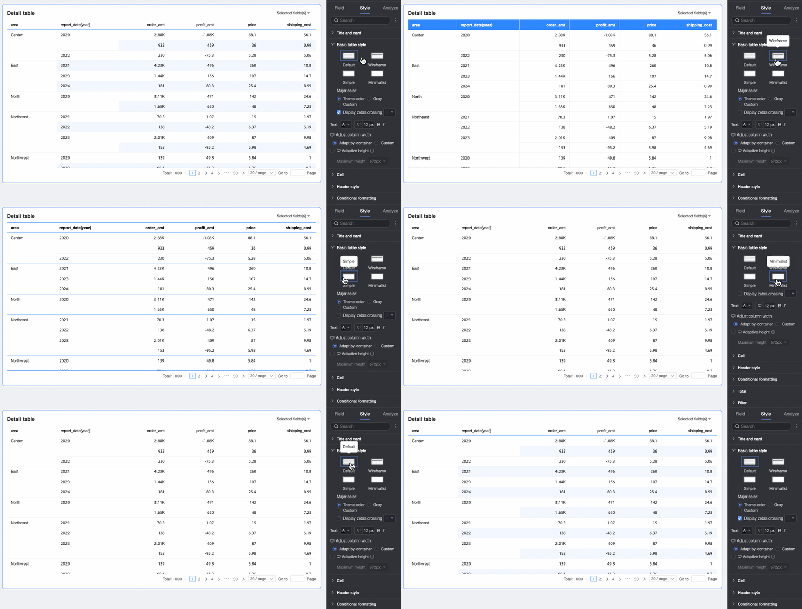
Theme style: Four types are available: Default, Wireframe, Simple, and Minimalist.
-
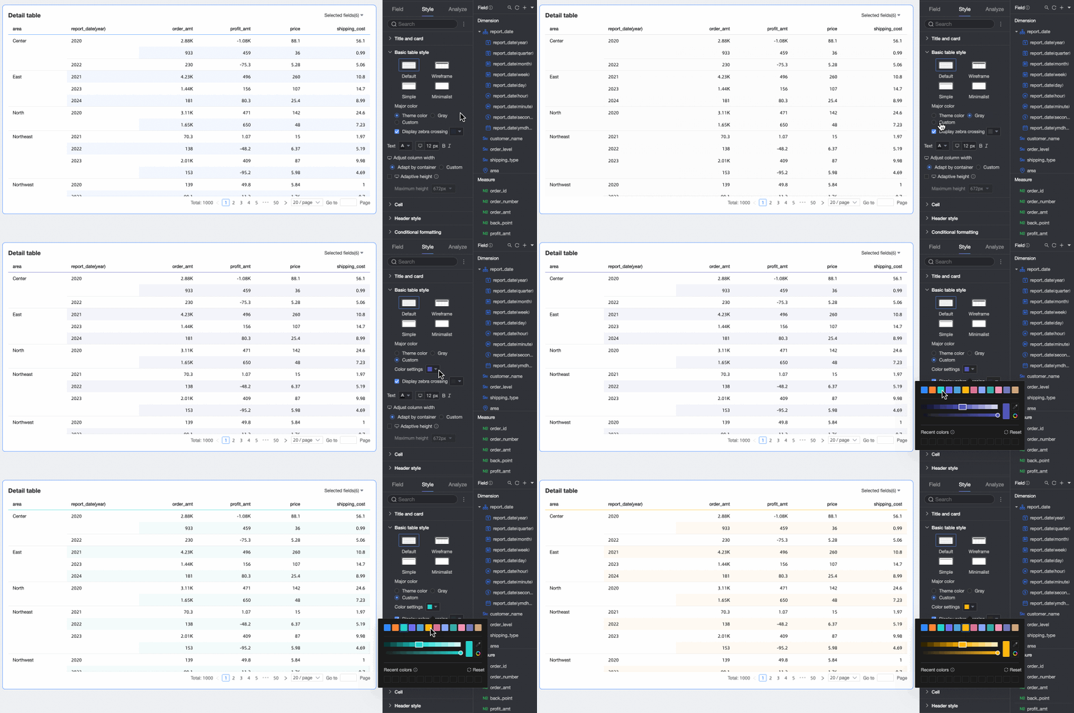
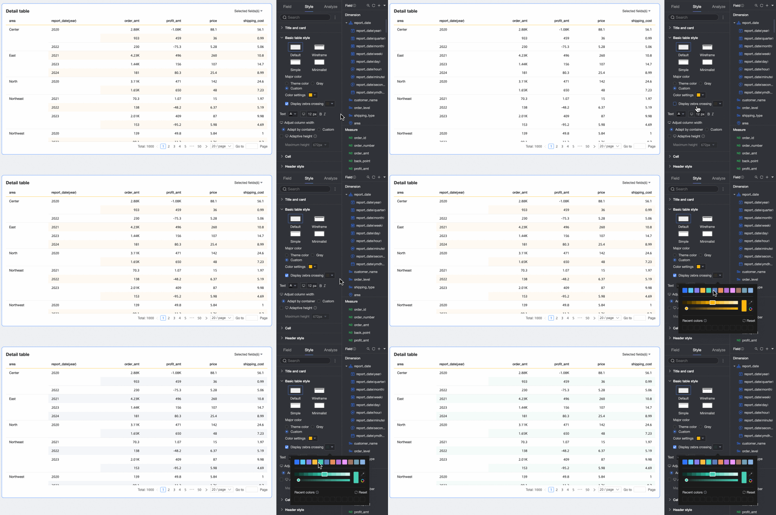
Primary color: When the theme for the details table is set to Default, Wireframe, or Simple, this option sets the primary color. The color can follow the Theme color, or be set to Gray or Custom.
-
Show striped rows: Select whether to display striped rows in the details table and set the stripe color.
Text
Configure the text style for the details table.
Column Width, Row Height
Set the Column Width and Row Height for the details table. You can choose between Fit to Content and Custom.
-
Fit to Content: Ensures efficient space usage and text visibility, suitable for tables that adapt to different screen sizes and layouts.
-
Custom: Manually enter column width and row height values for precise table layouts. When you select custom mode, row height and column width are set to automatic by default. Deselect automatic to configure specific pixel values.
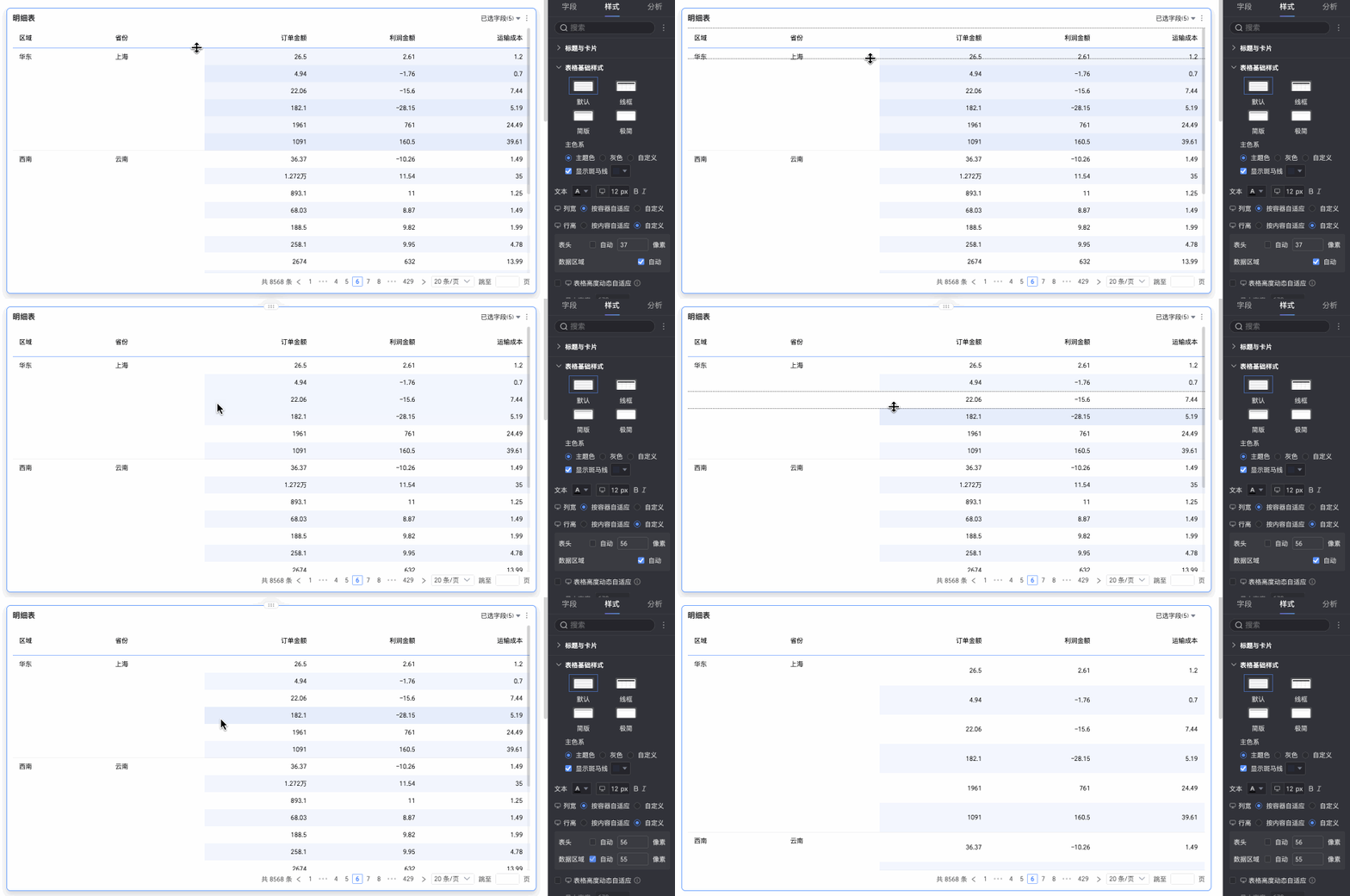
If you are unsure of the exact Row Height value, drag the rows to visually adjust the height and preview the effect.
You can drag the table header row height and the data area row height separately. After you drag, the row height within that area is uniformly adjusted, and the specific row height value is automatically entered into the corresponding row height setting box.
NoteColumn width and row height settings for PC and mobile are independent. Set them separately for each platform as needed.
Auto line break
After you select this option, the table content wraps automatically.
NoteThe details table supports recognizing line break characters in fields. You can also use line break characters to customize the line break effect.
Dynamic table height adaptation and maximum height
The table height settings support two strategies: fixed height and adaptive height.
-
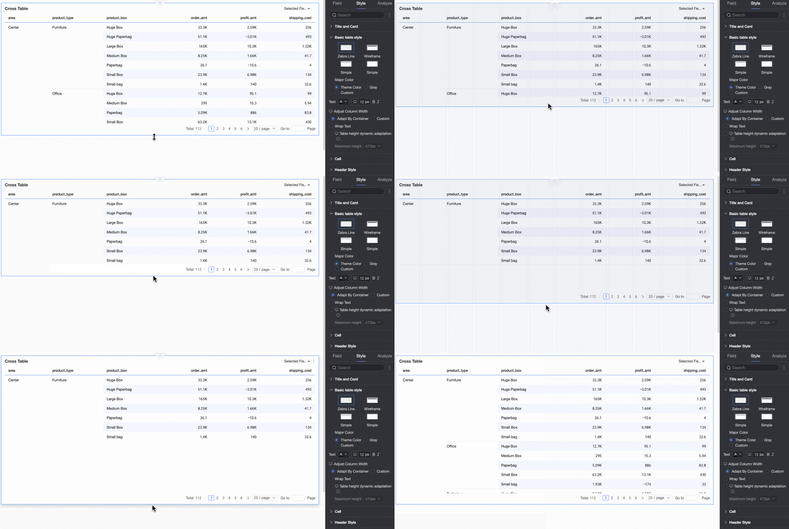
Fixed height: The table height uses the fixed height strategy by default. You can manually set the table container height by dragging.
-
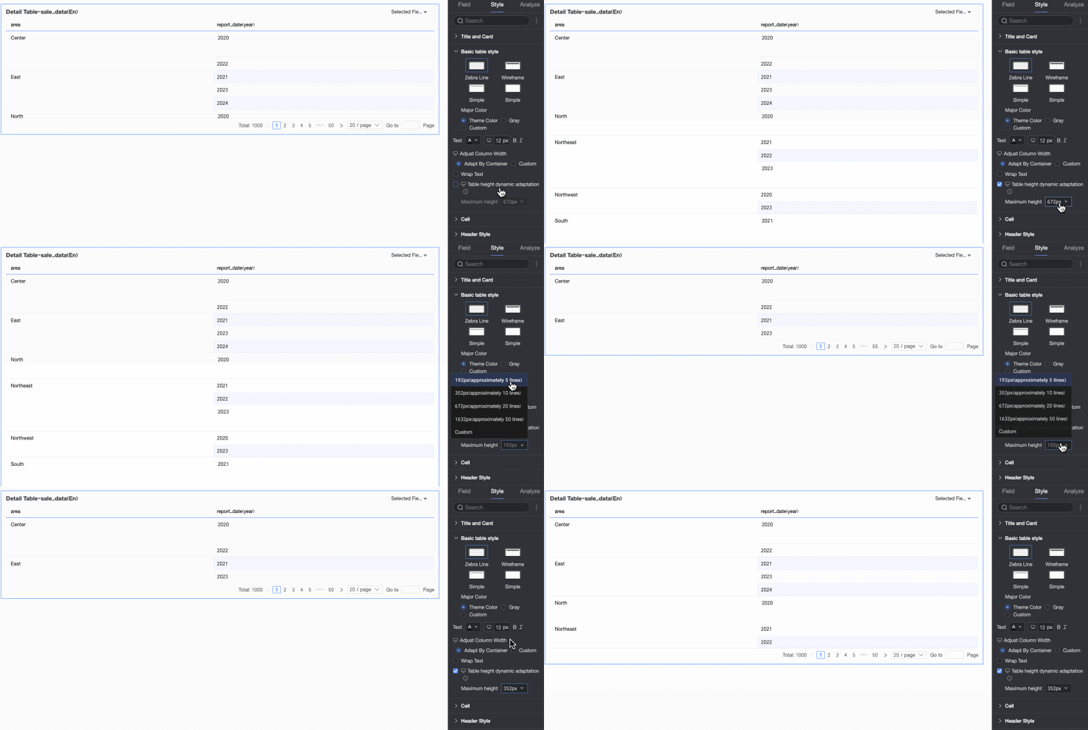
Adaptive height: After you enable dynamic table height adaptation, the table container height adjusts automatically based on the data content. You can set a maximum table height (the combined height of the header and data rows) to cap the height during dynamic adaptation.
Supported maximum height options include: 192px (approximately 5 rows), 352px (approximately 10 rows), 672px (approximately 20 rows), 1632px (approximately 50 rows), and custom.
Note-
When the row height is set to Custom mode, only the custom option is available in Dynamic table height adaptation. Customize the maximum table height based on the table effect you need.
-
You can switch between the
icons at the top of the page to configure the adaptive height settings for the PC and mobile terminals respectively. -
The dynamic table height adaptation feature is enabled by default on the mobile terminal. You can only adjust the maximum table height value.
-
This feature may affect the overall layout of the report. Enable it based on your actual needs.
-
-
In the Cell section, configure how cells are displayed and sorted.
Configuration item
Description
Freeze
Specifies whether to freeze the table header or specific columns.
Measure display grouping
Groups measures for display. When Mixed layout for dimensions/measures is enabled, dimension fields can also be grouped. You can also set descriptions for each group.
Sort mode
Sets the sort mode for the details table.
-
All modes: Displays all sort modes in a drop-down list. Select and switch the sort mode for a column from the list.
-
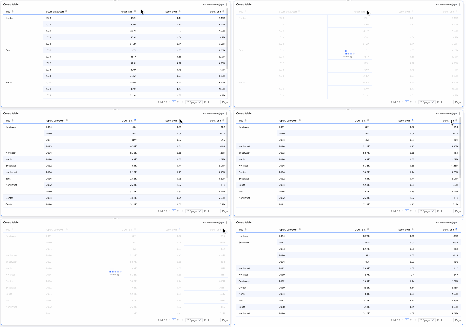
Global sort only: Select this mode to perform a global sort on a field by clicking its column header. After you select this option, click the icon
on the right of the column header to sort in ascending or descending order. Global sort can apply to multiple columns or a single column.-
When you select Apply to Multiple Columns, you can globally sort data based on multiple columns. The system first sorts the data by the first selected column. If identical values exist, the system then sorts the data by the second selected column, and so on.
-
When you select Single-column Sort, the chart is sorted based on a single column, and all rows are rearranged according to the values in that column. In other words, only one column can be sorted at a time. For example, if you sort column A and then sort column B, the sorting on column A is automatically cleared.
-
-
No sort: Disables sorting. If you select this option, report viewers cannot sort data in any column.
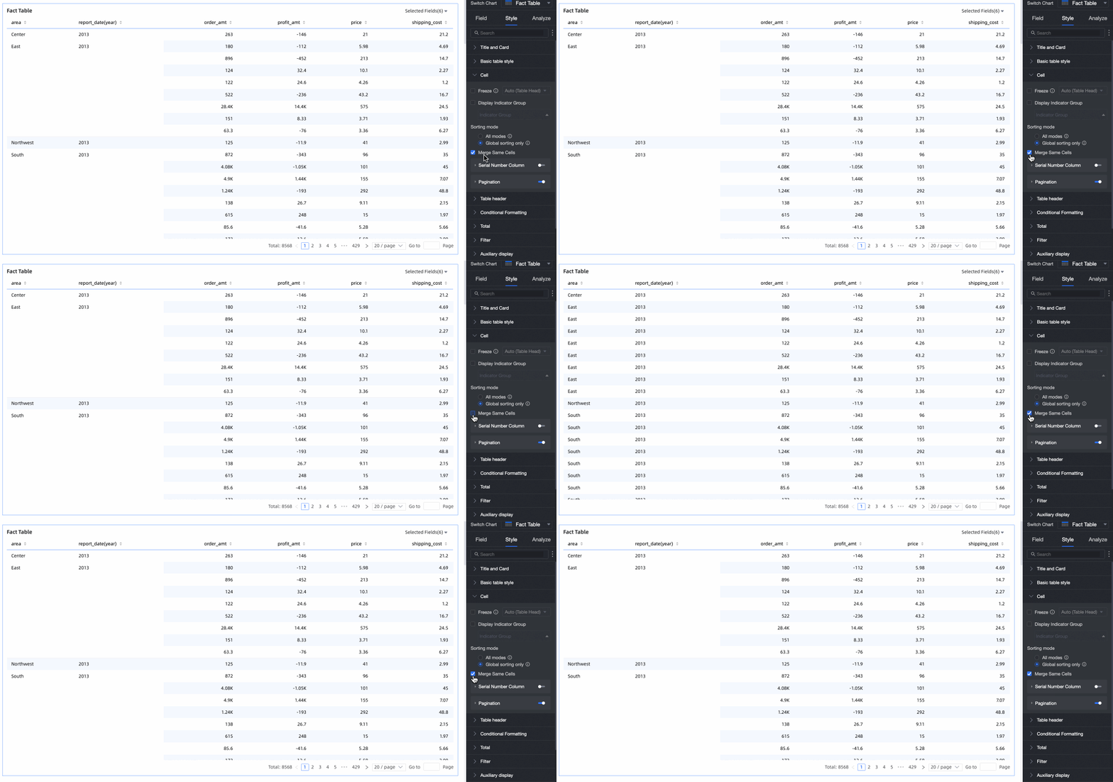
Merge cells with same value
Specifies whether to merge adjacent cells that have the same value.
Wrap text in content area
When you configure a details table, you may want to wrap text in specific areas for a better layout. For example, wrap long text in the content area while leaving the header unwrapped.
Select Wrap text in content area to automatically wrap long text in the content area.
Note-
The details table recognizes newline characters in fields. You can use them to create custom line breaks.
-
This option controls text wrapping only for the content area. To adjust text wrapping for the header, see Header settings.
Image field display mode
If the chart contains an image field, you can set its display mode: scale while maintaining aspect ratio, crop to fit, or stretch to fit the area.
NoteYou can use the Image Field only if the dataset contains an image field and that field is of the image type (
). For more information, see Application of image dimensions in dashboards.Row number column
Displays a column with row numbers.
① Set a name for the row number column.
② Select Do not display row number for total row.
NoteThe Do not display row number for total row option is available only if you enable column totals for the details table.
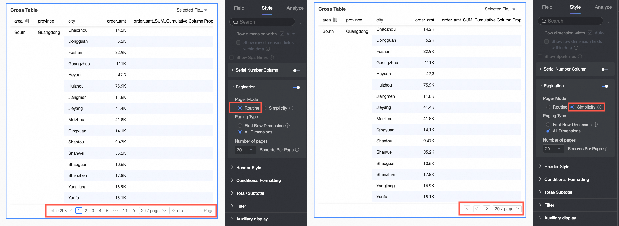
Paginator
Specifies whether to display a paginator. Use a paginator for large datasets to prevent slow loading and improve navigation. To enable it, click the paginator switch icon (
).After you enable the paginator, you can configure the following settings.
-
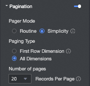
The default paginator mode is Normal. If you have a very large amount of data, select Simple mode. Simple mode does not calculate the total number of entries.
-
Supported page sizes are 10, 20, 30, 50, 80, 100, 200, and 500 entries per page.
-
-
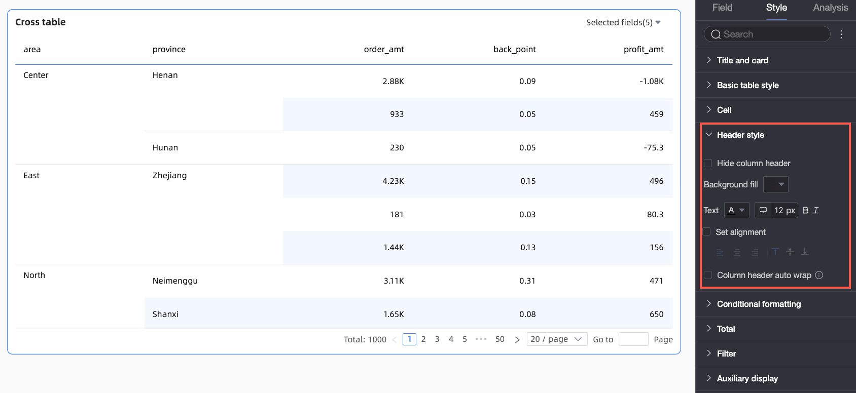
In Header, configure the header style for the details table.
Parameter
Description
Hide table header
Select this option to hide the table header.
Background fill
Set the background color of the table header.
Text
Set the text style of the table header.
Set alignment
Select this option to set the alignment of the table header.
This setting overrides the alignment specified in the field configuration. For example, if the Profit Amount field is set to left-aligned in the field configuration but is set to center-aligned here, the field name in the table header will be center-aligned.
Table header word wrap
Select this option to automatically wrap long text in the table header.
-
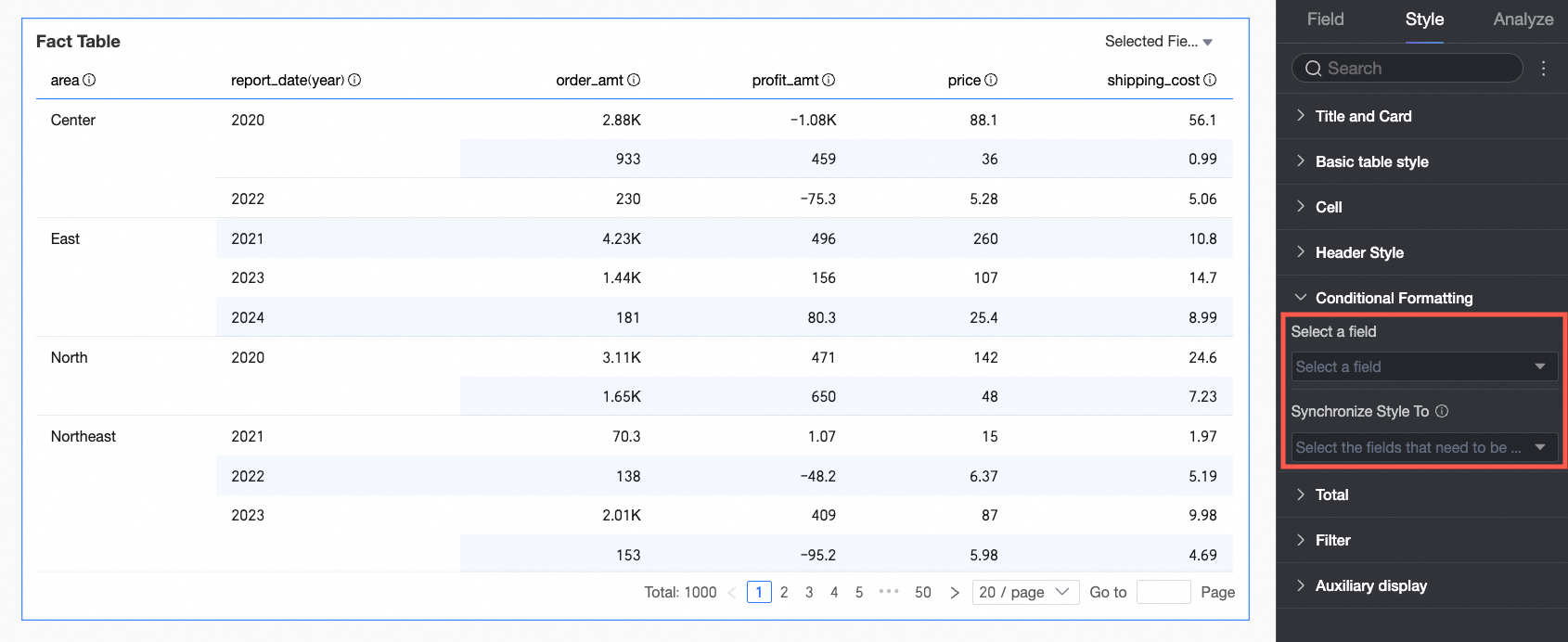
In the Conditional Formatting section, set conditional formats for your data.
Configuration item
Description
Select a field
Select the field to format. You can choose any field from the data panel.
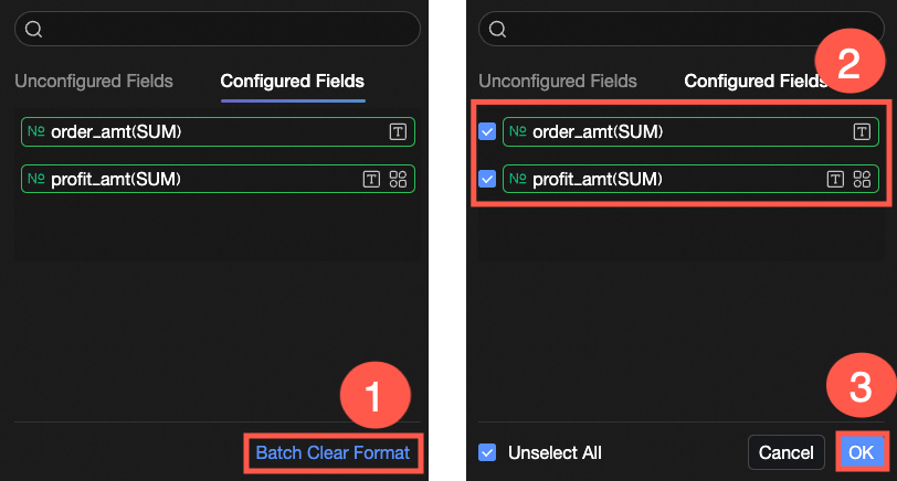
After you configure the styles, if you no longer need some of them, you can remove them in bulk. Click Bulk Clear Formatting in the lower-right corner of the field panel. In the list, select the formats to clear and then click OK.
Quick Style
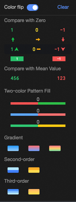
Set the marker icon or font color for the current field from a list of predefined styles. Quick styles are supported only for measure fields, not for dimension fields.
-
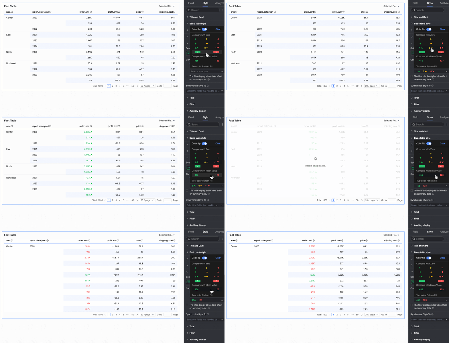
Comparison: Compare values with 0 or the average value.
-
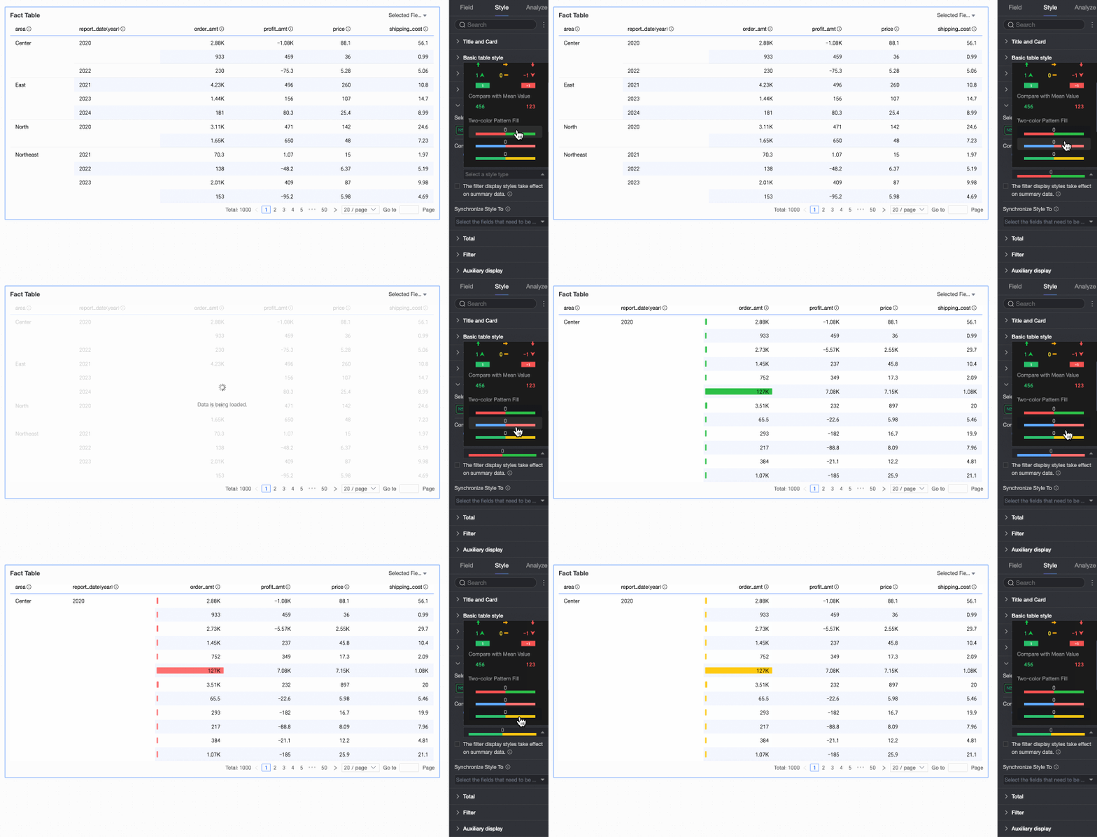
Two-color fill: Select the colors for the data bars.
NoteThe length of the data bar is calculated as follows: If the maximum value is positive and the minimum value is negative, the denominator is the larger of the two absolute values. If the maximum and minimum values are both positive or both negative, the denominator is the difference between their absolute values.
-
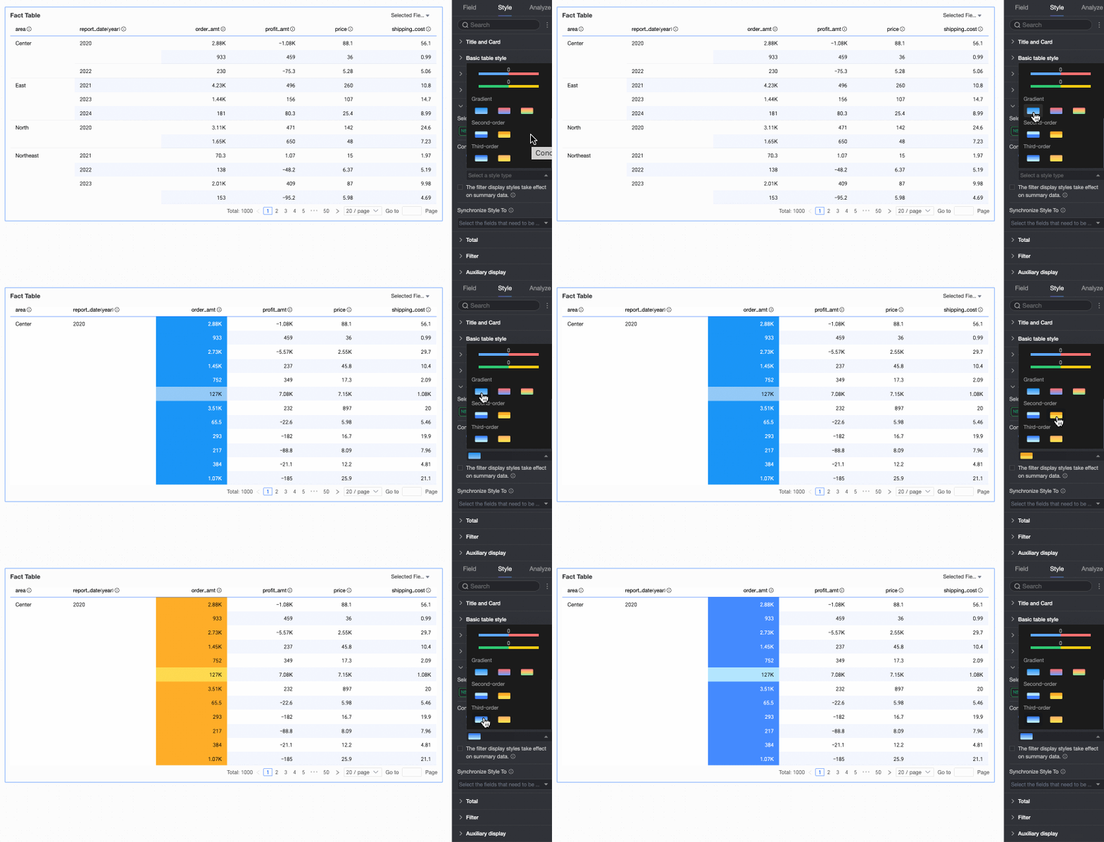
Color scale: Choose from Gradient, Two-level, or Three-level scales.
-
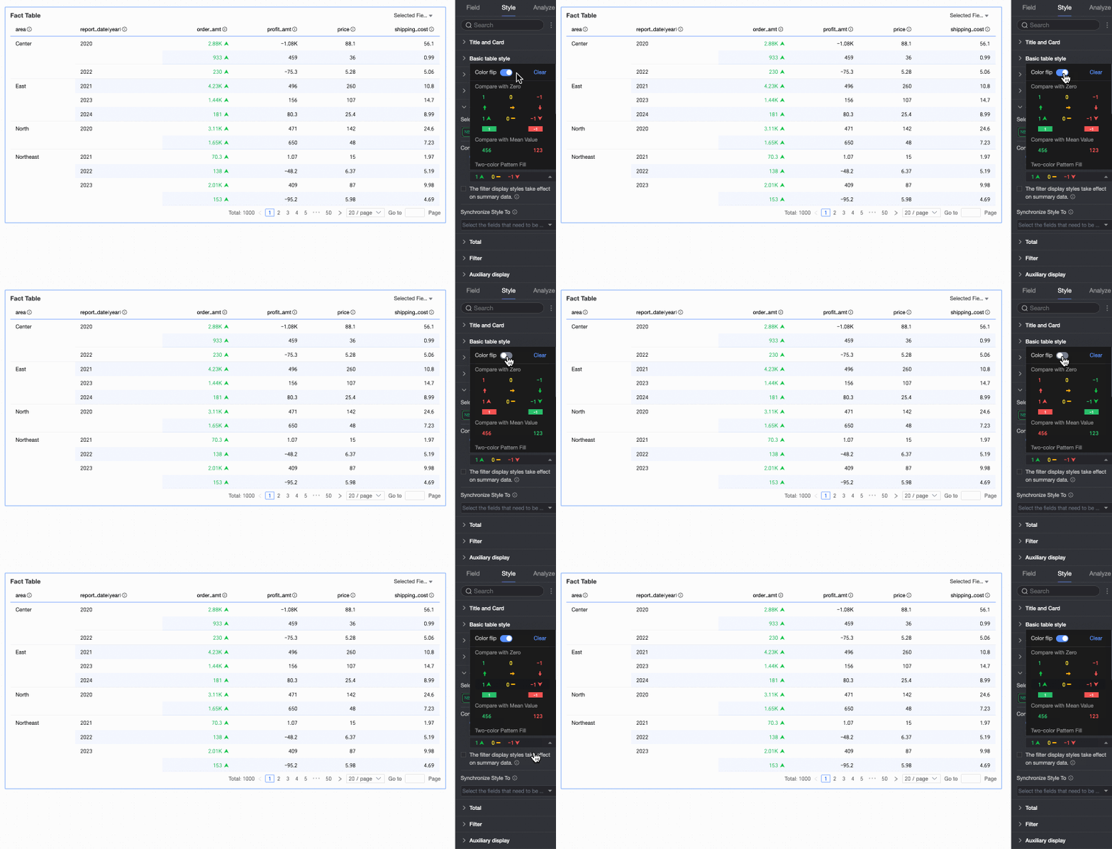
Invert colors
For example, in a comparison, values less than 0 might be red and values greater than 0 might be green. If you invert the colors, values less than 0 become green and values greater than 0 become red.
-
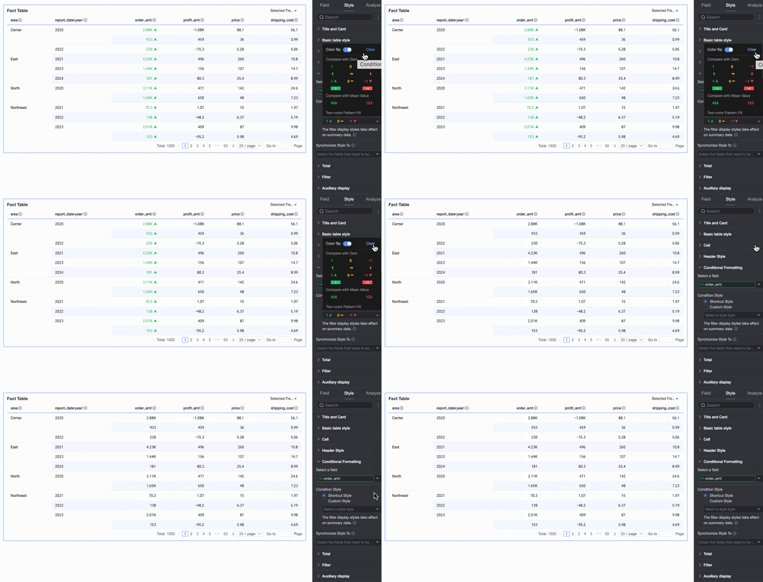
Clear: To remove a quick style that you no longer need, click Clear.
Custom Style
In addition to predefined quick styles, you can configure custom styles. Custom styles are available for both measure and dimension fields, but the options differ.
-
Measure fields: You can configure Highlight Text/Background, Icon, Color Scale, and Data Bar.
-
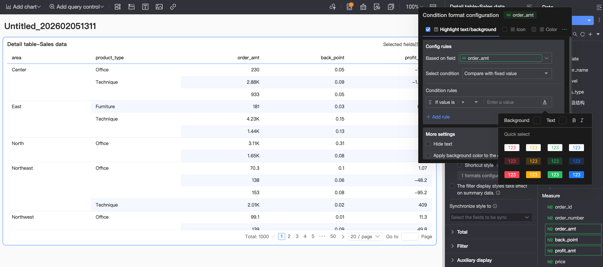
Highlight Text/Background: Configure rules to highlight the text color or background color of field values. This helps visually emphasize key data in the table.
Configure the following settings.-
Based on field: Select the data field to which the rule applies. By default, this is the field you chose in the Select a field section. You can also choose other fields from the chart to create complex rules based on the values of those fields.
-
Condition selection: Set the comparison basis for the rule. You can choose to Compare with fixed value, Group by percentage range, or Compare with dynamic field.
-
Conditional rule: Define the logic for the rule and the cell's text and background style when the rule is met. You can set the text color, bold, italics, and background fill color.
-
Add rule: Click to add a new rule.
-
More settings: Choose whether to hide the text of the current field and whether to apply the background color to the entire row.
-
-
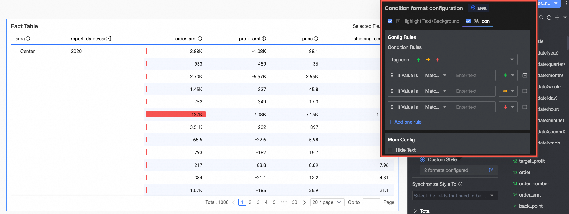
Icon: Display a specific icon in a cell based on a numerical comparison. This clearly shows the relationship between the current data and a target value.
Configure the following settings.-
Based on field: Select the data field to which the rule applies. By default, this is the field you chose in the Select a field section. You can also choose other fields from the chart to create complex rules based on the values of those fields.
-
Condition selection: Set the comparison basis for the rule. You can choose to Compare with fixed value, Group by percentage range, or Compare with dynamic field.
-
Conditional rule: Click the Marker Icon box to select an icon type from the available icon sets. Then, define the data condition logic for that icon. You can also select a unique marker icon for each comparison rule.
-
Add rule: Click to add a new rule.
-
More settings: Choose whether to hide the text of the current field.
-
-
Color scale: Changes the cell background color based on the value to show data distribution and trends.
NoteYou can configure a color scale only if Highlight Text/Background, Icon, and Data Bar are not selected.
Configure the following settings.-
Condition selection: Set the comparison basis for the rule. You can choose to Compare with fixed value or Group by percentage range.
-
Conditional rule: Set the color scale style (gradient, one-level, or two-level). Specify the maximum and minimum values, boundary values, and the color for each value range.
-
In More settings, set the shape of the color scale bar and choose whether to hide the text of the current field.
-
-
Data bar: Displays values as bars of varying length and color within cells for intuitive comparison of relative values.
Configure the following settings.-
Conditional rule: Set the display rules for the data bars in the current measure field. You can specify a different color for each rule.
-
Add rule: Click to add a new rule.
-
Custom min/max: Select this to set custom maximum and minimum values. In automatic mode, the maximum defaults to the highest value in the field, and the minimum defaults to the lowest value.
-
More settings: Choose whether to show a background for the data bars and customize its color. You can also choose to hide the text of the current field.
-
-
-
Dimension fields: You can configure Highlight Text/Background and Icon.
-
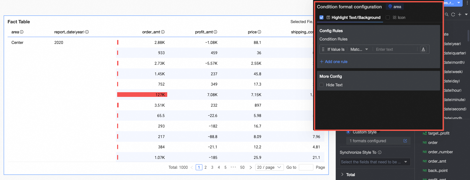
Highlight Text/Background
-
In the Rule creation section, set the conditional rule to highlight the text of the current dimension field. The condition is based on the dimension value, so you can only enter text in the condition value input box.
-
In More settings, choose whether to hide the text of the current field.
-
-
Icon
-
In the Rule creation section, set the icon rule for the current dimension field. The condition is based on the dimension value, so you can only enter text in the condition value input box.
-
In More settings, choose whether to hide the text of the current field.
-
-
Apply conditional styles to summary data
If you select this option, the conditional styles also apply to the summary data.
Sync style to
Sync the current conditional formats to other fields.
-
-
In the Total section, click the switch
to enable or disable column totals. Enabling this option summarizes all values in a column.Setting
Description
Grand total (Column total)
Total display name
Set a display name for the total that reflects your business data, such as "Total Sales by Region".
Calculation method
Select a uniform aggregation method for all fields. This does not apply to calculated fields, which keep their original aggregation method.
To set a different aggregation method for each field, select Custom from the drop-down list. Then, configure the aggregation logic for each field in the Custom Calculation section as needed.
Style settings
Set the text style for the total. Choose between the system default style or a custom style with a specific font color, background color, and font weight.
Pin to bottom
Choose whether to pin the column total to the bottom of the table.
NoteFor frequently asked questions about configuring totals, see FAQ.
-
In the Filter section
-
After you enable Show Field Content Filter, you can click the Selected Fields drop-down list in the details table to filter or sort fields in preview mode.
-
After you enable Enable Quick Filter, you can click the Filter drop-down list in the details table to filter fields in preview mode.
-
-
Under Display Assistance, you can set the Scrollbar Display Mode and Scrollbar Thickness.
-
Show on Hover: The scrollbar appears only when you hover over the table.
-
Always Show: The scrollbar is always visible.
-
To make the scrollbar more visible, adjust its thickness.
-
 icons at the top of the page to configure the adaptive height settings for the PC and mobile terminals respectively.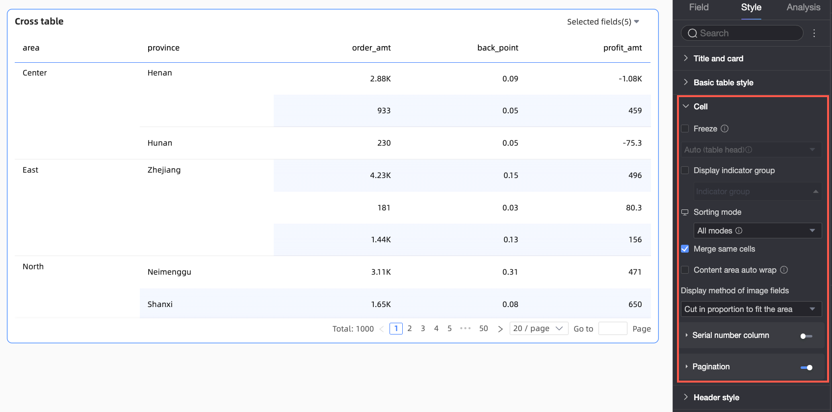


 on the right of the column header to sort in ascending or descending order. Global sort can apply to multiple columns or a single column.
 ). For more information, see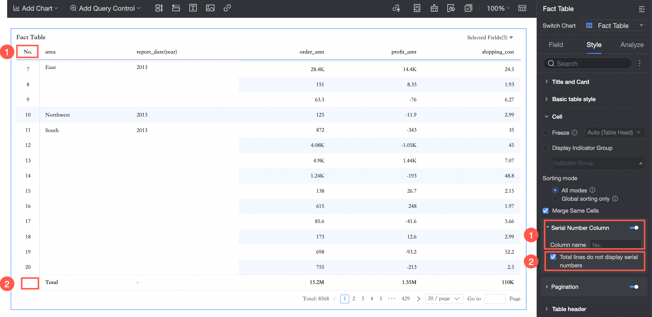
 ).
).
 Configure the following settings.
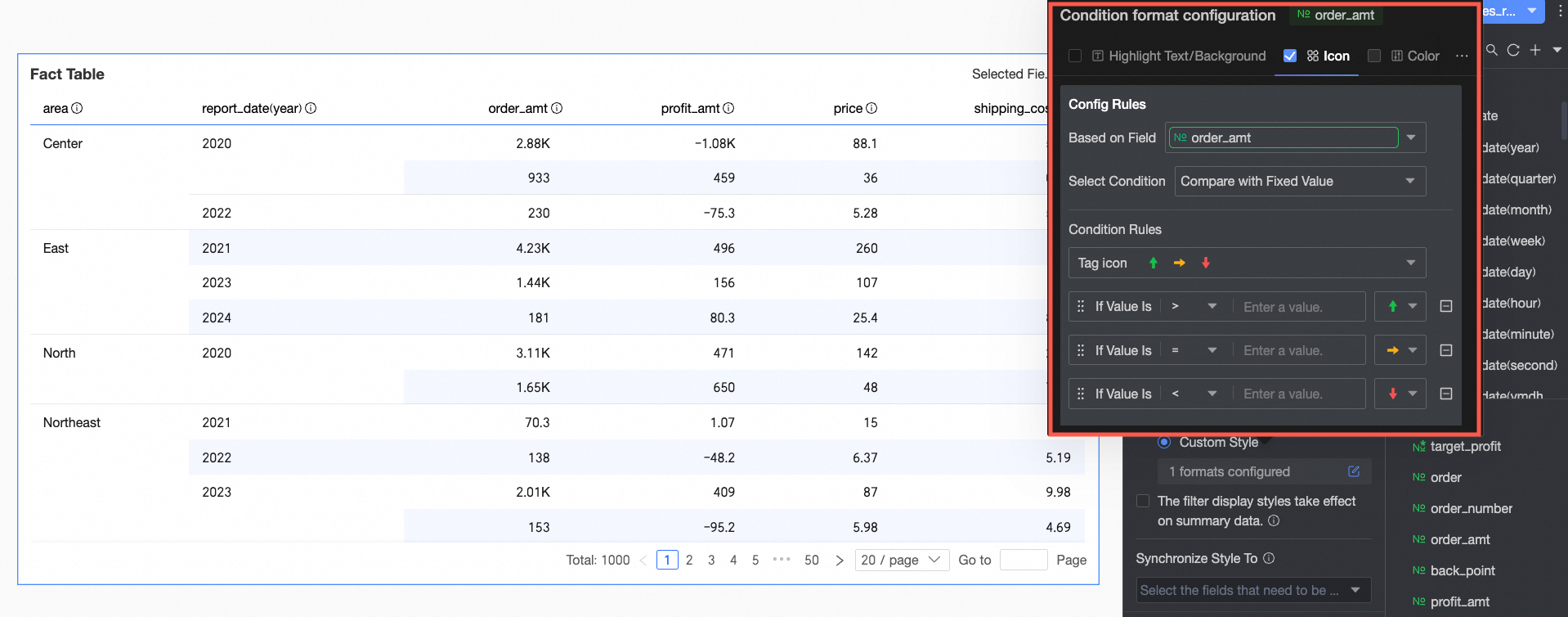 Configure the following settings.
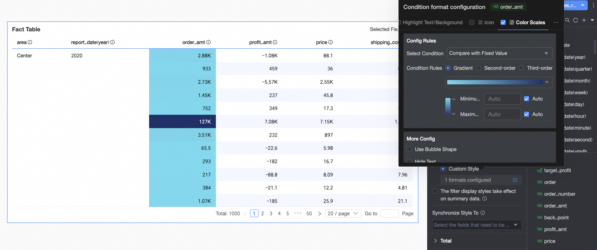 Configure the following settings.
 Configure the following settings.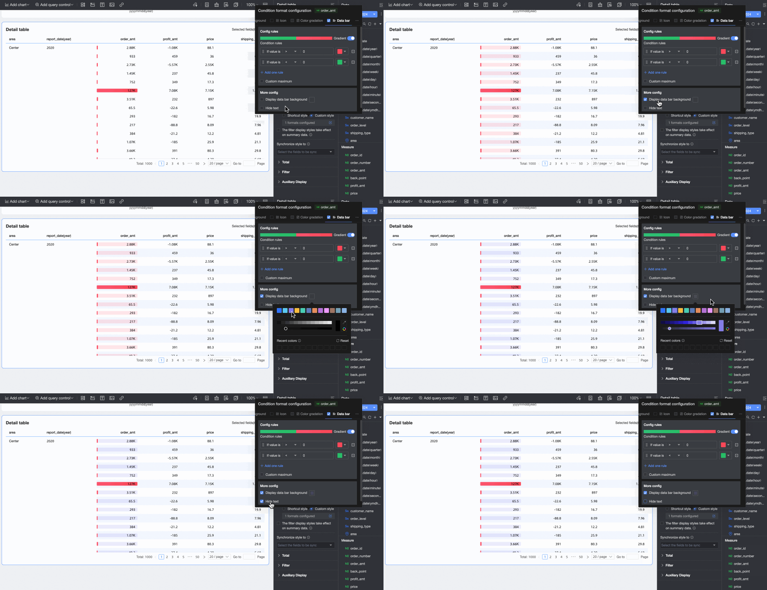
 to enable or disable column totals. Enabling this option summarizes all values in a column.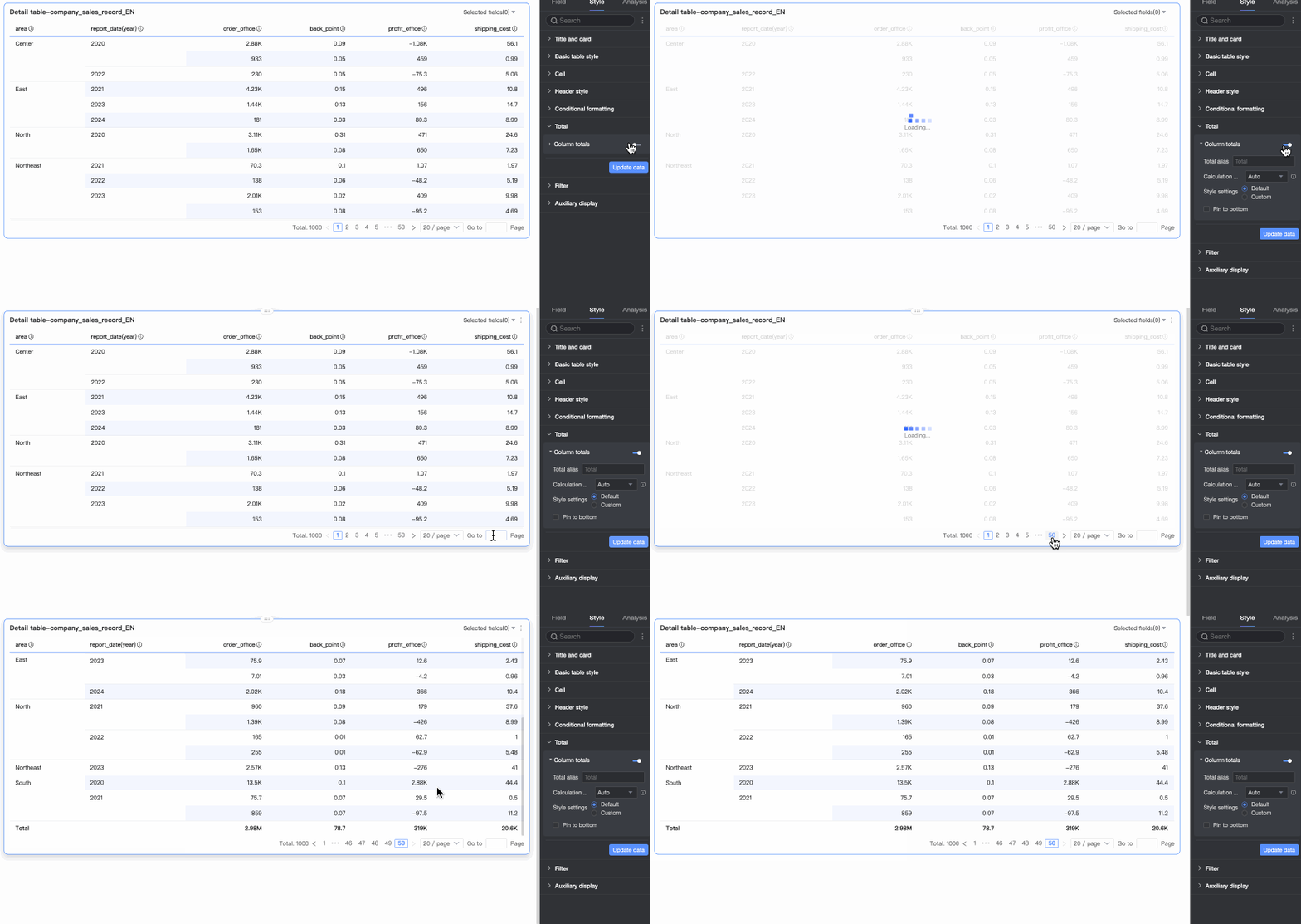
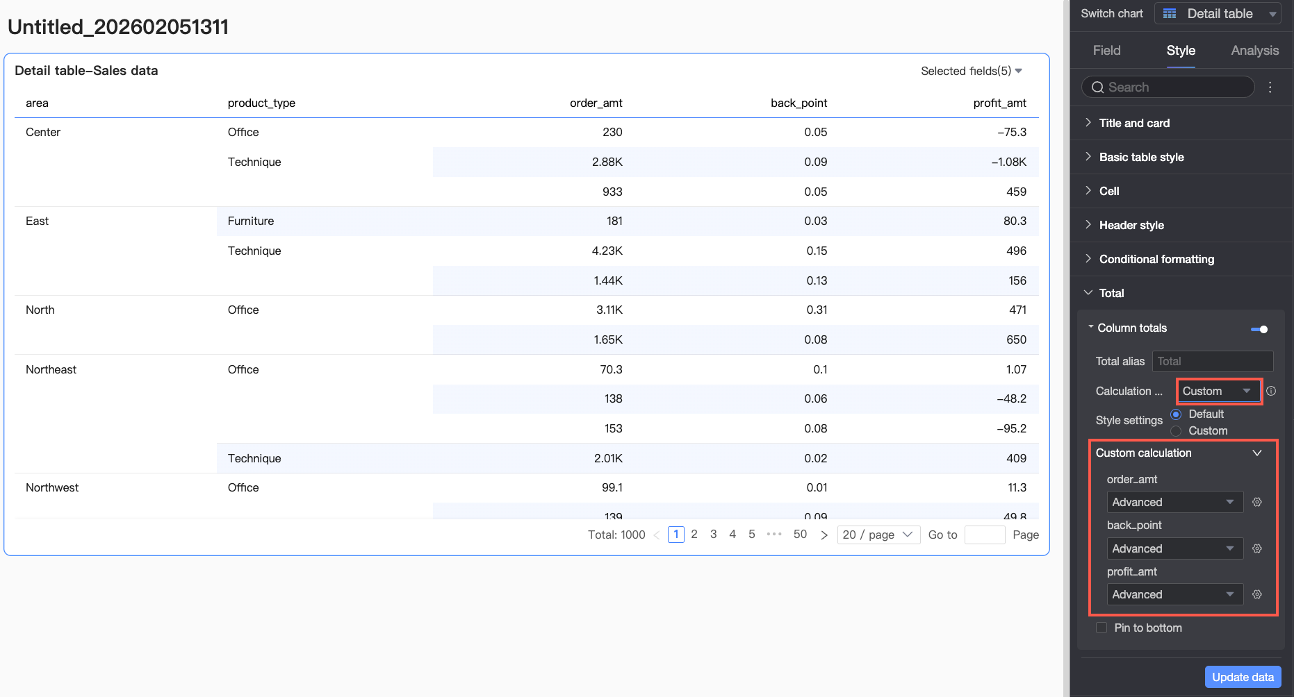
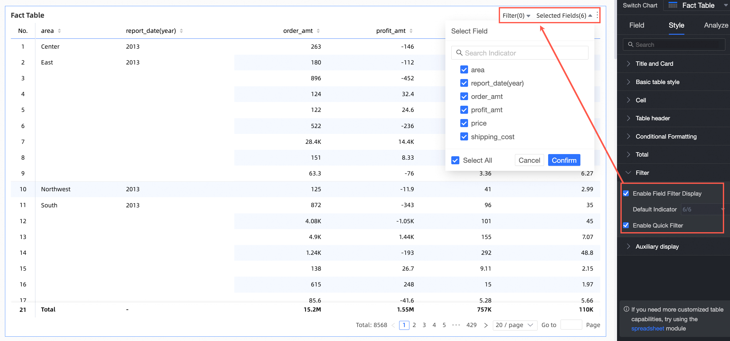
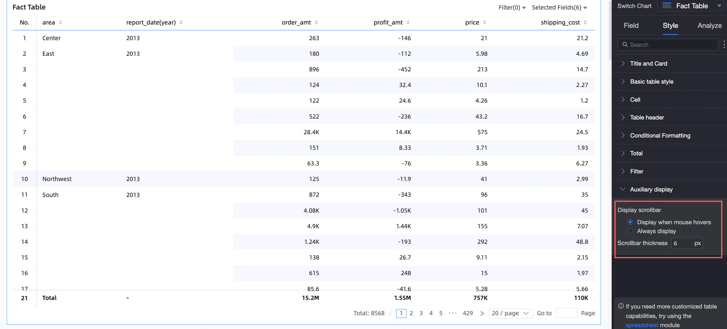
Chart analysis configuration
|
Configuration item |
Name |
Description |
|
Data interaction |
Drill down |
After you configure drill-down fields in the Fields pane, you can set the display style for drill-down level rows. |
|
Interaction |
When this option is enabled, clicking an area or field in a chart updates the content of other related charts on the dashboard. For more information, see Interaction settings and display. |
|
|
Navigation |
When this option is enabled, clicking a field in a chart redirects you to an associated report. Navigation supports two methods: parameter navigation and external links. Parameter navigation requires global parameters. For more information, see Navigation settings and display. |
|
|
Advanced settings |
Event column |
After you select this option, you can enter data in the details table. Events can be configured only if no dimension fields are added to the columns. For more information, see Add a data entry event. You can configure DingTalk events in the details table. For more information, see Events. |
|
Enable secondary measure display |
Select this option to configure the display format for secondary measures. For more information, see Enable secondary measure display. |
Enable secondary measure display
After you configure a measure, you can enable and configure a secondary measure.

After you select Enable secondary measure display, the comparison measure drop-down list includes all available measures.
-
Comparison date selection: Select a date field from the dataset.
Note-
If the chart contains a date field, the secondary measure comparison date can only be the date field with the finest granularity in the chart.
-
If the chart does not contain a date field, you can select any date field from the dataset for the secondary measure comparison date.
-
-
Comparison method: The available comparison methods depend on the granularity of the date field. A maximum of four comparison fields are displayed. For example, if you set Comparison date to a daily granularity, Comparison content selection displays Day-over-day comparison, Week-over-week comparison, Month-over-month comparison, and Year-over-year comparison. If you set Comparison date to a monthly granularity, Comparison content selection displays Month-over-month comparison, Year-over-year comparison, and more.
-
Content to display: By default, Percentage difference is selected. You can also select Difference or Original value.
-
Difference: The data display format is the same as the measure's display format.
When you select Difference, you can also select Calculate percentage point difference for percentage measures. This option is not selected by default. If you select this option and the measure is in a percentage format, the content is automatically displayed in percentage points (pt). For example, 5.2% - 4.1% = 1.1 pt. You can then choose to keep 0, 1, or 2 decimal places.
-
Percentage difference: You can set the display format to keep 0, 1, or 2 decimal places.
-
-
Same-period comparison (effective only when the query filter is bound to daily granularity): If you configure a filter condition, the same filter is applied to the comparison period. For example, if you configure a filter condition for 2022-01-02, the filter condition for 2021-01-02 is also applied when calculating the year-over-year comparison. Day-over-day comparison automatically supports same-period comparison. Dynamic period-over-period comparison does not support same-period comparison.
-
When data from the previous period is negative: Select the formula to calculate the percentage difference. The selected formula takes effect only for data items where the value from the previous period is < 0. You can set it to:
-
(Current period data / Previous period data - 1) * 100%: The default value.
-
1 - (Current period data / Previous period data) * 100%
-
Display as -
-
-
Sync comparison measures: Syncs the configuration of the current measure to multiple other measures.
-
Display position: The default position is Right of measure. Independent right column and Below measure are also supported.
-
Right of measure: A new measure column is added to the right of the current measure. The column name is the selected comparison method, such as Year-over-year comparison, Day-over-day comparison, Month-over-month comparison, or Week-over-week comparison.
When measures are in columns, the secondary measures are displayed sequentially to the right of the primary measures.
-
Independent right column: The last column dimension is split to display the selected comparison methods, such as Day-over-day comparison, Week-over-week comparison, Month-over-month comparison, or Year-over-year comparison. These are displayed in a separate column to the right of the current measure.
-
Below measure: Multiple rows for comparison measures are added below the current measure. The alignment matches the primary measure: text is left-aligned and numbers are right-aligned.
The comparison measures share the same column as the primary measure. A new row is added below the primary measure's header to display the names of the selected comparison methods, such as Day-over-day comparison, Week-over-week comparison, Month-over-month comparison, or Year-over-year comparison.
-
-
Display style: Select the display colors for positive and negative numbers in the table. You can choose from the following options: Follow global semantic color settings (uses the settings from Page Settings > Global Style > Semantic Colors), Positive numbers in red, negative numbers in green, or Positive numbers in green, negative numbers in red.


Frequently asked questions
How totals are calculated
-
If the original data is GMV (Sum), the calculation for totals and subtotals defaults to Auto, which uses the GMV (Sum) logic. If you set the total calculation to Custom and select Average as the aggregation method, the total is calculated as GMV (Average).
-
If the original data is id (Count Distinct), the calculation for totals and subtotals defaults to Auto, which uses the id (Count Distinct) logic. If you set the total calculation to Custom and select Count as the aggregation method, the total is calculated as id (Count).
How do I calculate a ratio?
-
Define the ratio.
In this example, assume the ratio is defined as (Measure A / Measure B).
-
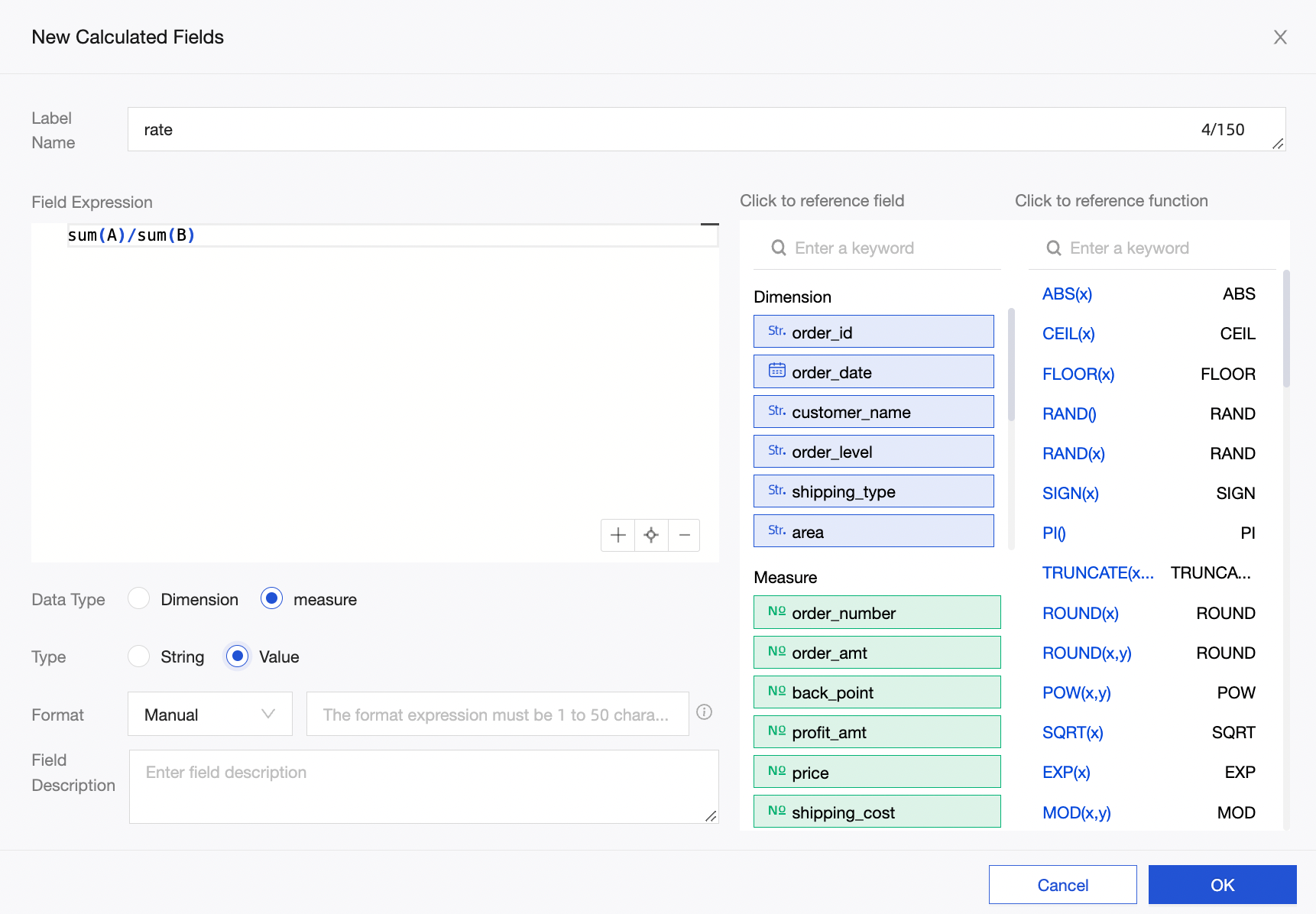
In the dataset, create a new calculated field and define the expression as rate=sum(A)/sum(B).
-
In the data panel of the dashboard, select the rate (Sum) measure and enable totals and subtotals. The calculation logic defaults to Auto, which is rate (Sum). Therefore, the calculation logic for the total and subtotal is sum(A)/sum(B).
NoteIf you define the expression as rate=A/B in the dataset and enable automatic calculation for totals and subtotals, the logic defaults to A/B (Sum). This produces incorrect results, such as a ratio exceeding 100%.