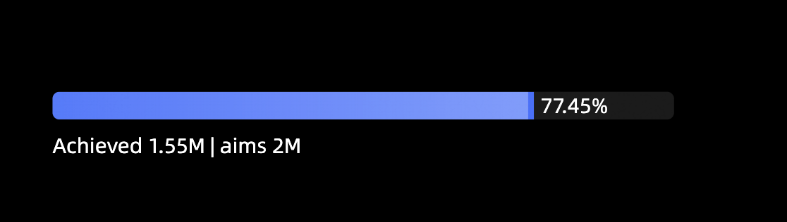
A progress bar visually displays a metric's progress toward a target. You can add data to a progress bar and configure its styles.
Example
Configure data
-
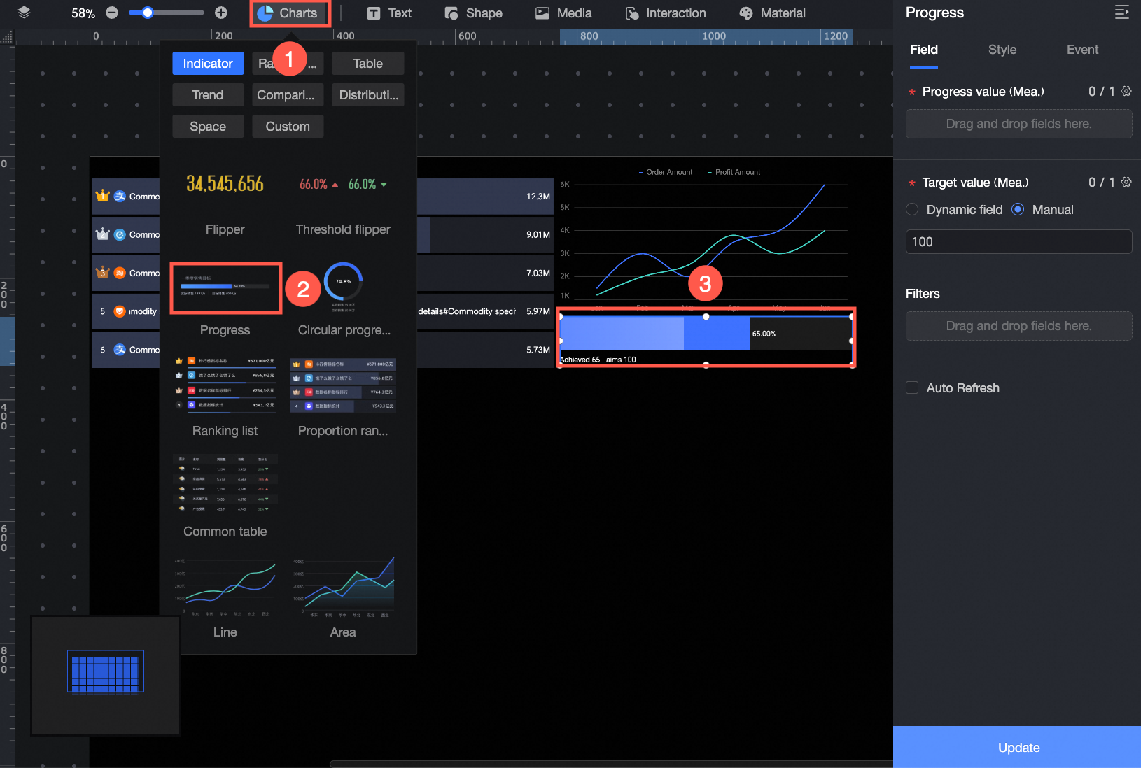
In the Charts section of the component library, find progress bar and drag it onto the canvas.
-
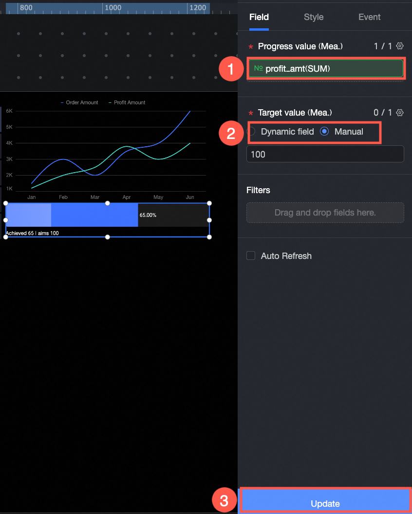
Click Select a dataset and add data as shown below.
In this example, target value/measure is set to manual input. You can also select dynamic field.
You can also perform the following operations: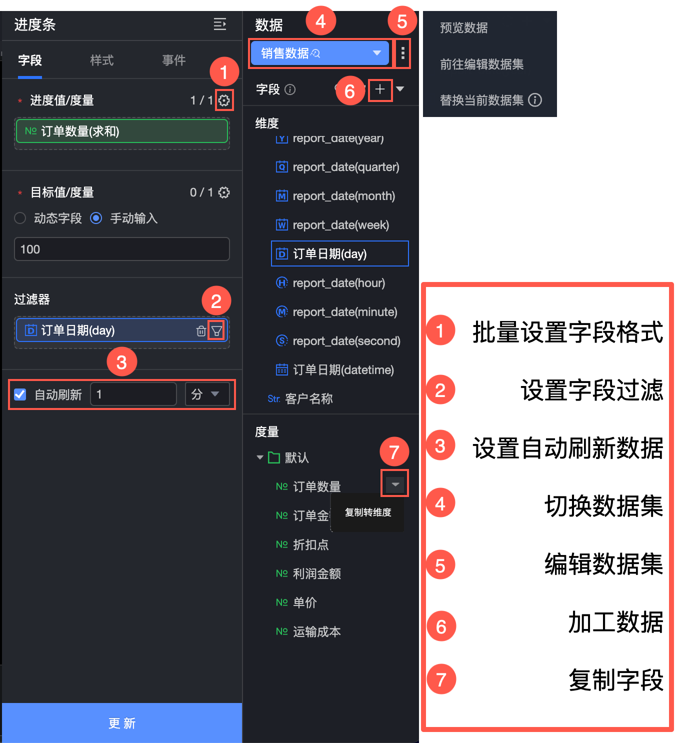
-
Set field formats in batches (①). For details, see Configure field styles in batches.
-
Set a field filter (②). For details, see Filter data.
-
Set up automatic data refresh (③). For details, see Refresh data on a schedule.
-
Switch the dataset (④). For details, see Switch a dataset.
-
Edit the dataset (⑤). For details, see Edit a dataset.
-
Process data (⑥). For details, see Create a calculated field, Create a grouping dimension, and Create a placeholder.
-
Copy a field (⑦). For details, see Copy a field and convert it to a dimension.
Configure styles
Position and size
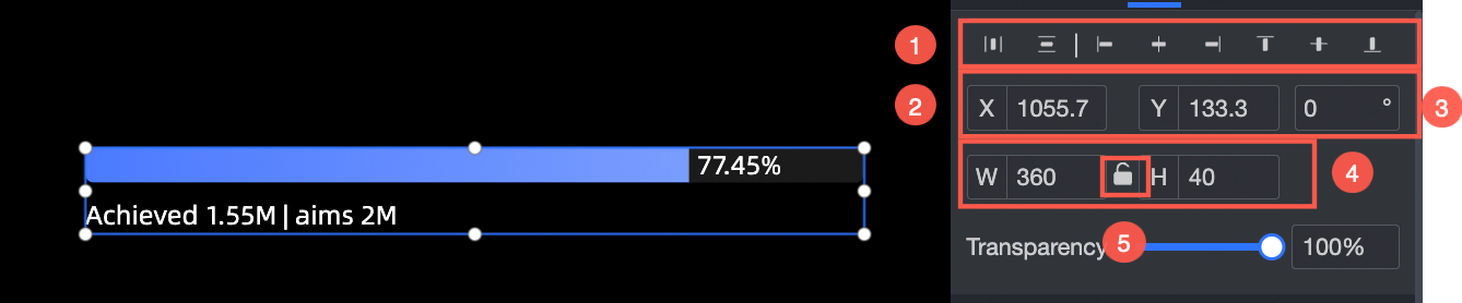
In the configuration pane, you can adjust the following settings for the component:
-
Adjust the component's alignment (①). Options include left, center, and right.
-
Adjust the component's position (②). Set its X and Y coordinates, relative to the top-left corner of the canvas.
-
Adjust the component's rotation (③). Set the rotation angle.
-
Adjust the component's size (④). Set its width (W) and height (H).
-
Lock the component (⑤). When locked, you cannot adjust its size or position.
-
Set the component's opacity (⑥).
Progress bar
In the Progress bar section, you can modify the progress color (①), background color (②), and corner radius (③).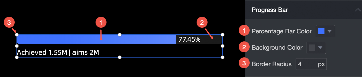
Data labels
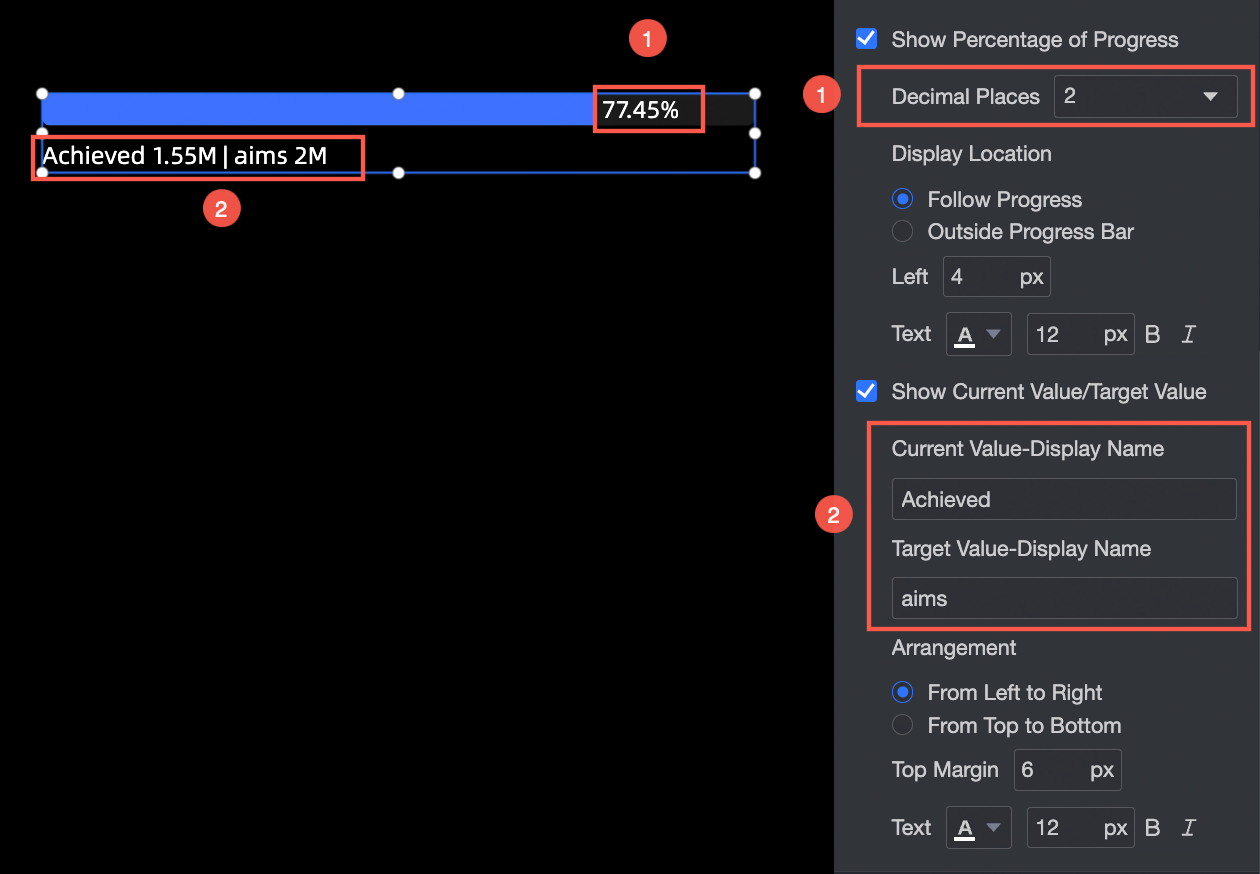
In the Data labels section, you can:
-
Display progress percentage: Set the number of decimal places for the percentage value (①), its display position (follow the progress bar or outside the progress bar), the left margin, and the text style.
-
Display current value/target value: Set a display name for the current or target value (②), the layout (horizontally or vertically), the top margin, and the text style.
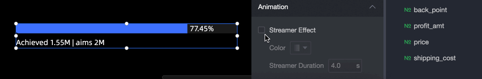
Animation
In the Animation section, you can set the following effects:
-
Color: Set the shimmer effect color. Solid and gradient colors are supported.
-
Shimmer duration: Set the duration of one shimmer cycle, in seconds (s).