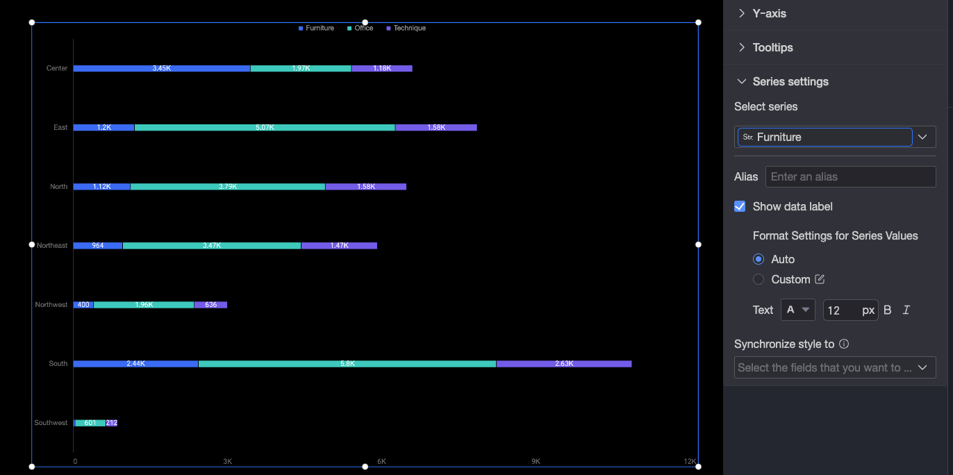
Stacked bar chart
A stacked bar chart is ideal for showing the composition of data across different categories. This topic explains how to add data to and configure the style of a stacked bar chart.
Prerequisites
You have created a dashboard. For more information, see Create a dashboard.
Example
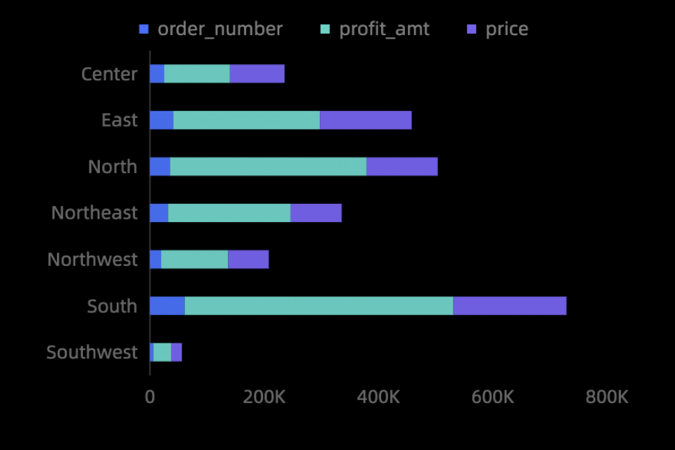
Add data
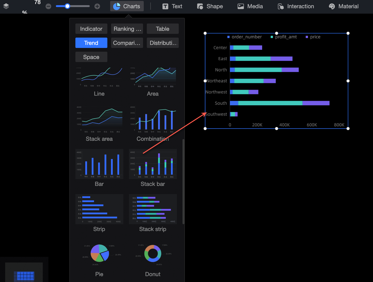
In the Charts section of the component library, find the bar chart and drag it to the canvas.
Click Select a dataset and add data as shown in the following figure. The updated chart appears as follows.
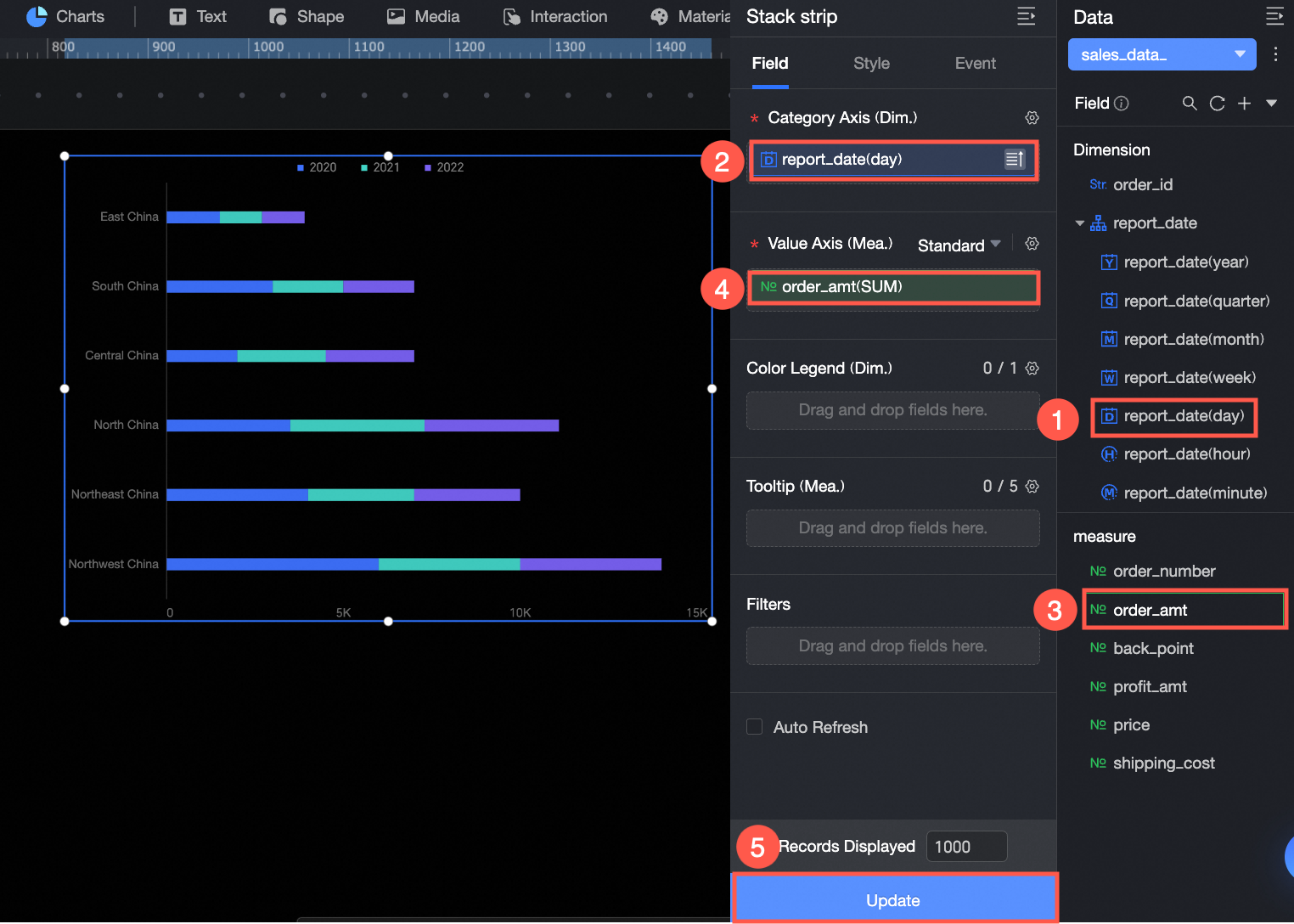
You can also perform the following operations on your data:
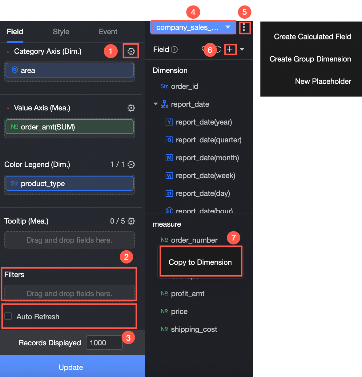
① Configure field styles in batches. For more information, see Configure Field Styles in Batches.
② Set a field filter. For more information, see Filter Data.
③ Configure periodic data refresh. For more information, see Refresh Data Periodically.
④ Switch the dataset. For more information, see Switch Dataset.
⑤ Edit the dataset. For more information, see Edit Dataset.
⑥ Process data. For more information, see Create a calculated field, Create a grouped dimension, and Create a placeholder.
⑦ Duplicate a field. For more information, see Duplicate as a dimension.
Chart styles
Position and size
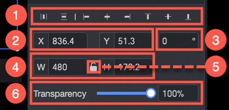
① Alignment: Sets the component's alignment to Align Left, Align Center, or Align Right.
② Position: Sets the component's X and Y coordinates relative to the top-left corner.
③ Rotation: Sets the component's rotation angle.
④ Size: Sets the component's width (W) and height (H).
⑤ Lock Component: Prevents the component from being resized.
⑥ Opacity: Sets the component's opacity.
Drawing area
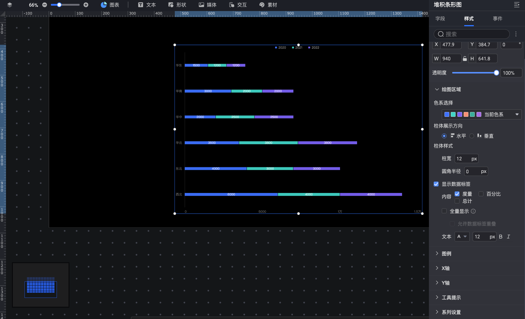
Color Palette: Select the colors for the bars.
Bar Direction: Sets the bar orientation to Horizontal or Vertical.
Bar Style: Configure the Bar Width and Border Radius of the bars.
Show Data Labels: Toggles the display of data labels. You can also configure the label content (Measure, Percentage, or Total), display options, and text style. When you select Percentage, you can set the number of decimal places. The default is 2.
If you choose to show all data labels, the system automatically adjusts their positions to prevent overlap. However, if there are too many labels, some may be hidden to avoid extending beyond the axis area. You can also select Allow Data Labels to Overlap.
NoteWhen you select Percentage, the format settings in the series settings section do not apply. These settings only affect Measure and Total labels.
Legend
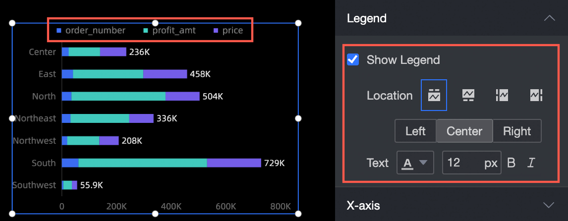
Show Legend: Toggles the visibility of the legend.
Position: Sets the legend's position. This option is available only when the legend is visible.
Text: If the legend is displayed, you can configure the text style, such as font size and color.
Axis
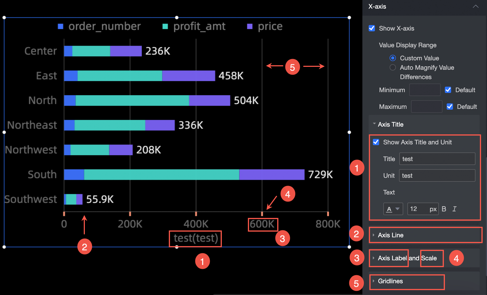
The settings described below for the X-Axis also apply to the Y-axis.
Show Axis Title and Unit: Set the axis title, unit, and text style (①).
Axis Line: Configures the style, thickness, and color of the axis line (②).
Axis Label and Tick: Configure the text style for axis labels and the thickness and color of ticks (③, ④).
Gridline: Configures the style, thickness, and color of gridlines (⑤).
Tooltip
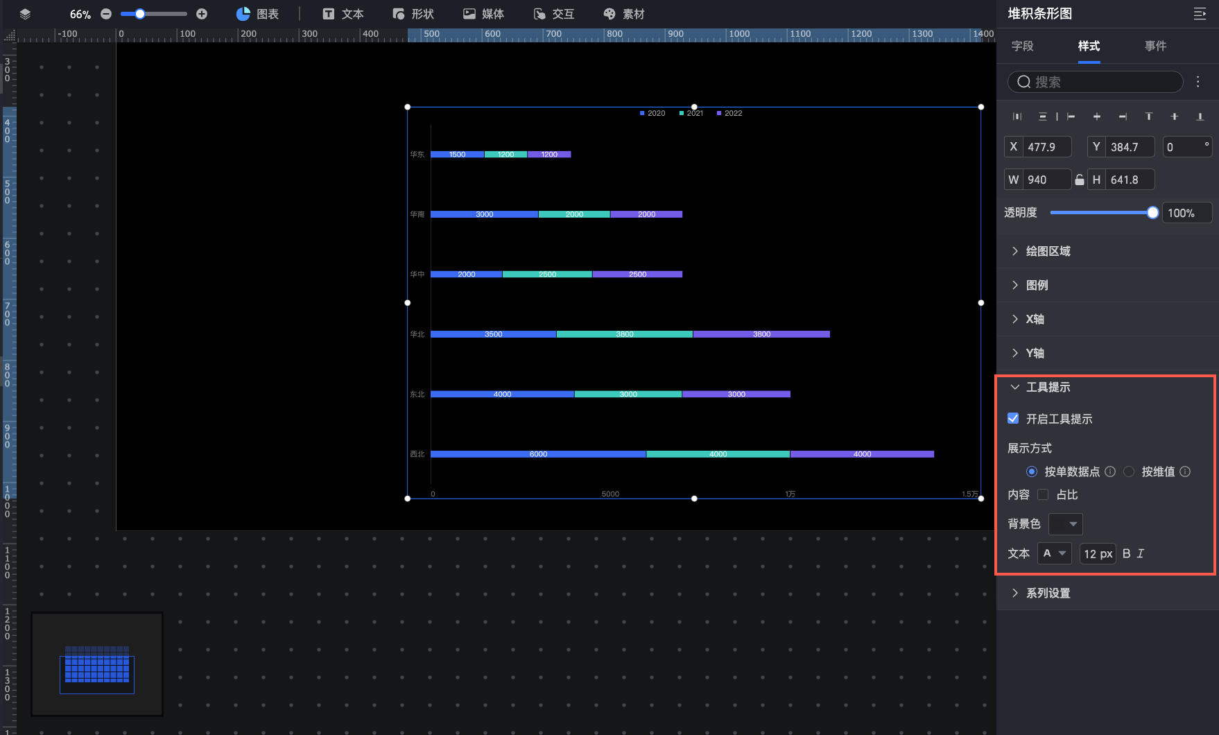
Parameter | Description |
Display Mode | Sets how tooltip content is displayed. Options are By Single Data Point and By Dimension Value. |
Content | Content options depend on the Display Mode. For By Single Data Point, you can select Percentage. For By Dimension Value, you can select Total and Percentage. |
Background Color | Sets the background color. |
Text | Sets the tooltip text style. |
Series settings
In the series settings section, you can configure individual data series.
You can set the Alias and Series Number Format in the Series Settings panel only if Color Legend/Dimension is enabled in the Field configuration panel.
Select Series: Select a dimension or measure based on your business scenario.
Alias: Sets a custom display name for the selected series.
Show Data Labels: Configure the number format and Text Style for data labels. The number format supports two modes: Auto and Custom.
Auto: This is the default option. The series inherits the number format from its source measure field.
Custom: Click the
 icon to configure the data format in the Data Display Format Settings dialog box. For information about the options in the dialog box, see Custom number format.
Sync Style To: Applies the current series' conditional formatting to other measures.
 icon to configure the data format in the Data Display Format Settings dialog box. For information about the options in the dialog box, see