This topic answers frequently asked questions about using visualization charts in Quick BI.
Line and column charts
Crosstabs
Other charts
Why a line chart shows fewer data points
When a line chart contains a large amount of data, it intelligently displays a thumbnail axis for a summary view.
If you want the chart to display all data points, go to the panel and set Show Thumbnail Axis to Do not show.
How anomaly detection works in a line chart
The Anomaly Detection feature uses an algorithm that learns from your data to identify abnormal data points. For more information, see Anomaly Detection.
Combine a column and line chart
Create a combo chart and configure each measure to display as a line or a column. For more information, see combo chart.
Add last year's data to a column chart
Add the month field to the dataset, add report_date(year) to Color Legend/Dimension, and update the data.
Add a data table below a column chart
No. As an alternative, you can add a crosstab component below the chart.
Add a reference line to a column chart
In the panel, you can add a reference line to show values such as an average. For more information, see reference line.
Adjust column width in a column chart
Yes. In the Style panel, configure the column width in the Plotting Area section.
Change colors in a stacked column chart
Go to . From the Select Series drop-down list, choose a measure and then set a color in the Style section.
Sort a stacked column chart by total sum
Yes. In the field panel, you can set the sort order to Ascending by Stacked Total or Descending by Stacked Total.
Display the secondary axis in a combo chart
Add measure fields to both the Primary Value Axis and Secondary Value Axis areas. The secondary axis appears after you update the chart.
Set up a dual-axis in a combo chart
In a combo chart, the chart automatically displays a dual axis after you add measure fields to both the Primary Value Axis and Secondary Value Axis areas.
Remove the Y-axis title
In the Style panel, go to the Axis section and delete the text in the Axis Title field for the corresponding axis.
Display a crosstab and a trend chart in one chart
No, this is not supported.
Change the number of preview rows
No, you cannot modify a chart on the preview page. If you need to change the number of rows, click the edit icon on the preview page to open the dashboard editor and modify the chart.
Freeze columns in a crosstab
Yes. In the panel of the crosstab, select Freeze and choose the columns to lock.
Automatic YoY and MoM calculation
No, this is not automatically supported.
You can calculate these values by selecting the year-over-year and month-over-month comparison aggregation function in the field settings for the total, or by creating a custom function expression in the advanced settings.
Row totals in a crosstab
No. Crosstabs currently support only column totals.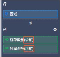
Text wrapping in a crosstab
Text wrapping is not supported for fields in the measure area. It is supported for fields in the dimension area.
If you need to wrap text for a measure field, first convert it to a dimension field. Then, go to the panel and select Wrap Text.
Configure calculation rules for subtotals
Yes.
In the panel, select Show Grand Totals for Columns and configure the field.
Group columns under a single header
Use the Display Column Settings feature in the crosstab style settings. For more information, see legacy crosstab.
Maximum queryable rows in a crosstab
A crosstab can query up to 10,000 rows. With Self-Service Data Retrieval in the Professional Edition, you can download up to one million rows.
Drill-down to a URL from a crosstab
Yes. For more information, see drill-down.
Customize crosstab style colors
No, this is not supported.
Change the font size in a crosstab
No, this is not supported.
Fix incorrect data bar colors
Go to . In the Select Format section, choose Data Bar, and then set the maximum and minimum values.
Summarize data for a specific row
No, this is not supported.
Preserve formatting when exporting to Excel
Yes.
Adjust column width in a crosstab
Position your cursor on the border between two column headers, then click and drag to adjust the width.
Center-align content in a crosstab
Yes. In the Series Settings, set the Alignment to center.
On the dashboard edit page, go to the Data tab of the Chart Design panel, click the  icon next to Columns, and change the alignment.
Transpose rows and columns in a crosstab
On the dashboard edit page, go to the Data tab on the right and click the  icon to transpose rows and columns. For more information, see legacy crosstab.
Adjust spacing between bars in a bar chart
No, this is not supported.
Enable drill-down for a pie chart
On the Data tab, in the Sector Label/Dimension area, find the target field, and click the Drill-down icon.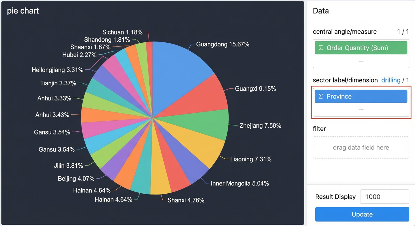
Chart interaction during drill-down
Yes. For more information, see drill-down.
Customize map background and text colors
No, this is not supported.
Show latest or summary data in an indicator trend chart
An indicator trend chart shows the most recent data based on the date dimension. To display summary data, create an indicator card. For more information, see indicator card.
Change the color of axis values
No, this is not supported.
Adjust the font size on an indicator card
Go to , select Enable Font Settings, and adjust the indicator font size.
Set the numeric format for a scatter chart axis
On the chart edit page, click the pencil icon next to the axis title to set the numeric format.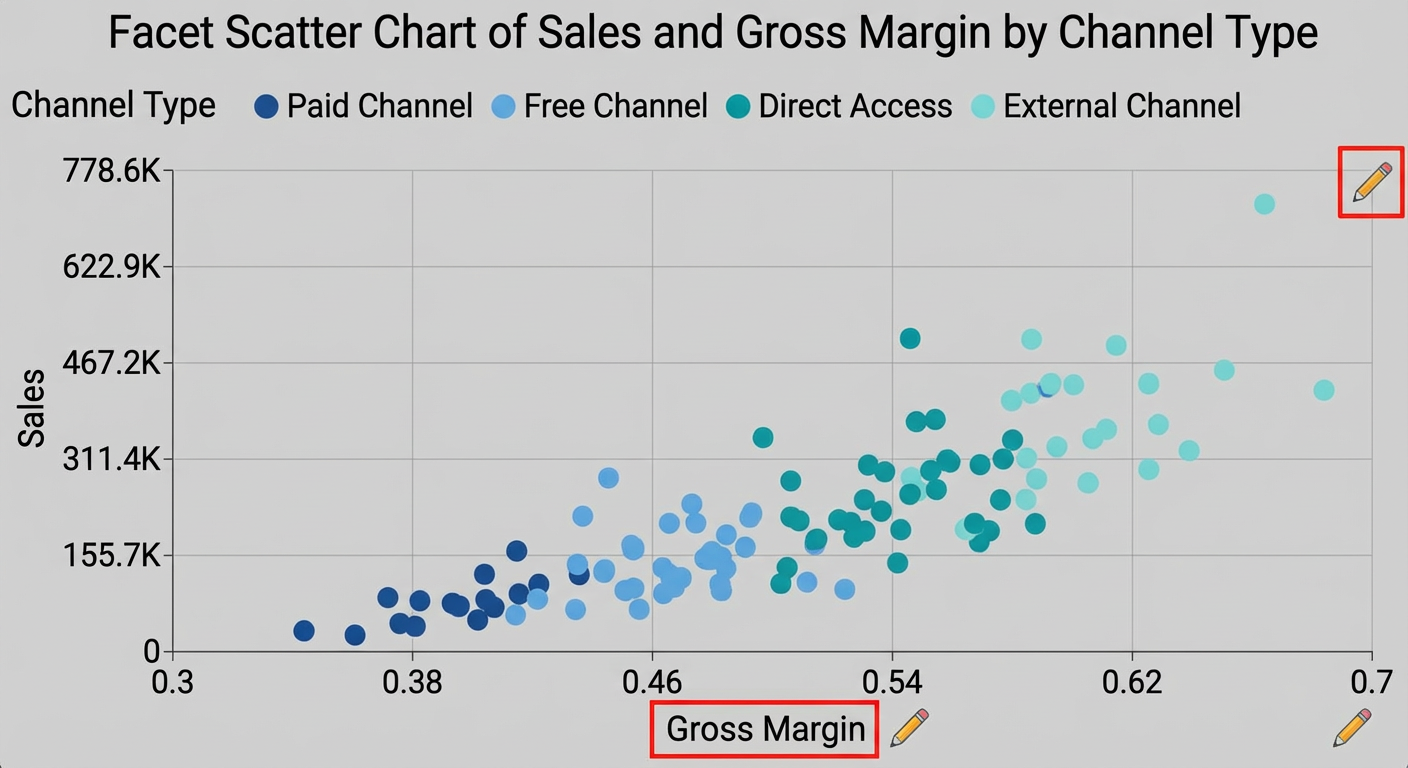
Add measures to a map
No. You can add a maximum of five measures.
Adjust dimension value boxes in a treemap
You cannot adjust the size of dimension value boxes. If you have a large amount of data, we recommend displaying the treemap horizontally.
Apply style settings to multiple charts
No. Because style settings differ between chart types, this feature is not supported.
Move a chart to a tab
Click the  icon in the upper-right corner of the chart, select Move to, and then choose the destination tab.
Configure scheduled data refresh for a dashboard
On the Advanced tab of a chart component, you can set an automatic refresh interval. The chart then fetches real-time data from the database each time the dashboard is opened.
Place multiple charts in a single tab
Yes.
Set the maximum value of a progress bar to a measure
Yes.